Successful change management relies on having the right metrics to measure progress, gauge impact, and communicate with stakeholders. Moreover, the right metrics can drive continuous improvement and help directly achieve change outcomes. However, not all metrics are beneficial, and some can mislead or fail to meet stakeholder needs, especially when managing change projects. Let’s check out the top change management metrics to avoid and go through examples to take note.
Understanding the Disconnect: Change Managers vs. Business Stakeholders
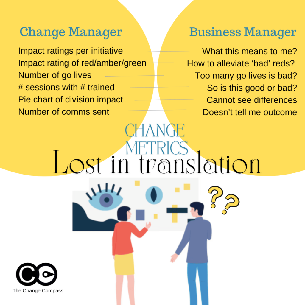
A significant reason certain change management metrics fall short is the differing perspectives between change managers and business stakeholders. Change managers and change practitioners are trained to view metrics through the lens of change management frameworks and methodologies, focusing on detailed assessments and structured approaches as a part of the change management strategy. These include applying ratings and judgments on aspects such as impact levels indicating levels and areas of impact.
In contrast, business stakeholders prioritize business operations, strategic outcomes, and practical implications. The busy business stakeholder is often looking for practical implications from metrics that can be used to directly drive decision making, meaning “what do I do with this data to improve the ultimate business outcome”.
Of course, different stakeholders have different data needs, and you need to show the right metric to the right type of stakeholder. For example, operations-focused stakeholders expect fairly detailed metrics and internal historical data to understand what that means in terms of organisation, coordination, capacity, and performance perspectives. Senior managers may prefer higher-level data with a focus on strategic impacts, overall progress, and adoption indicators of change success rate.
This disconnect can lead to the use of metrics that do not resonate with or are misunderstood by stakeholders that disrupt change success.
Change managers may leverage metrics that are derived from the various change management documents such impact assessments, training plan or communications plan. Metrics are also often chosen for ease of use and ideally are not overly complicated to execute.
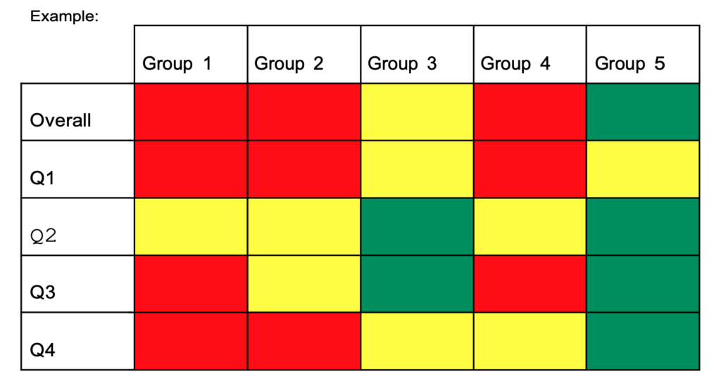
For example, impact assessments typically involve rating stakeholder groups and initiatives on a traffic light system (red, amber, green) based on their impact. While this approach is systematic, it can be problematic for several reasons:
- Lack of Sufficient Stakeholder Context: Business stakeholders might not understand the practical implications of these ratings. For instance, an “impact rating per initiative” may not clearly convey what the rating means for day-to-day operations or strategic goals. For example, if an initiative has a red impact rating, stakeholders might not grasp the specific operational changes or strategic adjustments needed, in essence, “what do I do with this?”. So, incorrect usage of data could result in lack of stakeholder engagement.
- Misinterpretation of Traffic Light Ratings: The red, amber, green system can be misleading. Stakeholders might interpret red as an indicator of alarm or imminent risk, while green may be seen as a sign that no action is needed. This is because stakeholders are trained to interpret traffic light ratings this way (from the various project/business updates they’ve attended). In reality, red might simply mean high impact, requiring focused attention, and green might indicate a low impact but still require monitoring. For instance, a red rating might indicate significant process changes that need careful management, not necessarily a negative outcome.
- Hard to defend ratings if prompted: Business stakeholders may also want to drill into how the ratings are determined, and based on what basis. They may expect a logical data-backed reasoning of how each colour scheme is determined. If a rating is based on an overall ‘personal judgment’ this may be hard to defend infront of a group of stakeholders.
Examples of Potentially Misleading Metrics
Certain metrics, although straightforward, can be easily misinterpreted and fail to provide a realistic picture of change impacts as a part of effective change management. Often these are selected because they are easy to report on. However, easy, make not give you the outcome you are looking for.
- Number of Go-Lives: Tracking the number of Go-Lives over time might seem like an effective way to represent change volume. However, the most significant impacts on people given time often occur before or after the Go-Live date. For example, the preparation and training phase before Go-Live and the adoption phase afterward are critical periods that this metric overlooks. A Go-Live date might indicate a milestone but not the challenges, progress or impacts faced during the implementation phase.
- Number of Activities Implemented: Similar to Go-Lives, this metric focuses on quantity rather than quality. Simply counting the number of activities does not account for their effectiveness or the actual change they drive within the organisation. For example, reporting that 50 training sessions were conducted does not reveal whether employees found them helpful or if they led to improved performance.
- Number of impacts or stakeholders impacted: Again, using a numerical way to indicate progress can be very misleading, or unmeaningful. This is because it may be ‘interesting’ but with no real action for your stakeholder to take in order to somehow lead to a better overall change outcome. If metrics do not result in some kind of action, then over time it will not shape your change(s) toward the targeted outcomes. Or worse, your stakeholders may lose interest and lose confidence in the strategic impact of these metrics.
- Another common way to report change metrics is to use the number of impacts or number of stakeholders impacted by the organizational change. This can be in terms of the following:
- Number of divisions impacted
- Number of stakeholder groups impacted
- Number of employees impacted
- Number of initiatives per division/stakeholder
Metrics That May Be Too Operational
Metrics that are overly operational can fail to capture meaningful progress or adoption. Perhaps if the metric are for reporting within the Change Management team that may be OK. However, when you are showing metrics to stakeholders, a different set of expectations should be cast.
If you are presenting metrics to senior managers, you need to ensure that they hit the mark for that audience group. If the group is more interested in strategic impact, and higher level progress outcomes, you need to tailor accordingly.
Examples of metrics that may be too operational include:
- Number of Communications Sent: This metric measures activity but not effectiveness. Sending numerous emails or messages does not guarantee that the message is received, understood, or acted upon by stakeholders. For instance, stakeholders might receive 100 emails, but if the content is unclear, the communication effort is wasted. Or worse, the emails may not even have been read.
- Number of Training Sessions Attended: This one is a classic. While training is crucial, the number of sessions attended does not necessarily reflect the attendees’ understanding, engagement, or the practical application of the training. For example, employees might attend training but not apply the new skills if the training is not relevant to their roles for various reasons.
- Number of workshops/meetings: Another way of articulating the change management progress in terms of activities is the number of workshops or meetings conducted with stakeholders including focus groups to indicate employee engagement. Again, this may be good to track within the change management team. However, presenting this metric to stakeholders may not be appropriate as it may not meet their needs nor indicate change management success.
- Number of changes: This may be a common way to report on changes planned, but it doesn’t really inform the extent of the change. One change can be significantly impactful whilst another does not have major stakeholder impacts and are more system impacts. Listing number of changes may be deceiving or misleading. This kind of data may not get you the level of acceptance targeted.
To read more about reporting to executives or senior managers, check out our Ultimate Guide to Change Management Reports Your Executives Want to See.
The Importance of Effective Data Visualization
The way metrics are presented is just as important as the metrics themselves. Poor visualization can lead to misinterpretation, confusion, and misguided decisions. Here are some common pitfalls to avoid:
Ineffective Use of Pie Charts
Pie charts can be misleading when used to show data points that are not significantly different. For example, using a pie chart to represent the percentage of divisions impacted by a change might not effectively communicate the nuances of the impact if the differences between the divisions are minimal. A pie chart showing 45%, 30%, and 25% might not convey the critical differences in impact levels among divisions.
Misleading Traffic Light Ratings
Using red, amber, and green to indicate high, medium, and low impacts can send the wrong message. Stakeholders might associate these colours with good and bad outcomes rather than understanding the actual levels of impact. Stakeholder may be used to interpreting these in the context of their usual project or business updates where red indicated alarm and ‘bad’. This can lead to unnecessary alarm or complacency. For instance, a green rating might suggest no need for action, while in reality, it might require ongoing monitoring.
Overuse of Colours
Using too many colours in charts and graphs can overwhelm stakeholders, making it difficult to discern the key message. Using colours in data visualisation can be two-edged sword. Colour can effectively point your stakeholders are the area where you want them to focus on. But, too many colours can lose your audience. A cluttered visual can obscure the critical data points and lead to misinterpretation. For example, a graph with ten different colours can confuse stakeholders about which data points are most important.
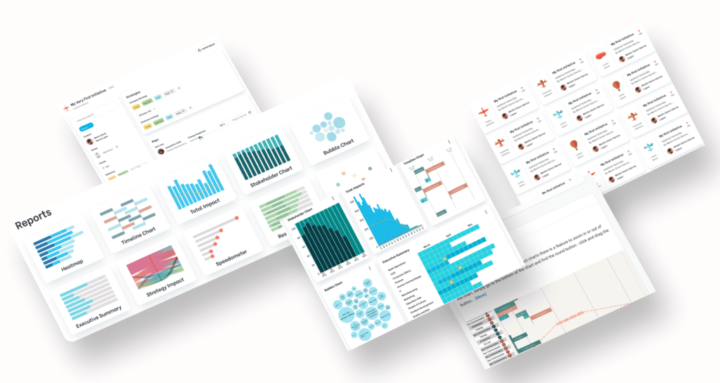
Data visualisation tools are also important. A lot of people use Power BI which works for a foundational level of charts. For tailored charts, specifically designed to to influence stakeholders to clearly see certain angles of risks and opportunities leverage tools such as Change Compass.
Practical Takeaways for Senior Change Managers
To ensure that change management metrics are effective and take into account best practices practices, consider the following practical takeaways:
Align Metrics with Key Stakeholder Perspectives
- Understand Stakeholder Priorities: Engage with stakeholders to understand their business goals, priorities and concerns. Tailor your metrics to address these aspects directly. For example, if stakeholders are concerned about operational efficiency, focus on metrics that reflect improvements in this area.
- Use Business Language: Frame your metrics in a way that resonates with business stakeholders. Avoid change management jargon and reference, and ensure that the implications of the metrics are clear and actionable. For example, instead of using technical terms, explain how the metrics impact business outcomes. Think in terms of business activities, milestones, busy periods, and capacity challenges.
Focus on Meaningful Metrics
- Measure Outcomes, Not Just Activities: Change leaders should prioritize metrics that reflect the outcomes and impacts of change indicate level of knowledge, rather than just the activities performed as a part of change management KPIs. For example, instead of counting the total number of employees attending change management training sessions, measure the improvement in employee performance or knowledge retention post-training.
- Example: Instead of reporting that 100 employees attended training sessions, report that 85% of attendees showed improved performance in their roles after training, or that certain level of competencies were gained. Note that quantifiable metrics have more impact on the audience.
- Track Engagement and Adoption: Monitor metrics that indicate the level of engagement and adoption among stakeholders or their perception of the change. This could include surveys, feedback forms, or direct measures of behaviour change and the overall success rate of the change.
- Example: Use post-training surveys to measure employee confidence in applying new skills or managerial rating of application of learnt skills rather than employee satisfaction of the training sessions using satisfaction scores. Track the percentage of employees who actively use new tools or processes introduced during the change.
- Example: Instead of reporting that 100 employees attended training sessions, report that 85% of attendees showed improved performance in their roles after training, or that certain level of competencies were gained.
- Example: Use post-training surveys to measure employee confidence in applying new skills or managerial rating of application of learnt skills. Track the percentage of employees who actively use new tools or processes introduced during the change.
Improve Metric Visualization
- Simplify Visuals: Use clear, simple visuals that highlight the key messages. Avoid clutter and ensure that the most important data points stand out.
- Example: Use bar charts or line graphs to show trends over time rather than pie charts that can be harder to interpret.
- Contextualize Data: Provide context for the data to help stakeholders understand the significance. For example, instead of just showing the number of Go-Lives, explain what each Go-Live entails and its expected impact on operations. Or better, focus on showing the varying levels of impact on different stakeholders across time within the initiative.
- Example: Accompany a Go-Live count with a visual showing the varying impact level of various implementation activities of the changes.
- Example: Use bar charts or line graphs to show trends over time rather than pie charts that can be harder to interpret.
- Example: Accompany a Go-Live count with a visual showing the varying impact level of various implementation activities of the changes.
To read more about effective data visualisation tips in presenting change data, check out Making impact with change management charts infographic.
Communicate Effectively
- Narrative Approach: Combine metrics with a narrative that explains the story behind the numbers as a part of the change management process. This can help stakeholders understand the broader context and implications.
- Example: Instead of presenting raw data, provide a summary that explains key trends, successes, and areas needing attention.
- Educate your stakeholders: Depending on stakeholder needs you may need to take them on a phased approach to gradually educate them on change management metrics and how you ultimately want them to drive the outcomes.
- Example: You may start the education process to focus on more simplistic and easy-to-understand measures, and as your stakeholders are more change-mature, move to drill into more detailed metrics that explain the ‘why’ and ‘how’ to drive outcome success.
- Continuously improvement: Provide regular updates on key metrics and adjust them based on feedback from stakeholders. Continuous communication ensures that everyone remains aligned and informed.
- Example: Hold monthly review meetings with stakeholders to discuss the latest metrics, address concerns, and adjust strategies as needed.
- Example: Instead of presenting raw data, provide a summary that explains key trends, successes, and areas needing attention.
- Example: You may start the education process to focus on more simplistic and easy-to-understand measures, and as your stakeholders are more change-mature, move to drill into more detailed metrics that explain the ‘why’ and ‘how’ to drive outcome success.
- Example: Hold monthly review meetings with stakeholders to discuss the latest metrics, address concerns, and adjust strategies as needed.
Examples of Effective Metrics
Employee Adoption and Engagement
- Percentage of Employees Adopting New Process/System: This metric measures the rate at which employees are using new processes or systems introduced during the change. High adoption rates indicate successful integration.
- Implementation: Use software usage analytics or surveys to track tool adoption rates.
- Visualization: A graph showing adoption rates over time.
- Employee Feedback Scores: Collect feedback on change initiatives through surveys or stakeholder ratings to measure sentiment/feedback and identify areas for improvement.
- Implementation: Conduct regular surveys asking employees about their experience with the change process. Do note that depending on the change you may expect negative feedback due to the nature of the change itself (vs the way it was implemented).
- Visualization: Bar/Line charts comparing feedback scores across different departments or time periods. Bar/Line charts are the standard go-to for data visualisation. They are easy to understand and interpret.
- Implementation: Use software usage analytics or surveys to track tool adoption rates.
- Visualization: A graph showing adoption rates over time.
- Implementation: Conduct regular surveys asking employees about their experience with the change implementation process. Do note that depending on the change you may expect negative feedback due to the nature of the change itself (vs the way it was implemented).
- Visualization: Bar/Line charts comparing feedback scores across different departments or time periods. Bar/Line charts are the standard go-to for data visualisation. They are easy to understand and interpret.
Impact on Business Outcomes
- Improvement in Key Performance Indicators (KPIs): Track changes in KPIs that are directly impacted by the change initiatives, such as productivity, customer satisfaction, customer experience, improvement in process inconsistencies or financial performance.
- Implementation: Identify relevant KPIs and measure their performance before and after change initiatives.
- Visualization: Use line/bar graphs to show trends in KPI performance over time.
- Operational Efficiency Metrics: Measure improvements in operational processes, such as reduced cycle times, error rates, or cost savings.
- Implementation: Track specific operational metrics relevant to the change initiatives.
- Visualization: Bar charts or heatmaps showing improvements in efficiency metrics across different operational areas.
- Implementation: Identify relevant KPIs and measure their performance before and after change initiatives.
- Visualization: Use line/bar graphs to show trends in KPI performance over time.
- Implementation: Track specific operational metrics relevant to the change initiatives.
- Visualization: Bar charts or heatmaps showing improvements in efficiency metrics across different operational areas.
To read more about change adoption metrics visit The Comprehensive Guide to Change Management Metrics for Adoption.
Change management effectiveness requires metrics that not only measure progress but also resonate with business stakeholders and accurately reflect the impact of change initiatives. They should provide valuable insights. Avoiding common pitfalls such as relying on easily misinterpreted or overly operational metrics is crucial. By aligning metrics with stakeholder perspectives, focusing on meaningful outcomes, improving visualization, and communicating effectively, senior change and transformation professionals can ensure that their metrics truly support the success of their change initiatives.
The top change management metrics to avoid are those that fail to provide clear, actionable insights to business stakeholders. By understanding and addressing the disconnect between change managers and business stakeholders, and by prioritizing metrics that truly reflect the impact and progress of change, you can drive more effective and successful change management efforts by influencing your stakeholders in your organisation.
As a next step, Chat with us if you would like to discuss more about leveraging AI and technology to generate high-impact change management metrics and data for your stakeholders, both at project and portfolio levels, using data visualisation tools.