In our fast-moving, data-centric world, the ability to capture the focus of senior leaders during data presentations is not just a valuable skill but a vital one. With attention spans growing shorter and the constant deluge of information, this challenge has become even more significant. To put it in perspective, think about this surprising fact: the average person’s attention span has shrunk from 12 seconds in 2000 to a mere 8 seconds today, which is even less than that of a goldfish.
Now, here’s the thing: when we present data to senior managers, we should understand that they are subject to the same challenges. Their workdays are a whirlwind of meetings, overflowing email inboxes, and a steady stream of digital interruptions. Just getting a meeting with a senior leader can be a tough feat in itself, and once you do, making an instant and lasting impression becomes essential.
The Significance of Data in a Time-Strapped World
In this age of information overload, where data constantly competes for our limited attention, the stakes couldn’t be higher. To put it plainly, research has uncovered an astonishing fact: senior leaders spend, on average, only 15 seconds reviewing a document before making a decision. In this remarkably brief moment, your data presentation must do more than simply seize their attention; it must inform and persuade, creating an indelible impact.
Now, let’s embark on a journey into five crucial strategies, thoughtfully designed to ensure that your data presentations to senior leaders not only capture their attention but also make a lasting mark on their decision-making process.
1. Use data visualization
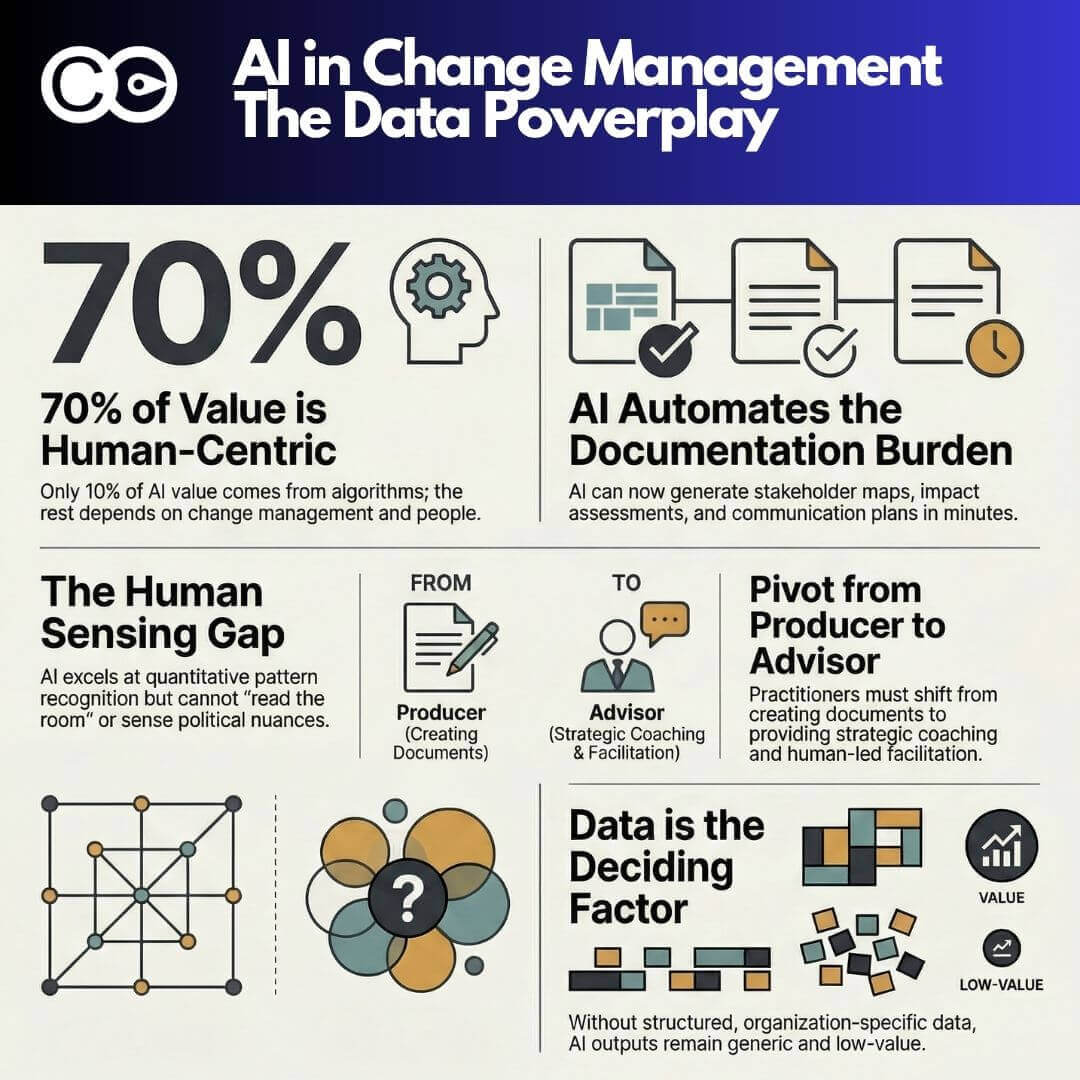
Data visualization is a remarkable tool for making your information truly unforgettable. It’s not just about presenting data; it’s about creating a visual narrative that resonates. Visual content is something our brains process with remarkable efficiency compared to raw data. To bring your data to life, consider crafting infographics, diagrams, or charts that distill intricate data into simple, digestible forms.
However, here’s the key: clarity and simplicity. The aim isn’t to drown senior leaders in excessive detail. Rather, it’s about enabling them to grasp the essence of your message at a single glance.
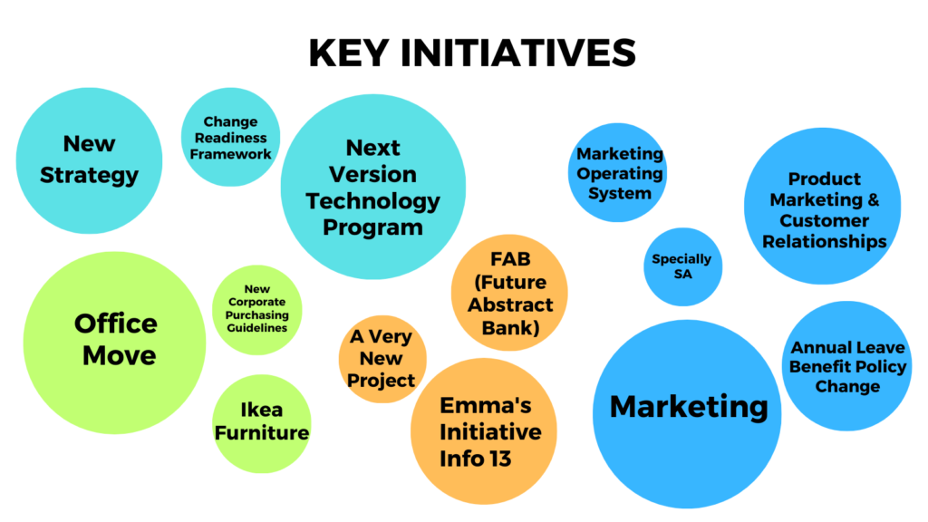
But remember, data visualization is more than adding charts; it’s about weaving a story. It’s about choosing the right type of visualization that complements your message. For instance, if you’re seeking to convey the impact of change initiatives, think about employing a bubble diagram. This elegant choice can illustrate the full extent of each initiative’s influence, transforming complex data into a captivating narrative.
Here’s an example of a bubble diagram that shows the extent of the impact of each initiative.
2. Navigating Psychological Bias in Data Presentation
Psychological bias is a formidable factor that can distort the way data is perceived, ultimately leading to decisions that may not be aligned with the true insights. To tackle this challenge effectively, it’s imperative to be meticulous in your choice of color schemes and data representations, with the ultimate aim of reducing cognitive biases.
Understanding the Impact of Color:
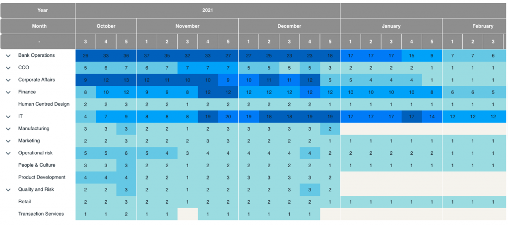
The use of color is a potent tool that can significantly affect the way we perceive information. Research has demonstrated that individuals can subconsciously interpret the same color differently, leading to potential misinterpretation of data. For example, red, traditionally associated with caution or danger, can be misconstrued as a negative signal even when it signifies high levels of change or activity.
To counteract these biases, it’s critical to recognize that the way you present data can influence how senior leaders perceive it. A seemingly subtle yet profoundly influential alteration involves replacing traditional traffic light colors with different shades in change heatmaps, offering a more objective representation of data. This meticulous shift minimizes unintentional misinterpretations, ensuring that the data is approached with clarity and impartiality.
By incorporating this awareness into your data visualization strategy, you not only elevate the quality of your presentations but also cultivate a more unbiased and objective environment for senior leaders to engage with the data. This approach enables them to make decisions grounded in the true insights the data provides, ultimately leading to more informed and effective outcomes.
Here is an example of a change heat map from The Change Compass, using different shades of blue instead of traffic light colors.
3. Tailoring Data Detail for Maximum Impact
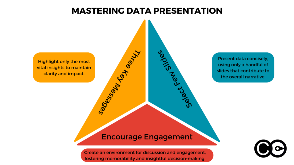
When it comes to presenting data to senior leaders, the age-old adage “less is more” couldn’t be truer. The art of capturing their attention and making a lasting impression often lies in the fine balance between depth and brevity. To master this art, it’s essential to focus on conveying no more than three key messages per meeting. The data you present should be honed to a razor’s edge, laser-focused on supporting the messages you aim to convey.
The Strategic Choice of Content
When it comes to presenting data to senior leaders, the age-old adage “less is more” couldn’t be truer. The art of capturing their attention and making a lasting impression often lies in the fine balance between depth and brevity. To master this art, it’s essential to focus on conveying no more than three key messages per meeting. The data you present should be honed to a razor’s edge, laser-focused on supporting the messages you aim to convey.
The selection of what to present is as critical as how you present it. In this context, less isn’t just more; it’s clearer and more impactful. Restrict the number of slides to just a few, ensuring that each slide serves a precise purpose while contributing to the overall narrative you’re crafting.
This strategic approach encourages discussion, engagement, and, most importantly, memorability. By avoiding information overload and guiding senior leaders through a concise, purpose-driven data journey, you create an environment ripe for insightful dialogue and informed decision-making.
4. Storytelling Using Data: Crafting a Narrative with Change Data
When it comes to engaging senior leaders with change initiatives, data becomes your most potent storytelling tool. Your change story should transcend mere speculation or gut feelings. It should be a narrative firmly grounded in the facts and figures, painting a vivid picture of the transformations taking place within your organization.
In essence, you are the storyteller, and the data is your plot, characters, and climax. Your narrative is the reflection of the changes happening, the challenges being faced, and the opportunities on the horizon. However, it’s not just about presenting data; it’s about using data to construct compelling stories that resonate with senior leaders.
To effectively engage senior leaders, consider the following key stories that your change data can help formulate and emphasize:
The Acceleration of Change: One of the critical narratives your data should convey is the ever-increasing pace of change. Show how the rate of change is evolving over time, highlighting that the organization’s ability to adapt is being tested like never before. This story emphasizes the urgency of the situation and the need for strategic responses.
Changing Volumes: Your data should illustrate fluctuations in the volume of change initiatives. Are they increasing, decreasing, or maintaining a consistent flow? This story aids in understanding whether the organization is overburdened with constant changes or if there’s a need for more transformative initiatives.
Capacity Risks and Emerging Challenges: Data should pinpoint potential capacity risks in various parts of the business. If certain departments or teams are near their limits in handling changes, senior leaders need to be aware of the looming challenges. Use your data to predict and prevent capacity-related bottlenecks.
Alignment with Strategy: Are the scheduled changes in your plan aligned with the overall strategic vision of the organization? Your data story should reveal any disparities between the two. A misalignment between change initiatives and the broader strategy can have detrimental consequences, and senior leaders should be made aware of this.
Impact on Customer Segments: If the same customer segment is affected by multiple change initiatives within a short timeframe, it can result in confusion and dissatisfaction. Your data story should bring this to light, highlighting the need for coordination and a more customer-centric approach to change management.
Change Saturation and Business Performance: One of the key narratives to create revolves around the concept of change saturation. Your data should indicate when a particular part of the business has reached a point where it can no longer absorb or adapt to more changes effectively. Show how this affects business performance and why it’s crucial to address it promptly.
In the realm of engaging senior leaders with change data, the data isn’t just raw information; it’s the foundation of a powerful story. As a change leader, your role is to weave a compelling narrative using data as your threads. Your stories should resonate with senior leaders, guiding them toward informed decisions and strategic actions in the ever-evolving landscape of change.
5. Use eye-catching visuals to increase memorability
Using eye-catching visuals is a powerful way to make your message memorable when presenting change data to senior leaders. In most corporate settings, the usual types of data visualization, such as pie charts, bar charts, and scatter plots, are commonly used. To set your data apart and capture your audience’s attention, consider these creative approaches:
1. Unique Color Schemes: Choose vibrant and unconventional color schemes for your charts and graphs. Bold colors can make data pop and draw attention to key insights. Ensure that the colors align with your brand or the theme of your presentation.
2. Innovative Chart Types: Experiment with different types of charts and graphs that best represent your data. Consider using radar charts, waterfall charts, Sankey diagrams, or treemaps, depending on the complexity of your data and the story you want to tell.
3. Engaging Layouts: Play with the layout of your visuals to create a unique and memorable design. You can use unconventional arrangements, like circular layouts or zigzag patterns, to present your data in a visually appealing way.
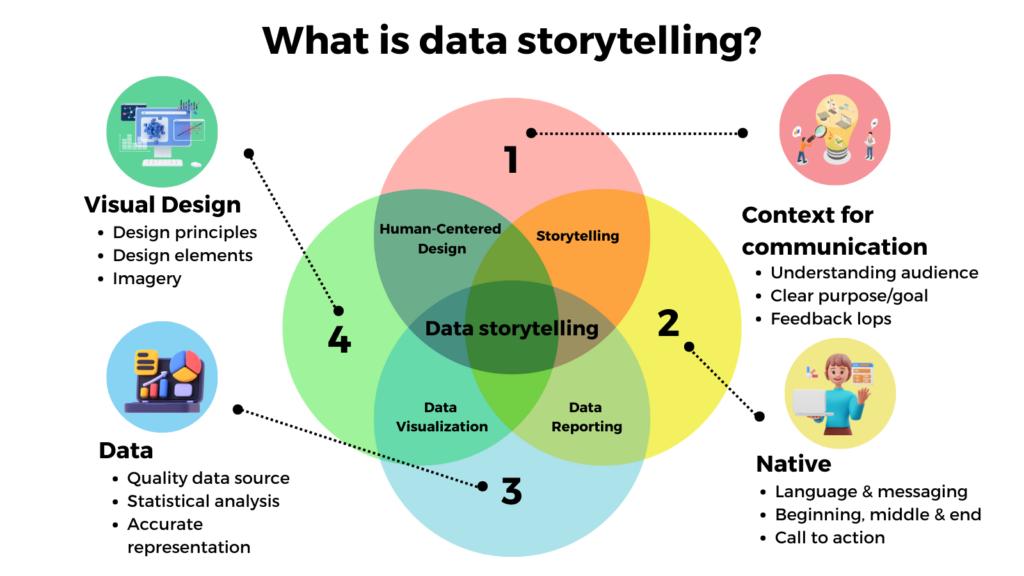
4. Data Storytelling: Integrate your visuals into a broader narrative. Instead of displaying raw data, tell a story using the visuals. Explain how the data points connect and impact each other. This approach helps senior leaders better understand the implications of the data.
5. Data Overlays: Combine different types of visuals to provide a comprehensive view of the data. You can overlay line charts on top of heatmaps or combine bar charts with area charts to highlight relationships and patterns.
6. 3D Effects: Use three-dimensional effects sparingly to add depth and dimension to your visuals. This can make specific data points stand out and create a visually interesting presentation.
7. Customized Illustrations: Incorporate custom illustrations and icons that are relevant to the data and the message you want to convey. This adds a personalized touch to your visuals.
8. Visual Metaphors: Use metaphors or analogies to represent data. For example, you can use a puzzle piece visual to show how different components fit together to form a complete picture.
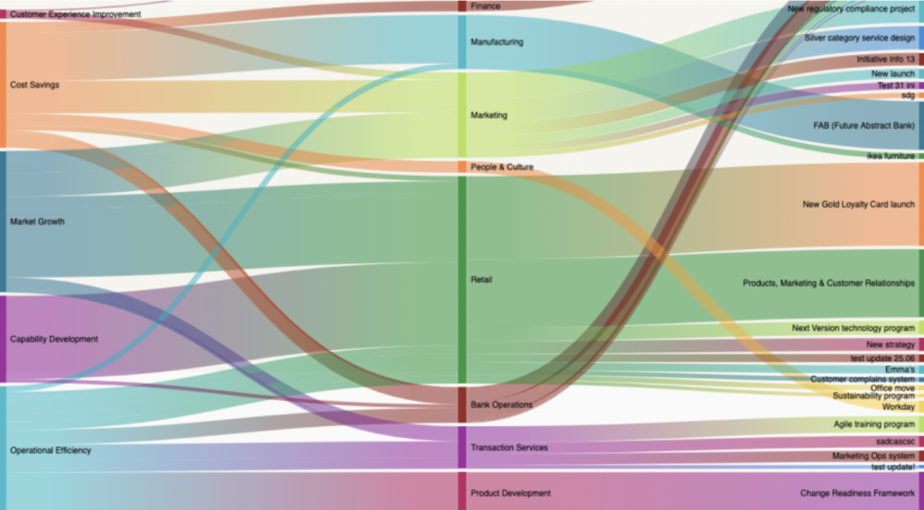
Here is an example of a chart that shows the extent to which each company strategy impacts different divisions and the various initiatives in concern. Instead of a standard bar chart, consider using a visually engaging diagram that resembles interconnected gears, symbolizing how different strategies drive various initiatives and divisions forward.
By embracing innovative design and visualization techniques, you can create visuals that not only convey your data effectively but also leave a lasting impression on senior leaders. When your data is presented in a memorable and visually captivating way, it is more likely to influence decision-making and drive meaningful change within the organization.
Mastering the art of engaging senior leaders with change data is the key to influencing decisions effectively in our fast-paced business environment. For a practical demonstration of these strategies, book a weekly demo with The Change Compass.