Heat maps have become the default visual language of organisational change management. Almost every change team produces one. They are familiar, easy to build, and satisfying to present, colourful grids that give the impression of analytical rigour. But here is the uncomfortable truth: for most organisations, heat maps are where change analytics begins and ends.
Prosci’s benchmarking research consistently shows that organisations with excellent change management are seven times more likely to meet project objectives than those with poor change management (88% vs 13%). And a key differentiator between excellent and poor is measurement capability. When your change reporting has not evolved beyond the heat map, you are almost certainly making slower and less informed decisions than you could be.
This article does not argue that heat maps are useless. They serve a purpose as an initial orientation tool. But they become dangerous when they are treated as the final word on change impact. Here are the specific limitations, and a practical path forward.
The three problems with relying on change heat maps
Before discussing alternatives, it is worth understanding precisely why heat maps fall short. The issues are not cosmetic, they are structural.
Heat maps flatten complexity into a single dimension
A standard change heat map typically shows volume of change by business unit or stakeholder group, using colour intensity to indicate “high,” “medium,” or “low” impact. But change is not one-dimensional. A business unit might face a low volume of changes that are each individually massive in scope, or a high volume of changes that are individually minor but cumulatively overwhelming.
The core problem is that heat maps flatten multidimensional data into a single visual layer. A 2023 Harvard Business Review article on employee change fatigue revealed that the average employee now experiences 10 planned enterprise changes per year, up from just 2 in 2016. When you reduce that complex, overlapping change landscape to red, amber, and green cells, you inevitably lose the nuance that matters most, particularly the interdependencies between initiatives and their cumulative impact on people.
Heat maps are snapshots, not trajectories
A heat map shows you where things stand at a single point in time. It does not show you whether things are getting better or worse, whether the pace of change is accelerating or decelerating, or whether a business unit that looks “green” today is about to turn “red” next quarter when three major initiatives converge.
Decision-makers do not just need to know the current state. They need to understand the trajectory: where are we heading, and do we need to change course?
Heat maps rarely drive specific action
The most common reaction to a change heat map presentation is nodding. Senior leaders see the colours, acknowledge that some areas have more change than others, and move to the next agenda item. This is because heat maps present information without context or recommendation.
A heat map that shows Finance is “red” tells you nothing about why it is red, which specific changes are causing the overload, or what you should do about it. Without that analytical depth, the heat map becomes wallpaper rather than a decision-making tool.
Five ways to move beyond the heat map
If heat maps are your starting point, the question is: what comes next? Here are five practical pathways that progressively build your change analytics capability.
1. Understand the transformation narrative, not just the volume
Heat maps count changes. But the number of changes is rarely the most important question. What matters is the nature of those changes and how they interact.
Start asking deeper questions about your change portfolio:
- Are these changes fundamentally reshaping the operating model, or are they incremental process improvements?
- Do multiple initiatives affect the same teams, systems, or processes simultaneously?
- Is there a logical sequencing, or are changes landing randomly based on project timelines?
When you understand the transformation narrative, you can explain to senior leaders not just how much change is happening, but what kind of change it is and what it means for the organisation’s capacity to absorb it. For a deeper exploration of why change saturation is a pandemic for most large organisations, this shift from quantity to quality is the single most impactful upgrade you can make.
2. Move from static spreadsheets to data-driven storytelling
WTW’s 2023 global study of 600 organisations found that companies taking a data-driven, proactive approach to change management drive nearly three times more revenue than those with below-average change effectiveness. Change accelerators achieved 6% one-year revenue growth compared to negative 30% for transitional companies. The implication is clear: the quality of your change data directly shapes the quality of your outcomes. Yet many change teams still build their heat maps manually in Excel, updating them quarterly at best.
Data-driven storytelling means:
- Replacing opinion-based impact ratings with quantifiable metrics (system usage data, training completion rates, process compliance scores)
- Using visualisation tools that update in real time as underlying data changes
- Structuring your narrative around what the data shows, not what you think the audience wants to hear
The shift from “I believe this area is heavily impacted” to “the data shows this area has 14 concurrent changes affecting 2,300 employees over the next quarter” is transformational for credibility.
3. Analyse stakeholder impact across multiple dimensions
Heat maps typically look at change through an organisational lens: which business units are affected. But changes also affect customers, partners, subject matter experts, and communities of practice that cross organisational boundaries.
Build a multi-dimensional view of impact that includes:
- Volume: How many changes are landing?
- Complexity: How difficult is each change to adopt?
- Duration: How long will the disruption last?
- Concurrency: How many changes overlap in timing?
- Cumulative load: What is the total cognitive and operational burden on each stakeholder group?
Tools like The Change Compass’s Total Impact visualisation allow you to layer these dimensions rather than reducing them to a single colour code. When a senior leader can see that the Customer Service team faces four concurrent changes of moderate complexity over the same eight-week window, the conversation shifts from “they’re amber” to “we need to reschedule one of these.”
4. Assess the pace and trajectory of change
A heat map is a photograph. What you need is a time-lapse.
Build visualisations that show how the change landscape evolves over time:
- Is the volume of change increasing or decreasing quarter over quarter?
- Are go-live dates clustering in ways that create bottlenecks?
- Do timelines realistically account for embedding periods, or do they assume instant adoption?
- Are benefits realisation milestones aligned with actual change completion, or are they aspirational?
When you can show a trajectory, you create the opportunity for proactive decision-making. A leader who sees that Q3 is trending toward saturation can act in Q2 to reschedule or resource up. A leader who sees a static red cell in Q3 has no time to respond.
5. Connect change to strategic alignment
The most mature change analytics capability does not just track what is changing and how much. It tracks whether the right things are changing.
Map your change portfolio against the organisation’s strategic priorities:
- What percentage of change effort is aligned to the top three strategic goals?
- Are the highest-priority strategic initiatives receiving adequate implementation runway and stakeholder communication?
- Is there meaningful change effort being spent on initiatives that no longer align with current strategy?
This analysis often reveals uncomfortable truths: that 40% of the change portfolio is legacy work with no clear strategic connection, or that the CEO’s top priority has the least change management support. For practical approaches to this challenge, see our guide on how to be more strategic in managing change. These are insights that heat maps simply cannot provide.
The evolution from heat maps to dynamic change analytics
The gap between what heat maps offer and what organisations need has driven the emergence of a new category of tools: dynamic change analytics platforms.
A Capgemini change management study (2023) found that an organisation’s level of data maturity directly increases the success of its transformation efforts. The reason is straightforward: when you can see the change landscape updating in real time rather than waiting for a quarterly spreadsheet refresh, you make better decisions faster.
Modern change analytics platforms go beyond the heat map in several critical ways:
- Real-time data integration. Instead of manually updating a spreadsheet, the platform pulls data from project management tools, HR systems, and survey platforms continuously.
- Predictive analytics. AI models forecast where saturation is likely to occur based on historical patterns and planned change volumes, allowing proactive resequencing.
- Multi-dimensional impact views. Replace the single red/amber/green cell with layered visualisations showing volume, complexity, timing, and cumulative load simultaneously.
- Automated reporting. Generate stakeholder-specific views, from executive summaries to team-level detail, without manually rebuilding reports for each audience.
- Scenario modelling. Test “what if” scenarios before committing to change schedules: what happens if we delay Initiative X by four weeks? How does that affect the saturation forecast for the Technology team?
Digital change management platforms like The Change Compass were built specifically to address the limitations of heat map-based reporting. If your organisation has outgrown the heat map, and most have, book a live demo to see what dynamic change analytics looks like in practice.
When heat maps still make sense
To be fair, heat maps are not always wrong. They can be useful in specific contexts:
- As an initial orientation tool when a new change leader joins and needs a quick visual overview
- For very early-stage change portfolio management where the organisation has no analytics infrastructure
- As a simplified communication device for audiences who are not yet ready for more complex visualisations
The key is treating the heat map as a stepping stone, not a destination. If your change analytics capability has not evolved beyond heat maps in the past 12 months, that should be a red flag.
The heat map is a stepping stone, not a destination
Change management heat maps served the profession well as a first generation of change analytics. They gave practitioners a visual language for describing change impact and a tool for getting the attention of senior leaders. But the profession has moved on, and the tools need to move with it.
The five pathways described in this guide, from understanding the transformation narrative to connecting change to strategic alignment, represent a practical progression. You do not need to implement all five at once. Start with the one that addresses your organisation’s most acute blind spot, build credibility through better insights, and expand from there.
The organisations that are leading in change management today are not the ones with the prettiest heat maps. They are the ones that have graduated beyond them entirely.
Frequently asked questions
What is a change management heat map?
A change management heat map is a visual tool that displays the volume or intensity of change across an organisation, typically using colour-coded cells to indicate high, medium, or low impact by business unit or time period. While useful as a starting point, heat maps have significant limitations because they flatten complex, multi-dimensional change data into a single visual dimension.
Why are change heat maps not enough for enterprise change management?
Heat maps reduce complex change data to simple colour codes, losing critical nuance about change complexity, duration, concurrency, and cumulative stakeholder load. With the average employee now experiencing 10 planned changes per year (up from 2 in 2016, according to Harvard Business Review), the interdependencies between initiatives are too complex for a single visual layer. Enterprises need multi-dimensional analytics to make informed sequencing and resourcing decisions.
What should I use instead of a change management heat map?
Progress from heat maps to dynamic change analytics platforms that offer real-time data integration, multi-dimensional impact views, predictive saturation modelling, and automated reporting. These tools provide the analytical depth needed for informed decision-making. In the interim, you can improve your existing approach by layering dimensions such as complexity, concurrency, and trajectory into your reporting.
How do you measure change saturation?
Change saturation is measured by tracking the cumulative change load on specific stakeholder groups, including the volume of concurrent changes, the complexity of each change, the duration of disruption, and the recovery time between major changes. Modern analytics tools use predictive models to forecast saturation before it occurs, enabling proactive resequencing.
What is change portfolio management?
Change portfolio management is the practice of viewing and managing all active and planned change initiatives across an organisation as a coordinated portfolio, rather than as isolated projects. It involves analysing the combined impact on stakeholder groups, sequencing changes to manage saturation, and aligning the portfolio with strategic priorities.
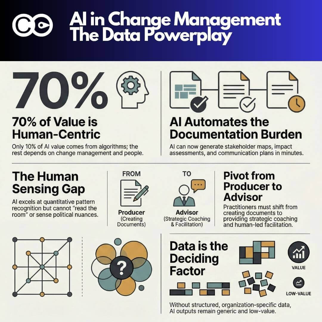
How does AI improve change management analytics?
AI-powered change analytics provides real-time adoption tracking, predictive saturation modelling, automated sentiment analysis, and impact attribution. According to Prosci’s research, practitioners using AI report significantly increased efficiency and faster response times. Gartner’s 2026 study found that teams redesigning workflows with AI are twice as likely to exceed revenue goals, enabling a shift from reactive problem-solving to proactive risk mitigation.
References
- Prosci (2014, updated 2025). The Correlation Between Change Management and Project Success. https://www.prosci.com/blog/the-correlation-between-change-management-and-project-success
- Harvard Business Review (2023). Employees Are Losing Patience with Change Initiatives. https://hbr.org/2023/05/employees-are-losing-patience-with-change-initiatives
- WTW (2023). Successful Change Management Pivotal to Achieving Higher Revenue Growth. https://www.wtwco.com/en-us/news/2023/11/successful-change-management-pivotal-to-achieving-higher-revenue-growth-wtw-research-finds
- Capgemini (2023). Change Management Study 2023. https://www.capgemini.com/insights/research-library/change-management-study-2023/
- Prosci (2024, updated 2026). AI in Change Management: Early Findings. https://www.prosci.com/blog/ai-in-change-management-early-findings
- Gartner (2026). Top Change Management Trends for CHROs in the Age of AI. https://www.gartner.com/en/newsroom/press-releases/2026-3-16-gartner-identifies-top-change-management-trends-for-chros-in-age-of-ai