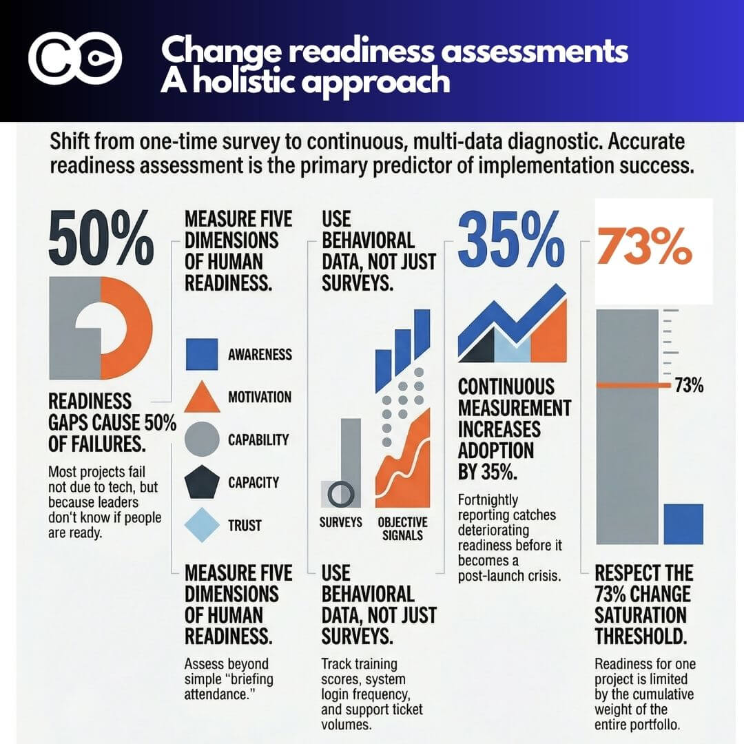
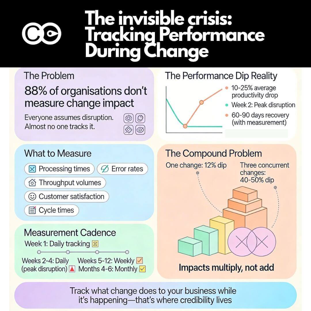
good change adoption dashboard can make or break the full benefit realization of a change initiative. It captures the essence of what stakeholders need to focus on to drive full change adoption. This visual representation of the status and progress of a change initiative provides real-time data and insights into how well-impacted employees are adopting the change and what steps can be taken to improve adoption rates. In this article, we will outline the steps for designing an effective change adoption dashboard.
Change adoption is often only measured toward the end of a change initiative. This is a mistake since the adoption journey can start as early as the project commencement, or when stakeholders start hearing about the initiative. At a minimum, change adoption should be defined and agreed upon before significant change impact happens. If you are implementing a system this will be well before the system go-live.
These are the key steps in building a great change project adoption dashboard.
Step 1: Define the Objectives of the Change Initiative
The first step in designing a change adoption dashboard is to clearly define the objectives of the change initiative. This includes understanding what the change is, what it aims to achieve, and what the desired outcomes are. Understanding the objectives of the change initiative is critical to defining the metrics that will be used to measure adoption and success.
If your initiative has a long list of objectives, be careful not to be tempted to start incorporating all of these into your dashboard. Your task is to pin down the most critical change management objectives that must be met in order for the initiative to be successful. If you are really struggling with how many objectives you should focus on, aim for the top three.
Step 2: Identify Key Metrics
Once the objectives of the change initiative have been defined, the next step is to identify the key metrics that will be used to measure adoption and success. These metrics should be directly tied to the objectives of the change initiative and should provide actionable insights into the progress and success of the change.
Some examples of metrics that can be used to measure change adoption include:
1. Stakeholder engagement levels (depending on your stakeholder impacts these could be customer, employee or partners)
2. Stakeholder engagement levels (depending on your stakeholder impacts these could be customer, employee or partners)
3. User adoption rates
4. Process improvement metrics
5. Time to adoption
6. Feedback from employees
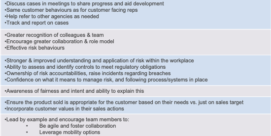
The key is to locate the few metrics that will form the core of what full change adoption means. As a general rule, this often means a behaviour change of some kind. Here are some examples.
1. If the goal is changing a business process from A to B. Then you are looking for employees to start following the new process B. Then, identify the core behaviours that mean following process B.
2. If the goal is to start using a new system, then you would focus on system usage. Also focus on tracking any workarounds that employees may resort to in order not to use the system.
3. If the goal is to improve customer conversations, then you would focus on the quality of those conversations using key indicators. This may involve call listening or customer satisfaction ratings.
Again, ensure you are not over-extending yourself by picking too many metrics. The more there is, the more work there is. Having too many metrics also lead to attention dilution, and you start to loose stakeholder focus on the more critical metrics compared to less critical ones.
In the group of metrics you’ve chosen, if there is no behaviour measure then it is likely you may have missed the most critical element of change adoption. In most cases, behaviour change metric is essential for any change adoption dashboard.
If your change process involves too many behaviour steps, then focus on ones that are easier to track and report on. In a system implementation project, they could be system usage reports or login frequency.
Step 3: Choose the Right Visualization Techniques
The next step in designing a change adoption dashboard is to choose the right visualization techniques. The visualizations should be chosen based on the data that needs to be displayed and the insights that need to be gained. Some examples of visualization techniques that can be used include:
- Bar graphs: to display changes in metrics over time
- Pie charts: to display the distribution of data
- Line charts: to display changes in metrics over time
- Heat maps: to display the distribution of data on a map
Selection of charts can be technical, and your goal is always to choose the right type of chart to make it easier for the audience to understand and interpret. Minimise on having too many colors since this can be distracting and overwhelming. Use colours carefully and only to show a particular point or to highlight a finding. Choosing the wrong chart can mean more questions than answers for your stakeholders, so choose carefully.
Visit our article ‘Making Impact with Change Management Charts’ to learn more about data visualisation techniques.
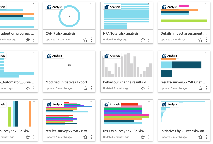
Beyond just having a collection of charts, modern dashboards have a mixture of different types of visuals to aid easy stakeholder understanding. For example, you could have different data ‘tiles’ that show key figures or trends. You may also want to incorporate key text descriptions of findings or trends in your dashboard. Having a mixture of different types of information can help your stakeholders greatly and avoid data saturation.
Step 4: Design the Dashboard
Once the objectives, metrics, and visualization techniques have been defined, the next step is to design the dashboard. The design should be intuitive and user-friendly, with the ability to drill down into the data to gain deeper insights. The dashboard should also be accessible to all stakeholders, including employees, managers, and executives.
Data visualisation is a discipline in itself. For a general overview and key tips on chart design and selection visit our article to learn more about data visualisation techniques.
To reduce manual work in constantly updating and producing the dashboard for your stakeholders think about leveraging technical solutions to do this for you. A common approach is to use excel spreadsheet and PowerBI. This may be feasible for some, but it often involves using a PowerBI expert (which may come at a cost), and any time you want to change the dashboard you need to loop back the expert to do it for you.
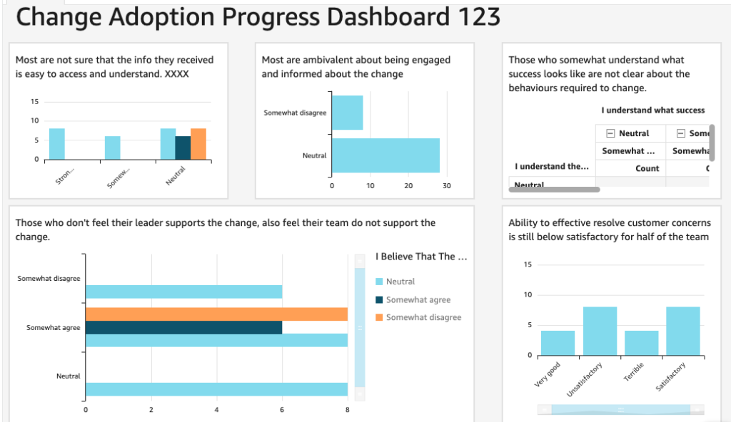
The Change Compass has incorporated powerful and intuitive dashboarding and charting features so that you do not need to be an expert to create a dashboard. Reference our templates as examples and create your own dashboard with a few clicks.
Step 5: Test and Refine the Dashboard
The final step in designing a change adoption dashboard is to test and refine it. This includes testing the dashboard with a small group of stakeholders and getting their feedback. Based on their feedback, the dashboard can be refined and improved until it provides the insights and data that stakeholders need to drive change adoption.
A key part of this step is testing any automation process in dashboard generation. Is the data accurate? Is it recent and updated? What operating rhythms do you need to have in place to ensure that the process flows smoothly, and that you get the dashboard produced every week/month/quarter?
Step 6: Continuously Monitor and Update the Dashboard
It is important to continuously monitor the change adoption dashboard and update it regularly. This will help to ensure that the dashboard remains relevant and provides the most up-to-date information on the progress of the change initiative.
The reality is that stakeholders will very likely get bored with the same dashboard time and time again. They will likely suggest changes and amendments from time to time. Anticipate this and proactively improve your dashboard. Does it drive the right stakeholder focus and conversation? If not, tweak it.
Good stakeholder conversations mean that your stakeholders are getting to the roots of why the change is or is not taking place. The data presented prompts the constant focus and avoids diversion in that focus. This is also a journey for your key stakeholders to find meaning in what it takes to lead the change and reinforce the change to get business results.
Summary
Designing an effective change adoption dashboard is a critical step in ensuring the success of change initiatives. By providing real-time data and insights into how well employees are adopting the change, a change adoption dashboard can help key stakeholders make informed decisions and take action to improve adoption rates. Ultimately it is about achieving the full initiative benefits targeted. By following the steps outlined in this article, change managers can design a change adoption dashboard that provides the insights they need to drive change adoption.
Building and executing a change adoption dashboard can be a manually intensive and time consuming exercise. Leverage technology tools that incorporates automation and AI. You will find that this can significantly increase the speed in which you are able to execute on not just the change dashboard, but driving the overall change delivery. For example, you can leverage out-of-the-box features such as forecasting and natural language query to save significant time and effort.
Have a chat to us about what options there are to help you do this.


