How to conduct a change impact assessment: a complete practitioner guide
A change impact assessment is the structured analysis that identifies what specifically will change for each stakeholder group as a result of an initiative, and how significant that change is likely to be for them. It covers the dimensions that drive adoption risk: processes (which steps change), systems (which tools change), roles (which responsibilities change), people skills (what new capability is required) and behaviours (what new habits the change depends on). A complete assessment differentiates impacts by group rather than averaging across the organisation, because the same project lands very differently on a contact centre, an underwriting team and a digital product squad.
A project manager and the head of a contact centre walk out of the same briefing about an upcoming CRM implementation. The project manager spends that afternoon completing the change impact assessment. He rates process changes as medium impact (two training days, standard user adoption support), job role changes as low (minor workflow adjustments), and system changes as high (major platform replacement). The assessment looks solid. It covers the categories. The ratings seem reasonable.
The contact centre head gets on the phone to her team leads. “Do you understand what this means for us?” she asks. “Our staff are going to re-learn their entire workflow from scratch during the biggest quarter of the year. Some of these people have been working the same way for eight years. And nobody asked us how this was going to land.”
Same change. Entirely different picture of its impact. One of those pictures ended up in the assessment. The other didn’t.
This is the central problem with how most change impact assessments are conducted: they are completed by people with a project-centric view of the world, using frameworks designed to categorise and rate impact, but the angle from which they are assessed shapes everything they capture. A practitioner who understands this limitation, and builds a process to correct for it, will produce assessments that are substantially more useful than those that don’t.
This guide covers how to do exactly that: how to build a robust categorical framework, how to assess the same change from multiple angles, how to find the stakeholder groups you’re most likely to miss, and how to quantify impact data in ways that make it visible without stripping out the human signal that makes it meaningful.
What most change impact assessments get wrong
Search for “change impact assessment” and you’ll find dozens of templates, all variations on the same theme: a matrix of impact categories, a high/medium/low rating scale, a stakeholder column. The templates are not wrong. The categories they cover (processes, systems, job roles, behaviours, organisational structure) are genuinely the right things to assess. The problem is not the structure. It’s the assumption embedded in how the structure gets filled in.
Most impact assessments are completed by the project team or the change practitioner supporting them. They are intelligent, informed people. But they are, by definition, looking at the change from the inside out: from the perspective of what the project is doing, not from the perspective of what the change asks of the people it will touch.
That project-centric angle creates two specific failure modes. First, impact ratings tend to reflect project risk rather than human experience: something is rated “high impact” because it is technically complex or carries implementation risk, not because it will be profoundly disruptive to the people going through it. Second, the stakeholder scope tends to reflect who the project team already knows about, not the full population of people whose working lives will be affected.
The fix for both problems is not a better template. It is a more deliberate approach to who fills in the template, from what angle, and how.
Building your categorical framework: how to classify and rate change impacts
A categorical framework is the foundation of any impact assessment. It gives you a consistent structure for describing what the change affects and a common language for rating how significantly it affects each dimension.
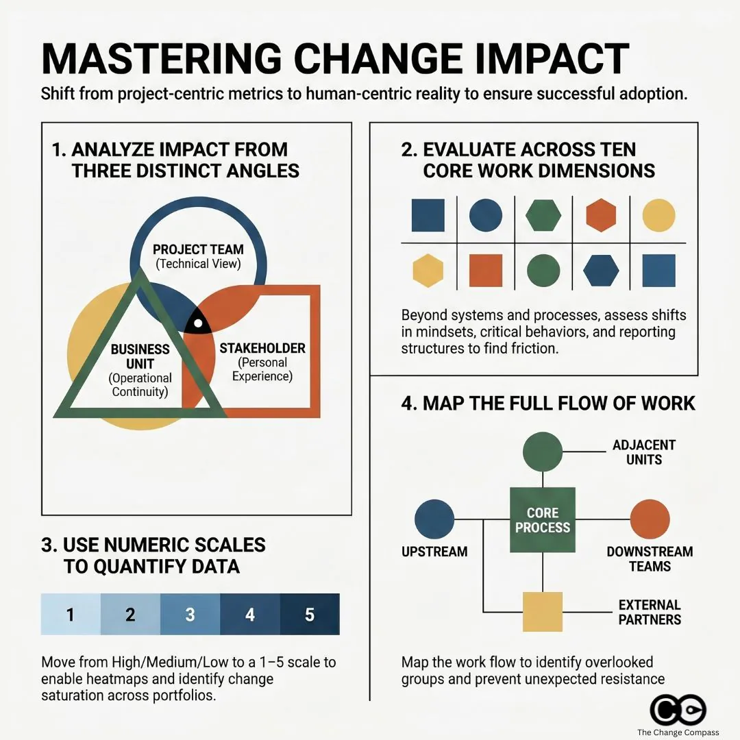
The most widely used categorical approach traces back to frameworks like Prosci’s 10 Aspects of Change Impact, which identifies the core dimensions of an individual’s work experience that a change can alter: processes, systems, tools, job roles, critical behaviours, mindsets and beliefs, reporting structure, performance review criteria, compensation, and physical location.
Not every aspect will be relevant to every change. But working through all ten prevents the common error of assessing only the obvious categories (processes, systems) while overlooking the ones that generate the most human friction (critical behaviours, mindsets, reporting lines).
Impact categories to cover
For most organisational changes, your framework should assess impact across at least these dimensions:
- Process and workflow changes: the steps, procedures, or ways of working that will change
- System and technology changes: tools or platforms being introduced, replaced, or modified
- Role and responsibility changes: whether job descriptions, duties, or accountability structures will shift
- Behavioural changes: new habits, skills, or ways of interacting that are required
- Structural changes: reporting relationships, team composition, organisational design
- Cultural and mindset shifts: changes to norms, values, or operating assumptions
- Physical or location changes: office moves, remote working arrangements, site changes
Each dimension should be assessed for each affected stakeholder group, not just at the organisational level. A process change may be trivial for one team and fundamental for another.
Scoring and rating approaches
The simplest and most commonly used rating approach is a three-point scale: high, medium, and low. This has the advantage of simplicity and speeds up workshops and interviews. Its limitation is that it compresses nuance and makes it difficult to aggregate data across multiple changes or stakeholder groups.
A five-point numeric scale (1 = no impact, 5 = transformational impact) offers more granularity and, critically, makes the data quantifiable. When you need to compare the relative impact load across multiple projects or business units, numeric scores give you something to aggregate. When you’re reporting to a senior steering committee or trying to identify which groups are most affected across a portfolio of change, a dataset of numeric scores is far more useful than a colour-coded grid.
The rating criteria for each score point should be defined clearly and agreed before the assessment begins. “High impact” means different things to a risk manager and a frontline team leader. Calibrating the scale in advance, with concrete examples, dramatically improves the consistency and comparability of ratings across different assessors.
The angle problem: why the same change looks different depending on who is assessing it
If you ask a project manager, a business unit head, and a frontline team leader to independently complete an impact assessment for the same change, you will not get three versions of the same document. You will get three substantially different documents, with different ratings, different concerns, and different blind spots.
This is not because one of them is wrong. Each is describing the change from a genuinely different vantage point, and each vantage point illuminates things the others don’t see.
The project angle
The project team sees the change in terms of scope, deliverables, and implementation risk. Their impact ratings tend to focus on technical complexity, interdependencies with other systems, and the effort required to design, build, and deploy. This is useful, but it can consistently underestimate the human load of the change. A system migration that is technically straightforward can be enormously disruptive to the people who use it every day, and the project team, who may have spent months immersed in the new system’s logic, often underestimates how steep that learning curve will be for someone coming to it fresh.
The business unit angle
Business unit leaders see the change in terms of operational continuity. Their concerns are concrete: How much time will this pull away from BAU operations? How will this affect our ability to hit our targets during the transition? What does it mean for our team’s capacity and morale when we’re already stretched? A business unit assessment often surfaces timing and capacity concerns that the project team has not factored in, and it is not uncommon for a business unit head to rate the same change two impact levels higher than the project team did.
The stakeholder group angle
The angle most frequently missing from impact assessments is the perspective of the people actually going through the change. Frontline employees, customer-facing staff, and operational teams often experience changes very differently from how they are described in the project documentation. Their concerns are personal and concrete: Will I need to be retrained? Will my job change significantly? Will I have the support I need? Will this make my work harder before it gets easier?
Prosci’s Best Practices in Change Management research, drawing on data from over 10,800 practitioners across 25 years of benchmarking, identifies cultural awareness and alignment between the project’s understanding of impact and the actual experience of impacted employees as critical predictors of whether change management activity translates into real adoption outcomes.
The practical implication is straightforward: your impact assessment process should actively gather input from multiple angles, not just from the project team. That means structured conversations with business unit leaders, team leads, and representative samples of frontline staff, alongside whatever the project team has already documented. Where ratings differ significantly across angles, that gap is itself an important signal. It points to where misalignment is most likely to surface during implementation.
Casting a wide net: the stakeholder groups most teams miss
One of the most consistent gaps in change impact assessments is not in the ratings or the categories. It is in the list of stakeholder groups being assessed in the first place.
Project teams naturally scope their stakeholder lists to the people and groups they already interact with: the sponsoring business unit, the IT team managing the technical implementation, the HR team handling role changes. These are the groups that show up in steering committee minutes. They are not the only groups affected.
Across a broad range of change programmes, these are the groups most commonly missed:
- Adjacent business units that interact with the changing process or system: a finance system change may significantly affect the procurement team even if procurement is not a named project stakeholder
- External and third-party partners: suppliers, distributors, and contractors who interface with internal systems or processes can be substantially disrupted by changes they were never consulted on
- Downstream customer-facing teams: changes in back-office processes often surface as problems in call centres and customer service teams, well after implementation is complete
- Indirect managers: team leaders who don’t formally own the change but whose day-to-day management work is affected by it, particularly where performance expectations or reporting cadences shift
- The quiet middle: employees who are neither visible change champions nor visible resistors, but who represent the majority of the adoption challenge and are consistently underrepresented in workshops and reference groups
Addressing this gap requires a deliberate stakeholder identification step at the very start of the assessment process, before any rating or scoring begins. A useful approach is to map the flow of work: trace the current process or system from end to end and identify every team, role, or external party that touches it at any point. This exercise frequently surfaces groups that weren’t on the original stakeholder list.
PMI’s research on stakeholder management is explicit about this: effective stakeholder management requires identifying all stakeholders, not just the visible or convenient subset. The same principle applies directly to impact assessment. A group not included in the scope of the assessment receives no change management support, no matter how significantly they are affected.
Bringing overlooked groups into the assessment process early, even through a brief structured interview or workshop, has two benefits. You get a more accurate picture of impact. And you start the engagement process with groups who would otherwise feel the change was done to them, rather than with them, which is one of the most reliable accelerants of resistance.
Quantifying impacts so you can see the full picture
There is a real tension in change impact assessment between the analytical value of numeric, quantified impact data and the risk of over-simplifying what is fundamentally a human experience. That tension does not need to be resolved in favour of one side. The most useful assessments work with both.
Building a scoring model that enables visualisation
When your impact assessment covers multiple stakeholder groups across multiple impact categories, the volume of data becomes significant quickly. A portfolio of ten concurrent change initiatives, each affecting six stakeholder groups across seven impact dimensions, produces 420 individual data points. Nobody can meaningfully interpret that as a spreadsheet of text ratings.
Numeric scoring enables you to aggregate this data into something visible. A change heatmap plots total impact load by stakeholder group or business unit, making it immediately clear which groups are facing the heaviest combined burden. Trend charts show how impact load is expected to peak and trough over a programme timeline. Portfolio comparisons surface the groups most at risk of change saturation, the point at which cumulative change volume exceeds an organisation’s capacity to absorb it.
These visualisations are not a substitute for analysis. They are a tool for making the analysis accessible to the people who need to act on it: executive sponsors, programme directors, and business unit leaders who have twenty minutes, not two hours, to understand the change landscape before making resource decisions.
Keeping qualitative insights in the picture
What numeric scores cannot capture is the texture of the human experience of change. A score of 4 out of 5 on “mindset and behavioural change” for a particular stakeholder group tells you this dimension is rated as a high impact area. It doesn’t tell you that the specific reason it’s high is that this team has been through two similar programmes in the last three years, neither of which delivered what was promised, and their starting position is deep scepticism rather than cautious openness.
That context is essential for designing effective change support. It doesn’t live in the rating. It lives in the interview notes, the workshop observations, and the conversations your change practitioners have had with team leaders. The standard for an effective impact assessment is not one approach or the other: it is a quantitative layer that enables pattern recognition and reporting, combined with a qualitative layer that explains the patterns and guides the intervention design.
As Harvard’s Advanced Leadership Initiative has noted on impact performance reporting, organisations that rely solely on quantitative metrics miss the strategic and contextual signals that explain why outcomes diverge, and often find themselves reacting to problems they could have anticipated if they’d given the human signal appropriate weight.
Most assessment templates are built for one data type or the other. The best practice is to design deliberately for both from the outset: numeric scores that can be aggregated and visualised, plus structured fields for the contextual observations that give those scores meaning.
Managing impact data at scale with digital tools
When you’re managing a single change programme, a well-structured spreadsheet can serve as your impact assessment tool. When you’re operating across multiple concurrent programmes, with dozens of stakeholder groups and regular executive reporting requirements, spreadsheets break down quickly. Version control, aggregation, and real-time reporting become significant operational problems.
Digital change management platforms like Change Compass are designed specifically for this context. They allow you to build and maintain impact assessments across a portfolio of changes, visualise cumulative impact load by stakeholder group over time, and generate the reporting that executive sponsors and programme boards need without a change practitioner spending two days manually consolidating spreadsheets before every steering committee. The underlying logic is the same as a well-built manual assessment. The difference is what becomes possible when the data is structured, centralised, and queryable across the full change portfolio.
Making impact assessment the start, not a checkbox
The most common failure mode in change impact assessment is completing it once, at the start of a programme, and never returning to it. The assessment becomes a governance artifact rather than a working tool.
Change programmes evolve. Scope changes. Implementation timelines shift. New stakeholder groups come into scope. The impact profile at go-live can look substantially different from what was assessed during the design phase. An assessment that isn’t updated doesn’t just become inaccurate: it actively misleads the people making resourcing and support decisions.
A useful impact assessment is updated at each major programme milestone, shared with business unit leaders as a conversation tool rather than a document to file, and actively used to prioritise where change management effort is directed. The stakeholder groups with the highest impact scores should receive the deepest engagement. The impact dimensions with the highest scores should receive the most specific support design.
Start with a stakeholder identification step that casts a wider net than your initial project scope. Run the assessment from multiple angles, not just the project’s view. Use numeric scoring to enable visualisation, and qualitative data to explain what the numbers are telling you. Treat the assessment as a working document that evolves with the programme.
The change impact assessment that does all of this is not just better governance. It is the foundation of a change management approach grounded in the actual experience of the people going through the change, which is, ultimately, the only experience that matters.
Frequently asked questions
What is a change impact assessment?
A change impact assessment is a structured process for identifying and evaluating how a proposed change will affect different parts of an organisation, including its people, processes, systems, and structures. It is typically completed during the planning phase of a change programme to inform change management design, resource allocation, and stakeholder engagement priorities.
How do you rate impacts in a change impact assessment?
Most practitioners use either a three-point scale (high, medium, low) or a five-point numeric scale. For portfolio reporting and visualisation across multiple initiatives, a numeric scale is more useful because it allows for aggregation and comparison. Whichever scale you use, the rating criteria should be clearly defined before assessments begin to ensure consistency across different assessors filling in the same framework.
Which stakeholder groups are most commonly missed in change impact assessments?
The groups most frequently overlooked include adjacent business units that interact with the changing process, external partners and third-party suppliers, downstream customer-facing teams, indirect managers, and the majority of employees who don’t attend steering committees or reference groups. A deliberate stakeholder identification step, tracing the flow of affected work end to end, is the most reliable way to surface these groups before the assessment begins.
How is a change impact assessment different from a stakeholder analysis?
A stakeholder analysis identifies who has an interest in or influence over a change and assesses their current level of support and engagement. A change impact assessment identifies what the change will specifically alter in the working lives of different groups. Both are needed for effective change management, and each informs the other: a stakeholder analysis shapes who you assess, and the impact assessment shapes how you engage.
How often should a change impact assessment be updated?
At minimum, an impact assessment should be reviewed at each major programme milestone: design completion, build completion, and pre-implementation. Any significant change in project scope, timeline, or stakeholder landscape should also trigger a review. Treating the assessment as a living document, rather than a one-time deliverable, is one of the most consistent differentiators between high-performing and lower-performing change functions.
References
- Defining Change Impact by Prosci
- Best Practices in Change Management, 12th Edition by Prosci
- How to Assess and Address Change Impacts Quickly by Prosci
- Improve Stakeholder Management Using Change Management Tools by Project Management Institute
- A data-backed approach to stakeholder engagement by McKinsey
- Elevating Qualitative Data in Impact Performance Reporting by Harvard Advanced Leadership Initiative Social Impact Review
- The Complete Guide to Change Management Assessments by The Change Compass
- Change Management Heat Map: Step-by-Step Guide by The Change Compass
- How to Measure Change Saturation by The Change Compass