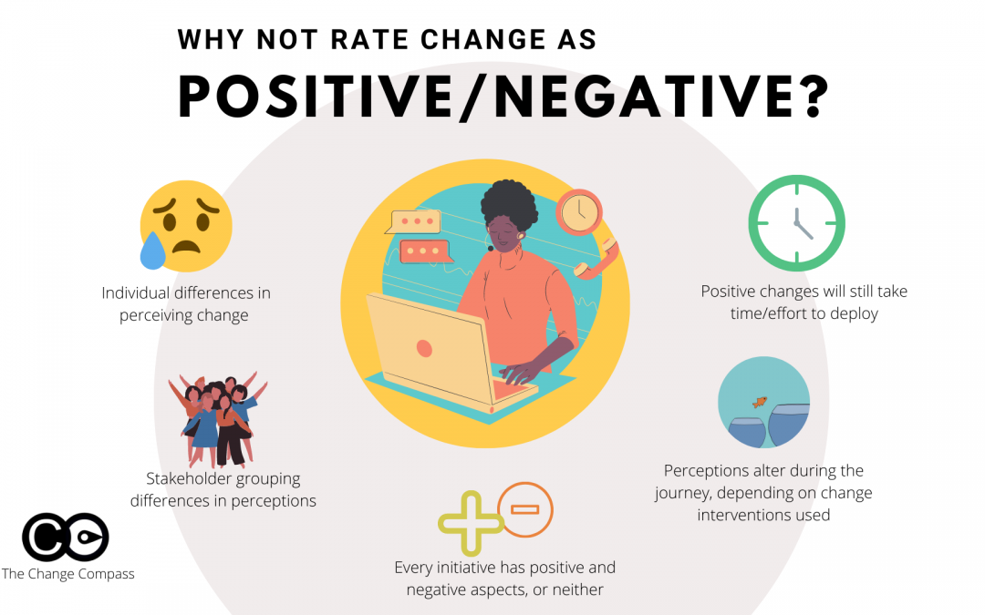
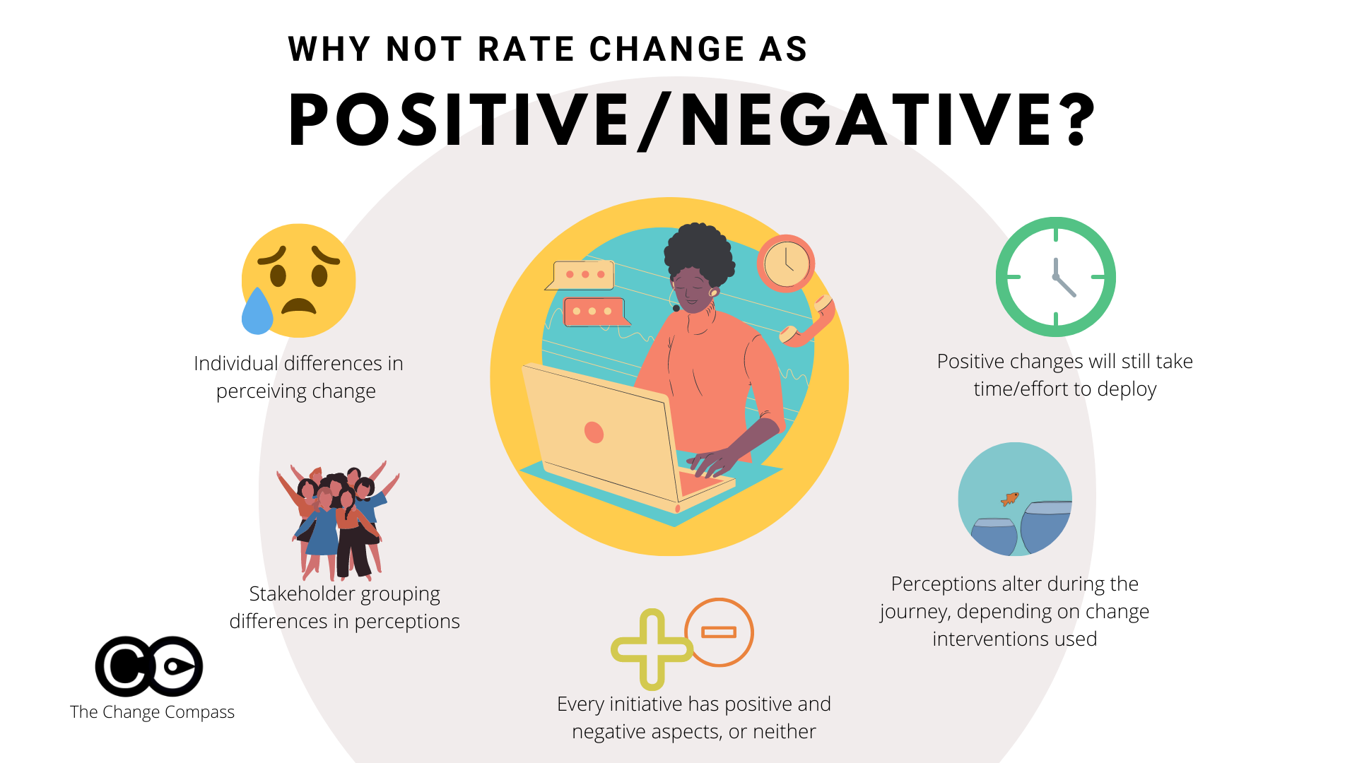
Change can be seen as positive or negative? In this infographic we breakdown the usefulness of labelling a change as either being positive or negative.
You may have been asked to rate change into either a positive or negative change to classify initiatives and thereby use the classification to aid change implementation. After all, we all know of initiatives that nearly everyone sees as negative and other initiatives where it’s going to make people’s lives easier, and therefore viewed as mostly positive. So, is it useful to classify every initiative as either positive or negative? Let’s examine this closely.
What is the usefulness of classifying change into either positive or negative?
Some managers believe that if we are able to classify change as either positive or negative then we are able to focus on those changes that are perceived as negative since they may require significant managerial effort to drive through the change. Also, negative changes may face more resistance. Therefore, knowing this helps to plan for change implementation.
Negative changes could include significant restructures where employees are losing their jobs, and where there are significant cost-cutting outcomes targeted. On the other hand, a positive change could be a process improvement where the new process makes work easier for impacted employees, requiring less approval and less paperwork.
However, there are many issues with this assumption. Let’s break things down….
Differences in individual perception
Every individual has a different perception of the same change initiative. After all, we are all individuals with different upbringings, personalities, life experiences, and preferences. In a major restructuring, whilst most impacted employees losing their jobs may see this as negative, there could be those who are eager to receive the redundancy payout, possessing long tenure at the company. Others may initiative find the change negative, however found that this was a great opportunity to launch a career they had always wanted.
On the other hand, even for a seemingly positive change that could make most employee’s lives easier, not everyone may see it that way. There are always some that simply do not like changes at all. It could be that they are so used to the old ways of working that any change and adjustment would be perceived as negative.
You may recognise this Rubin Vase picture – either an old woman or a young lady.
Different perceptions in stakeholder groups
It is also important to note that not every stakeholder group would perceive the same initiative in the same way. It depends on various factors. For example, with a phone upgrade, younger employees or those groups more familiar with technology would welcome the change with open arms. New phones with new features, exciting functions, faster responses, and better quality cameras – how could anyone view this as negative?
Well, it could be that for those who are not ‘early adopters’ and are used to using the same phone for the long term, this may be a negative change. They may not even want to use most of the features of the phone and in fact, more features could mean more confusion and more time required to learn the functions of the phone.
There are positives and negatives in most changes
Inherent in every change, there could be both positive or negative aspects of the change for the same stakeholder. Implementing a new system in order to improve response time and incorporate greater digital features may be initially painful. The significant work required to understand why the change is required, the long time spend in preparing for the change, only to find that releases often get pushed back.
Eventually when the system gets launched there is excitement and everyone is saying how much easier the new system is to use. However, like all systems, there are bugs that need to be ironed out and this could take at least a few months. So, you can see that it’s not as easy to just label the whole initiative as positive or negative. It depends on which angle we are viewing the change and at what phase of the initiative.
Changes may be neither positive nor negative
Some changes may be neutral. Think of the slew of regulatory changes impacting the financial services sector. Many of these are process changes that are geared to provide more oversight, transparency, and to benefit customers.
Small process or policy changes may not be difficult to understand nor to implement. Employees may not find it a difficult change, however, it doesn’t really benefit them in their roles. However, they do understand why this was implemented and that this is important to abide by or the company may be fined by the regulator. So, this is an example of how some changes don’t need to be necessarily positive or negative.
Perception may not be either positive nor negative. Humans are more complex than that.
Perception toward the change could be altered during the implementation
Change management is about influencing stakeholder perceptions. If perceptions toward change cannot be altered then what is the point of change management you may ask? Absolutely.
Stakeholders may initially have a negative perception of the change due to preconceived ideas about the ‘why’ of the change. Or it could be that managers’ roles are impacted negatively and therefore they then painted a negative image for their teams. It could also be that insufficient communication and engagement have been in place and therefore the change came as a surprise – leading to negative perceptions, more towards the senior managers that are driving the change, than the change itself.
Effective change managers are able to skillfully diagnose stakeholder perceptions and anticipate their potential reactions to change. The change intervention is therefore designed to effectively influence and collaborate with impacted stakeholders to build rapport and consensus toward the change. What may have started out as a negative change, can be turned around into a neutral or even positive one.
Time it takes to embed the change for positive/negative changes
It is a fallacy to assume that positive changes always take less effort than negative ones. This is not always the case. If we go back to our example of the new system, like any new system, whether perceived in a positive or negative light, effort and time are required to learn the new system. Focus and effort are required to understand why this change is needed, what it is aiming to achieve, and the impacted stakeholder’s role in this. Therefore, it is not necessarily the case that positive changes require less effort and focus.
But would negative changes face more resistance? Maybe yes and maybe no. Again, it depends. For example, we know from the below involvement and commitment curve that there more someone is involved in crafting the change the more committed they will feel to the outcome of the change. So, resistance could be the result of insufficient or ineffective engagement, rather than a necessary result of a perceived ‘negative’ change.
So, you can see that it may not be so useful to try and label change as positive or negative in order to aid change planning. A much more useful angle to look at planning for change is to look at aspects such as impact, stakeholder readiness, behaviour changes required, level of complexity, etc.
Change management is a critical discipline for organisations navigating today’s fast-paced and complex business environment. At its core, change management refers to the structured approach and set of processes that organisations use to transition individuals, teams, and entire organisations from a current state to a desired future state. The ultimate goal is to drive adoption of new processes, technologies, or strategies while minimizing resistance and disruption.
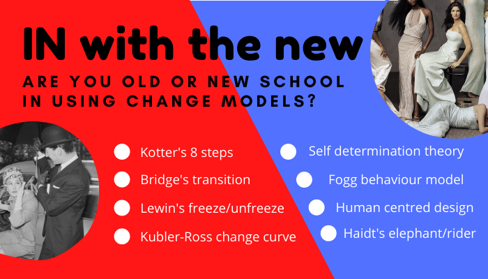
The Enduring Influence of Classic Change Management Models
For decades, organisations have relied on a handful of classic change management models to guide their transformation efforts. These foundational frameworks have shaped the way leaders think about change, offering structured methodologies to manage the human and operational challenges that accompany organisational shifts.
Some of the most widely recognized traditional models include:
Lewin’s 3-Stage Model of Change: Developed in the 1950s, Kurt Lewin’s model breaks change into three simple steps: Unfreeze, Change, and Refreeze. The unfreezing stage involves preparing the organisation for change by challenging the status quo. The change stage is the implementation phase, where new processes or behaviours are introduced. Finally, the refreezing stage aims to solidify these changes as the new norm, embedding them into the organization’s culture and operations.
McKinsey 7S Model: This model emphasizes the importance of aligning seven key elements—Strategy, Structure, Systems, Shared Values, Style, Staff, and Skills—to achieve successful change. The 7S framework highlights the interconnectedness of organisational components and the need for holistic alignment during transformation.
Bridge’s Transition Model: Unlike models focused primarily on processes and systems, Bridge’s model centers on the psychological and emotional transitions individuals experience during change. It outlines three phases: Letting Go, The Neutral Zone, and The New Beginning, recognizing that emotional responses can be a major source of resistance.
ADKAR Model: While slightly more contemporary, the ADKAR model remains a staple in many organisations. It focuses on five building blocks for successful change: Awareness, Desire, Knowledge, Ability, and Reinforcement.
These classic models have provided organisations with blueprints for managing change, helping leaders anticipate challenges, structure their communications, and guide employees through transitions. They have been especially valuable in large, hierarchical organisations where clear, step-by-step processes are necessary to coordinate efforts across multiple teams and layers of management.
Limitations of Traditional Change Models
Despite their enduring popularity, research has increasingly shown that many of these traditional models have limited efficacy in today’s dynamic business world. The pace of change has accelerated, and organisations now face more complex, interconnected, and unpredictable challenges than ever before. As a result, the linear, stepwise approaches of older models can struggle to keep up with:
Rapid technological advancements that require agile and iterative approaches.
Cross-functional collaboration that blurs traditional organisational boundaries.
Continuous transformation, rather than discrete, one-off change initiatives.
Employee expectations for transparency, empowerment, and participation in the change process.
Many of these models were developed in an era when change was infrequent and could be managed as a discrete event. Today, change is constant, and organisations must be able to adapt quickly and continuously. This has led to a growing recognition that newer, more flexible and evidence-based change management models are needed to address the realities of modern business.
The Shift Toward Modern Change Management Approaches
In response to these limitations, new change management models have emerged, informed by recent research and the evolving needs of organisations. These models tend to emphasize:
Behavioural science and data-driven insights to understand and influence employee behaviour more effectively.
Agility and adaptability, allowing organisations to respond rapidly to change and iterate their approaches as needed.
Employee engagement and co-creation, recognizing that successful change depends on active participation and buy-in from those affected.
Continuous measurement and feedback, using real-time data to assess progress and adjust strategies on the fly.
Here are some examples of modern models:
Fogg Behaviour Model: Applies behavioural science principles to drive sustainable change by focusing on motivation, ability, and prompts.
Agile Change Management: Uses iterative planning, rapid feedback, and cross-functional collaboration to enable organisations to adapt quickly.
Self-Determination Theory (SDT): Emphasizes the importance of intrinsic motivation by fostering autonomy, competence, and relatedness among employees. Change initiatives grounded in SDT encourage choice, participation, and personal relevance, leading to more sustainable and meaningful change.
User-Centric Design: Focuses on designing change interventions around the needs, preferences, and experiences of end users. By deeply understanding what motivates and frustrates employees, organisations can co-create solutions that drive engagement and adoption.
A lot of popular change management models are old models, many of which have been shown by research to have limited efficacy in the business world. Nevertheless, some of these models are still referred to as the core ‘pillars’ of change management. What are newer change management models that have been shown by research to have better validity?
Comparing Classic and Modern Change Management Models
The landscape of change management has evolved significantly, with organisations increasingly recognizing the need to move beyond traditional frameworks. Below is a detailed comparison of classic and modern change management models, highlighting their core characteristics, strengths, and limitations.
Classic Change Management Models
Classic models, such as Lewin’s 3-Stage Model, McKinsey 7S, and ADKAR, have long served as the foundation for organisational change initiatives. These models share several defining features:
Linear, Stepwise Approach Classic models typically follow a sequential process. For example, Lewin’s model moves from Unfreeze to Change to Refreeze, while ADKAR progresses through Awareness, Desire, Knowledge, Ability, and Reinforcement.
Top-Down Implementation Change is often driven by leadership, with plans and communications cascading down through the organisation. This structure assumes that senior leaders set the direction and employees follow.
Focus on Process and Structure Traditional models emphasize formal processes, organisational structures, and systems alignment. The McKinsey 7S model, for instance, stresses the importance of aligning strategy, structure, and systems to achieve successful change.
One-Off Initiatives These models are designed for discrete change projects—such as a merger, system upgrade, or restructuring—rather than ongoing transformation.
Strengths of Classic Models:
Provide clear, step-by-step guidance, making them easy to communicate and implement.
Useful for large, hierarchical organisations with established chains of command.
Effective for managing straightforward, well-defined changes.
Limitations of Classic Models:
Can be rigid and slow to adapt to unexpected developments.
Often overlook the emotional and behavioural aspects of change.
May struggle in environments where change is continuous and unpredictable.
Modern Change Management Models
Modern models have emerged in response to the increasing complexity and speed of change in today’s business environment. These frameworks are characterized by:
Agility and Iteration Modern models embrace flexibility, allowing organisations to adapt quickly as circumstances evolve. Change is seen as an ongoing process rather than a linear journey.
Behavioural Science and Data-Driven Insights Newer models use research from psychology and behavioural economics to understand how people respond to change. Techniques such as nudging, habit formation, and real-time feedback are integrated to drive sustainable adoption.
Employee Engagement and Co-Creation Rather than being imposed from the top down, change is co-created with employees. This approach values transparency, open communication, and active participation, fostering a sense of ownership and reducing resistance.
Continuous Measurement and Feedback Modern models leverage digital tools and analytics to monitor progress, gather feedback, and adjust strategies in real time. This ensures that change initiatives remain relevant and effective.
Examples of Modern Models:
Fogg Behaviour Model: Focuses on the interplay of motivation, ability, and prompts to drive behaviour change.
Agile Change Management: Applies agile principles—such as iterative planning, cross-functional collaboration, and rapid prototyping—to change initiatives.
Digital-First Frameworks: Use technology and automation to streamline change processes and provide actionable insights.
Strengths of Modern Models:
Highly adaptable to fast-changing environments.
Address both the rational and emotional dimensions of change.
Foster a culture of continuous improvement and innovation.
Limitations of Modern Models:
May be challenging to implement in organisations with deeply entrenched hierarchies or resistance to new ways of working.
Require a higher level of change management capability and digital literacy.
Classic vs. Modern Change Management Models
Aspect
Classic Models
Modern Models
Approach
Linear, stepwise
Iterative, agile
Leadership Style
Top-down
Collaborative, participatory
Focus
Process, structure
Behaviour, engagement, data
Change Type
Discrete, one-off
Continuous, ongoing
Tools & Techniques
Templates, checklists
Digital tools, analytics, nudges
Employee Role
Recipients of change
Co-creators of change
Measurement
Periodic, post-implementation
Real-time, continuous
When to Use Each Approach
While modern models offer clear advantages in today’s environment, classic frameworks still have their place—particularly for well-defined, large-scale projects with clear objectives and timelines. In contrast, modern models are better suited to organisations facing ongoing transformation, rapid innovation, or the need for cultural change.
The most effective change leaders often blend elements from both approaches, tailoring their strategies to the unique needs of their organisation and the specific challenges at hand.
Applying Modern Change Management Models—Practical Steps for Success
Adopting modern change management models requires organisations to rethink traditional approaches and embrace new ways of driving transformation. Below are practical, action-oriented steps for effectively applying contemporary change management principles, ensuring that change is not only implemented but also sustained.
1. Start with a Clear Vision and Purpose
Define the “Why”: Articulate the underlying purpose of the change. Employees are more likely to support transformation when they understand its rationale and how it aligns with organisational values and goals.
Connect to Strategy: Ensure the change initiative is directly linked to broader business objectives. This alignment helps prioritize resources and maintains focus.
2. Engage Stakeholders Early and Often
Co-Create Solutions: Involve employees, customers, and key stakeholders in designing the change. Use workshops, focus groups, and digital platforms to gather input and foster ownership.
Transparent Communication: Maintain open, two-way communication channels. Share progress, setbacks, and successes honestly to build trust and reduce uncertainty.
3. Leverage Behavioural Science and Data
Map Behaviours: Identify specific behaviours that need to change. Use behavioural mapping to clarify what actions drive desired outcomes.
Apply Nudges and Prompts: Introduce subtle cues, reminders, or incentives that make it easier for people to adopt new behaviours. For example, digital prompts or recognition programs can reinforce positive actions.
Monitor with Analytics: Use digital tools to track adoption rates, engagement, and feedback in real time. Adjust strategies based on what the data reveals.
4. Build Agility into the Change Process
Iterative Implementation: Break the change into manageable phases or sprints. Test solutions on a small scale, gather feedback, and refine before rolling out more broadly.
Empower Local Teams: Give teams the autonomy to adapt change initiatives to their unique context. Encourage experimentation and learning from both successes and failures.
5. Foster a Culture of Continuous Improvement
Encourage Feedback Loops: Regularly solicit feedback from all levels of the organisation. Use quick surveys, digital suggestion boxes, or team retrospectives to surface insights.
Celebrate Small Wins: Recognize and reward progress, not just final outcomes. Celebrating incremental achievements helps sustain momentum and reinforces positive change.
Adapt and Evolve: Be prepared to pivot strategies as new information emerges. Continuous improvement means viewing change as an ongoing journey, not a one-time event.
6. Equip Leaders and Employees for Success
Upskill Change Leaders: Provide training in agile methodologies, data analytics, and behavioural science. Modern change leaders need a diverse toolkit to navigate complexity.
Support Employees: Offer resources such as coaching, peer networks, and digital learning modules to help employees build confidence and competence during transitions.
7. Sustain Change with Reinforcement and Measurement
Embed Change in Systems: Update policies, processes, and technologies to reflect new ways of working. This institutionalizes change and reduces the risk of reverting to old habits.
Continuous Measurement: Use dashboards and key performance indicators (KPIs) to track progress. Share results openly and use them to guide ongoing adjustments.
Practical Example: A large financial services firm sought to implement a digital-first customer service model. Instead of mandating the change from the top, leaders formed cross-functional teams to co-design new workflows. Behavioural nudges—such as digital prompts and peer recognition—encouraged adoption. Real-time analytics tracked customer satisfaction and employee engagement, allowing for rapid adjustments. Regular feedback sessions and visible celebration of milestones helped embed the new model as “the way we work.”
Final Thoughts
Organisations that thrive in today’s environment are those that treat change as a continuous, collaborative, and data-informed process. By applying modern change management models—grounded in behavioural science, agility, and real-time measurement—leaders can drive transformation that is not only effective but also enduring. The key is to blend clear vision, stakeholder engagement, and adaptive execution, ensuring that change becomes a core organisational capability rather than a disruptive event.
Frequently asked questions
What are the main old change management models? The most widely cited traditional change models include Lewin’s three-step model (Unfreeze, Change, Refreeze, developed in the 1940s), Kotter’s 8-Step Model (1996), and the McKinsey 7-S Framework (1980s). These models were designed for an era of slower, more predictable change and treat change as a finite event rather than a continuous process. Research has consistently shown they perform poorly in complex, fast-moving environments.
What are the key differences between old and new change management models? Traditional models tend to be linear, prescriptive, and leader-driven, assuming change can be planned in full before execution begins. Modern approaches are iterative, stakeholder-centred, and data-informed. They treat resistance as information rather than an obstacle, build feedback loops into the process, and account for the reality that organisational conditions change during implementation.
Does research support modern change management approaches over traditional ones? Yes, though the evidence base is still developing. Studies comparing iterative change approaches with linear ones have found significantly higher success rates for agile methodologies in complex environments. Prosci research consistently shows that structured, people-centred change management, regardless of which model is used, produces better outcomes than technically-focused project management alone.
Should organisations abandon traditional change models entirely? Not necessarily. Traditional models still provide useful conceptual anchors. Kotter’s 8 steps, for example, remain a practical communication tool for explaining change to senior leaders unfamiliar with change management. The problem arises when traditional models are applied rigidly as execution frameworks rather than as frameworks for thinking. Many mature change functions use a hybrid approach: classic models for communication and stakeholder engagement, modern approaches for day-to-day change execution.
Most change functions have opinions. The best ones have data.
There is nothing wrong with experienced judgement in change management. A seasoned practitioner who has run fifty programmes develops pattern recognition that is genuinely valuable. But experienced judgement on its own has a ceiling. It cannot scale across a portfolio of twenty concurrent initiatives. It cannot identify that three separate programmes are about to converge on the same group of employees in the same six-week window. And it cannot make a credible case to a CFO for additional resourcing unless it can translate human risk into numbers.
That is what change analytics capability provides. Not just dashboards and reports, but the organisational capacity to turn change data into decisions , decisions about which programmes need more support, which stakeholder groups are at risk of saturation, where adoption is lagging behind plan, and how to allocate scarce change management resources across a complex portfolio.
This article sets out what change analytics capability looks like in 2026, how to build it systematically, and what separates organisations that get genuine value from their change data from those that produce reports nobody acts on.
Why change analytics capability matters more now than ever
The analytics landscape has shifted profoundly in the past three years. Gartner’s 2025 data and analytics trend research identifies agentic AI and decision intelligence as the defining themes, with organisations moving beyond simply collecting data toward using it to make better decisions faster. Sixty-one percent of organisations are already evolving their data and analytics operating model because of AI’s impact.
This shift matters for change functions because it raises the bar on what “data-driven” means. Organisations that are building sophisticated decision intelligence capabilities in their commercial and operational functions are going to expect the same rigour from their change management function. A heat map with green-amber-red cells and no underlying methodology will not hold up in that environment.
The second driver is the compounding complexity of the change portfolio. Gartner research on change fatigue documented that employees experienced an average of ten simultaneous enterprise changes in 2022. Managing that volume without portfolio-level analytics is like running a hospital without patient records , theoretically possible, but not something you would design intentionally.
The third driver is accountability. Change management has historically struggled to demonstrate its own value in quantitative terms. Analytics capability provides the mechanism to do this: adoption rates by group, time to proficiency, correlation between change management investment and delivery outcomes. These are not vanity metrics , they are the evidence base for sustainable resourcing of the change function.
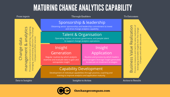
The four components of change analytics capability
Change analytics capability is not a single tool or a single role. It is an organisational capability with four interdependent components.
Component 1: Data infrastructure
You cannot analyse what you cannot collect. The data infrastructure component covers what change data is collected, in what format, at what frequency, and from what sources.
Common change data sources include:
Change impact assessment data (groups affected, severity, change dimensions)
Programme timeline and milestone data
Stakeholder readiness survey results
Adoption metrics (system usage, process completion, self-reported confidence)
Sentiment data (pulse surveys, manager feedback, support ticket categories)
HR data (headcount, location, reporting lines) for population segmentation
The critical design question is whether this data lives in connected systems or disconnected spreadsheets. A change function that manually compiles data from twelve different programme SharePoint sites every fortnight does not have analytics capability , it has a reporting overhead.
Component 2: Analytical methodology
Data infrastructure provides the raw material. Analytical methodology determines what you do with it. This component covers the frameworks and calculations used to turn raw data into meaningful signals.
Key analytical methodologies for change functions include:
Change load analysis: Calculating the total volume of change being asked of each stakeholder group at any point in time, accounting for all concurrent initiatives. This is the foundation of change saturation management.
Adoption trajectory modelling: Tracking adoption rates against predicted curves to identify groups that are falling behind and require targeted intervention.
Readiness gap analysis: Comparing assessed readiness levels against readiness thresholds required for successful go-live, enabling proactive resourcing decisions before problems materialise.
Impact correlation analysis: Examining the relationship between change impact scores and adoption outcomes to sharpen future impact assessment methodology.
Component 3: Reporting and visualisation
Analytics that cannot be communicated are analytics that do not get acted on. Reporting and visualisation capability covers how change insights are packaged for different audiences.
Executive audiences need portfolio-level summaries: which programmes are on track for adoption, which groups are at risk, what the cumulative change load looks like across the organisation. They need this information in a format that takes two minutes to consume, not twenty.
Programme teams need operational detail: adoption metrics by group, readiness gap analysis by role, intervention recommendations for the next sprint cycle.
Business unit leaders need a group-specific view: what is landing on their people, when, and how that compares to their team’s current capacity.
The mistake many change functions make is producing one standardised report for all audiences. A skilled change analyst designs the visualisation to match the decision the audience needs to make.
Component 4: Decision-making integration
This is the component that separates analytics capability from analytics activity. Decision-making integration refers to whether change data is actually used to make portfolio and programme decisions, or whether it sits in a report that is acknowledged and filed.
The indicators of genuine decision-making integration include:
Change analytics data is included as a standard agenda item in programme steering committee meetings
Portfolio-level change load data informs programme sequencing and go-live scheduling decisions
Adoption metrics trigger formal review and response when they fall below thresholds
Change analytics are referenced in investment cases for change management resourcing
Without this integration, even excellent analytics capability produces limited value.
Building the capability: a five-stage maturity model
Change analytics capability does not appear fully formed. It develops in stages, and most organisations are at stage one or two.
Stage 1: Baseline awareness Change data exists in individual programme documents. Impact assessments are completed per programme. No aggregation or portfolio view. Analytics capability = zero.
Stage 2: Programme-level reporting Individual programmes track and report adoption metrics. Change managers produce reports for their specific programme stakeholders. No cross-programme view. Analytics capability = low.
Stage 3: Portfolio aggregation Change data is collected in a consistent format across programmes and aggregated into a portfolio view. The change function can report on cumulative change load and cross-portfolio adoption status. Analytics capability = moderate.
Stage 4: Predictive analytics Historical adoption data informs predictions for new programmes. Readiness gap analysis drives proactive resourcing decisions. Statistical models are applied to portfolio data to identify risk patterns. Analytics capability = high.
Stage 5: Decision intelligence Analytics are embedded into portfolio governance. Scenario modelling tools allow leadership to test sequencing decisions before committing. AI-assisted analysis identifies emerging risks and patterns faster than human review alone. Analytics capability = advanced.
Most large organisations should be targeting Stage 3 or 4. Stage 5 is achievable but requires significant investment in both tooling and analytical capability within the change function.
The AI dimension: what has changed since 2022
The past three years have fundamentally changed what is achievable in change analytics. Large language models can now summarise open-text survey responses at scale, identify sentiment patterns across stakeholder groups, and flag emerging risks in qualitative data that would previously have required hours of manual analysis.
Gartner’s 2024 analytics research identifies “decision intelligence” as the key capability organisations need to develop, moving beyond data collection and visualisation toward using data to actively inform and improve decisions. For change functions, this means building the capacity to ask predictive questions: given this programme’s impact profile, readiness trajectory, and the current portfolio load on this group, what is the probability of achieving adoption targets on schedule?
This is not science fiction. Purpose-built change management platforms are already incorporating these capabilities. The constraint is not the technology , it is whether the change function has built the data infrastructure and analytical methodology to feed the models meaningful inputs.
Practical tools for building change analytics capability
Building change analytics capability does not require a data science team. It requires three things: a commitment to consistent data collection, a methodology for analysis, and a platform that makes aggregation practical.
For organisations at Stage 1 or 2, the starting point is standardising the data that is collected across programmes. A consistent change impact assessment template, a standard adoption survey instrument, and a single place where programme data is stored are the foundations everything else builds on.
For organisations at Stage 3 and above, purpose-built platforms like Change Compass provide the infrastructure to aggregate cross-portfolio data, visualise cumulative change load by stakeholder group, and track adoption metrics in real time without manual compilation. The weekly demo is a practical way to see what portfolio-level change analytics looks like in practice.
The analyst role: who owns change analytics?
As change analytics capability matures, the question of ownership becomes important. In most change functions, analytics work is done by change managers as a secondary responsibility. This works at Stage 2, but breaks down at Stage 3 and above.
Dedicated change analyst roles are increasingly common in large enterprise change functions. The change analyst focuses on data collection, methodology design, reporting, and the translation of data into decision-ready insights. This role sits at the intersection of change management and data analysis , and it is distinctly different from either.
Organisations that are serious about building analytics capability typically find that one dedicated change analyst serving a team of four to six change managers delivers returns that more than justify the investment, in the form of better-targeted change management effort and more credible reporting to leadership.
Where the return comes from
Change analytics capability generates return in three ways.
First, it improves the allocation of change management effort. When you can see which groups face the highest impact and the greatest adoption risk, you can direct scarce practitioner time to where it matters most rather than spreading it evenly across all programmes.
Second, it reduces adoption failures. Early warning signals , declining survey confidence, usage data below threshold, support ticket spikes , allow interventions before adoption problems become adoption failures. The cost of an intervention in week three is a fraction of the cost of a go-live failure in month six.
Third, it builds the case for the change function itself. Prosci research documents that organisations with excellent change management are significantly more likely to meet their objectives. Analytics capability is what turns that generalisation into a specific, defensible claim about your organisation’s change function.
Frequently asked questions
What is change analytics capability?
Change analytics capability is an organisation’s ability to systematically collect, analyse, and act on data about the change it is managing. It spans data infrastructure, analytical methodology, reporting design, and , critically , the integration of change data into actual portfolio and programme decisions. A change function with strong analytics capability can demonstrate adoption trends, flag saturation risks, and make the case for resourcing with evidence.
What data should a change analytics function collect?
The most valuable data sources are change impact assessment data (which groups, how severely, across which dimensions), stakeholder readiness survey results, adoption metrics (system usage, process adherence, self-reported confidence), and programme timeline data. HR population data is also essential for segmenting results by group, geography, or role type.
How does change analytics differ from project reporting?
Project reporting tracks whether activities have been completed: training delivered, communications sent, workshops run. Change analytics tracks whether change is actually happening: adoption rates, readiness levels, cumulative change load, sentiment trends. The first tells you what the change team has done. The second tells you whether it is working.
Do you need specialist tools for change analytics?
You do not need specialist tools to start. A consistent data collection approach and a shared repository are enough to get to Stage 2 or 3. But managing portfolio-level change data across ten or more concurrent programmes without purpose-built tooling quickly becomes unviable. Platforms designed for enterprise change management provide the aggregation, visualisation, and real-time tracking that make higher maturity levels practical.
How long does it take to build change analytics capability?
Moving from Stage 1 to Stage 3 , from no analytics to a functional portfolio view , typically takes six to twelve months of consistent effort, assuming leadership support and access to appropriate tools. The main constraint is not technology but discipline: building the habit of consistent data collection across all programmes, regardless of size or complexity.
Change management data is the lifeblood of effective organizational transformation. Its collection and analysis provide the evidence needed to guide decisions, measure impact, and ensure that change initiatives deliver real value. By focusing on the extraction of actionable insights from this data, organizations can move beyond intuition and anecdote, and instead rely on objective, evidence-based strategies.
Change management data is the lifeblood of effective organizational transformation. Its collection and analysis provide the evidence needed to guide decisions, measure impact, and ensure that change initiatives deliver real value. By focusing on the extraction of actionable insights from this data, organizations can move beyond intuition and anecdote, and instead rely on objective, evidence-based strategies.
Why Change Management Data Matters
Change management data refers to the information collected throughout the change process – before, during, and after implementation. It includes quantitative metrics such as productivity, turnover rates, and customer satisfaction, as well as qualitative feedback from surveys, interviews, and focus groups. Process data – tracking training completion, adherence to timelines, and communication effectiveness – also plays a critical role. Financial data, such as cost savings and ROI, further rounds out the picture.
This data is essential for:
Assessing the current state of the organization and identifying gaps or opportunities for improvement.
Measuring the effectiveness of change initiatives and comparing outcomes to expected goals.
Identifying risks and resistance, allowing organizations to proactively address challenges.
Providing evidence-based recommendations for continuous improvement and future initiatives.
Collecting the Right Data
The process of extracting meaningful insights begins with identifying the right data to collect, paying attention to the type of raw data collected that informed decisions. Organizations should start by defining their objectives and determining which key performance indicators (KPIs) will best measure success. By following a few key steps, organizations can effectively analyze their data. Questions to consider include:
What outcomes do we want to measure?
Which data sources and methods are most appropriate?
How frequently should we gather data?
For example, quantitative data can be gathered through workforce analytics software, while qualitative insights often come from employee surveys or interviews, customer feedback, observation of customer behaviour, etc. Process types of data may require a mix of manual and automated methods to derive valuable insights, depending on the complexity of the change initiative.
Analyzing Change Management Data for Insight
Once data is collected, robust data analytics techniques are needed to extract actionable results. Common approaches include:
Descriptive analytics: Summarizing historical data to understand trends and patterns.
Predictive analytics: Using past data to forecast future outcomes, such as the likelihood of resistance or adoption rates.
Sentiment analysis: Analyzing feedback and communication to gauge employee emotions and attitudes.
Network analysis: Mapping relationships and influence within the organization to identify key stakeholders and influencers.
These techniques help organizations answer critical questions:
How effective are our change initiatives?
Where are the main sources of resistance?
How can we tailor communication and support to increase adoption?
What are the financial and operational impacts of change?
Leveraging Data for Change Impact Analysis
Change impact analysis is a structured approach to understanding how change affects people, processes, and technology. Data plays a central role in this process, enabling organizations to:
Assess the scope and magnitude of change across different areas.
Identify dependencies and potential ripple effects.
Tools like interviews, workshops, and surveys provide rich data for impact analysis, while dashboards and visualizations help communicate findings to stakeholders.
Applying Data Insights to Optimise Change Strategies
With robust data collection and analysis in place, organizations are equipped to move beyond merely understanding change dynamics – they can now actively shape and optimize their transformation efforts by utilizing actionable data insights. The next critical step is translating data insights into effective, adaptive strategies that drive real and lasting results.
Adapting Change Strategies Based on Data
The real power of change management data lies in its ability to inform ongoing strategy adjustments for business decisions. By continuously monitoring key metrics, organizations can identify what’s working and what’s not, enabling swift, evidence-based course corrections. For example:
Enhancing Communication: If survey data reveals confusion or disengagement among employees, organizations can modify messaging, increase transparency, or experiment with new communication channels to improve clarity and buy-in.
Refining Training Programs: Performance metrics may highlight gaps in employee skills or knowledge. Data-driven insights allow for the development of targeted training sessions or e-learning modules to address specific needs.
Adjusting Timelines and Rollouts: If adoption rates lag behind expectations, organizations can extend implementation timelines or introduce changes in phases, allowing for incremental learning and adaptation.
Addressing Resistance: Sentiment analysis can pinpoint where resistance is strongest. Organizations can then develop tailored interventions – such as additional support, open forums, or leadership engagement – to address concerns and build trust.
Optimizing Resource Allocation: Data can reveal which teams or departments are struggling most, enabling organizations to redirect resources or leadership support where it’s needed most.
Demonstrating Value and Building Buy-In
One of the most persuasive uses of change management data is in demonstrating the value of transformation initiatives to stakeholders. When backed by data, success stories become far more compelling. For example, organizations can share concrete evidence – such as a 20% reduction in customer complaints or a 15% increase in employee satisfaction – to build buy-in and momentum for ongoing change efforts. This transparency fosters trust and encourages a culture of continuous improvement.
Leveraging Technology for Real-Time Insights
Modern change management is increasingly supported by digital tools and platforms that provide real-time data and visual dashboards for decision making. These technologies enable organizations to:
Monitor Progress Instantly: Digital assessment tools offer real-time “temperature checks” on how change is being received across teams and geographies, allowing for rapid response to emerging issues.
Share Insights Widely: Dashboards make it easy to distribute data and insights to all stakeholders, ensuring everyone is aligned and informed.
Automate Routine Tasks: Data science techniques can automate repetitive processes like data collection and analysis, freeing up resources for more strategic activities.
Building a Sustainable, Data-Driven Change Culture
To truly embed a data-driven approach, organizations must foster a culture that values evidence-based decision-making and continuous learning. This involves:
Investing in Data Literacy: Providing training and hands-on experience with data analysis for change teams, and encouraging collaboration with data scientists or analysts.
Promoting Knowledge Sharing: Regular sessions where teams share insights, case studies, and lessons learned help build collective expertise and drive ongoing improvement.
Celebrating Successes: When data shows positive results, sharing those successes widely reinforces positive behaviors and encourages continued adoption of change.
Extracting and applying insights from change management data transforms how organizations approach transformation. By continuously analyzing data, adapting strategies, and leveraging technology, organizations can ensure their change initiatives are more effective, agile, and sustainable – ultimately allowing team members to achieve their transformation goals with greater confidence and impact. This then becomes a key competitive advantage.
As a next step to understand further, we you can check out this infographic on how data can be transformed into actionable insights. Click on the link below to download the infographic:


