A Transformation Director recently described her tool selection process to me with a sentence that has stuck. “Most vendors we evaluated showed us a Gantt chart, a heatmap and a resourcing chart, and called it portfolio management. None of them could easily tell me which of our 30+ initiatives were competing for the same audience bandwidth, and none of them could explain why our adoption scores were sliding even though delivery was on track.”
This is the gap most buyers walk into. The change management software market has grown crowded over the last three years, and almost every vendor now promises a “single view of change”. For a PMO Director with a board paper due in two weeks, the demos look reassuringly similar. They are not. The difference between a visualisation tool and a real change portfolio management platform is the difference between a basic, generic dashboard and an intelligence layer that informs the decisions your executive team makes about sequencing, capacity and risk.
This guide is written for PMO/Transformation Directors and enterprise change leads who are evaluating a change portfolio management tool in 2026. It covers what the category actually requires, why your change data is your system of record, what AI features matter (and which to walk away from), and a seven-criteria framework to use in your shortlist conversations.
What change portfolio management actually is (and what most tools are selling instead)
Let’s start with a definition. Change portfolio management is the structured, systematic discipline of managing change across the enterprise portfolio. It includes initiative-level analysis, cross-portfolio risk and opportunity identification, capacity assessment, conflict detection and visual data storytelling that informs business decision making at executive level. It is not a chart. It is a practice supported by a system, built on a defined set of change portfolio management best practices.
Most tools you will see in vendor demos are selling a slice of this. They will show you three views and stop:
- A Gantt or timeline chart of initiatives plotted across the next 12 to 18 months
- A heatmap of impacts by business unit or stakeholder group, usually colour-coded by month
- A resourcing chart showing change practitioner allocation across the portfolio
Those three views are useful as visual artefacts. They are not portfolio management. Portfolio management is what you do with them. The vendor that shows you a heatmap but cannot help you interrogate it, model alternative scenarios, or detect the structural risks hiding inside it has given you a clipboard, not a platform. A useful test in a demo: ask “Show me where two initiatives are competing for the same stakeholder group in the same fortnight, and what the projected adoption impact is if we don’t re-sequence.”
The work a PMO is being asked to do has changed. McKinsey’s research on transformation has consistently shown that the bulk of value erosion happens in implementation, not strategy, with 42 per cent of value lost in the implementation and scaling phases. The PMO is the function closest to that loss. To prevent it, you need to do analysis, not just observation.
The portfolio analysis layer most tools skip
The work that turns visualisation into intelligence sits in five activities:
- Risk and opportunity identification across the portfolio (where are we exposed, where are we under-using capacity)
- Cross-initiative dependency mapping (which initiatives share the same audience, the same systems, or the same critical resources)
- Saturation and capacity modelling (what is the true change load on each business unit at each point in time, and where does that breach safe thresholds)
- Scenario analysis (if we delay initiative X, what does the load profile look like, and which audiences benefit)
- Executive narrative development (how do we tell this story in one slide that drives the right decision)
A change portfolio management tool earns the name when it can support all five. Anything that stops at heatmaps and Gantt charts has stopped at observation.
Why your change data is your system of record
Here is the part most PMO conversations skip. Every other corporate function has a system of record. HR has its HRIS. Finance has its general ledger. Operations has its ERP. Risk has its GRC platform. Change is the only enterprise function still routinely run out of spreadsheets, slide decks and project management tools repurposed for portfolio reporting.
This matters more than it sounds. The system of record is not the tool. It is the authoritative source of data on which decisions are made. When the CFO needs to know the cash position, they don’t ask three teams to email their numbers and reconcile them in Excel. They look at the ledger. When the CHRO needs to know headcount, they look at the HRIS. The PMO is the function that should be the system of record for change data, and most PMOs aren’t, because they don’t have a tool that can hold the data in a structured, queryable, executive-ready form.
Why is this the foundation? Because the data informs everything that comes after it. The approach you recommend to the business, the sequencing decisions you make, the capacity warnings you raise, the readiness conclusions you draw. All of these are only as credible as the data underneath them. If your data lives in fragmented spreadsheets owned by individual change managers, your recommendations are anecdotal. If your data lives in a structured portfolio platform with consistent impact frameworks, audience taxonomies and historical patterns, your recommendations are evidence-based. The platform is upstream of the conversation.
This is also why a change portfolio tool is fundamentally different from a project management tool. Monday, Smartsheet and similar platforms are excellent at task tracking and team coordination. They are not designed to hold change data as a system of record. The fields they track (task, owner, status, due date) are not the fields a change leader needs to make portfolio decisions (impacted audience, change type, adoption risk, saturation contribution, dependency map). Trying to bolt change portfolio management onto a project management tool is like trying to run payroll out of Trello. It will technically work for a while, and it will fail at scale.
For a fuller treatment of why the change function deserves its own intelligence layer rather than a project tool with extra columns, the change intelligence platform pillar article goes deeper into the architecture.
Why standard charts cannot tell your story
The second area where tools quietly fail is data visualisation. The PMO’s job is not to display data. It is to influence executive decisions using data. Those are different jobs, and they need different visualisations.
Most vendors offer a fixed set of charts: a Gantt timeline, an impact heatmap, a resourcing bar chart, possibly a stoplight summary. These are fine for an analyst staring at a screen for ten minutes. They are not what a CEO needs to see in a 5-minute portfolio update.
The complexity of an enterprise change portfolio is genuinely high. You are simultaneously tracking initiatives with different start dates, different audiences (sometimes overlapping, sometimes nested), different change types, different risk profiles, different dependencies and different stages of maturity. A standard chart library can show you any one of those dimensions. None of them can show you the story you need to tell, which is usually two or three of them intersected.
What this means in practice: the data visualisation in a real portfolio tool needs to be flexible. You need to be able to filter, slice, overlay, drill down and reshape the view to match the question being asked. The CFO has a different question to the COO. The board wants a different cut to the divisional MD. The sequencing committee needs to see something different to the audit committee. If your tool gives you the same three charts for all of them, you are doing manual translation work every week that a properly designed platform would do in real time.
A practical test: in your shortlist demos, ask the vendor to build a chart that shows you the top five stakeholder groups by impact load over the next quarter, then layer in the projected change saturation score for each, then highlight which initiatives are driving the highest contribution. If the answer is “we’d need to build a custom report”, you’ve found the ceiling. If they can do it live in the platform, you’ve found a real visualisation engine.
The principle is straightforward: complex change demands flexible visualisation. The story changes, the audience changes, the question changes. The chart must change with it, and one glance must do the work.
AI features: what to look for, what to avoid
If you are evaluating change portfolio tools in 2026 and AI is not on your criteria list, your evaluation is out of date. The PMO use cases for AI fall into two buckets, and both matter:
Reducing manual effort. A change portfolio generates an enormous volume of administrative work: drafting impact statements, summarising initiative updates, normalising data from different change managers, generating stakeholder communications, building first-cut readiness assessments. A capable AI layer should automate large parts of this without removing the change manager from the loop.
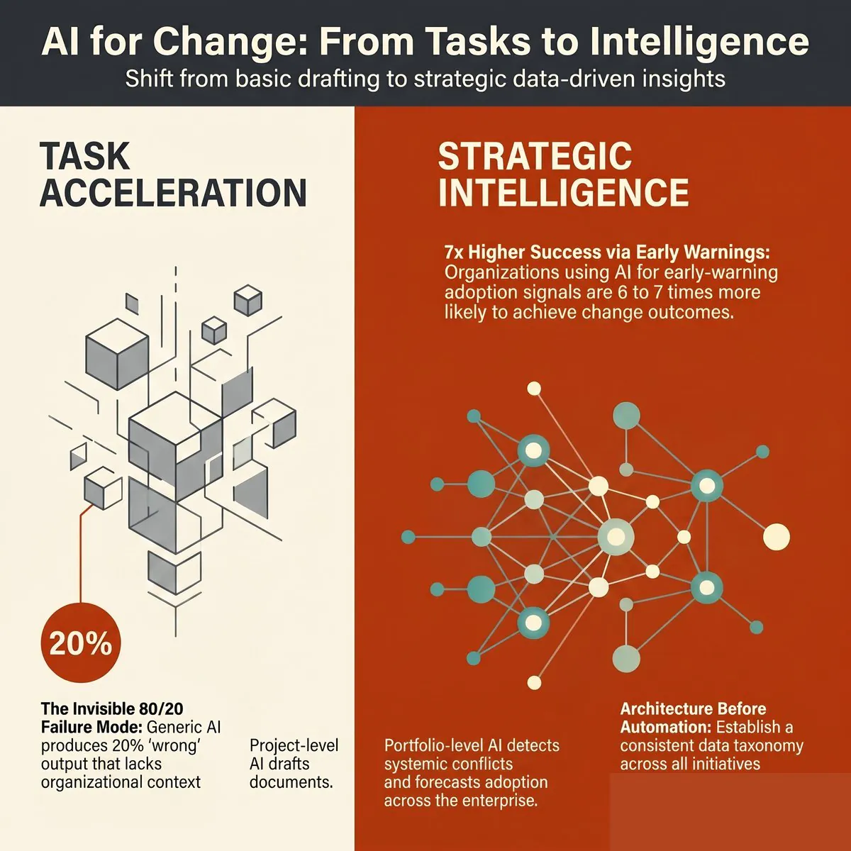
Generating insight. This is the higher-value bucket and the one most providers are weaker on. The AI should be able to look across your portfolio and tell you things you wouldn’t have spotted by hand: emerging saturation hotspots, audience groups whose risk profile has shifted, initiatives whose adoption trajectory is diverging from the plan, dependencies that have moved into the critical path.
Both buckets require one thing the vendor demos often skip past: your data. This is the point many PMOs miss when they’re comparing tools against ChatGPT or Copilot. General AI tools cannot do portfolio-level work for you because they have no portfolio data. They can draft a generic impact statement. They cannot tell you that your Q3 SAP rollout is the third initiative landing on Operations in eight weeks and that adoption is at risk because Operations is already at 87 per cent of safe load. The data is what makes the AI useful.
There is a sharper version of this point worth making to your executive team. General-purpose AI tools used without your organisation’s change data will give you cookie-cutter recommendations. The bigger risk is not that the recommendations are generic. It is that they are confidently wrong, in a way that sounds plausible enough to act on. A general model with no context about your portfolio will recommend an approach that’s wrong for your sector, your maturity, your stakeholder base or your sequencing reality. The cost is not the bad recommendation. The cost is the time spent going down a wrong path because the recommendation sounded sensible. We treat this risk in more depth in the companion piece on AI change management automation, which explains the architecture difference between general AI and a change-data-informed AI layer.
What this means for your buyer’s evaluation:
- The AI features must be trained on or fed by your portfolio’s structured change data, not bolted on as a generic LLM wrapper
- The vendor should be able to demonstrate insight generation, not just text generation (drafting a paragraph is table stakes; spotting a saturation risk is differentiation)
- There must be a clear and consistent path for human-in-the-loop review on any AI-generated recommendation that flows to executives
- The AI must explain its reasoning (what data did it use, what assumptions did it make), so the change leader using it can defend the recommendation in the room
The vendor that says “yes, we have AI” without being able to demonstrate the data plumbing is, with respect, behind. AI without your data is generic by definition.
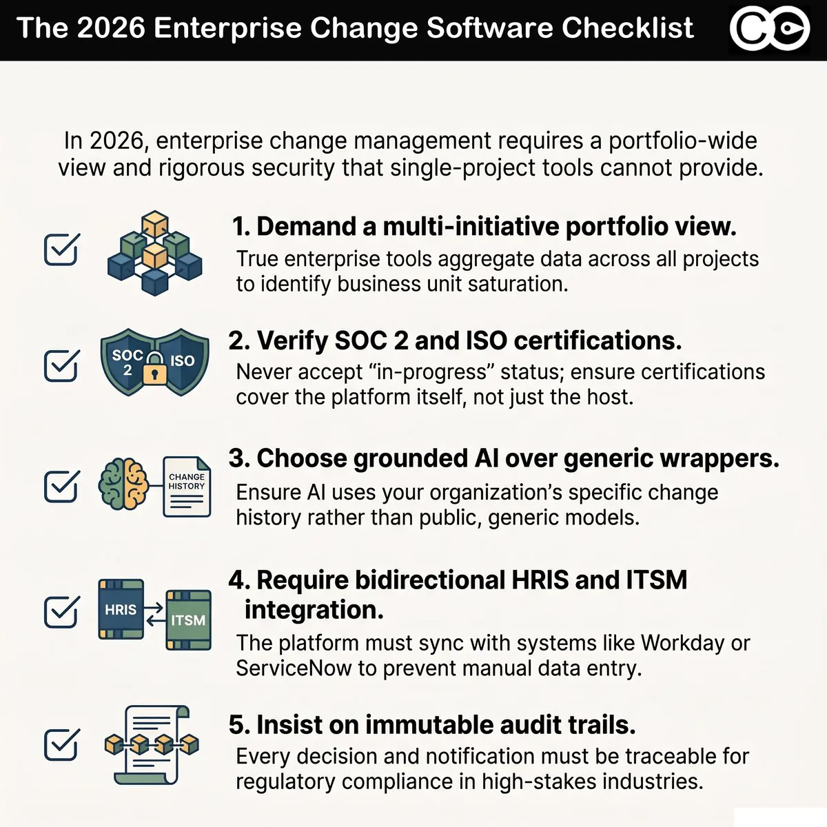
The seven criteria for evaluating a change portfolio management tool
If you take one artefact from this article into a shortlist conversation, take this. These are the seven evaluation criteria we recommend PMO Directors use, in priority order. Each is followed by a question to ask in the demo.
| # | Criterion | Question to ask in the demo |
|---|---|---|
| 1 | Portfolio analysis depth | “Show me how you identify cross-initiative risk and opportunity, not just where you display it.” |
| 2 | Data as system of record | “What is the data model? Can it hold consistent impact, audience and saturation data across all initiatives, regardless of who entered it?” |
| 3 | Flexible data visualisation | “Build me a chart now, live, showing X dimension intersected with Y dimension for the top Z audiences.” |
| 4 | AI features informed by portfolio data | “Demonstrate one insight the AI surfaced that a human wouldn’t have spotted.” |
| 5 | Executive-ready outputs | “Show me the slide or dashboard you would put in front of my CEO. Can it be filtered by their question in real time?” |
| 6 | Saturation and capacity modelling | “How do you measure saturation? Is it a real model with thresholds, or a colour applied to a heatmap?” |
| 7 | Conflict and dependency detection | “Show me where two initiatives are competing for the same audience in the same window. Did the platform flag it, or did I have to find it?” |
The order matters. A platform can have beautiful visualisations and weak data. A platform with weak data will mislead you. Start at criterion two if you’re tight on time. If the data model doesn’t hold up, nothing built on top will.
A few of these are worth a closer look.
Saturation and capacity
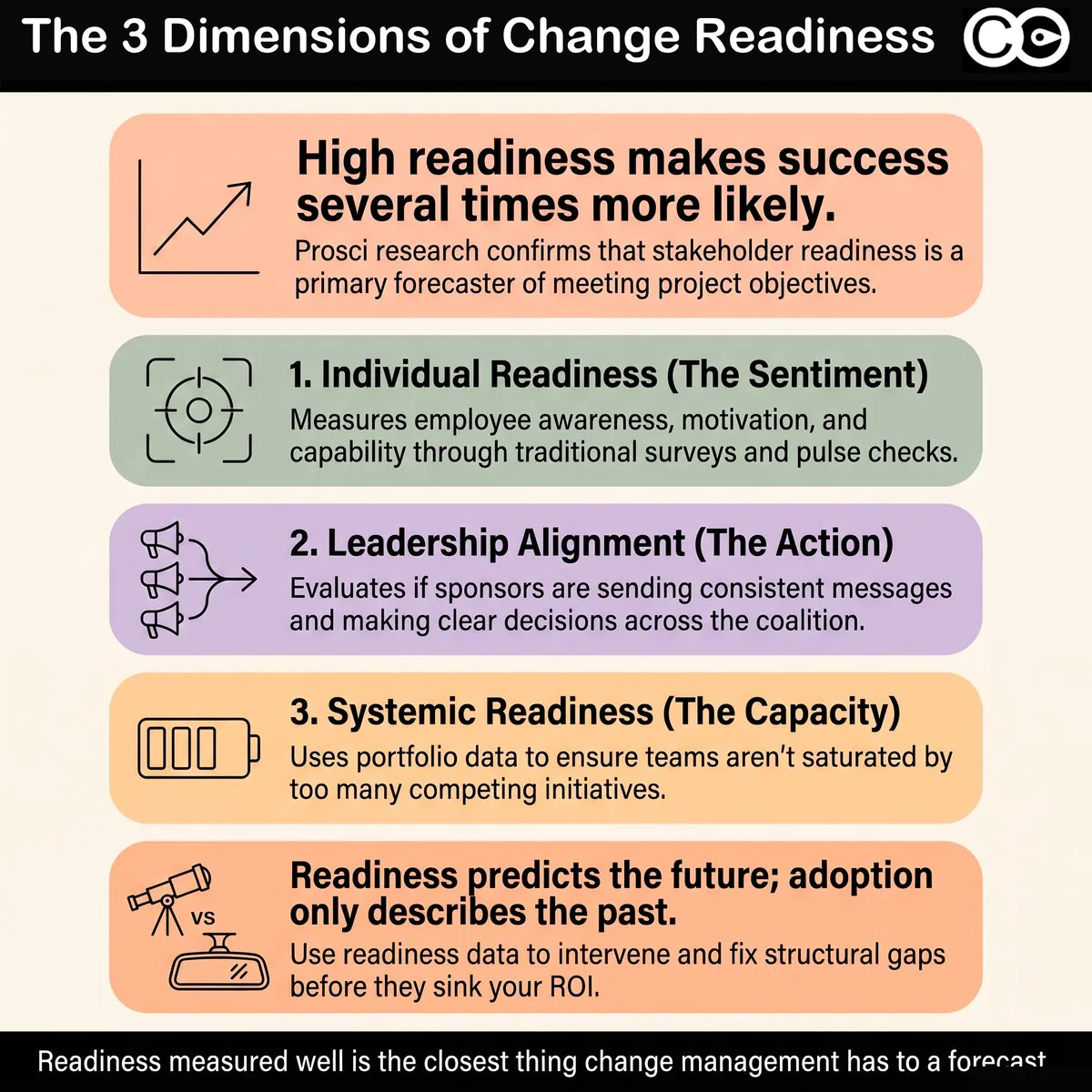
Change saturation is the single biggest cause of preventable adoption failure. Prosci’s research and our own client data consistently show that organisations that exceed their safe change load see a measurable drop in adoption rates, often well before any single initiative shows red on its individual report. The portfolio view is the only place this risk becomes visible.
A real saturation model has thresholds (per audience, per role, sometimes per geography), tracks contribution by initiative, and forecasts forward. A fake saturation feature is a heatmap with three colours. Make sure you can tell the difference. For more on the model, see our practical methodology for measuring change saturation.
Conflict and dependency detection
The structural problem with most enterprise change portfolios is not that the initiatives are individually badly run. It is that they are individually well run, on parallel tracks, by teams that never see each other’s stakeholder lists. Conflict detection is the platform capability that makes the hidden visible. Two initiatives competing for the same business unit in the same fortnight is a problem you cannot solve if you cannot see it. The right tool surfaces this automatically, not on request.
Executive reporting
The most overlooked criterion. Your tool is doing one of two things at executive level: making you look credible, or making you look like the spreadsheet team. There is no middle. The platforms that win at this layer let you generate executive views in real time, filter them live in the meeting, and answer questions on the spot. The ones that lose make you go away, build a slide and come back next week.
For a worked example of what executive-grade reporting looks like at a Fortune 500 financial services firm, see our case studies on elevating change data to the executive table.
The vendor landscape: what’s actually out there
The change portfolio management category includes four kinds of tools that PMOs commonly evaluate. None are equivalent.
1. Project and work management platforms (Monday, Smartsheet, Asana, Jira, Microsoft Project). Strong at task tracking, team coordination and basic Gantt visualisation. Weak at change-specific data structures (impacted audience, change type, saturation contribution) and almost universally weak at portfolio-level analytics. Useful as your delivery tool. Not a change portfolio platform. The common failure mode is the PMO that tries to retrofit Monday with custom columns and reports, ends up with a high-maintenance spreadsheet, and concludes “tools don’t work for change”. The tool wasn’t built for change.
2. HR analytics and employee experience platforms (Workday Adaptive, Visier, Glint, Culture Amp). Strong at employee sentiment, engagement data and HR analytics. Weak at initiative tracking and portfolio composition. Useful as a complementary data source feeding readiness insights. Not a portfolio platform on their own.
3. General-purpose AI tools (ChatGPT Enterprise, Copilot, Claude, Gemini). Strong at text generation, drafting and conversational analysis. Weak at portfolio data management because they don’t have your data. Useful as a productivity layer for individual change managers. Not a portfolio platform.
4. Purpose-built change portfolio platforms (The Change Compass and a small number of others). Designed from the data model upwards for change portfolio work: change-native fields, structured audience taxonomies, saturation modelling, cross-initiative analytics, AI insight layer informed by portfolio data, executive-grade visualisation. This is the category to evaluate against your seven criteria.
This taxonomy matters because the wrong category will look adequate in the first 90 days. The cracks show at scale, when the portfolio grows past 20 to 30 active initiatives, when the executive team starts asking forward-looking questions, and when adoption issues start surfacing that the tool cannot diagnose.
For a broader enterprise software lens that includes security, governance and integration criteria alongside change-specific features, the enterprise change management software buyer’s guide is the companion piece to this article, and our organisational change management software compared guide covers the dedicated OCM platform category in more depth.
Red flags in a vendor evaluation
A short list of things that should slow your evaluation down, not speed it up:
- The demo shows the same three charts (Gantt, heatmap, resourcing) and the vendor calls it portfolio management
- The vendor cannot answer how their AI uses your data (the answer “we use OpenAI’s API” is not an architecture)
- The data model is not visible or not explained, or every customer apparently configures it from scratch
- Saturation is described but not measured (no thresholds, no model, just colour)
- Executive reporting is “we’ll build you a custom dashboard” rather than a real-time configurable view
- Conflict and dependency detection requires a custom report or human analysis to surface
- The vendor’s reference customers are all individual change managers, not PMO Directors or transformation leaders
- Pricing is not anchored to data volume or portfolio size, which usually means it will become anchored to them later
None of these is fatal on its own. A pattern of three or more should make you go back to the brief.
What the right tool actually does for you
The point of all of this is not the tool. It is the outcomes the right tool unlocks. A real change portfolio management platform should move the needle on three things:
Systemic change capability. Not the capability of individual change managers, who are usually competent. The capability of the function as a whole to do portfolio-level work consistently. A platform with a real data model lifts the floor of the function. Less time spent reconciling spreadsheets, more time spent on analysis, advisory and influence.
Adoption and readiness. The downstream measure. Better data leads to better sequencing decisions, better load management, better stakeholder conversations and better readiness preparation. Better readiness preparation leads to better adoption. The mechanism is upstream. The result is adoption rates that move because the underlying conditions move.
Executive influence. The metric most PMO Directors quietly care about. Your change data, when held in a system of record and visualised flexibly, becomes a data set the executive team treats as authoritative. The conversation moves from “the change team is asking us to slow down” to “the portfolio data shows we are at 92 per cent capacity in Operations next quarter, here is the sequencing recommendation”. This is the shift Northwestern Mutual described in their work with us: change data elevated to the same level of visibility and priority as financial and operational data.
The Change Compass is the platform we’ve built for this category. We exist because PMO Directors at firms like Northwestern Mutual, IAG and NiSource told us the tooling they had wasn’t enough. We aren’t the only option you should evaluate. We are the option you should benchmark the rest against. If you’d like to see what a purpose-built change portfolio platform looks like applied to your portfolio, our team runs PMO-focused demos that walk through the seven criteria above using real data structures. Book one, or pressure-test your shortlist against the criteria with your own internal team. Either way, the framework is what matters.
Where to start
If you take one action from this article, make it this: before you sit through another vendor demo, write down the three portfolio questions your executive team is asking that your current tooling cannot answer cleanly. Maybe it’s “are we going to overload Operations next quarter”. Maybe it’s “where are two initiatives quietly competing for the same audience”. Maybe it’s “what’s our forward 12-month saturation curve and where does it breach”. Bring those three questions to every demo. Ask each vendor to answer them live, with their tool, using a portfolio data set, not a slide deck. The right tool will answer at least two of them in the demo and show flexibility in catering for audience needs.
The category is changing fast and the gap between the visualisation tools and the real portfolio platforms is widening, not narrowing. Choose the platform that treats your change data as a system of record, makes it flexible to visualise, applies AI on top of it rather than instead of it, and gives you outputs your executive team actually uses. That’s the buy that pays back. Anything less is a clipboard. If your executive team still needs convincing that portfolio data belongs on their agenda, our guide to building change portfolio literacy in senior leaders covers how to bring them along.
For a comprehensive view of how AI is reshaping the discipline at both project and portfolio level, see our complete guide to AI in change management.
Frequently asked questions
What is a change portfolio management tool?
A change portfolio management tool is a software platform built specifically to hold, analyse and visualise change data across an enterprise portfolio of initiatives. It is distinct from a project management tool (which tracks tasks and timelines) and from a general BI or analytics tool (which lacks change-specific data structures). It supports portfolio-level activities such as risk identification, capacity and saturation modelling, conflict and dependency detection, and executive reporting.
How is change portfolio management different from project portfolio management?
Project portfolio management focuses on delivery: what initiatives are running, who owns them, what milestones are due, what budget is committed. Change portfolio management focuses on the people-side outcomes: which audiences are impacted, by what change types, at what load, with what adoption risk. The two are complementary, but the data structures and the analytical questions are different. A PPM tool tells you whether projects are on track. A change portfolio tool tells you whether your organisation is on track to absorb them.
Do general AI tools like ChatGPT or Copilot replace the need for a change portfolio platform?
No. General AI tools are useful for individual productivity tasks (drafting communications, summarising notes, generating first-cut content). They are not portfolio platforms because they don’t hold your change data as a system of record. Recommendations from general AI tools without your portfolio data tend to be generic at best and confidently wrong at worst, because they have no context for your sector, your maturity, your stakeholder base or your sequencing. The two tool categories are complementary, not substitutes.
What is the most important criterion for choosing a change portfolio tool?
The data model. A platform with a strong data model can be improved everywhere else; a platform with a weak data model can never be saved by features bolted on top. Ask the vendor to explain how the platform holds impact data, audience taxonomies, saturation contribution and dependencies in a consistent, queryable structure. If they cannot explain it clearly, that’s your answer.
How long should a tool evaluation take?
For an enterprise PMO, expect six to twelve weeks from shortlist to decision. The two highest-leverage activities in that window are: (a) running a pilot against your real portfolio data, not a demo data set, and (b) interviewing two or three reference customers at PMO Director level, not change manager level. Skipping either of those will cost you more later than they cost you now.
References
- McKinsey & Company. “Common pitfalls in transformations: a conversation with Jon Garcia.”
- Prosci. “Best Practices in Change Management research.”
- Project Management Institute. “Pulse of the Profession 2024.”
- Deloitte. “Global Human Capital Trends 2024.”
- Gartner. “Gartner Programme and Portfolio Management research insights.”