

Most change practitioners build the same thing first: a spreadsheet with a tab for each project, a column for status, and a colour-coded RAG rating that everyone agrees to update “by Friday.” It’s a genuinely good tool, and it can comfortably hold six to eight initiatives if those initiatives are simple: different teams, different timing, no real overlap. Then, without any change in the initiative count, two project teams schedule mandatory training for the same 200 branch staff in the same week, nobody notices until the complaints start, and the practitioner spends the next afternoon reverse-engineering what went wrong from five different versions of the same file. This is not a story about too many initiatives, or bad discipline. It’s what happens when the complexity of the change outgrows a format that was only ever built to list projects, not to show where they collide.
This article is a practical guide to that whole arc. It starts with the spreadsheet almost everyone builds first, including exactly how to build one properly, because there is nothing wrong with starting there. It then covers the specific point where spreadsheet-based tracking stops showing you what you need to see, what that actually costs in hours and in risk, and how to make the case for something better when the time comes. The case, as you’ll see, is not really about saving time. It’s about what a portfolio of change looks like to the people who are betting the year’s strategy on it going well.
The point where spreadsheet-based change initiative tracking breaks down
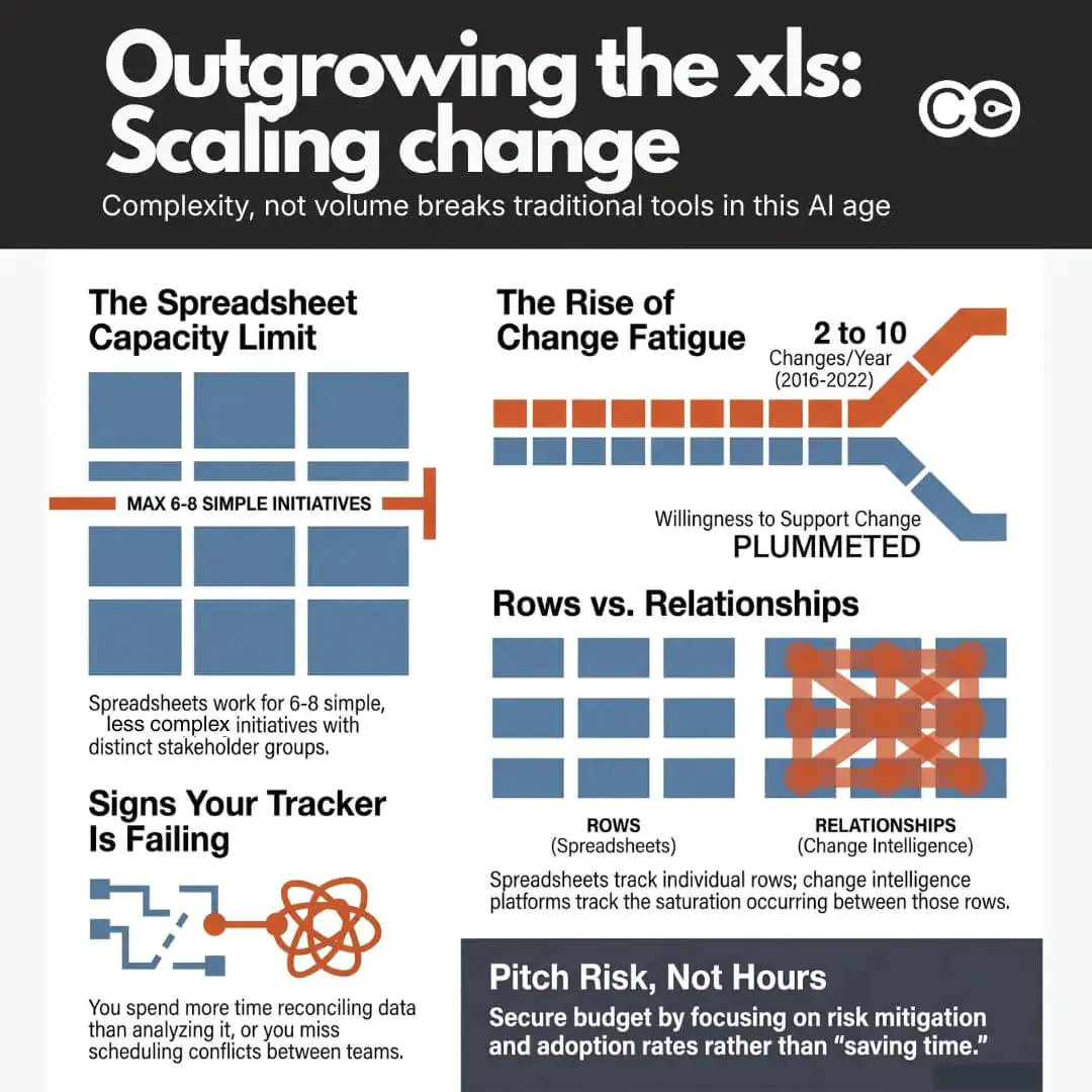
A spreadsheet is a genuinely good tool for a portfolio of six to eight initiatives, provided the changes themselves are simple: a single stakeholder group each, no shared timing, no shared teams. Each has an owner, a timeline, a handful of stakeholders, and updates happen often enough that one person can keep the file current in their head. The failure mode isn’t sudden, and it isn’t really about count. It creeps in as complexity increases, and by the time it’s obvious, the practitioner has usually been quietly compensating for weeks: cross-checking two tabs by hand before a steering committee meeting, emailing three project managers to confirm a stakeholder count nobody trusts anymore, or maintaining a “master” version that only exists because the shared one kept getting overwritten.
The question worth asking isn’t “how many initiatives are we tracking?” A team running eight straightforward, non-overlapping changes can often stay on a spreadsheet indefinitely. The questions that actually predict whether your tracker is about to fail you are different, and none of them are about volume:
- How complex are the changes this team is actually facing, not how many of them there are. A single high-impact system change with five stakeholder groups and three dependencies is harder to track than four simple, contained ones.
- What’s the real risk of saturation building up underneath the numbers? A spreadsheet can tell you an initiative count. It can’t easily tell you whether the same people are being asked to absorb change faster than they can adapt.
- Where are changes overlapping? Specifically: within one role, within a specific team, within a single week, or within a business unit, carrying more than one change at the same time. This is the question a row-per-initiative format is structurally worst at answering, because the overlap only exists in the relationship between rows, not in any single row.
A spreadsheet can hold the initiative count indefinitely; it’s the saturation and overlap questions it fails on, usually well before the sheet itself looks unmanageable. The signs are consistent enough to check yourself against. Your tracking has stopped working if:
- Updating one initiative’s timeline doesn’t automatically update the shared view everyone else is looking at
- Two people have edited the file this week and you’re not fully sure whose version is current
- You’ve missed, or nearly missed, a scheduling conflict between two initiatives touching the same group of people
- Building the monthly executive update takes the better part of a day, most of it spent reconciling data rather than analysing it
- Nobody outside your team can self-serve an answer about portfolio status; they all have to ask you
None of these individually is a crisis. Together, they describe a practitioner spending an increasing share of their week being a human database instead of a change professional. The rest of this guide assumes you’re somewhere on that curve, whether you’re building your first tracker or you’re already living with three or four of the symptoms above.
Build a basic change initiative tracker in an hour
If you don’t have a tracker yet, or the one you have has sprawled past usefulness, start here. This is the structure that scales furthest before it needs to be replaced, and it takes about an hour to set up properly.
The three tabs you need
A workable spreadsheet tracker needs exactly three tabs, no more. Extra tabs are usually where trackers go to die, because each one is another place data can drift out of sync with the others.
Initiative log. One row per initiative. Columns: initiative name, sponsor, owner, business unit, start date, go-live date, current status (RAG), and a one-line description. This is your portfolio anchor; every other tab refers back to the initiative name here.
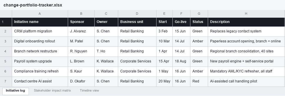
Sample initiative log for a portfolio of six concurrent changes across two business units.
Stakeholder impact matrix. One row per stakeholder group per initiative (so a single initiative touching three teams gets three rows). Columns: initiative name (matched to the log), stakeholder group, headcount, impact type (process, system, role, or location), impact level (high/medium/low), and the week the impact lands.
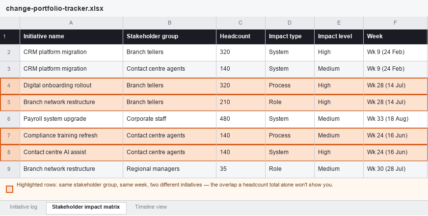
The same portfolio’s stakeholder impact matrix. The highlighted rows show Branch Tellers and Contact Centre Agents each carrying two initiatives in the same week, an overlap invisible from the initiative log alone.
Timeline view. A simple week-by-week or month-by-month grid, with initiatives as rows and time periods as columns, shaded to show when each initiative is actively impacting people (not just its overall project timeline, but specifically when change hits the ground).
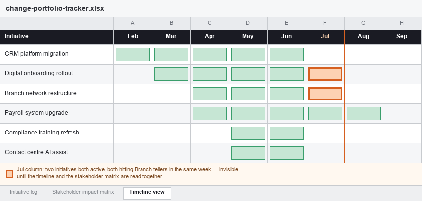
The timeline view of the same portfolio. The July column flags exactly where the overlap sits: two initiatives, one team, one month.
Read on their own, each tab answers a different question: the log tells you what’s running, the matrix tells you who’s carrying it, and the timeline tells you when it lands. Read together, as in the example above, they answer the harder question a spreadsheet is otherwise bad at surfacing: which team, in which week, is quietly carrying two changes at once.
Step-by-step: setting it up
- Create the initiative log first and populate it with everything currently running or approved to start in the next quarter. Don’t wait for a “complete” list; add rows as new initiatives are approved.
- Build the stakeholder impact matrix as a separate tab, using the initiative name as a lookup key (a simple data validation dropdown pulling from the log keeps names consistent, which matters more than it sounds like it should).
- Sum total headcount impact per stakeholder group per week using a pivot table or
SUMIFSformula referencing the matrix. This single calculation is the difference between a list of projects and an actual view of change load. - Build the timeline grid manually or with conditional formatting keyed off the start/go-live dates in the log.
- Set a fixed weekly or fortnightly cadence to update all three tabs together, and put it in the calendar as a recurring task, not an ad hoc one.
- Before every steering committee or portfolio review, manually scan the stakeholder matrix for any group appearing in more than one initiative in the same week. This is the conflict-detection step, and at this stage it has to be done by eye.
This will comfortably serve a portfolio of six to eight concurrent initiatives, as long as they’re relatively simple and don’t share stakeholder groups or timing. It will not comfortably serve a portfolio that’s grown more complex than that, regardless of how few or many initiatives are actually in it, for reasons covered next.
What spreadsheet tracking starts to hide as your portfolio grows
The specific limitation isn’t capacity in a literal sense; a spreadsheet can technically hold a hundred rows as easily as ten. What breaks is the set of questions the format can actually answer. Three facets, in particular, become invisible right when they matter most, which tend to be exactly the facets an executive audience is asking about.
The first is aggregate load over time. A pivot table can sum stakeholder headcount for a single week if you build it correctly, but showing how cumulative change impact rises and falls across a rolling twelve-month view, filterable by division or stakeholder group, requires the kind of dynamic recalculation spreadsheets do badly at scale. This is the same underlying problem addressed by a practical methodology for measuring change saturation: saturation isn’t a property of any single initiative, it’s a property of the portfolio at a point in time, and a tool built around one-row-per-initiative structurally struggles to show it.
The second is cross-initiative conflict detection. Manually scanning a matrix for overlapping stakeholder groups, the way the July column in the timeline example above was found, works fine at six or seven initiatives. At fifteen, with multiple business units, regional variations, and shifting timelines, the manual scan either takes hours or misses things, and it usually does both.
The third is a single, trusted source of truth. The moment more than one person touches the file, version control becomes a live problem. Someone opens the file locally, someone else edits the shared copy, a formula gets accidentally overwritten, and the practitioner ends up spending real time each week confirming which version is “the” version before trusting anything in it enough to present it.
None of this is a criticism of the people building these trackers. It’s a description of what a row-and-column format was never designed to do: represent a dynamic, overlapping, many-to-many system where the same 200 people might sit inside three different initiatives at once, each with a different owner who has no visibility into the other two.
The manual cost of keeping it updated in 2026
The maintenance burden is worth being honest about, because it’s easy to underestimate how much of it is happening in the background of a busy change function.
Where the hours actually go
Every week, someone has to chase updates from initiative owners who are, understandably, more focused on delivering their own project than keeping a shared file current. Every steering committee cycle requires manually reconciling three tabs, checking totals by hand, and rebuilding at least part of the executive-facing view from scratch because the raw data was never structured to present cleanly. This is not unique to change management. Asana’s Anatomy of Work research found that knowledge workers spend roughly 60% of their time on “work about work”: chasing updates, reconciling status, and switching between tools rather than doing the work itself. Manual spreadsheet-based portfolio tracking is a concentrated version of exactly that pattern, sitting inside a function that is meant to be helping the rest of the organisation absorb change, not generating its own administrative load.
The error problem no one budgets for
The other cost is quieter and harder to see until it surfaces at the worst possible moment: error. Spreadsheet error research is one of the more consistently reproduced findings in applied computing, precisely because the format makes mistakes easy to make and hard to catch. A widely cited academic review of the spreadsheet-error literature summarised more than a decade of independent studies with the same conclusion each time: spreadsheet errors are common, not rare, and they are rarely caught by the people who made them, because a formula that returns a plausible-looking wrong number doesn’t announce itself. In a change portfolio tracker, that might mean an impact count that’s silently wrong, a stakeholder group double-counted across two tabs, or a formula that quietly stopped updating three tabs ago. None of that shows up until a number gets challenged in a steering committee, and by then it’s a credibility problem, not just a data problem.
In an environment where every other business function, from finance to sales to operations, is moving toward live dashboards and automated reporting, a change function still reconciling spreadsheets by hand each week looks increasingly like an outlier, and it is one of the more visible signals to executives that the practice hasn’t yet matured to match the rest of the business.
Why the funding conversation should be about risk and adoption, not hours saved
When practitioners eventually ask for budget to move beyond spreadsheets, the instinctive pitch is almost always about time: “this will save the team ten hours a week.” It’s true, and it’s the weakest version of the argument. Ten hours a week is a real but modest line item against most transformation budgets, and it invites an easy counter: hire an analyst, or just accept the manual work as the cost of doing the job.
The stronger argument, and the one that actually lands with a CFO or a transformation sponsor, is that a spreadsheet cannot show them the three things they are actually accountable for.
Risk
Gartner’s research on change fatigue found that the average number of major enterprise changes employees were expected to absorb rose from around two per year in 2016 to roughly ten per year by 2022, while the proportion of employees willing to support organisational change fell from 74% to 38% over the same period. That is a five-fold increase in change volume landing on a workforce that has become dramatically less willing to absorb it, and almost none of that risk is visible from an initiative-by-initiative spreadsheet, because the risk lives in the overlap between initiatives, not inside any single one. An executive asking “what’s our exposure to change fatigue this quarter” cannot get a real answer from a tool that was never built to show cumulative load across a portfolio.
Adoption
Portfolio blindness doesn’t just create fatigue risk; it actively undermines the return on the initiatives themselves. McKinsey’s research on large-scale transformations found that, on average, only about 2% of employees are directly involved in shaping a typical transformation effort, and organisations that meaningfully expand that participation see substantially better outcomes. Every initiative competing for the same finite attention, without a portfolio-level view of who is already stretched thin, makes that problem worse, not better. Adoption isn’t just a property of how well one initiative was managed; it’s a property of how much room the people affected actually had to adopt it, and that’s a portfolio-level question a spreadsheet isn’t structured to answer.
Capacity
Prosci’s Best Practices research found that 73% of organisations report being near, at, or beyond their change saturation point, largely because, as Prosci’s own analysis notes, no one in the organisation is keeping a genuine portfolio view of everything underway at once. That is precisely the gap a spreadsheet-based tracker leaves open even when it’s being maintained conscientiously: it tracks initiatives, not the cumulative capacity being drawn down across all of them.
Put those three together and the funding conversation changes shape entirely. You are no longer asking for a tool that saves the team time. You are asking for the organisation’s only reliable early-warning system for change fatigue, adoption failure, and capacity overrun across a portfolio worth, in most enterprises, many multiples of what the tool itself costs. That is the argument that gets budget approved, because it is framed in terms executives are already accountable for, not in terms of a practitioner’s weekly workload. It is also, not coincidentally, the same reframe that works when building the broader business case for change management investment: risk avoided and adoption protected are usually larger, more defensible numbers than hours saved, and they are the numbers a CFO already has a mental model for evaluating.
When to move from a spreadsheet to dedicated change initiative tracking software
There’s no single headcount that marks the exact moment to switch, and initiative count on its own is a weak signal, as the earlier reframe should make clear. A short, honest checklist gets most practitioners to the right answer. If two or more of the following are true, the spreadsheet is very likely costing more than a dedicated platform would:
- You’ve moved past eight or so concurrent initiatives, or fewer than that but complex and overlapping (shared stakeholder groups, shared timing, shared business units)
- More than one person needs to update or rely on the tracker
- You produce a portfolio-level executive report on a recurring cycle (monthly or more often)
- You’ve had, or narrowly avoided, a scheduling or stakeholder conflict between initiatives in the last quarter
- Building the executive update takes longer than actually analysing what it shows
- Leadership is asking questions about the portfolio (saturation, capacity, sequencing) that the spreadsheet structurally can’t answer
If that’s you, the natural next step is evaluating dedicated change initiative tracking software rather than continuing to patch the spreadsheet. That evaluation is its own piece of work, and a buyer’s guide covering the criteria that actually separate a real change portfolio tool from a generic project tracker is worth reading in full before shortlisting vendors, because the features that matter here (aggregation logic, saturation modelling, conflict detection) rarely show up clearly in a sales demo unless you know to ask for them specifically.
What a change intelligence platform gives you that a spreadsheet never can
This is where a platform like Change Compass earns its place, not as a fancier spreadsheet, but as a structurally different tool. Instead of one row per initiative that has to be manually cross-referenced against every other row, a dedicated change intelligence platform aggregates stakeholder impact automatically across every initiative in the portfolio, in real time, as initiative owners update their own data. The same 200 branch staff appearing in three initiatives in the same week shows up as a visible spike the moment the third initiative is entered, not three weeks later when someone happens to notice.
That structural difference is what the case for treating a change intelligence platform as core infrastructure actually rests on: change data, like HR data or financial data, only becomes useful at the moment it can be aggregated, queried, and trusted as a single source of truth, rather than reassembled by hand each reporting cycle. A spreadsheet can describe individual initiatives well. It cannot, by design, become that kind of system of record. Everything covered above, saturation visibility, conflict detection, a version-controlled shared view, executive reporting without a day of manual reconciliation, comes from that one structural shift, not from any single feature.
Start with a spreadsheet. Just don’t stay there.
There’s nothing wrong with building your first change portfolio tracker in Excel. It’s a genuinely good tool for six to eight simple initiatives, and the template in this guide will comfortably see most practitioners through their first year of managing concurrent change. The mistake isn’t starting there. It’s mistaking initiative count for the real signal, and staying on a spreadsheet past the point where the format can show what the organisation actually needs to see: how complex the change has become, how close the portfolio is to saturation, and where changes are overlapping on the same team, role, or business unit in the same week. Then, when the funding conversation comes, lead with risk and adoption, not hours. That’s the version of the pitch that gets funded.
Frequently asked questions
What is change initiative tracking software?
Change initiative tracking software is a purpose-built platform for managing multiple concurrent organisational change initiatives, as distinct from generic project management tools. It typically aggregates stakeholder impact data across initiatives, visualises change load and saturation over time, and flags scheduling or capacity conflicts automatically, rather than requiring manual cross-referencing.
Can I track multiple change initiatives in Excel?
Yes, and it’s the right starting point for most practitioners. A spreadsheet can comfortably handle six to eight concurrent initiatives, provided they’re relatively simple: different stakeholder groups, different timing, no real overlap. Use a three-tab structure (initiative log, stakeholder impact matrix, timeline view) with the initiative name as a shared lookup key across tabs, and set a fixed update cadence. What actually limits a spreadsheet isn’t the initiative count, it’s complexity and overlap: the same stakeholder group appearing in two initiatives in the same week is a much stronger signal that the format is breaking down than the number of tabs you’re maintaining.
How do you know when it’s time to move from a spreadsheet to dedicated software?
Two or more of the following are a reliable signal: you’ve moved well past eight concurrent initiatives, or have fewer than that but they’re complex and overlapping; you can’t say which team or role is carrying the most concurrent change this month, only how many initiatives exist in total; more than one person is maintaining the tracker; there’s a recurring executive reporting cycle; there’s been a recent near-miss on a stakeholder conflict; the executive update takes longer to build than to present; or leadership is asking portfolio-level questions (saturation, capacity, sequencing) the spreadsheet can’t answer.
What should a change portfolio funding request focus on?
Not hours saved. The stronger case is built on the three things a spreadsheet structurally can’t show an executive: change fatigue risk building up across the portfolio, adoption being undermined by initiatives competing for the same limited attention, and capacity being drawn down faster than the organisation can see. These map to risks executives are already accountable for, which makes the funding case easier to approve than a productivity argument.
How many change initiatives can a spreadsheet actually handle?
Volume alone isn’t the right measure. A spreadsheet can comfortably hold six to eight simple, non-overlapping initiatives, but a portfolio of three or four complex, overlapping initiatives will break it faster than eight simple ones will. The three questions that actually matter are how complex the changes are (not how many there are), how close the portfolio is to saturation, and whether changes are overlapping within the same role, team, week, or business unit.
What’s the difference between a project tracker and a change portfolio platform?
A project tracker, spreadsheet or software, is organised around delivery milestones for individual initiatives. A change portfolio platform is organised around cumulative impact on the people affected, aggregating stakeholder load, saturation, and adoption risk across every concurrent initiative at once, which is a structurally different question than “is this project on schedule.”
References
- Prosci: Strategies to Recognize and Deal With Change Saturation
- Gartner: Finance Leaders Should Factor Change Fatigue into Project Planning
- McKinsey: Reconfiguring Work, Change Management in the Age of Gen AI
- Asana: How Work About Work Gets in the Way of Real Work
- A Critical Review of the Literature on Spreadsheet Errors (Dartmouth Tuck School of Business)