Most change managers still measure transformation the way accountants balanced ledgers before spreadsheets: manually, periodically, and at the project level. The data arrives late, reflects only what was easy to capture, and serves reports more than decisions. Change management software has changed this significantly, but the full potential of software-enabled measurement is still underused in most large organisations.
This is a practical gap, not just a philosophical one. Gartner research found that only 32% of business leaders report achieving healthy change adoption among employees, despite most having change management frameworks in place. The gap between having a methodology and achieving adoption is, in large part, a measurement problem. If you cannot see adoption in real time, you cannot respond to it in time to make a difference.
Change management software measurement closes this gap. But understanding what software actually measures, what that data tells you, and how to apply it to your practice is where most teams need more depth.
The problem with manual change measurement
Before we get into what software enables, it is worth being clear about why the manual approach falls short.
The most common manual measurement approach involves stakeholder surveys at project milestones, training completion spreadsheets, and periodic progress reports compiled by each change manager. The problems are well-documented:
- Data is collected at points in time, not continuously, so you only know what was true when you asked
- Each project team uses slightly different scales and questions, making portfolio-level comparison impossible
- The data tends to reflect perceptions of process activity (training done, communications sent) rather than actual adoption behaviour
- By the time data reaches a report, it is often too old to act on
The result is that change functions often have a lot of data but limited insight. They can demonstrate activity but struggle to demonstrate impact.
Why this matters more than ever
Organisations are running more change programmes simultaneously than at any point in the last decade. Prosci’s correlation research consistently shows that projects with excellent change management are approximately seven times more likely to meet their objectives than those with poor change management. At the portfolio level, the difference between rigorous and ad-hoc change measurement is increasingly the difference between transformation programmes that land well and those that stall mid-delivery.
What change management software actually measures
Not all change management software measures the same things. It helps to understand the distinct measurement categories before evaluating any particular platform.
Adoption and readiness tracking
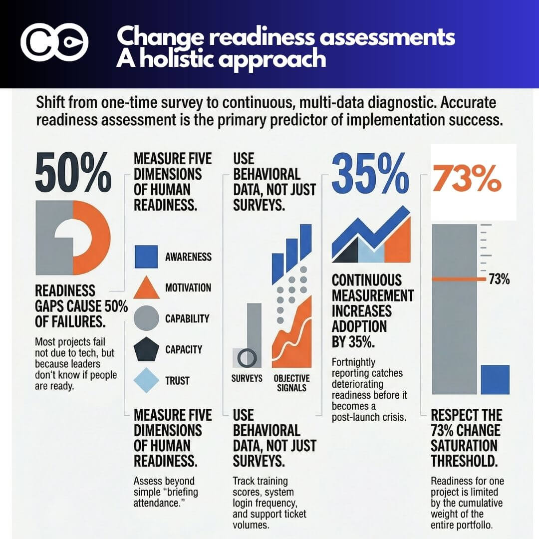
The most mature change management platforms enable real-time tracking of adoption across stakeholder groups, business units, or geographies. Rather than a single survey at go-live, you get a time-series view: where adoption is accelerating, where it is plateauing, and which groups are lagging. This allows your team to intervene before adoption failure becomes irreversible.
Readiness tracking operates similarly. Instead of a single readiness assessment six weeks before a programme goes live, software-enabled readiness measurement gives you a running picture of readiness across multiple dimensions: leadership alignment, process readiness, capability readiness, and technology readiness. Each dimension can be weighted and scored differently depending on the nature of the change.
Change impact and load
One of the most significant measurement capabilities that only software can reasonably provide at scale is change impact measurement across a portfolio. When you are running 15 or 20 change initiatives simultaneously, manually aggregating impact data across those programmes is practically impossible. Software platforms designed for portfolio change management, such as The Change Compass, enable impact data to be consolidated across the portfolio and visualised at the business unit or role group level.
This matters because the cumulative change load on a group of employees is often the single biggest predictor of adoption problems. An employee group facing five simultaneous changes, each individually manageable, may be at saturation point in aggregate. Manual measurement almost never surfaces this risk. Software measurement can.
Activity and engagement metrics
Beyond adoption outcomes, change management software tracks the activities that drive adoption: training attendance and completion rates, communication engagement (opens, clicks, responses), stakeholder engagement session attendance, and feedback loops. When tracked systematically, these activity metrics serve as leading indicators of adoption. A drop in training completion is a signal; a drop combined with declining stakeholder engagement attendance and decreasing survey participation is an early warning system.
Delivery tracking and change team performance
For change functions operating at scale, software also tracks the delivery of change management work itself: are plans being executed, are deliverables completed on schedule, are change budgets being spent as intended. This type of tracking serves accountability and continuous improvement within the change function.
Four measurement capabilities that separate good from great
Based on what the best-performing change functions in enterprise organisations do differently, four specific capabilities distinguish rigorous change management software measurement from basic reporting.
Baseline and benchmark data. Without a starting point, all measurement is relative to nothing. Software platforms that capture baseline readiness and adoption data before a change goes live allow you to compare ‘before’ and ‘after’ states with credibility. This is not just useful for internal learning, it is the data that change leaders need when demonstrating value to executives.
Role-level granularity. Organisation-level averages hide the distribution. A 72% adoption rate across the business might feel acceptable until you learn that three critical user groups are at 40%. Software measurement should provide role and business unit breakdown as a standard view, not a custom report.
Portfolio aggregation. The ability to see cumulative change load, adoption rates, and delivery status across all active programmes simultaneously is the most strategically valuable measurement capability a change function can have. It enables portfolio-level decision-making that is simply not possible with project-level spreadsheets.
Real-time alerting. The purpose of measurement is to enable decisions. Software that surfaces alerts when adoption drops below thresholds, when change load in a business unit exceeds safe limits, or when delivery milestones are missed turns measurement from a retrospective activity into a proactive management tool.
From manual measurement to decision intelligence
The shift from manual to software-enabled change measurement is not primarily about efficiency, though it is substantially more efficient. It is about the quality and timeliness of the decisions the measurement supports.
Capgemini Invent’s change management study surveyed 1,175 professionals across industries and found that organisations with high data maturity in their change programmes experienced 27% higher change success rates. The study identified data-driven leadership as adding a further 23% lift. These are not marginal improvements; they are the difference between change programmes that achieve their business cases and those that fall short.
The implication for your change function is practical. Where are you on the manual-to-software measurement spectrum? Do your decisions about change priority, resource allocation, and stakeholder intervention rely on real data or on informal knowledge and experience? Both matter, but experience without data is a ceiling that software can help you raise.
Using The Change Compass for change management software measurement
The Change Compass is designed specifically for enterprise change measurement challenges. It addresses portfolio-level change impact tracking, cumulative load visualisation, and adoption measurement in a single platform, with dashboards configured for different stakeholders: change teams need granular data, executives need portfolio health signals.
The platform’s measurement architecture is built around the insight that most change failures are not programme-specific; they are portfolio-level saturation problems that no one saw coming because no one was measuring load in aggregate. Software-enabled measurement changes the nature of the conversation you can have with business leaders from “our programme is on track” to “the combined change load on your customer service team is at risk level, and here is what we need to adjust.”
That is a fundamentally different conversation, and it is one that elevates the strategic contribution of the change function.
Making the shift in your organisation
If your change function is still primarily relying on manual measurement, a few practical steps can start the transition toward software-enabled measurement without requiring a complete overhaul of your existing approach.
Start with the portfolio view. Even if individual programme measurement remains manual, creating a centralised view of all active changes and their impact on key employee groups is a significant improvement. This does not require sophisticated software at first, but it clarifies what data you would need to collect consistently to make this view meaningful.
Standardise your baseline metrics. Before you can measure change across projects, you need a standard set of measures that every project uses. Readiness dimensions, adoption stage definitions, and impact categories need to be consistent across the portfolio. This standardisation is a prerequisite for any aggregated measurement.
Choose software that fits your portfolio complexity. The right change management software for a team running three projects simultaneously is different from what you need when running 25. Evaluate platforms based on the measurement use cases that matter most in your context: adoption tracking, portfolio load, or delivery management.
Where measurement should take you
Change management software measurement is not an end in itself. The goal is better decisions, sooner. When your measurement system is telling you that a business unit is approaching change saturation three months before a major go-live, you have time to act. When adoption data shows that a specific stakeholder group is consistently lagging while others are progressing, you have the basis for a targeted intervention.
The change functions that are most valued by their organisations are those that can show, with data, what the change landscape looks like and what it means for the business. Software-enabled measurement is what makes that possible.
Frequently asked questions
What is change management software measurement?
Change management software measurement refers to the use of digital platforms to systematically capture, aggregate, and analyse data about change adoption, readiness, stakeholder engagement, and change impact across one or more change programmes. It replaces or supplements manual spreadsheet-based tracking with real-time dashboards and portfolio-level visibility.
Can software really measure something as intangible as change adoption?
Yes, with the right design. Adoption is measured through a combination of leading indicators (training completion, engagement activity, survey participation) and lagging indicators (system usage data, process adherence, performance metrics). Software platforms aggregate these signals into a coherent adoption picture across stakeholder groups over time.
What is the difference between project-level and portfolio-level change measurement?
Project-level measurement tracks adoption and readiness for a single initiative. Portfolio-level measurement aggregates data across all active change programmes to reveal cumulative impacts, such as which business units are carrying the heaviest combined change load at any given point. Portfolio measurement is substantially more complex but significantly more strategically valuable.
How does change management software measurement improve ROI?
Prosci research shows that projects with excellent change management are seven times more likely to meet their objectives than those with poor change management. Software measurement supports excellent change management by providing real-time visibility that enables faster, better-informed interventions, directly improving adoption outcomes and benefits realisation.
What should I look for in change management software for measurement purposes?
Look for: role-level and business unit breakdown of adoption data, portfolio aggregation across multiple simultaneous programmes, baseline and trend data (not just point-in-time snapshots), configurable dashboards for different stakeholder audiences, and alert functionality that surfaces issues before they become crises.
Do I need to replace my existing tools to use change management software?
Not necessarily. Many change management platforms are designed to integrate with or complement existing project management and HR systems. The key requirement is data consistency, specifically standardising how adoption, readiness, and impact are defined and measured across your portfolio so that aggregated views are meaningful.
References
- Prosci. The Correlation Between Change Management and Project Success. https://www.prosci.com/blog/the-correlation-between-change-management-and-project-success
- Gartner. Gartner HR Research Finds Just 32% of Business Leaders Report Achieving Healthy Change Adoption by Employees (2025). https://www.gartner.com/en/newsroom/press-releases/2025-07-08-gartner-hr-research-finds-just-32-percent-of-business-leaders-report-achieving-healthy-change-adoption-by-employees
- Capgemini Invent. Change Management Study 2023. https://www.capgemini.com/insights/research-library/change-management-study-2023/
- Capgemini. Data-Driven Change Management is Crucial for Successful Transformation. https://www.capgemini.com/news/press-releases/data-driven-change-management-is-crucial-for-successful-transformation/
- The Change Compass. How to Measure Change Management Success: 5 Metrics Leaders Actually Use. https://thechangecompass.com/how-to-measure-change-management-success-5-key-metrics-that-matter/


