In the rapidly evolving landscape of financial services, organisations face significant challenges due to regulatory and technological changes. A large financial services corporation has recognised the need for an integrated approach to change management reporting, embedding it within general business reporting to enhance organisational agility and effectiveness. This case study outlines the firm’s journey, challenges faced, solutions implemented, and the resulting value derived from this strategic initiative.
Background
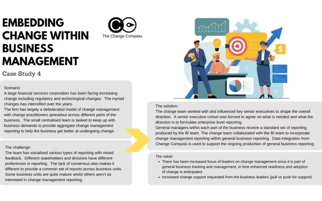
The corporation operates under a defederated model of change management, where change practitioners are distributed across various business units. This structure has led to inconsistent change management practices and reporting, complicating the ability to provide comprehensive insights into organisational change efforts. As regulatory demands and technological advancements have intensified, the need for cohesive change management reporting became paramount.
Challenges
The primary challenges encountered by the centralized change management team included:
Diverse Reporting Preferences: Different stakeholders and divisions within the organization exhibited varying preferences for reporting formats and metrics. This lack of consensus hindered the development of a standardized reporting framework.
Maturity Disparities: Business units displayed varying levels of maturity in their change management practices, with some units showing strong interest while others remained indifferent.
Feedback Variability: Initial attempts to socialize various reporting types received mixed feedback, complicating efforts to establish a unified approach.
Solution Implementation
To address these challenges, the change management team adopted a multi-faceted strategy:
Executive Engagement: The team actively engaged with senior executives to align on the direction for change management reporting. A senior executive cohort was formed to define essential reporting needs and establish a common vision.
Collaboration with Business Intelligence (BI) Team: The change management team partnered with the BI team to integrate change management metrics into existing general business reports. This collaboration ensured that change management insights were included in routine business tracking.
Data Integration: Utilising data from Change Compass facilitated the ongoing production of comprehensive reports that combined operational metrics with change management insights.
Value Realized
The integration of change management reporting into general business reporting yielded several significant benefits:
Increased Leadership Focus: By embedding change metrics within standard business reports, leaders began to prioritize change management as part of their strategic oversight. This shift is expected to enhance readiness and adoption of future changes across the organization.
Proactive Change Support: Business leaders increasingly requested support for change initiatives, indicating a transition from a push model (where support is offered) to a pull model (where support is actively sought).
Enhanced Reporting Consistency: The establishment of a standardized set of reports improved clarity and consistency in how change initiatives were tracked and communicated across business units.
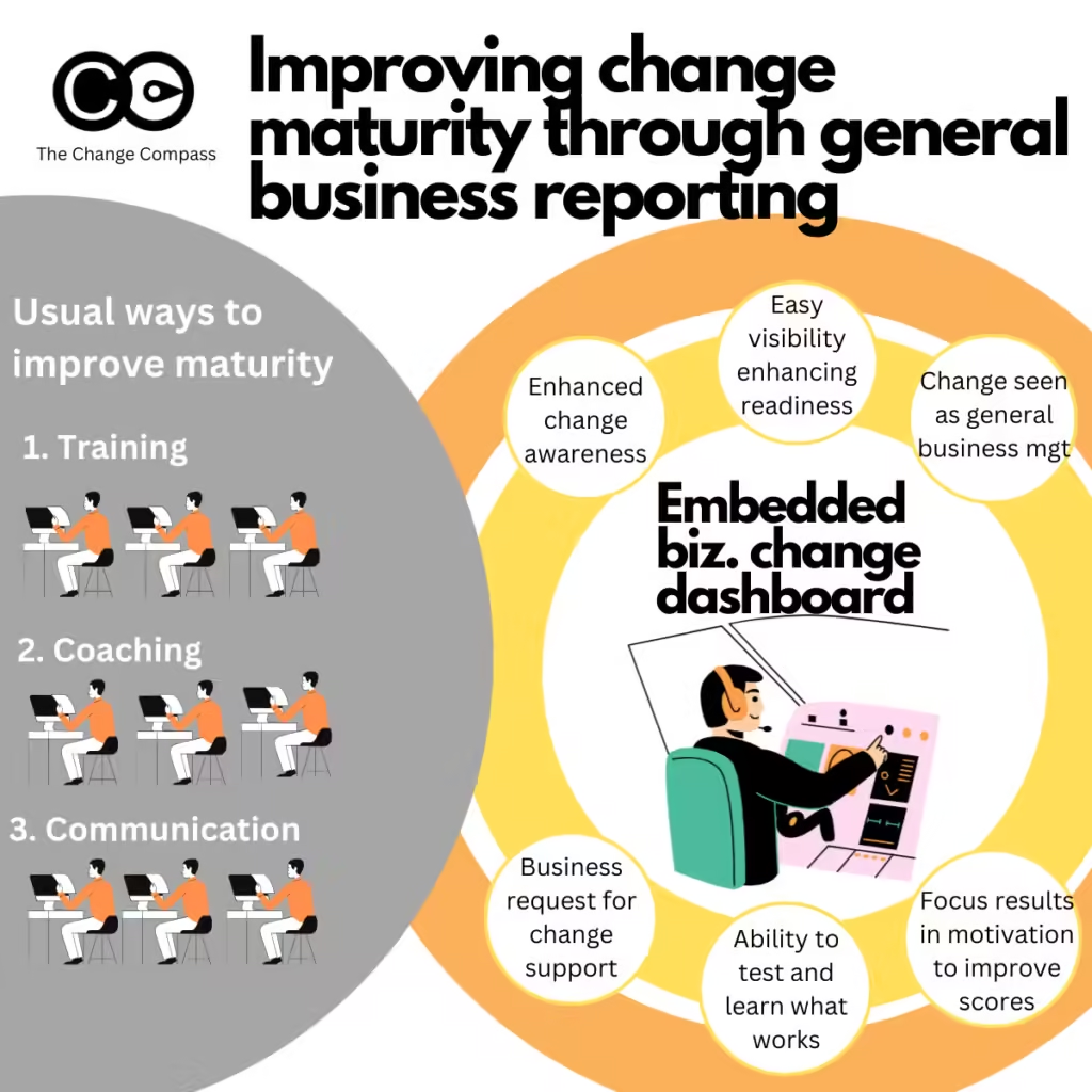
Change management Maturity: Enhancing change management maturity within the business is general done through capability development and coaching. However, this case showcases that embedding change management within general business management is a strategic way to raise awareness, visibility, and through this enhance the business’ efforts to improve the management of change.
This case study illustrates how a large financial services corporation successfully embedded change management reporting into its general business reporting framework. By engaging senior leadership, collaborating with data teams, and standardising metrics, the organisation not only improved its reporting capabilities but also fostered a culture that values proactive engagement with change initiatives. As a result, the firm is better positioned to navigate future changes while ensuring that it meets regulatory demands and capitalizes on technological advancements.
Measuring change is no longer a nice to have. It’s a must-have for a lot of organisations. A lot of stakeholders are now demanding to see and understand what is happening in the world of change. With the enhanced volume of change and therefore the increased investment made by the organisations, it’s no wonder.
Why are stakeholders demanding to see change data?
When we look across the room amongst the various disciplines, data forms an integral part of any function. Finance – tick. HR – tick, yes pretty much all aspects of people are tracked and reported. Operations – tick, as we have all types of performance KPIs and efficiency indicators. Technology – tick, since every part of technology can easily be measured and reported. Marketing – tick, as marketing outcomes are tied to revenue and customer sentiments.
With Covid it is even more the case that data is integral. We can no longer ‘walk the factory’ to sense what is happening. To see what is happening and what is going to happen stakeholders revert to data. In our virtual working environment, stakeholders require a constant dashboard of data to track how things are progressing.
Why is measuring change not an activity?
In the past it used to be that measuring change is only something you do in a project when you want to see if stakeholders are ready for the change. No more. Most organisations have a multitude of changes running concurrently. There is no choice to select 1 or 2 changes to roll out. With significant business challenges, most organisations are finding that running with multiple changes is the norm.
With multiple changes, increased stakeholder demands and appetite, measuring change is no longer just an activity. Measuring change takes a set of structured routines. It requires effective governance design. It takes experience and analytical expertise. Most of all, it is not a once-off event, it is a continual building of organisational muscle and capability. We are heading into the world of change analytics capability.
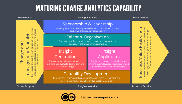
What is change analytics capability and how do I attain this?
Here are 7 core components of building and maturing change analytics capability:
1. Establishing change data management procedures and practices
This is about setting up the right steps in place so that change data can be identified, collected, and documented. This includes identifying the types of change data you would like to collect and how to go about collecting them. It will be easier to start with the core set of data required and then build from these as needed. This will reduce the risk of overwhelming your stakeholders.
After the right metrics and collection channels have been identified then it’s about building the regular routines to collect and document the metrics.
2. Sponsorship and leadership of change analytics
To really reap the value of change analytics you will need to gain the blessing and sponsorship of your leaders. Well, at least in time. In the beginning, you may need some time to come up with compelling data that tell the story that you want them to before you show your leaders. Eventually, without strong leadership buy-in, change data will not be effectively leveraged to make business decisions.
Getting your leaders’ blessing isn’t just a verbal exercise. It means that they are signing-up to regularly review, discuss and utilise change data to realise business value.
3. Build talent and organisation to support change analytics
Think about the various stakeholders and what you need them to understand in terms of change data. The way you educate stakeholders will be different to how you educate operations managers or the PMO. Plot out how you plan to help them get familiar with change data. Do you need particular roles to support data analysis? Is it a Change Analyst who is focused on the regular upkeep and consolidation of change data? What roles do you need other team members to play?
4. Insight generation
With a full set of change data infront of you, it’s now time to dive into them to generate insights. What is the data telling you? How do they support other data sources to form a clear picture of what is happening in the workforce? Is the data accurate and updated? Generating insights from the data takes skills and experience. It takes the ability to integrate different sources of data outside of change data themselves.
5. Insight application
This is about setting up the right routines and processes so that any insights generated may be discussed and applied. It could be through various governance forums, leadership or planning meetings that insights are shared and socialised. An integral part of this step is applying the insight by making business decisions. For example, do we delay the initiative roll out or invest more to support leaders? Are there reasons for us to speed up roll out to support the workforce?
6. Change analytics capability development
Change analytics is a capability.
With good change data emerging, you also need to have the right people with the right skills to collect, process and interpret the data. You may also want to think about which teams need what analytical skills. Do you have people in the team who are sufficiently analytical and data-oriented? Do they know how to interpret the data to form trends and predictions?
You may want to think about organising capability sessions or training to strengthen data analysis skills. Are there members in the different governance bodies that need support to be more confident in using change data?
7. Realising business value through change analytics
The last part of the equation is realising business value through change analytics. This is about tracking and documenting the value realised through using change analytics. It could include incidents where the business decision made has lead to significant risk reduction or operations protection. It could be enhanced leadership confidence mitigating risks in negative customer experience. Tracking value generated is critical to make clear to stakeholders the value of the overall investment.
If you found this article useful please share.
Do you have questions on measuring change for your organisation? Ping us on our chat.
A 2025 Gartner report found that fewer than 25% of organisations have moved beyond basic reporting when it comes to their change management data. Most change teams still rely on spreadsheets, survey snapshots, and anecdotal updates to communicate progress. Yet the same organisations invest heavily in analytics for marketing, finance, and operations. The gap is striking, and it is costing organisations real money in failed adoption, duplicated effort, and invisible change saturation.
Building a genuine change analytics capability is not about buying a dashboard tool and hoping people use it. It is about developing the people, processes, and data foundations that allow your change function to move from reactive reporting to predictive insight. This guide walks through a practical, stage-by-stage approach to building that capability, drawn from patterns observed across enterprise change teams in financial services, government, and large-scale technology transformations.
Why most change teams stall at the reporting stage
There is a critical difference between reporting and analytics, and most change functions confuse the two. Reporting tells you what happened: how many people attended the training, how many communications were sent, what the survey scores were. Analytics tells you what it means: which teams are at risk of adoption failure, where change saturation is building to dangerous levels, and which initiatives are competing for the same audience at the same time.
The reason most teams stall is structural, not technical. They lack three things simultaneously:
A data model that connects change activities to business outcomes rather than tracking them in isolation
An analytical mindset in the team, where practitioners ask “what does this pattern mean?” rather than “what number do the stakeholders want to see?”
A governance structure that makes data collection systematic rather than project-by-project
Until all three are in place, even sophisticated tools produce shallow outputs. A heat map without a data model behind it is just a coloured spreadsheet. A survey without an analytical framework is just a snapshot that tells you nothing about trajectory.
The four stages of change analytics maturity
Based on work across dozens of enterprise change functions, a clear maturity progression emerges. Understanding where your organisation sits on this continuum is the first step toward building capability intentionally rather than haphazardly.
Stage 1: Ad hoc reporting
At this stage, each project or initiative tracks its own metrics in its own way. There is no consistency in what gets measured, how it is collected, or how it is reported. Change managers produce PowerPoint slides with status updates, traffic-light ratings, and anecdotal commentary. The data is retrospective and rarely influences decisions.
You know you are here if your change reporting could be summarised as “things are on track” or “things are at risk” with little quantitative evidence behind either statement.
Stage 2: Standardised measurement
The team has agreed on a common set of metrics and a consistent approach to collecting them. This might include standardised impact assessments, consistent survey instruments, or a shared taxonomy for categorising change types. Data is still largely backward-looking, but it is now comparable across initiatives.
The hallmark of this stage is the ability to answer: “How does initiative A compare to initiative B in terms of employee impact?” If you cannot answer that question with data, you are still in Stage 1.
Stage 3: Integrated analytics
At this stage, change data is connected to other enterprise data sources. You can overlay change impact data with HR data (attrition, engagement scores, absenteeism), project data (timelines, milestones, budget), and operational data (productivity metrics, error rates, customer satisfaction). This is where the real analytical power begins.
A 2023 McKinsey analysis of organisational performance found that companies integrating people analytics with operational data were 2.5 times more likely to outperform peers on financial metrics. The same principle applies to change analytics: integration is what turns reporting into insight.
Stage 4: Predictive and prescriptive capability
The most mature change functions use their data not just to explain what happened, but to predict what will happen. They can model the likely impact of adding a new initiative to an already saturated portfolio. They can identify which business units are approaching adoption fatigue before it manifests in survey scores. They can quantify the productivity cost of overlapping go-lives and present scenario-based alternatives to the portfolio steering committee.
Reaching Stage 4 typically requires 18 to 24 months of sustained investment in data infrastructure, team capability, and stakeholder education. But even partial progress from Stage 1 to Stage 2 delivers measurable improvements in decision quality.
Building the foundation: your change data model
Before investing in tools or training, you need a data model that defines what you will measure, how entities relate to each other, and what questions the data should answer. A robust change data model typically includes five core entities:
Initiatives: the programmes, projects, and BAU changes flowing through the organisation, with attributes for type, size, timing, and strategic alignment
Impacts: the specific changes each initiative imposes on people, categorised by type (process, technology, role, policy, behaviour), intensity, and timing
Audiences: the teams, business units, roles, and locations affected by each impact, with enough granularity to identify overlap and accumulation
Interventions: the change activities delivered (training, communications, coaching, support), linked to specific impacts and audiences
Outcomes: adoption metrics, readiness scores, business performance indicators, and qualitative feedback that track whether the change is landing
The relationships between these entities are what make the model powerful. When you can trace a line from a strategic initiative through its individual impacts to the specific teams affected, and then through the interventions delivered to the adoption outcomes achieved, you have a data model capable of supporting real analytics.
Most organisations attempt to build this model in spreadsheets, which works at small scale but collapses under the weight of a real enterprise portfolio. A Prosci study on organisational change capability identified that teams using purpose-built change management platforms were significantly more likely to sustain their analytics capability over time compared to those relying on generic tools.
Developing analytical skills in your change team
A data model without people who can interpret it is useless. And here is the uncomfortable truth: most change practitioners were not trained in data analysis. Their backgrounds are in communications, psychology, HR, or project management. Asking them to suddenly think in terms of correlation, trend analysis, and statistical significance is unrealistic without deliberate investment.
The good news is that you do not need data scientists. You need practitioners who develop what might be called “analytical fluency”: the ability to look at change data and ask the right questions, spot meaningful patterns, and translate findings into stakeholder language.
Practical steps to build this fluency include:
Data storytelling workshops: Teach the team to construct narratives from data rather than presenting raw numbers. A chart showing change saturation by business unit is data. A narrative explaining why the operations team is at risk of adoption failure because three major initiatives overlap in Q3, and what to do about it, is insight.
Paired analysis sessions: Pair a change practitioner with someone from the data or business intelligence team for regular analysis sessions. The change practitioner brings domain knowledge; the analyst brings technical skill. Over time, both learn from each other.
Hypothesis-driven reviews: Replace status update meetings with hypothesis-driven discussions. Instead of “here is what happened this month,” start with “we hypothesised that the new process rollout would see higher adoption in teams with dedicated change champions. Here is what the data shows.”
Benchmark libraries: Build an internal library of benchmarks from past initiatives. How long does adoption typically take for a technology change versus a process change? What survey scores at the three-month mark predict successful adoption at twelve months? These benchmarks become the foundation for predictive capability.
A 2024 HR Grapevine analysis on people analytics maturity found that the biggest barrier to analytics adoption was not technology but the gap between available data and the ability of HR and change professionals to use it meaningfully. Investing in skill development pays off faster than investing in tools.
Embedding change analytics into governance and decision-making
The final, and often most difficult, step is making sure that change analytics actually influences decisions. Too many organisations build the capability, produce the reports, and then watch as steering committees ignore the data and make politically driven decisions anyway.
Embedding analytics into governance requires three structural changes:
First, change data must be a standing agenda item in portfolio governance meetings. Not an optional appendix, not an “if we have time” discussion, but a required input to every major decision about initiative timing, sequencing, and resourcing. When the portfolio steering committee debates whether to bring forward a new initiative, the change analytics view of current saturation, team capacity, and cumulative impact should be presented alongside the financial business case.
Second, define trigger thresholds that mandate action. Establish clear thresholds: if change saturation in a business unit exceeds a defined level, new initiatives targeting that unit require additional justification and mitigation plans. If adoption metrics fall below a target at a defined milestone, the initiative enters a remediation process. These triggers take analytics out of the advisory space and into the operational space.
Third, report outcomes, not just activities. Senior leaders quickly tune out reports about how many training sessions were delivered or how many communications were sent. They engage when you show them the relationship between change interventions and business outcomes: the correlation between structured change support and faster time-to-competency, or the measurable productivity impact of overlapping go-lives on frontline teams.
According to Gartner’s 2026 change management trends report, organisations that embed data-driven decision-making into their change governance frameworks see 40% higher success rates in complex transformation programmes compared to those relying on qualitative assessment alone.
How digital change tools accelerate analytics capability
Building a change analytics capability does not require starting from scratch. Purpose-built digital change management platforms like The Change Compass provide the data model, collection mechanisms, and visualisation layers that would take months to build manually. They standardise how impacts are assessed, connect initiatives to affected audiences, and generate portfolio-level views that make saturation and overlap immediately visible. For teams moving from Stage 1 to Stage 2, a dedicated platform can compress the journey from years to months by removing the infrastructure burden and letting the team focus on developing their analytical skills.
Where to start this week
If you are reading this and recognising your organisation in Stage 1, here is a practical starting point. Do not try to build everything at once. Pick one initiative currently in flight and apply a structured approach: map its impacts by audience, measure adoption using consistent criteria, and present the findings as a narrative to your steering committee. Use that single case to demonstrate the difference between reporting and analytics. Once stakeholders see what is possible, the conversation about investing in broader capability becomes much easier.
The organisations that build genuine change analytics capability do not do it by accident. They invest deliberately in data models, in their people’s analytical skills, and in governance structures that make data a required input to decisions. The payoff is a change function that can see around corners, anticipate problems before they escalate, and demonstrate its value in the language that senior leaders actually care about: business outcomes.
Frequently asked questions
What is change analytics capability?
Change analytics capability is an organisation’s ability to systematically collect, analyse, and act on data related to change initiatives. It goes beyond basic reporting to include trend analysis, predictive modelling, and data-driven decision-making about how change is planned, sequenced, and delivered across the enterprise.
How long does it take to build change analytics capability?
Moving from ad hoc reporting to standardised measurement typically takes three to six months with focused effort. Reaching integrated analytics, where change data connects to HR and operational data, usually requires 12 to 18 months. Full predictive capability can take two years or more, depending on data infrastructure and team skill levels.
Do I need a data scientist on my change team?
Not necessarily. What you need is analytical fluency: the ability to interpret data patterns, construct hypotheses, and translate findings into actionable recommendations. Pairing change practitioners with existing business intelligence or data teams is often more effective than hiring dedicated data scientists into the change function.
What tools do I need for change analytics?
The most important tool is a consistent data model, not software. That said, purpose-built change management platforms significantly reduce the effort required to collect, structure, and visualise change data. Generic tools like spreadsheets work at small scale but become unmanageable for enterprise portfolios with dozens of concurrent initiatives.
How do I convince senior leaders to invest in change analytics?
Start with a single compelling example. Take one initiative where you can show the relationship between change data and a business outcome, such as how structured adoption support reduced time-to-competency by a measurable amount, or how overlapping go-lives correlated with a spike in customer complaints. One concrete case study is more persuasive than any slide deck about the theoretical value of analytics.
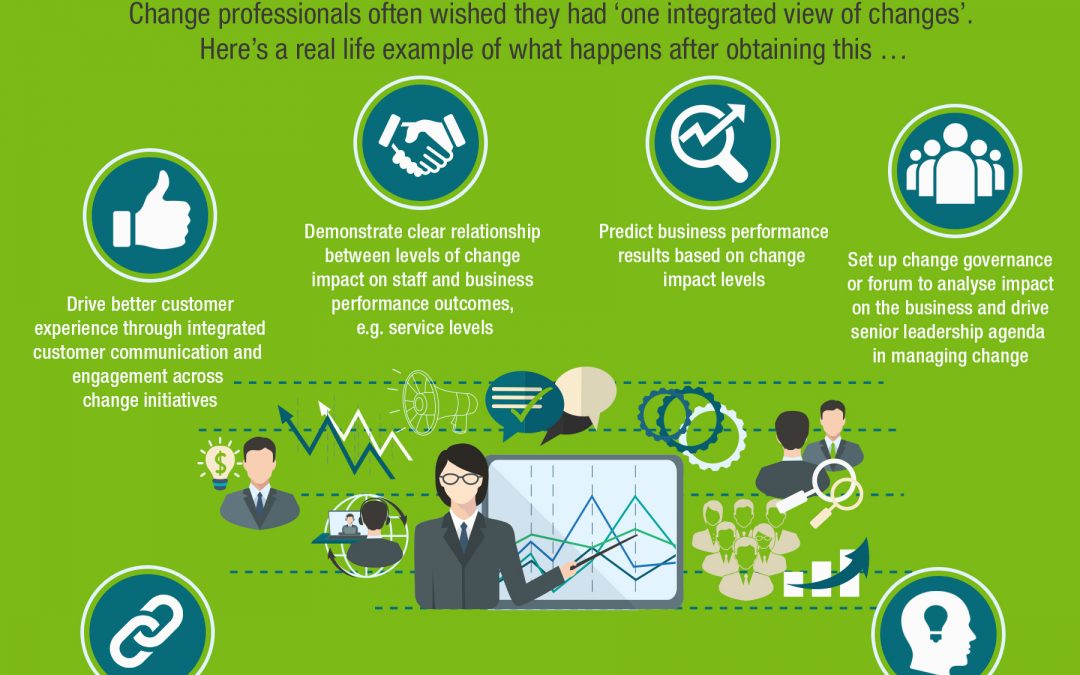
For years, the holy grail of enterprise change management has been “one view of change”: a consolidated, real-time picture of every initiative landing across the organisation, who it affects, when, and how intensely. Many teams pursue this for months or even years, fighting for data, standardising taxonomies, and building relationships with programme managers who would rather not share their timelines. Then, finally, they get it. The single view exists. The portfolio is visible. And the immediate reaction from most teams is: “Now what?”
This is the part nobody writes about. Achieving visibility is a milestone, not a destination. The real value of a single view of change only materialises when the organisation learns to use it: to make different decisions, to govern portfolios more actively, and to protect employee capacity in ways that were previously impossible. This article explores what happens after you achieve a single view of change, the capabilities it unlocks, and the mistakes that can undermine it.
Why visibility alone does not change anything
The first uncomfortable truth is that having a single view of change does not automatically lead to better outcomes. It is possible, and surprisingly common, for an organisation to build an impressive portfolio view and then continue making decisions exactly as it did before: politically, reactively, and without reference to cumulative employee impact.
This happens because visibility is a necessary condition for good portfolio governance, but not a sufficient one. Three additional ingredients are required:
Decision rights: Someone must have the authority to act on what the data shows, including the authority to delay, reschedule, or descope initiatives when saturation thresholds are breached
Decision triggers: The organisation needs predefined thresholds that mandate review, not just dashboards that people can choose to ignore
Decision cadence: Portfolio reviews must happen frequently enough to be relevant. A quarterly review is too slow for most enterprise portfolios where timelines shift weekly
A Planview analysis of strategic portfolio management found that only 13% of organisations had achieved high effectiveness across all three attributes of strategic portfolio management: visibility, alignment, and adaptability. Most had visibility but lacked the governance structures to translate it into action.
The five capabilities a single view of change unlocks
When an organisation genuinely learns to use its single view of change, it gains access to capabilities that were previously impossible. These are not theoretical advantages; they are specific, observable shifts in how the change function operates.
1. Cumulative impact analysis
For the first time, you can see the total load of change landing on any given team, role, or location across all initiatives. This is fundamentally different from looking at each initiative in isolation. A single system upgrade might look manageable. But when you overlay it with the process redesign, the organisational restructure, and the regulatory compliance programme all hitting the same operations team in the same quarter, the picture changes dramatically.
Cumulative impact analysis allows you to move from “is this initiative ready?” to “can this team absorb one more change right now?” That is a far more useful question.
2. Proactive sequencing and scheduling
With a portfolio view, you can identify scheduling conflicts before they happen. If two major go-lives are planned for the same business unit in the same month, you can raise the issue six weeks in advance rather than discovering it in a post-implementation review. The value here is not just avoiding collisions; it is creating a rational basis for sequencing conversations that were previously driven by whoever had the loudest sponsor.
3. Scenario modelling for new initiatives
When a new initiative is proposed, you can model its impact on the existing portfolio before committing resources. What happens if we launch in Q2 versus Q3? Which teams would tip into saturation? What if we phase the rollout by region rather than going organisation-wide? These are questions that can only be answered with a populated portfolio view, and they fundamentally change the quality of business case discussions.
4. Evidence-based stakeholder engagement
Senior leaders respond to data they cannot argue with. A single view of change provides that. When you can show the CTO that the technology team is absorbing impacts from seven concurrent initiatives, and that the data predicts adoption risk will peak in six weeks, you are having a fundamentally different conversation than “the team seems overwhelmed.” The specificity and evidence base of a portfolio view changes the nature of stakeholder engagement from persuasion to problem-solving.
5. Trend analysis and organisational learning
Over time, a maintained portfolio view becomes a historical record. You can analyse patterns: which types of changes consistently take longer to adopt? Which business units recover fastest from saturation peaks? What level of concurrent change correlates with attrition spikes? This kind of organisational learning is impossible without longitudinal data, and it transforms the change function from reactive support to strategic advisory.
The governance shifts required to make it work
Achieving a single view of change requires data and tooling. Making it useful requires governance reform. Here are the specific structural changes that distinguish organisations that merely have visibility from those that use it effectively.
Establish a change portfolio authority. Someone, whether a change portfolio manager, a transformation office lead, or a governance committee, must have the explicit mandate to review portfolio-level data and make recommendations about initiative timing, sequencing, and resource allocation. Without this authority, the single view becomes a reporting artefact rather than a decision-making tool.
Build change data into initiative approval gates. Before any new initiative receives funding or resources, the portfolio impact assessment should be a mandatory input. This means the business case template includes a section on cumulative impact to affected teams, and the approval committee reviews this alongside financial and strategic criteria.
Create escalation triggers based on saturation thresholds. Define what “too much change” looks like for your organisation. This will vary by industry, workforce composition, and change maturity. But the principle is consistent: when a team’s cumulative impact score crosses a defined threshold, a review is automatically triggered. This takes the decision out of subjective judgement and into a structured process.
A 2025 Smartsheet report on enterprise project portfolio management found that 92% of professionals said adapting to organisational change is difficult, and organisations with defined, repeatable governance processes were far more likely to adapt quickly when conditions shifted.
Common mistakes after achieving a single view of change
Having worked with dozens of organisations that have built portfolio visibility, a consistent set of mistakes emerges in the first six to twelve months. Knowing these in advance can save you from repeating them.
Overloading the view with detail. The temptation is to capture everything: every micro-change, every communication, every training session. This creates noise that obscures the signal. Your single view should focus on changes that materially affect people’s day-to-day work, not every email update or optional webinar.
Treating the view as a static report. A portfolio view that gets updated monthly is already outdated. Effective organisations treat it as a living system that updates as timelines shift, new initiatives are approved, and adoption data comes in. If your single view is a quarterly PDF, you are missing most of its value.
Failing to maintain data quality. The view is only as good as its inputs. If project managers stop updating their timelines, or if new initiatives are approved without being added to the portfolio, the view degrades quickly. Data governance is not a one-time setup; it requires ongoing discipline and clear accountability for who updates what, and when.
Using visibility for blame instead of planning. When the portfolio view reveals that a team is overwhelmed, the correct response is “how do we help?” not “whose fault is this?” If stakeholders feel the data will be used punitively, they will stop contributing to it. The fastest way to kill a single view of change is to weaponise it.
A practical roadmap for the first 90 days after going live
If your organisation has recently achieved a single view of change, or is close to it, here is a structured approach to making it operationally useful within the first quarter.
Days 1 to 30: validate and socialise
Spend the first month validating the data with initiative owners. Walk each major programme team through the portfolio view and confirm that their timelines, impacts, and affected audiences are accurate. This serves two purposes: it improves data quality, and it builds ownership. When programme managers see their initiative in context alongside everything else hitting their stakeholders, they become allies rather than resistors.
Days 31 to 60: identify and act on quick wins
Look for obvious scheduling conflicts or saturation hotspots and bring them to the relevant governance forum. You want an early success story: an instance where the portfolio view identified a risk that would have been missed, and the organisation took action to mitigate it. This builds credibility for the approach and creates demand for more portfolio-level insight.
Days 61 to 90: embed into governance
Work with the transformation office or portfolio governance committee to make the change portfolio review a standing agenda item. Present the first trend analysis: what has changed in the portfolio over the past two months? Where has impact increased or decreased? Which teams have moved from amber to red? This establishes the rhythm of data-driven portfolio governance.
How digital change platforms sustain the single view
Maintaining a single view of change manually, in spreadsheets or slide decks, is possible at small scale but unsustainable for organisations managing more than a handful of concurrent initiatives. Purpose-built platforms like The Change Compass are designed to maintain the single view as a living system: automatically aggregating impact data across initiatives, visualising cumulative load by team and time period, and enabling the scenario modelling and threshold-based alerts that make governance actionable rather than theoretical.
The shift that matters most
Achieving a single view of change is a significant accomplishment, but it is the beginning of a capability journey, not the end. The organisations that extract the most value from their portfolio visibility are those that pair it with clear decision rights, defined saturation thresholds, and a governance cadence that forces regular engagement with the data. Without these structures, even the most comprehensive portfolio view sits unused.
The real measure of success is not whether you can see all the change happening across your organisation. It is whether that visibility leads to different, better decisions about how change is planned, sequenced, and delivered. That is the life after one view of change, and it is where the work truly begins.
Frequently asked questions
What is a single view of change?
A single view of change is a consolidated, real-time picture of all change initiatives across an organisation, showing who they affect, when impacts land, and how intensely. It enables portfolio-level analysis of cumulative employee impact rather than viewing each initiative in isolation.
How long does it take to build a single view of change?
With a purpose-built platform, a usable portfolio view can be established in four to eight weeks for a mid-sized portfolio. Manual approaches using spreadsheets typically take three to six months and are harder to maintain over time. The data collection and stakeholder engagement are usually more time-consuming than the technical setup.
What happens if we build a single view but leadership ignores it?
This is common and usually stems from the view not being embedded into governance processes. The solution is to make portfolio data a mandatory input to initiative approval gates and steering committee agendas, rather than an optional report. Starting with one compelling example of a risk the view identified can build executive buy-in.
Can a single view of change work across different methodologies?
Yes. Organisations running a mix of waterfall, agile, and hybrid programmes can still build a single view by focusing on the common denominator: the impact on people. Regardless of delivery methodology, every initiative creates change impacts that affect specific teams at specific times. The portfolio view aggregates these impacts, not the project plans.