Most change management teams can tell you what activities they completed. Very few can tell you what difference those activities made. According to Prosci’s research on metrics for measuring change management, 76% of organisations that measured compliance and overall performance met or exceeded project objectives, compared to just 24% that did not measure at all. Yet the same research found that 40% of respondents could not align on goals and objectives, and 29% struggled to identify appropriate KPIs.
This gap represents one of the most significant missed opportunities in organisational change management. When you measure change properly, you do not just track progress, you fundamentally alter how decisions get made, how resources get allocated, and how the organisation learns from each transformation.
This guide walks through a practical framework for measuring change management outcomes: from selecting the right metrics, to designing dashboards that drive action, to presenting findings that influence senior leaders. Whether you are building a measurement capability from scratch or refining an existing approach, the principles here will help you move from activity tracking to genuine outcome measurement.
Why most change measurement efforts fall short
The problem is not that organisations refuse to measure change. The problem is that they measure the wrong things, or measure the right things too late.
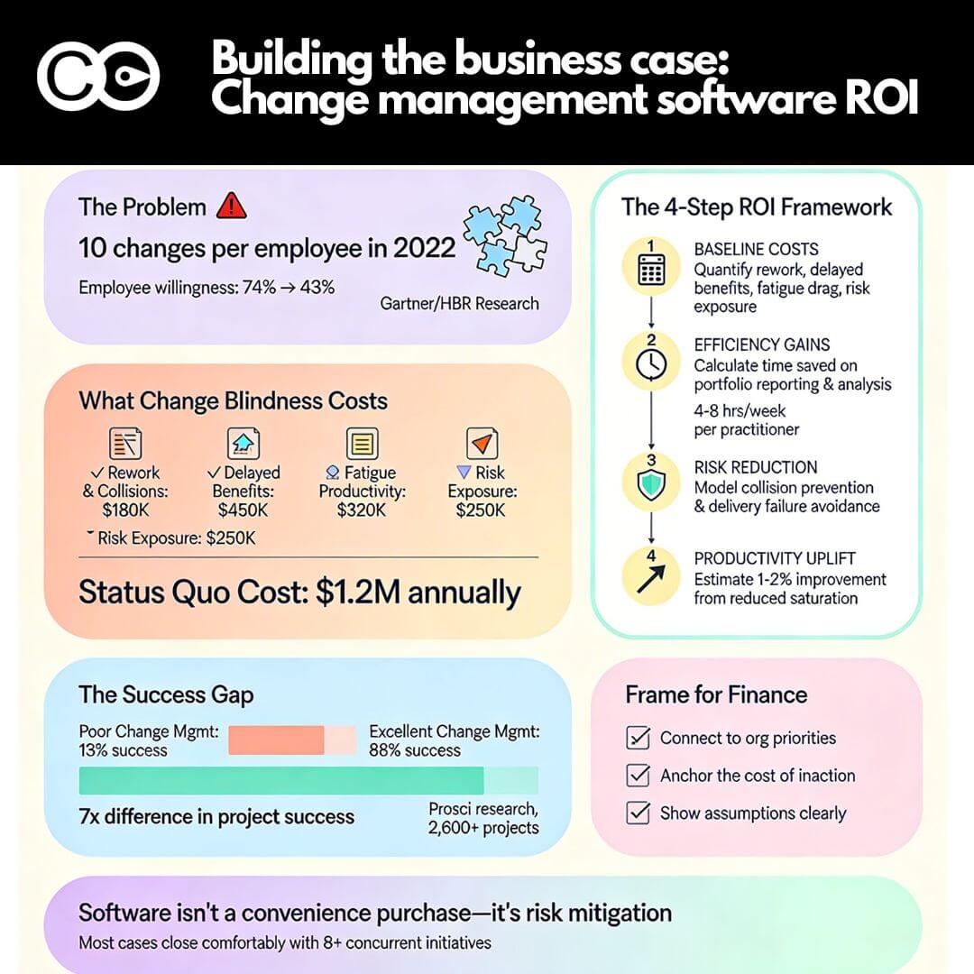
Prosci’s benchmarking data on the correlation between change management and project success makes the case unequivocally: 88% of projects with excellent change management met or exceeded their objectives, compared to just 13% with poor change management. That is a sevenfold difference in outcomes. The difference is not effort, it is focus.
Common measurement traps to avoid
Most measurement failures fall into one of three categories:
- Activity metrics masquerading as outcomes. Counting the number of training sessions delivered or communications sent tells you nothing about whether people changed their behaviour. These metrics are easy to collect, which is precisely why teams default to them.
- Measuring too late. Waiting until post-implementation to assess adoption means you have no opportunity to course-correct. By the time the data confirms a problem, the project team has moved on.
- Measuring without a baseline. If you did not capture how things worked before the change, you cannot credibly demonstrate improvement afterward. Establishing baselines is boring work, but it is the foundation of every meaningful measurement.
The measurement framework below addresses each of these traps systematically.
A seven-step framework for measuring change outcomes
This framework has been refined through work with large enterprises across financial services, government, and telecommunications. It is designed to be practical, not academic.
Step 1: Define what “success” looks like before you start
Before selecting any metrics, align with your project sponsor on what a successful change outcome looks like. This sounds obvious, but it is skipped remarkably often. Ask three questions:
- What behaviour change do we need to see?
- By when?
- How will we know it has happened?
Document these answers. They become your measurement anchor.
Step 2: Select metrics across three levels
Effective change measurement operates at three levels, and you need metrics at each:
- Leading indicators track early signals of adoption: attendance at training, login rates for new systems, manager conversations completed. These tell you if the change is gaining traction.
- Adoption indicators track whether people are actually using the new processes, systems, or behaviours: feature utilisation rates, process compliance percentages, error rates in new workflows.
- Impact indicators track whether the change is delivering its intended business outcomes: productivity gains, cost reductions, customer satisfaction shifts, revenue impact.
A common mistake is overloading the leading indicator level and neglecting adoption and impact. Aim for 2-3 metrics at each level, not 15 metrics scattered across all three.
Step 3: Establish baselines
For every metric you select, capture the current state before the change is implemented. If quantitative data is not available, use structured qualitative baselines: stakeholder sentiment surveys, capability self-assessments, or observation checklists.
Step 4: Build a measurement cadence
Decide when each metric will be collected and reported. A practical cadence for most enterprise changes:
- Leading indicators: weekly during active implementation
- Adoption indicators: fortnightly for the first 3 months, then monthly
- Impact indicators: monthly, starting 4-6 weeks after go-live
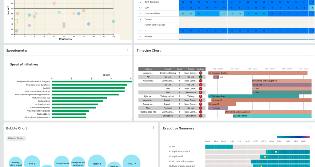
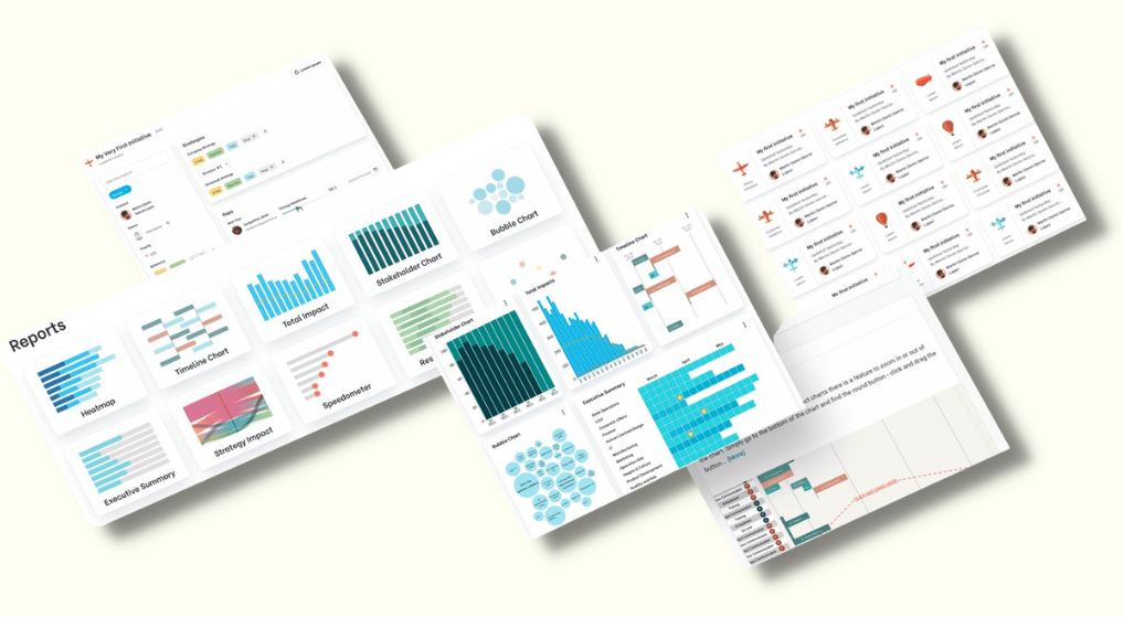
Step 5: Design dashboards that drive decisions
This is where most measurement efforts succeed or fail. A dashboard that presents data is not the same as a dashboard that drives action.
Effective change dashboards follow four principles:
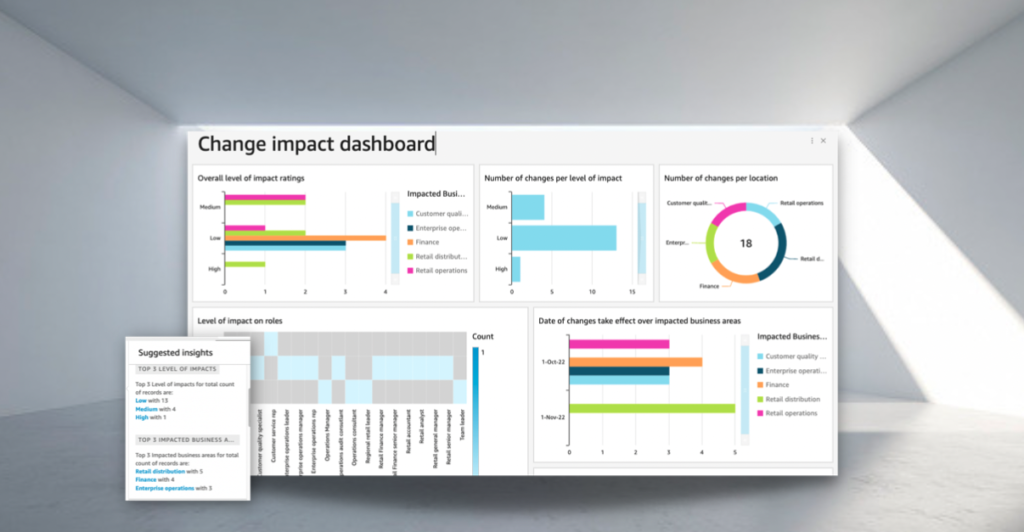
- Focus ruthlessly. Include only the metrics that matter for decision-making. If a metric does not trigger a specific action when it moves, remove it.
- Make the story obvious. Use visual formats your audience can understand in seconds: traffic light indicators for progress, trend lines for trajectory, and comparison bars for benchmarking.
- Enable drill-through. Senior leaders want the headline. Middle managers want the detail. Build dashboards that allow both, ideally with a single summary view and clickable drill-downs into business units or stakeholder groups.
- Balance quantitative and qualitative. Numbers without narrative are as dangerous as narrative without numbers. Include 2-3 qualitative insights alongside the data in every dashboard view.
Step 6: Translate data into recommendations
Presenting data is not enough. Your audience needs to understand what the data means and what they should do about it.
The strongest approach follows a deductive chain: observation leads to interpretation, interpretation leads to recommendation. For example:
The Finance team shows 42% training completion against a target of 80%, with engagement survey scores declining over the past two weeks. This suggests the current training schedule is not accommodating Finance’s month-end workload. Recommendation: reschedule remaining Finance training sessions to weeks 2-3 of the month and add a 15-minute manager briefing to address engagement concerns.
Every recommendation should be specific, time-bound, and assigned to a named owner.
Step 7: Build governance around measurement
Change measurement should not live in a standalone report that gets emailed once a month. Integrate your metrics into existing governance forums: steering committees, programme boards, leadership stand-ups.
Build stakeholder capability over time. The first few presentations may require extensive explanation. By month three, your audience should be able to read the dashboard independently and ask informed questions. For a practical guide on how to design dashboards that senior leaders actually engage with, see our guide on designing a change adoption dashboard.
How AI and analytics are reshaping change measurement
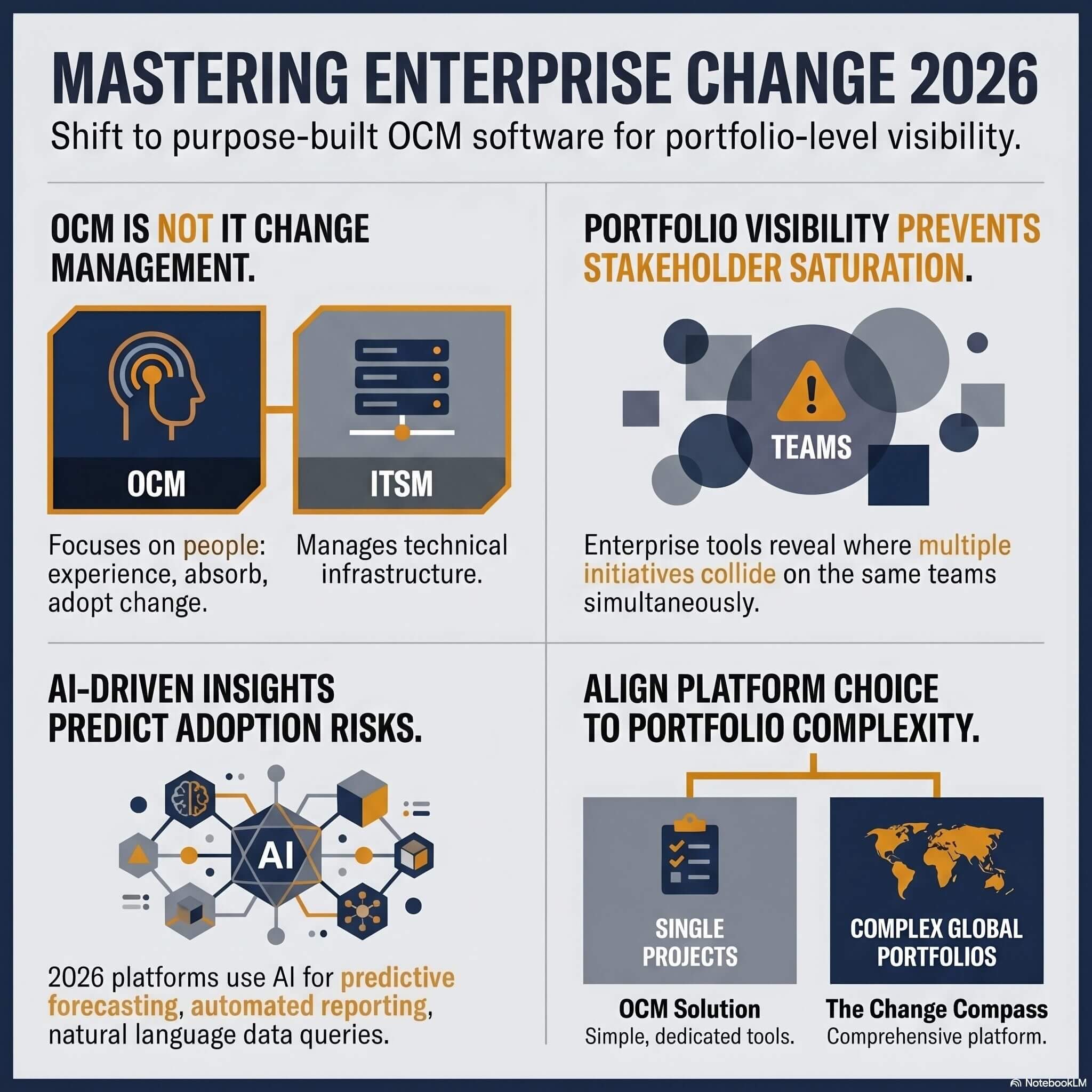
The change measurement landscape is shifting rapidly. Where practitioners once relied on manual surveys and spreadsheet-based dashboards, modern change management platforms now offer real-time analytics, predictive modelling, and automated insight generation.
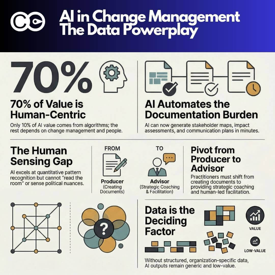
Prosci’s research on AI in change management found that while only 39% of change practitioners currently use AI in their work, those who do report significantly increased efficiency, faster response times, and better workload management. Meanwhile, a March 2026 Gartner study found that teams redesigning workflows with AI are twice as likely to exceed revenue goals, and that 78% of CHROs agree workflows and roles must change to realise AI’s full value.
Key capabilities that are now available include:
- Real-time adoption tracking. Instead of waiting for monthly survey results, modern tools track system logins, feature usage, and process compliance continuously.
- Predictive saturation analysis. AI models can forecast when a business unit is approaching change saturation based on historical patterns and current load, allowing leaders to adjust sequencing before problems emerge.
- Automated sentiment analysis. Natural language processing applied to employee feedback, support tickets, and collaboration tools provides a real-time pulse on how people are experiencing the change.
- Impact attribution. Advanced analytics can correlate specific change activities with business outcome movements, helping teams understand which interventions actually drove results.
Digital change management tools, such as The Change Compass, bring these capabilities together in a single platform, allowing change teams to move from periodic static reports to continuous, data-driven measurement. Rather than spending days assembling a heat map in a spreadsheet, practitioners can focus on interpreting the data and driving better outcomes. If you are building or upgrading your measurement capability, see how it works in a live demo.
Ensuring data integrity before you present
Before any measurement data reaches a senior audience, it must pass three integrity checks:
- Pattern check. Scan for unusual spikes, drops, or inconsistencies. If training completion jumped from 30% to 90% overnight, something is wrong with the data, not right with the programme.
- Source audit. Confirm that data is being collected consistently across business units. Different definitions of “completion” or “adoption” across teams will undermine the entire dashboard.
- Stakeholder validation. Share preliminary findings with one or two trusted stakeholders before the formal presentation. They will catch errors and context gaps that are invisible to the change team.
Presenting flawed data destroys credibility, and credibility is the change practitioner’s most valuable currency. It is better to present fewer metrics with confidence than a comprehensive dashboard you cannot defend.
Telling the story: from data to influence
The most impactful change measurement presentations follow a consistent structure:
- Summary findings. Open with the headline: are we on track, ahead, or behind? Do not bury this.
- Three key insights. Limit yourself to three themes. Senior leaders cannot absorb more than this in a single session.
- Data-supported reasoning. For each insight, show the specific data that supports it. Use the deductive chain described in Step 6.
- Recommendations with owners. End with specific, assigned actions. “We recommend…” is weak. “Sarah will reschedule Finance training by Friday” is strong.
The goal is not to present a report. The goal is to change a decision.
Measurement is a strategic capability, not an administrative one
Measuring change management outcomes is not an administrative exercise, it is a strategic capability. The organisations that build this capability systematically, using a structured framework with clear metrics at multiple levels, are the ones that consistently deliver better transformation results.
Start with the seven-step framework in this guide. Select metrics at the leading, adoption, and impact levels. Build dashboards that drive decisions, not just display data. And invest in the governance structures that keep measurement embedded in how your organisation manages change.
The question is not whether you can afford to measure change properly. Given that organisations with structured measurement achieve four times the return on their change investment, the question is whether you can afford not to.
Frequently asked questions
What is change management measurement?
Change management measurement is the practice of tracking and evaluating how effectively an organisation manages the people side of change. It involves collecting data on adoption rates, behaviour changes, and business outcomes to assess whether change initiatives are achieving their intended results and to identify where course corrections are needed.
What are the best KPIs for measuring change management?
The most effective KPIs operate at three levels: leading indicators (training completion, communication reach, manager engagement), adoption indicators (system utilisation rates, process compliance, error rates), and impact indicators (productivity metrics, customer satisfaction, cost savings). Select 2-3 metrics at each level rather than tracking everything.
How do you measure change adoption?
Change adoption is measured by tracking whether people are actually using new processes, systems, or behaviours as intended. Common adoption metrics include system login frequency, feature utilisation rates, process compliance percentages, and the ratio of old-process to new-process usage. Combine quantitative data with qualitative feedback for a complete picture.
How often should you measure change management outcomes?
Leading indicators should be tracked weekly during active implementation, adoption indicators fortnightly for the first three months then monthly, and impact indicators monthly starting four to six weeks after go-live. Avoid measuring too infrequently (you miss trends) or too frequently (you create noise).
What is the ROI of change management?
Prosci’s benchmarking data shows that projects with excellent change management are seven times more likely to meet their objectives than those with poor change management (88% vs 13%). Separately, Prosci found that 76% of organisations that measured compliance and overall performance met or exceeded objectives, compared to just 24% that did not measure.
How can AI help measure change management?
AI-powered change analytics tools provide real-time adoption tracking, predictive saturation modelling, automated sentiment analysis, and impact attribution. According to Prosci’s research, practitioners who use AI report significantly improved efficiency and faster response times. Gartner’s 2026 findings show teams redesigning workflows with AI are twice as likely to exceed revenue goals, suggesting that AI-enabled measurement creates a measurable competitive advantage.
References
- Prosci (2022, updated 2025). Metrics for Measuring Change Management. https://www.prosci.com/blog/metrics-for-measuring-change-management
- Prosci (2014, updated 2025). The Correlation Between Change Management and Project Success. https://www.prosci.com/blog/the-correlation-between-change-management-and-project-success
- Prosci (2024, updated 2026). AI in Change Management: Early Findings. https://www.prosci.com/blog/ai-in-change-management-early-findings
- Gartner (2026). Top Change Management Trends for CHROs in the Age of AI. https://www.gartner.com/en/newsroom/press-releases/2026-3-16-gartner-identifies-top-change-management-trends-for-chros-in-age-of-ai
- Harvard Business Review (2023). Employees Are Losing Patience with Change Initiatives. https://hbr.org/2023/05/employees-are-losing-patience-with-change-initiatives