A change readiness assessment is a structured evaluation of how prepared an organisation, a business unit or a specific stakeholder group is to absorb a planned change and sustain new ways of working once the change goes live. It measures more than awareness or training completion. A robust readiness assessment captures historical change capacity, current workload and competing initiatives, leadership commitment, stakeholder sentiment, and the operational conditions that determine whether new behaviours will stick. Results are used to make sequencing, sponsorship and intervention decisions before go-live, not retrospectively. It is the supply-side answer to the demand created by the change portfolio.
Change readiness is one of the most critical, yet often misunderstood, concepts in organisational change management. For many practitioners, it’s been reduced to a series of surveys or assessments, a simple gauge of how “ready” stakeholders feel. But this oversimplification often leads to missed risks, unforeseen barriers, and ultimately, failed initiatives.
What is a change readiness assessment and why is it important?
A change readiness assessment evaluates an organisation’s preparedness for implementing changes, including aspects of organisational culture. It identifies potential obstacles, gauges employee attitudes, and measures overall alignment with new initiatives. This assessment is crucial as it helps leaders strategize effectively, ensuring smoother transitions and higher acceptance rates among employees during the change process.
True readiness requires more than checking a box on perceptions; it’s about strategically evaluating whether the organisation, at every level, is equipped to embrace, execute, and sustain the change. Let’s explore what it takes to reimagine change readiness as a multi-dimensional, evidence-based approach that ties people, processes, and technology into a cohesive readiness framework.
The Myth of the Readiness Survey
Surveys are not inherently bad tools, but they have their limits. Let’s start by looking at why they’ve become synonymous with readiness assessments and the pitfalls they often present.
Why Surveys Dominate
Surveys are appealing because they are quick, scalable, and easy to analyse. A single survey can provide insights into stakeholder sentiment across a large audience, giving change managers a sense of where resistance might lie.
The problem is that surveys capture perceptions, not reality. Stakeholders might report high awareness of a change but lack the detailed understanding required to implement it effectively. Most survey ask if a stakeholder is aware of certain aspects about the project. However, it doesn’t go into the depth in which the level of awareness is what is expected at that phase of the project (to do this a ‘test’ may be required). Similarly, they might feel optimistic about a change initiative but underestimate the challenges involved.
Example of Survey Pitfalls
Consider a large retail chain rolling out a new inventory management system. A readiness survey revealed that 85% of employees were aware of the change, and 75% felt confident they could adapt. However, post-implementation data told a different story:
Less than 50% of employees were actually using the new system correctly.
Misaligned processes between stores caused delays in inventory updates.
Leadership was disengaged, leading to inconsistent enforcement of new practices.
This misalignment occurred because the survey captured what employees thought, not what they could actually do. This just shows knowing may not equate to doing. Being aware, and understanding something does not necessarily translate into behaviour change.
Change readiness is not a one-dimensional measure of sentiment or awareness; it is the alignment of key elements—people, processes, technology, and leadership—toward the successful delivery of a change initiative.
Depending on the initiative the dimensions may also be different since different initiatives may require more or less of the various elements to be successful. For example, if there is a strong behavioural compliance element to the change, then tracking the change readiness process from understanding the why, strong leadership reinforcement, and operational reporting process setup may all critical elements of readiness.
Key Dimensions of Readiness
Leadership ReadinessAre leaders aligned on the vision and goals of the change? Are there different levels of readiness of different leadership levels?
Do they have the skills to lead their teams through uncertainty? What parts of the leadership skills are lacking? Coaching? Communication?
Are they modelling the behaviours required for change adoption?
Employee Capacity and CapabilityDo employees have the skills to adopt new processes or tools?
Can the organisation absorb the change given competing priorities and the context of change efforts? What does the change landscape look like? What about the operational capacity constraints?
Process ReadinessAre operational processes aligned with the new ways of working? Are new processes required being worked on so that the change may be sustained as business-as-usual after Go-Live? Are accountabilities clear for the new or changed processes?
Are dependencies between departments or systems resolved?
Technological ReadinessAre systems and tools tested and reliable?
Are integrations with existing technology functioning as expected?
Sponsorship and GovernanceAre sponsors actively engaged, providing oversight, and removing roadblocks? Or does the sponsor delegate all tasks and not really visible?
Is there a governance structure to monitor progress and address risks? For example, if risks need to be addressed would that decision be made or would the project just continue along?
Cultural/Behavioural ReadinessIs the organisational culture supportive of innovation and adaptability? In a lot of cases the organisation may not be ready, but the assessment needs to be on to what the extent the departments impacted have the capacity to change and adapt. This of course also depends on the quantum of the change.
Are there underlying resistance patterns that need addressing? If so, are they valid feedback regarding how previous changes were planned and executed, or is the negative behaviour inherent in the culture?
Are leaders aligned on the vision and goals of the change? Are there different levels of readiness of different leadership levels?
Do they have the skills to lead their teams through uncertainty? What parts of the leadership skills are lacking? Coaching? Communication?
Are they modelling the behaviours required for change adoption?
Do employees have the skills to adopt new processes or tools?
Can the organisation absorb the change given competing priorities? What does the change landscape look like? What about the operational capacity constraints?
Are operational processes aligned with the new ways of working? Are new processes required being worked on so that the change may be sustained as business-as-usual after Go-Live? Are accountabilities clear for the new or changed processes?
Are dependencies between departments or systems resolved?
Are systems and tools tested and reliable?
Are integrations with existing technology functioning as expected?
Are sponsors actively engaged, providing oversight, and removing roadblocks? Or does the sponsor delegate all tasks and not really visible?
Is there a governance structure to monitor progress and address risks? For example, if risks need to be addressed would that decision be made or would the project just continue along?
Is the organisational culture supportive of innovation and adaptability? In a lot of cases the organisation may not be ready, but the assessment needs to be on to what the extent the departments impacted have the capacity to change and adapt. This of course also depends on the quantum of the change.
Are there underlying resistance patterns that need addressing? If so, are they valid feedback regarding how previous changes were planned and executed, or is the negative behaviour inherent in the culture?
Example of a Strategic Approach
A financial services firm implementing a new risk management framework took a holistic approach to readiness. Instead of relying solely on stakeholder feedback, they:
Conducted leadership alignment workshops to ensure consistency in messaging.
Assessed employee capacity through workload analysis, adjusting timelines to reduce burnout risk. Given the significant focus on risk with multiple initiative items all targeting risk, managing capacity and prioritisation is important.
Simulated new risk-reporting processes to identify and address bottlenecks.
Used tools to analyse training completion rates and correlate them with system usage data.
This approach ensured readiness across all dimensions, reducing post-implementation issues.
Who Determines Readiness? Not Just Stakeholders
Stakeholders play an important role in assessing readiness, but they are not the sole authority. Their feedback is valuable, but it must be balanced with input from project teams, leadership, and objective data sources.
You can take the doctor-patient analogy here. The patient may tell you they are feeling well, however the trained physician may see symptoms that things may not be what they seem. Of course, the patient will need to understand why things may not be as they appear and want the treatment for it to go ahead. However, the physician has the accountability to form a diagnosis and subscribe the treatment. A trained change practitioner is no different and needs to cast a lens taking into account a range of evidence to form an assessment.
Mapping the Required vs. Observed Levels of Readiness
To truly determine readiness, it’s essential to compare the required level of readiness at each phase of a project with the observed level.
Define Required ReadinessWhat specific outcomes must be achieved at this stage? E.g. Awareness level, discussions and briefings about the change at impacted business units, town hall sessions, coaching sessions, etc.
What capabilities, processes, and systems need to be in place?
Assess Observed ReadinessUse surveys, interviews, and observations to gather qualitative data.
Analyse quantitative data from project reports, metrics, and tools.
Identify Gaps and RisksWhere do observed levels fall short of required levels?
What are the risks of proceeding with these gaps?
Develop a Mitigation PlanCollaborate with stakeholders to address critical gaps.
Adjust timelines, allocate resources, gain more leadership presence or provide additional training, refreshers as needed.
What specific outcomes must be achieved at this stage? E.g. Awareness level, discussions and briefings about the change at impacted business units, town hall sessions, coaching sessions, etc.
What capabilities, processes, and systems need to be in place?
Use surveys, interviews, and observations to gather qualitative data.
Analyse quantitative data from project reports, metrics, and tools.
Where do observed levels fall short of required levels?
What are the risks of proceeding with these gaps?
Collaborate with stakeholders to address critical gaps.
Adjust timelines, allocate resources, gain more leadership presence or provide additional training, refreshers as needed.
Example
In a healthcare organisation transitioning to electronic medical records (EMR), required readiness included:
Leadership capable of driving adoption across departments.
Staff proficient in using the new system.
IT support ready to address technical issues.
Observed readiness showed gaps in staff proficiency and IT capacity. The organisation postponed the rollout to provide targeted training and hire additional contract IT staff, avoiding potential disruptions to patient care.
What to Do With Readiness Outcomes
A readiness assessment is only as valuable as the actions it informs. Once gaps are identified, they must drive decisions and interventions to keep the initiative on track.
Turning Insights Into Action
Engage Stakeholders in Decision-Making
Share readiness findings with key stakeholders, including project teams, sponsors, and impacted groups. Align on priorities for closing gaps.
Tailor Interventions to Critical Needs
Focus efforts on the most significant gaps that could derail the initiative. This is a key point since there may be a long list of desirable elements that should be there but are not. Most projects have limited time and resources so you should always focus on the most critical gaps that need addressing.
Monitor Progress Continuously
Readiness is not static. Reassess periodically to ensure interventions are effective. In this way you can also track the ongoing shifts in readiness, hopefully demonstrating that the readiness is increasing closer to the Go-Live.
A manufacturing company preparing to launch a new product line used readiness outcomes to guide their actions:
Leadership Readiness Gap: Conducted intensive coaching sessions with plant managers to align messaging and prepare for likely employee questions and responses.
Process Gap: Piloted the production process in a single plant to refine workflows prior to broader roll out.
Technological Gap: Added two weeks to testing cycles to address system bugs.
These targeted interventions ensured a smoother launch with minimal disruption.
Evidence-Based Readiness: A Balanced Approach
Stakeholder perceptions are important, but they must be balanced with objective evidence. An evidence-based approach combines multiple data sources to provide a more accurate and actionable view of readiness. Prior to Covid, it would be typical to ‘walk the floor’ to get a sense what is happening and actual sentiments on the floor for employees. With a virtual workforce, there are digital means to gage engagement and sentiments.
Key Sources of Evidence
Surveys and InterviewsCapture stakeholder sentiments, concerns, and insights.
Use open-ended questions to uncover nuanced perspectives.
ObservationMonitor real-world behaviours, such as system usage or meeting participation.
Identify gaps between what people say and what they do.
Metrics and ReportsAnalyse training completion rates, system performance, and project milestones. Other metrics may also include operational indicators and reporting.
Leverage digital tools to uncover trends and correlations.
Digital ToolsLeverage corporate social channels such as Yammer to gain overall understanding of potential sentiments and engagement levels.
Project website pages may also be created, with viewership tracked to assess if viewership levels are as anticipated
Use digital survey tools to manage and analyse data
Capture stakeholder sentiments, concerns, and insights.
Use open-ended questions to uncover nuanced perspectives.
Monitor real-world behaviours, such as system usage or meeting participation.
Identify gaps between what people say and what they do.
Analyse training completion rates, system performance, and project milestones. Other metrics may also include operational indicators and reporting.
Leverage digital tools to uncover trends and correlations.
Leverage corporate social channels such as Yammer to gain overall understanding of potential sentiments and engagement levels.
Project website pages may also be created, with viewership tracked to assess if viewership levels are as anticipated
Use digital survey tools to manage and analyse data
Application of Evidence-Based Readiness
A global telecom company implementing an AI-driven customer support platform combined data sources to assess readiness:
Surveys revealed high awareness but low confidence in AI capabilities.
Metrics showed that only 40% of staff had completed required training.
Observations identified resistance among middle managers who feared job displacement.
Using this evidence, the company developed a tailored plan to address resistance, enhance training, and engage leaders as champions of the change.
Overcoming Methodology Constraints
Many change practitioners fall into the trap of rigidly following methodologies, even when they don’t fit the context. While frameworks provide valuable structure, they must be adapted to the unique needs of each initiative.
Guiding Principles for Flexibility
Start with the End in Mind
Focus on the outcomes you need to achieve, not the steps prescribed by a methodology.
Adapt to Organisational Context
Tailor your approach to fit the size, complexity, and culture of the organisation.
Leverage Technology
Use digital tools to enhance traditional methodologies with real-time data and insights.
Example: Adapting Methodologies
A technology company scaling its agile transformation initially followed a rigid methodology that required readiness surveys every six weeks. When resistance from regional teams emerged, the change team shifted to weekly check-ins and introduced agile workshops tailored to each team’s needs.
The Future of Change Readiness
As change initiatives become more complex, traditional readiness assessments will no longer suffice. The future lies in leveraging new technologies, data, and continuous improvement to create a dynamic, real-time view of readiness.
Emerging Trends
Real-Time Dashboards
Track readiness across dimensions in real time, using digital tools to visualize progress. This is especially valuable when the change is complex and helps establish a baseline for future evaluations.
AI-Driven Insights
Use AI to analyse large datasets, uncover patterns, and predict risks. Tools such as Change Automator can help to link different data sources from different systems, run your change readiness surveys, so that you get an integrated holistic lens across the evidence. AI-generated insights can help you uncover trends in the data, especially critical when you have a complex change program with different data sets. You can then easily create and share live dashboards with your stakeholders.
Continuous Assessments
Move from one-time assessments to iterative readiness evaluations throughout the project lifecycle. As you learn more about readiness of your stakeholders, there may be areas that you would want to probe further into subsequently.
Change readiness is not a survey, an assessment, or a methodology step. It’s a strategic, evidence-based process that ensures organisations are truly prepared for change at every level. Especially with complex change, readiness levels may evolve throughout the journey. With each evolution, particular interventions may be required depending on what the evidence is telling us.
By adopting a holistic approach, engaging stakeholders, and leveraging data, change practitioners can move beyond perceptions and drive meaningful, sustainable transformation that will successfully achieve targets.
To read more about using change data to maximise results check out our articles:
What is a change readiness assessment? A change readiness assessment is a structured process for evaluating how prepared an organisation is to implement and sustain a specific change. It examines dimensions including leadership alignment, employee awareness and capability, cultural fit, and operational capacity. Unlike a one-off survey, an effective readiness assessment combines multiple data sources to build an evidence-based picture of where the organisation stands before a change is deployed.
How is change readiness different from change impact assessment? A change impact assessment identifies what will change and who will be affected. A change readiness assessment asks whether the affected groups are prepared for that change. Both are important and complementary. Readiness assessment typically happens after impact assessment, using the impact findings to focus readiness evaluation on the areas of greatest disruption.
When should a change readiness assessment be conducted? Ideally, a readiness assessment should begin before a change is launched and continue at regular intervals throughout implementation. An early assessment (3 to 6 months before go-live) provides a baseline and highlights gaps to address. Follow-up assessments during rollout reveal whether readiness is improving or whether specific groups need additional support.
What are the most important dimensions to assess in a readiness evaluation? The most important dimensions vary by the type of change, but common high-value areas include: leadership readiness (do sponsors have the will and skill to lead this change?), employee awareness (do people understand why the change is happening?), capability readiness (do people have the knowledge and tools to work in the new way?), and cultural readiness (does the existing culture support or resist the intended direction of change?).
How do you act on low readiness scores? Low readiness scores should trigger targeted interventions, not project delays by default. If leadership readiness is low, the focus should be on sponsor coaching and alignment sessions. If employee awareness is low, communication should be accelerated. If capability gaps are the issue, training should be redesigned or supplemented. The value of a readiness assessment is that it allows intervention to be targeted rather than generic.
How to measure change saturation: a practical methodology for enterprise change functions
Most organisations can feel change saturation before they can prove it. Leaders sense that employees are struggling, change managers notice adoption slipping, and business partners start raising concerns about “too much at once.” But when it comes to quantifying the problem, securing executive attention, or making a credible case for adjusting programme sequencing, feeling is not enough.
Measurement changes that dynamic entirely. An organisation that can measure change saturation can demonstrate it, act on it, and prevent it from quietly undermining transformation outcomes. An organisation that cannot measure it is stuck responding to symptoms rather than causes.
This article sets out a practical methodology for measuring change saturation in enterprise environments: what to measure, how to score it, what the data tells you, and how to turn the output into decisions that protect adoption and reduce change fatigue.
Why change saturation is so difficult to measure
The challenge with measuring change saturation is that it is not a single variable. It is an emergent condition that arises from the interaction between several variables: the volume of concurrent changes landing on a group, the intensity of each change, and the capacity of the group to absorb them. None of these is directly observable in isolation.
Volume is relatively straightforward to count: how many programmes are actively affecting this group right now? But volume without intensity gives you an incomplete picture. A group managing two major system replacements simultaneously is more saturated than a group managing ten minor policy updates. And both assessments are useless unless they are calibrated against capacity: a high-performing change champion network in a well-managed business unit with experienced managers can absorb more than a stretched team in the middle of a restructure.
Prosci’s Best Practices in Change Management research found that 73% of organisations surveyed were near, at, or beyond the saturation point. The reason that number is so high is not that organisations are careless. It is that most organisations have no systematic way to see saturation building before it becomes critical.
The three dimensions of a change saturation measurement model
A rigorous methodology for measuring change saturation needs to address all three dimensions: load, intensity, and capacity.
Dimension 1: Change load
Change load is the quantitative foundation of saturation measurement. It answers the question: how much change is being asked of this group, across all programmes, right now?
Calculating change load requires a portfolio-level view. For each group of employees, you need to know:
How many programmes are currently in active delivery (preparation, go-live, or post-go-live embedding)
The size of the group and the proportion affected by each programme
The timeline of each programme’s peak demand periods
A simple change load index can be constructed by assigning each programme a weight (based on the size and duration of its demand on the group) and summing those weights for each group across the current period. The output is a comparative score: Group A has a load index of 4.2, Group B has a load index of 1.8. High-load groups are immediate candidates for deeper investigation.
Dimension 2: Change intensity
Not all changes demand the same cognitive and behavioural adjustment. Change intensity measures how disruptive each individual programme is to the employees it affects. A robust intensity assessment covers the following dimensions:
Process change: Are employees being asked to follow materially different processes or procedures?
System change: Are new technologies being introduced that require new skills and habits?
Role change: Are roles being restructured, responsibilities shifting, or reporting lines changing?
Behavioural change: Are fundamental ways of working or cultural norms being challenged?
Location and environment: Are physical working arrangements changing?
Each dimension is typically scored on a scale of one to five: one meaning minimal adjustment required, five meaning radical shift. The total intensity score for a programme across all dimensions provides a standardised basis for comparison that goes well beyond “major” and “minor” labels.
When intensity scores are multiplied by the number of people affected, you get a weighted impact figure that can be aggregated across all programmes to give a cumulative impact score for any stakeholder group.
Dimension 3: Absorption capacity
Absorption capacity is the most subjective of the three dimensions, but it is also the most important for calibrating risk. Two groups facing identical change load and intensity may have very different actual saturation risk depending on their current capacity to absorb change.
Factors that increase absorption capacity include: a recent track record of successful change adoption, strong and engaged line managers who actively support transitions, low current business workload, a stable team structure, and access to dedicated change support resources.
Factors that reduce absorption capacity include: recent history of poorly managed change, a restructure or leadership transition in the past twelve months, high current business workload or seasonal pressure, high attrition in the period, and limited manager availability.
Capacity can be assessed using a structured scoring approach: assign each factor a weight and a score, sum the results, and produce a capacity index. When capacity is low and load is high, the saturation risk calculation shifts dramatically.
Combining the three dimensions: the saturation risk score
Once you have load, intensity, and capacity scores for each stakeholder group, you can combine them into a single saturation risk score. The formula is straightforward in principle:
Saturation Risk = (Change Load x Average Intensity) / Absorption Capacity
Groups with a high numerator (high load and high intensity) and a low denominator (low capacity) are at the greatest risk of saturation. Groups with moderate load, moderate intensity, and high capacity may be managing comfortably.
The specific weighting and calibration of this formula will vary by organisation. The important thing is that the formula is applied consistently across all groups and time periods so that comparisons are meaningful. An organisation that calculates saturation risk scores every quarter develops a trend view: is this group’s score rising, stable, or declining? That trend view is often more actionable than any single data point.
Gartner’s research on change fatigue identifies the cascading effects of high saturation: employee intent to stay declines by up to 42% and individual performance can fall by up to 27%. Having a risk score that flags these conditions before they materialise is what gives organisations time to intervene.
Leading indicators: what to watch before saturation becomes critical
Quantitative load, intensity, and capacity scores are the analytical foundation. But they are only as useful as the data that feeds them. Leading indicators provide an early warning layer that flags emerging saturation risk in real time.
The most reliable leading indicators for change saturation include:
Readiness assessment scores: If stakeholder readiness surveys are showing declining confidence in the same groups across multiple programmes, that is a strong signal of emerging saturation even before adoption data confirms it.
Support ticket volume and type: A spike in “how do I” tickets, process queries, or errors in a group that has recently gone through multiple changes indicates that new ways of working are not yet embedded.
Manager-reported concerns: Direct reports from line managers about team overload, confusion about priorities, or declining morale are a ground-level signal that formal data often misses.
Participation rates in change activities: Declining attendance at training sessions, communications open rates falling, or drop-off in workshop participation are early indicators that employees are starting to disengage from change processes.
Pulse survey sentiment: Structured short-cycle surveys asking employees specifically about their change experience, not just general engagement, can surface saturation signals weeks before adoption metrics deteriorate.
The value of these indicators is in their combination. Any single signal can have alternative explanations. When multiple leading indicators are moving in the same direction for the same group, the probability of saturation risk is high.
Lagging indicators: confirming what the leading indicators predicted
If saturation goes undetected or unmanaged, it will eventually show up in lagging indicators. These are retrospective: they confirm that saturation has already occurred, rather than giving you time to prevent it.
Key lagging indicators include:
Adoption rates below threshold: If post-go-live adoption data shows that target behaviours are not being sustained at expected levels, saturation is one of the most common root causes.
Benefits realisation shortfalls: When programmes that expected to deliver financial or operational outcomes within a defined period consistently fall short, compounded change load is often a contributing factor.
Attrition spikes in high-change groups: Research from Prosci identifies that 54% of employees experiencing change fatigue actively look for a new role. Voluntary attrition data disaggregated by group and correlated with change load data can confirm saturation impact after the fact.
Quality or error rate increases: In operational groups going through system or process changes, a measurable increase in errors or rework can indicate that employees are not yet proficient in the new ways of working.
Tracking lagging indicators matters for two reasons. First, they close the loop on the saturation risk methodology: if your risk scores correctly predicted the groups that experienced adoption failure, your model is calibrated well. Second, they provide the evidence base for executive conversations about saturation impact, which is often necessary before organisations will invest in prevention.
Building a change saturation dashboard
Measurement only creates value when it is visible to the people who can act on it. A change saturation dashboard serves as the primary communication tool for the enterprise change function, translating complex multi-variable analysis into a format that programme sponsors, business unit leaders, and transformation executives can consume quickly.
An effective saturation dashboard includes:
Portfolio heat map by group: A matrix showing which stakeholder groups are carrying the highest change load in the current quarter, with colour coding indicating saturation risk levels.
Trend lines for high-risk groups: For groups flagged as high-risk, a rolling view of their saturation score over the past two to four quarters.
Programme convergence view: A calendar-based visualisation showing where multiple programmes are landing on the same groups in the same window.
Leading indicator summary: A consolidated view of the current readings on key leading indicators, with flagging for any that are trending in a concerning direction.
Intervention log: A record of what saturation management interventions have been initiated, by whom, and for which groups.
This kind of visibility transforms saturation management from a reactive exercise into a governance function. When the dashboard is presented regularly to the portfolio governance committee, saturation risk becomes a standing agenda item alongside cost, schedule, and scope.
Practical tools for saturation measurement at scale
For enterprise change functions managing ten or more concurrent programmes, the practical challenge of measuring saturation is significant. The data collection, aggregation, and analysis required to maintain a current, accurate view of saturation risk across a complex portfolio cannot be managed sustainably in spreadsheets.
Change Compass is built specifically for this challenge. The platform provides enterprise change functions with a centralised data infrastructure for capturing change impact and load across the portfolio, automated aggregation of cumulative change demand by stakeholder group, and real-time visualisation of saturation risk. Rather than manually compiling data from twelve different programme SharePoint sites, change managers can work from a single source of truth that surfaces portfolio-level risk automatically.
For change teams in the early stages of building measurement capability, starting with the Change Compass weekly demo is a practical way to see what portfolio-level saturation measurement looks like in practice before committing to a platform investment.
Making measurement actionable: from scores to decisions
The ultimate purpose of measuring change saturation is not to produce scores. It is to produce better decisions about how the change portfolio is managed. A saturation risk score that sits in a report and is never acted on has no value.
The decisions that saturation measurement should be driving include:
Sequencing decisions: When high-risk groups are identified, programme governance should have a mechanism to delay or phase go-live dates for lower-priority programmes to reduce peak load.
Resourcing decisions: Groups identified as high-risk may require additional change support capacity, including dedicated practitioners, enhanced manager coaching, or intensified communication.
Scope decisions: When sequencing is not possible, MVP thinking applied to change scope can reduce the intensity of individual programmes landing on high-risk groups.
Reporting decisions: High-risk groups should be on the executive sponsor radar, with regular updates on saturation indicators and intervention progress.
Prosci’s research on change management metrics consistently identifies that organisations that actively measure and act on change data are significantly more likely to meet or exceed their project objectives. The measurement methodology matters, but the governance mechanism that turns measurement into action matters just as much.
Where to start: a phased approach to building saturation measurement capability
Most enterprise change functions cannot build a full saturation measurement system overnight. The most practical approach is phased.
Phase 1: Establish the data foundation. Standardise the change impact assessment template across all programmes so that group-level impact data is collected in a consistent, comparable format. Without this, aggregation is impossible.
Phase 2: Build the portfolio view. Map all active and upcoming programmes against the employee population in a shared register. Identify which groups are affected by more than two significant changes in the next quarter.
Phase 3: Add the intensity layer. For the highest-load groups identified in Phase 2, conduct structured intensity assessments for each programme affecting them. Calculate cumulative intensity scores.
Phase 4: Introduce capacity assessment. Develop a structured capacity scoring instrument for the highest-risk groups. Combine load, intensity, and capacity scores into a risk index.
Phase 5: Automate and sustain. Move from manual calculation to platform-supported aggregation and visualisation, so that saturation risk is maintained as a live view rather than a quarterly exercise.
The organisations that manage change saturation most effectively are those that started this journey early enough to have meaningful data before the next major convergence point. The methodology above is scalable from small beginnings, but the longer measurement is deferred, the less lead time there is to act.
Frequently asked questions
What is the best way to measure change saturation?
The most robust approach combines three dimensions: change load (the volume of concurrent programmes affecting a group), change intensity (how disruptive each programme is across process, system, role, and behavioural dimensions), and absorption capacity (the group’s current ability to take on change). Combining these into a saturation risk score, tracked over time, provides a meaningful basis for governance and intervention decisions.
How do you know when an organisation has reached change saturation?
Saturation is typically confirmed by a combination of leading and lagging indicators. Leading indicators include declining readiness scores across multiple programmes for the same groups, rising support ticket volumes, and falling participation in change activities. Lagging indicators include below-target adoption rates, benefits realisation shortfalls, and voluntary attrition spikes in high-change groups. When multiple signals align, saturation is almost certainly a factor.
What data do you need to measure change saturation?
The minimum data set includes: the change portfolio (all active programmes and their timelines), impact assessment data (which groups are affected, how significantly), readiness and adoption metrics from each programme, and capacity indicators for the highest-risk groups. Ideally this data is maintained in a centralised platform rather than distributed across programme-level documents.
Can change saturation be measured at the team level?
Yes, and team-level measurement is often the most actionable. While portfolio-level heat maps identify which business units or functions are carrying the highest load, team-level analysis identifies where the risk is most acute and allows targeted support to be directed precisely. Line manager input is essential for accurate capacity assessment at the team level.
How often should change saturation be measured?
At a minimum, quarterly. For organisations running fast-moving transformation portfolios, monthly or rolling measurement is more appropriate. The goal is to have enough lead time to act on risk signals before they translate into adoption failure. A retrospective saturation assessment after go-live confirms what happened but does not allow intervention.
Change management reports are the structured outputs that translate portfolio-level change activity, adoption progress, readiness signals and operational impact into the language and timeframes that executive sponsors, programme boards and senior leaders need to make decisions. The strongest reports combine four data layers: portfolio view (what is in flight and when), impact view (which groups are absorbing what), adoption view (whether new ways of working are sticking) and risk view (where saturation, sponsorship or capacity gaps threaten outcomes). Effective reporting cadences are tied to decision rhythms (monthly executive meetings, quarterly portfolio reviews) rather than producing data for its own sake.
Why Nailing the Right Change Management Metrics is Critical and Can Make or Break Your Reputation
As organizations strive to adapt and thrive in dynamic environments, how the change management process is tracked has become a strategic imperative. However, the success of any change initiative hinges not only on effective planning and execution but also on the ability to measure and communicate its impact accurately. After all, without the right measures how do we know that we are moving in the right direction? In this article, we explore critical change management reports that executives value in shaping organizational understanding and decision-making. We delve into the metrics that may compromise your credibility and, more importantly, highlight the metrics that executives truly value, providing a roadmap to creating reports that resonate with leadership.
Reading your executives and where they are
Prior to designing the right change management reports and metrics it is absolutely essential that you understand where they are coming from. Understanding their key concerns and perspectives will help you design the right content to engage them. Key questions you may want to delve into include:
What issues are top of mind for executives when it comes to managing change?
What has worked or not worked well in the past for change (within what timeline) that should be taken into account?
How experienced are these executives in driving complex change?
Putting your strategic hat on, what are the key business performance challenges that executives are facing into? What are the people and change connections to these?
What are the top key organisational risks that executives are focused on? What are the people and change connections to these?
Vanity Metrics – Metrics That Don’t Connect to Business Outcomes
One of the pitfalls in change management reporting is the reliance on vanity metrics—superficial measures that may look impressive but lack a direct connection to tangible business outcomes. Metrics such as the number of training hours delivered, numbers of stakeholder groups who received communications or the volume of communication materials distributed might seem impressive and easy to measure, but they provide little insight into the real impact of the change on the organization.
Executives are not interested in surface-level data; they want to understand how the change contributes to the achievement of strategic objectives and positively influences key performance indicators. To enhance credibility, change management reports must move beyond vanity metrics and focus on indicators that align with broader business goals.
Activity Metrics – Counting Without Context
Measuring the sheer volume of activities related to a change initiative can be misleading, or worse, meaningless, if not accompanied by context and relevance. Activity metrics, such as the number of workshops conducted, numbers of impact assessment activities conducted, number of deliverables worked on, or emails sent, might create an illusion of progress. However, these metrics fail to provide insights into the quality of engagement, the depth of understanding among employees, or the actual impact on work behaviours. Operational managers may find these interesting, but less likely for executives.
Instead of focusing solely on activities, change management reports should emphasize the effectiveness of these activities in driving desired outcomes. Metrics should, instead, highlight the quality of engagement, the level of understanding, and the behavioural shifts observed within the organization.
Cost-Focused Metrics – Counting Dollars Without Value
While cost-related metrics are important for financial stewardship, solely focusing on cost without considering the value generated by the change can undermine the perceived success of the initiative. Metrics such as the budget spent or the cost per participant may provide financial insights but do not necessarily convey the broader impact on organizational performance.
Change management reports should focus more on value metrics than cost metrics. Focusing purely on cost is restricting the value of managing change as another cost to the business. However, focusing on the value created in maximising business performance and achieving greater adoption can significant extend the understanding of change management value. Executives are interested in understanding what business value is created through managing change. Value includes how the targeted benefits are better realised and how the business performance is protected or maximised during the implementation of change.
Intra-Practice Metrics – Metrics That Only Change Management Cares About
It’s a common misstep to develop metrics that only resonate within the change management function and key project milestones but fail to capture the attention of other business units or executives. Metrics that focus exclusively on communication buzz generated, training satisfaction rates, or employee satisfaction with change processes might be valuable for internal assessments but lack the relevance needed to engage executives.
Even the focus on change maturity, that is often the single most critical focus for change management functions, may or may not appeal to a lot of executives. Unless you have already taken the executives on the journey of why focusing on change maturity is critical and you have them fully onboard with this, treat carefully in reporting on change maturity metrics.
At executive level, change management reports should transcend departmental boundaries and speak to the broader organizational impact. This means that your focus should be on reporting at a portfolio level and key strategic initiatives as relevant. Focus on generating insights of what the totality of changes mean to the organisation, and what employee experiences are across multiple initiatives. Metrics should also align with strategic goals and showcase how the change initiatives contributes to overarching business objectives.
The Right Metrics
I. Change Readiness Metrics – Assessing the Pulse of the Organization
Change readiness metrics serve as a barometer for understanding how prepared an organization is for a change initiative. To provide meaningful insights, these metrics should delve into the engagement journey, capturing key elements such as awareness, involvement, and participation.
Awareness: Measure the level of understanding and awareness of the upcoming change across different employee segments.
Involvement: Assess the degree to which employees are actively engaged in the change process, seeking their input and involvement.
Participation: Evaluate the extent to which employees are actively participating in change-related activities and initiatives.
Data Collection Methodology
Utilize a mix of quantitative and qualitative methods to gather data, including surveys, focus groups, and feedback mechanisms.
Ensure a representative sample across different organizational levels and functions to capture a comprehensive view of readiness.
Change Readiness Topic Areas
1. Awareness Assessment:
This section evaluates the extent to which employees are aware of the impending changes across initiatives. It includes an analysis of communication effectiveness, the clarity of messaging, and the overall visibility of the change initiatives. Metrics may encompass the percentage of employees who understand the change purpose and the reach of communication channels.
2. Involvement Evaluation:
Involvement is a key factor in gauging how actively employees are participating in the change process. This explores the degree to which employees feel engaged and have opportunities to contribute to the planning and decision-making aspects of the change. Employees may not have the opportunities to contribute to all types of change initiatives but for those that are relevant this can be quite insightful. Metrics include participation rates in change-related workshops, the number of submitted suggestions, and levels of engagement in feedback sessions.
3. Perceived Impact:
This area delves into employees’ perceptions of how the changes will affect them personally and professionally. It includes an analysis of perceived benefits, risks, and the overall impact on day-to-day responsibilities. Metrics may encompass the percentage of employees who feel well-informed about the impact of the change and qualitative insights from open-ended survey questions.
4. Change Champions performance:
Identifying and nurturing change champions can be crucial for successful change implementation, especially across the change portfolio. The presence of key business change champions who actively support and advocate for the changes within their teams and business units can shed light on how the change is performing. Metrics include the presence of key change champions across business areas, their engagement levels, and the effectiveness of their engagement strategies within their respective departments.
5. Learning and Development Readiness:
Learning and development play a vital role in equipping employees with the skills necessary for the upcoming changes. This section evaluates the organization’s readiness to deliver learning programs effectively, including the availability of resources, the alignment of learning content with change objectives, and the accessibility of learning materials. This can be outlined not just at initiative levels, but from business unit perspectives. Different business units may have different processes and channels from which to deploy learning and development across initiatives. The readiness and maturity of these can make or break the adoption of changes.
6. Resource Allocation and Availability:
Change initiatives often require additional resources, and this section examines the organization’s capacity to allocate and provide the necessary resources for a smooth transition. Metrics include the allocation and availability of SME resources, business representatives, the availability of technology and tools, and the overall preparedness of support functions for the myriad of change initiatives. Is there adequate allocation of these resources? For example, for digital transformation is there still reliance on manual work processes that should be upgrade to drive efficiency and effectiveness?
7. Leadership Alignment:
Leadership alignment is a critical factor influencing change readiness. This section evaluates the extent to which various leaders are aligned with the change vision and actively communicate their support. Metrics encompass leadership messaging consistency, visibility, and the perceived commitment of leaders to the success of the change.
8. Employee Feedback Mechanisms:
Establishing effective feedback mechanisms is essential for continuous improvement during change initiatives. This section assesses the availability, content and effectiveness of channels through which employees can provide feedback, ask questions, and express concerns. Metrics include response rates to feedback requests, the variety of feedback channels used, and themes of responses from targeted employee groups.
Change Readiness Data Collection Methods
Collecting data on change readiness is a crucial step in understanding an organization’s preparedness for a change initiative. Various approaches can be employed to gather relevant information. Here’s a list of key approaches:
Surveys and Questionnaires
Focus Groups
Interviews
Observation
Benchmarking
Document Analysis
Readiness Workshops
Network Analysis
Online Platforms and Social Listening
Pulse Surveys
Interactive Assessments
II. Change Journey Analytics – Navigating the Transformation Landscape
Change journey analytics provide a view of what key employee change experience highlights are, including insights on any behavioural changes, attitudinal changes, the volume of changes and how changes are being driven against key business performance challenges.
Change Volume Risks – Change volume risk measures highlight key change impact volumes across the business over time, with key call outs on any risks on heightened change periods.
Change Activity Design – The totality of change management activities across initiatives from the lens of impacted employee groups should be analysed with potential risks highlighted.
Single View of Change of BAU and Strategic Initiatives – Provide a consolidated view of ongoing business-as-usual (BAU) changes alongside strategic initiatives.
Business Performance – Link change activities to business performance metrics. Demonstrate how the change initiative contributes to key performance indicators and strategic goals.
Nurturing Lasting Transformation: The Role of Adoption Analytics in Sustainable Change
When we discuss adoption analytics, we transcend the traditional boundaries of project management. While implementation marks the beginning of change, adoption analytics guide us through the more profound stages, measuring the extent to which the organization has embraced and embedded the change.
1. Business Performance Metrics: Gauging Impact on Organizational Vital Signs
To truly understand the success of change initiatives, one must look beyond the surface and delve into its impact on key business performance metrics. This involves a holistic examination of factors such as productivity, efficiency, and customer satisfaction.
Productivity: Assessing the changes’ effects on productivity involves measuring the organization’s output and efficiency post-implementation.
Efficiency: Changes often aim to streamline processes and enhance efficiency.
Customer Satisfaction: In many cases, change initiatives are driven by a desire to improve customer experience.
By examining these metrics, organizations can gauge the real impact of the change on their vital signs, ensuring that the intended improvements manifest in tangible and measurable ways.
2. Benefit Realization: From Anticipation to Tangible Outcomes
Anticipated benefits form the backbone of any change initiative, but true success lies in the tangible realization of these expected outcomes. Benefit realization assessment through adoption analytics involves tracking key performance indicators (KPIs) directly influenced by the change.
Tracking KPIs: Identify and monitor KPIs that are closely tied to the specific objectives of the change.
Tangible Outcomes: Work hand-in-hand with initiative benefit owners to ensure clear ownership and tracking of benefits.
Continuous Improvement: Benefit realization is an ongoing process. Regularly review and adjust strategies based on the data collected.
Collaboration with Initiative Benefit Owners: A Crucial Element
A vital aspect of successful adoption analytics is collaboration with initiative benefit owners. Establishing clear ownership ensures accountability and facilitates a more targeted and effective approach to tracking and optimizing outcomes.
Crafting Compelling Change Management Reports
In the fast-paced world of change management, the ability to convey the impact of initiatives through well-crafted reports is a skill that cannot be underestimated. Executives require more than superficial metrics; they demand a nuanced understanding of how change aligns with strategic goals and influences organizational performance.
By steering clear of vanity metrics, activity-focused measurements, and overly cost-centric reporting, change management professionals can elevate their credibility and influence within the organization. Instead, a focus on change readiness, journey analytics, and adoption metrics provides a holistic perspective that resonates with executives.
A change management report for executive audiences should include: overall change programme status (on track, at risk, or off track); adoption and readiness metrics with trend direction; the top three risks with recommended mitigation actions; decisions required from the executive; and a summary of the change portfolio load on the most affected employee groups.
How often should change management reports be produced?
Portfolio-level change management reports should be produced monthly, aligned to the organisation’s governance calendar. Reports for active, high-risk change programmes should be produced fortnightly.
How do you make change management reports credible to senior leaders?
Credibility comes from data, not opinion. Reports that include quantitative adoption rates, readiness scores, and specific risk assessments are significantly more credible than reports that describe activities or use subjective language.
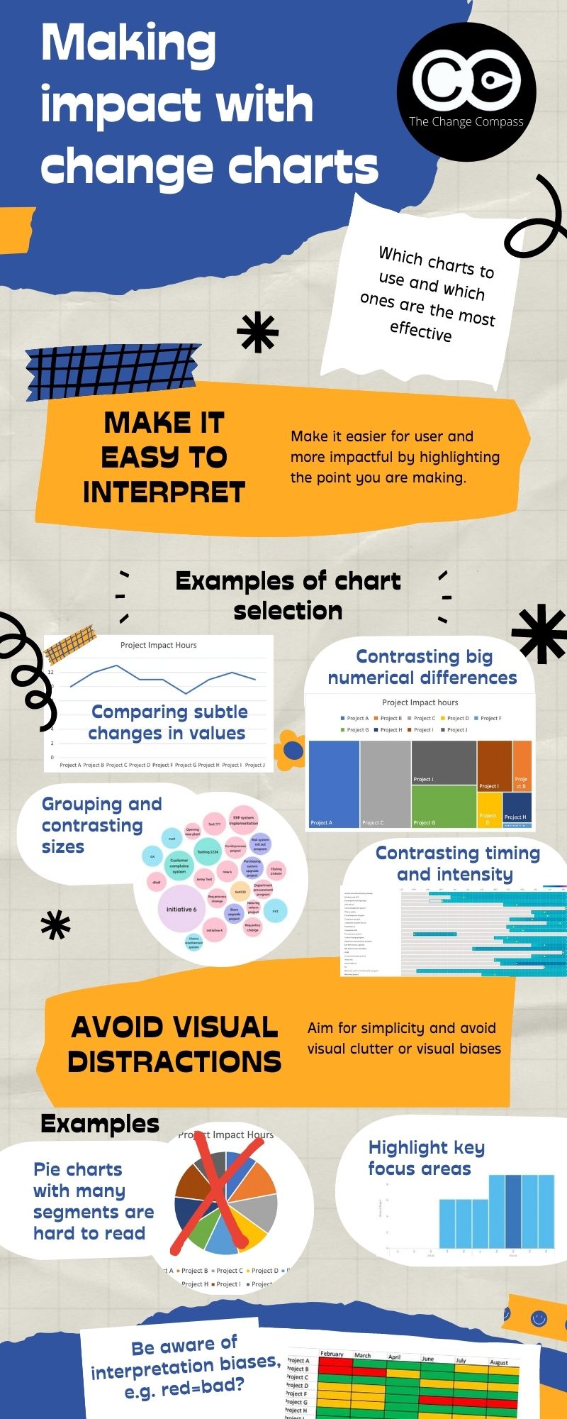
Infographic: Making impact with change management charts
Choosing the right chart type is as important as having the right data. This infographic summarises the key principles for selecting and designing change management charts that make an immediate impact with your audience.
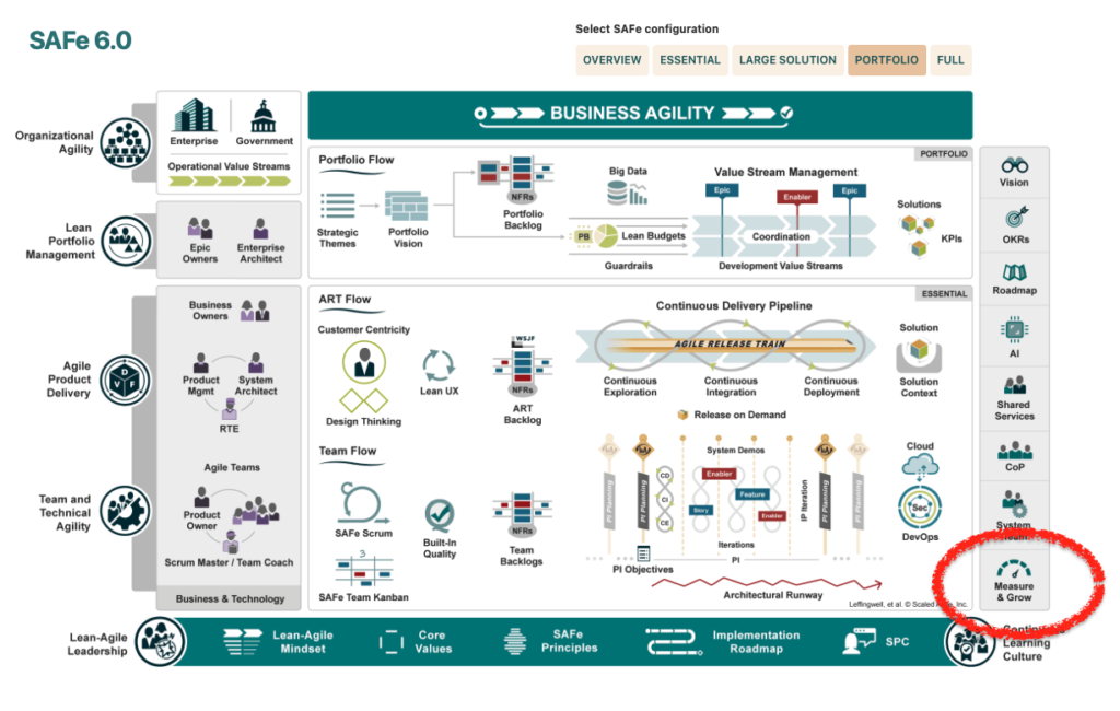
Scaled Agile Framework (SAFe) has emerged as a leading methodology to address the organisational change demands of fostering flexibility, collaboration, and continuous improvement. A cornerstone of SAFe is the principle of ‘Measure and Grow,’ which emphasizes using data and fact-based decisions to enhance change outcomes over time, including predictability. Despite its centrality, SAFe does not explicitly detail the change management components essential for its success, including its deep understanding of SAFe’s measurement model that enables the design of a tailored metrics strategy for ensuring strategic alignment. Here we outline how change management practitioners can effectively apply the ‘Measure and Grow’ principle within an Agile Release Train (ART) to lead change and improve outcomes to support the Scaled Agile environment.
What does it mean to “measure and grow” in a business context?
In a business context, “measure and grow” refers to the process of evaluating performance metrics to identify how our work drives business value and areas for improvement, aligning with strategic business goals. By analyzing data, companies can implement strategies that foster growth, enhance productivity, and improve overall outcomes. This approach ensures continuous development aligned with organizational goals.
The “Measure and Grow” Principle in Scaled Agile
What does it mean to “measure and grow” in a business context?
“Measure and grow” in a business context refers to the process of assessing performance metrics and outcomes to identify areas for improvement. By analyzing data, businesses can implement strategies that foster growth, enhance customer satisfaction, and optimize resource allocation, ultimately driving sustainable success and competitive advantage.
“Measure and Grow” is integral to SAFe, focusing on systematic measurement and continuous improvement for overall business agility within the value stream. By leveraging data and analytics, organizations can quickly respond to market changes, make informed decisions that meet the needs of our customers, identify areas needing attention, uncover improvement opportunities, and iteratively enhance meaningful change in performance. For change management professionals, this principle translates into a structured approach to evaluate the effectiveness of change initiatives, pinpoint areas for improvement, and implement necessary adjustments.
In a Scaled Agile environment, “Measure and Grow” is a core tenant or principle that applies in all types of agile environments. By continuously assessing and refining change efforts, organizations can align their initiatives with strategic objectives, mitigate risks, and ensure sustained success.
In practice, a lot of organisations have not pinpointed exactly how change management measures can make or break the outcome of the change, and in a SAFe environment, across the program, portfolio as well as enterprise.
The ‘Measure and Grow’ principle as a core part of SAFe (From Scaled Agile Framework)
To operationalize the “Measure and Grow” principle in change management, it is crucial to establish a set of metrics and assessment frameworks. Here are some broad categories of different types of change measurements that are relevant. Note that since we are talking about SAFe, it is not just at the initiative level that we are talking about metrics. More importantly, it is about establishing a system to promote change improvement across the organisation.
Change Management KPIs and OKRs
Key Performance Indicators (KPIs) and Objectives and Key Results (OKRs) are essential tools for tracking the success of change management initiatives. KPIs provide quantitative measures of performance, while OKRs align change efforts with broader organizational goals. A change management stream or function should focus on establishing KPIs or OKRs to achieve laser focus on achieving change outcomes.
Examples of Initiative-Level Change Management KPIs that may roll out to form portfolio views
Employee Engagement Levels: This KPI assesses how change impacts employee morale and engagement, providing insight into the overall acceptance and support of the change initiative.
Learning Achievement Rates: This can include tracking the percentage of employees who have completed necessary training programs, as well as achieving the target level of competence to ensure that the workforce is adequately prepared for the change.
Feedback Scores: Collecting feedback from stakeholders through surveys or feedback forms helps gauge perception and identify areas needing improvement. It is important to note that depending on the change context, stakeholders may not be happy with the content of the change. However, understanding and tracking this perception is still important.
Change Adoption Rate: This KPI measures the percentage of stakeholders who have adopted the change. High adoption rates are the ultimate goal for initiatives.
Issue Resolution Time: Measuring the time taken to resolve user-related issues related to the change highlights the efficiency of support mechanisms and the responsiveness of the change management team. This is especially important during an agile environment where there may be constant changes.
Change Readiness and Stakeholder Engagement Metrics
Evaluating change readiness and stakeholder engagement is crucial to the success of any change initiative. These metrics help assess the organization’s preparedness for change and the level of involvement and support from key stakeholders. Readiness and engagement rates can also roll up at a portfolio level to provide oversight.
Change Readiness Metrics
Readiness Assessments: Conduct surveys or interviews to gauge the organization’s preparedness for the impending change. This can include evaluating awareness, understanding, and acceptance of the change.
Resource Availability: Measure the availability of necessary resources, such as budget, personnel, and tools, to support the change initiative.
Communication Effectiveness: Assess the clarity, frequency, and effectiveness of communication regarding the change to ensure stakeholders are well-informed and engaged.
Stakeholder Engagement Metrics
Engagement Scores: Use surveys or feedback forms to measure the engagement levels of stakeholders, indicating their commitment and support for the change.
Participation Rates: Track stakeholder participation in change-related activities, such as workshops, meetings, and training sessions, to gauge their involvement.
Influence and Support: Assess the influence and support of key stakeholders in driving the change, ensuring that influential figures are actively endorsing the initiative.
By monitoring these metrics, change management professionals can identify potential barriers to change and take proactive steps to enhance readiness and engagement.
Stakeholder Competency Assessment
Successful change initiatives rely on the competence and readiness of key stakeholders. Assessing stakeholder competency involves evaluating the capability of sponsors and change champions to support and drive the change.
Sponsor Readiness/Capability Assessment
Sponsor Engagement: Measure the level of engagement and commitment from sponsors, ensuring they are actively involved and supportive of the change.
Decision-Making Effectiveness: Assess the ability of sponsors to make timely and effective decisions that facilitate the change process.
Resource Allocation: Evaluate the sponsor’s ability to allocate necessary resources, such as budget and personnel, to support the change initiative.
Change Champion Capability Assessment
Training and Knowledge: Measure the knowledge and training levels of change champions to ensure they are well-equipped to support the change.
Communication Skills: Assess the ability of change champions to effectively communicate the change message and address stakeholder concerns.
Influence and Leadership: Evaluate the influence and leadership capabilities of change champions, ensuring they can effectively drive and sustain the change.
By conducting these assessments, change management professionals can ensure that key stakeholders are prepared and capable of supporting the change initiative.
Change Adoption Metrics
Change adoption metrics provide insight into how well the change has been accepted and integrated into the organization. These metrics help assess the effectiveness of the change initiative and identify areas for improvement. At a portfolio level, there may be different levels of change adoption set for different initiatives depending on priority and complexity.
Key Change Adoption Metrics
Adoption Rate: Measure the percentage of stakeholders who have adopted the change, indicating the overall acceptance and integration of the new processes or systems.
Usage Metrics: Track the usage of new tools, processes, or systems introduced by the change to ensure they are being utilized as intended.
Performance Metrics: Assess the impact of the change on key performance indicators, such as productivity, efficiency, and quality, to determine the overall success of the change initiative.
By monitoring these metrics, change management professionals can gauge the success of the change initiative and identify opportunities for further improvement. To read more about change adoption metrics check out The Comprehensive Guide to Change Management Metrics for Adoption.
Change Impact and Capacity Metrics
Understanding the impact of change and the organization’s capacity to manage it is crucial for successful change management. Change impact metrics assess the effects of the change on the organization, while capacity metrics evaluate the organization’s ability to manage and sustain the change.
Change Impact Metrics
Aggregate impacts: Aggregate impacts across initiatives to form a view of how various teams and roles are impacted by various changes.
Risk Assessments: Identify potential risks associated with the change and evaluate their impact, ensuring that mitigation strategies are in place. A particular focus should be placed on business performance during change, across initiatives.
Capacity Metrics
Resource Capacity: Assess the availability of resources, such as personnel, budget, and tools, to support the change initiative and optimize flow time, enhance flow velocity, and improve flow efficiency while monitoring Flow Load.
Change Fatigue: Measure the risk for potential fatigue within the organization and its impact on stakeholders, ensuring that change initiatives are paced and driven appropriately.
Support Structures: Evaluate the effectiveness of support structures, such as training programs, information hubs, and help desks, in facilitating the change. Support structures may also include change champion networks.
By assessing change impact and capacity, change management practitioners can ensure that the organization is well-equipped to manage and sustain the change initiative.
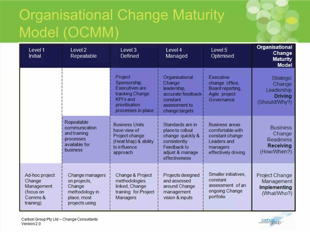
Change Maturity Assessment
Change maturity assessments provide a comprehensive evaluation of the organization’s capability to manage change effectively. These assessments help identify strengths and weaknesses in the organization’s change management practices and provide a roadmap for improvement.
The Change Management Institute (CMI) Change Maturity Model is a comprehensive framework that takes a holistic approach to enhancing an organization’s change management maturity. It’s divided into three core functional domains, each playing a vital role in the overall journey toward maturity:
Project Change Management
Business Change Readiness
Strategic Change Leadership.
These domains serve as the foundation for achieving higher levels of maturity within the organization.
Within each of these domains, the CMI model outlines a structured path, consisting of five distinct maturity levels. These levels represent a continuum, starting at Level 1, which serves as the foundational stage, and progressing all the way to Level 5, the zenith of maturity and effectiveness. This multi-tiered approach offers organizations a clear roadmap for growth and development, ensuring that they have the tools and insights necessary to navigate the complexities of change management.
By conducting regular change maturity assessments, change management professionals can identify areas for improvement and develop targeted strategies to enhance the organization’s change management capability.
The “Measure and Grow” principle is a powerful tool for improving change outcomes in a Scaled Agile environment. By leveraging data and fact-based decision-making, change management professionals can ensure that change initiatives are effective, aligned with strategic objectives, and continuously improving. Establishing robust metrics and assessment frameworks, such as KPIs, OKRs, change readiness and stakeholder engagement metrics, stakeholder competency assessments, change adoption metrics, change impact and capacity metrics, and change maturity assessments, is essential to applying the “Measure and Grow” principle effectively.
Incorporating these metrics and assessments into change management practices enables organizations to identify areas for improvement, make informed decisions, and drive continuous improvement. By doing so, change management professionals can enhance the effectiveness of change initiatives, ensure successful adoption, and ultimately achieve better business outcomes.
Diagnosing change resistance is the practice of working past the most visible symptoms to identify the actual structural, behavioural or environmental cause that is blocking adoption. Surface-level blockers, such as low attendance at training or complaints in town halls, are usually downstream effects of deeper causes: unclear sponsorship, competing operational pressures, undisclosed scepticism about the business case, or a previous change that left scar tissue. A layer-by-layer diagnostic method asks “what is causing this” repeatedly until the answer points to something the change team can actually act on. Without this discipline, change interventions end up addressing symptoms while the root cause continues to derail adoption.
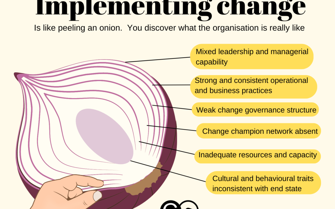
Change management, much like peeling an onion, involves uncovering multiple layers before reaching the core. Each layer peeled back in the journey of planning and implementing change reveals new insights about the organization and the stakeholders impacted by the change. This process is essential to understanding the full scope of the change, adapting strategies accordingly, and ensuring successful implementation. By examining the various facets of an organization, such as leadership capability, operational practices, and cultural traits, we can better navigate the complexities of change management. Let’s explore the analogy of peeling an onion in change management and some practical insights for transforming change outcomes.
What is the peeling the onion protocol and how does it work?
The Peeling the Onion Protocol is a change management strategy that involves gradually uncovering layers of resistance within an organization. By systematically addressing concerns and facilitating open dialogue, this protocol fosters understanding and acceptance of change, ultimately leading to smoother transitions and enhanced collaboration among team members.
Peeling the layers – each layer reveals a different facet of the organisation and how they may or may not be conducive to supporting the change. Here are some ‘layers’ you may want to examine.
Leadership and Managerial Capability in Managing Change
Effective change management begins with strong leadership. Leaders and managers play a crucial role in guiding the organization through the transition. Peeling back this layer reveals whether leaders are equipped with the necessary skills, knowledge, and attitudes to drive change. It also highlights their ability to inspire and mobilize their teams, communicate the vision effectively, and manage resistance. Assessing leadership capability is fundamental, as inadequate leadership can hinder the entire change process.
Operational and Business Practices
The next layer involves examining the organization’s operational and business practices. This includes evaluating current workflows, processes, and systems to identify areas that may need adjustment or improvement. Understanding how daily operations align with the proposed changes helps in anticipating potential disruptions and devising strategies to minimize them. Are existing practices consistent with the end state of the change? Are existing practices consistent? (or NA?) Why or why not? This layer also involves identifying key performance indicators (KPIs) that can measure the success of the change initiatives (https://thechangecompass.com/how-to-manage-a-multitude-of-change-initiatives-including-enterprise-wide/).
Change Governance Practices and Structure
Change governance refers to the frameworks and structures in place to manage and oversee change initiatives. Having the right governance structure ensures that the right oversight and decision making is setup to steer the change to success. Peeling back this layer involves assessing the effectiveness of existing governance mechanisms, such as steering committees, decision-making protocols, and accountability structures. Strong change governance ensures that change initiatives are well-coordinated, resources are allocated appropriately, and progress is monitored consistently. Weak governance, on the other hand, can lead to confusion, misalignment, and failure to achieve desired outcomes.
Key questions to ask here include such as:
Is there sufficient governance bodies in place at different levels of the organisation to support change?
Are there too many governance bodies?
Are decision-making processes clear and effective?
Are the right stakeholders involved in the relevant decision-making areas?
Engagement Channels
Effective engagement is critical in change management. This is more than just communication. This layer focuses on the channels and methods used to engage with stakeholders throughout the change process. Evaluating engagement channels helps in understanding how information is disseminated, feedback is collected, and concerns are addressed. It also highlights the effectiveness of internal communications and the role of external communications in managing stakeholder expectations and perceptions. What channels are most effective for what audience groups? Are there any gaps for engaging with all groups of stakeholders? (beyond just blasting emails or messages).
Change Champion Network
Change champions are resignated individuals within the organization who advocate for and support the change initiatives. Peeling back this layer involves identifying and empowering these champions. It also includes assessing their influence, credibility, and ability to motivate others. A strong network of change champions can facilitate smoother transitions by promoting buy-in, addressing resistance, and reinforcing positive behaviors. With the right nurturing and experience, an organisation-wide changechampion network can act to support a myriad of change initiatives.
System and Process Maturity
The maturity of systems and processes within an organization significantly impacts the success of change initiatives. This layer involves evaluating the current state of technological systems, process automation, and data management practices. Mature systems and processes provide a solid foundation for implementing changes efficiently and effectively. Conversely, immature systems may require significant upgrades or overhauls to support the desired changes.
Change Management Maturity
Change management maturity refers to the organization’s overall capability to manage change. Peeling back this layer involves assessing the maturity of change management practices, methodologies, and tools. Organizations with mature change management capabilities have established frameworks, experienced practitioners, and a culture that embraces change. In contrast, organizations with low maturity may struggle with inconsistencies, resistance, and a lack of structured approaches.
This layer examines the availability of resources and capacity to support change initiatives. It includes assessing the organization’s financial resources, human capital, and physical infrastructure. Adequate resources and capacity are essential for executing change plans, overcoming obstacles, and sustaining momentum. Insufficient resources can lead to delays, reduced quality, and increased stress on employees. This does not just include the resources required within the project itself, it points more to the impacted stakeholders and if they have the resources and capacity required to undergo the change.
Culture and Behavioral Traits
Organizational culture and behavioral traits play a significant role in how change is perceived and adopted. Peeling back this layer involves understanding the underlying values, beliefs, and behaviors that influence how employees respond to change. It also includes identifying cultural strengths that can be leveraged and cultural barriers that need to be addressed. A supportive culture fosters resilience, adaptability, and a positive attitude towards change.
Specifically:
Do existing behaviours and practices support the change end state?
Are there potentially inconsistent behaviours comparing the end state and the current state?
Beyond the specific behaviours required in the change initiative itself, how are these in alignment with broader cultural practices?
Key Takeaways from the Onion Analogy in Change Management
1. Each Layer Needs to Be Peeled Before Another Layer Can Be Peeled
The process of discovering and understanding the complexities of change cannot be rushed. Each layer provides valuable insights and learning opportunities that prepare the organization for the next layer of discovery. Skipping layers or rushing through the process can lead to incomplete assessments, overlooked challenges, and ineffective solutions. Patience and persistence are crucial for a thorough and successful change management journey.
Assessing and understanding each layer can take time. Data, both quantitative and qualitative, may be required to truly understand what each layer means and how it implicates the change.
2. How the Onion Appears May Not Be What It Is at Its Core
Initial perceptions of the organization may not reflect its true state. It takes time and effort to uncover the deeper issues, strengths, and opportunities. This requires a willingness to look beyond surface-level indicators and delve into the core aspects of the organization. Attention to detail and a commitment to uncovering the truth are essential for developing accurate and effective change strategies.
For example:
Are publically communicated and reinforced messages acted on?
Do leaders practice what they preach?
Do stakeholders commit to decisions already made? Or do they ignore it?
Is there clear alignment between different layers of the organisation? How is this done?
3. You May Discover Rotten Parts That Need to Be Replaced
During the process of peeling back layers, you may encounter parts of the organization that are severely inadequate or dysfunctional. These “rotten” parts may need to be replaced or significantly improved before the change can proceed. This could involve overhauling critical capabilities, restructuring teams, or implementing new systems. Recognizing and addressing these issues promptly is essential for ensuring the overall health and success of the organization.
You may find, for example:
Stakeholders that are adamant to block the change for various reasons
Teams that simply do not have the right skills or attitude to transition to the required state
Processes that are simply outdated or convoluted, so much that end state targets cannot be achieved
Systems that are outdated and do not provide the right insights to support the end state
4. Different Types of Onions and Organizations
Just as there are different types of onions, organizations vary in size, complexity, and nature. Assessing the complexity of the change at the outset helps in determining the time, effort, and resources required to peel back the layers. A comprehensive understanding of the organization’s unique characteristics allows for tailored change management strategies that address specific needs and challenges.
Practical Steps for Applying the Onion Analogy in Change Management
Step 1: Initial Assessment and Planning
Begin by conducting a thorough initial assessment of the organization. This involves gathering data, engaging with key stakeholders, and understanding the current state of affairs. Develop a comprehensive change management plan that outlines the objectives, scope, and timelines for each layer of the onion. This plan should also identify key metrics for measuring success and mechanisms for tracking progress.
Step 2: Assess Leadership and Managerial Capability
Evaluate the capability of leaders and managers to drive change. This includes assessing their skills, experience, and attitudes towards change. Provide training and support where needed to enhance their ability to lead effectively. Strong leadership is foundational to the success of any change initiative.
Step 3: Examine Operational and Business Practices
Analyze current workflows, processes, and systems to identify areas that may require adjustment. Engage with employees at all levels to gather insights and understand potential bottlenecks. Develop strategies to streamline operations and ensure alignment with the change objectives.
Step 4: Review Change Governance Practices
Assess the existing governance structures and practices in place to manage change initiatives. Ensure that there are clear decision-making protocols, accountability mechanisms, and regular progress reviews. Strengthen governance frameworks as needed to support effective change management.
Step 5: Evaluate Engagement Channels
Review the channels and methods used to communicate with stakeholders. Ensure that there are effective mechanisms for disseminating information, collecting feedback, and addressing concerns. Enhance engagement strategies to foster transparency, trust, and collaboration.
Step 6: Identify and Empower Change Champions
Identify individuals within the organization who can serve as change champions. Empower them with the necessary tools, resources, and support to advocate for the change initiatives. Leverage their influence and credibility to promote buy-in and address resistance.
Step 7: Assess System and Process Maturity
Evaluate the maturity of technological systems and processes. Identify areas that require upgrades or improvements to support the change. Invest in the necessary infrastructure and tools to ensure seamless implementation.
Step 8: Assess Change Management Maturity
Conduct a maturity assessment of the organization’s change management capabilities. Identify gaps and areas for improvement. Develop and implement strategies to enhance change management practices, methodologies, and tools.
Step 9: Review Resources and Capacity
Evaluate the availability of resources and capacity to support the change initiatives. Ensure that there are adequate financial, human, and physical resources to execute the change plans. Address any resource constraints proactively to prevent delays and disruptions.
Step 10: Understand Culture and Behavioral Traits
Conduct a cultural assessment to understand the underlying values, beliefs, and behaviors that influence how employees respond to change. Identify cultural strengths that can be leveraged and barriers that need to be addressed. Develop strategies to foster a supportive culture that embraces change.
The analogy of peeling an onion provides a powerful framework for understanding and managing change within an organization. Each layer peeled back reveals new insights and learning opportunities that are essential for successful change management. By carefully examining the various facets of the organization, such as leadership capability, operational practices, and cultural traits, organizations can navigate the complexities of change more effectively.
Patience, persistence, and attention to detail are key to uncovering the true state of the organization and developing tailored strategies that address specific needs and challenges. Ultimately, the journey of peeling the onion in change management leads to a deeper understanding, better preparation, and more successful change outcomes.