Across our change management industry, it seems that producing change heatmaps and being focused singularly on one question is the norm. We all know that change is complex. Change is evolving. Change is multi-dimensional. Change is more than just answering one question. Is there more?
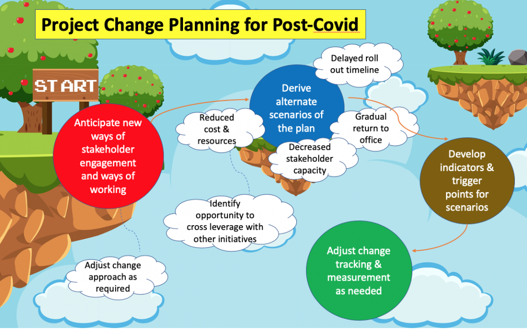
Whilst organisations plan return to office approach and the overall aftermath that is Covid on the business, here is an infographic on key project change planning considerations post-Covid.
Most of us are still in lockdown or partial lockdown with Covid. At the same time, many countries are in the process of lifting restrictions and resuming normal business and social activities. In the US President Trump pushes to reopen the economy and phase out the coronavirus task force. In Italy the restriction have just been lifted. Here in Australia the government is planning a gradual return to business.
What is going to happen after we return to work? What would the new world look like post Covid or transitioning away from Covid?
As change practitioners we have a unique role to play in helping to support change and help the organization to adjust to the new norms. We are impacted like everyone else and yet we need to lead others to transition through the change. We are after all change leaders.
Here are some of the likely realities of the post-Covid world after we return to ‘the norm’ after the Covid lockdown:
1. Continued virtual working
It is likely that organizations will be cautious and phase the gradual ‘return to work’ process so as to avoid any potential of re-infection. Some are already in the 1 week in 1 week out arrangement to reduce the number of employee on the same floor. Others may selectively organise the return to work on a group by group or team by team manner, again to control the density level of employees per area.
Employees at Google and Facebook were told that they could continue to work from home until next year. For Amazon employees it is until October. There is also quite a number of large financial services firms that will continue virtual working.
As a result, the days of virtual working will not go away any time soon. As significant numbers of employees continue to work from home, so will the need to continually engage our stakeholders virtually. This includes engaging impacted stakeholders, designing effective leadership communication, sensing change readiness, and measuring change embedment. Do all of these virtually.
There is research to suggest that video conferencing over an extended period of time is cognitively very taxing for people. The attentiveness and focus required to go through a whole day of video conference meetings can add toll to the health and well-being of employees. Supporting employees to build effective virtual working habits is critical.
2. Employees who want to remain WFH
There are those who are stressed working from home and struggle with looking after kids and juggling meetings. They as a result cannot wait to return to the office when schools are closed.
However, there are also those who have enjoyed working virtually immensely.
Catherine lives in the mountains 2 hour away from the office. Every day that she works from home she is saving 4 hours per day in commuting time. She gets to spend more time with her husband and her cat and she can easily open the door onto her balcony, overlooking the forest during her virtual meetings. She gets to cook more and can move around the house as needed so that she is not disturbed by her husband, who is also working from home.
Mark is also quite reluctant to return back to the office. He is finding that he is significantly more productive as there is no one approaching him to chat about the weekend, and all the various chit chat that happens within an office environment. He gets to focus on his deliverables without the office noises. Between meetings Mark can fit in his workouts at the park or at home. He definitely feels that he has a much better work-life balance.
3. Cost cutting and Zero based budget
New articles abound that we are entering an unprecedented period of economic depression, the worst since the second world war for Europe and worse than the financial meltdown in 2008 for the US. What this means is that most business will be impacted in a major way. Many businesses have already closed shop whilst others are belt-tightening or planning to in order to manoeuvre the uncertain future that is post Covid.
There are those businesses that have had most of their revenue wiped out, including retail, entertainment and food & beverage industries. There are also ramifications for businesses that support other businesses that are impacted by Covid, such as manufacturing or aerospace.
Companies may resort to a zero-based budget approach of prioritising the basics of cost management in order to survive. According to Wikipedia zero-based budget (ZBB) “is a method of budgeting in which all expenses must be justified and approved for each new period”. This is essentially a reset of cost to careful consider the most critical cost required to sustain the business. In this system, costs are grouped and measured against previous results and current expectations, enabling management to allocate funds by current need instead of by historical expenditures.
As change practitioners we need to prepare for rounds of cost containment or cutting of the initiatives that we are involved in. Expenditure will be tightly controlled. We need to consider ways in which we can continue to carry out change work with minimum additional expenditure.
4. Eventual reduction of commercial real estate utilisation
During Covid organizations have learnt that virtual working does work, even for those who have not experimented with this way of working. In order to save cost, companies will naturally plan to reduce any floor space requirement for those who are soon facing property rental lease renewal. Over time, we will start to see a reduction of commercial property requirement from businesses as organizations down size their office space footage and leverage more on virtual working.
So it looks like virtual working is likely here to stay. As change practitioners we need to continually develop and refine our change approaches in engaging our stakeholders virtually. There are various digital tools that can help fortunately. Some tools are designed to measure team engagement using machine learning. Others allow the expression of mood and responses without having to put this into verbal communication. Leverage these tools going forward (as cost permits) to engage effectively in a virtual world.
5. Disruption of initiatives/Re-planning
We need to be prepared for a series of disruptions whether it be ways of working, having to re-adjust change approaches, tightening expenditure, or having our change initiatives altered. Some initiatives will get pushed back, cancelled or moved forward. New initiatives or even restructuring exercises may emerge on top of existing initiatives. We may be asked to deliver more with less resources.
How do we manage our existing portfolio of change initiatives within this environment? We need to be agile and flexible to anticipate and work with various initiative changes. It could be that business capacity constantly shifts as a result of staff moving back to the office, or that teams become restructured therefore disrupting the initiative roll out.
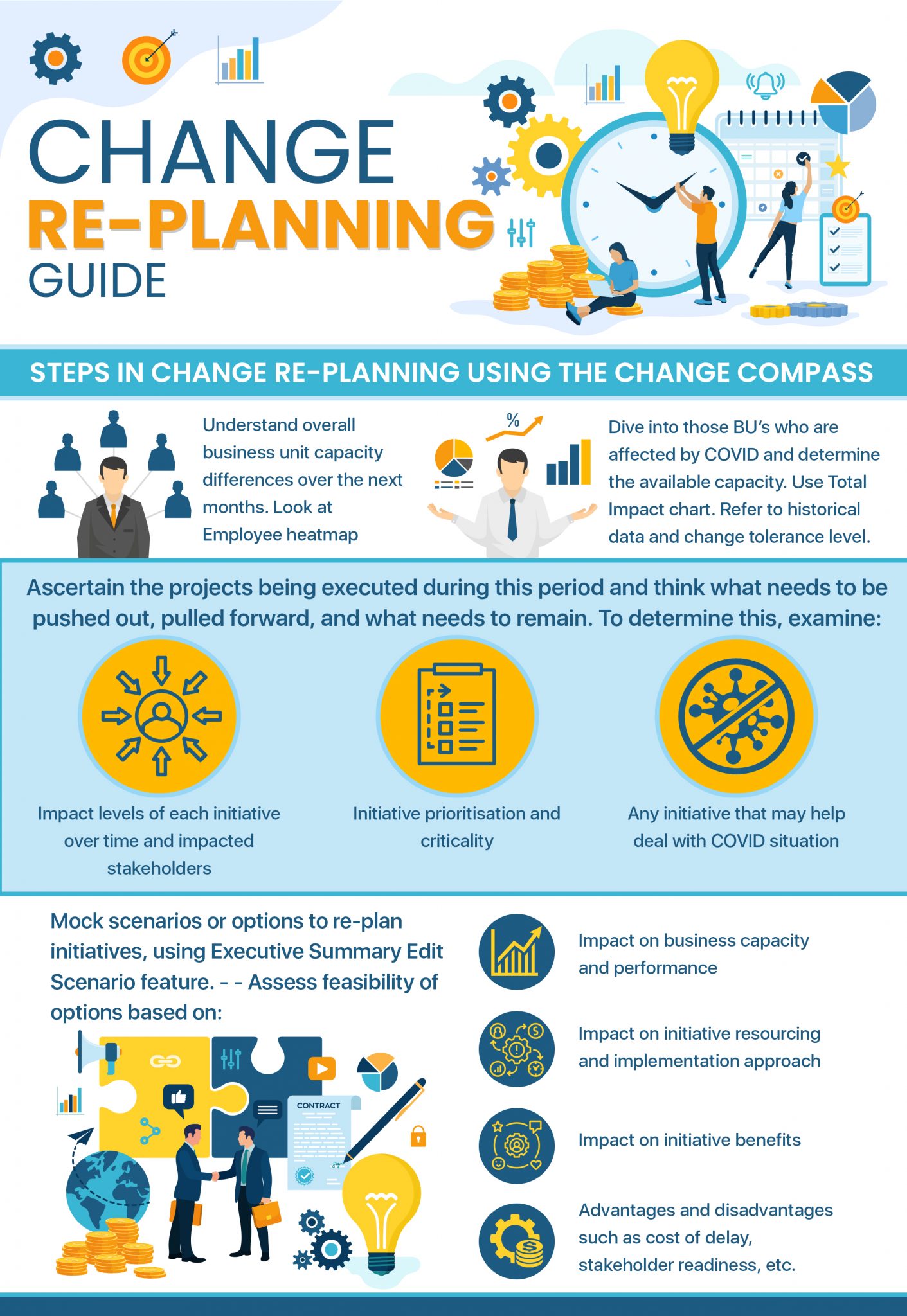
Utilise visual management to analyse and foresee implications of shifting initiatives. The Change Compass has a scenario planning feature that allows you to visualise the picture of new scenarios when various initiative timelines are shifted. For more details please listen to our webinar on re-planning during Covid.
Key considerations when shifting initiatives include:
Subsequent implications on business capacity (will we create another peak change volume later in the year?)
Potential dependencies of projects in the sequence of the roll out
Overlap with any planned business black-out periods or periods of high work volumes (such as customer contact volumes)
Implications on benefit realisation in relation to business targets
Business readiness due to transition back to the office
Initiative resources and bandwidth available to carry out any shifts in implementation timeline
Communication implications of the shifted initiatives that will be delivered to the same stakeholder group
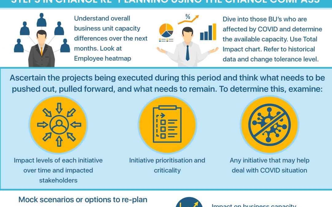
During Covid organisations are re-planning their initiatives to better cater for the various impacts on people and business capacity.
We have summarised key steps in change re-planning during Covid using The Change Compass in this 1-pager infographic. Follow the step by step guide to support your organisation during any re-planning exercises.
Change Saturation is a concept that describes our capacity for change as limited … like a cup. We have a limited amount of capacity for change. When there is too much change going on the cup spills over and there is ‘change saturation’. When this happens with too much change then there is stress in the impacted stakeholder groups.
It could be that there is intense increase in workload or work complexity. Performance could drop as a result. When frontline staff experience change saturation it could be that they don’t have the capacity to support all the customer enquires leading to longer customer wait times. Customer satisfaction levels could be impacted. Employee satisfaction could also be impacted.
What causes it?
There are 3 causes for change saturation
1. There are too many initiatives going on at the same time. The totality of changes across multiple initiatives leads to the cup being overfilled. This is the reality of corporate life. There aren’t many organizations that are only executing one initiative at any one time. However, it also depends on the level of impact within each initiative and not just the number of initiatives in total. If every initiative has very little impact it could be smaller in total than a very large complex change initiative with very high impact. It will take a lot of peanuts to fill up a jar, versus a few large biscuits.
2. The change initiatives are occurring too fast. We have all been through highly agile initiatives that have short sprints, that pivot quickly and implement the change quickly as well. Often due to discoveries and learnings along the way there are project delays as the project figures out how to get itself on track. However, the original go-live date has not been changed so as to meet senior stakeholder expectations and to manage project cost. What this means is that the impacted business suddenly has much less time to get ready for the change compared to the original timeline. This condensed timeline to go through and embed the changes leads to increased change saturation.
3. Business circumstances have lead to the cup being overfilled. In the case of COVID19, most businesses are going through challenging times. Some are struggling to cope with increased customer volumes, whilst others have lost significant business and can no longer operate. During these times businesses revert to survival mode, or their business continuity plan. The top focus remains to delivery its core services with all other priorities to take a back seat. The very nature of this environment means that a large part of the organisation is under immense pressure to perform. The cup is saturated even before any additional planned initiatives. To read more about Planning for change during COVID19 click here.
How to measure it
Every part of the organization may have a different level of change saturation. This is because different teams play different functional roles by definition. As a result one department may be impacted by the same change differently compared to another.
Therefore it is important to be able to measure the change saturation point for a part of the business if we are aiming to manage it. Change saturation should not just be a point of discussion just based on feelings and perceptions.
How do we measure the change saturation point for one part of the business? Measuring change saturation is not purely a science but more of an art.
Take for example, you have been working closely with the call centre team and have monitored their business performance across different initiatives over the past few months. Last month you noticed that they had reached a point where there were more initiatives being implemented than previously.
On top of this you noticed that some of their performance metrics that may be linked to change saturation were negatively affected. These included increased call waiting time, decreased customer satisfaction, increased staff turnover, and challenges for planners to schedule sufficient resources to cover shifts and undergo allocated initiative activities such as training. Team leaders also provided feedback that there was too much change going on and managing workload was challenging.
You can then calculate this change saturation by assigning a weighting to each change initiative in terms of its change impacts on the business. Then adding the various change impacts for last month will give you a total factor of change saturation. Last month your assessment, together with the call centre business, is that there was definite change saturation. So, if you see this level of change approaching in your planning coming up, then this would be a red signal for you to start to work with your stakeholders on managing this upcoming Change saturation.
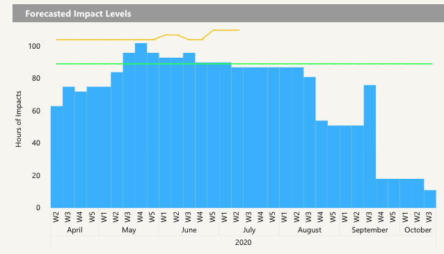
Here is an example of measuring change saturation with The Change Compass.
The green line depicts change saturation for this department
It is important to note that some businesses may be calling out that they have change saturation simply to lower the expectation bar. By lowering the bar expected to undergo change volume, it is then easier for them to meet their performance targets. This is why it is important to measure change saturation. Anyone can claim that their cup is overflowing with change without data to support.
How to manage it
There are 2 main ways to manage change saturation. Either you reduce the change saturation level or you increase the change capacity (increasing the size of the cup).
Short term – Reduce change saturation
1. Stop all change initiative roll out during COVID19. If your organization is undergoing significant challenges and it was deemed that the cup is already overflowing in terms of capacity, then work with your business to determine how long of a period would there need to be a hold of any change implementation. This decision may be reviewed on a monthly basis or fortnightly basis to enable careful monitoring of the development COVID19 impact on the organisation.
2. Delay the roll-out of change initiatives to reduce change saturation. Work with your stakeholders to re-prioritise certain initiatives and push out others to better manage the change saturation. During COVID19 your organization may have a significantly reduced level of change tolerance, whether its because everyone is adjusting to working from home or its ‘all hands on deck’ in serving the customer. Work with your stakeholders to understand what initiatives are critical in order to meet any shorter or medium-term business objectives or deemed a priority by senior managers. Then determine the roadmap of implementation taking into account business change capacity.
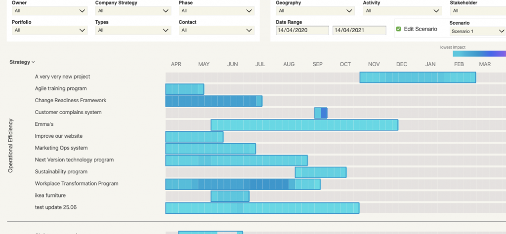
3. Use a scenario approach to model the period in which COVID19 may be impacting your organisation and therefore model the recommended change implementation sequences. This approach requires that you have a good awareness of the existing planned initiatives across the business. You may need to adopt a logic-based approach to assess the change saturation points if you have not collected historical data. Here is an example of a scenario planning feature from The Change Compass where you can visually model likely scenarios of change roll-out sequences.
Initiatives may be dragged around to model different change scenarios
Long term – Build change capacity and resilience
1. Hire more people. For some parts of the organisation where there the change saturation is on frontline consultants servicing the customer. It may be possible to increase change capacity to some extent by hiring more staff to serve the customer. However, this depends how effective the organization is in quickly hire and onboard frontline consultants to reach ‘time to performance’. For other parts of the organisation where the subject matter experts may be in short demand because of COVID19, leveraging potential business substitutes where available may be an option. This approach may be used in conjunction with other recommendations to reduce change saturation.
2. Improve the change capability of leaders. One of the most important levers in building change capacity and resilience is the effectiveness of leaders. We have all seen how some leaders who are engaging, open, actively make way for the change, and address any obstacles, have led teams to undergo significant change journeys. Other leaders may be undergoing the same change journey but somehow have not had the same success. Instead, they could be plagued with change resistance and stagnation due to the ability of its leader. Change leadership development of leaders is a long term play and not a quick win by any means.
3. Work on change maturity. Organisations that have higher change maturity have more capacity for change and are more resilient to constant changes. Change maturity measures such as change leadership capability, business change readiness and project change implementation maturity. This is also a long term play, requiring significant focus and time investment.


