Most change teams that ask for “better visibility” already have a dashboard, a heat map, or some version of a portfolio view. The problem showing up in boardroom after boardroom isn’t that the picture doesn’t exist. It’s that the picture reads as FYI rather than as something built to force a decision. A saturation heat map with three shades of amber tells an executive something is elevated. It doesn’t tell them enough to say no to the third overlapping initiative landing in the same quarter. When change data is presented at awareness level instead of decision level, executives don’t see the risk clearly enough to act on it, so they approve the overlap and move on.
This is not a data problem. It is a presentation problem: the wrong level of detail for the decision at hand, data stripped of the business context that would make the risk feel urgent, and a visual that doesn’t match the shape of the risk it’s describing.
Change practitioners are trained to think in stakeholder groups, impact levels, readiness stages and activity counts. Executives are trained to think in risk, cost, timeline and competitive position. Both groups can be looking at the same single view of change and walk away with entirely different conclusions, because the information was never positioned, visualised and detailed in a way that connects to the decision the executive is actually being asked to make. Solving this gap is arguably a bigger lever for change management effectiveness than anything else on the practitioner’s desk right now, and it is almost entirely unaddressed in how change teams are trained or how change management software is designed.
The single view of change paradox: Visibility without influence
There’s a quiet assumption running through most change portfolio initiatives: if leadership could just see everything at once, they’d make better decisions. Build the dashboard. Consolidate the spreadsheets. Get every initiative into one system. Then walk into the steering committee and watch the sequencing conversation finally happen on merit instead of politics.
It rarely plays out that way, and often for a more basic reason than executives assume: most organisations don’t actually have a complete single view of change to begin with. What they usually have is a list of major initiatives sourced from project and portfolio management tools, capturing scope, timeline, budget and delivery status. That’s project planning and execution data. It says almost nothing about the other half of the picture: which teams get hit, how hard, and what it does to day-to-day operational performance while the change is landing. The view executives are shown is frequently a project status report wearing a change hat, built to summarise for awareness rather than force a decision.
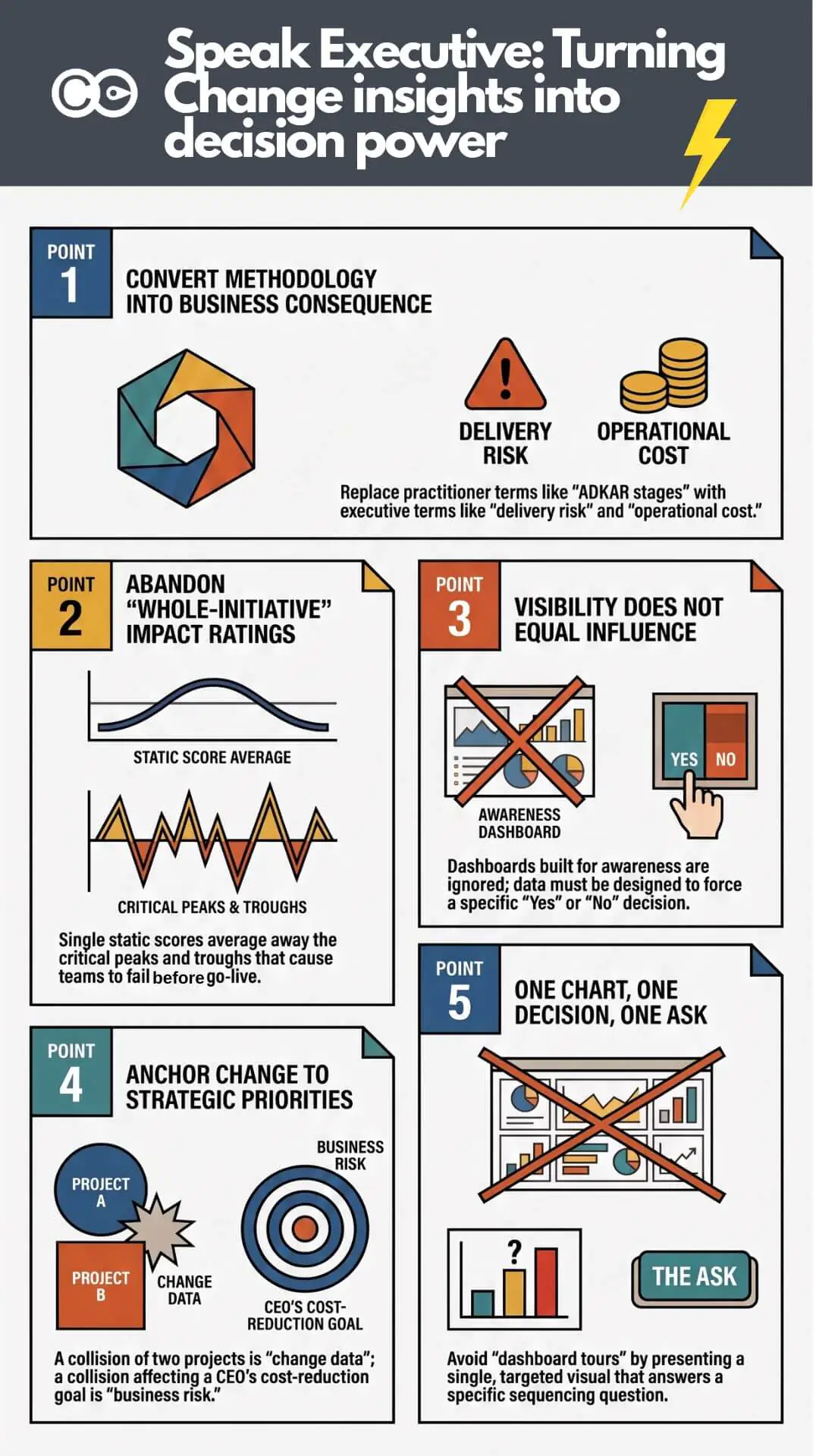
Even where a genuine change portfolio view does exist, capturing initiatives, impacted teams and rough timelines, it tends to render that impact data at the level a status update needs, not the level a decision needs. A heat map that shows “elevated saturation” in amber is accurate. It is also, by design, too abstract to force a call. Executives register that something is busy and approve the third initiative anyway, because nothing in what they were shown was precise or consequential enough to make saying no feel necessary.
The most common version of this under-detail problem is a single impact rating for the whole initiative: “this initiative is High impact,” full stop, for its entire life. That one number collapses months of real variation into a single static score. It doesn’t show the peaks and troughs as the initiative moves through design, testing and go-live, it doesn’t show that Finance is barely touched while Operations is hit hard for six straight weeks, and it doesn’t show that impact on the contact centre in March looks nothing like impact on the same team in June. A whole-initiative rating averages away exactly the information a sequencing or saturation decision needs: when the peak lands, and who it lands on. In most contexts, one rating for the whole initiative provides very little useful insight on its own.
The mistake is assuming visibility and influence are the same capability. They are not. Visibility answers “can you see it.” Influence answers “will it change what you decide,” and that depends on whether the data was pitched at FYI level or built to force a specific call. A dashboard earns the first. It does nothing to guarantee the second, and change teams that treat the dashboard itself as the finish line are solving the easier half of the problem.
Two operating languages: How change practitioners think versus how executives decide
The reason a technically excellent single view of change can still fail to move a decision comes down to something more fundamental than dashboard design. Change practitioners and executives are, in a very real sense, running two different operating systems for how they process the same information.
That gap isn’t only vocabulary. It’s four compounding things: the words used, the business context the finding is placed inside (or isn’t), the visualisation chosen, and the level of detail shown for that specific type of risk. Get the words right but skip the business context and the finding still reads as an internal change concern, not a business risk. Get the context right but pick the wrong visual and it still doesn’t register. Vocabulary is the most visible symptom. It is not the whole problem.
How change practitioners think
Change practice has a well-developed internal vocabulary, and for good reason. Frameworks like ADKAR give practitioners a shared way to diagnose where an audience is in the change journey. Stakeholder impact assessments break a change down by group, role and level of disruption. Readiness scores, activity counts and heat maps make an intangible thing, organisational disruption, tangible enough to manage.
This vocabulary is precise, methodologically sound, and almost entirely foreign to how a chief operating officer or chief financial officer reasons about a decision. “Forty per cent of the frontline team is at the ‘awareness’ stage” is a meaningful diagnostic to a change manager. To an executive, it’s an abstraction requiring translation before it connects to anything they’re accountable for.
How executives decide
Executives, particularly at the level where sequencing decisions get made, process a different set of variables: cost, delivery risk, timeline exposure, competitive position, regulatory obligation, and what a board will ask at the next review. They are not resistant to change data. They’re evaluating it against a completely different decision frame, one built around consequence and accountability rather than method and process. This gap shows up constantly in how portfolio conversations get framed to leadership, where spotting a conflict early is often the difference between an initiative that lands cleanly and one that quietly derails delivery three months later.
What the change practitioner says
What the executive hears
“This initiative is in the ‘desire’ stage of ADKAR”
Unclear how this affects delivery
“Twelve stakeholder groups are impacted”
A number without a consequence attached
“Change saturation is elevated this quarter”
A soft warning, easy to override
“Our readiness score is 62 per cent”
Not obviously connected to risk or cost
“This will collide with the ERP rollout”
A concrete, specific, and actionable risk
Notice the pattern in the right-hand column. The items that land are the ones already expressed in terms of consequence: a collision, a risk, a cost. The items that don’t land are expressed in methodology terms that require the executive to do the translation work themselves, and executives in a steering committee meeting are not going to do that work. They will simply move to the next agenda item.
Why the language gap exists (and why it isn’t the practitioner’s fault)
It’s tempting to read the section above as a criticism of change practitioners. It isn’t. Change management has spent two decades building rigour into diagnosis and methodology, largely because that rigour was what the field lacked most. Certifications, frameworks and benchmarking studies have all reinforced a practitioner-facing vocabulary; very little of that same investment has gone into executive and board-level communication, a genuinely different skill from stakeholder analysis.
The research backs this up. Prosci’s Best Practices in Change Management research, now in its 12th edition, consistently finds active sponsorship the single largest contributor to change success, and consistently finds a large share of sponsors don’t understand their own role well enough to fulfil it. McKinsey’s analysis of change journey management found programmes with clearly structured governance, steering committee, change office, named sponsors, succeed at markedly higher rates, and that frequent progress communication matters. But frequency of what matters just as much: a weekly update in practitioner vocabulary doesn’t carry the same weight as one in the language the committee already uses for every other agenda item.
Deloitte’s Global Boardroom Program found two-thirds of board members and C-suite executives rank open, transparent communication the single most important leadership factor in organisational resilience. Change teams sit on some of the richest early-warning data in the organisation. The gap isn’t a lack of communication. It’s communication that hasn’t been converted into the form, and context, the audience is already primed to act on.
Change data needs a business context, not just a decision framing
Even consequence-framed change data can fail to land if it’s presented in isolation from the strategic and operational context executives are already tracking. A collision between two initiatives matters more, and reads as more urgent, when it’s tied explicitly to a named strategic priority the executive is accountable for, or an operational challenge already on their radar (a cost-out programme, a regulatory deadline, a customer-facing service risk), rather than presented as a standalone change-management finding. The more integrated a risk is with the business context the executive already holds in their head, the more attention it earns: “this collides with the Q3 cost-reduction priority the CEO reports to the board on” carries a different weight than the same risk on its own change-management slide.
This is also why change data can be accurate, correctly visualised and correctly worded, and still get waved through. It hasn’t been positioned inside the frame the executive is already using to prioritise everything else competing for their attention.
The cost of getting the translation wrong
The consequences of this gap compound into the next funding conversation, too. Change functions are asked, almost every budget cycle, to justify their existence in terms the finance team understands: cost avoided, delivery protected, adoption secured. A team that has spent the year presenting saturation scores and readiness percentages, without converting them into risk and cost, arrives at that conversation with a weak hand. The near-misses they prevented are invisible, because they were never described in terms anyone outside the practice would remember.
Teams that consistently frame portfolio data as business risk in business context build a track record executives can point to later, exactly the material a strong business case for change management investment is built from. Teams that never make that shift re-litigate their value from scratch every year, regardless of how good their underlying data was.
What earns executive attention: Lead with consequence, not method
If the diagnosis is a translation gap, the fix is not more dashboards or more detail. It’s a deliberate shift in what gets led with.
Lead with consequence, not method
Every piece of change data can be expressed two ways: as a methodology fact, or as a business consequence. “Change saturation is elevated” is a methodology fact. “Two of our highest-priority initiatives land on the same frontline team in the same six-week window, and that combination has historically pushed adoption down and error rates up” is a business consequence. Same underlying data. Completely different weight in the room.
This matters more than it might seem. Research on data storytelling from Harvard Business School has found the impact of a story on an audience’s beliefs holds up far better over time than a raw statistic, whose influence fades fast once the meeting ends. A sequencing recommendation that’s going to still shape a decision a week later needs to be carried by a consequence, not a number.
One chart, one decision, one ask
The second shift is about restraint. A single view of change is built to hold everything, which is exactly why it should never be presented in full to an executive audience. CIO Dive’s coverage of Gartner’s research on data storytelling in the boardroom describes leaders bridging technical detail and business understanding by combining visualisation, narration and context around a single focused message, not the full breadth of what they know.
For a change portfolio conversation, that means picking one chart that answers one question and forces one decision, rather than taking the committee on a guided tour of the dashboard. A saturation heat map that shows exactly where two initiatives collide, with a single clear recommendation underneath it, will do more work than twelve slides of stakeholder breakdowns. The detail should exist and should be available if someone asks. It should not be the opening move.
Match the visual and the detail to the type of risk
Not every risk needs the same visual or the same depth. A single scheduling collision is usually clearest as a simple timeline: two bars overlapping, one week called out. A saturation issue spanning multiple teams over multiple months needs the heat map, because the pattern across teams and time is the point. Use a heat map for a single collision and it’s too abstract for a black-and-white timing problem; use a two-bar timeline for a saturation pattern and it’s too narrow to show the accumulation. Matching the visual and the detail to the shape of the risk, then positioning it against the business context above, is as much a part of the translation as the words used. This is also where a whole-initiative rating fails outright: it has no time dimension and no group breakdown, so there’s nothing to visualise beyond a single static badge. The underlying data needs to be captured at stakeholder-group and time-period level before any chart choice can show the peaks, troughs and who-gets-hit-when that make a sequencing risk concrete.
Common mistakes worth watching for in your own reporting:
Leading with process, not consequence. Opening with “here’s where we are on the ADKAR journey” instead of “here’s what happens if we launch these together”
Too many charts, no clear ask. A dashboard tour with no single decision point at the end
Burying the risk in the data. Trusting the executive to spot the collision themselves rather than naming it explicitly
No business context attached. Presenting a finding as a standalone change-management metric instead of linking it to a strategic priority or operational challenge the executive already owns
Wrong visual for the risk type. Using a heat map for a single scheduling collision, or a bare list for a multi-team saturation pattern
One rating for the whole initiative. Averaging away the peaks and troughs over time, and the variation across stakeholder groups and business units, into a single score
No pre-empted “so what.” Presenting a finding without answering the question every executive is silently asking: what should I do differently because of this
Treating every audience the same. Using the same level of detail for a steering committee that you’d use for a fellow practitioner
A practical framework for translating your single view of change into executive language
Here is a four-step process for converting portfolio data into something an executive audience will actually act on, whatever change management software or portfolio tool you’re using to hold the underlying data.
Start with the decision, not the update. Before opening the dashboard, write down the single decision you need this audience to make. If there isn’t one, you’re delivering a status report, not a briefing, and status reports rarely change behaviour.
Convert every practitioner metric into a consequence metric. For each data point you plan to show, ask “so what happens if this is true.” Twelve impacted stakeholder groups becomes delivery risk to a named deadline. A readiness score of 62 per cent becomes a specific, quantified adoption risk tied to a business outcome the executive already cares about.
Attach it to business context. Link the consequence to a strategic priority, an operating challenge, or a line already on the executive’s own agenda, not just to the change portfolio in isolation. A risk connected to something they’re already accountable for is harder to wave through than one that only exists on a change-management slide.
Match the visual and the detail to the risk type. Pick the chart shape suited to the risk, a timeline for a single collision, a heat map for a spread pattern, and show only the depth of detail this specific decision needs. The wrong visual or too much detail buries the point as effectively as the wrong words.
Answer the “so what” before anyone has to ask it. Close with a direct recommendation, not just a finding. “We recommend sequencing initiative A ahead of initiative B, with a four-week gap” is a request the committee can approve, defer or challenge. A heat map on its own is not.
This is a discipline, not a one-off exercise. It’s worth revisiting every time you prepare for a steering committee, board update, or executive-level sequencing conversation, because the audience’s attention and patience for translation work is the scarcest resource in the room, not the underlying data.
How Change Compass closes the translation gap
A well-built single view of change should do more than store data. It should make the translation work in the previous section faster and more consistent, rather than leaving every practitioner to reinvent the framing from scratch before every executive conversation.
This is one of the areas where the design of the underlying change management software genuinely matters, not just as a data repository but as a communication tool. Part of that starts earlier than the presentation layer: capturing the people-impact and operational-performance data that project and portfolio management tools don’t hold in the first place, at the level of detail a whole-initiative rating can’t provide, by stakeholder group, by business unit, over time, so the change view isn’t just a project status report wearing a change hat and isn’t just one static score per initiative.
Change Compass has been built around exactly this problem, drawing on patterns observed across a large and varied base of change teams reporting to executive audiences. Certain visualisations and framings come up again and again in the platform as the ones that actually shift a sequencing conversation: a saturation heat map that makes a multi-team overlap visually undeniable, a simple timeline for a single collision where a heat map would be overkill, a simplified executive summary that strips a portfolio down to the initiatives that matter for this decision, and narrative templates that translate raw impact data into risk language positioned against the strategic priorities the executive is already tracking.
The point of these templates isn’t to remove judgement from the practitioner. It’s to remove the blank-page problem every time a change team needs to walk into a room and make a case, so the starting point is already halfway translated into the language that room speaks, rather than the language the practitioner’s methodology speaks. A single view of change that has this translation layer built in, rather than bolted on as an afterthought, closes a meaningful part of the gap described throughout this article before a single word of the presentation gets written.
If you’re still evaluating which platform to build this single view on, translation capability is worth adding to your shortlist criteria alongside the more familiar ones like integration options and reporting depth. Our buyer’s guide to change portfolio management tools covers the fuller list of criteria PMOs typically use to separate a genuine change portfolio platform from a generic project tracker with a change label on it, translation capability included.
Making the translation a discipline, not an afterthought
A single view of change is necessary. It is not sufficient. The organisations that actually change executive decisions with their portfolio data are not the ones with the most comprehensive dashboard. They’re the ones who have built a habit of converting practitioner data into consequence, business context, the right visual and the right level of detail, every single time, not just the right words.
That habit is learnable: lead with a decision, not an update; convert metrics into consequences; tie the finding to a strategic priority or operating challenge the executive already owns; match the visual and detail to the shape of the risk. Change management software can make this faster and more consistent, and it can close the more basic gap of holding people-impact data most project tools never capture in the first place. But it can’t replace the judgement of choosing, every time, what this specific audience needs to see and hear in order to act.
Frequently asked questions
What does “single view of change” mean? Every active and planned initiative, plus the teams, roles and timelines they affect, consolidated in one place instead of scattered spreadsheets and team trackers. Most organisations that think they have this actually have a project-level view only, timelines and delivery status without the people-impact and operational-performance layer. It’s the foundation for sequencing and saturation decisions, but on its own it only solves visibility, not whether that visibility changes what leadership decides.
Why don’t executives respond well to typical change management dashboards? Most change dashboards summarise for awareness rather than a decision: practitioner vocabulary, findings without the business context that would make a risk feel urgent, and often a visual or detail level that doesn’t match the risk shown. The data can be accurate and still fail to influence a decision if it reads as FYI rather than something built to force a call.
How is change management software different from just having a single view of change? A spreadsheet can technically deliver a single view of change. Purpose-built software goes further by structuring how data is captured, aggregated and translated into executive-ready visuals and narratives, positioned against the business context the executive already tracks, rather than leaving that work to whoever is preparing the next update.
What’s the difference between change data and business risk framing? Change data describes what’s happening: which groups are impacted, at what level, over what timeframe. Business risk framing describes what it means: the cost of a collision, the delivery risk to a deadline. The same underlying data can be presented either way, and only the second tends to change a decision.
How can change practitioners get better at speaking executive language? Practise converting every metric into a consequence before presenting it: for each data point, ask “so what happens if this is true, and what should the audience do differently because of it.” Over time this becomes a habit rather than a translation done under pressure before every steering committee meeting.
Why isn’t a single impact rating for the whole initiative enough? A whole-initiative rating (High, Medium, Low, applied once, for the entire life of the initiative) averages away the variation a sequencing decision actually needs: the peaks and troughs as the initiative moves through design, testing and go-live, and the very different impact levels for different stakeholder groups, business units and teams at different points in time. Two initiatives can both carry a “High” rating and still be nowhere near each other in when their real pressure lands or who it lands on. Without that time and group breakdown, there’s nothing underneath the rating to sequence against.
AI-enabled change management software is the new generation of platform that combines persistent portfolio data with applied artificial intelligence to surface insights about change impact, adoption risk and stakeholder load that previously required hours of analyst work to produce. The shift from form-filling change management to intelligent change management means software now reads the portfolio, identifies conflicts between concurrent initiatives, generates first-cut artefacts such as impact lists and stakeholder maps, and answers natural-language questions about change health. It does not replace change practitioners. It removes the manual data work that previously absorbed most of their capacity.
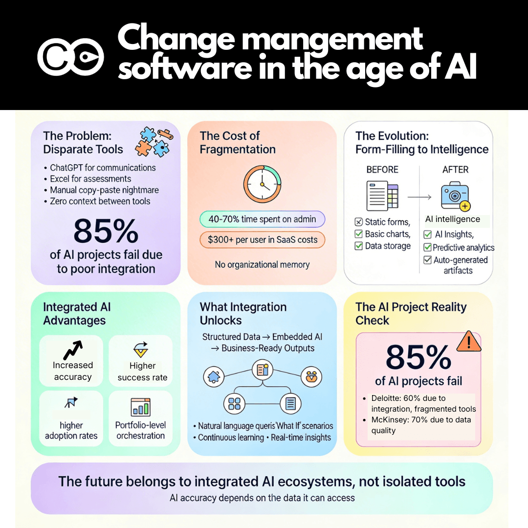
The change management software landscape is experiencing a fundamental transformation. With the increasing adoption of AI, change practitioners have relied on disparate tools, ChatGPT for communications, back to spreadsheets for impact assessments, project management platforms for tracking, and separate reporting systems for dashboards. This fragmented approach creates an exhausting cycle of copying, pasting, reformatting, and manually recreating content across different documents and systems.
The emergence of artificial intelligence is changing the game entirely. But not all AI applications are created equal. The real power lies not in individual AI tools used in isolation, but in integrated systems where AI has access to comprehensive change data, organisational context, and structured workflows. This is where change management software transitions from being merely a data repository to becoming an intelligent transformation partner.
The current reality: Disparate tools and manual workarounds
Walk into most change management teams today and you’ll find practitioners juggling multiple tools simultaneously. Research shows that nearly 50% of companies use disconnected AI tools, significantly cutting productivity and ROI. The typical workflow looks like this:
Morning: Use ChatGPT to draft stakeholder communications. Copy the output into Word, reformat to match organisational templates, adjust tone based on feedback, save multiple versions.
Midday: Build an impact assessment in Excel. Manually populate stakeholder names, roles, and impact levels. Create pivot tables to summarise by department. Copy charts into PowerPoint for steering committee presentation.
Afternoon: Generate infographics using Canva or another design tool. Download, resize, embed into emails and presentations. Hope the formatting stays intact when others open the files.
End of day: Update project trackers, populate status reports, consolidate feedback from multiple sources into a single document.
The cognitive load is substantial. The risk of error is high. Version control becomes a nightmare. And most critically, the AI tools being used have little or limited context about your specific change initiative, your organisational structure, your previous decisions, or the interconnections between different change activities.
This matters profoundly because AI accuracy and usefulness are determined by the data it has access to. When you use disparate tools with isolated prompts, each interaction starts from zero. The AI doesn’t know that Marketing is already managing three concurrent changes. It can’t reference that Finance has low readiness scores. It won’t flag that your proposed communication conflicts with another initiative’s messaging.
Research confirms this challenge: Gartner reports that 85% of AI projects fail to deliver on their promises, with poor integration being a primary culprit. Deloitte’s 2026 research shows that 40% of agentic AI projects will be cancelled by 2027 due to unanticipated cost, complexity, or risk—not because the technology failed, but because the foundation wasn’t properly integrated. The problem isn’t AI capability, it’s AI isolation.
The Evolution of Change Management Software: From Forms to Intelligence
Traditional change management software emerged primarily as structured data capture systems. They helped practitioners move beyond spreadsheets by providing:
Standardised templates for stakeholder analysis, impact assessments, and communication plans
Basic workflow for review and approval processes
Simple visualisations like bar charts and tables showing readiness scores or training completion rates
Central repositories where change artefacts could be stored and accessed
These capabilities represented progress. Having change data in a single system beat having it scattered across file shares, email attachments, and individual laptops. But most remained fundamentally passive, a place to record information, not a system that actively helped practitioners make better decisions or work more efficiently.
The emergence of AI is changing this paradigm entirely. Modern change management platforms are embedding intelligence throughout the entire change lifecycle, transforming from data capture tools into active transformation partners.
The Power of Integrated AI: Context, Structure, and Intelligence
Here’s where the story gets interesting. The most significant AI advancement in change management software isn’t about having AI features, it’s about having AI that operates within an integrated change management environment.
Consider The Change Compass as an example. Because the platform already structures change data – initiatives, stakeholders, impacts, readiness scores, communications, training plans, adoption metrics, as well as other details about your organisation such as your industry and department structure – the embedded AI has rich context for every interaction.
The ‘Insights’ Feature: AI That Reads Your Change Portfolio
Rather than asking practitioners to manually analyse their change portfolio, The Change Compass Insights feature continuously reads the data and surfaces recommendations and observations automatically. It might flag:
“Three initiatives are targeting the Customer Service team simultaneously in Q2. Consider sequencing Initiative B to start in Q3 to avoid saturation.”
“Readiness scores for Finance have dropped 15% since last assessment. Resistance themes suggest concerns about process complexity.”
“Training completion rates are 40% below target for the Operations group. Current go-live date may be at risk.”
This isn’t generic advice from a chatbot. It’s specific, actionable intelligence derived from your actual change data. Research shows that organisations using continuous measurement achieve 25-35% higher adoption rates than those conducting periodic manual reviews.
Data Visualisation with Intelligence
Traditional change software provide limited data visualisation and required practitioners to build charts manually, select data fields, choose chart types, format axes, add labels. The Change Compass allows users to generate a wide range of data visualisations with a few clicks, then ask for AI analysis of either a specific chart or an entire dashboard.
Imagine viewing a heatmap showing change saturation across departments. Instead of interpreting it yourself, you can ask: “What are the highest-risk areas in this view?” The AI responds with analysis specific to your data: “Operations and IT are experiencing the highest saturation levels, each managing 4-5 concurrent initiatives. Both departments show declining readiness scores and increasing resistance indicators. Recommendation: defer Initiative X or reallocate change support resources.”
This dramatically reduces the time from data to insight to decision. Research from McKinsey indicates that AI-enabled workflows have grown 8x in just two years, from 3% to 25% of organisational processes – precisely because integrated AI accelerates decision-making.
Natural Language Data Queries
One of the most powerful capabilities emerging in modern change management software is the ability to ask questions using everyday language and receive immediate data-driven answers.
Instead of building complex Excel formulas or custom reports, practitioners can ask:
“Which initiatives are affecting the Sales team?”
“Show me readiness trends for the Finance transformation over the past three months.”
“What percentage of stakeholders have completed training for Initiative A?”
The system queries the structured change data and returns precise answers instantly. This capability is transforming change management from a discipline that requires technical data skills to one where business insight and change expertise drive analysis.
‘What If’ Scenarios and Forecasting
Advanced change management platforms now enable scenario planning and predictive analytics. Users can set up “What If” scenarios:
“What happens to team saturation if we move Initiative B’s go-live from March to May?”
“If current adoption trends continue, when will we reach 80% proficiency?”
“What’s the projected impact on operational performance if we launch these three initiatives concurrently?”
The AI generates forecasts based on historical patterns, current data, and configurable assumptions. Research shows that predictive analytics in change management can identify at-risk populations before issues escalate, enabling proactive rather than reactive intervention.
This shifts change management from reactive problem-solving to strategic planning. Leaders can test different sequencing options, resource allocations, and timing decisions before committing, dramatically reducing the risk of change saturation and adoption failure.
Generating Business-Ready Artefacts: Structure Plus Intelligence
Perhaps the most transformative capability of AI-integrated change management software is the ability to generate common change artefacts – stakeholder analysis, impact assessments, learning needs analysis, communication plans- automatically from structured data.
Here’s why this matters:
The Traditional Manual Approach
A practitioner using disparate AI tools might:
Use ChatGPT to generate a stakeholder analysis template
Copy the output into Word
Manually populate stakeholder names from an Excel list
Adjust impact levels based on notes from workshop sessions
Reformat to match organisational templates
Share draft for review
Consolidate feedback from multiple reviewers
Repeat reformatting and repopulation when stakeholder list changes
This process takes hours or days. Version control is manual. Updates require rework. And the AI tool generating the template has no knowledge of your actual stakeholders, their roles, their previous engagement levels, or their readiness scores.
The Integrated AI Approach
In The Change Compass, because stakeholder data is already structured – roles, departments, influence levels, impact scores, readiness assessments, communication preferences, training schedule – the system can generate a comprehensive stakeholder analysis with a few clicks.
The output isn’t a generic template. It’s a business-ready document pre-populated with:
Actual stakeholder names and roles from your change initiative
Influence and impact levels calculated from assessment data
Engagement strategies tailored to each stakeholder segment
Current readiness status showing where gaps exist
Historical context if stakeholders were involved in previous initiatives
Most critically, when stakeholder data updates – someone joins the team, readiness scores change, feedback is captured, the artefact can be refreshed instantly. No manual copying, pasting, or reformatting. The structure and data are integrated.
The same principle applies to impact assessments, learning needs analyses, communication plans, and adoption dashboards. The combination of structured data and embedded AI creates efficiency gains that isolated AI tools simply cannot match.
AI Learning from Your Updates: Continuous Improvement
One of the most underappreciated aspects of AI-integrated change software is that the system learns from your corrections and amendments over time.
When you generate a stakeholder analysis and then adjust impact levels based on additional context, the AI notes those patterns. When you modify communication messaging to better match your organisational tone, the system adapts. When you sequence initiatives differently than initial recommendations, the AI updates its understanding of your priorities.
This creates a virtuous cycle. The more you use the system, the more accurate and aligned its outputs become. It’s not just executing tasks – it’s learning your organisation’s specific context, culture, and constraints.
A lot of organisations are treating AI as an augmentation tool, enhancing human capabilities rather than replacing them, experience higher productivity and employee satisfaction. Integrated change management software exemplifies this principle – AI handles data processing, pattern recognition, and initial drafting, while practitioners apply business judgment, stakeholder insight, and strategic direction.
The Competitive Advantage: Speed, Accuracy, and Strategic Focus
Organisations using integrated AI-enabled change management software gain several measurable advantages:
1. Time Reclamation
Research from Stanford shows that knowledge workers using AI assistants achieve significantly greater productivity by completing tasks more efficiently. In change management specifically, our users report:
Significant reduction in time spent on documentation and reporting
Significantly faster generation of change artefacts
Significant reduction of manual data consolidation tasks
This isn’t about working less, it’s about redirecting effort from administrative tasks to strategic value. Practitioners spend more time engaging stakeholders, designing interventions, and analysing resistance, and less time copying data between systems.
2. Data-Driven Decision Making
Integrated systems enable evidence-based change management at scale. Research shows that organisations measuring change performance continuously achieve 6.5x higher initiative success rates than those using periodic manual assessments.
When AI has access to comprehensive change data, it can identify patterns practitioners might miss:
Correlation between training completion timing and adoption success
Early warning signals that predict resistance escalation
Optimal sequencing patterns based on historical outcomes
This transforms change management from an art based on experience to a discipline informed by both experience and data.
3. Portfolio-Level Orchestration
Perhaps most critically, integrated AI systems enable portfolio-level change management that disparate tools cannot support. Research shows that 78% of employees report feeling saturated by change, and 48% experiencing change fatigue report increased stress.
Integrated platforms provide visibility into:
How many concurrent initiatives affect each team
Where saturation thresholds are being exceeded
Which changes should be sequenced vs. run in parallel
Where change support resources are most needed
This portfolio intelligence is impossible when change data is fragmented across multiple systems. The ability to manage change at enterprise scale while protecting employee capacity represents a genuine competitive advantage.
The Future: Self-Optimising Change Ecosystems
The trajectory is clear. Change management software is evolving from passive data repositories to active intelligence systems that:
Predict adoption challenges before they emerge based on readiness signals, saturation indicators, and historical patterns
Recommend intervention strategies tailored to specific resistance themes and stakeholder segments
Generate scenario plans showing the likely outcomes of different sequencing, resourcing, and timing decisions
Automate routine tasks like status reporting, dashboard updates, and artefact generation, freeing practitioners for strategic work
Continuously learn from each change initiative, building organisational change intelligence over time
Research from McKinsey indicates that by 2027, AI-augmented change management will be the norm rather than the exception. Organisations still relying on disconnected tools and manual workflows will find themselves at a significant disadvantage.
The winners will be those that recognise AI’s value lies not in isolated applications but in integrated ecosystems where intelligence, data, and workflows connect seamlessly.
Practical Steps for Practitioners
If you’re currently using disparate AI tools and feeling the pain of manual consolidation, consider these steps:
1. Audit your current AI usage. How much time do you spend copying, pasting, and reformatting AI outputs? What data is siloed in different systems? Where do version control issues occur?
2. Evaluate integrated platforms. Look for change management software with embedded AI that operates on your actual change data, not just generic prompts.
3. Prioritise structure. AI is only as good as the data it accesses. Platforms that structure change data – initiatives, stakeholders, impacts, readiness, communications – enable far more powerful AI applications.
4. Test specific use cases. Start with artefact generation (stakeholder analysis, communication plans) where the time savings are immediately visible.
5. Build the business case.Research shows integrated AI systems reduce processing time by up to 70% and cut SaaS spend significantly. Quantify the hours spent on manual data work and present the ROI of an integrated approach.
The future of change management belongs to practitioners who harness AI not as a collection of isolated tools, but as an integrated intelligence layer that amplifies their strategic impact. Platforms like The Change Compass demonstrate what’s possible when structure, data, and intelligence converge – and the gap between organisations using integrated systems and those relying on disparate tools will only widen.
The question isn’t whether AI will transform change management. It’s whether your organisation will lead that transformation or struggle to catch up.
Frequently Asked Questions
How is AI transforming change management software?
AI is transforming change management software from passive data repositories into active intelligence systems that generate insights, predict risks, recommend interventions, and create business-ready artefacts. Modern platforms embed AI throughout the change lifecycle, using structured data to provide context-aware recommendations rather than generic advice.
What’s the difference between using ChatGPT for change management vs. integrated AI in change software?
ChatGPT and similar tools operate in isolation without access to your specific change data, stakeholder information, or organisational context. Each interaction starts from zero. Integrated AI in platforms like The Change Compass has access to your entire change portfolio, enabling specific, actionable intelligence based on your actual initiatives, readiness scores, and historical patterns.
Can AI in change management software learn from my organisation over time?
Yes. Advanced platforms learn from your corrections, amendments, and decisions. When you adjust AI-generated outputs to match your organisational tone, priorities, or specific context, the system adapts. Over time, outputs become increasingly accurate and aligned with your organisation’s unique requirements.
What are the key AI features in modern change management software?
Key features include automated insights that flag risks and recommendations, natural language data queries allowing practitioners to ask questions in everyday language, data visualisation with AI analysis, “What If” scenario planning, predictive forecasting, and automated generation of business-ready artefacts like stakeholder analyses and communication plans.
How much time can AI-integrated change management software save?
Research shows practitioners experience 40-70% reductions in documentation and reporting time, 50% faster generation of change artefacts, and near-elimination of manual data consolidation. One case study showed a 70% reduction in processing time after moving from disparate tools to an integrated AI system.
Why do 60% of AI projects fail despite good technology?
Deloitte research shows most AI project failures stem from poor integration, not weak technology. When AI tools operate in isolation without access to comprehensive data and organisational context, they cannot deliver meaningful business value. Success requires integrated systems where AI, data, and workflows connect seamlessly.
What should I look for when evaluating AI-enabled change management software?
Prioritise platforms with structured data frameworks (initiatives, stakeholders, impacts, readiness), embedded AI that operates on your actual change data, ability to generate business-ready artefacts automatically, portfolio-level visibility and analytics, and systems that learn from your updates over time. Avoid platforms that simply add ChatGPT-style interfaces to basic form-filling systems.
Most change managers still measure transformation the way accountants balanced ledgers before spreadsheets: manually, periodically, and at the project level. The data arrives late, reflects only what was easy to capture, and serves reports more than decisions. Change management software has changed this significantly, but the full potential of software-enabled measurement is still underused in most large organisations.
This is a practical gap, not just a philosophical one. Gartner research found that only 32% of business leaders report achieving healthy change adoption among employees, despite most having change management frameworks in place. The gap between having a methodology and achieving adoption is, in large part, a measurement problem. If you cannot see adoption in real time, you cannot respond to it in time to make a difference.
Change management software measurement closes this gap. But understanding what software actually measures, what that data tells you, and how to apply it to your practice is where most teams need more depth.
The problem with manual change measurement
Before we get into what software enables, it is worth being clear about why the manual approach falls short.
The most common manual measurement approach involves stakeholder surveys at project milestones, training completion spreadsheets, and periodic progress reports compiled by each change manager. The problems are well-documented:
Data is collected at points in time, not continuously, so you only know what was true when you asked
Each project team uses slightly different scales and questions, making portfolio-level comparison impossible
The data tends to reflect perceptions of process activity (training done, communications sent) rather than actual adoption behaviour
By the time data reaches a report, it is often too old to act on
The result is that change functions often have a lot of data but limited insight. They can demonstrate activity but struggle to demonstrate impact.
Why this matters more than ever
Organisations are running more change programmes simultaneously than at any point in the last decade. Prosci’s correlation research consistently shows that projects with excellent change management are approximately seven times more likely to meet their objectives than those with poor change management. At the portfolio level, the difference between rigorous and ad-hoc change measurement is increasingly the difference between transformation programmes that land well and those that stall mid-delivery.
What change management software actually measures
Not all change management software measures the same things. It helps to understand the distinct measurement categories before evaluating any particular platform.
Adoption and readiness tracking
The most mature change management platforms enable real-time tracking of adoption across stakeholder groups, business units, or geographies. Rather than a single survey at go-live, you get a time-series view: where adoption is accelerating, where it is plateauing, and which groups are lagging. This allows your team to intervene before adoption failure becomes irreversible.
Readiness tracking operates similarly. Instead of a single readiness assessment six weeks before a programme goes live, software-enabled readiness measurement gives you a running picture of readiness across multiple dimensions: leadership alignment, process readiness, capability readiness, and technology readiness. Each dimension can be weighted and scored differently depending on the nature of the change.
Change impact and load
One of the most significant measurement capabilities that only software can reasonably provide at scale is change impact measurement across a portfolio. When you are running 15 or 20 change initiatives simultaneously, manually aggregating impact data across those programmes is practically impossible. Software platforms designed for portfolio change management, such as The Change Compass, enable impact data to be consolidated across the portfolio and visualised at the business unit or role group level.
This matters because the cumulative change load on a group of employees is often the single biggest predictor of adoption problems. An employee group facing five simultaneous changes, each individually manageable, may be at saturation point in aggregate. Manual measurement almost never surfaces this risk. Software measurement can.
Activity and engagement metrics
Beyond adoption outcomes, change management software tracks the activities that drive adoption: training attendance and completion rates, communication engagement (opens, clicks, responses), stakeholder engagement session attendance, and feedback loops. When tracked systematically, these activity metrics serve as leading indicators of adoption. A drop in training completion is a signal; a drop combined with declining stakeholder engagement attendance and decreasing survey participation is an early warning system.
Delivery tracking and change team performance
For change functions operating at scale, software also tracks the delivery of change management work itself: are plans being executed, are deliverables completed on schedule, are change budgets being spent as intended. This type of tracking serves accountability and continuous improvement within the change function.
Four measurement capabilities that separate good from great
Based on what the best-performing change functions in enterprise organisations do differently, four specific capabilities distinguish rigorous change management software measurement from basic reporting.
Baseline and benchmark data. Without a starting point, all measurement is relative to nothing. Software platforms that capture baseline readiness and adoption data before a change goes live allow you to compare ‘before’ and ‘after’ states with credibility. This is not just useful for internal learning, it is the data that change leaders need when demonstrating value to executives.
Role-level granularity. Organisation-level averages hide the distribution. A 72% adoption rate across the business might feel acceptable until you learn that three critical user groups are at 40%. Software measurement should provide role and business unit breakdown as a standard view, not a custom report.
Portfolio aggregation. The ability to see cumulative change load, adoption rates, and delivery status across all active programmes simultaneously is the most strategically valuable measurement capability a change function can have. It enables portfolio-level decision-making that is simply not possible with project-level spreadsheets.
Real-time alerting. The purpose of measurement is to enable decisions. Software that surfaces alerts when adoption drops below thresholds, when change load in a business unit exceeds safe limits, or when delivery milestones are missed turns measurement from a retrospective activity into a proactive management tool.
From manual measurement to decision intelligence
The shift from manual to software-enabled change measurement is not primarily about efficiency, though it is substantially more efficient. It is about the quality and timeliness of the decisions the measurement supports.
Capgemini Invent’s change management study surveyed 1,175 professionals across industries and found that organisations with high data maturity in their change programmes experienced 27% higher change success rates. The study identified data-driven leadership as adding a further 23% lift. These are not marginal improvements; they are the difference between change programmes that achieve their business cases and those that fall short.
The implication for your change function is practical. Where are you on the manual-to-software measurement spectrum? Do your decisions about change priority, resource allocation, and stakeholder intervention rely on real data or on informal knowledge and experience? Both matter, but experience without data is a ceiling that software can help you raise.
Using The Change Compass for change management software measurement
The Change Compass is designed specifically for enterprise change measurement challenges. It addresses portfolio-level change impact tracking, cumulative load visualisation, and adoption measurement in a single platform, with dashboards configured for different stakeholders: change teams need granular data, executives need portfolio health signals.
The platform’s measurement architecture is built around the insight that most change failures are not programme-specific; they are portfolio-level saturation problems that no one saw coming because no one was measuring load in aggregate. Software-enabled measurement changes the nature of the conversation you can have with business leaders from “our programme is on track” to “the combined change load on your customer service team is at risk level, and here is what we need to adjust.”
That is a fundamentally different conversation, and it is one that elevates the strategic contribution of the change function.
Making the shift in your organisation
If your change function is still primarily relying on manual measurement, a few practical steps can start the transition toward software-enabled measurement without requiring a complete overhaul of your existing approach.
Start with the portfolio view. Even if individual programme measurement remains manual, creating a centralised view of all active changes and their impact on key employee groups is a significant improvement. This does not require sophisticated software at first, but it clarifies what data you would need to collect consistently to make this view meaningful.
Standardise your baseline metrics. Before you can measure change across projects, you need a standard set of measures that every project uses. Readiness dimensions, adoption stage definitions, and impact categories need to be consistent across the portfolio. This standardisation is a prerequisite for any aggregated measurement.
Choose software that fits your portfolio complexity. The right change management software for a team running three projects simultaneously is different from what you need when running 25. Evaluate platforms based on the measurement use cases that matter most in your context: adoption tracking, portfolio load, or delivery management.
Where measurement should take you
Change management software measurement is not an end in itself. The goal is better decisions, sooner. When your measurement system is telling you that a business unit is approaching change saturation three months before a major go-live, you have time to act. When adoption data shows that a specific stakeholder group is consistently lagging while others are progressing, you have the basis for a targeted intervention.
The change functions that are most valued by their organisations are those that can show, with data, what the change landscape looks like and what it means for the business. Software-enabled measurement is what makes that possible.
Frequently asked questions
What is change management software measurement?
Change management software measurement refers to the use of digital platforms to systematically capture, aggregate, and analyse data about change adoption, readiness, stakeholder engagement, and change impact across one or more change programmes. It replaces or supplements manual spreadsheet-based tracking with real-time dashboards and portfolio-level visibility.
Can software really measure something as intangible as change adoption?
Yes, with the right design. Adoption is measured through a combination of leading indicators (training completion, engagement activity, survey participation) and lagging indicators (system usage data, process adherence, performance metrics). Software platforms aggregate these signals into a coherent adoption picture across stakeholder groups over time.
What is the difference between project-level and portfolio-level change measurement?
Project-level measurement tracks adoption and readiness for a single initiative. Portfolio-level measurement aggregates data across all active change programmes to reveal cumulative impacts, such as which business units are carrying the heaviest combined change load at any given point. Portfolio measurement is substantially more complex but significantly more strategically valuable.
How does change management software measurement improve ROI?
Prosci research shows that projects with excellent change management are seven times more likely to meet their objectives than those with poor change management. Software measurement supports excellent change management by providing real-time visibility that enables faster, better-informed interventions, directly improving adoption outcomes and benefits realisation.
What should I look for in change management software for measurement purposes?
Look for: role-level and business unit breakdown of adoption data, portfolio aggregation across multiple simultaneous programmes, baseline and trend data (not just point-in-time snapshots), configurable dashboards for different stakeholder audiences, and alert functionality that surfaces issues before they become crises.
Do I need to replace my existing tools to use change management software?
Not necessarily. Many change management platforms are designed to integrate with or complement existing project management and HR systems. The key requirement is data consistency, specifically standardising how adoption, readiness, and impact are defined and measured across your portfolio so that aggregated views are meaningful.
References
Prosci. The Correlation Between Change Management and Project Success. https://www.prosci.com/blog/the-correlation-between-change-management-and-project-success
Gartner. Gartner HR Research Finds Just 32% of Business Leaders Report Achieving Healthy Change Adoption by Employees (2025). https://www.gartner.com/en/newsroom/press-releases/2025-07-08-gartner-hr-research-finds-just-32-percent-of-business-leaders-report-achieving-healthy-change-adoption-by-employees
Capgemini Invent. Change Management Study 2023. https://www.capgemini.com/insights/research-library/change-management-study-2023/
Capgemini. Data-Driven Change Management is Crucial for Successful Transformation. https://www.capgemini.com/news/press-releases/data-driven-change-management-is-crucial-for-successful-transformation/
The Change Compass. How to Measure Change Management Success: 5 Metrics Leaders Actually Use. https://thechangecompass.com/how-to-measure-change-management-success-5-key-metrics-that-matter/