Ask a senior change manager in a large organisation whether their portfolio contains change conflicts and the honest answer is usually some version of “probably, but I couldn’t tell you exactly where”. That is not a failure of effort. It is a failure of visibility. In a portfolio of fifteen to forty concurrent initiatives, each governed in its own steering committee with its own definition of success, conflicts between initiatives are the default condition, not the exception. The harder problem is that the conflicts only become obvious in hindsight: in next quarter’s engagement dip, in a softening adoption curve, in a manager’s exit interview that mentions “too much change at once” without naming the specific collisions that caused it.
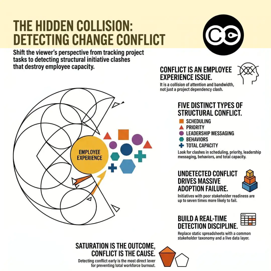
Change conflict, in the portfolio sense, is any structural collision between two or more change initiatives that competes for the same finite resource inside the impacted employee’s experience. The resource might be attention, time, behavioural bandwidth, leadership credibility, training capacity, or system stability. The conflict is rarely deliberate. It is the predictable consequence of running multiple initiatives that were each designed in isolation, governed in isolation, and measured in isolation.
This is a different concept from interpersonal conflict on a team, and different again from project portfolio dependency conflict in the PMO sense (where the unit of analysis is the deliverable, and the conflict is over scope, schedule, budget, or sequencing of project outputs). Change conflict sits between the two. The unit of analysis is the impacted employee, and the resource being competed for is their absorption capacity. A portfolio with zero project-dependency conflicts can still saturate the workforce in ways that destroy adoption, because the project view does not look sideways at the employee experience.
Change conflict is also one of the principal mechanisms that produces change saturation at the portfolio level. Saturation is the state in which the workforce can no longer absorb additional change. Conflict is one of the underlying drivers, because it draws on the same finite resource from multiple directions at once. Detecting conflict early is one of the most direct levers an organisation has for preventing saturation. Saturation is the outcome. Conflict is one of the causes you can actually do something about.
Why change conflicts are structurally hard to detect
Change conflicts are not hard to detect because they hide. They are hard to detect because the systems we use to govern change portfolios were never designed to see them.
Each initiative has its own sponsor, steering committee, status report, and definition of success. Every one of those artefacts looks inward at the initiative. None of them looks sideways at the other initiatives sharing the workforce. The PMO sees deliverables. The change team sees their initiative’s stakeholders. The HR business partner sees engagement scores. The line manager sees their day. No node in standard project governance is responsible for the intersection.
The result is that conflicts can only be diagnosed retrospectively: in the engagement survey that lands two quarters later, in the adoption metric that softens without obvious cause, in the spike of mid-level attrition, or in the post-implementation review that traces failure to “change fatigue” without naming the specific collisions that caused it. By that point, the cost has compounded, the conflicts that produced it have moved on, and the next portfolio cycle repeats the pattern.
Change conflict detection, as a discipline, is the deliberate work of closing this gap. It treats portfolio collision as a discoverable, classifiable, real-time signal rather than a retrospective story. To do that, you need three things: a named taxonomy of conflict types so you know what you are looking for, a method for surfacing each type before it manifests, and a data layer that can aggregate impact across initiatives without depending on spreadsheets that age out within a fortnight.
The five types of change conflict you need to detect
Change conflict shows up in five distinct, recognisable forms. The categories are not academic. Each has its own diagnostic signal and its own characteristic failure mode when undetected.
Scheduling conflict
The most familiar type, and the only one most PMOs actively manage. Scheduling conflict occurs when two or more initiatives require the same group of employees to engage with major change events in the same window. Two go-lives in the same fortnight. A system cutover the same week as a structural reorganisation announcement. A mandatory training module landing in the same sprint as a performance-review cycle change.
Scheduling conflict is the easiest to spot, because dates are visible, but it is the most underestimated. Resolving it by sliding events apart by a week declares the problem solved without addressing the cumulative cognitive load on the same group across a six-week absorption window.
Priority conflict
Priority conflict occurs when two initiatives ask the same employee, manager, or team to treat their initiative as the top priority for the same period. Operations excellence asks branch managers to focus on cost reduction. The customer experience programme asks them to focus on relationship deepening. The risk culture initiative asks them to focus on conduct and escalation discipline. Each is a legitimate priority on its own. Together, in the same quarter, they are a contradiction.
This is the most corrosive of the five, because it cannot be resolved by sequencing. Employees and middle managers eventually pick one, usually the one whose owner has the most political weight, and the others quietly fail. Detection requires you to compare not just calendars but stated priorities, by stakeholder group.
Leadership and management messaging conflict
Leadership messaging conflict happens when the senior leaders associated with different initiatives say things that contradict each other, or use language that signals different cultures, values, or behavioural expectations. The CFO writes that “speed of execution” is the strategic priority. The CHRO writes that “psychological safety” is the cultural shift. The COO emails about “doing more with less”. The CEO speaks about investing in capability. Together, in the same eight-week period, they tell the employee that leadership does not know what it wants.
Prosci’s 12th Edition Best Practices in Change Management (drawing on more than 10,800 practitioners) repeatedly identifies active and visible sponsorship as the single largest predictor of change success. The corollary, that contradictory sponsorship is a primary predictor of failure, is the part most organisations under-instrument. Management messaging conflict is the line-manager version of the same problem: when middle managers are asked to coach contradictory behaviours, they default to delivering neither.
Behavioural conflict across initiatives
Behavioural conflict is distinct from messaging conflict. Messaging conflict is what leaders say. Behavioural conflict is what initiatives require employees to actually do. Two initiatives can have aligned leadership messaging and still ask employees to perform contradictory behaviours on the ground.
A common example sits in regulated contact-centre environments. A regulatory change programme implements a new disclosure obligation requiring agents to disclose additional product or risk information to customers and to actively prompt for follow-up questions before closing the call. At the same time, the operational leadership team is running an efficiency initiative aimed at reducing the average handle time per call. Both initiatives are legitimate, both have executive sponsors, and both are being delivered correctly within their own scope. From the agent’s seat, they are mutually exclusive instructions arriving in the same week from different parts of the organisation, with no forum in which the contradiction can be raised. A second common pattern: a risk-conduct programme asks bankers to escalate any uncertainty, while a sales productivity programme rewards closing in-meeting.
Behavioural conflict is structurally invisible to most change methodologies because most impact assessments capture process and system changes but not behavioural shifts. Detection requires extending stakeholder impact analysis to include the behavioural request explicitly, and aggregating those requests at the stakeholder-group level.
Resource and capacity conflict
The fifth type is often confused with scheduling conflict. Resource and capacity conflict occurs when multiple initiatives draw on the same finite pool of human capacity, even if their events are not scheduled in the same week. The pool may be the change team itself, the training function, the technology platform team, or, most commonly, a single critical stakeholder group whose absorption capacity is being drawn on for months at a stretch.
Capacity conflict has a cumulative signature. It looks fine in any given week. It produces burnout, error rates, and decision fatigue over a quarter. The diagnostic question is “what is the cumulative draw on this group over a rolling twelve-week window?” not “is there a clash this fortnight?”.
The cost of undetected change conflict
The cost shows up in four observable ways, all measurable if you instrument for them.
The first is collapsed adoption. Prosci’s research consistently shows that initiatives with poor stakeholder readiness are six to seven times more likely to miss their objectives than those with strong readiness, and conflict is a primary driver of poor readiness because stakeholders forced to choose between competing demands will protect their own day-to-day function. The second is leadership credibility erosion. Employees who experience contradictory leadership signals across initiatives stop trusting the strategic narrative itself, and that loss of trust compounds across future changes. The third is attrition. Workplace Intelligence research found that 53% of employees report experiencing too much change at once, with 71% feeling overwhelmed by the volume of change. Employees in saturated, conflict-heavy environments leave at materially higher rates than employees in coherent ones. The fourth, and most often missed, is middle-manager capacity collapse: the layer of the organisation that absorbs portfolio conflict by translating contradictions into a workable narrative for their teams. Over time they stop translating, behavioural change quietly stops across the portfolio, and no project sponsor sees it.
In every one of those failure modes, the underlying conflict was technically detectable at the point of portfolio planning. The cost is not the conflict. The cost is the delay between when the conflict became real and when anyone in the organisation noticed.
How to detect change conflict: a five-step method
Detection is a discipline, not a tool. Whether you do it manually or with platform support, the method is the same.
Establish a common stakeholder taxonomy. Every initiative must categorise impact against the same set of stakeholder groups, defined consistently across the portfolio. Without this you cannot aggregate. Most organisations discover that their initiatives use overlapping but non-identical group names (“branch managers” in one, “frontline leaders” in another, “RMs” in a third), which makes aggregation impossible.
Overlay every initiative on a single calendar at the stakeholder-group level. Not at the project-milestone level. The output should show, for each stakeholder group, every event that touches them across the next twelve weeks, colour-coded by intensity. The eye picks up scheduling and capacity conflicts immediately when the data is visualised this way. This is the function of a change saturation heatmap.
Audit the leadership and management messaging across initiatives. Pull the last eight weeks of all-hands communications, sponsor videos, and manager talking-point packs across every active initiative. Read them as a single corpus. Look for contradictory framing, mismatched language about culture or pace, and gaps where one initiative implicitly contradicts another.
Map behavioural requests at the group level. For each stakeholder group, list every behaviour each initiative is asking them to perform or stop performing. Identify the contradictions. This is the step almost no organisation does, and it is the one that surfaces behavioural conflict.
Compute cumulative draw per stakeholder group. For each group, calculate the volume of impact, training, communication touches, and behavioural requests across a rolling twelve-week window. Mark groups exceeding their absorption ceiling. This is the capacity conflict view, and it requires a defined capacity model to make sense of the numbers.
These five steps together produce a portfolio conflict picture rather than a project conflict picture. The output usually reveals that several initiatives have been quietly damaging each other for months. That discomfort is the entry point to actually managing them.
Why spreadsheets, project management tools, and generic AI cannot detect change conflict
Most organisations attempt change conflict detection with the tools they already have. The attempts fail in predictable ways, and the failure is structural rather than a question of effort.
Spreadsheets can hold the data, but they cannot keep it current. The moment any initiative replans (which happens weekly in a real portfolio), the spreadsheet ages out. A spreadsheet rebuilt monthly is detecting conflicts that have already manifested. A spreadsheet rebuilt weekly consumes a half-time analyst and still trails reality.
Project management tools (Monday, Smartsheet, Jira, MS Project) are designed to track deliverables, not impacts. Their unit of analysis is the project task, not the impacted employee. They have no native model of stakeholder groups, no aggregation across initiatives by group, no behavioural-request layer, and no capacity ceiling against which to compare. You can build extensions, but you end up building a change intelligence platform inside a project tool, badly.
Generic AI assistants (ChatGPT, Copilot, Gemini) have a deeper limitation: they have no access to the organisation’s portfolio data. A ChatGPT prompt about whether initiatives A, B, and C are in conflict can only produce a plausible-sounding generic answer drawn from training data. It cannot know that initiative B has just slipped two weeks, that stakeholder group X is also being touched by initiative D, or that the behavioural request in initiative C contradicts the messaging in A. Conflict detection requires cross-initiative organisational data aggregated in real time, structured against a common taxonomy. That is not a prompt problem. It is a data infrastructure problem.
This is why a purpose-built change intelligence platform sits in a different category from the alternatives. Detection at portfolio scale is not a feature you can bolt onto a general-purpose tool. It is the data architecture or it is nothing.
How Change Compass’s Conflict Detection Engine works
Change Compass implements change conflict detection as a continuously-running engine across the live portfolio, not a periodic spreadsheet exercise. The platform aggregates impact data from every active initiative against a common stakeholder taxonomy, then evaluates each stakeholder group against five conflict signals in real time.
What triggers an alert
The engine surfaces a conflict alert when one or more of these conditions is met for a given stakeholder group within a defined window:
Concentration: the cumulative volume of impact events exceeds the group’s defined absorption threshold within a rolling window.
Overlap: two or more high-intensity events from different initiatives fall within the same fortnight for the same group.
Behavioural contradiction: two initiatives are requesting opposing behaviours from the same group within the same window.
Messaging divergence: sponsor or manager communications across initiatives are flagged as inconsistent in framing or stated priority.
Capacity draw: the group is being drawn on continuously across a twelve-week or longer horizon by three or more initiatives, with no recovery gap.
Each alert is tied back to the specific initiatives causing it, the affected stakeholder group, and the window in which the conflict will manifest. The aim is to give portfolio decision-makers a signal early enough to act on, not after the fact.
How conflicts get resolved
Detection only matters if it leads to action. The engine pairs alerts with resolution options: sequencing recommendations (which initiative to slip and to when, to minimise cumulative load), absorption modelling (what the load picture would look like under each resolution scenario), and escalation triggers when the conflict cannot be resolved at the working level. Resolution is owned by the portfolio change forum, which has the authority to defer, reshape, or, where required, decline an initiative that would breach absorption thresholds. The platform does not make the call. It surfaces the trade-off in a form the executive can decide on.
Case study: detecting and resolving a four-initiative conflict
A mid-market Australian financial services organisation had four concurrent initiatives touching its branch network in Q3: a teller-system upgrade (cutover week 8), a new customer onboarding process (rollout weeks 6 and 10), a risk culture programme (manager workshops weeks 4 to 12), and an efficiency initiative (handle-time targets reset week 7). Each was governed by its own programme team. Each had reported green status. The portfolio change forum had been convened only quarterly.
When the Conflict Detection Engine ran across the live portfolio data, it surfaced four overlapping alerts on the branch-manager group within weeks 6 to 10: a concentration alert (cumulative impact intensity at 1.4x the defined ceiling), an overlap alert (system cutover and onboarding go-live within nine days), a behavioural contradiction alert (risk programme asking for slower deliberation while efficiency programme reduced handle-time targets), and a capacity draw alert (continuous manager workshop attendance across the same twelve-week window).
The resolution, agreed at a portfolio forum convened on the strength of the alerts, sequenced the onboarding rollout into Q4, paired the system cutover with a structured two-week absorption buffer, and reframed the risk and efficiency messaging into a single integrated narrative under the operating committee. None of the four initiatives missed their delivery commitments. Branch adoption of the teller-system upgrade landed twenty-one points above the organisation’s prior cutover average. The detection event paid for the entire engagement in a single intervention.
The pattern is generalisable: detection alone exposes the problem; the value is unlocked when detection feeds a forum that has the authority to act on what it sees.
Common mistakes in change conflict detection
Detection programmes fail in characteristic ways. The most common are:
Treating detection as a one-off mapping exercise. Conflict is a dynamic state. A map built once at the start of the quarter is detecting yesterday’s conflicts. Detection has to refresh continuously.
Detecting only scheduling conflicts. This handles the easiest type and misses the four that matter more. Priority, leadership messaging, behavioural, and capacity conflicts will not show up in a calendar overlay.
Letting detection sit at the change-manager level. Change managers can flag conflicts but cannot resolve priority, leadership, or capacity conflicts on their own authority. Detection without an executive forum to act on alerts is detection that goes nowhere.
Optimising each initiative’s runway over portfolio coherence. Resolution requires individual projects to accept a shape less convenient for them in exchange for a portfolio that lands as a whole. Without that trade, every alert is contested.
Detecting conflict without a capacity model. Conflict only matters relative to capacity. Without a defined model of how much change each group can absorb, every conflict argument becomes a clash of opinions about whether “this group can handle it”.
Where to start
Pick three stakeholder groups that sit at the intersection of the most initiatives in your current portfolio. Spend a fortnight mapping every initiative event, message, and behavioural request hitting each group across the next twelve weeks. Resist the temptation to act before you have the picture. Once you can see it, ask the executive sponsors of those initiatives to review it together. The conversation that follows is almost always the first time anyone in your organisation has tried to manage the portfolio rather than the projects. That conversation, repeated quarterly with a continuously-refreshed data view rather than a static map, is how change conflict detection becomes a governed capability rather than the invisible force quietly compounding adoption risk across every transformation you run.
What is change conflict detection? Change conflict detection is the discipline of identifying collisions between change initiatives before they derail delivery, by aggregating impact, behavioural, messaging, and capacity data across the portfolio against a common stakeholder taxonomy. It is distinct from project dependency tracking (which looks at deliverables) and from interpersonal conflict management (which looks at people). The unit of analysis is the impacted employee, and the goal is to surface collision early enough to resolve.
How do you manage conflicting change initiatives? Conflicting change initiatives are managed by detecting the collision early (through a continuously-refreshed portfolio view), classifying the conflict type (scheduling, priority, leadership messaging, behavioural, or capacity), and resolving it through a portfolio change forum with the authority to sequence, reshape, or decline initiatives that would breach absorption thresholds. Resolution is a portfolio governance act, not a project-level one.
What are the main types of change conflict to look for? There are five recognisable types: scheduling conflict (initiative events colliding in time), priority conflict (initiatives competing for the same top-priority slot), leadership and management messaging conflict (sponsors contradicting each other), behavioural conflict across initiatives (employees being asked to perform contradictory behaviours), and resource and capacity conflict (cumulative draw on a single stakeholder group’s absorption ceiling).
Why can’t generic AI or spreadsheets detect change conflicts? Detection requires cross-initiative organisational data, structured against a common stakeholder taxonomy, aggregated in real time. Spreadsheets age out the moment any initiative replans. Project management tools track deliverables, not employee-level impacts. Generic AI tools have no access to the organisation’s portfolio data and cannot reason about cumulative load on specific stakeholder groups. Detection is a data architecture problem, not a prompt problem.
What’s the difference between change conflict and change saturation? Change saturation is the state in which the workforce can no longer absorb additional change. Change conflict is one of the principal mechanisms that causes saturation, by drawing on the same finite resource from multiple directions at once. Saturation is the outcome; conflict is one of the causes. Detecting and resolving conflict is one of the most direct levers an organisation has for preventing saturation.
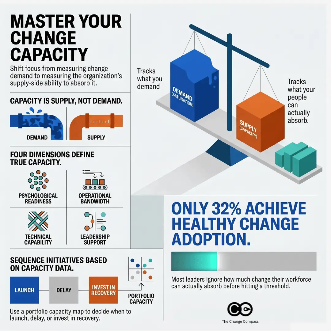
A change capacity model is a structured framework that defines and measures how much change a specific business unit, team or stakeholder group can absorb effectively at any given time, before performance and adoption start to degrade. It treats capacity as a multi-dimensional construct rather than a single number, capturing operational bandwidth (workload, time, attention), psychological readiness (sentiment, trust, fatigue), capability (skills and prior change experience), and leadership availability. A working capacity model is dynamic. It is updated continuously as initiatives complete, new programmes launch, or stakeholder conditions shift, and it informs sequencing and sponsorship decisions at the portfolio level.
A July 2025 Gartner study found that only 32% of business leaders report achieving healthy change adoption by employees. The research defines healthy adoption not just as compliance, but as employees acting on change, doing so on time, and without undue stress or disengagement. On that measure, two thirds of organisations are failing.
The most common diagnosis is that the individual change programmes were too complex, too poorly sponsored, or too poorly communicated. That diagnosis is sometimes right. But the more systemic explanation is something else entirely: organisations simply do not know how much change their workforce can absorb. They have a clear view of what they are demanding: the change portfolio. They have almost no structured view of what each part of the business can supply.
A change capacity model addresses the supply side. It is a structured, multi-dimensional assessment of each business unit or stakeholder group’s current ability to absorb change effectively. It tells you, before you commit to a launch date or a sequencing plan, which parts of your organisation are genuinely ready to receive more change and which are already at or past their threshold.
This article explains what a change capacity model is, how to build one, and how to use it to make sequencing and prioritisation decisions that reflect what your organisation can actually handle.
Why “capacity” needs a better definition
When change leaders talk about capacity, they usually mean one of two things: time or morale. Is this team’s calendar full? Are they tired? These are reasonable questions, but they are inadequate as a basis for a portfolio-level decision.
Capacity is not a single variable. A team can have ample time in their calendars and still lack the psychological readiness to engage with another round of change. A team can have high morale and healthy engagement scores and still lack the technical experience to adopt a specific type of technology change without significant support. A team can have all of the above and still be constrained by a management layer that is already carrying three times the typical change-leadership load.
The research makes the point clearly. According to Gartner’s 2025 analysis of change adoption, workers with high trust in their organisation have a capacity for change that is 2.6 times greater than those with low trust, and employees in teams with strong cohesion have 1.8 times the change capacity of those in fragmented teams. Neither of these factors appears in a bandwidth assessment. Neither of them appears in an engagement survey cut by average scores. They are distinct dimensions of capacity that require deliberate measurement.
A robust change capacity model treats capacity as a multi-dimensional construct, assesses it by stakeholder group rather than by initiative, and tracks it over time rather than treating it as a fixed condition.
It is also worth clarifying what a capacity model is not. It is not a change saturation measurement, which tracks how much change is currently being demanded of each group. Saturation measurement answers the demand side of the equation: what is being placed on people. Capacity modelling answers the supply side: what people can absorb. The two should be read together, but they are built differently and capture different things. If you are new to the saturation concept, What is change saturation? provides a full foundation before building the capacity model alongside it.
What a change capacity model includes
A complete change capacity model has three components:
A capacity taxonomy: a defined set of dimensions along which capacity is assessed, consistently applied across all groups in the portfolio.
A group-level assessment: a scored profile for each business unit or stakeholder group across those dimensions, produced through a combination of data inputs.
A portfolio-level map: an aggregated view that allows you to compare capacity across groups, identify constraints, and integrate capacity data into your sequencing and governance decisions.
The model should be designed to be maintained over time, not just completed once. Change capacity is dynamic. It degrades under sustained load, recovers once significant initiatives complete, and can be deliberately built through targeted intervention. A model that is only run at the start of a financial year will be misleading by the second quarter.
The four dimensions of change capacity
The core of any capacity model is its taxonomy of dimensions. What follows is a four-dimension framework that covers the factors consistently shown to predict change absorption at the group level. Organisations should adapt the specific inputs and scoring criteria to their context, but the four categories represent the minimum viable model.
Absorptive capacity: psychological and emotional readiness
Absorptive capacity reflects the degree to which a group is psychologically prepared to receive and engage with change. It is shaped by recent history more than by current intent: how previous changes landed, how much adoption debt remains unresolved, and how much trust exists in the change process itself.
Key factors include:
The outcome quality of recent changes: did the last programme actually deliver what was promised? Groups that have experienced repeated change that underdelivered have lower absorptive capacity for the next wave, regardless of how good that next programme is.
Adoption debt: the volume of incomplete adoption from previous initiatives that a group is still carrying. A team still operating workarounds from a system implementation six months ago has effectively not finished that change, even if the project has been closed. The 10 signs of change overload are often the visible symptoms of exactly this condition: groups carrying adoption debt from previous programmes that compromises their absorptive capacity for the next one.
Trust in leadership and in the change process. Gartner’s research found that 79% of employees have low trust in change. In organisations where this is the predominant sentiment, absorptive capacity is structurally constrained regardless of what the current BAU workload looks like.
Operational capacity: bandwidth available for change activity
Operational capacity is the dimension most organisations measure, and the one they over-index on. It is the time and bandwidth available for change-related activity: attending training, participating in pilots, adjusting to new processes, and absorbing the productivity dip that accompanies any significant transition.
Factors to assess include:
Current BAU workload and whether peak operational periods coincide with planned change activity
Active project and programme commitments beyond the change portfolio, including IT delivery work, regulatory deadlines, and business development activity
Span of management control: managers with broader spans have less time per direct report to invest in change support, which research published in PMC links to higher work-related stress and reduced leadership effectiveness during organisational transitions
Prior unplanned workload demands: business units experiencing performance pressure, customer escalations, or operational incidents are operating with reduced bandwidth for anything outside the critical path
Operational capacity is the dimension most likely to be seasonal and volatile. A business unit that has high operational capacity in February may have near-zero capacity in September if that is their peak period. The model must capture this temporal dimension, not just a point-in-time snapshot.
Capability capacity: skills and experience for this type of change
Capability capacity is the degree to which a group has the existing skills, knowledge, and change experience required to adopt the specific type of change being asked of them. This dimension is change-type dependent: the capability profile that matters for a technology transformation is different from the one that matters for a process redesign or a structural reorganisation.
The most useful indicators are:
Prior experience with this category of change. A team that has successfully adopted two previous CRM implementations has demonstrably higher capability capacity for a third than a team approaching it for the first time, even if both have identical bandwidth.
Change management maturity at the group level: the degree to which a group has developed consistent habits for navigating transitions, including strong adoption of learning and development programmes and a track record of embedding new ways of working.
Digital literacy, where technology change is the primary change type in the current portfolio.
Learning velocity from historical data: how quickly this group completed adoption milestones in comparable previous programmes.
Organisations that track adoption data at the initiative level over time are well-positioned to build this dimension. Those that do not have it in structured form can use calibrated manager assessments as a proxy.
Leadership capacity: manager and sponsor bandwidth
Gartner has noted that managers often lack the capacity to serve as the sole champions for change in their teams, and that expecting them to sell the change, model new behaviours, and simultaneously create safe space for their people frequently produces manager fatigue before the programme has even reached its most demanding phase. Leadership capacity is the dimension most consistently overlooked, and often the binding constraint on the entire model.
Leadership capacity includes:
The number of current change initiatives requiring active management-layer support: briefing, cascade, coaching, and problem-solving. Each initiative that requires a manager to actively champion change is a draw on a finite pool of leadership attention.
Manager change management competency: the skill level of the frontline management layer in facilitating transitions, having change conversations, and sustaining momentum without top-down pressure.
Sponsor quality and availability in the relevant business unit: whether the accountable executive sponsor has genuine commitment and time to discharge their sponsorship obligations.
Whether the leadership layer itself is subject to change (a restructure, leadership rotation, or change in reporting lines) concurrent with the change programme. A management layer in transition has significantly reduced capacity to lead change for the teams below it.
How to score capacity across your organisation
Turning the four-dimension framework into a usable model requires a scoring structure that is consistent, calibrated, and practical to maintain. The following process is designed to work with the data most organisations already have, without requiring a dedicated analytics infrastructure to get started.
Step 1: Define your group taxonomy. Use the same stakeholder group or business unit classifications as your change impact assessments and saturation model. Consistency across models is essential: the value of a capacity model is that it can be read alongside your demand data. If your groups are defined differently across tools, the integration breaks down.
Step 2: Score each group on each dimension. Use a three-point or five-point scale per dimension, with defined criteria for each score level. Three-point scales (high, medium, low capacity) are easier to calibrate and maintain; five-point scales allow for more granularity once the model matures. The scoring process should draw on multiple data sources:
Pulse survey data for absorptive capacity
Project and workload data for operational capacity
Adoption history and HR learning data for capability capacity
Manager assessment and initiative load data for leadership capacity
Step 3: Build your Composite Capacity Index. Aggregate the four dimension scores for each group into a single index. At first pass, equal weighting across dimensions is reasonable. More sophisticated models apply weights based on the change type: a technology-heavy portfolio should weight capability capacity more heavily; a structural reorganisation should weight absorptive and leadership capacity more heavily.
Step 4: Create your portfolio capacity map. Visualise the capacity profile of all groups together. This is your baseline: the supply-side view of your portfolio. It tells you where capacity is strong (groups that can absorb additional change without significant risk), where it is constrained (groups approaching their limit), and where it is depleted (groups that should not be the target of new significant change without deliberate remediation).
Step 5: Establish a refresh cadence. Quarterly is the minimum. After every major programme milestone, update the capacity data for affected groups: absorptive capacity changes when an initiative lands well or badly; operational capacity changes as workload peaks and troughs; leadership capacity changes when sponsors rotate or managers leave.
Integrating capacity data into sequencing decisions
The capacity model pays for itself when it changes the sequencing and timing decisions that shape your change portfolio. Three specific applications are worth building into your governance process.
Pre-commitment capacity checks
Before any new initiative is added to the portfolio and a go-live date committed to leadership, run a capacity check for every affected group. Which dimensions are currently constrained? Does the timing align with a high-capacity period or a low-capacity one? What capacity recovery is expected from changes currently in flight? This is a governance question, not just a change management question: it belongs in the portfolio approval process, not as a post-decision consideration.
Capacity recovery planning
When a major initiative completes, the affected groups do not immediately return to full capacity. Absorptive capacity in particular requires recovery time: the period in which new ways of working are consolidated, adoption debt is resolved, and the psychological overhead of sustained change decreases. Building deliberate recovery windows into the portfolio calendar (protected periods during which no new significant change is initiated against high-load groups) is not a concession to slowness. It is the mechanism by which adoption quality is preserved across the portfolio cycle.
Targeted capacity-building investment
The model identifies structural capacity constraints that cannot be resolved by better sequencing alone. A business unit with consistently low leadership capacity may need a manager development investment. A group with persistently low absorptive capacity may need a reset period combined with visible delivery on past change commitments before it can receive new programmes effectively. These interventions belong in the capability-building plan of the change function, resourced and scheduled like any other programme investment.
Five mistakes to avoid when building a change capacity model
Treating capacity as a single variable. If your model produces a single “capacity score” that is effectively a composite of time and morale, it will mislead. The four-dimension structure exists because each dimension can move independently. A group can be high on operational capacity and low on absorptive capacity at the same time, and conflating the two produces a score that suggests readiness when the reality is more complex.
Building the model once and not maintaining it. A capacity assessment that is run at the beginning of a financial year and not updated is a liability rather than an asset. By the third quarter, the picture has moved significantly. The model must be maintained on a defined cadence, with the discipline to update it after significant programme milestones.
Relying only on survey data. Surveys are an important input, but they capture sentiment rather than structural capacity. Operational capacity, capability capacity, and leadership capacity all have better signals in project data, adoption history, and manager workload data. Build a multi-source model from the start.
Ignoring the leadership capacity dimension. This is the most frequent omission. Organisations that map employee capacity in detail but treat manager capacity as unlimited will consistently underestimate the true constraint on adoption. The management layer is typically the bottleneck: it is where change communication is supposed to cascade, where adoption support happens, and where resistance is first encountered and either addressed or amplified.
Building the model in isolation from demand data. Capacity on its own is not actionable. A group with medium capacity and low change demand has no problem. A group with medium capacity and very high demand is in active risk territory. The capacity model is most powerful when read alongside your change saturation measurement: supply against demand, at the group level, tracked over time.
How digital tools support change capacity modelling
Maintaining a change capacity model manually, across multiple groups, multiple dimensions, and quarterly update cycles, is feasible for smaller organisations but becomes increasingly difficult as portfolio size grows. The model depends on data from multiple sources (pulse surveys, project registers, adoption tracking, HR data), and integrating those sources manually introduces both effort and lag.
Digital change management platforms such as Change Compass are designed to support exactly this kind of portfolio-level intelligence. Rather than building capacity data separately from initiative data, a purpose-built platform integrates both: initiative volume and impact data sits alongside capacity inputs, enabling a live view of where demand is running ahead of supply across the organisation. When capacity data is updated (after a programme completes, after a pulse survey cycle, or after a manager assessment) the platform refreshes the portfolio picture in real time, rather than requiring a manual rebuild of the model.
From capacity snapshot to portfolio governance
The goal of a change capacity model is not to produce an interesting dashboard. It is to change the questions your leadership and portfolio governance teams are asking before they approve new change commitments. Instead of “is this initiative ready to launch?” the question becomes: “is the receiving organisation ready to adopt it?”
That shift is significant. It moves the accountability for change success upstream, into the portfolio decisions that shape the timing and sequencing of change, rather than leaving the change management function to manage the consequences of decisions already made. It also creates a shared, data-based language for conversations that have traditionally been difficult: the conversation about deferring a launch, protecting a business unit, or reducing the simultaneous change load on a particular team.
Start with the data you have. Score the four dimensions using proxy measures where better data does not yet exist. Build the model for your highest-priority groups first, then expand. The first iteration does not need to be precise to be valuable. It needs to be consistent and maintained, and it needs to be read alongside your change demand data, not in isolation.
The organisations in the 32% that achieve healthy change adoption by their employees have typically not found a better communications strategy or a better sponsor. They have built a systematic view of what their workforce can absorb, and they have used that view to make different decisions about what to ask of them and when.
Frequently asked questions
What is a change capacity model?
A change capacity model is a structured assessment of a business unit or stakeholder group’s ability to absorb change at a given point in time. It typically covers multiple dimensions: psychological readiness, operational bandwidth, change-relevant skills, and leadership capacity. It is tracked over time to inform portfolio sequencing and governance decisions.
How is change capacity different from change saturation?
Change saturation measures the demand side: how much change is currently being placed on a group relative to their ability to absorb it. A capacity model measures the supply side: what the group is inherently able to absorb given their current psychological state, workload, capability level, and leadership support. The two should be read together, but they are built and maintained differently.
How often should a change capacity model be updated?
Quarterly is the recommended minimum. In addition, the model should be updated after any significant programme milestone: particularly when a major initiative completes, a leadership change occurs in a key business unit, or a pulse survey reveals a significant shift in sentiment. Capacity is dynamic; a model that is only updated annually will mislead more than it guides.
What data do you need to build a change capacity model?
A basic model can be built with: pulse survey data (for absorptive capacity), project and workload data (for operational capacity), historical adoption data (for capability capacity), and manager assessments (for leadership capacity). Organisations that do not have all of these in structured form can start with calibrated manager input across all four dimensions and layer in more granular data as the model matures.
How do you use a capacity model to make sequencing decisions?
The most direct application is a pre-commitment capacity check: before adding a new initiative to the portfolio, reviewing the capacity profile of every group the initiative will affect and assessing whether the planned timing aligns with a high-capacity period. The model also supports capacity recovery planning (building in protected windows after high-load periods) and identifying groups that need targeted capacity-building investment before they can receive additional change effectively.
A change impact assessment is the structured analysis that identifies what specifically will change for each stakeholder group as a result of an initiative, and how significant that change is likely to be for them. It covers the dimensions that drive adoption risk: processes (which steps change), systems (which tools change), roles (which responsibilities change), people skills (what new capability is required) and behaviours (what new habits the change depends on). A complete assessment differentiates impacts by group rather than averaging across the organisation, because the same project lands very differently on a contact centre, an underwriting team and a digital product squad.
A project manager and the head of a contact centre walk out of the same briefing about an upcoming CRM implementation. The project manager spends that afternoon completing the change impact assessment. He rates process changes as medium impact (two training days, standard user adoption support), job role changes as low (minor workflow adjustments), and system changes as high (major platform replacement). The assessment looks solid. It covers the categories. The ratings seem reasonable.
The contact centre head gets on the phone to her team leads. “Do you understand what this means for us?” she asks. “Our staff are going to re-learn their entire workflow from scratch during the biggest quarter of the year. Some of these people have been working the same way for eight years. And nobody asked us how this was going to land.”
Same change. Entirely different picture of its impact. One of those pictures ended up in the assessment. The other didn’t.
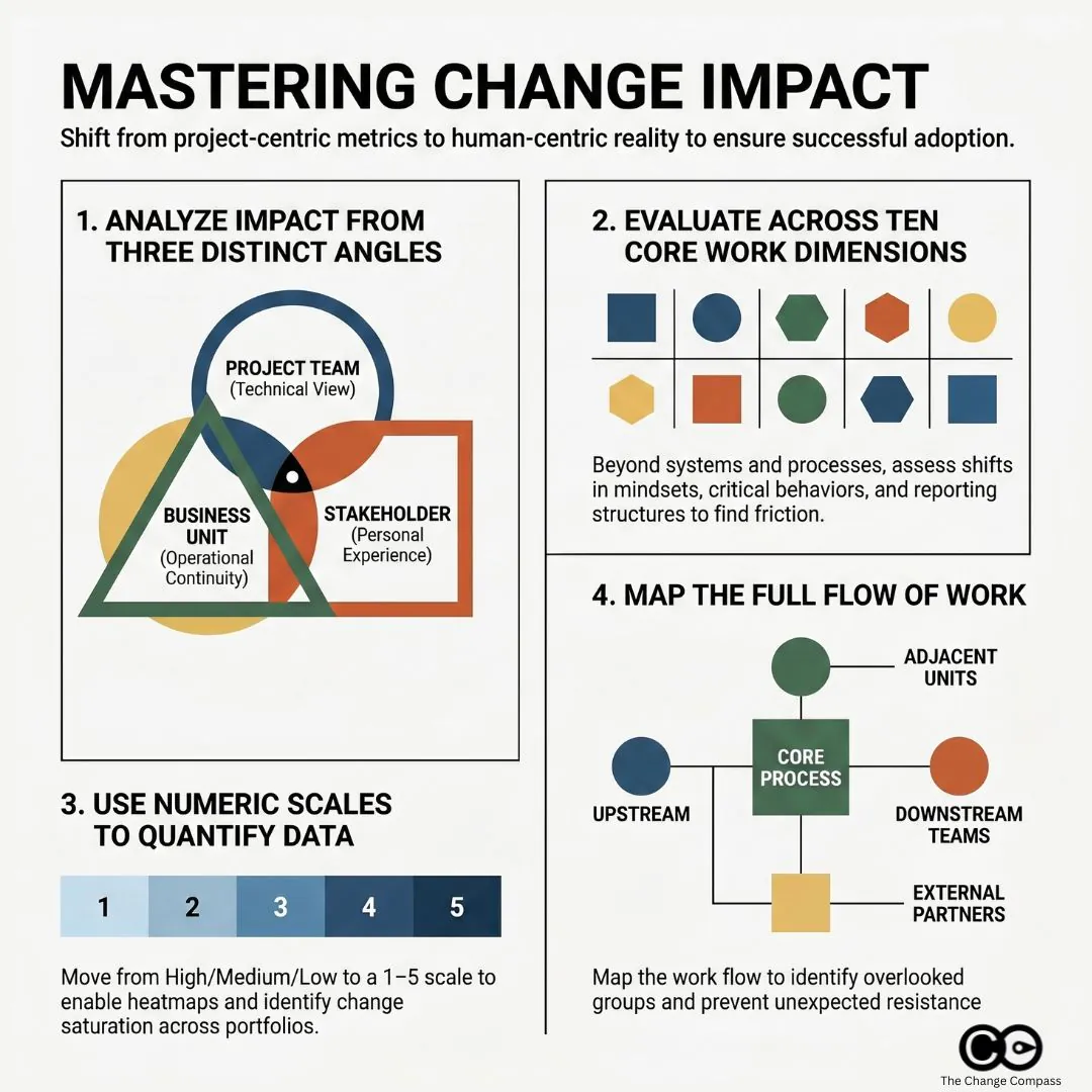
This is the central problem with how most change impact assessments are conducted: they are completed by people with a project-centric view of the world, using frameworks designed to categorise and rate impact, but the angle from which they are assessed shapes everything they capture. A practitioner who understands this limitation, and builds a process to correct for it, will produce assessments that are substantially more useful than those that don’t.
This guide covers how to do exactly that: how to build a robust categorical framework, how to assess the same change from multiple angles, how to find the stakeholder groups you’re most likely to miss, and how to quantify impact data in ways that make it visible without stripping out the human signal that makes it meaningful.
What most change impact assessments get wrong
Search for “change impact assessment” and you’ll find dozens of templates, all variations on the same theme: a matrix of impact categories, a high/medium/low rating scale, a stakeholder column. The templates are not wrong. The categories they cover (processes, systems, job roles, behaviours, organisational structure) are genuinely the right things to assess. The problem is not the structure. It’s the assumption embedded in how the structure gets filled in.
Most impact assessments are completed by the project team or the change practitioner supporting them. They are intelligent, informed people. But they are, by definition, looking at the change from the inside out: from the perspective of what the project is doing, not from the perspective of what the change asks of the people it will touch.
That project-centric angle creates two specific failure modes. First, impact ratings tend to reflect project risk rather than human experience: something is rated “high impact” because it is technically complex or carries implementation risk, not because it will be profoundly disruptive to the people going through it. Second, the stakeholder scope tends to reflect who the project team already knows about, not the full population of people whose working lives will be affected.
The fix for both problems is not a better template. It is a more deliberate approach to who fills in the template, from what angle, and how.
Building your categorical framework: how to classify and rate change impacts
A categorical framework is the foundation of any impact assessment. It gives you a consistent structure for describing what the change affects and a common language for rating how significantly it affects each dimension.
The most widely used categorical approach traces back to frameworks like Prosci’s 10 Aspects of Change Impact, which identifies the core dimensions of an individual’s work experience that a change can alter: processes, systems, tools, job roles, critical behaviours, mindsets and beliefs, reporting structure, performance review criteria, compensation, and physical location.
Not every aspect will be relevant to every change. But working through all ten prevents the common error of assessing only the obvious categories (processes, systems) while overlooking the ones that generate the most human friction (critical behaviours, mindsets, reporting lines).
Impact categories to cover
For most organisational changes, your framework should assess impact across at least these dimensions:
Process and workflow changes: the steps, procedures, or ways of working that will change
System and technology changes: tools or platforms being introduced, replaced, or modified
Role and responsibility changes: whether job descriptions, duties, or accountability structures will shift
Behavioural changes: new habits, skills, or ways of interacting that are required
Structural changes: reporting relationships, team composition, organisational design
Cultural and mindset shifts: changes to norms, values, or operating assumptions
Physical or location changes: office moves, remote working arrangements, site changes
Each dimension should be assessed for each affected stakeholder group, not just at the organisational level. A process change may be trivial for one team and fundamental for another.
Scoring and rating approaches
The simplest and most commonly used rating approach is a three-point scale: high, medium, and low. This has the advantage of simplicity and speeds up workshops and interviews. Its limitation is that it compresses nuance and makes it difficult to aggregate data across multiple changes or stakeholder groups.
A five-point numeric scale (1 = no impact, 5 = transformational impact) offers more granularity and, critically, makes the data quantifiable. When you need to compare the relative impact load across multiple projects or business units, numeric scores give you something to aggregate. When you’re reporting to a senior steering committee or trying to identify which groups are most affected across a portfolio of change, a dataset of numeric scores is far more useful than a colour-coded grid.
The rating criteria for each score point should be defined clearly and agreed before the assessment begins. “High impact” means different things to a risk manager and a frontline team leader. Calibrating the scale in advance, with concrete examples, dramatically improves the consistency and comparability of ratings across different assessors.
The angle problem: why the same change looks different depending on who is assessing it
If you ask a project manager, a business unit head, and a frontline team leader to independently complete an impact assessment for the same change, you will not get three versions of the same document. You will get three substantially different documents, with different ratings, different concerns, and different blind spots.
This is not because one of them is wrong. Each is describing the change from a genuinely different vantage point, and each vantage point illuminates things the others don’t see.
The project angle
The project team sees the change in terms of scope, deliverables, and implementation risk. Their impact ratings tend to focus on technical complexity, interdependencies with other systems, and the effort required to design, build, and deploy. This is useful, but it can consistently underestimate the human load of the change. A system migration that is technically straightforward can be enormously disruptive to the people who use it every day, and the project team, who may have spent months immersed in the new system’s logic, often underestimates how steep that learning curve will be for someone coming to it fresh.
The business unit angle
Business unit leaders see the change in terms of operational continuity. Their concerns are concrete: How much time will this pull away from BAU operations? How will this affect our ability to hit our targets during the transition? What does it mean for our team’s capacity and morale when we’re already stretched? A business unit assessment often surfaces timing and capacity concerns that the project team has not factored in, and it is not uncommon for a business unit head to rate the same change two impact levels higher than the project team did.
The stakeholder group angle
The angle most frequently missing from impact assessments is the perspective of the people actually going through the change. Frontline employees, customer-facing staff, and operational teams often experience changes very differently from how they are described in the project documentation. Their concerns are personal and concrete: Will I need to be retrained? Will my job change significantly? Will I have the support I need? Will this make my work harder before it gets easier?
Prosci’s Best Practices in Change Management research, drawing on data from over 10,800 practitioners across 25 years of benchmarking, identifies cultural awareness and alignment between the project’s understanding of impact and the actual experience of impacted employees as critical predictors of whether change management activity translates into real adoption outcomes.
The practical implication is straightforward: your impact assessment process should actively gather input from multiple angles, not just from the project team. That means structured conversations with business unit leaders, team leads, and representative samples of frontline staff, alongside whatever the project team has already documented. Where ratings differ significantly across angles, that gap is itself an important signal. It points to where misalignment is most likely to surface during implementation.
Casting a wide net: the stakeholder groups most teams miss
One of the most consistent gaps in change impact assessments is not in the ratings or the categories. It is in the list of stakeholder groups being assessed in the first place.
Project teams naturally scope their stakeholder lists to the people and groups they already interact with: the sponsoring business unit, the IT team managing the technical implementation, the HR team handling role changes. These are the groups that show up in steering committee minutes. They are not the only groups affected.
Across a broad range of change programmes, these are the groups most commonly missed:
Adjacent business units that interact with the changing process or system: a finance system change may significantly affect the procurement team even if procurement is not a named project stakeholder
External and third-party partners: suppliers, distributors, and contractors who interface with internal systems or processes can be substantially disrupted by changes they were never consulted on
Downstream customer-facing teams: changes in back-office processes often surface as problems in call centres and customer service teams, well after implementation is complete
Indirect managers: team leaders who don’t formally own the change but whose day-to-day management work is affected by it, particularly where performance expectations or reporting cadences shift
The quiet middle: employees who are neither visible change champions nor visible resistors, but who represent the majority of the adoption challenge and are consistently underrepresented in workshops and reference groups
Addressing this gap requires a deliberate stakeholder identification step at the very start of the assessment process, before any rating or scoring begins. A useful approach is to map the flow of work: trace the current process or system from end to end and identify every team, role, or external party that touches it at any point. This exercise frequently surfaces groups that weren’t on the original stakeholder list.
PMI’s research on stakeholder management is explicit about this: effective stakeholder management requires identifying all stakeholders, not just the visible or convenient subset. The same principle applies directly to impact assessment. A group not included in the scope of the assessment receives no change management support, no matter how significantly they are affected.
Bringing overlooked groups into the assessment process early, even through a brief structured interview or workshop, has two benefits. You get a more accurate picture of impact. And you start the engagement process with groups who would otherwise feel the change was done to them, rather than with them, which is one of the most reliable accelerants of resistance.
Quantifying impacts so you can see the full picture
There is a real tension in change impact assessment between the analytical value of numeric, quantified impact data and the risk of over-simplifying what is fundamentally a human experience. That tension does not need to be resolved in favour of one side. The most useful assessments work with both.
Building a scoring model that enables visualisation
When your impact assessment covers multiple stakeholder groups across multiple impact categories, the volume of data becomes significant quickly. A portfolio of ten concurrent change initiatives, each affecting six stakeholder groups across seven impact dimensions, produces 420 individual data points. Nobody can meaningfully interpret that as a spreadsheet of text ratings.
Numeric scoring enables you to aggregate this data into something visible. A change heatmap plots total impact load by stakeholder group or business unit, making it immediately clear which groups are facing the heaviest combined burden. Trend charts show how impact load is expected to peak and trough over a programme timeline. Portfolio comparisons surface the groups most at risk of change saturation, the point at which cumulative change volume exceeds an organisation’s capacity to absorb it.
These visualisations are not a substitute for analysis. They are a tool for making the analysis accessible to the people who need to act on it: executive sponsors, programme directors, and business unit leaders who have twenty minutes, not two hours, to understand the change landscape before making resource decisions.
Keeping qualitative insights in the picture
What numeric scores cannot capture is the texture of the human experience of change. A score of 4 out of 5 on “mindset and behavioural change” for a particular stakeholder group tells you this dimension is rated as a high impact area. It doesn’t tell you that the specific reason it’s high is that this team has been through two similar programmes in the last three years, neither of which delivered what was promised, and their starting position is deep scepticism rather than cautious openness.
That context is essential for designing effective change support. It doesn’t live in the rating. It lives in the interview notes, the workshop observations, and the conversations your change practitioners have had with team leaders. The standard for an effective impact assessment is not one approach or the other: it is a quantitative layer that enables pattern recognition and reporting, combined with a qualitative layer that explains the patterns and guides the intervention design.
As Harvard’s Advanced Leadership Initiative has noted on impact performance reporting, organisations that rely solely on quantitative metrics miss the strategic and contextual signals that explain why outcomes diverge, and often find themselves reacting to problems they could have anticipated if they’d given the human signal appropriate weight.
Most assessment templates are built for one data type or the other. The best practice is to design deliberately for both from the outset: numeric scores that can be aggregated and visualised, plus structured fields for the contextual observations that give those scores meaning.
Managing impact data at scale with digital tools
When you’re managing a single change programme, a well-structured spreadsheet can serve as your impact assessment tool. When you’re operating across multiple concurrent programmes, with dozens of stakeholder groups and regular executive reporting requirements, spreadsheets break down quickly. Version control, aggregation, and real-time reporting become significant operational problems.
Digital change management platforms like Change Compass are designed specifically for this context. They allow you to build and maintain impact assessments across a portfolio of changes, visualise cumulative impact load by stakeholder group over time, and generate the reporting that executive sponsors and programme boards need without a change practitioner spending two days manually consolidating spreadsheets before every steering committee. The underlying logic is the same as a well-built manual assessment. The difference is what becomes possible when the data is structured, centralised, and queryable across the full change portfolio.
Making impact assessment the start, not a checkbox
The most common failure mode in change impact assessment is completing it once, at the start of a programme, and never returning to it. The assessment becomes a governance artifact rather than a working tool.
Change programmes evolve. Scope changes. Implementation timelines shift. New stakeholder groups come into scope. The impact profile at go-live can look substantially different from what was assessed during the design phase. An assessment that isn’t updated doesn’t just become inaccurate: it actively misleads the people making resourcing and support decisions.
A useful impact assessment is updated at each major programme milestone, shared with business unit leaders as a conversation tool rather than a document to file, and actively used to prioritise where change management effort is directed. The stakeholder groups with the highest impact scores should receive the deepest engagement. The impact dimensions with the highest scores should receive the most specific support design.
Start with a stakeholder identification step that casts a wider net than your initial project scope. Run the assessment from multiple angles, not just the project’s view. Use numeric scoring to enable visualisation, and qualitative data to explain what the numbers are telling you. Treat the assessment as a working document that evolves with the programme.
The change impact assessment that does all of this is not just better governance. It is the foundation of a change management approach grounded in the actual experience of the people going through the change, which is, ultimately, the only experience that matters.
Frequently asked questions
What is a change impact assessment?
A change impact assessment is a structured process for identifying and evaluating how a proposed change will affect different parts of an organisation, including its people, processes, systems, and structures. It is typically completed during the planning phase of a change programme to inform change management design, resource allocation, and stakeholder engagement priorities.
How do you rate impacts in a change impact assessment?
Most practitioners use either a three-point scale (high, medium, low) or a five-point numeric scale. For portfolio reporting and visualisation across multiple initiatives, a numeric scale is more useful because it allows for aggregation and comparison. Whichever scale you use, the rating criteria should be clearly defined before assessments begin to ensure consistency across different assessors filling in the same framework.
Which stakeholder groups are most commonly missed in change impact assessments?
The groups most frequently overlooked include adjacent business units that interact with the changing process, external partners and third-party suppliers, downstream customer-facing teams, indirect managers, and the majority of employees who don’t attend steering committees or reference groups. A deliberate stakeholder identification step, tracing the flow of affected work end to end, is the most reliable way to surface these groups before the assessment begins.
How is a change impact assessment different from a stakeholder analysis?
A stakeholder analysis identifies who has an interest in or influence over a change and assesses their current level of support and engagement. A change impact assessment identifies what the change will specifically alter in the working lives of different groups. Both are needed for effective change management, and each informs the other: a stakeholder analysis shapes who you assess, and the impact assessment shapes how you engage.
How often should a change impact assessment be updated?
At minimum, an impact assessment should be reviewed at each major programme milestone: design completion, build completion, and pre-implementation. Any significant change in project scope, timeline, or stakeholder landscape should also trigger a review. Treating the assessment as a living document, rather than a one-time deliverable, is one of the most consistent differentiators between high-performing and lower-performing change functions.
Conducting a change readiness assessment is the practical process of evaluating, before a change goes live, whether each affected stakeholder group has the capacity, capability, commitment and conditions in place to absorb the change successfully. The step-by-step approach starts with defining what readiness means for this specific change, then segments the affected population, captures data from multiple sources (workload metrics, sentiment surveys, manager input, historical capacity data), scores each group against readiness criteria, and translates the results into specific intervention actions for low-readiness groups. The output is not a single score, but a prioritised action plan with named owners.
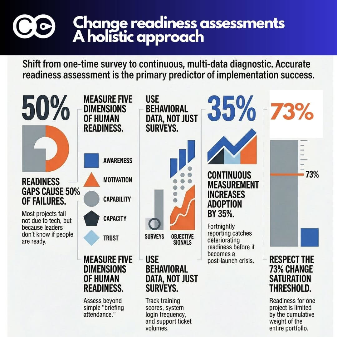
That number should give every change manager pause. Because the most common readiness tool in most organisations is a pre-launch survey, sent three weeks before go-live, with a 40% response rate and results that confirm what the project team already suspected. That is not readiness assessment. That is a post-rationalisation exercise.
Genuine change readiness is a dynamic, multi-dimensional condition. It reflects whether employees have the awareness, motivation, capability, and psychological bandwidth to adopt a specific change right now, not just whether they attended a briefing session and ticked a box. And critically, it is shaped not only by their attitudes toward your particular initiative, but by everything else being asked of them simultaneously across the entire change portfolio.
This guide sets out a practical, evidence-based approach to change readiness assessment: one that goes well beyond the survey, incorporates behavioural and system data, uses AI to accelerate synthesis, and accounts for the cumulative weight of change that real employees actually carry.
Why readiness is the real precursor to adoption
There is a persistent assumption in change management circles that adoption follows awareness. Build enough awareness, communicate clearly, and people will eventually adopt. The evidence does not support this. Prosci’s longitudinal research, drawing on more than 8,000 data points from organisations globally, shows that initiatives with excellent change management are six times more likely to meet their objectives than those with poor change management, and that the jump from awareness to actual behavioural change is where most programmes falter.
The ADKAR model is instructive here. Awareness and Desire are prerequisites for Knowledge, but Knowledge does not automatically produce Ability. People can understand exactly what a change requires and still be unable or unwilling to do it. Readiness sits squarely in that gap between knowing and doing. It is the accumulated condition of a person at a specific point in time: their confidence, their capacity, their trust in leadership, their workload, and their sense of whether this change is worth the effort it demands.
The Prosci research is unambiguous: when change management is applied with excellence, approximately 80% of projects meet or exceed their objectives. With poor or absent change management, that figure drops to 14%. The readiness assessment is your early-warning mechanism for which trajectory you are on.
What makes readiness especially critical is its predictive value. A readiness gap identified six weeks before go-live is actionable. The same gap identified two weeks post-launch is a crisis. Organisations that conduct continuous readiness measurement, rather than a single pre-launch snapshot, achieve 25–35% higher adoption rates than those relying on one-time assessment. Readiness is not a checkbox on a project plan. It is a continuous diagnostic.
The problem with survey-only readiness assessment
Surveys are useful. They are scalable, they are comparable over time, and when designed well they can surface genuine sentiment. But as the sole readiness instrument, they have serious limitations that most organisations overlook.
First, surveys measure declared intent, not demonstrated behaviour. A person can respond positively to “I feel confident using the new system” and still default to the old process when the pressure is on. The intention-behaviour gap is well documented in psychology: what people say they will do and what they actually do are often quite different, particularly in high-pressure or ambiguous environments.
Second, surveys are a lagging signal. By the time results are collated and reported, the organisation has moved on. Conditions change fast, particularly when multiple initiatives are running concurrently and team-level dynamics shift week by week.
Third, response rates and response bias skew the picture. Those most likely to respond to a readiness survey are often those with the strongest views: either enthusiastic adopters who inflate the readiness score, or disengaged resistors who depress it. The large silent middle, whose readiness is often the critical variable, is systematically underrepresented.
Finally, surveys can tell you that a readiness gap exists but rarely why it exists. Knowing that 42% of respondents feel “not confident” with the new process is interesting. Understanding whether that is driven by inadequate training, distrust of leadership, competing priorities, or unclear role expectations requires a different kind of data entirely.
A multi-method framework for change readiness assessment
Robust readiness assessment treats the survey as one of several data sources, not the primary one. The framework below sets out a step-by-step approach that change managers can apply to any initiative, from a technology rollout to a structural reorganisation.
Step 1: define the readiness dimensions for your specific change
Before deploying any assessment method, clarify what readiness actually means for this change. Generic readiness scales are rarely sufficient. An ERP implementation demands different readiness than a culture change programme. For each initiative, identify the specific dimensions you need to assess. These typically include:
Awareness: Do people understand what is changing, why, and what it means for their role?
Motivation: Do people see a personal benefit or at least a compelling reason to engage?
Capability: Do people have the skills, knowledge, and tools required to operate in the new way?
Capacity: Do people have the time and bandwidth to absorb this change given their current workload?
Trust and confidence: Do people trust that the change is being well-managed and that leadership is genuinely committed?
This scoping step prevents you from measuring the wrong things and ensures your assessment data connects directly to actionable interventions.
Step 2: use surveys as one signal, not the signal
Design your readiness survey around the specific dimensions you identified in Step 1, not a generic template. Keep it short (eight to twelve questions maximum), include at least two open-text questions to surface qualitative nuance, and run it at multiple points rather than once. Segment results by team, location, role, and manager, because aggregate scores mask the local variation that drives or blocks adoption.
Critically, build in a follow-up protocol for low-readiness scores. A survey that identifies a problem but triggers no response is worse than no survey at all: it signals to employees that their concerns were collected and ignored.
Step 3: gather behavioural and system data
This is where most change readiness assessments have a blind spot, and where the most honest picture of readiness lives. Behavioural and system data reflects what people are actually doing rather than what they say they will do.
Depending on your change, this data might include:
Training completion rates and assessment scores: Not just whether people attended, but how they performed. Low scores in required competency modules are a direct readiness signal.
System adoption data: Login frequency, feature utilisation, process completion rates, and error rates in new systems. These are real behavioural readiness indicators that most organisations already collect but rarely route to change teams.
Help desk and support ticket volumes: Spikes in support requests after go-live indicate either inadequate readiness or inadequate training design. Tracking ticket categories reveals exactly where readiness gaps are concentrated.
Process compliance data: Are people following the new process or reverting to old workarounds? Audit trails in systems like CRM, ERP, or workflow tools can reveal this directly.
Attendance and participation in change activities: Who is attending information sessions, completing pre-work, or engaging with change networks? Absence from these touchpoints is a passive readiness signal.
The discipline here is routing this data to change managers in near-real time, rather than leaving it siloed in IT systems or HR platforms where it is never seen through a readiness lens.
Step 4: conduct manager sensing and pulse reporting
Frontline and middle managers see readiness in ways that no survey can capture. They hear the informal conversations, notice who is quietly resistant, observe who needs extra support, and understand the team-level dynamics that shape how change lands.
Structured manager sensing involves regular (typically fortnightly) brief check-ins where managers report on a small number of consistent indicators: team sentiment, specific concerns raised, any behavioural changes in response to the upcoming change, and their own confidence in supporting the transition. This data should be structured enough to aggregate and compare across the organisation, but lightweight enough that managers will actually complete it.
Some organisations go further, using pulse tools that ask managers to rate team readiness across two or three dimensions on a simple scale, providing a running heatmap of readiness by team and location. This kind of continuous sensing is far more valuable than a single pre-launch survey, because it catches deteriorating readiness before it becomes an adoption problem.
Step 5: run diagnostic workshops and focus groups
Workshops serve a function that no quantitative method can replicate: they allow you to probe, test assumptions, and hear the reasoning behind attitudes. A well-facilitated readiness workshop with a cross-section of impacted employees will surface the specific concerns, misconceptions, capability gaps, and workload pressures that are shaping readiness in that part of the organisation.
Structured focus groups, particularly with sceptics or resistors, are especially valuable. These conversations often reveal systemic issues that no survey would capture: a lack of trust in a specific leader, a process design flaw that makes the new way harder than the old way, or a team-specific constraint that the broader programme has failed to account for.
Readiness workshops also serve a secondary purpose: they are themselves a readiness-building intervention. When employees feel heard, when their concerns are taken seriously and addressed directly, their readiness to engage with the change typically improves.
Step 6: synthesise signals into a dynamic readiness picture
The final step is the one most organisations skip. Gathering data from five different sources is useful only if that data is brought together into a coherent, interpretable picture of readiness at the group level and across the initiative’s lifecycle.
A readiness synthesis should map across the dimensions you defined in Step 1, draw on all your data sources, and be updated at meaningful intervals (typically fortnightly during an active change period). It should identify which groups are ready, which are borderline, and which are at risk, along with a clear articulation of the specific readiness gaps driving each risk rating. That synthesis is the document your sponsor and project team should be reviewing at every steering committee meeting.
The cumulative change problem: how your portfolio shapes readiness for any single initiative
Here is the readiness problem that change management programmes most consistently underestimate: the readiness of your people for this change is not determined solely by this change. It is shaped by everything else they are being asked to absorb simultaneously.
Research consistently shows that 73% of organisations are at or near their change saturation point: the threshold where concurrent initiatives overwhelm staff capacity and the ability to absorb any individual change, regardless of its quality, diminishes sharply. And the consequences are significant. Among employees experiencing high change fatigue, 54% are actively looking for new roles, compared to just 26% of those experiencing low fatigue, a retention gap of nearly 30 percentage points that is directly attributable to change overload.
The implication for change readiness assessment is significant. You cannot assess readiness for your ERP implementation without accounting for the fact that the same people are simultaneously navigating a restructure, a new performance management system, and an office relocation. Each of those initiatives consumes cognitive and emotional bandwidth. Each creates its own uncertainty and anxiety. And each reduces the available capacity for your initiative.
A change manager who assesses readiness in isolation from the broader change portfolio is working with an incomplete picture. They may diagnose low readiness for their initiative when the real issue is systemic change saturation: people who are fundamentally willing to adopt the new system but who simply do not have the bandwidth to engage with yet another change right now.
This demands a portfolio-level view of readiness. Organisations need to understand not just whether people are ready for a specific change, but what the cumulative change load looks like from the employee’s perspective, and how that load is distributed across different teams and roles.
Viewing readiness through the employee lens across the full change landscape
The most useful shift in perspective for any change readiness assessment is to move from the initiative view to the employee view. Instead of asking “are people ready for this change?”, ask “what does the full change picture look like for someone in this role right now, and does that picture leave them with the capacity and motivation to adopt this particular change?”
This means mapping the full set of changes affecting each impacted group, assessing the cumulative impact and demand on their time, and using that as the baseline against which you interpret readiness data for any individual initiative. A team that shows moderate readiness for your project but is simultaneously navigating three other significant changes is in a fundamentally different situation from a team with the same readiness score but minimal other change exposure.
The employee-centric view of readiness also reveals sequencing opportunities that an initiative-by-initiative assessment misses. If two high-impact changes are arriving at the same time for the same group of people, that is not a readiness problem, it is a scheduling problem, and the right intervention is timing adjustment rather than more training.
Organisations that adopt this perspective tend to make materially better decisions about go-live timing, phasing, and the allocation of change management resources. Rather than deploying equal effort across all initiatives regardless of context, they concentrate support where the cumulative load is highest and where readiness gaps are most pronounced.
How AI is transforming readiness intelligence
The traditional barriers to multi-method readiness assessment have been time and synthesis capacity. Gathering data from five sources, segmenting it by group, and producing a coherent readiness picture every two weeks was genuinely burdensome for most change teams. AI is materially changing this equation.
Large language models and AI-assisted analytics tools can now process qualitative survey responses at scale, automatically coding open-text comments by theme and sentiment, identifying patterns that would take a human analyst days to surface. A free-text comment from 400 survey respondents can be synthesised in minutes, with the most common concerns ranked, the strongest language flagged, and the themes segmented by business unit.
Predictive analytics applied to system and behavioural data can generate early-warning signals before readiness problems become visible to the naked eye. Drops in training assessment scores, spikes in specific support ticket categories, or declining engagement with change communications can all be weighted and combined into a predictive readiness score that alerts the change manager before go-live.
Natural language processing applied to collaboration platforms, such as workplace chat or internal forums, can provide a passive sentiment signal that reflects how employees are actually talking about a change in their day-to-day interactions, a very different and often more candid data source than anything they would submit in a formal survey.
The 2024 State of AI Change Readiness research by Microsoft found that the biggest barrier to AI adoption within organisations is not technological, it is leadership, and specifically the gap between leader confidence and actual employee readiness. That finding applies equally to AI-assisted readiness tools: the technology is available, but change teams need to actively embed it into their practice rather than waiting for it to arrive pre-packaged.
AI does not replace the human judgment required to interpret readiness data and design appropriate interventions. But it does dramatically accelerate the data collection, synthesis, and signal-detection work that currently consumes the majority of a change manager’s analytical time.
Using digital tools to maintain a dynamic view of readiness
For organisations managing multiple initiatives simultaneously, maintaining a dynamic, portfolio-level view of readiness requires more than spreadsheets and periodic reports. Digital change management platforms like Change Compass are specifically designed to provide this visibility, allowing change managers to track readiness indicators across multiple initiatives, overlay cumulative change impact data, and view readiness from the employee-centric perspective rather than the initiative view. The platform’s ability to aggregate multiple data inputs and present a real-time change load picture across the organisation makes the kind of portfolio-level readiness analysis described in this article genuinely scalable, rather than something that only the best-resourced programmes can afford to do.
Conclusion
Change readiness assessment is not a compliance activity or a project milestone to tick off. It is the most important predictive mechanism a change manager has, and the quality of that assessment is what separates teams that catch adoption problems early from teams that spend the post-launch period firefighting.
The shift required is from single-method, point-in-time assessment to a multi-method, continuous, employee-centric approach that accounts for the full change landscape people are navigating. That means triangulating surveys with system data, manager reports, behavioural signals, and workshop diagnostics. It means maintaining a portfolio-level view of cumulative change load. And it means using AI to accelerate synthesis so that readiness intelligence is available when it is needed, not three weeks after the window for intervention has closed.
Start with your current initiative. Define the readiness dimensions that matter. Map all five data collection methods. Build the portfolio-level overlay. That is the step from readiness assessment as a ritual to readiness assessment as a genuine strategic tool.
Frequently asked questions
What is a change readiness assessment?
A change readiness assessment is a structured process for evaluating whether employees and the organisation as a whole are prepared to adopt a specific change. It examines dimensions including awareness, motivation, capability, capacity, and trust. Effective assessments use multiple data sources, not just surveys, to build an accurate and actionable picture.
How is change readiness different from change adoption?
Readiness is a precondition for adoption: it describes the state of preparedness before and during a change, while adoption describes the demonstrated behavioural change that results from successful implementation. You assess readiness to predict and influence adoption outcomes. Low readiness, if unaddressed, reliably produces low adoption.
How often should change readiness be assessed?
Research indicates that organisations using continuous measurement rather than single-point assessments achieve significantly higher adoption rates. For active change initiatives, readiness should be assessed at meaningful intervals throughout the implementation lifecycle, typically fortnightly, with rapid-signal methods (manager sensing, system data) running continuously in between.
What is change saturation and how does it affect readiness?
Change saturation occurs when the cumulative volume of concurrent changes exceeds an organisation’s capacity to absorb them. Research indicates 73% of organisations are already at or near this threshold. Saturation directly undermines readiness for any individual initiative by consuming the cognitive and emotional bandwidth employees need to engage with and adopt a specific change.
How can AI support change readiness assessment?
AI can significantly accelerate readiness data collection and synthesis. Applications include automated thematic analysis of open-text survey responses, predictive analytics applied to system usage and support ticket data, passive sentiment analysis from internal collaboration platforms, and real-time dashboards that aggregate multiple readiness signals into an interpretable summary for change managers and sponsors.
Change management maturity is the degree to which an organisation has institutionalised change capability so it is repeatable, consistent and improving over time, rather than dependent on individual practitioners or isolated programmes. A mature change function has a defined methodology applied across initiatives, embedded practitioners across business units, governance that connects change activity to portfolio decisions, measurement infrastructure that tracks adoption and benefit realisation, and leaders who model the behaviour change required of others. Maturity matters because it is the difference between an organisation that succeeds at change because of who is in role, and one that succeeds because of how it operates.
Most organisations approach change maturity the same way they approach most capability gaps: they send people on training courses, roll out a methodology, and distribute a set of templates. It is a reasonable instinct. But after working with organisations across industries and geographies, a consistent pattern emerges that challenges this assumption. The teams that made the biggest leaps in change maturity were not the ones with the most comprehensive training programmes or the most elaborately designed toolkits. They were the ones who first learned to see the change happening around them.
That distinction matters enormously. Visibility and measurement do something that training alone rarely achieves: they create intrinsic motivation. When a business leader can look at a dashboard and see that their team is absorbing seven concurrent initiatives, the conversation about change management stops being abstract. It becomes urgent, personal, and practical. And organisations that reach that point of urgency tend to improve their change capability faster than any classroom intervention could achieve.
This article makes the case that building genuine change management maturity requires three things working in concert: meaningful visibility of change across the organisation, robust governance structures that bring discipline to how change is planned and sequenced, and a portfolio-level view that treats change capacity as a finite resource to be managed. Training has a role, but it is further down the list than most organisations assume.
The training-and-templates assumption
Ask a senior HR or transformation leader how their organisation is building change capability, and the answer is usually some version of the same story. A cohort of change practitioners has been trained in a recognised methodology, perhaps Prosci’s ADKAR model or Kotter’s eight-step framework. A standard set of templates has been created and made available on an intranet. Sponsor briefings are scheduled. A change network has been formed.
These are not bad things. But they share a common limitation: they treat change management as a skill to be acquired by specialists, rather than as a discipline to be embedded across the business. The result is that change management remains something that happens to business teams rather than something they actively participate in. Leaders nod along to change plans prepared by dedicated practitioners, but rarely feel enough ownership of the data to ask hard questions or push back on the change load being placed on their people.
Prosci’s research across more than 2,600 organisations reveals the cost of this gap. Projects with excellent change management are 88% likely to meet or exceed their objectives. Projects with poor change management: 13%. That is a nearly seven-fold difference in outcomes, driven largely by the quality of how the people side of change is managed. And yet the majority of organisations still treat the methodology as the destination, rather than as a starting point.
The deeper problem is that training programmes and templates are, by design, disconnected from real-time data. They equip people with frameworks for thinking about change. What they do not do is give business teams a clear, current picture of what is actually being asked of their people, how ready those people are for upcoming changes, or whether adoption is actually occurring once changes go live.
What actually accelerates change maturity
Visibility as the first catalyst
The most reliable accelerant for change maturity is the moment a business leader first sees their team’s change load visualised in a meaningful way. Not a list of projects. Not a status report. A genuine picture of cumulative change impact: how many initiatives are hitting which business units, in which timeframes, and what that means for the people doing the day-to-day work.
Something shifts when that visibility arrives. Leaders who previously treated change management as a compliance exercise start asking different questions. How does this new initiative land on top of what my team is already absorbing? Are we sequencing this sensibly? Who is most at risk of overload? What does our readiness data actually show? These are exactly the right questions, and they rarely get asked without data to prompt them.
This matters because sustainable change capability is built on habit and ownership, not on awareness. A business unit leader who has seen the visual representation of their team’s change load, and who has experienced the relief of better sequencing or the cost of poor planning, will prioritise change management in ways that no training course can instil. The motivation is intrinsic, grounded in something they have directly witnessed.
When business teams can see the data, behaviour shifts
The pattern repeats across organisations of different sizes and sectors. Business teams that engage regularly with change impact data, readiness assessments, and adoption tracking begin to mature much faster than teams where change management remains the exclusive domain of the change team. They start using the language. They ask for assessments before agreeing to new project timelines. They flag risks earlier, because the data gives them the language and the evidence to do so.
Readiness data is particularly powerful in this regard. When business leaders can see that their team’s readiness scores are lagging behind the go-live date of a major system change, the conversation about additional support shifts from a change practitioner’s recommendation to a business leader’s decision. That shift in ownership is the difference between change management as a service and change management as a capability.
Adoption metrics complete the picture. Tracking whether people are actually using new systems, following new processes, or behaving differently after a change goes live tells the organisation something that no impact assessment or readiness survey can: whether the change has truly landed. Mature change organisations do not close out initiatives when they go live. They close them out when adoption targets are met.
This is not simply a technology observation. It is a behavioural one. Data creates accountability. When change impact, readiness, and adoption are all visible, the full lifecycle of change becomes manageable rather than aspirational.
What research tells us about mature change organisations
The performance gap is significant
The case for investing in change maturity is not just philosophical. The performance differential between mature and immature change organisations is measurable, and it is substantial.
Prosci’s maturity model research found that more than half of organisations (54%) operate at Level 1 or Level 2 on the five-level maturity scale, meaning change management is either absent, ad hoc, or applied only on isolated projects. Only 11% had reached Level 4 or Level 5, where change management is embedded into organisational standards and has become a genuine organisational competency. The gap between these groups is not marginal: at higher maturity levels, change management occurs across more initiatives, is applied more consistently, and produces significantly better outcomes in terms of benefits realisation and achievement of strategic goals.
McKinsey’s research reinforces this picture. Organisations with excellent change management practices are six times more likely to meet or exceed their performance expectations. The research also found that putting equal emphasis on performance and organisational health during transformations is what separates the 30% success rate from a 79% success rate.
More recently, Deloitte’s research on organisational agility found that organisations leading the way in agility are approximately twice as likely as their peers to report better financial results. Change maturity and organisational agility are not the same thing, but they are deeply connected: an organisation that has built genuine change capability can move faster, absorb more change with less disruption, and recover more quickly when things do not go to plan.
The ability to undergo more rapid change without burning out the workforce is precisely what high-maturity organisations develop. They are not necessarily running more changes. They are running changes better, sequencing them more carefully, tracking readiness more rigorously, and building the organisational muscle to do it repeatedly.
The saturation problem most organisations overlook
One of the most consistent findings in change management research is how severely most organisations underestimate the cumulative burden of change on their people. Prosci’s research found that more than 73% of respondents reported their organisations were near, at, or beyond the saturation point. Yet most change governance conversations focus on individual initiative delivery, not on the total change load being absorbed by any given team or role group.
Change saturation is not simply a question of too many changes happening at once. It is a question of whether the organisation has the structures to see the problem coming, and the authority to do something about it. Without visibility and governance, saturation is invisible until it becomes a crisis. By the time leaders notice the symptoms, including rising resistance, disengagement and initiative stalling, the damage is already done. Readiness scores that were adequate six months earlier have deteriorated. Adoption rates have plateaued. And the change team is firefighting rather than building capability.
The structural foundations of change maturity
Visibility alone is necessary but not sufficient. Organisations that sustain high levels of change maturity over time tend to have three structural elements in place that give their change capability a backbone.
Change governance
Change governance refers to the formal structures, decision rights, and accountability mechanisms that determine how change is planned, approved, and overseen at an organisational level. Without governance, change management remains advisory. Individual practitioners can produce excellent assessments and plans, but if there is no mechanism for those assessments to influence decisions about timelines, sequencing, resourcing, or priority, they sit in folders and gather dust.
Effective change governance typically includes:
An executive-level sponsor or committee with explicit accountability for the change portfolio
A defined escalation path for change conflicts and capacity constraints
Regular rhythms for reviewing the cumulative change load across business units
Clear criteria for what triggers a change impact assessment, a readiness review, or an adoption audit
Governance checkpoints that require adoption evidence before an initiative can be formally closed
Governance does not need to be bureaucratic. But it does need to be real. The organisations that build genuine change maturity are the ones where change governance carries actual weight in project and portfolio decisions.
Business change processes
Alongside governance structures, mature change organisations embed change management into their core business processes rather than treating it as a parallel activity. This means change impact assessment is a standard part of the project initiation process. It means change readiness data is a standing item on portfolio review agendas, not a one-time survey conducted in the final weeks before go-live. It means adoption measurement is built into the benefit realisation framework from the outset, not bolted on after the fact. And it means business unit leaders have a defined role in the change process, not just as recipients of communications but as active participants in planning, readiness tracking, and adoption accountability.
The practical effect of this integration is significant. When business change processes are built into how the organisation already works, change management becomes part of the operating rhythm rather than an add-on. The cognitive load on individual practitioners reduces. Consistency improves. And the organisation begins to build a shared vocabulary around change impact, readiness, and adoption that reaches well beyond the change team.
Change portfolio management as air traffic control
Perhaps the most critical structural element for organisations managing high volumes of concurrent change is the practice of change portfolio management, sometimes described using the air traffic control metaphor. Just as an air traffic control tower tracks all flights in the air and on the ground, managing runway capacity and issuing ground stops when necessary, an effective change portfolio function tracks all active and planned initiatives, assesses their cumulative impact on affected populations, monitors readiness and adoption status across the portfolio, and has the authority to sequence, defer, or prioritise accordingly.
Protiviti’s analysis of change saturation describes this function well: a change management centre of excellence operating like an air traffic control tower, monitoring what is planned, assessing capacity, and implementing “ground stops” on lower-priority projects when the organisation cannot absorb more change. Without this function, competing projects land on the same business units simultaneously, readiness is assumed rather than measured, and adoption rates become a post-project surprise rather than an in-flight metric.
The air traffic control metaphor is useful precisely because it frames change capacity as a finite resource. Runways have limits. So do people. An organisation that treats change capacity as effectively unlimited will consistently over-commit, under-deliver, and wonder why its change programmes keep stalling.
A practical roadmap for building change maturity
Building change maturity is not a linear process, but there is a practical sequence that tends to produce the fastest results. Organisations that skip directly to governance structures without first establishing data visibility often find that governance lacks teeth, because there is nothing concrete for it to act on. Conversely, organisations that invest in visualisation without governance tend to produce interesting data that does not translate into changed behaviour.
A sequenced approach looks like this:
Start with change impact data. Before investing in methodology training or governance frameworks, get a clear picture of the change currently hitting your business. Which teams are most affected? What is the cumulative load across key role groups? This baseline is the foundation for everything that follows.
Add readiness and adoption tracking. Impact data tells you what is coming. Readiness data tells you whether your people are prepared for it. Adoption data tells you whether it has actually taken hold. Building all three into your measurement framework early means you are managing the full change lifecycle, not just the delivery phase.
Make the data visible to business leaders. Do not present change load, readiness, or adoption data only to the change team. Bring it into the room with general managers, operational leaders, and executives. The goal is to create the shared awareness that makes governance conversations real rather than theoretical.
Establish lightweight governance. Once leaders can see the data, the case for governance is self-evident. Start with a simple portfolio review rhythm and clear decision rights for managing conflicts and sequencing. Governance does not need to be complex to be effective.
Embed change into business processes. Identify two or three core business processes, such as project initiation, business case approval, or benefit realisation reviews, and integrate change impact assessment, readiness gates, and adoption milestones into them. This is where change management moves from advisory to mandatory.
Build capability where it is needed most. Only at this point does targeted training become highly effective, because it is being delivered to people who already understand why it matters. Training disconnected from real change context rarely sticks. Training delivered to leaders who are already engaged with impact, readiness, and adoption data lands differently.
Measure and improve. Use your baseline data to track maturity progress over time. Mature organisations treat change capability as a measured outcome, not an aspiration.
How digital tools support the journey
Building the kind of change visibility that accelerates maturity requires more than spreadsheets. Platforms like Change Compass are designed specifically to help organisations aggregate change impact data across initiatives, visualise the cumulative load on business units and role groups, and track readiness and adoption in a single portfolio view. When business leaders can see a real-time picture of what their teams are absorbing, how prepared they are, and whether previous changes have genuinely been adopted, the conversations about sequencing, prioritisation, and capacity shift from abstract to concrete. That shift, from gut feel to governed data, is often the turning point in an organisation’s maturity journey.
Where the journey actually starts
The organisations that build genuine change management maturity are not necessarily the ones with the most comprehensive training programmes or the most sophisticated methodologies. They are the ones that first make change visible across its full lifecycle, from impact through to readiness and adoption, then put governance structures in place to act on what they see, and then build the portfolio management discipline to treat change capacity as something to be managed deliberately rather than consumed carelessly.
The research is clear: mature change organisations outperform their peers significantly, can absorb more change with less disruption, and are far more likely to achieve the outcomes their transformation programmes set out to deliver. The path to that level of maturity is more practical than most organisations expect. It starts not with a training calendar, but with a dashboard.
What is change management maturity? Change management maturity refers to how consistently and effectively an organisation applies change management principles, processes, and governance across its initiatives. Prosci’s five-level maturity model ranges from Level 1 (absent or ad hoc) to Level 5 (organisational competency), where change management is a strategic capability embedded across the enterprise. Mature organisations apply change management systematically across impact, readiness, and adoption, not just on high-profile projects and not just during the delivery phase.
How does change management maturity affect business performance? The performance evidence is significant. Prosci’s research shows that projects with excellent change management are nearly seven times more likely to meet their objectives than those with poor change management. McKinsey’s research found that organisations with strong change capabilities are six times more likely to outperform their peers. At an organisational level, greater maturity translates directly into higher transformation success rates, better adoption outcomes, and faster realisation of strategic benefits.
What is change portfolio management and why does it matter? Change portfolio management is the practice of tracking and coordinating all active and planned change initiatives across an organisation, assessing their cumulative impact on affected teams, monitoring readiness and adoption across the portfolio, and sequencing them to prevent saturation and conflict. It is sometimes described using the air traffic control metaphor: like managing runway capacity, it ensures initiatives land without collision. More than 73% of organisations are operating at or near change saturation, which makes portfolio management one of the highest-leverage investments a mature change function can make.
What is the difference between change readiness and change adoption? Readiness measures whether people have the awareness, knowledge, and capability to change before a go-live event. Adoption measures whether they are actually using new ways of working after it. Both matter, and both are frequently under-measured. Organisations that track only readiness often mistake pre-launch preparation for sustained behaviour change. Organisations that track only adoption often find that poor readiness caused the low adoption rates they are now scrambling to fix. Mature change organisations track both, sequentially and in relation to each other.
What is the fastest way to build change management maturity? Based on observed patterns and available research, the fastest path to maturity begins with making change visible to business leaders across its full lifecycle, covering impact, readiness, and adoption, rather than starting with training. When leaders can see concrete data on what their teams are absorbing and whether change is actually sticking, they develop an intrinsic motivation to manage it better. Governance structures and embedded business processes then give that motivation a formal channel. Targeted capability building is more effective once leaders already understand why it matters.