It is the year of rabbit in the Chinese New Year of 2023. A quarter of the world’s population celebrates this. It is also the first year that a lot of countries are emerging from Covid and where there are little or no restrictions on travel and movement. People are travelling again and taking vacations. There is optimism in the air. Optimism that hopefully, the year brings better luck in health and economy for people a new year with hopefully less change and fewer disruptions.
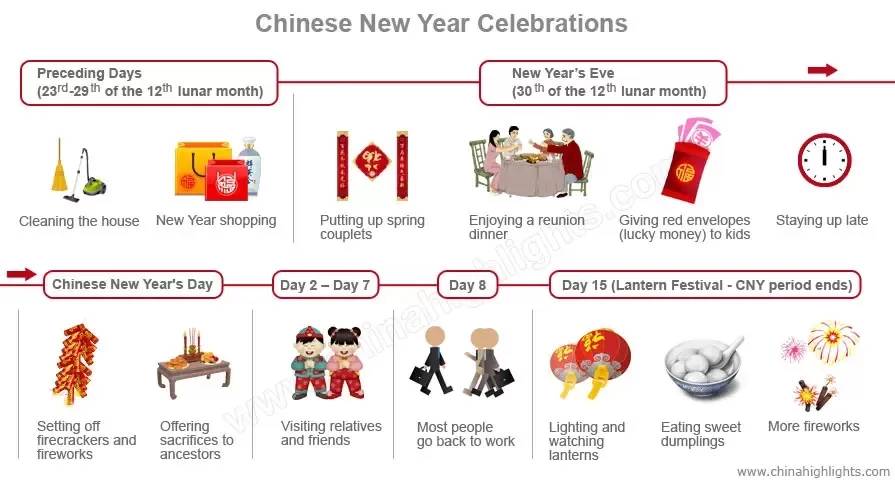
With any Chinese New Year, there is a set of traditional customs that accompany the new year. These customs have developed over the years as people gather to pray, to gather, to celebrate, and to make wishes for the new year. For example, the customs of a family getting together to clean their house, having dinner, and staying u late on New Year’s Eve were formed in the Wei and Jin dynasties (220-420 AD). From the Tang dynasty (618-907 AD) entertainment formed including as firecrackers, dragon and lion dances, and lantern shows.
These customs have been formed to welcome the new and the good and remove the bad and the old. It helps to gear the families and communities to bring positivity in facing the new year. These rituals help people focus on the milestone and use it as an opportunity to reset and renew.
In running change projects, we also need to re-gear ourselves for the new year so that we ourselves are in the right head space and outlook to drive successful change in the new year. How might we do this? Chinese new year customs offer some useful suggestions.
Tip 1 – Getting the house in order
To prepare for the new year the Chinese clean their houses and surrounding areas as a symbol of sweeping out any misfortune and traces of bad luck. This is aimed to rid the house of back luck and misfortune of the past to open up the spaces for all that is new, including good luck.
Change practitioners should also follow suit to ensure that their change initiative is set up for success. Keeping the ‘house in order’ means:
Ensuring the documentation and data are optimised, easy to access, orderly, and can meet audit requirements.
Access to files is well organised and appropriate. Roles that no longer require access may need permission updates
The change team resourcing is optimised. Is there sufficient change resources to meet project requirements for the new year? How can resourcing be optimised? If the change management stream was asked to cut costs, what would be items to consider?
Tip 2: Visiting relatives and friends – or stakeholders
Another Chinese New Year custom is to visit friends and relatives. This is a way for people to bring good wishes to each other. Often these visits involve bringing gifts such as fruit and local products.
Change practitioners should begin the new year by meeting with various stakeholder groups. Bring positive thoughts and wishes to your meetings. Re-connect with your stakeholder groups to find out how their holiday period fared. This may be one of those few opportunities during the year where you’re able to connect to your stakeholders at a personal level by understanding more about their families (whatever form the family may consist of).
When you re-connect with your stakeholder groups, think about:
What are the new or changing needs of your stakeholders in the new year?
Which stakeholders do you need to spend more or less time with as a result of your experience last year?
Where are your stakeholders along the change journey? What else could help to speed up their adoption of the change?
What communication, engagement, and learning needs have worked well or not so well with them?
Typical Chinese New Year customs
Tip 3: Setting off firecrackers and fireworks – or re-highlighting the change
In the Chinese New Year, the firecrackers and fireworks are to create a festive atmosphere to welcome the new year. It is about creating the right environment.
In a similar way, change practitioners need to think about how to open the new year with a bang to re-orient their stakeholders to focus on the change. This does not mean setting off fireworks literally. But it means being clear about what communications and engagement tactics might be needed to create the right environment for people to focus on the change in the new year.
It may not need to be a communications campaign. Some ideas of what may work in organisations to draw attention to re-orientate back to the focus on the change:
An interview with the project sponsor
Town hall session
A social lunch or drinks session
Posters and cards
Emails about the focus for the year
Show-and-tell session about the holiday period
Tip 4: New year’s shopping – or update
People buy food and gifts for Chinese New Year for friends and family to celebrate the fresh new year. This also includes wearing new clothes as a symbol of good health and prosperity for the new year.
In a similar vein, change practitioners should think about what reset or update is needed for the new year. What has been learned from the past year which can be applied in the new year? Does the change approach need to be adjusted or tweaked for the new year?
What aspects of the change needs to be updated for the new year?
These might include such as:
New survey format or tool to allow the project to easily design conditional questioning to probe deeper into potential change readiness and change adoption blockers
Change messaging or positioning that may need to be tweaked to better resonate with particular stakeholder groups. Look at the data in terms of feedback, click rates, or viewership rate of communication materials as evidence
Change measurement system may need to be tweaked. Are you able to collect the right type and level of data to make critical change decisions? How should measures be altered accordingly to better suit the demands of the new year?
Leverage AI and automation to work more productively and deliver more value. There is ChatGPT which is wildly talked about that can uses to write content for all types of purposes. The Change Compass also offers a range of automation and AI tools to make your lives easier in delivering change
These are some of the ways in which change practitioners can practice traditional Chinese New Year’s customs and rituals and apply them to their projects. Customs have been formed over hundreds of years and exist to mark milestones collectively for people. They help gear us for the new year, to be better prepared, and to be in the right mindset. Moreover, they help us to have the capacity to be optimistic. Through optimism, we can welcome the new year with intentions toward successful change.
In this Change Practitioner Q&A Series we interview change practitioners to find out more about how they approach their work.
A bit about Alvaro …
Alvaro is a change and program management professional, with experience in diverse industries, from Energy & Utilities, Education, Tech, Professional services, and Financial Services. He has worked across programs in transformation, technology, restructures, risk, regulatory, and culture.
Change Compass: Hi Alvaro, describe yourself in 3 sentences
Alvaro:
Personally, I tend to be cheerful and optimistic.
Professionally, I’m quite driven. I love to play a big part in complex pieces of work, being accountable for end-to-end delivery.
I like to “zoom in and out”. Diving into particular task detail, and also being clear of its value in the organisation, community, and society as a whole.
Change Compass: What has been the most challenging situation for you as a change practitioner? Tell us what happened and how you fared through it.
Alvaro:
The evolving nature of the change role and therefore the expectation on me as a practitioner. The definition of “change practitioner” is subjective across industries, teams, and projects; and thus, the “role” is not necessarily tied to a “title”. I’ve experienced this multiple times on projects.
Consider the overlap between the change analyst and business analyst roles, or between a change manager and a project manager. Since change management is not an isolated function, but rather is embedded across various teams, roles, activities, and artefacts (e.g., implementation plan), it’s not always easy to clarify roles and responsibilities. And this overlapping becomes more blurred when you add Agile ways of working/methodologies, product management, human-centred design, etc, which reminds me of The Change Compass articles on the role of Change Management in Agile.
These situations may be problematic if people in the team believe change management is an isolated function, or limit the practitioner to a particular methodology, potentially leading to “step on toes” situations – which I’m sure your readers are familiar with.
To overcome this, in the short term, I’ve spent time ensuring clarity of roles and responsibilities. Sometimes, this requires peer education on what change management is, which might even lead to some tough conversations. However, we should at least try to agree on common ground.
In the long-term (and I think we are heading there), industries, communities of practice, and professionals overall should move away from resourcing based on “titles” to evaluating “skills”. For example, rather than requesting a PM and a Change Lead, let’s think about the skills required for the management of such a piece vs the volume of expected effort.
Change Compass: What are the most critical and most useful things to focus on when you first start on a project, and why.
Alvaro: I would say three things:
1) Data: From PMO/CMO, find out about the product, service, and industry… but to start, obtain an employee list with information on location, business areas, and roles. This will allow you to dissect the organisation to understand the complexity of each area, and how to best plan your engagement. All you need is the basic understanding of organisational design, and pivot table skills.
2) Governance: Change professionals are usually not accountable for this, but we should definitely be a part of it. It makes a difference when roles and responsibilities (from business sponsor to the intern), communication, and approval channels are clear. This includes agreed ways of working. I don’t mean unnecessary formal documentation or undesired and draining team-building workshops. A visual representation (accessible for contributors) with one or two conversations should suffice.
3) Project documentation as a product: Clear, honest, diligent, and accessible documentation on what you are working on, feeling comfortable to disclose the work in progress. If you treat your project documentation as a great product for your stakeholders (from the beginning), you’ll save a lot of time for them and yourself (and they will love you for it).
TIP: Look at the collaboration tools at the company. Some are better than others, I strongly recommend Confluence.
Change Compass: As change practitioners, we don’t often get to stick around to see the fruits of our labour, but from your experience what are the top factors in driving full change adoption?
Alvaro:
Discuss with your team and business owners the expected adoption and embedment outcomes from the beginning, including how they will be measured.
Include a decent timeframe within the implementation plan for adoption and embedment work (before and after Go Live). Do not squeeze this within “hyper-care”.
Understand the embedment systems at the organisation (if any). This may include existing forums, regular surveys, champions, and team leader/supervisor conversations within the business. Instead of creating “new” sessions, you can agree with the business to leverage these.
Adoption & embedment documentation tends to be a “tick the box” exercise. Those supervising change within organisations need to be more outcome-oriented, rather than auditors (checking if the change manager completed “x” or “y” artefact). This will promote a focus on the quality of delivery, over a focus on the completion of documentation. For change managers, it means moving from “I’ve done the embedment plan” to “I’ve co-designed an embedment plan with the stakeholders”.
Change Compass: You’ve been known as great at managing tough stakeholders. What’s your secret?
Alvaro:
The honest yet boring side of it is that I actually enjoy conflict resolution. Years back, I used to work at a restaurant and my peers would always ask me to resolve a situation with a tough customer. It doesn’t sound like helpful advice, right? Well, I guess my take is: practice conflict resolution! You may understand it but it gets better with experience. Other things are:
• Empathy: You never talk to a “title” (e.g., Executive Manager), they are a person, with a life behind their job. • Transparency: Don’t play politics… it’s 2022 at the time of this article. Be yourself and say what and how things are. • Vulnerability: Geez! This one is so important. Admitting you (or what you represent) might be wrong (or can be better) is extremely powerful. Build trust by being human.
Change Compass: If you could alter the change management practice for the better, what would you want to see happen?
Alvaro:
I would love to see a focus on skills, not titles or fixed “change methodologies”. This also includes seeing change as embedded across roles, artifacts, and activities, not as an isolated function.
Skills for a change practitioner must include strong project management, as well as data analysis to drive decisions in engagement, overall timing, and measurement. This includes companies using integrated tools to understand change across the organisation, as well as change practitioners understanding how to leverage them.
Finally, change management institutions and communities of practice must push to better integrate change management within project management methodologies. For example, as part of Prince 2 or Safe Scrum. There’s no need for a “change role”, but many aspects are missed (or unclear).
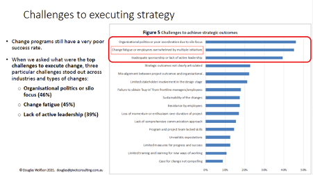
Seventy-three percent of employees affected by significant change initiatives report moderate to high stress levels. Fifty-four percent of those experiencing change fatigue actively look for a new role. And according to Gartner, employee willingness to support enterprise change collapsed from 74% to 43% between 2016 and 2022, driven directly by the increase in concurrent change from an average of two initiatives to ten.
This is not a data quality problem or a measurement artefact. It is the consequence of a structural failure in how large organisations manage their change portfolio. Programmes are approved, resourced, and launched without any systematic accounting for the cumulative burden they place on the employees who must absorb them. The result is change saturation , the state in which an organisation’s people have exceeded their capacity to process, adapt to, and sustain new ways of working.
Change saturation is not a new concept. But it has become the defining risk in enterprise transformation, and most organisations still have no formal mechanism to detect it, prevent it, or manage it when it occurs.
What change saturation actually is
Change saturation is the point at which the cumulative demands of multiple concurrent changes exceed the capacity of an individual, team, or organisation to respond effectively. It is not the same as change resistance, though the two are frequently conflated.
A resistant employee has a specific objection to a specific change. A saturated employee has no capacity left for any change. The saturated employee is not opposed , they are exhausted. The cognitive and emotional bandwidth required to learn new systems, follow new processes, report to new managers, and operate in new team structures is finite. When multiple programmes drain that bandwidth simultaneously, the result is a predictable set of symptoms: declining adoption, increased errors, higher attrition, and a pervasive sense among employees that nothing ever sticks.
Prosci’s Best Practices in Change Management research found that 73% of survey respondents reported their organisations were near, at, or beyond the saturation point. Separate Gartner research found that change fatigue causes employee intent to stay with their employer to decline by as much as 42%, while individual performance can decline by up to 27%.
These are not edge-case findings. They describe the median experience of employees in large organisations running active transformation portfolios.
The mechanics of saturation: how it builds
Change saturation does not arrive suddenly. It builds progressively as programmes accumulate and organisational capacity is steadily consumed. Understanding the mechanics helps practitioners identify where the risk is highest before symptoms appear.
The accumulation problem
Most programme approval processes assess the business case for individual initiatives in isolation. A system migration looks viable on its own. A restructure looks viable on its own. A new performance management framework looks viable on its own. But when all three land on the same group of employees in the same quarter, the cumulative demand is not additive , it is multiplicative. Each change adds complexity to the others and reduces the cognitive headspace available for any of them.
The timing problem
Even when organisations are aware of their total change portfolio, timing decisions are typically made by programme teams optimising for their own delivery schedule rather than for the employee population’s capacity. Go-live dates are chosen based on technology readiness, budget cycles, and executive preferences, not based on a view of what is already landing on the affected groups in that window.
The visibility problem
In most large organisations, no single person or team has real-time visibility of the total change demand on any given group of employees. Programme-level change managers know their own programme’s impact. They typically do not know what three other programmes are asking of the same people at the same time. Without that visibility, saturation risk is invisible until it becomes a problem.
The perception gap
Leadership teams frequently underestimate saturation risk because they observe it from a different vantage point. An executive sponsor sees one programme delivering one strategically important change. Their employees see ten. This perception gap is one of the most persistent drivers of under-investment in saturation management. When leaders genuinely do not believe saturation is occurring, the case for portfolio-level change management is difficult to make.
How to diagnose change saturation in your organisation
Before you can manage saturation, you need to be able to see it. Here is a practical diagnostic framework.
1. Map the change portfolio against the employee population. For each major initiative in flight, document which groups of employees are affected, how significantly, and across which change dimensions (processes, systems, roles, behaviours). This produces a heat map of change load by group.
2. Overlay the timeline. Plot each programme’s key demand periods (readiness preparation, go-live, post-go-live embedding) against a shared calendar. Identify windows where multiple programmes are making simultaneous demands on the same groups.
3. Assess cumulative load against capacity. For the highest-load groups, make an explicit assessment: is the cumulative change demand in the next six months within the realistic absorption capacity of this group? Factors to consider include: the complexity of each change, the group’s recent change history, their current business workload, and the availability of manager support.
4. Identify the saturation threshold. There is no universal rule for when saturation occurs. But a useful working heuristic is that when a group is experiencing more than two significant changes simultaneously , meaning changes that require new skills, new processes, or major behavioural shifts , saturation risk is elevated and requires active management.
5. Monitor leading indicators. Declining engagement survey scores, rising voluntary attrition in specific groups, increasing support ticket volumes, and manager-reported readiness concerns are all leading indicators of saturation before it becomes critical.
Six strategies for managing change saturation
Once saturation risk has been identified, there are six practical strategies for managing it. The most effective organisations use all six; the choice of which to prioritise depends on the severity of the risk and the speed of the portfolio.
1. Sequence rather than stack. The most direct intervention is changing the timing of when changes land on a group. If three programmes are converging on the same team in the same quarter, the default response should be sequencing , staggering go-live dates or phasing rollouts to spread demand over a longer period. This requires programme governance that treats employee capacity as a real constraint, not a soft consideration.
2. Reduce the scope of individual changes. Not every programme change needs to go live at once. MVP (minimum viable product) thinking, applied to change scope, means launching the essential changes first and introducing complexity in subsequent phases. A phased rollout extends the absorption curve and reduces peak demand.
3. Strengthen change support capacity. When sequencing is not possible, additional change support , more dedicated change practitioners, stronger manager engagement, more accessible training , can increase the effective capacity of affected groups. This is the most common intervention, but it is less efficient than sequencing because it treats symptoms rather than causes.
4. Make saturation visible to leadership.Prosci’s research on change saturation consistently identifies senior leader awareness as a prerequisite for effective saturation management. When leadership genuinely understands the cumulative demand on their people, sequencing decisions become easier to make and sustain. When they do not, every programme team will argue for priority.
5. Build a change portfolio governance function. Ad hoc saturation management is not scalable. Sustainable management of saturation risk requires a governance mechanism that regularly reviews cumulative change load across the portfolio, has the authority to influence programme sequencing, and reports to senior leadership on change capacity and risk. This is typically the function of the enterprise change management office.
6. Track and report saturation metrics. What gets measured gets managed. Organisations that actively track saturation indicators , cumulative change load scores by group, adoption rates across the portfolio, change fatigue survey results , are better positioned to intervene early than those that wait for symptoms to appear.
Change saturation and the AI-enabled future
One of the emerging developments in saturation management is the use of AI to detect and predict saturation risk earlier in the programme lifecycle. Rather than waiting for adoption to decline or attrition to spike, predictive models can flag groups at risk based on their current change load, their historical adoption patterns, and the characteristics of the changes landing on them.
This capability is not hypothetical. Purpose-built change management platforms are beginning to incorporate predictive saturation scoring alongside traditional impact assessment tools. For large organisations managing thirty or more concurrent programmes, this kind of automated early warning is becoming practically necessary.
Change Compass is designed specifically for this challenge , providing enterprise change functions with real-time portfolio visibility, cumulative impact analysis, and the data infrastructure needed to make evidence-based sequencing decisions. The Change Automator extends this with workflow automation that reduces the manual overhead of portfolio tracking.
The cost of ignoring change saturation
Organisations that treat saturation as an unavoidable side effect of transformation pay a price that rarely appears in programme business cases.
The most visible cost is adoption failure. When employees cannot absorb multiple changes simultaneously, adoption rates fall, benefits are not realised, and programmes that looked like successes in go-live status reports quietly fail in the field. Programmes that modelled a twelve-month payback period routinely take two or three years when saturation delays genuine adoption.
Less visible but equally significant is the attrition cost. When 54% of saturated employees look for a new role, the human capital loss is not just the direct replacement cost. It is the loss of institutional knowledge, change champion networks, and the managerial capability that is most critical during complex transitions.
The reputational cost is longer-term but persistent. Organisations that develop a reputation for poorly managed, relentless change find it harder to generate employee commitment to each subsequent initiative. The cumulative effect of saturation experiences is a default scepticism toward any new programme announcement , the “here we go again” response that can kill a transformation before it starts.
Frequently asked questions
What is change saturation?
Change saturation is the state in which an organisation’s people have exceeded their capacity to absorb, adapt to, and sustain multiple concurrent changes. It is distinct from change resistance: a saturated employee is not opposed to change, they are overwhelmed by the volume of it. Saturation manifests as declining adoption rates, increasing errors, rising attrition, and a general inability to embed new ways of working.
How do you measure change saturation?
Effective measurement combines change load analysis (the total volume and intensity of change demands on each group across all concurrent programmes), adoption metrics (whether changes are actually sticking), and leading indicators such as pulse survey scores, manager-reported readiness, and support ticket volumes. A portfolio-level change load heat map is the most practical starting tool.
What is the difference between change saturation and change fatigue?
The terms are often used interchangeably, but there is a useful distinction. Change fatigue describes the emotional and psychological state of an employee who is tired of change , the feeling of exhaustion and cynicism that accumulates over time. Change saturation describes the structural condition in which the volume of change exceeds capacity , the systemic problem that causes fatigue. Managing saturation requires portfolio-level intervention; managing fatigue requires individual and team-level support.
How many changes can employees absorb at once?
There is no universal threshold, but Gartner research suggests that the average large-organisation employee was experiencing ten simultaneous planned enterprise changes in 2022 , a level that research shows produces dramatic declines in willingness to support change. A practical working heuristic for significant changes (those requiring new skills, behaviours, or ways of working) is that more than two simultaneous changes elevates saturation risk materially.
Can change saturation be prevented entirely?
Not entirely, in large organisations running active transformation portfolios. But its severity and frequency can be significantly reduced through deliberate portfolio sequencing, consistent use of cumulative change load assessment, and a governance function that treats employee capacity as a genuine constraint. Organisations that build these capabilities experience meaningfully better adoption outcomes and lower attrition than those that manage change programme-by-programme.
“Orchestration” was named the project management word of the year for 2025. This is not a coincidence. It reflects a shift in how leading organisations are approaching the complexity of managing multiple changes simultaneously, moving from a model where initiatives are planned, delivered, and evaluated in isolation to one where the entire portfolio of change is coordinated as a single, dynamic system.
The older model, where each change programme has its own change manager, its own engagement plan, and its own go-live date, was designed for a world where organisations ran two or three major changes a year. Most large enterprises now run far more than that. Smartsheet’s 2025 Project and Portfolio Management Priorities Report, surveying 1,488 professionals at companies with more than 200 employees, found that 70% dealt with more change in 2024 than in any previous year, and 98% said those changes required them to alter their work priorities. A further 71% said constant workplace shifts make it difficult to stay productive.
The volume problem is not going away. Change orchestration is the discipline that addresses it.
What change orchestration actually means
Change orchestration is the practice of coordinating multiple concurrent change initiatives at the portfolio level, sequencing and resourcing them to maximise adoption across the organisation rather than optimising each in isolation.
The distinction from traditional change management is important. Traditional change management, done well, delivers a single initiative effectively. Change orchestration asks a different and harder question: given everything this organisation is changing simultaneously, what is the sequence, timing, and resource allocation that gives us the best chance of adoption across all of it?
This is fundamentally a portfolio management capability. It requires visibility of the full change landscape, a consistent methodology for assessing and comparing impact across initiatives, and governance structures that allow portfolio-level decisions to override programme-level preferences when necessary.
The OCM Solution 2025-2026 OCM Trends Report identifies three forces reshaping change management: the rapid rise of AI, growing change fatigue, and the demand for portfolio visibility. All three converge in the case for change orchestration. AI is accelerating the pace of change initiatives. Change fatigue is the consequence of uncoordinated delivery. Portfolio visibility is the prerequisite for orchestration to work.
The problems that only orchestration can solve
There are two failure modes that are structural to single-programme change management and that only portfolio orchestration addresses.
Change collision
Change collision occurs when two or more initiatives simultaneously demand significant behavioural change from the same employee group, without coordination of messaging, timing, or support. The employees receive conflicting or contradictory demands, or are simply overwhelmed by the volume of things they are being asked to change at once.
Change collision is most common at the intersection of large-scale technology programmes and organisational restructuring. Both require employees to change how they work. When they land in the same quarter, neither lands well. The technology adoption suffers. The structural change generates more resistance than it would in isolation. The organisation pays the cost twice.
Orchestration prevents collision by giving change leaders visibility of what is landing when and for which employee groups, enabling them to negotiate timing adjustments, stagger go-lives, or allocate additional support resources to groups carrying disproportionate load.
Change saturation
Change saturation is the cumulative effect of sustained high change load over time. It differs from collision in that it does not require two changes to land simultaneously. It occurs when an employee group has been absorbing continuous change for an extended period, and their capacity to engage meaningfully with new initiatives has been depleted.
Saturated employee groups show characteristic patterns: declining engagement survey scores, increasing resistance to new initiatives even when those initiatives are well-designed, higher-than-expected support demand post go-live, and slower adoption curves across the board. These patterns are often misread as specific programme problems when they are actually portfolio problems.
Orchestration addresses saturation by tracking cumulative change load over time, not just point-in-time impact. A programme that looks low-impact in isolation may be the fifth significant change landing on a specific team in 18 months. Without portfolio visibility, this risk is invisible. With it, the change team can flag saturation risk and advocate for sequencing adjustments before the problem materialises.
An orchestration maturity model
Change orchestration capability develops in recognisable stages. Most organisations sit at level one or two; the most sophisticated are at level four or five.
Level 1: Inventory. The change function maintains a list of active change programmes, but there is no systematic analysis of interaction effects or cumulative load. Orchestration is ad hoc, driven by individual change manager relationships rather than portfolio governance.
Level 2: Scheduling. The portfolio view includes timeline data, and there are informal conversations about scheduling conflicts. Go-live dates are occasionally adjusted to reduce obvious collisions. Impact data is inconsistent and not aggregated.
Level 3: Impact aggregation. Impact assessments use consistent methodology across programmes, enabling cumulative load to be calculated by employee group. The portfolio view shows not just what is changing, but how much change is landing on each part of the organisation and when. Regular portfolio reviews identify risk.
Level 4: Active sequencing. Portfolio-level decisions actively sequence initiatives based on change capacity and strategic priority. Programmes are deliberately staged, spaced, or consolidated based on orchestration analysis. Executive governance supports sequencing decisions even when they conflict with individual programme timelines.
Level 5: Predictive orchestration. AI-assisted analysis of historical adoption data informs capacity modelling. The change function can predict, with meaningful confidence, which groups are at risk of saturation given the current portfolio plan, and propose adjustments before risk materialises. This is where the field is heading.
How technology enables change orchestration
Manual orchestration at portfolio scale is difficult. The data management challenge alone, maintaining current, consistent impact data across 20 or more concurrent programmes, is substantial. More importantly, the analytical work of aggregating impact by role group, calculating cumulative load, and identifying risk patterns across the portfolio is time-consuming if done manually and prone to the blind spots that come from working in spreadsheets.
Purpose-built change portfolio management platforms, such as The Change Compass, address this directly. The platform’s core capability is change portfolio visualisation: seeing cumulative impact by business unit, role, or geography across all active initiatives simultaneously. This transforms orchestration from an aspiration into a practical process. Instead of a change leader spending a day preparing a portfolio view, the view is always current and accessible. Analysis that previously required significant effort becomes routine.
The Change Automator, as part of The Change Compass platform, further extends this capability by automating the coordination of change activities across programmes, reducing the administrative burden on change teams and enabling them to focus on the strategic sequencing decisions that human judgment is required for.
Making the business case for change orchestration
For change leaders who need to make an internal case for investing in orchestration capability, the most compelling argument is loss quantification. What does poor orchestration cost the organisation?
If a major technology programme misses its adoption targets by 20% because the user group it targets was simultaneously absorbing a structural reorganisation and a policy change, the cost is the delayed benefits realisation of the programme. In a typical enterprise technology implementation with a $50 million total project cost and a 30% productivity improvement target, a 20% shortfall in adoption could represent millions of dollars in unrealised benefit over the first year.
The Smartsheet research found that 92% of PPM professionals struggle to adapt to workplace changes, and 23% of organisations lack a standardised process for adapting to change at all. In organisations running complex change portfolios, the absence of orchestration capability is a significant and quantifiable source of value loss.
Where to start with orchestration
For organisations at level one or two on the maturity model, the most practical entry point is to start with visibility. Map all active change initiatives. Identify the five employee groups bearing the highest cumulative change load. Review whether the timeline for any current or planned initiative creates collision or saturation risk for those groups.
This diagnostic takes days, not months, and typically surfaces at least one critical risk that was not visible before the exercise. That visibility, and the conversation it enables with business leadership, is the first value that orchestration delivers. From there, the capability can be built progressively: a consistent impact methodology, a regular portfolio review, and eventually a governance structure that gives the change function the authority to make sequencing recommendations that stick.
Frequently asked questions
What is change orchestration?
Change orchestration is the practice of coordinating multiple concurrent change initiatives at the portfolio level, ensuring they are sequenced, resourced, and delivered in a way that maximises adoption across the whole organisation rather than optimising each initiative in isolation. It addresses the change collision and change saturation problems that arise when multiple significant changes land simultaneously on the same employee groups.
How is change orchestration different from change management?
Change management focuses on a single initiative: helping employees understand, adopt, and sustain a specific change. Change orchestration operates above this level, managing the interaction effects and cumulative impact of all changes across the portfolio. Both are necessary: orchestration without execution quality at the programme level fails to deliver, and strong programme-level change management without portfolio coordination creates avoidable collision and saturation.
Why is change orchestration more important now than five years ago?
Three trends have made it more critical: the volume of concurrent change initiatives in large organisations has increased substantially, the pace of AI-driven transformation is compressing timelines, and the evidence on change fatigue shows that employee change capacity is finite and can be depleted. All three make the cost of uncoordinated change higher, and the value of orchestration greater.
What data do you need to start orchestrating change?
At minimum: a complete inventory of active and planned change initiatives, a consistent impact assessment methodology that captures which employee groups are affected and to what degree, and timeline data for each initiative. This is enough to identify collision and saturation risks at a basic level. More sophisticated orchestration requires adoption tracking data and historical benchmarks, but visibility starts with the inventory.
What tools support change orchestration?
Portfolio-level change management platforms such as The Change Compass are purpose-built for this challenge. They aggregate impact data across programmes, visualise cumulative load by employee group, and enable the portfolio-level governance conversations that orchestration requires. General project management tools can support basic inventory management but typically lack the change-specific impact and adoption analytics that mature orchestration requires.
References
PMC Lounge. Project Management Word of the Year 2025: Orchestration. https://www.pmclounge.com/project-management-word-of-the-year-2025-orchestration/
Smartsheet. Navigating Change in 2025: Strategies for Project and Portfolio Managers (2025 PPM Priorities Report). https://www.smartsheet.com/content-center/inside-smartsheet/research/2025-ppm-priorities-report-key-takeaways
Gartner. Gartner HR Research Finds Just 32% of Business Leaders Report Achieving Healthy Change Adoption by Employees (2025). https://www.gartner.com/en/newsroom/press-releases/2025-07-08-gartner-hr-research-finds-just-32-percent-of-business-leaders-report-achieving-healthy-change-adoption-by-employees
ResearchGate. Global Trends in Change Management: Insights and Key Takeaways for 2025. https://www.researchgate.net/publication/389707029_Global_Trends_in_Change_Management_Insights_and_Key_Takeaways_for_2025
We’ve all heard about how change is the only constant and that change is intensifying and not going away. On top of increasing digitisation, we have Covid, extreme weather disruptions as well as other company changes. Not all changes can be planned for. Change is a balancing act, requiring significant skill and management. The analogy comes to mind of a spinning plate circus act. Each plate needs attention and constant spinning. The problem is when you have 10, 50, or 100+ plates, it becomes almost impossible to pay attention to every single one across the company.
This is exactly why it is so critical to have a single view of change. When you are only spinning a few plates you can easily see them all and have enough attention and bandwidth to ensure they are all spinning effectively. When the number and intensity of change multiply, this becomes tricky. Without a single view of change, how can any organisation manage change across the board? This is exactly the problem.
For most companies, each project team is organised as a separate team, with a separate set of stakeholders. Multiply this by the number of projects and you get the problem. The number of silos that is each project creates significant complexity for the organisations. These include:
At any one time, there will be multiple projects impacting the same part of the business. Since each project is only focused on its activities, they are mostly not aware of project activities from other projects that are impacting the same stakeholders.
For the same group of stakeholders, there may be very different ways of engagement and change journeys required. Too many different types of change can make it difficult for the impacted stakeholders to digest. Also, these changes, when combined, may or may not support the business objectives of that particular part of the business.
Some PMOs try to contain this complexity by creating different portfolios in which to group projects. The thinking is that each of the portfolio managers can manage a set of projects and can try to help join the dots where possible to coordinate the various releases and implementation of projects within each portfolio. However, managing too many portfolios can create even more complexity and thereby be less agile for the organisation. Also, most project portfolio managers are typically focused more on technical activities and releases, and less on resultant people impacts.
Why create a single view of change?
1. Change saturation and limited capacity
The first reason for creating a single view of change is to assess the risk for and avoid change saturation. There is evidence from several surveys including that from Prosci showing that change saturation/fatigue is one of the biggest challenges for organisations in changing. The pressure to change fast and still maintain business performance is real and impacts a wide range of industries.
Research highlighting change fatigue as a key change challenge
2. Business capacity.
Even if there was not a risk of change saturation and fatigue, there is constantly a challenge of limited business capacity to change versus ‘keeping the lights on’ activities or executing business-as-usual tasks. This includes both the capacity to change for those impacted by the change, and also for subject-matter-experts from the business who may be pulled by multiple projects and thereby have limited bandwidth.
3. Change portfolio management
The first 2 points are of a business lens, in terms of business-related change impacts across projects. However, from a change portfolio perspective, it also makes sense to have a single view of change to better manage a change portfolio.
What is offered by a single view of change that is meeting a gap with the data captured by existing PMO is, change impact. This change impact includes types of stakeholders, roles, the parts of the organisations, and how they are impacted by the change. Data may capture the extent of the change effort required, the time required to undergo change activities, and even behaviours required as a part of the transformation.
With a single view of change, the project portfolio can be better managed in terms of:
Project change resource allocation
Project release coordination and harmonisation and how they impact stakeholders
Change execution design across projects
Examine opportunities to create ‘change bundles’ where it makes sense, or to break down change releases into smaller pieces if that is a better fit for the business
Monitor operational risks across change releases
4.Change adoption
The ultimate goal of creating a single view of change is to maximize change adoption across the board. An impacted stakeholder group is likely going to experience multiple changes. If there is a way to design a change adoption process that makes it easier for the stakeholders it will significantly increase the likelihood of achieving full change adoption.
As a real example, at a major bank, the same group of stakeholders was asked by one project led by the Product division to prepare for the end of life of a credit card. They were asked to tell customers that this card will not only be sold after a certain date. On the other hand, another project led by Marketing was telling the same groups of stakeholders to sell more of this credit card to try and meet their quarterly target. Needless to say, this type of confusing message will not serve well to achieve any of the project change adoption targets.
5. Risk in change
Change risk management is an emerging discipline and growing in importance for Chief Risk Officers. This is particularly the case for financial services corporations. Risk in change is about how the organisation manages the risks by undergoing the committed changes in a way that allows them to operate safely. A key challenge is the visibility of the various changes presented in a way that allows the business to visualise these changes to be able to see the associated risks. A single view of change can add significant value from a risk lens.
If having a single view of change is so critical why is it that not more organisations have this? Here are some key reasons:
Perceived difficulty in capturing a single view of change. Most change practitioners will think of the vast number of projects that need to be engaged to create this view and the time it takes to do this.
How to capture the single view of change. With the various types of data available in each initiative some get overwhelmed and are not able to pinpoint exactly what information is required to be captured.
How to report on a single view of change. Most opt for a simple traffic light showing red, amber, and green of the varying levels of impact of each project. The problem is that this is not always based on data (instead, based on personal judgment), and is often not quite granular enough to make this useful.
One of the key benefits of a single view of change is that it is critical in supporting the work of managing a change portfolio to make the right decisions to manage change holistically. To find out more about how to calculate the financial benefit of managing a change portfolio visit our article here.
Solution on building a single view of change quickly
There are several approaches to building a single view of change quickly. As a first step, it’s important to define what outcome is required and how the artifacts might be used to make impactful business decisions. Focus on capturing the impact of change per initiative as a starter, detailing different levels of impact of the initiative based on actual impact activities of each initiative, versus using high-level personal judgment (which may be hard to defend in front of senior managers).
1. Focus on one part of the business to capture a single view of change
It’s important to note that a single view of change should always be showing the view from the business stakeholders’ perspective, versus from a project/program perspective. A way to kickstart the process with a more achievable target is to select one part of the business to start focusing on. Ideally, choose a part of the business that is concerned about change volume and would like to use the reports developed with a single view of change.
Ensure you get these stakeholders onboard, and involve those who ‘feel the pain’ of change complexity. These stakeholders can be your change champions in supporting the development and utilisation of a single view of change.
2. Focus on a smaller set of initiatives as a start
Again, rather than trying to capture every initiative in one go, start by selecting a group of initiatives, either within a portfolio or a large program. It can also be that you start by focusing on the more ‘strategic initiatives that are of higher visibility to stakeholders. These initiatives are also easier to define.
3. Conduct workshops to quickly gather data
One of the best ways to collect data quickly is to gather these in structured workshops. In each of the workshops you have a representative from each project attending, either a change manager or a project manager. In the workshop, you talk through the data you are trying to capture and work with the group to capture them. During the session, it is also a good idea to view the data collected and clarify as needed to ensure the data is spot on.
It is a good idea before the workshop to provide a simple template for participants to do the pre-work, identifying the change impact activities for their respective projects. Be clear in defining what these change impact activities mean, providing examples to show them the types of data you are after.
Here is a sample timeline for creating a single view of change:
Week 1: Align with sponsors and senior stakeholders on the ‘why’ of creating a single view of change Week 2-3: Conduct workshops to collate data cross initiatives Week 4: Create data visualisation and share with stakeholders
3. Utilise digital tools to automate and speed up the process
Using an Excel spreadsheet may be a good way to go in the beginning, but for organisations that have a digital focus, leveraging digital tools make perfect sense. Using change management tools that help you piece together a single view of change with all the fields and reports already built can save significant time and effort. With the ease of support for ongoing data collection, and reporting significant time and resources are saved. In addition, a good tool can help provide additional insight into what is happening to the organisation that manual ways may not generate. The ability to add significant value through data-backed insight that can significantly influence change implementation is one of the key advantages of leveraging a digital tool.
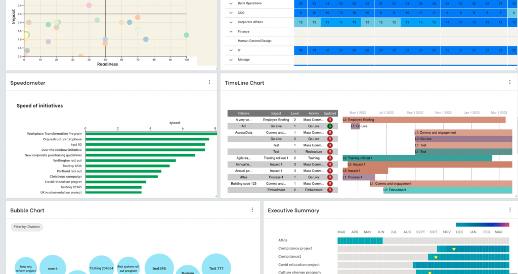
Different examples of a single view of change visualization
Moreover, a single view of change should not be a static artifact. Instead, it should be a live data source that is constantly changing as the organisation undergoes various changes. In a fast-paced change environment, it is even more critical to have the right digital tool to provide clear tracking and reporting.
Practical Tips and Strategies for Implementing a Single View of Change
Implementing a single view of change requires a systematic approach and careful consideration of various factors. Here are detailed practical tips and strategies to facilitate the process:
Define Clear Objectives:
Start by clearly defining the objectives of implementing a single view of change. Determine what outcomes the organization hopes to achieve, such as improved coordination, enhanced decision-making, or increased change adoption rates.
Ensure that the objectives are specific, measurable, achievable, relevant, and time-bound (SMART), providing a clear roadmap for implementation and evaluation.
Engage Stakeholders:
Conduct Impact Assessments:
Conduct comprehensive impact assessments for each change initiative to understand its potential effects on stakeholders, processes, systems, and the organization as a whole.
Identify and analyze potential conflicts, dependencies, and overlaps between projects to mitigate risks and ensure effective coordination and alignment.
Utilize tools and methodologies such as stakeholder analysis, risk assessment, and change impact analysis to gather and analyze relevant data.
Utilize Change Management Tools:
Leverage change management tools and technologies to streamline the process of capturing, analyzing, and managing change data.
Choose tools that align with the organization’s needs and capabilities, providing features such as data visualization, workflow automation, collaboration, and reporting.
Train users on how to effectively utilize these tools and provide ongoing support and maintenance to ensure their optimal functionality.
Establish Clear Communication Channels:
Establish clear communication channels and protocols for sharing information, updates, and feedback related to change initiatives.
Implement regular meetings, newsletters, intranet portals, and other communication tools to keep stakeholders informed and engaged throughout the implementation process.
Encourage two-way communication, soliciting input and feedback from stakeholders and addressing any concerns or questions in a timely and transparent manner.
Provide Training and Support:
Offer comprehensive training and support to employees and stakeholders to help them navigate and adapt to change effectively.
Develop and deliver training programs, workshops, and resources focused on building change management skills, resilience, and readiness.
Provide ongoing support and guidance to individuals and teams as they navigate the complexities of change, offering coaching, mentoring, and access to relevant resources and expertise.
Monitor and Adapt:
Continuously monitor the effectiveness of the single view of change implementation and be prepared to adapt and refine strategies as needed.
Establish key performance indicators (KPIs) and metrics to track progress, measure success, and identify areas for improvement.
Solicit feedback from stakeholders and project teams regularly, incorporating insights and lessons learned into ongoing iterations and updates of the single view of change.
Engage key stakeholders from across the organization in the process of establishing a single view of change. This includes representatives from project teams, senior management, frontline employees, HR, IT, and other relevant departments.
Foster open communication and collaboration among stakeholders, encouraging them to share insights, concerns, and feedback throughout the implementation process.
Consider forming a dedicated change management team or steering committee to oversee the implementation and ensure alignment with organizational goals.
By implementing these practical tips and strategies, organizations can establish a robust and effective single view of change that enhances coordination, alignment, and success in managing change initiatives across the organization.
Addressing Potential Objections or Challenges
While implementing a single view of change offers numerous benefits, organizations may encounter objections or challenges along the way. Here are detailed strategies for addressing common concerns:
Resource Allocation:
Address concerns about resource allocation by conducting a thorough assessment of the time, budget, and personnel required for implementing a single view of change.
Prioritize resources based on the strategic importance and potential impact of change initiatives, focusing efforts on high-priority projects with the greatest potential for success.
Consider leveraging external expertise or resources, such as consultants, trainers, or change management professionals, to supplement internal capabilities and ensure successful implementation.
Resistance to Change:
Proactively address resistance to change by fostering a culture of openness, transparency, and collaboration within the organization.
Communicate the rationale behind the single view of change initiative, highlighting the benefits and opportunities it presents for stakeholders and the organization as a whole.
Provide training, education, and support to help employees and stakeholders understand and embrace the changes, addressing concerns, fears, and misconceptions along the way.
Involve stakeholders in the decision-making process and empower them to contribute to the development and implementation of the single view of change, fostering ownership and commitment to its success.
Organizational Culture Barriers:
Recognize that organizational culture can influence the success of change initiatives and take proactive steps to address cultural barriers.
Assess the current organizational culture and identify any values, beliefs, or norms that may hinder the adoption of a single view of change.
Align the implementation of the single view of change with the organization’s values and cultural priorities, emphasizing collaboration, innovation, and continuous improvement.
Engage cultural change champions and influencers within the organization to champion the initiative, build momentum, and overcome resistance to cultural change.
By proactively addressing potential objections or challenges, organizations can mitigate risks and obstacles to implementing a single view of change, paving the way for greater success and effectiveness in managing change initiatives.
In conclusion, establishing a single view of change is not merely an advantageous undertaking for change practitioners; it’s a fundamental necessity for navigating the complexities of modern organizational change. When executed effectively, a single view of change has the potential to significantly enhance the management of change portfolios and drive higher levels of change adoption across initiatives.
While the process of gathering and organizing data for a single view of change may seem daunting, structured approaches such as workshops can expedite this process, allowing organizations to achieve results within weeks rather than months.
However, it’s essential to recognize that a single view of change should not be viewed as a one-time endeavor. Instead, it should be embraced as an ongoing process, continuously evolving to meet the dynamic needs of the organization. By consistently generating engaging and impactful data visualizations, organizations can leverage their single view of change to glean valuable business insights and inform strategic decision-making.
In essence, a single view of change isn’t just a tool; it’s a transformative capability that empowers organizations to thrive amidst the ever-evolving landscape of change.
If you are about to embark on creating a single view of change and are thinking about whether or how to leverage a digital offering to support your efforts reach out and have a chat with us.