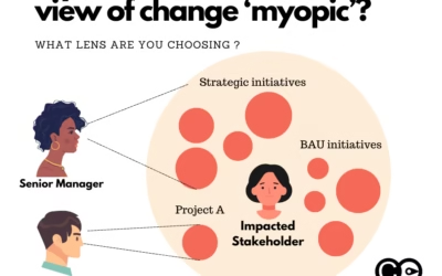
Do We Really Need a View of Changes Across the Organisation? As the pace of change accelerates, senior leaders are increasingly asking for a comprehensive view of changes happening across the organisation. However, not everyone sees the need for this. Some change...
Latest Blogs •
How to Improve Change Adoption: A Practical Guide for Change Practitioners
Change adoption is the heart of every change practitioner’s work. It’s the primary measure of whether a change initiative truly succeeds, yet, surprisingly, many organizations still fail to adequately track, measure, and manage change adoption. Without a clear...
Mastering Systems Change Management Through Systems Thinking
Change management practitioners are often tasked with ensuring that transitions are smooth and successful. However, to truly excel in this role, it’s crucial to embrace a systems thinking approach—an understanding that organisations are complex, interconnected systems...
The One Under-Emphasized Skill for Successful Change Managers
Change managers are not just facilitators of change transition; they are strategic partners who must understand and navigate complex organisational landscapes. One key skill that is often under-emphasised in this role is analytical capability. By adopting a strategic...
Are You Too Fixated on the Change Maturity of Your Organisation?
As a change management practitioner, your mission is to guide organisations through change, building their ability to manage transitions effectively and sustainably. A major part of this work often involves helping organisations develop their "change maturity" — the...
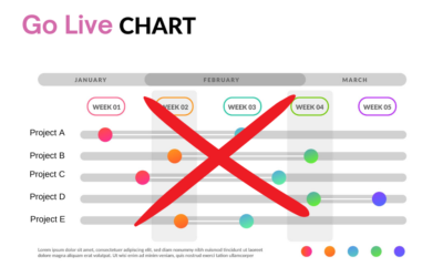
The Danger of Using Go Lives to Report on Change Management Impacts
In the world of change management, Go Lives are often seen as significant milestones. For many project teams, these events represent the culmination of months or even years of hard work, signaling that a new system, process, or initiative is officially being launched....
The ultimate guide to measuring change
Change measurement translates organisational impact into quantifiable data through surveys, analytics dashboards, and AI-powered tools. Organisations that measure change readiness and adoption rates are 78% more likely to meet project objectives. This guide covers six...
Change Management Adoption Metric Examples
Here is an infographic on examples of change management adoption metrics that you can use for your initiatives. There are metrics examples for 3 types of initiatives: System implementation Compliance Restructuring To find out...
Data driven revolution: The Crucial Role of Strategic Change Data Management
There is now a lot of attention and focus on data. However, is the same applied to change management data? With the substantial financial investments companies make in change efforts, there's a growing recognition of the need to leverage change management data...
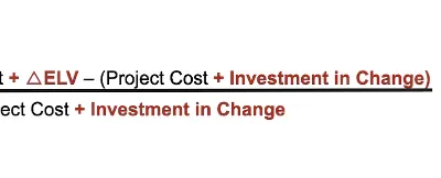
Why using change management ROI calculations severely limits its value
Change management professionals often struggle with proving the worth of their services and why they are needed. There are certainly plenty of reasons why change management professionals are required and most experienced project managers and senior leaders...
What are some of the benefits of using data science in change?
Change management is often seen as a ‘soft’ discipline that is more an ‘art’ than science. However, successful change management, like managing a business, relies on having the right data to understand if the journey is going in the right direction toward...
Designing a Change Adoption Dashboard: A Guide for Change Managers
good change adoption dashboard can make or break the full benefit realization of a change initiative. It captures the essence of what stakeholders need to focus on to drive full change adoption. This visual representation of the status and progress of a change...


