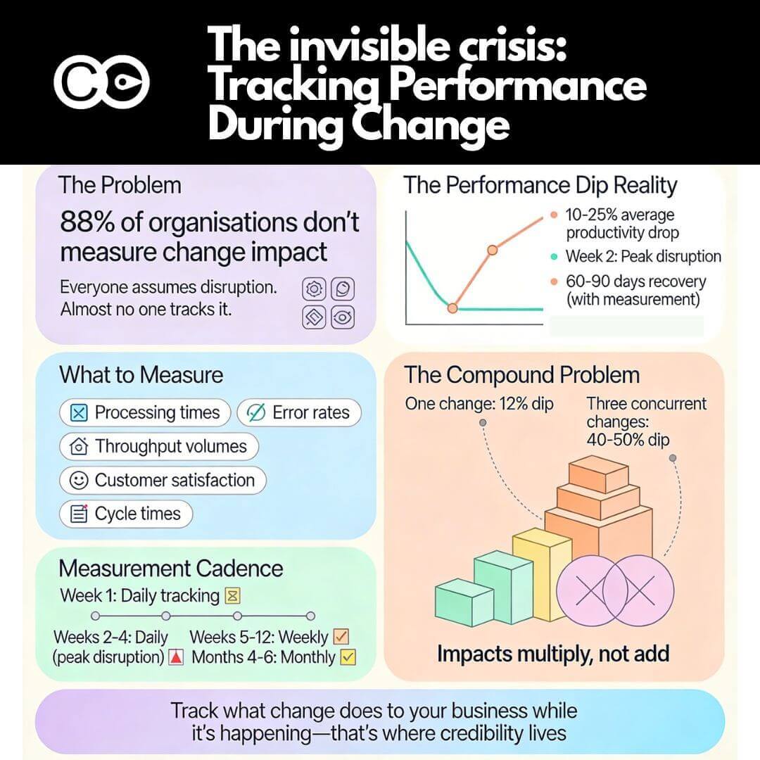
A typical scenario for a lot of program meetings goes something like this. The program spends the bulk of the time discussing program cost, delivery progress, technical risks and resourcing challenges. And when it comes to Change Management reporting, we are often left with a few anecdotes from stakeholder interviews, and often the only real quantitative reporting comes in the forms of training completion, readiness surveys, and email communications hit rates.
One wonders why Change Management is often glossed over as fluffy and soft vs. strategic and quantitative. Even for those who intuitively believe that managing change ought to be important, most lack quantitative data that demonstrate clearly how change progress directly impacts business outcomes.
How does a business manager, program or a change practitioner demonstrate the true strategic value of tracking change initiatives in order to highlight any risks and achievements? In particular with a group of initiatives.
Here are a few ways in which change impacts may be captured and reported in a quantitative way to support strategic decision making, starting with a birds-eye-view and sequentially drill down deeper to understand the scenario to aid strategic decisions:
1. Customer Experience Impact
One of the most profound ways in which change progress may be reported at a strategic level is by the extent to which initiative change impacts are shaping customer experiences. How are customer experiences shaped as a result of the suite of changes taking place?
Do initiatives result in a positive or negative impact on customer experience? E.g. does it improve or worsen a service delivery speed, functionality, quality, etc. Legislative initiatives for example may result in negative experiences depending on the nature of the change.
Is there too much change going on at the same time?
Does the customer give a damn about the change?
2. Change Impact dashboard
A good high-level view of various change impact data for an executive dashboard may include:
Initiative quantity and type (technology, product, policy, etc.) throughout the calendar year
Impact level and type (go-live, training, customer, etc.)
At-a-glance pie charts and bar graphs are ideal for summarizing multiple axes of data within a 1-pager
3. Change impact heat map
A good heatmap can be one of the most visually memorable reports on change impact with options to drill down into colour-coded divisional and sub-divisional impacts across the timeline indicating both the number of initiatives as well as the levels of impact.
4. Detailed initiative schedule
A detailed initiative schedule is helpful as we start to drill down to analyze which initiatives are contributing to business and delivery risks. Data may include initiative names, impact level, impact type, and impact dates across the calendar year. One starts to get a detailed understanding of which initiatives are high impact, contributing to change fatigue or could be better communicated and in synchronisation with other initiatives to reduce complexity for the audience.
5. Initiative report
After we have a clear understanding of the initiatives that we need to work on aligning to improve the overall execution and delivery effectiveness we then move to clarify the details of each initiative. At this level, the reporting contains a description of the initiative, contact persons, delivery timeline and business impact data. The report, therefore, should contain sufficient details to allow very actionable steps to connect, discuss, and plan for change alignment between initiative, portfolio and business owners.
To read more about change analytics follow these links:
Top 7 challenges faced by change managers in generating insight from change data


