In 2022, the average employee experienced ten planned enterprise changes simultaneously. In 2016, that number was two. Gartner’s research on change fatigue documents what happened next: employee willingness to support change collapsed from 74% to 43% in the same period.
That collapse is not a cultural problem. It is a process problem. The change management process most organisations still use was designed for a world where major transformation happened once every few years. It was built on linear, sequential logic: assess, plan, deploy, embed. Each phase completes before the next begins. Business as usual is suspended while the change happens. Then it resumes.
That model has been structurally broken for some time. The organisations that are still using it are not just inefficient , they are actively making change harder for their employees. This article examines why the traditional change management process fails in a high-velocity environment, what a modern iterative approach looks like, and how to make the shift without starting from scratch.
Why the waterfall change management process struggles at pace
The traditional change management process borrows its logic from waterfall project management: define requirements, plan in detail, execute in order, hand over to operations. Its appeal is its clarity. Everyone knows where they are in the process. Progress can be tracked against a plan.
The problem is that this logic assumes a level of environmental stability that no longer exists in most large organisations. By the time a twelve-month change programme has completed its planning phase and is ready to deploy, the business conditions that informed the design have often shifted. Stakeholders who were engaged at the start have moved on. The technology landscape has changed. A new leadership priority has landed. The organisation that was going to receive this change is not the same organisation that commissioned it.
McKinsey research on agile organisations consistently finds that organisations using iterative methodologies succeed at significantly higher rates than those using linear approaches. The mechanism is straightforward: iterative approaches build in the capacity to learn and adjust, rather than treating every deviation from the plan as a failure.
The second structural problem with the traditional change management process is that it treats adoption as a phase rather than a continuous state. The “embedding” phase at the end of a waterfall change programme is meant to lock in new behaviours after go-live. But adoption does not work this way. Behaviour change is not a state you reach , it is something you continuously maintain, reinforce, and measure. A process that treats embedding as a finite activity will almost always underinvest in it.
The three levels of the modern change management process
Before redesigning the change management process, it helps to be clear about what a change management process is actually trying to achieve. McKinsey’s framework for change identifies three levels of ambition, each of which calls for a different process:
Level 1: Compliance
The goal is that people adopt new procedures, processes, or tools. This is the most transactional form of change management and requires the shortest change process. Communication, training, and structured support are the primary mechanisms.
Level 2: Mobilisation
The goal is preparing employees for broader shifts that require new behaviours and ways of working. This requires more sustained engagement, leadership involvement, and reinforcement over a longer period.
Level 3: Transformation
The goal is improving performance and organisational health by embedding new management practices that change the way the organisation operates. This is the most complex form of change and cannot be managed through a linear, time-bounded process. It requires continuous measurement, iteration, and leadership commitment over years, not months.
Most organisations apply the same process regardless of which level they are operating at. The result is that compliance-level changes get over-engineered, and transformation-level changes get under-resourced.
What a modern, iterative change management process looks like
An iterative change management process is not simply a faster version of the waterfall model. It is a fundamentally different design. Rather than completing each phase before beginning the next, it runs phases in parallel, builds feedback loops into the process, and treats each sprint or cycle as an opportunity to adjust.
Here is what each stage looks like in practice:
Stage 1: Orientation and framing (weeks 1-3)
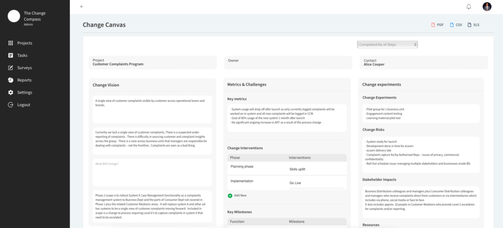
Rather than a comprehensive upfront planning phase, orientation focuses on the essential questions: who is affected, how significantly, what are the non-negotiables, and what can flex? The output is a lightweight change canvas rather than a detailed change management plan. The canvas captures impact, stakeholder profile, key risks, and the initial hypothesis for the change approach.
This stage should be done with the project team, not after the project team has finished its planning.
Change management activity is structured in four-to-six-week cycles, each with a clear focus and a measurable outcome. A cycle might focus on leader alignment, a specific stakeholder group’s readiness, or the training design for a particular module.
Each cycle ends with a short retrospective: what did we learn? what changed in the environment? what needs to adjust? This retrospective is not a sign of failure , it is how the process gets smarter over time.
Key activities within each cycle include:
Stakeholder pulse checks (short surveys or structured conversations)
Review of adoption indicators (early usage data, support ticket patterns, manager feedback)
Communication and engagement delivery against the current cycle’s priorities
Adjustment of the next cycle’s plan based on what was learned
Stage 3: Go-live support (weeks surrounding each release)
Go-live in an iterative environment is not a one-time event. Multiple releases may occur across the programme’s life. For each release, the change process focuses on:
Ensuring the affected groups are ready (not just informed)
Having reinforcement mechanisms in place at the team level
Monitoring adoption metrics from day one, not week four
This is the stage most waterfall processes either skip or treat as complete once training has been delivered. In an iterative model, adoption management continues until adoption indicators demonstrate genuine embedding, not just initial usage.
Adoption management activities include:
Regular adoption reporting to programme and business leadership
Targeted intervention for groups or roles showing lagging adoption
Reinforcement through leadership visibility and peer recognition
Updating supporting materials as practice evolves
The five principles that separate modern change management from the waterfall approach
Beyond the structural shift to iterative cycles, modern change management rests on five principles that distinguish it from its waterfall predecessor.
1. Start with impact, not activity. Traditional change processes generate activity plans: communication sent, training delivered, workshops run. Modern change management starts with impact data: which groups are most affected, how severely, and what does that mean for how they need to be supported? Activity follows from impact analysis, not from a template.
2. Measure behaviour, not completion. Sending a communication is not the same as people understanding the change. Delivering training is not the same as people being able to do their jobs differently. Modern change management tracks behavioural indicators , adoption rates, usage patterns, manager confidence, stakeholder sentiment , not just activity completion.
3. Run change management with the project, not after it. The persistent failure of change programmes that “bolt on” change management late is well-documented. Prosci’s research on change management timing consistently shows that early involvement in programme design, not just programme delivery, produces materially better outcomes.
4. Treat leaders as active participants, not passive sponsors. The role of executive sponsorship in change outcomes is one of the most consistently supported findings in the research literature. But modern change management goes further than securing a sponsor name on a communications template. It designs for active, visible leadership engagement at the moments that matter most to employees , particularly during transitions that affect role security, team structure, or ways of working.
5. Manage the portfolio, not just the programme. The Gartner finding that employees experienced an average of ten simultaneous changes underscores the problem with programme-level change management in isolation. Modern change management requires a portfolio view , tracking cumulative change load across the employee population and making explicit decisions about sequencing, pacing, and priority.
Common failure modes in the modern change management process
Even organisations that have adopted an iterative model run into predictable failure modes.
Iterations without real retrospectives. Running four-week cycles is not the same as running iterative change management. The value comes from the disciplined retrospective that follows each cycle , the honest assessment of what is working, what is not, and what needs to change. Organisations that go through the motions of iteration without genuine reflection get the overhead without the benefit.
Confusing speed with agility. Moving faster through the same linear process is not agility. Agility is the capacity to adjust direction based on new information. A team that compresses a twelve-month waterfall plan into six months is not running an iterative process , it is running a compressed linear one.
Under-resourcing the analytical function. An iterative change management process produces more data than a waterfall one. Adoption metrics, stakeholder pulse results, usage data, and portfolio load information all need to be collected, analysed, and acted on. Without the analytical capacity to do this, the feedback loops that make iteration valuable cannot function.
How digital tools support an iterative change management process
Iterative change management generates a data challenge that manual processes cannot easily handle. Change practitioners need to track adoption across multiple concurrent releases, monitor stakeholder sentiment across different groups, and maintain a real-time picture of cumulative change load.
This is where purpose-built change management platforms add operational value. Tools like Change Compass allow change teams to consolidate portfolio-level change data, track adoption metrics in real time, and generate the reporting that keeps programme teams and business leaders aligned on what is actually happening on the ground. For organisations running iterative change management at scale, this kind of digital infrastructure is not optional , it is what makes the process sustainable.
Making the shift: where to start
If your organisation is currently running a waterfall change management process and you want to move to an iterative model, here is a practical starting point.
Choose one active programme and run the next delivery phase as an iterative cycle rather than a phase-gate sequence. Define a four-to-six-week cycle, set one measurable adoption goal for that cycle, run a structured retrospective at the end, and adjust the next cycle based on what you learn.
You do not need to redesign your entire change methodology before starting. The iterative model is self-improving , each cycle builds the evidence base for the next one. What you do need is the leadership support to treat a retrospective’s findings as actionable, not defensive.
The organisations that have moved farthest toward modern change management are those that started with a small, visible experiment and used its results to make the case for broader adoption. That is, itself, an iterative approach.
Frequently asked questions
What is a change management process?
A change management process is the structured approach an organisation uses to plan, deliver, and embed change , covering everything from initial impact assessment through to adoption monitoring after go-live. A modern change management process is iterative rather than linear, running short cycles with feedback loops rather than sequential phases that must complete before the next begins.
What is the difference between agile and waterfall change management?
Waterfall change management completes each phase , planning, communication, training, embedding , in sequence before moving to the next. Agile or iterative change management runs these activities in parallel cycles, typically four to six weeks long, with a retrospective at the end of each cycle to assess what is working and adjust the next cycle’s plan. The iterative model handles environmental change better and tends to produce better adoption outcomes.
Why do change management processes fail?
The most common failure modes are: late involvement of change practitioners in programme design, treating adoption as a final phase rather than an ongoing state, measuring activity completion rather than behaviour change, and failing to manage cumulative change load across the employee population. Organisations that run change management as a project-level add-on rather than a portfolio-level discipline are particularly vulnerable.
How long should a change management process take?
Duration depends on the scale and complexity of the change. A compliance-level change might require a process of two to three months. A major transformation that requires genuine behaviour change and cultural shift may require sustained change management activity over two to three years. The mistake is applying a fixed time horizon to a change before assessing what level of change it actually requires.
How do you measure a change management process?
Effective measurement combines leading indicators , stakeholder readiness assessments, manager confidence surveys, early adoption rates , with lagging indicators , business performance metrics, sustained usage data, quality outcomes. The key shift from traditional measurement is tracking what people are actually doing differently, not what change management activities have been completed.
Agile methodology is fast becoming the ‘norm’ when it comes to project methodology. There are strong benefits promised of faster development time, the ability to morph with changing requirements, less time required to implement the solution, and a better ability to meet project objectives through continuous improvement. There aren’t too many organisations that do not use some form of agile project methodology in how they manage initiatives.
What started out as a way of developing software has evolved into the accepted methodology for managing projects. A scan of literature available on the internet shows a significant outline of the various roles, including the product owner and the development team, and their importance to stakeholders, including end users, in the agile project methodology process. Most roles are clearly outlined and accounted for. There are clear roles established for the business owner, the project manager, the scrum master, developers, testing and quality, product manager, architect, human-centred designer, and even IT operations.
However, there is a glaring gap. What about the role of the change manager?
A review of literature available through project management organisations such as APM (Association of Project Management) and PMI (Project Management Institute) showed glaring omission of the role of the change manager or change management practitioners from agile methodology. The same is also true for Scaled Agile Frameworks where there is a brief mention of the importance of change management in the agile approach, but no mention of the role of the change manager/practitioner.
Is it that there are less projects requiring change managers?
The evidence is against this hypothesis. Jobs in change management are plentiful, with data on ‘Indeed’ online employment portals pulling up over 38,000 job postings. On top of this, there is an increasing number of jobs posted. According to the U.S. Bureau of Labor Statistics, “management analytics” which includes change management, is projected to have a 14% growth rate between 2018 and 2028. In Australia, the ‘Seek’ employment platform projected change management job growth to be at 15% growth in the next 5 years.
Is it that agile methodology is more for technical projects and therefore the omission of change managers?
The agile approach and agile manifesto can be used for a range of different projects, but not all projects. There is certainly evidence of agile project methodology used by software developers in a wide range of industries from financial services, government, non-profit, pharmaceuticals, utilities, and retail industries. The agile methodology is commonly cited for being better for projects where the outcome is not clearly known and where the end change has a level of uniqueness. There are times, though, when waterfall methodology is more appropriate, depending on the situation.
However, it is not true that agile methodology is only used for more technical projects. Even for projects where the focus is not on technical development, agile approaches are used widely. Agile changes have been used for re-organisation exercises. Here is an example from the Business Agility Institute. Executive teams also use agile means to manage various strategic initiatives that are not technical. Agile approaches are even applied to managing church initiatives.
What is the likely reason for the clear omission of change management in the agile methodology?
Organisations in charge of documenting agile methodology are mainly focused on project management and software development. If we take the examples of PMI and APMG, both are project management associations, and both are focused on the project management perspectives of agile, particularly in complex environments. The portion on organizational change management is a specialism of project management. It could be that these organisations have not sufficiently developed agile change management methodology to integrate with agile project management.
Organisations in charge of documenting agile methodology are mainly focused on project management and software development, and not include the agile change management process. If we take the examples of PMI and APMG, both are project management associations, and both are focused on the project management perspectives of agile. The portion on organizational change management is a specialism of project management. It could be that these organisations have not sufficiently developed agile change management methodology to integrate with agile project management.
Even at Scaled Agile, which is about applying agile across the organisation, the omission of the role of change managers is still the case. Frameworks from Scaled Agile are quite detailed and rigorous. All aspects of the roles of various organisational members, including scrum teams, are clearly outlined. Even the role of IT departments in DevOps are clearly spelled out to support agile. But not the role of change managers. Again, this could be due to those at Scaled Agile not having a change management background, and therefore not being able to articulate the various role detail.
However, there are some very critical roles that change practitioners play not only at project level, but at program, epic, and organisational levels. Without the right change management support the following are key risks when organisations are working at SaFe (scaled agile) level:
Change sequencing to maximise adoption across the change portfolio
Packaging change to achieve optimal change adoption, e.g. in terms of integrating communications and learning interventions across projects
Establishing business unit based change champions that can support multiple projects and can help piece together different changes for impacted employees
There are some attempts at closing the gap to document agile change management approaches as a part of the change management process. However, most are conceptual, high level, and not sufficiently detailed to provide clear guidance and practical application for the change practitioner. On the other hand, the work of change management in agile projects should not only be clear for the change practitioner but also be clear for the project manager and other project members.
To access practical agile playbooks visit our agile playbook resources.
What’s the problem of omitting the role of change managers from agile methodologies?
1. The role of change management could easily be omitted. Particularly for less experienced project managers who are starting out in agile. The risk could be that change management is omitted from the project altogether since it is not called out as a clear role
2. Change practitioners and agile practitioners are not clear with the roles they play and therefore are not sufficiently involved in driving and supporting the project in the right way. Since there is not a clear set of guidelines and agile principles methodology for change practitioners, it is common to see varying approaches in how change managers support agile projects within the current business environment, with some still using a similar approach as to supporting traditional change management and waterfall projects which may not be appropriate.
3. Agile projects are not successful because change management work is not sufficiently incorporated into agile processes, particularly in the context of digital transformation. With change management roles not spelt out, the project executes the change without critical change management foundations, and therefore, by embracing agile thinking, it is at the risk of not achieving the adoption, adaptation, and benefit realisation targeted.
What should we do about this?
1. Encourage change management associations such as CMI and ACMP to invest in detailing agile change management methodology in a way that sets standards and guidelines for change management skills practitioners to follow.
2. Influence and work with APMG, PMI and Scaled Agile to include explicitly the role of change managers and agile change management methodology.
Change management is emerging to be a strong discipline that executives are starting to recognise as critical to successful change. The role of change practitioners should be stated explicitly and recognised clearly. Change managers should not have to tip-toe in maneuvering their place in supporting agile change projects, nor should they need to convince other project team members of their place throughout various agile routines and methodology phases. It is now time for the change community to drive this and achieve the recognition that it deserves.
Change portfolio management is the discipline of viewing, governing and sequencing every concurrent change initiative across an organisation as a single connected system rather than as a collection of independent projects. It looks across financial, operational, technology, regulatory and people-side changes, then makes decisions about timing, resource allocation, intervention and sequencing based on the cumulative impact on each business unit. The seven best practices that distinguish high-performing organisations from those that struggle include treating portfolio intelligence as governance rather than reporting, sequencing changes by stakeholder absorption capacity, measuring saturation continuously rather than at point-in-time, and integrating portfolio data into executive decision rhythms.
Managing a set of change initiatives through a systematic approach in the project intake process and portfolio management process, often outlined in a table of contents, is relatively new for some organizations. This strategic approach is drawn from the portfolio project management method by dividing a set of initiatives into different teams and viewing various project ideas and initiatives in unison. By doing this, organizations can make more informed decisions, allowing things to become more manageable from the perspective of planning how to organize the strategic objectives and business goals of the planning and sequencing of these changes.
Project portfolio managers are focused on investment funding, program management, governance, project execution, project selection, and resource allocation, including selecting the best individual projects related to the best projects and those related projects endeavors. For portfolio change managers, there are similar focus areas such as change program management, change initiative execution, resource management, and quality assurance. However, there are also several marked differences, including a focus on business change governance, business change capability, change leadership, and change tools and methodology.
In practice, there is often a wide range of practices in the service delivery and model of portfolio change management. Some focus purely on supporting project delivery and provide valuable insights, and in the process fail to uplift business change capability. Others tend to focus on general change capability through training and development and very little on change governance and supporting strategy implementation.
So, what are some of the best practices in strategic portfolio management that align with strategic organizational goals and change portfolio management by coordinating with individual project managers in achieving a strategic portfolio of projects that support strategic goals and overall business strategy? How does the change portfolio management function position itself to be strategic, value-adding, and seen as a driver of business results? Here are 10 best practices.
1. Use hard data.
A lot of change professionals often shy away from data. We prefer to focus on behavior, leadership, mindsets, norms, and culture. Whilst the ‘soft’ things may matter we need to be comfortable in working with data. Peter Drucker’s famous saying goes ‘What gets measured gets done’.
Disciplines with a strong focus on data usually have a strong seat at the business table. For example, Finance, Operations, and Sales. Even Marketing is not just about creative ideas and concepts, but there is a strong focus on cost, revenue forecast, and customer responses. Armed with data that drives business decisions you get a strong seat at the decision-making table.
What types of data should portfolio change managers focus on? The standard change measures include training attendance, stakeholder ratings, and arbitrary business readiness ratings. To really demonstrate value, portfolio change managers need to turn change management into a science and be able to quantify change to inform investment decisions effectively. Change Impacts is one great example. By quantifying change impacts into discrete units one can start to measure and understand what changes are and how they move over time and across different parts of the business.
2. Link change practices with business outcomes
Continuing from the previous point – armed with quantitative change impact data, the portfolio change manager is able to analyze the data to find any correlations between change impact data and business performance data. This can become a very powerful picture to take to the senior management team – drawing out the impact of changes on business performance.
Based on data from The Change Compass. An organization has been able to draw significant correlations between change impacts and customer satisfaction levels. This has since raised meaningful discussions regarding the approach of implementing changes and how to mitigate any potential negative impacts on the customer experience. It does not necessarily mean minimize on change impacts on the customer. Instead, it challenges the group to think through how to better engage and prepare for the customer to transition through changes. This is a great example of demonstrating the importance of linking change impacts with business outcomes.
3. Focus on building change capability more than just execution
A lot of organizations treat change management as only discrete pieces of work that need to be carried out as a part of a project. With this approach, these organizations have hired mainly contractors with some permanent change managers purely focused on project execution. Whilst this work is absolutely required to successfully land initiatives, these resources come and go and in the end, the organization is often no better off in managing change.
Instead, there needs to be a continual focus on developing business change capability. This may be carried out in different ways. With each project implementation, the change manager may focus on uplifting change management capabilities in the business within its leaders. Effective engagement and learning channels can be established to better aid the deployment of change initiatives. These include self-paced training systems, know-how regarding establishing and measuring various learning interventions, and different types of employee engagement channels, both face-to-face and digital.
As change portfolio managers, a concerted focus on embedding business change capability can ensure that the business becomes more mature at undergoing change. A strategic plan can be developed that includes different ways of targeting capability uplift and change maturity. This requires business sponsorship and focus. It is also a critical part of effective operational management.
4. Design and manage change governance
Establishing effective change governance does not mean complicated multi-level governance with lots of documentation, policies, and procedures and lots of headcounts to manage the processes. Change governance means having the right processes to ensure there is sufficient oversight and visibility on what changes are going to happen and the effectiveness of change delivery.
Different organizations will establish different governance processes to suit the particular cultural and business environment. However, at the most basic level, there should be a regular cadence where managers can see and visualize the changes that are going to happen, and discuss any risks and issues with the picture they are seeing. At the same cadence, there should also be a review of the previous changes and how they’ve been rolled out, with a view to identifying opportunities for improvement.
There should also be different levels of change governance for larger organizations. For a business unit, there should be a change governance focusing on changes within the business unit. There should also be an enterprise-level change governance focused on changes across the organization. At the enterprise level, the discussion will be on strategic initiatives that run across the company. There should also be discussions on any risks and issues with business readiness and the progress of the change.
A standard meeting agenda for change governance would include the following:
Review the previous month’s changes including callouts of highlights, challenges, employee engagement, results, and overall progress
Examining metrics around the amount of change and to what extent the level of changes can be digested by the business appropriately
Identifying potential contentions of concurrent changes within the plan. If concurrent changes are being released into the business, discussions should zoom in on the quantum and nature of change contention, rationale as to why the business may not be able to handle the volume of changes, and implications if the releases were to proceed
Examining the data to ensure that all changes are captured and there is nothing missing. Change data should contain key projects being implemented, BAU changes, and other corporate programs from groups such as IT or HR
Examining the overall upcoming change slate and identify upcoming risks and opportunities as a part of risk management. Opportunities may include potential gaps where there is very little change, and where there may be opportunities for initiatives to land
5. Leverage digital tools
Change portfolio managers manage the slate of projects using a structured process of funding, prioritization, analysis, and review based on data, ensuring strategic alignment with business objectives and maximizing business value. In a similar vein, so should change portfolio managers, particularly when considering insights from project proposals and a project management office. The power that change managers have is not around cost or schedule data; it is on change impact and change readiness as discrete data points, including the crucial role of the contributions of team members. The challenge is how to collect, analyze, present, and leverage the power of these data.
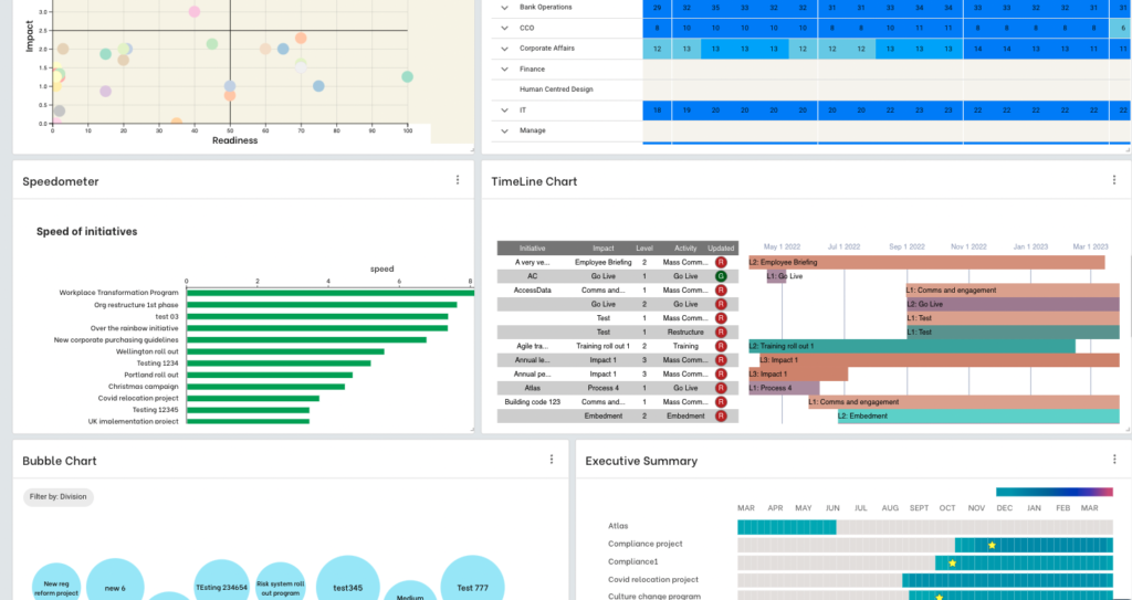
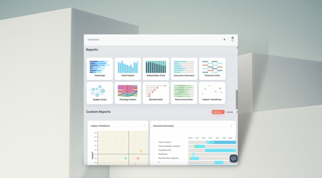
The Change Compass is a change portfolio management software that quantifies and packages change impacts into data that can be easily analyzed and presented in various visual formats to decision-makers in real time, as a part of effective portfolio management. Visuals are specifically designed to make people change decisions, and are not just simple headlamps or Gantt charts. Initiative owners who own the source of the information update change impact data. Up-to-date change impact project data can be accessed at any time with reporting generated automatically. The portfolio change manager can easily dissect, drill down, and cut data to find out the change health of the portfolio:
Is there too much change?
How is our staffing resource impacted by change activities (especially for resource-sensitive areas such as call centres)
What’s the change tolerance level for the business?
How are various stakeholder groups impacted by the changes?
How are initiatives under particular strategic themes impacting the business?
How are customers and their respective experiences impacted by our initiatives?
6. Examine customer impacts
At a portfolio level, it is not sufficient to just focus on internal employee and stakeholder impacts. The change portfolio management team manager also needs to place focus on how are customers impacted by the planned changes. This drives at the core of the focus of a lot of the organizations on the customer.
One large financial services organization that was focused on customer experiences started analyzing data on customer change impacts across initiatives. Through this, there was a significant realization that the same group of customers was impacted by 6 significant initiatives at the same time. Across each of these initiatives, there was no coordination and the silo approach meant that poor synchronization and coordination could lead to a very poor customer experience. Subsequently, new roles and remits were created to manage this customer experience through facilitating a coordinated approach to planning and implementing initiative rollout.
7. Iterative planning
Iterative planning is a core of agile ways of working. At the core of iterative planning is the belief that we don’t always know the solution that we are striving for at the beginning of the change initiative. It is when we start testing and getting feedback from users that we are able to refine our proposal and be able to come up with a solution that suits the organization.
To truly support agile ways of working, change management needs to be able to develop prototypes of the change approach, and be able to morph or tweak the approach as required based on feedback. For example, a change approach can be tested on a particular team, the change champion group, or a selected trial group. Communication and engagement approaches as well as learning approaches can be tested in these groups.
Want to learn more about managing change portfolios?
If you’re ready to start to manage a portfolio of change initiatives using data and insights, have a chat to us about how to leverage The Change Compass capabilities to help you pinpoint key risks and opportunities in managing across initiatives. To book a demo click here.
Enterprise change management reporting is changing. In today’s dynamic business environment, it no longer consists of general updates on organisational change management efforts, change leaders, streams of project progress, or updates on various change capability training session volumes and satisfaction rates. Executives are demanding more value from enterprise change functions that incorporate change management practices and digital transformation, leveraging new tools. The pace of change since Covid has not slowed down. For many, it has increased in pace and volume. To gain better insight into how the change management function is supporting the success of organisations, reports and dashboards have often become a visible linchpin of what value enterprise change management delivers.
What is enterprise change management and why is it important?
Enterprise change management refers to the structured approach organizations use to manage the people side of change in organizational change management, including the types of organizational change in processes, systems, and personnel across an entire organization, while integrating risk management principles. It’s crucial for minimizing disruption, ensuring smooth transitions, and enhancing employee engagement. Effective change management fosters resilience, boosts productivity, and aligns teams with organizational goals for sustained success.
What is enterprise change management and why is it important?
Enterprise change management refers to the structured approach organizations use to manage changes in processes, technologies, and organizational structures, including various type of change efforts that relate to the levels of change management. It’s crucial for minimizing resistance and ensuring smooth transitions. Effective change management enhances employee engagement, drives project success, and fosters a culture of adaptability within the organization.
Having the right content and format for your enterprise reports can make or break your reputation in the realm of information technology. Do it right and you could start a ripple of high-impact and strategic conversations across senior stakeholders that drive focus on improving change. You can be in the spotlight in influencing change leadership and the achievement of change and transformation goals. Do it wrong and you may never have another opportunity to have the room to talk about change management to senior leaders. You may be associated with not providing much value and too ‘operational’.
At its core, enterprise change management reporting goes beyond merely tracking progress. It encompasses a holistic approach that considers various factors crucial to the success of organizational initiatives. While monitoring progress, readiness, and the amount of work done may be interesting components, true impact comes from focusing on impacts, adoption and predictors for benefit realization.
Executives and stakeholders are not just interested in receiving progress updates; they seek insights into the likelihood of initiative success and the potential risks that may impede desired outcomes. These risks extend beyond project timelines and budget constraints to encompass broader business implications such as performance impacts, capacity constraints, prioritization effectiveness, and the sustainability of behavioural change.
Impacts of change:
Quantifying and visualising impacts are not new to change practitioners. The key is how the data is presented over time. A lot of change practitioners would settle with a standard heatmap based on personal ratings. This does not deliver much value as the data cannot be easily substantiated by evidence (since it is more of a finger in the air estimation). Standard heatmaps also are too high level and does not really support key decision making.
Decision making requires specific data points such as:
Change saturation or change tolerance levels (these levels need to be substantiated based on business indicator reference to justify the levels, and not be someone’s personal opinion)
What division, team, role and which week the saturation points are forecasted
Corresponding data on what initiatives, and their respective impact activities that contribute to the saturation risk, and therefore proposed options
A key part of representing change impacts should not just be at an operational level, which is more concerned about capacity and bandwidth. Impact should also be tied to strategic levers, portfolio types, benefit types and readiness.
Predictive Indicators for Success:
To create impactful change management reports, organizations must incorporate predictive indicators that go beyond change volume and risk assessment. These indicators should provide insights into business performance, strategy achievement, and the realization of intended benefits.
These are some of the ways you can incorporate predictive indicators:
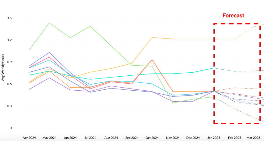
Forecast lines. With sufficient data you can forecast such as impact or capacity levels (which may be seasonal), or even readiness levels across the initiative lifecycle historically across initiatives.
The types of factors that can be included as predictive indicators can include readiness. It could be that readiness levels only get lifted just before go live or at go live. Adoption levels can also be forecasted if you have trend data across initiatives
Change tolerance levels across different parts of the business can also be seen as a predictive way of forecasting how much capacity there is for change beyond which saturation may be a key risk
Adoption and Behaviour Tracking:
Central to successful change management is the adoption and sustained implementation of new processes or technologies. Tracking adoption rates, user engagement, and behavioural changes are crucial indicators of initiative success. However, it’s essential to strike a balance between capturing relevant metrics and overwhelming stakeholders with unnecessary data.
Capturing behaviour change data can be key for larger initiatives or transformations. Behavioural change can be central in a range of changes such as customer centricity, efficiency, team collaboration or effectiveness. Measuring key behaviour changes that drive the initiative outcome the most is critical. For example, having effective conversations with customers to improve customer experience is a behaviour that can be rated, tracked and reported. Depending on the change, there may also be system features that can aid the tracking of these behaviours.
Effective change management goes hand in hand with strategic alignment, strategic goals, and necessary resources for strategic objectives. Reports should assess how initiatives contribute to overarching business objectives and whether they align with the rest of the organization’s strategic direction in the first place. Business leaders can utilize metrics related to revenue growth, cost savings, customer satisfaction, and employee productivity to provide valuable insights into the impact of change initiatives on business performance.
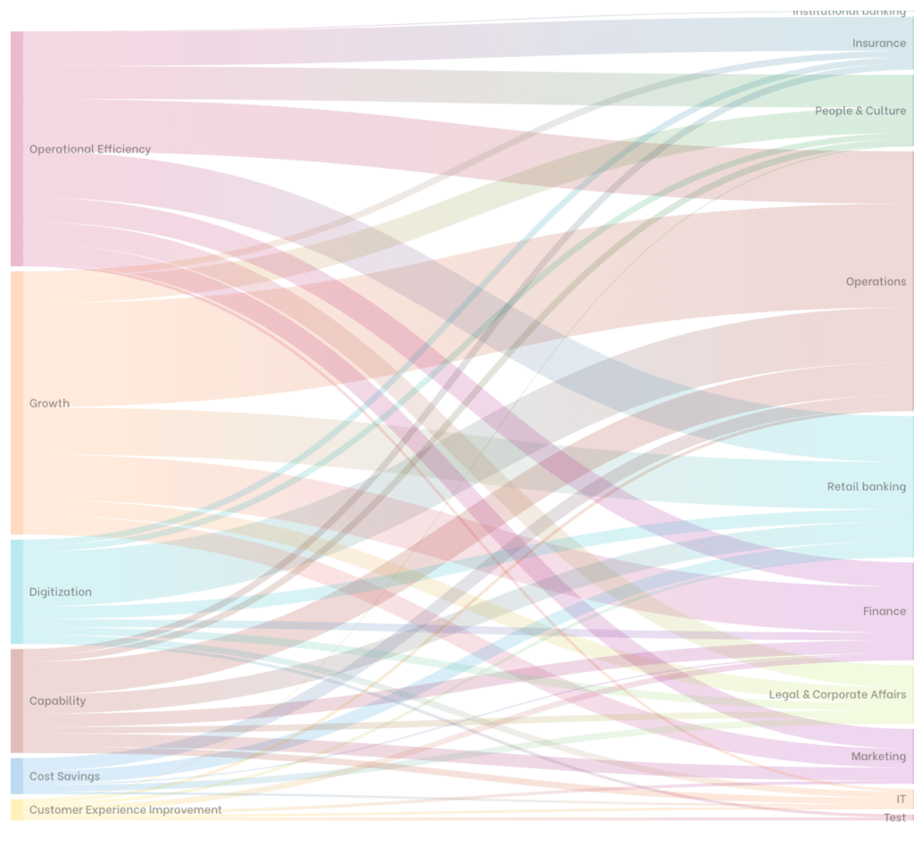
You can also link your change impacts to each strategic lever. In this way you can visually show the size of the impact per strategic lever. This will give your executives a way to examine whether the right level of impacts in the right areas of business are planned as a part of the course of each strategic lever.
The other angle is to visually show the pace of change against the strategic levers. Are certain key initiatives being driven at the right pace at the right time? Will the velocity of change exceed the ability of the business to absorb the changes? Or is the velocity not sufficiently meeting leadership expectations?
Benefit Realization:
Ultimately, the success of change initiatives is measured by their ability to deliver tangible benefits and assess the impact of the change. Change management reports should include key performance indicators (KPIs) and metrics that track the progress of change initiatives and the realization of expected benefits, whether they are financial gains, process efficiencies, or competitive advantages. By monitoring benefit realization, organizations can course-correct as needed and ensure that investments in change deliver the intended outcomes.
A key responsibility for change is to focus on those foreward looking measures that predict eventual benefit realisation, including readiness, adoption, engagement and behaviour change. Be sure to link these specifically to high benefit initiatives to provide strategic oversight.
Balancing Complexity and Clarity:
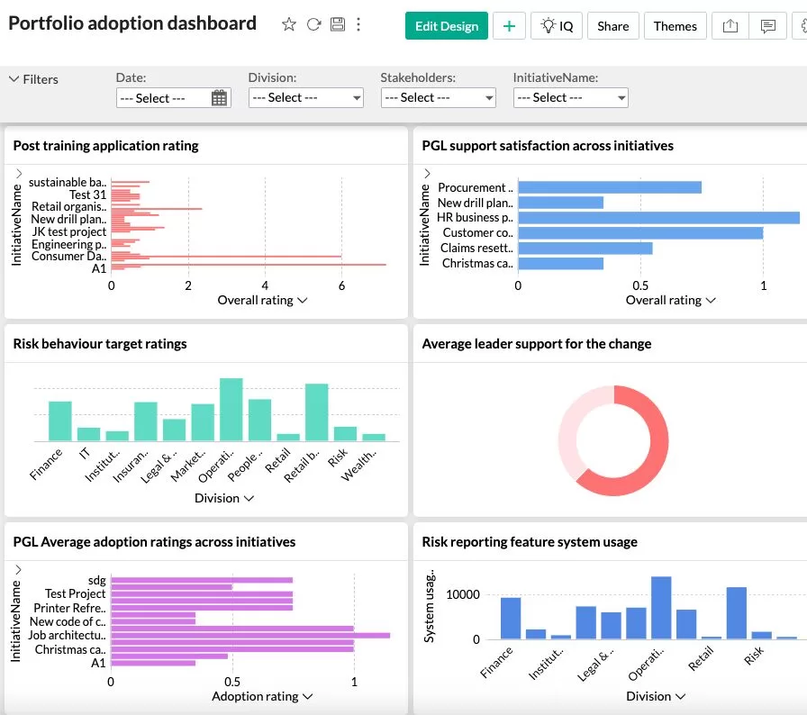
While incorporating a diverse range of metrics is essential for comprehensive reporting, it’s equally important to maintain clarity and focus. Reports should be structured in a way that highlights key insights and trends without overwhelming stakeholders with excessive detail. Visualizations such as charts, graphs, and dashboards can help distill complex data into actionable insights, facilitating informed decision-making at all levels of the organization.
All aspects of chart and dashboard designs are critical. These range from colour scheme chosen, number of charts, commentary, titles, legends, sequencing of charts, and type of charts chosen all act to either contribute to simplicity and clarity or complexity and confusion. Your narrative as you talk through the charts also plays a key role in building the story-line, and simplifying the key messages and actions you would like to impart to the audience.
Charts and dashboards tell a story and in presenting them you should always incorporate any actions required from the audience. If this is not done then it will always remain a FYI. FYI content will be deemed lower in the value curve over time and your stakeholders will lose interest. Instead, you should work on crafting a continual story that ebbs and flows. The following are key questions you should be asking when crafting you ongoing charts and dashboards:
Is there an emerging risk or opportunity that warrants specific focus for this month?
How are we tracking the effectiveness of stakeholder actions through data? This feedback loop is critical and gives your stakeholders a reference point for their own effectiveness
Is your data-based story uni-dimensional? Are there other dimensions beyond what you have been presenting that stakeholder should be aware of?
Are you giving stakeholders what they are most interested in? Whether it be strategic success progress, or benefit realisation?
Are you presenting change data in a holistic way in terms of how the business is run? Vs. just focused on standard change management function-specific metrics such as training sessions, or number of workshops completed?
Enterprise change management reporting is a critical tool for navigating the complexities of organizational change. By focusing on predictive indicators, including adoption and behavior tracking, business performance alignment, and benefit realization, organizations can unlock the full potential of their change management initiatives. However, achieving impactful reporting requires a careful balance between complexity and clarity, ensuring that stakeholders receive actionable insights without being inundated with unnecessary information. Ultimately, by harnessing the power of enterprise change management reporting, organizations can drive successful outcomes and thrive in an ever-evolving business landscape.
To find out more about enterprise change management reporting leveraging digital automation and analytics chat to us here.
Enterprise change management reporting refers to the systematic reporting of change management data across an organisation’s full portfolio of change initiatives – not just individual programme updates. It provides leadership with visibility of the total volume and complexity of change the organisation is absorbing, the adoption performance across all major programmes, and the change capacity available to absorb further change. Enterprise reporting is the foundation of a mature, data-driven approach to change governance.
How does enterprise change reporting differ from programme-level change reporting?
Programme-level change reports focus on the readiness, adoption, and risk status of a single change initiative. Enterprise change reports aggregate data across all programmes to show the full picture of change load, resource deployment, and adoption performance at the organisational level. Enterprise reporting answers questions that programme-level reporting cannot: which employee groups are over-saturated with change? Which programmes are competing for the same people’s attention? Is the organisation’s change capacity sufficient for the current and planned change portfolio?
What data do you need for enterprise change management reporting?
Enterprise change reporting requires three types of data: change portfolio data (what changes are being delivered, to whom, and on what timeline), change impact data (the level of disruption each change creates for each affected employee group), and adoption data (the rate at which changes are being adopted across the organisation). Collecting and aggregating this data manually is extremely difficult at enterprise scale – a purpose-built change management platform is typically required to make enterprise reporting sustainable and credible.
A change readiness assessment is a structured evaluation of how prepared an organisation, a business unit or a specific stakeholder group is to absorb a planned change and sustain new ways of working once the change goes live. It measures more than awareness or training completion. A robust readiness assessment captures historical change capacity, current workload and competing initiatives, leadership commitment, stakeholder sentiment, and the operational conditions that determine whether new behaviours will stick. Results are used to make sequencing, sponsorship and intervention decisions before go-live, not retrospectively. It is the supply-side answer to the demand created by the change portfolio.
Change readiness is one of the most critical, yet often misunderstood, concepts in organisational change management. For many practitioners, it’s been reduced to a series of surveys or assessments, a simple gauge of how “ready” stakeholders feel. But this oversimplification often leads to missed risks, unforeseen barriers, and ultimately, failed initiatives.
What is a change readiness assessment and why is it important?
A change readiness assessment evaluates an organisation’s preparedness for implementing changes, including aspects of organisational culture. It identifies potential obstacles, gauges employee attitudes, and measures overall alignment with new initiatives. This assessment is crucial as it helps leaders strategize effectively, ensuring smoother transitions and higher acceptance rates among employees during the change process.
True readiness requires more than checking a box on perceptions; it’s about strategically evaluating whether the organisation, at every level, is equipped to embrace, execute, and sustain the change. Let’s explore what it takes to reimagine change readiness as a multi-dimensional, evidence-based approach that ties people, processes, and technology into a cohesive readiness framework.
The Myth of the Readiness Survey
Surveys are not inherently bad tools, but they have their limits. Let’s start by looking at why they’ve become synonymous with readiness assessments and the pitfalls they often present.
Why Surveys Dominate
Surveys are appealing because they are quick, scalable, and easy to analyse. A single survey can provide insights into stakeholder sentiment across a large audience, giving change managers a sense of where resistance might lie.
The problem is that surveys capture perceptions, not reality. Stakeholders might report high awareness of a change but lack the detailed understanding required to implement it effectively. Most survey ask if a stakeholder is aware of certain aspects about the project. However, it doesn’t go into the depth in which the level of awareness is what is expected at that phase of the project (to do this a ‘test’ may be required). Similarly, they might feel optimistic about a change initiative but underestimate the challenges involved.
Example of Survey Pitfalls
Consider a large retail chain rolling out a new inventory management system. A readiness survey revealed that 85% of employees were aware of the change, and 75% felt confident they could adapt. However, post-implementation data told a different story:
Less than 50% of employees were actually using the new system correctly.
Misaligned processes between stores caused delays in inventory updates.
Leadership was disengaged, leading to inconsistent enforcement of new practices.
This misalignment occurred because the survey captured what employees thought, not what they could actually do. This just shows knowing may not equate to doing. Being aware, and understanding something does not necessarily translate into behaviour change.
Change readiness is not a one-dimensional measure of sentiment or awareness; it is the alignment of key elements—people, processes, technology, and leadership—toward the successful delivery of a change initiative.
Depending on the initiative the dimensions may also be different since different initiatives may require more or less of the various elements to be successful. For example, if there is a strong behavioural compliance element to the change, then tracking the change readiness process from understanding the why, strong leadership reinforcement, and operational reporting process setup may all critical elements of readiness.
Key Dimensions of Readiness
Leadership ReadinessAre leaders aligned on the vision and goals of the change? Are there different levels of readiness of different leadership levels?
Do they have the skills to lead their teams through uncertainty? What parts of the leadership skills are lacking? Coaching? Communication?
Are they modelling the behaviours required for change adoption?
Employee Capacity and CapabilityDo employees have the skills to adopt new processes or tools?
Can the organisation absorb the change given competing priorities and the context of change efforts? What does the change landscape look like? What about the operational capacity constraints?
Process ReadinessAre operational processes aligned with the new ways of working? Are new processes required being worked on so that the change may be sustained as business-as-usual after Go-Live? Are accountabilities clear for the new or changed processes?
Are dependencies between departments or systems resolved?
Technological ReadinessAre systems and tools tested and reliable?
Are integrations with existing technology functioning as expected?
Sponsorship and GovernanceAre sponsors actively engaged, providing oversight, and removing roadblocks? Or does the sponsor delegate all tasks and not really visible?
Is there a governance structure to monitor progress and address risks? For example, if risks need to be addressed would that decision be made or would the project just continue along?
Cultural/Behavioural ReadinessIs the organisational culture supportive of innovation and adaptability? In a lot of cases the organisation may not be ready, but the assessment needs to be on to what the extent the departments impacted have the capacity to change and adapt. This of course also depends on the quantum of the change.
Are there underlying resistance patterns that need addressing? If so, are they valid feedback regarding how previous changes were planned and executed, or is the negative behaviour inherent in the culture?
Are leaders aligned on the vision and goals of the change? Are there different levels of readiness of different leadership levels?
Do they have the skills to lead their teams through uncertainty? What parts of the leadership skills are lacking? Coaching? Communication?
Are they modelling the behaviours required for change adoption?
Do employees have the skills to adopt new processes or tools?
Can the organisation absorb the change given competing priorities? What does the change landscape look like? What about the operational capacity constraints?
Are operational processes aligned with the new ways of working? Are new processes required being worked on so that the change may be sustained as business-as-usual after Go-Live? Are accountabilities clear for the new or changed processes?
Are dependencies between departments or systems resolved?
Are systems and tools tested and reliable?
Are integrations with existing technology functioning as expected?
Are sponsors actively engaged, providing oversight, and removing roadblocks? Or does the sponsor delegate all tasks and not really visible?
Is there a governance structure to monitor progress and address risks? For example, if risks need to be addressed would that decision be made or would the project just continue along?
Is the organisational culture supportive of innovation and adaptability? In a lot of cases the organisation may not be ready, but the assessment needs to be on to what the extent the departments impacted have the capacity to change and adapt. This of course also depends on the quantum of the change.
Are there underlying resistance patterns that need addressing? If so, are they valid feedback regarding how previous changes were planned and executed, or is the negative behaviour inherent in the culture?
Example of a Strategic Approach
A financial services firm implementing a new risk management framework took a holistic approach to readiness. Instead of relying solely on stakeholder feedback, they:
Conducted leadership alignment workshops to ensure consistency in messaging.
Assessed employee capacity through workload analysis, adjusting timelines to reduce burnout risk. Given the significant focus on risk with multiple initiative items all targeting risk, managing capacity and prioritisation is important.
Simulated new risk-reporting processes to identify and address bottlenecks.
Used tools to analyse training completion rates and correlate them with system usage data.
This approach ensured readiness across all dimensions, reducing post-implementation issues.
Who Determines Readiness? Not Just Stakeholders
Stakeholders play an important role in assessing readiness, but they are not the sole authority. Their feedback is valuable, but it must be balanced with input from project teams, leadership, and objective data sources.
You can take the doctor-patient analogy here. The patient may tell you they are feeling well, however the trained physician may see symptoms that things may not be what they seem. Of course, the patient will need to understand why things may not be as they appear and want the treatment for it to go ahead. However, the physician has the accountability to form a diagnosis and subscribe the treatment. A trained change practitioner is no different and needs to cast a lens taking into account a range of evidence to form an assessment.
Mapping the Required vs. Observed Levels of Readiness
To truly determine readiness, it’s essential to compare the required level of readiness at each phase of a project with the observed level.
Define Required ReadinessWhat specific outcomes must be achieved at this stage? E.g. Awareness level, discussions and briefings about the change at impacted business units, town hall sessions, coaching sessions, etc.
What capabilities, processes, and systems need to be in place?
Assess Observed ReadinessUse surveys, interviews, and observations to gather qualitative data.
Analyse quantitative data from project reports, metrics, and tools.
Identify Gaps and RisksWhere do observed levels fall short of required levels?
What are the risks of proceeding with these gaps?
Develop a Mitigation PlanCollaborate with stakeholders to address critical gaps.
Adjust timelines, allocate resources, gain more leadership presence or provide additional training, refreshers as needed.
What specific outcomes must be achieved at this stage? E.g. Awareness level, discussions and briefings about the change at impacted business units, town hall sessions, coaching sessions, etc.
What capabilities, processes, and systems need to be in place?
Use surveys, interviews, and observations to gather qualitative data.
Analyse quantitative data from project reports, metrics, and tools.
Where do observed levels fall short of required levels?
What are the risks of proceeding with these gaps?
Collaborate with stakeholders to address critical gaps.
Adjust timelines, allocate resources, gain more leadership presence or provide additional training, refreshers as needed.
Example
In a healthcare organisation transitioning to electronic medical records (EMR), required readiness included:
Leadership capable of driving adoption across departments.
Staff proficient in using the new system.
IT support ready to address technical issues.
Observed readiness showed gaps in staff proficiency and IT capacity. The organisation postponed the rollout to provide targeted training and hire additional contract IT staff, avoiding potential disruptions to patient care.
What to Do With Readiness Outcomes
A readiness assessment is only as valuable as the actions it informs. Once gaps are identified, they must drive decisions and interventions to keep the initiative on track.
Turning Insights Into Action
Engage Stakeholders in Decision-Making
Share readiness findings with key stakeholders, including project teams, sponsors, and impacted groups. Align on priorities for closing gaps.
Tailor Interventions to Critical Needs
Focus efforts on the most significant gaps that could derail the initiative. This is a key point since there may be a long list of desirable elements that should be there but are not. Most projects have limited time and resources so you should always focus on the most critical gaps that need addressing.
Monitor Progress Continuously
Readiness is not static. Reassess periodically to ensure interventions are effective. In this way you can also track the ongoing shifts in readiness, hopefully demonstrating that the readiness is increasing closer to the Go-Live.
A manufacturing company preparing to launch a new product line used readiness outcomes to guide their actions:
Leadership Readiness Gap: Conducted intensive coaching sessions with plant managers to align messaging and prepare for likely employee questions and responses.
Process Gap: Piloted the production process in a single plant to refine workflows prior to broader roll out.
Technological Gap: Added two weeks to testing cycles to address system bugs.
These targeted interventions ensured a smoother launch with minimal disruption.
Evidence-Based Readiness: A Balanced Approach
Stakeholder perceptions are important, but they must be balanced with objective evidence. An evidence-based approach combines multiple data sources to provide a more accurate and actionable view of readiness. Prior to Covid, it would be typical to ‘walk the floor’ to get a sense what is happening and actual sentiments on the floor for employees. With a virtual workforce, there are digital means to gage engagement and sentiments.
Key Sources of Evidence
Surveys and InterviewsCapture stakeholder sentiments, concerns, and insights.
Use open-ended questions to uncover nuanced perspectives.
ObservationMonitor real-world behaviours, such as system usage or meeting participation.
Identify gaps between what people say and what they do.
Metrics and ReportsAnalyse training completion rates, system performance, and project milestones. Other metrics may also include operational indicators and reporting.
Leverage digital tools to uncover trends and correlations.
Digital ToolsLeverage corporate social channels such as Yammer to gain overall understanding of potential sentiments and engagement levels.
Project website pages may also be created, with viewership tracked to assess if viewership levels are as anticipated
Use digital survey tools to manage and analyse data
Capture stakeholder sentiments, concerns, and insights.
Use open-ended questions to uncover nuanced perspectives.
Monitor real-world behaviours, such as system usage or meeting participation.
Identify gaps between what people say and what they do.
Analyse training completion rates, system performance, and project milestones. Other metrics may also include operational indicators and reporting.
Leverage digital tools to uncover trends and correlations.
Leverage corporate social channels such as Yammer to gain overall understanding of potential sentiments and engagement levels.
Project website pages may also be created, with viewership tracked to assess if viewership levels are as anticipated
Use digital survey tools to manage and analyse data
Application of Evidence-Based Readiness
A global telecom company implementing an AI-driven customer support platform combined data sources to assess readiness:
Surveys revealed high awareness but low confidence in AI capabilities.
Metrics showed that only 40% of staff had completed required training.
Observations identified resistance among middle managers who feared job displacement.
Using this evidence, the company developed a tailored plan to address resistance, enhance training, and engage leaders as champions of the change.
Overcoming Methodology Constraints
Many change practitioners fall into the trap of rigidly following methodologies, even when they don’t fit the context. While frameworks provide valuable structure, they must be adapted to the unique needs of each initiative.
Guiding Principles for Flexibility
Start with the End in Mind
Focus on the outcomes you need to achieve, not the steps prescribed by a methodology.
Adapt to Organisational Context
Tailor your approach to fit the size, complexity, and culture of the organisation.
Leverage Technology
Use digital tools to enhance traditional methodologies with real-time data and insights.
Example: Adapting Methodologies
A technology company scaling its agile transformation initially followed a rigid methodology that required readiness surveys every six weeks. When resistance from regional teams emerged, the change team shifted to weekly check-ins and introduced agile workshops tailored to each team’s needs.
The Future of Change Readiness
As change initiatives become more complex, traditional readiness assessments will no longer suffice. The future lies in leveraging new technologies, data, and continuous improvement to create a dynamic, real-time view of readiness.
Emerging Trends
Real-Time Dashboards
Track readiness across dimensions in real time, using digital tools to visualize progress. This is especially valuable when the change is complex and helps establish a baseline for future evaluations.
AI-Driven Insights
Use AI to analyse large datasets, uncover patterns, and predict risks. Tools such as Change Automator can help to link different data sources from different systems, run your change readiness surveys, so that you get an integrated holistic lens across the evidence. AI-generated insights can help you uncover trends in the data, especially critical when you have a complex change program with different data sets. You can then easily create and share live dashboards with your stakeholders.
Continuous Assessments
Move from one-time assessments to iterative readiness evaluations throughout the project lifecycle. As you learn more about readiness of your stakeholders, there may be areas that you would want to probe further into subsequently.
Change readiness is not a survey, an assessment, or a methodology step. It’s a strategic, evidence-based process that ensures organisations are truly prepared for change at every level. Especially with complex change, readiness levels may evolve throughout the journey. With each evolution, particular interventions may be required depending on what the evidence is telling us.
By adopting a holistic approach, engaging stakeholders, and leveraging data, change practitioners can move beyond perceptions and drive meaningful, sustainable transformation that will successfully achieve targets.
To read more about using change data to maximise results check out our articles:
What is a change readiness assessment? A change readiness assessment is a structured process for evaluating how prepared an organisation is to implement and sustain a specific change. It examines dimensions including leadership alignment, employee awareness and capability, cultural fit, and operational capacity. Unlike a one-off survey, an effective readiness assessment combines multiple data sources to build an evidence-based picture of where the organisation stands before a change is deployed.
How is change readiness different from change impact assessment? A change impact assessment identifies what will change and who will be affected. A change readiness assessment asks whether the affected groups are prepared for that change. Both are important and complementary. Readiness assessment typically happens after impact assessment, using the impact findings to focus readiness evaluation on the areas of greatest disruption.
When should a change readiness assessment be conducted? Ideally, a readiness assessment should begin before a change is launched and continue at regular intervals throughout implementation. An early assessment (3 to 6 months before go-live) provides a baseline and highlights gaps to address. Follow-up assessments during rollout reveal whether readiness is improving or whether specific groups need additional support.
What are the most important dimensions to assess in a readiness evaluation? The most important dimensions vary by the type of change, but common high-value areas include: leadership readiness (do sponsors have the will and skill to lead this change?), employee awareness (do people understand why the change is happening?), capability readiness (do people have the knowledge and tools to work in the new way?), and cultural readiness (does the existing culture support or resist the intended direction of change?).
How do you act on low readiness scores? Low readiness scores should trigger targeted interventions, not project delays by default. If leadership readiness is low, the focus should be on sponsor coaching and alignment sessions. If employee awareness is low, communication should be accelerated. If capability gaps are the issue, training should be redesigned or supplemented. The value of a readiness assessment is that it allows intervention to be targeted rather than generic.