Planning for Change During COVID-19 and Beyond: The Practitioner’s Role
When COVID-19 hit in early 2020, most organisations did not simply pause their change programmes and wait for things to return to normal. They found themselves simultaneously managing a global health crisis, shifting their entire workforce to remote working, and trying to determine which of their existing change initiatives still made sense, which needed to be redesigned, and which needed to be stopped entirely. A Gartner survey from mid-2020 found that 52% of organisations were operating at reduced capacity, and yet the volume of change being pushed onto employees had not reduced proportionally. The result was a collision between business necessity and human bandwidth that most change portfolios were simply not designed to absorb.
This is precisely where the change practitioner’s role shifts from operational to genuinely strategic. Rather than waiting for project sponsors to hand down revised timelines and updated communications plans, practitioners who understood change portfolio dynamics could step forward and help the business make better decisions about how to sequence, pace, and resource change work across a radically different operating environment. The webinar below explores these dimensions in depth, covering how to re-plan a portfolio of changes, how to work within constrained business capacity, how to adapt change delivery for remote and distributed teams, and how to plan for multiple change scenarios when the future is deeply uncertain.
The practitioner’s strategic role in portfolio re-planning
For too long, the dominant model of change management has positioned practitioners as delivery specialists: people who produce stakeholder maps, run communications, design training, and report on adoption. That model was already under pressure before COVID. The pandemic simply made its limitations impossible to ignore. When every project timeline becomes uncertain and every business unit suddenly has 60% less capacity to engage with change, the skill that matters most is not the ability to write a good communications plan. It is the ability to look across an entire portfolio of change and help the organisation make sound decisions about what to do, in what order, with what level of investment.
This is a fundamentally different kind of contribution, and it requires practitioners to have a solid understanding of how change load accumulates across an organisation. The concept is straightforward: every change initiative, regardless of its individual importance, consumes a finite portion of the organisation’s attention, energy, and time. When multiple projects compete for the same pool of business capacity, performance suffers across all of them. During COVID, that pool shrank dramatically and quickly, but in most organisations the project portfolio did not shrink with it. Practitioners who could quantify that gap, and advise leadership on how to close it, became indispensable. Those who continued to work project-by-project, in isolation, became invisible.
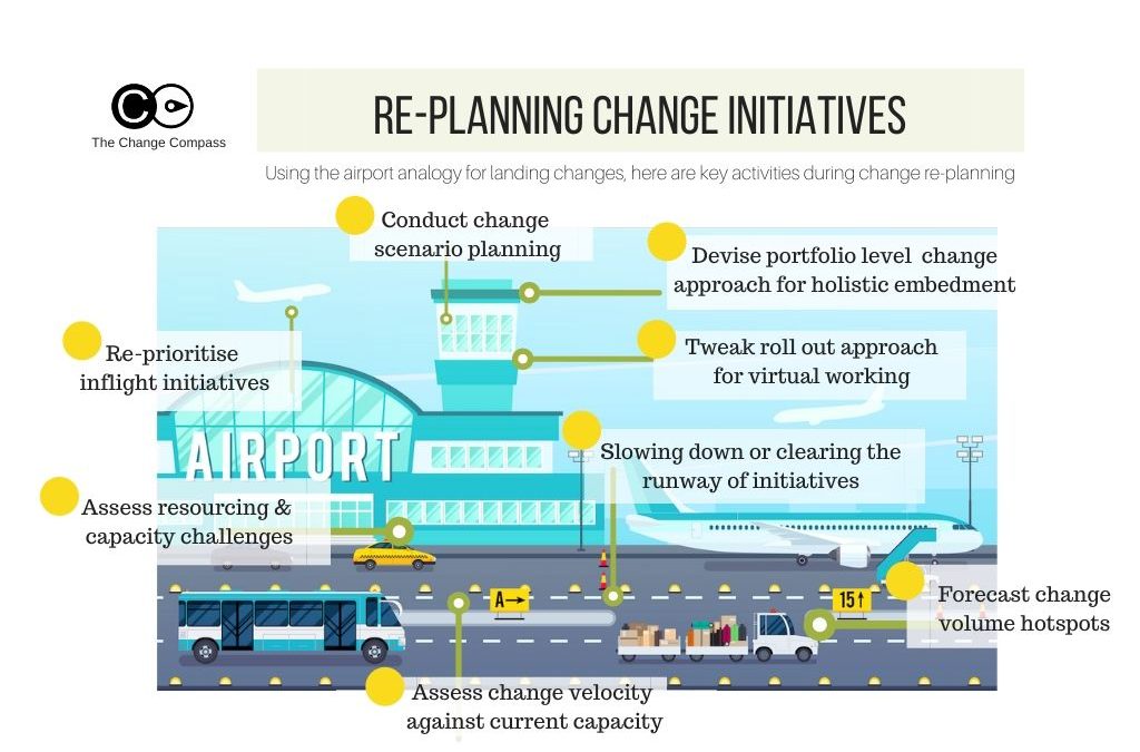
How to help your business re-plan a portfolio of changes
Re-planning a change portfolio is not simply a matter of pushing project dates out by three to six months. Done well, it is an exercise in triage: understanding which changes are genuinely time-critical, which can be deferred without material harm, which need to be redesigned to fit the new environment, and which should be paused or cancelled. The practitioner’s role in this process is to bring both a methodology and a perspective that the programme office or project management function typically lacks.
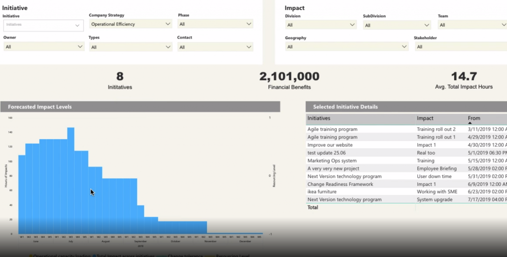
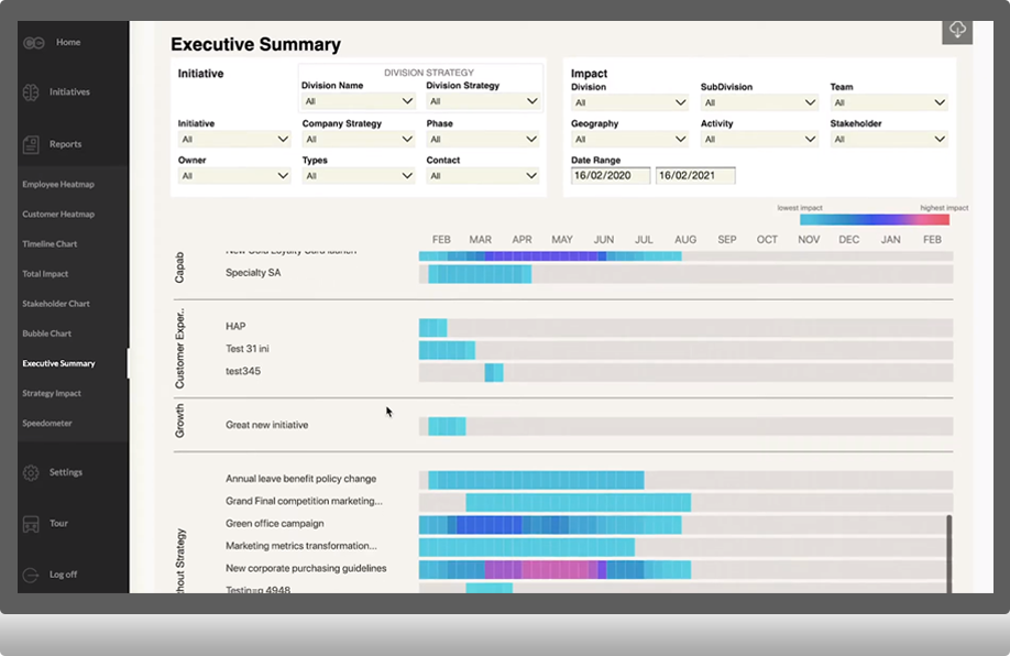
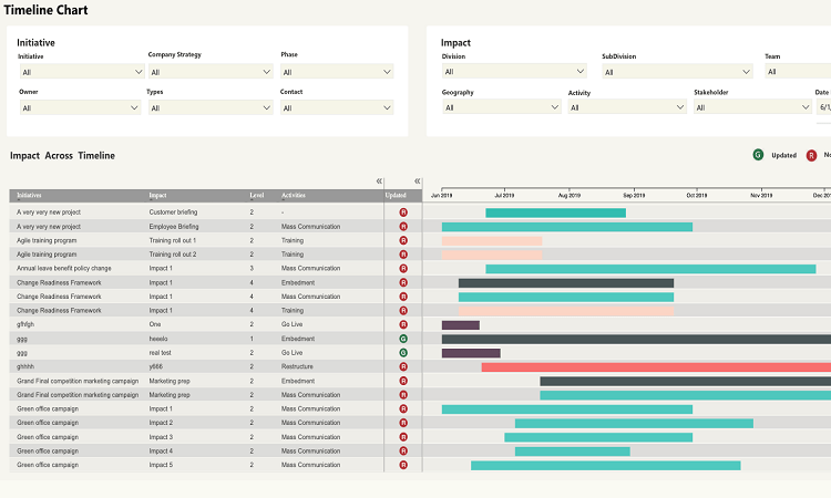
A practical starting point is to map the current portfolio against two dimensions: the strategic importance of each initiative, and the change capacity required from key business areas over the next six to twelve months. This kind of mapping does not need to be exhaustive to be useful. Even a rough assessment of which business groups are most heavily loaded, and which projects draw most heavily on those groups, will reveal collisions that no individual project manager can see from within their own initiative. McKinsey’s work on driving organisational behaviour change during the pandemic highlighted that the ability to move quickly and deliberately on prioritisation, rather than attempting to run all programmes simultaneously, was a key differentiator between organisations that managed the crisis well and those that struggled.
From there, the practitioner can facilitate structured conversations with business leaders about sequencing trade-offs. This is not advocacy for any particular project. It is the provision of an honest picture of cumulative impact, presented in terms that business leaders can act on. Tools like The Change Compass are built specifically to support this kind of portfolio-level visibility, helping change teams map impact by business area, role type, and time period so that over-loading becomes visible before it becomes a problem.
Fitting project timelines to changed business capacity
One of the most common mistakes organisations make when disruption hits is treating timeline adjustment as a purely project management decision. Project managers look at resource availability, dependencies, and critical path. What they rarely look at is the capacity of the receiving organisation – the managers, team leaders, and frontline employees who need to understand, adopt, and embed each change in their daily work. These are different variables, and conflating them produces timelines that look achievable on paper but fail in practice.
The practitioner’s job is to introduce business capacity as an explicit variable in timeline decisions. This means translating the organisation’s operational reality into change schedule inputs. During COVID, that meant accounting for the fact that team leaders were spending significantly more time on welfare conversations, performance management, and operational coordination than they had been before the crisis. It meant recognising that customer-facing staff had little bandwidth for system training when call volumes had doubled. It meant understanding that the HR and finance functions that typically sponsor change initiatives were themselves under enormous pressure managing redundancies, remote work policies, and government support schemes.
Gartner research released in October 2020 warned that employee change fatigue had doubled during the year, and that the capacity of employees to absorb change without experiencing burnout or disengagement had declined sharply. Practitioners who used that kind of evidence to make the case for realistic pacing were performing a genuinely valuable service, even when the message was uncomfortable for sponsors who wanted to maintain pre-COVID delivery schedules.
Adapting the change approach for remote and hybrid environments
Moving a change programme from a face-to-face delivery model to a fully virtual one requires more than replacing physical workshops with video calls. The underlying assumptions of most change methodologies were built around proximity: the ability to have informal conversations in corridors, to read the room in a workshop, to build trust through repeated in-person contact, and to create the social pressure of public commitment in a group setting. None of those mechanisms transfer directly to a distributed environment, and practitioners who tried to run their standard approach over video quickly discovered this.
The most effective adaptation is not to replicate the face-to-face model online but to redesign the approach around what digital channels do well. Asynchronous communication – recorded messages, written updates, self-paced learning modules – can actually reach more people more consistently than a single town hall ever could. Short, focused digital interventions are often more respectful of people’s time than a two-hour workshop, particularly when employees are juggling home and work demands simultaneously. Harvard Business Review’s 2020 guide to managing newly remote workers emphasised the importance of structured, regular communication with clear purpose, rather than replicating the cadence and format of in-person interaction. The same principle applies to change delivery.
There is also a coaching dimension that becomes more important, not less, when the organisation is distributed. Managers and team leaders are the most important channel for change adoption at the local level. In a remote environment, their ability to understand and communicate the reason for a change, to role-model new behaviours, and to support their teams through the transition is the primary mechanism by which change lands. Investing in manager capability and manager-specific change toolkits is not a luxury in a remote environment; it is the foundation of effective delivery.
Stakeholder engagement strategies for distributed teams
Stakeholder engagement has always been one of the most relationship-intensive aspects of change management. Building the trust and understanding that allows a sponsor to advocate effectively for a change, or a resistant middle manager to become a credible champion, typically takes time and repeated contact. The shift to remote working compressed those opportunities and changed the texture of professional relationships in ways that practitioners needed to actively compensate for.
The first adjustment is frequency and intentionality. In a physical office, a change practitioner might have had a dozen informal conversations with key stakeholders in a single week without ever scheduling them formally. In a remote environment, those conversations need to be deliberately created. This does not mean filling people’s calendars with unnecessary meetings. It means being strategic about which relationships need active maintenance, and finding lightweight but regular ways to keep those connections alive – a brief check-in, a shared resource, a direct question by message. Prosci’s guidance on remote change team engagement highlighted four specific practices: clear role definition, structured communication rhythms, explicit acknowledgment of the unique pressures of remote work, and the creation of virtual spaces for informal connection among change network members.
The second adjustment is to broaden who counts as a stakeholder. In a remote environment, the formal hierarchy often matters less than informal influence networks. The team leader who keeps her people grounded during uncertainty, the subject matter expert who others trust to interpret what a new system actually means for their day-to-day work, the person in operations who has been with the organisation for fifteen years and whose scepticism will either sink or validate a change – these people have always mattered, but in a distributed environment their influence becomes even more pronounced because the organisation’s informal communication channels are less visible and harder to monitor. Identifying and engaging these voices early is not optional when the grapevine is operating entirely through private chat channels.
Planning for change scenarios and anticipating ongoing uncertainty
One of the most disorienting aspects of the COVID period for change practitioners was the instability of assumptions. Timelines were set and then revised. Lockdowns were announced and then extended or lifted. Business conditions changed with a speed that made twelve-month change plans feel like fiction. The traditional change management approach of building a plan, socialising it, and executing against it was simply not fit for purpose in that environment.
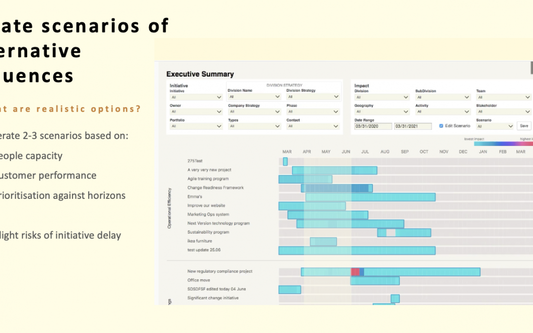
Scenario-based planning offers a more robust alternative. Rather than building a single change plan and then scrambling to update it when conditions shift, the practitioner designs the change approach around a set of plausible futures and defines in advance what the change programme will look like under each. At its simplest, this might mean developing three variants: a base case, a more constrained case assuming ongoing disruption, and an accelerated case if conditions improve faster than expected. The value is not that any one of these scenarios will prove exactly right. The value is that the organisation has already thought through the implications and can move quickly rather than starting from scratch each time circumstances change.
Scenario planning also changes the conversation with leadership. Instead of presenting a single plan for approval and then returning to ask for more time when things change, the practitioner presents a portfolio of responses and asks leadership to make an explicit choice about which approach to activate given current conditions. That is a more honest and more sophisticated conversation, and it positions the practitioner as a strategic partner rather than a project delivery resource.
Lessons that outlast COVID: what to embed permanently
The practices that helped organisations navigate the COVID period are not simply emergency measures to be discarded once the crisis passes. Several of them represent genuine improvements on the pre-COVID default, and organisations that have embedded them permanently are better positioned for the ongoing volatility that characterises the post-pandemic environment. McKinsey’s research on reimagining the post-pandemic organisation found that the companies recovering most strongly were those that had used the disruption to accelerate structural and cultural shifts rather than simply restore their prior operating model.
Portfolio-level change management is the most important of these. The discipline of mapping cumulative change impact, having explicit conversations about capacity and sequencing, and treating the organisation’s attention as a finite and precious resource – none of this was invented during COVID, but COVID made the case for it in a way that no consulting paper ever could. Organisations that now have regular portfolio review processes, supported by data on change load and business capacity, are far less likely to pile change on top of change in the way that produced so much burnout and failure in the years before the pandemic.
The shift to hybrid change delivery is similarly durable. The assumption that change management requires physical presence was never fully justified, and the COVID period produced ample evidence that well-designed digital approaches can match or exceed the reach and effectiveness of face-to-face delivery for many change types. Retaining the best of both, rather than defaulting back to the old model, is both practical and strategic. Similarly, the emphasis on manager capability as the primary adoption lever – rather than communications campaigns or formal training alone – reflects a more sophisticated understanding of how change actually happens in organisations, and it deserves to become permanent practice regardless of what the working environment looks like.
Frequently asked questions
What is change portfolio management and why does it matter during a crisis?
Change portfolio management is the practice of viewing all active change initiatives across an organisation as a collective whole, rather than managing each project in isolation. During a crisis, it matters because available business capacity shrinks rapidly while the need for change does not, and only a portfolio view reveals where collisions and overloads are occurring before they derail individual projects and exhaust the workforce.
How do you engage stakeholders effectively when the whole organisation is working remotely?
Effective remote stakeholder engagement requires deliberate scheduling of conversations that would previously have happened informally, a broader definition of who counts as a key influencer, and a communication approach that uses asynchronous channels alongside live interaction. Structured rhythms of contact, clear role expectations for change network members, and investment in manager capability as the primary local adoption lever are the most consistently effective practices.
What is scenario-based change planning and how do practitioners use it?
Scenario-based change planning involves designing the change approach around a set of plausible future conditions rather than a single assumed trajectory. Practitioners typically develop two to three variants of their change plan, each calibrated to a different set of business conditions, and agree with leadership in advance which triggers would lead to activating each variant. This reduces reaction time when circumstances shift and positions the change team as strategically prepared rather than perpetually catching up.
What change management practices from COVID should organisations keep permanently?
The most valuable practices to retain are portfolio-level change governance, the use of digital and asynchronous channels alongside face-to-face delivery, scenario-based planning for change scheduling, and a strong emphasis on building manager capability as the primary adoption mechanism. Organisations that embed these practices into their standard change operating model are better equipped for the ongoing disruption and uncertainty that characterise the current business environment, well beyond the COVID period.
References
Gartner (2020). Gartner Cautions HR Leaders That the Risk of Change Fatigue Among Employees Has Doubled in 2020. Gartner Newsroom.
Gartner (2020). Gartner HR Survey Finds 52% of Organisations’ Business Operations Are Continuing at a Reduced Level. Gartner Newsroom.
McKinsey & Company (2020). Driving Organisational and Behaviour Changes During a Pandemic. McKinsey Organisation Blog.
McKinsey & Company (2021). Reimagining the Post-Pandemic Organisation. McKinsey & Company.
Prosci (2020). Four Ways to Engage Change Teams Remotely. Prosci Blog.
Kossek, E. E., & Lautsch, B. A. (2020). A Guide to Managing Your (Newly) Remote Workers. Harvard Business Review.