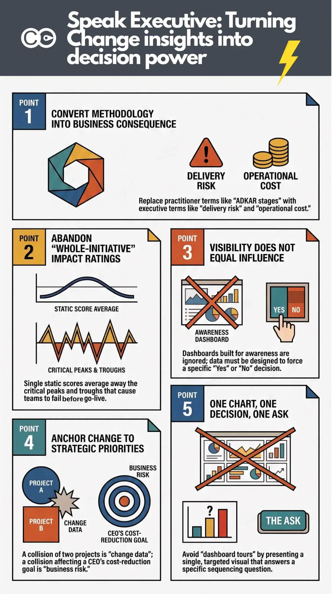


Most change teams that ask for “better visibility” already have a dashboard, a heat map, or some version of a portfolio view. The problem showing up in boardroom after boardroom isn’t that the picture doesn’t exist. It’s that the picture reads as FYI rather than as something built to force a decision. A saturation heat map with three shades of amber tells an executive something is elevated. It doesn’t tell them enough to say no to the third overlapping initiative landing in the same quarter. When change data is presented at awareness level instead of decision level, executives don’t see the risk clearly enough to act on it, so they approve the overlap and move on.
This is not a data problem. It is a presentation problem: the wrong level of detail for the decision at hand, data stripped of the business context that would make the risk feel urgent, and a visual that doesn’t match the shape of the risk it’s describing.
Change practitioners are trained to think in stakeholder groups, impact levels, readiness stages and activity counts. Executives are trained to think in risk, cost, timeline and competitive position. Both groups can be looking at the same single view of change and walk away with entirely different conclusions, because the information was never positioned, visualised and detailed in a way that connects to the decision the executive is actually being asked to make. Solving this gap is arguably a bigger lever for change management effectiveness than anything else on the practitioner’s desk right now, and it is almost entirely unaddressed in how change teams are trained or how change management software is designed.
The single view of change paradox: Visibility without influence
There’s a quiet assumption running through most change portfolio initiatives: if leadership could just see everything at once, they’d make better decisions. Build the dashboard. Consolidate the spreadsheets. Get every initiative into one system. Then walk into the steering committee and watch the sequencing conversation finally happen on merit instead of politics.
It rarely plays out that way, and often for a more basic reason than executives assume: most organisations don’t actually have a complete single view of change to begin with. What they usually have is a list of major initiatives sourced from project and portfolio management tools, capturing scope, timeline, budget and delivery status. That’s project planning and execution data. It says almost nothing about the other half of the picture: which teams get hit, how hard, and what it does to day-to-day operational performance while the change is landing. The view executives are shown is frequently a project status report wearing a change hat, built to summarise for awareness rather than force a decision.
Even where a genuine change portfolio view does exist, capturing initiatives, impacted teams and rough timelines, it tends to render that impact data at the level a status update needs, not the level a decision needs. A heat map that shows “elevated saturation” in amber is accurate. It is also, by design, too abstract to force a call. Executives register that something is busy and approve the third initiative anyway, because nothing in what they were shown was precise or consequential enough to make saying no feel necessary.
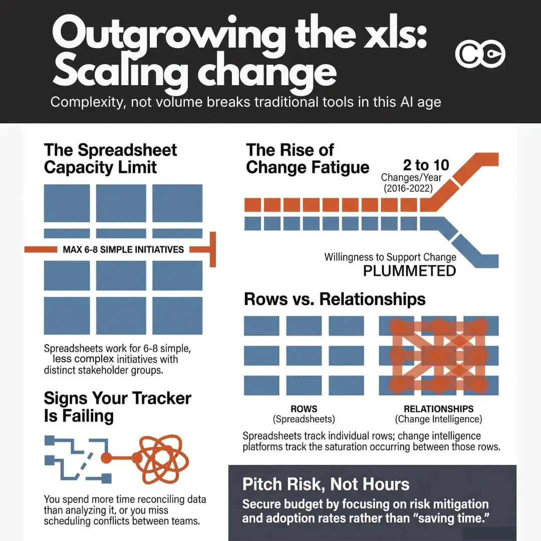
The most common version of this under-detail problem is a single impact rating for the whole initiative: “this initiative is High impact,” full stop, for its entire life. That one number collapses months of real variation into a single static score. It doesn’t show the peaks and troughs as the initiative moves through design, testing and go-live, it doesn’t show that Finance is barely touched while Operations is hit hard for six straight weeks, and it doesn’t show that impact on the contact centre in March looks nothing like impact on the same team in June. A whole-initiative rating averages away exactly the information a sequencing or saturation decision needs: when the peak lands, and who it lands on. In most contexts, one rating for the whole initiative provides very little useful insight on its own.
The mistake is assuming visibility and influence are the same capability. They are not. Visibility answers “can you see it.” Influence answers “will it change what you decide,” and that depends on whether the data was pitched at FYI level or built to force a specific call. A dashboard earns the first. It does nothing to guarantee the second, and change teams that treat the dashboard itself as the finish line are solving the easier half of the problem.
Two operating languages: How change practitioners think versus how executives decide
The reason a technically excellent single view of change can still fail to move a decision comes down to something more fundamental than dashboard design. Change practitioners and executives are, in a very real sense, running two different operating systems for how they process the same information.
That gap isn’t only vocabulary. It’s four compounding things: the words used, the business context the finding is placed inside (or isn’t), the visualisation chosen, and the level of detail shown for that specific type of risk. Get the words right but skip the business context and the finding still reads as an internal change concern, not a business risk. Get the context right but pick the wrong visual and it still doesn’t register. Vocabulary is the most visible symptom. It is not the whole problem.
How change practitioners think
Change practice has a well-developed internal vocabulary, and for good reason. Frameworks like ADKAR give practitioners a shared way to diagnose where an audience is in the change journey. Stakeholder impact assessments break a change down by group, role and level of disruption. Readiness scores, activity counts and heat maps make an intangible thing, organisational disruption, tangible enough to manage.
This vocabulary is precise, methodologically sound, and almost entirely foreign to how a chief operating officer or chief financial officer reasons about a decision. “Forty per cent of the frontline team is at the ‘awareness’ stage” is a meaningful diagnostic to a change manager. To an executive, it’s an abstraction requiring translation before it connects to anything they’re accountable for.
How executives decide
Executives, particularly at the level where sequencing decisions get made, process a different set of variables: cost, delivery risk, timeline exposure, competitive position, regulatory obligation, and what a board will ask at the next review. They are not resistant to change data. They’re evaluating it against a completely different decision frame, one built around consequence and accountability rather than method and process. This gap shows up constantly in how portfolio conversations get framed to leadership, where spotting a conflict early is often the difference between an initiative that lands cleanly and one that quietly derails delivery three months later.
| What the change practitioner says | What the executive hears |
|---|---|
| “This initiative is in the ‘desire’ stage of ADKAR” | Unclear how this affects delivery |
| “Twelve stakeholder groups are impacted” | A number without a consequence attached |
| “Change saturation is elevated this quarter” | A soft warning, easy to override |
| “Our readiness score is 62 per cent” | Not obviously connected to risk or cost |
| “This will collide with the ERP rollout” | A concrete, specific, and actionable risk |
Notice the pattern in the right-hand column. The items that land are the ones already expressed in terms of consequence: a collision, a risk, a cost. The items that don’t land are expressed in methodology terms that require the executive to do the translation work themselves, and executives in a steering committee meeting are not going to do that work. They will simply move to the next agenda item.
Why the language gap exists (and why it isn’t the practitioner’s fault)
It’s tempting to read the section above as a criticism of change practitioners. It isn’t. Change management has spent two decades building rigour into diagnosis and methodology, largely because that rigour was what the field lacked most. Certifications, frameworks and benchmarking studies have all reinforced a practitioner-facing vocabulary; very little of that same investment has gone into executive and board-level communication, a genuinely different skill from stakeholder analysis.
The research backs this up. Prosci’s Best Practices in Change Management research, now in its 12th edition, consistently finds active sponsorship the single largest contributor to change success, and consistently finds a large share of sponsors don’t understand their own role well enough to fulfil it. McKinsey’s analysis of change journey management found programmes with clearly structured governance, steering committee, change office, named sponsors, succeed at markedly higher rates, and that frequent progress communication matters. But frequency of what matters just as much: a weekly update in practitioner vocabulary doesn’t carry the same weight as one in the language the committee already uses for every other agenda item.
Deloitte’s Global Boardroom Program found two-thirds of board members and C-suite executives rank open, transparent communication the single most important leadership factor in organisational resilience. Change teams sit on some of the richest early-warning data in the organisation. The gap isn’t a lack of communication. It’s communication that hasn’t been converted into the form, and context, the audience is already primed to act on.
Change data needs a business context, not just a decision framing
Even consequence-framed change data can fail to land if it’s presented in isolation from the strategic and operational context executives are already tracking. A collision between two initiatives matters more, and reads as more urgent, when it’s tied explicitly to a named strategic priority the executive is accountable for, or an operational challenge already on their radar (a cost-out programme, a regulatory deadline, a customer-facing service risk), rather than presented as a standalone change-management finding. The more integrated a risk is with the business context the executive already holds in their head, the more attention it earns: “this collides with the Q3 cost-reduction priority the CEO reports to the board on” carries a different weight than the same risk on its own change-management slide.
This is also why change data can be accurate, correctly visualised and correctly worded, and still get waved through. It hasn’t been positioned inside the frame the executive is already using to prioritise everything else competing for their attention.
The cost of getting the translation wrong
The consequences of this gap compound into the next funding conversation, too. Change functions are asked, almost every budget cycle, to justify their existence in terms the finance team understands: cost avoided, delivery protected, adoption secured. A team that has spent the year presenting saturation scores and readiness percentages, without converting them into risk and cost, arrives at that conversation with a weak hand. The near-misses they prevented are invisible, because they were never described in terms anyone outside the practice would remember.
Teams that consistently frame portfolio data as business risk in business context build a track record executives can point to later, exactly the material a strong business case for change management investment is built from. Teams that never make that shift re-litigate their value from scratch every year, regardless of how good their underlying data was.
What earns executive attention: Lead with consequence, not method
If the diagnosis is a translation gap, the fix is not more dashboards or more detail. It’s a deliberate shift in what gets led with.
Lead with consequence, not method
Every piece of change data can be expressed two ways: as a methodology fact, or as a business consequence. “Change saturation is elevated” is a methodology fact. “Two of our highest-priority initiatives land on the same frontline team in the same six-week window, and that combination has historically pushed adoption down and error rates up” is a business consequence. Same underlying data. Completely different weight in the room.
This matters more than it might seem. Research on data storytelling from Harvard Business School has found the impact of a story on an audience’s beliefs holds up far better over time than a raw statistic, whose influence fades fast once the meeting ends. A sequencing recommendation that’s going to still shape a decision a week later needs to be carried by a consequence, not a number.
One chart, one decision, one ask
The second shift is about restraint. A single view of change is built to hold everything, which is exactly why it should never be presented in full to an executive audience. CIO Dive’s coverage of Gartner’s research on data storytelling in the boardroom describes leaders bridging technical detail and business understanding by combining visualisation, narration and context around a single focused message, not the full breadth of what they know.
For a change portfolio conversation, that means picking one chart that answers one question and forces one decision, rather than taking the committee on a guided tour of the dashboard. A saturation heat map that shows exactly where two initiatives collide, with a single clear recommendation underneath it, will do more work than twelve slides of stakeholder breakdowns. The detail should exist and should be available if someone asks. It should not be the opening move.
Match the visual and the detail to the type of risk
Not every risk needs the same visual or the same depth. A single scheduling collision is usually clearest as a simple timeline: two bars overlapping, one week called out. A saturation issue spanning multiple teams over multiple months needs the heat map, because the pattern across teams and time is the point. Use a heat map for a single collision and it’s too abstract for a black-and-white timing problem; use a two-bar timeline for a saturation pattern and it’s too narrow to show the accumulation. Matching the visual and the detail to the shape of the risk, then positioning it against the business context above, is as much a part of the translation as the words used. This is also where a whole-initiative rating fails outright: it has no time dimension and no group breakdown, so there’s nothing to visualise beyond a single static badge. The underlying data needs to be captured at stakeholder-group and time-period level before any chart choice can show the peaks, troughs and who-gets-hit-when that make a sequencing risk concrete.
Common mistakes worth watching for in your own reporting:
- Leading with process, not consequence. Opening with “here’s where we are on the ADKAR journey” instead of “here’s what happens if we launch these together”
- Too many charts, no clear ask. A dashboard tour with no single decision point at the end
- Burying the risk in the data. Trusting the executive to spot the collision themselves rather than naming it explicitly
- No business context attached. Presenting a finding as a standalone change-management metric instead of linking it to a strategic priority or operational challenge the executive already owns
- Wrong visual for the risk type. Using a heat map for a single scheduling collision, or a bare list for a multi-team saturation pattern
- One rating for the whole initiative. Averaging away the peaks and troughs over time, and the variation across stakeholder groups and business units, into a single score
- No pre-empted “so what.” Presenting a finding without answering the question every executive is silently asking: what should I do differently because of this
- Treating every audience the same. Using the same level of detail for a steering committee that you’d use for a fellow practitioner
A practical framework for translating your single view of change into executive language
Here is a four-step process for converting portfolio data into something an executive audience will actually act on, whatever change management software or portfolio tool you’re using to hold the underlying data.
- Start with the decision, not the update. Before opening the dashboard, write down the single decision you need this audience to make. If there isn’t one, you’re delivering a status report, not a briefing, and status reports rarely change behaviour.
- Convert every practitioner metric into a consequence metric. For each data point you plan to show, ask “so what happens if this is true.” Twelve impacted stakeholder groups becomes delivery risk to a named deadline. A readiness score of 62 per cent becomes a specific, quantified adoption risk tied to a business outcome the executive already cares about.
- Attach it to business context. Link the consequence to a strategic priority, an operating challenge, or a line already on the executive’s own agenda, not just to the change portfolio in isolation. A risk connected to something they’re already accountable for is harder to wave through than one that only exists on a change-management slide.
- Match the visual and the detail to the risk type. Pick the chart shape suited to the risk, a timeline for a single collision, a heat map for a spread pattern, and show only the depth of detail this specific decision needs. The wrong visual or too much detail buries the point as effectively as the wrong words.
- Answer the “so what” before anyone has to ask it. Close with a direct recommendation, not just a finding. “We recommend sequencing initiative A ahead of initiative B, with a four-week gap” is a request the committee can approve, defer or challenge. A heat map on its own is not.
This is a discipline, not a one-off exercise. It’s worth revisiting every time you prepare for a steering committee, board update, or executive-level sequencing conversation, because the audience’s attention and patience for translation work is the scarcest resource in the room, not the underlying data.
How Change Compass closes the translation gap
A well-built single view of change should do more than store data. It should make the translation work in the previous section faster and more consistent, rather than leaving every practitioner to reinvent the framing from scratch before every executive conversation.
This is one of the areas where the design of the underlying change management software genuinely matters, not just as a data repository but as a communication tool. Part of that starts earlier than the presentation layer: capturing the people-impact and operational-performance data that project and portfolio management tools don’t hold in the first place, at the level of detail a whole-initiative rating can’t provide, by stakeholder group, by business unit, over time, so the change view isn’t just a project status report wearing a change hat and isn’t just one static score per initiative.
Change Compass has been built around exactly this problem, drawing on patterns observed across a large and varied base of change teams reporting to executive audiences. Certain visualisations and framings come up again and again in the platform as the ones that actually shift a sequencing conversation: a saturation heat map that makes a multi-team overlap visually undeniable, a simple timeline for a single collision where a heat map would be overkill, a simplified executive summary that strips a portfolio down to the initiatives that matter for this decision, and narrative templates that translate raw impact data into risk language positioned against the strategic priorities the executive is already tracking.
The point of these templates isn’t to remove judgement from the practitioner. It’s to remove the blank-page problem every time a change team needs to walk into a room and make a case, so the starting point is already halfway translated into the language that room speaks, rather than the language the practitioner’s methodology speaks. A single view of change that has this translation layer built in, rather than bolted on as an afterthought, closes a meaningful part of the gap described throughout this article before a single word of the presentation gets written.
If you’re still evaluating which platform to build this single view on, translation capability is worth adding to your shortlist criteria alongside the more familiar ones like integration options and reporting depth. Our buyer’s guide to change portfolio management tools covers the fuller list of criteria PMOs typically use to separate a genuine change portfolio platform from a generic project tracker with a change label on it, translation capability included.
Making the translation a discipline, not an afterthought
A single view of change is necessary. It is not sufficient. The organisations that actually change executive decisions with their portfolio data are not the ones with the most comprehensive dashboard. They’re the ones who have built a habit of converting practitioner data into consequence, business context, the right visual and the right level of detail, every single time, not just the right words.
That habit is learnable: lead with a decision, not an update; convert metrics into consequences; tie the finding to a strategic priority or operating challenge the executive already owns; match the visual and detail to the shape of the risk. Change management software can make this faster and more consistent, and it can close the more basic gap of holding people-impact data most project tools never capture in the first place. But it can’t replace the judgement of choosing, every time, what this specific audience needs to see and hear in order to act.
Frequently asked questions
What does “single view of change” mean? Every active and planned initiative, plus the teams, roles and timelines they affect, consolidated in one place instead of scattered spreadsheets and team trackers. Most organisations that think they have this actually have a project-level view only, timelines and delivery status without the people-impact and operational-performance layer. It’s the foundation for sequencing and saturation decisions, but on its own it only solves visibility, not whether that visibility changes what leadership decides.
Why don’t executives respond well to typical change management dashboards? Most change dashboards summarise for awareness rather than a decision: practitioner vocabulary, findings without the business context that would make a risk feel urgent, and often a visual or detail level that doesn’t match the risk shown. The data can be accurate and still fail to influence a decision if it reads as FYI rather than something built to force a call.
How is change management software different from just having a single view of change? A spreadsheet can technically deliver a single view of change. Purpose-built software goes further by structuring how data is captured, aggregated and translated into executive-ready visuals and narratives, positioned against the business context the executive already tracks, rather than leaving that work to whoever is preparing the next update.
What’s the difference between change data and business risk framing? Change data describes what’s happening: which groups are impacted, at what level, over what timeframe. Business risk framing describes what it means: the cost of a collision, the delivery risk to a deadline. The same underlying data can be presented either way, and only the second tends to change a decision.
How can change practitioners get better at speaking executive language? Practise converting every metric into a consequence before presenting it: for each data point, ask “so what happens if this is true, and what should the audience do differently because of it.” Over time this becomes a habit rather than a translation done under pressure before every steering committee meeting.
Why isn’t a single impact rating for the whole initiative enough? A whole-initiative rating (High, Medium, Low, applied once, for the entire life of the initiative) averages away the variation a sequencing decision actually needs: the peaks and troughs as the initiative moves through design, testing and go-live, and the very different impact levels for different stakeholder groups, business units and teams at different points in time. Two initiatives can both carry a “High” rating and still be nowhere near each other in when their real pressure lands or who it lands on. Without that time and group breakdown, there’s nothing underneath the rating to sequence against.
References
- Data Storytelling: How to Effectively Tell a Story with Data (Harvard Business School Online)
- How do we manage the change journey? (McKinsey & Company)
- Best Practices in Change Management, 12th Edition (Prosci)
- Boards and C-suite cite open communication as critical to organisational resilience (Deloitte Global)
- How data storytelling turns CIOs into communication leaders (CIO Dive, reporting Gartner research)