“Is the project on track?” “Are we hitting milestones?” “What’s the budget status?”
Here’s the question almost no one asks:
“What is this change doing to our operational performance right now?”
Not after go-live. Not in a post-implementation review. Right now, during the transition, while people are absorbing the change and running the operation simultaneously.
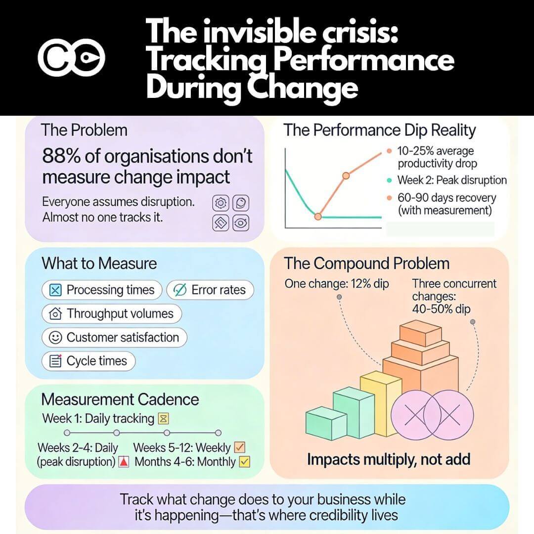
The silence around this question reveals a fundamental blind spot in how organisations manage transformation. Everyone assumes there will be a temporary productivity dip. They accept it as inevitable. But almost no one measures it. No one knows if it’s a 5% dip or a 25% dip. No one tracks how long recovery takes. And when you’re running multiple changes across the enterprise, those dips stack, compound, and create operational crises that leadership only discovers after significant damage has occurred.
The research on performance dips: what we know and what we ignore
The phenomenon of performance decline during organisational change is well-documented. Research consistently shows measurable productivity drops during implementation periods, yet few organisations actively track these impacts in real time.
The magnitude of performance loss
Studies examining various types of change initiatives reveal striking patterns:
ERP implementations: Performance dips range from 10% to 25% on average, with some organisations experiencing dips as high as 40%.
Enterprise system implementations: Productivity losses range from 5% to 50% depending on the organisation and system complexity.
Electronic health record (EHR) systems: Performance dips can reach 5% to 60%, particularly when high customisation is required.
Digital transformations: McKinsey research found organisations typically experience 10% to 15% productivity dips during implementation phases.
Supply chain systems: Average productivity losses sit at 12%.
These aren’t marginal impacts. A 25% productivity dip in a customer service operation processing 10,000 transactions weekly means 2,500 fewer transactions completed. A 15% dip in a manufacturing environment translates directly to output reduction, delayed shipments, and revenue impact. Yet most organisations discover these impacts only after they’ve compounded into visible crises.
Why performance dips occur
The mechanisms behind performance decline during change are well understood from cognitive and operational perspectives:
Cognitive load and task switching: Research on divided attention shows that complex tasks combined with frequent switching between demands significantly degrade performance. Employees navigating new systems whilst maintaining BAU operations experience measurable increases in error rates and reaction times.
Learning curves and proficiency gaps: Even with comprehensive training, real-world application of new processes reveals gaps between classroom scenarios and operational reality. The proficiency developed in controlled training environments doesn’t immediately transfer to production complexity.
Workaround proliferation: When new systems don’t match actual workflow requirements, employees develop workarounds. These workarounds initially appear functional but create hidden dependencies, data quality issues, and cascading problems that surface weeks later.
Support capacity constraints: As implementation teams scale back intensive go-live support, incident resolution slows. Issues that were resolved in minutes during week one take hours or days by week three, compounding operational delays.
Change saturation: When multiple initiatives land concurrently, performance impacts don’t add linearly—they compound exponentially. Research shows that 48% of employees experiencing change fatigue report increased stress and tiredness, directly impacting productivity.
The recovery timeline reality
Without structured change management and continuous monitoring, organisations experience extended recovery periods. Research indicates:
Without effective change management: Productivity at week three sits at 65-75% of pre-implementation levels, with recovery timelines extending 4-6 months.
With effective change management: Recovery happens within 60-90 days, with continuous measurement approaches achieving 25-35% higher adoption rates than single-point assessments.
The difference isn’t marginal. It’s the difference between a brief, managed disruption and a prolonged operational crisis that undermines the business case for change.
The compounding problem: multiple changes, invisible impacts
The performance dip research cited above assumes a critical condition that rarely exists in modern enterprises: one change at a time.
Most organisations today manage portfolios of concurrent initiatives. A finance function implements a new ERP system whilst rolling out revised compliance processes and restructuring the shared services team. A healthcare system deploys new clinical documentation software whilst updating scheduling systems and migrating financial platforms. A telecommunications company launches customer portal changes whilst implementing billing system upgrades and operational support system modifications.
When concurrent changes overlap, impacts don’t simply add up, they multiply.
The mathematics of compound disruption
Consider a realistic scenario: Three initiatives land across the same operations team within 12 weeks:
Initiative A (customer data platform): Expected 12% productivity dip
Initiative B (revised underwriting workflow): Expected 15% productivity dip
Initiative C (updated operational dashboard): Expected 8% productivity dip
If these were sequential, total disruption time would span perhaps 18-24 weeks with three distinct dip-and-recovery cycles. Challenging, but manageable.
When concurrent, the mathematics change. Employees don’t experience 12% + 15% + 8% = 35% productivity loss. They experience cognitive overload that drives productivity losses exceeding 40-50% because:
Attention fragments across three learning curves simultaneously
Support capacity spreads thin across three incident response systems
Training saturation occurs as employees attend sessions for multiple systems without time to embed any
Workarounds interact as temporary solutions in one system create problems in another
Psychological capacity depletes as change fatigue sets in
Research confirms this pattern. Organisations managing multiple concurrent initiatives report 78% of employees feeling saturated by change, with change-fatigued employees showing 54% higher turnover intentions. The productivity dip becomes not a temporary disruption but a sustained operational degradation lasting months.
The visibility gap
Here’s the critical problem: Most organisations lack the data infrastructure to see this happening in real time.
Research shows only 12% of organisations measure change impact across their portfolio, meaning 88% lack fundamental data needed to identify saturation before it undermines initiatives. Without portfolio-level visibility, leaders discover compound disruption only after:
Customer complaints spike
Error rates become unacceptable
Revenue targets are missed
Employee turnover accelerates
Projects are declared “failures” despite solid technical execution
By then, the cost of remediation far exceeds the cost of prevention.
Why organisations don’t track operational performance during change
If the research is clear and the impacts are measurable, why do so few organisations track operational performance during transitions?
Assumption that disruption is inevitable
Many leaders treat productivity dips as unavoidable costs of change, like renovation dust. “We’re implementing a major system, of course there will be disruption.” This mindset accepts performance loss as fate rather than a variable that leadership actions can influence.
Research challenges this assumption. Studies show that whilst some disruption accompanies complex change, the magnitude and duration are directly influenced by how well the transition is managed. High-performing organisations experience minimal performance penalties precisely because they track, intervene, and course-correct based on operational data.
Lack of baseline data
You can’t measure a dip if you don’t know the baseline. Many organisations lack established operational metrics or track them inconsistently. When change arrives, there’s no reliable pre-change performance level to compare against.
Without baselines, statements like “adoption is going well” or “the team is adjusting” remain subjective assessments unsupported by evidence. Leaders operate on impression rather than data.
Measurement infrastructure gaps
Even organisations with operational metrics often lack systems to correlate performance changes with change activities. They know processing times have increased or error rates have risen, but they can’t pinpoint whether the cause is the new system rollout, the concurrent process redesign, seasonal volume spikes, or unrelated factors.
This correlation gap means operational performance remains in one dashboard, project status in another, and no integration connects them. Steering committees review project milestones without visibility into business impact.
Focus on project metrics over business outcomes
Traditional project governance emphasises activity-based metrics: milestones completed, training sessions delivered, defects resolved. These metrics matter for project execution but don’t answer the question executives actually care about: Is the business performing through this change?
Research from McKinsey shows organisations tracking meaningful operational KPIs during change implementation achieve 51% success rates compared to just 13% for those that don’t, making change efforts four times more likely to succeed when measurement focuses on business outcomes rather than project activities.
Change management credibility gap
When change practitioners report on soft metrics like “stakeholder sentiment” or “readiness scores” without connecting them to hard operational outcomes, they struggle to maintain executive attention. Leaders want to know: What is this doing to our operation? If change management can’t answer with data, the discipline loses credibility.
The solution isn’t to abandon readiness and adoption metrics, those remain essential. The solution is to connect them explicitly to operational performance, demonstrating that well-managed change readiness translates into maintained or improved business outcomes.
What to measure: identifying operational metrics that matter
The first step in tracking operational performance during change is identifying which metrics genuinely reflect business health. Not every metric matters equally, and tracking too many creates noise rather than insight.
The 3-5 critical metrics principle
Focus on the 3-5 operational metrics that matter most to the business. These should be:
Directly tied to business outcomes: Metrics that executive leadership already monitors for business health, not change-specific proxies.
Sensitive to operational disruption: Metrics that would visibly shift if people struggle with new systems or processes.
Measurable at appropriate frequency: Metrics you can track weekly or daily during peak disruption periods, not quarterly lagging indicators.
Understandable to all stakeholders: Metrics that don’t require explanation. “Processing time” is clear. “Readiness index” requires interpretation.
Operational metric categories by function
Different functions have different critical metrics. Here are examples across common areas:
Customer service and support operations:
Average handling time per transaction
First-call resolution rate
Customer satisfaction scores (CSAT)
Ticket backlog age and volume
Escalation rates to supervisors
Manufacturing and production:
Throughput volume (units per shift/day/week)
Cycle time from order to completion
Defect rates and rework percentages
Equipment utilisation rates
On-time delivery percentages
Finance and accounting:
Invoice processing time
Days sales outstanding (DSO)
Error rates in journal entries or reconciliations
Month-end close timeline
Payment processing accuracy
Sales and revenue operations:
Quote-to-order conversion time
Sales cycle length
Forecast accuracy
Pipeline velocity
Customer onboarding time
Healthcare clinical operations:
Patient wait times
Documentation completion rates
Medication error rates
Bed turnover time
Chart completion timeliness
Technology and IT operations:
System availability and uptime
Mean time to resolution (MTTR) for incidents
Change success rate
Deployment frequency
Service desk ticket volume
The specific metrics vary by industry and function, but the principle holds: choose metrics that executives already care about, that reflect operational health, and that would visibly shift if change is disrupting performance.
Leading vs lagging operational indicators
Operational performance measurement should include both leading indicators (predictive) and lagging indicators (confirmatory):
Leading indicators provide early warning of emerging problems:
Training completion rates relative to go-live timing
Support ticket volumes and trends
System login frequency and feature usage
Employee sentiment scores
Workaround documentation requests
Lagging indicators confirm actual outcomes:
Throughput volumes and processing times
Error rates and rework
Customer satisfaction scores
Revenue and cost performance
Quality metrics
Both matter. Leading indicators enable intervention before performance degrades visibly. Lagging indicators validate whether interventions worked.
How to establish baselines before change lands
Baselines are the foundation of meaningful performance measurement. Without knowing where you started, you can’t quantify impact or demonstrate recovery.
Baseline establishment process
Step 1: Identify the 3-5 critical operational metrics for the impacted function or team, using the principles outlined above.
Step 2: Determine baseline measurement period. Ideally, capture 8-12 weeks of pre-change data to account for normal operational variation. This reveals typical performance ranges rather than single-point snapshots.
Step 3: Document baseline performance. Calculate average performance, typical variation ranges, and any seasonal patterns. For example: “Average processing time: 4.2 minutes per transaction, typical range 3.8-4.6 minutes, with slight increases during month-end periods.”
Step 4: Establish thresholds for concern. Define what magnitude of change warrants intervention. A 5% dip might be acceptable and temporary. A 20% dip signals serious disruption requiring immediate action.
Step 5: Communicate baselines to governance. Ensure steering committees and leadership understand baseline performance and what “normal” looks like before change begins.
Baseline data sources
Where does baseline data come from? Most organisations already collect operational metrics—they just don’t use them for change impact assessment:
Operational dashboards and business intelligence systems: Most functions track performance metrics for ongoing management. Leverage existing data rather than creating parallel measurement systems.
Time and motion studies: For processes lacking automated measurement, conduct time studies during the baseline period to understand current performance.
Quality assurance and audit data: Error rates, defect rates, and compliance metrics often exist in quality systems.
Customer feedback systems: CSAT scores, Net Promoter Scores (NPS), and complaint volumes provide external validation of operational performance.
Financial systems: Cost per transaction, revenue per employee, and similar financial metrics reflect operational efficiency.
The goal isn’t to create new measurement infrastructure (though sometimes that’s necessary). The goal is to systematically capture and document performance levels before change disrupts them.
When baselines don’t exist
What if you don’t have historical operational data? You’re implementing change into a new function, or metrics were never established?
Option 1: Rapid baseline establishment. Implement measurement 4-6 weeks before go-live. Not ideal, but better than no baseline.
Option 2: Industry benchmarks. Use external benchmarks to establish expected performance ranges. “Industry average for similar operations is X; we’ll track whether we maintain that level through change”.
Option 3: Relative baselines. If absolute metrics aren’t available, track relative changes: “Week 1 post-change will be our baseline; we’ll track whether performance improves or degrades from that point”.
Option 4: Proxy metrics. If direct operational metrics don’t exist, identify proxies that correlate with performance: employee hours worked, system transaction volumes, customer contact rates.
None of these are as robust as established baselines, but all provide more insight than flying blind.
Tracking operational performance during the transition
Once baselines exist and change begins, systematic tracking transforms assumptions into evidence.
Measurement cadence during change
Pre-change (weeks -8 to 0): Establish and validate baselines. Ensure data collection processes are reliable.
Go-live week (week 1): Daily measurement. Performance during go-live is artificial due to hypervigilant support, but daily tracking captures immediate issues.
Peak disruption period (weeks 2-4): Daily or at minimum three times per week. This is when performance dips typically peak and when early intervention matters most.
Stabilisation period (weeks 5-12): Weekly measurement. Performance should trend toward baseline recovery. Persistent gaps signal unresolved issues.
Post-stabilisation (months 4-6): Biweekly or monthly measurement. Confirm sustained recovery and benefit realisation.
The frequency isn’t arbitrary. Research shows week two is when peak disruption hits as artificial go-live conditions end and real operational complexity surfaces. Daily measurement during this window enables rapid response.
Creating integrated performance dashboards
Operational performance data should integrate with change rollout timelines in unified dashboards visible to all governance forums.
Dashboard design principles:
Integrate operational and change metrics on one view. Left side shows project milestones and change activities. Right side shows operational performance trends. The correlation becomes immediately visible.
Use visual indicators for thresholds. Green (within acceptable variance), amber (approaching concern threshold), red (intervention required). Leaders grasp status at a glance.
Overlay change activities on performance trend lines. When a performance dip occurs, the dashboard shows which change activity coincided. “Error rates spiked on Day 8, coinciding with the process redesign go-live”.
Enable drill-down to detail. High-level executive dashboards show summary trends. Operational leaders can drill into specific teams, shifts, or transaction types.
Update in real-time or near-real-time. During peak disruption periods, yesterday’s data is stale. Automated feeds from operational systems provide current visibility.
Interpretation and intervention triggers
Data without interpretation is noise. Establish clear triggers for intervention:
Threshold 1: Acceptable variance (0-10% from baseline). Continue monitoring. Some variation is normal. No intervention required unless sustained beyond expected recovery window.
Threshold 2: Concern zone (10-20% from baseline). Investigate causes. Increase support intensity. Prepare contingency actions if deterioration continues.
Threshold 3: Critical disruption (>20% from baseline). Immediate intervention required. Options include: pausing additional changes, deploying emergency support resources, simplifying rollout scope, or reverting to previous state if business impact is severe.
These thresholds aren’t universal—they depend on operational criticality and baseline variability. A 15% dip in non-critical administrative processing might be tolerable. A 15% dip in patient safety metrics or financial controls is not.
Bringing operational data into steering committees
Measurement matters only if it drives decisions. That means bringing operational performance data into governance forums where change priorities and resources are allocated.
Shifting the steering committee conversation
Traditional steering committee agendas focus on project status:
Milestone completion
Budget and timeline status
Risk and issue logs
Upcoming deliverables
These remain important, but they’re insufficient. The agenda must expand to include:
Operational performance trends: “Processing times increased 18% in week two, exceeding our concern threshold. Here’s what we’re seeing and what we’re doing about it.”
Business impact quantification: “The performance dip has reduced throughput by 2,200 transactions this week, representing approximately $X in delayed revenue.”
Correlation analysis: “The spike in errors correlates with the data migration issues we identified in last week’s incident log. Resolution is in progress.”
Recovery trajectory: “Performance recovered from 72% of baseline in week three to 85% in week four. We expect full recovery by week six based on current trend.”
Intervention decisions: “Given concurrent Initiative B launching next week whilst Initiative A is still stabilising, we recommend deferring Initiative B by three weeks to avoid compound disruption.”
This isn’t just reporting. It’s decision-making based on evidence.
Earning credibility through operational language
When change practitioners speak in operational terms … throughput, error rates, processing times, customer satisfaction, they speak the language of business leaders.
“Stakeholder readiness scores improved from 6.2 to 7.1” has less impact than “Processing times returned to baseline levels, confirming the team has embedded the new workflow.” Both metrics have value, but operational outcomes resonate more powerfully with executives focused on business performance.
Research confirms this principle. Change management earns its seat at leadership tables by demonstrating measurable impact on business outcomes, not just change activities.
Portfolio-level operational visibility
When organisations manage multiple concurrent changes, steering committees need portfolio-level operational visibility:
Heatmaps showing which teams are under highest operational pressure from concurrent changes. “Customer service is absorbing changes from Initiatives A, B, and C simultaneously. Operations is managing only Initiative B.”
Aggregate performance impact across all initiatives. “Total enterprise productivity is at 82% of baseline due to overlapping disruptions. Sequencing Initiative D would drop this to 74%, exceeding our risk tolerance.”
Recovery timelines across the portfolio. “Initiative A has stabilised. Initiative B is in week-three disruption. Initiative C hasn’t launched yet. This sequencing allows focused support where it’s needed most.”
This portfolio view enables trade-off decisions impossible at individual project level: defer lower-priority changes, reallocate support resources to highest-disruption areas, establish blackout periods for overloaded teams.
Real-world application: case example
Consider a mid-sized financial services firm implementing three concurrent technology changes affecting the same operations team:
Week 1 (Initiative A go-live): Daily tracking showed processing time increased to 3.8 hours (+19%), error rate jumped to 7.1% (+69%), volume dropped to 165 applications (-8%). CSAT held at 4.2.
Response: Increased on-site support from two FTEs to five. Extended helpdesk hours. Daily huddles to address emerging issues.
Week 3: Processing time recovered to 3.4 hours (+6% from baseline). Error rate improved to 5.1% (+21% from baseline but improving). Volume reached 174 applications (-3%). CSAT recovered to 4.3.
Decision point: Initiative B was scheduled to launch Week 4. Dashboard data showed Initiative A was stabilising but not yet fully recovered. Leadership faced a choice:
Option 1: Proceed with Initiative B as scheduled. Risk compound disruption whilst Initiative A is still embedded.
Option 2: Defer Initiative B launch by three weeks, allowing full Initiative A stabilisation before introducing new disruption.
Decision: Defer Initiative B. The operational data made visible the risk of compound impact. Three-week deferral extended overall timeline but protected operational performance and adoption quality.
Outcome: By Week 6, Initiative A metrics returned to baseline. Initiative B launched Week 7 into a stabilised operation. The team absorbed Initiative B with minimal disruption (processing time peaked at +8% vs the +19% for Initiative A, because the team wasn’t simultaneously managing two changes). Initiative C launched Week 12 after Initiative B stabilised.
Total programme timeline: Extended by three weeks. Total operational disruption: Reduced by an estimated 40% because changes were sequenced to respect team capacity rather than pushed concurrently for timeline optimisation.
This is what operational performance tracking enables: evidence-based decisions that optimise for business outcomes rather than project schedules.
Building the measurement infrastructure
For organisations without existing infrastructure to track operational performance during change, building capability requires systematic steps:
Month 1: Inventory and assess
Identify all operational metrics currently tracked across functions
Assess data quality, frequency, and accessibility
Identify gaps where critical functions lack performance metrics
Catalogue data sources and integration points
Month 2: Establish standards
Define the 3-5 critical metrics for each major function
Standardise calculation methods and reporting formats
Establish baseline measurement protocols
Create integration between operational systems and change dashboards
Month 3: Pilot measurement
Select one upcoming change initiative for pilot
Implement full baseline-to-recovery tracking
Test dashboard integration and governance reporting
Refine based on pilot learnings
Month 4-6: Scale enterprise-wide
Roll out standardised operational performance tracking across all major initiatives
Train project managers and change leads on measurement protocols
Integrate operational performance into steering committee agendas
Establish portfolio-level tracking for concurrent changes
Month 7+: Continuous improvement
Refine metrics based on what proves most predictive
Automate data collection and reporting where possible
Expand portfolio visibility and decision-making capability
Build predictive models based on historical change-performance correlation
Tools like The Change Compass provide ready-built infrastructure for this type measurement, enabling organisations to skip months of development and begin tracking immediately.
The strategic value of operational performance tracking
When organisations systematically track operational performance during change, the benefits extend beyond individual project success:
Evidence-based portfolio prioritisation: Data showing which teams are under highest operational pressure enables rational sequencing decisions rather than political negotiations.
Predictive capacity planning: Historical patterns of disruption by change type enable future planning: “ERP implementations typically create 12-15% productivity dips for 8-10 weeks. We need to plan support resources and defer lower-priority work accordingly.”
ROI validation: Connecting change investments to sustained operational improvements demonstrates value. “Initiative A cost $2M and delivered sustained 8% processing time improvement, representing $4M annual benefit.”
Change management credibility: Speaking the language of operational outcomes positions change management as strategic business capability, not administrative overhead.
Risk mitigation: Early detection of performance degradation enables intervention before crises emerge, protecting customer experience and revenue.
Research confirms these benefits are measurable. Organisations using continuous operational performance measurement during change achieve 25-35% higher adoption rates and 6.5x higher initiative success rates than those relying on project activity metrics alone.
Frequently Asked Questions
Why is it important to track operational performance during change implementation?
Tracking operational performance during change reveals the real business impact of transformation in real-time, enabling early intervention before productivity dips become crises. Research shows organisations measuring operational performance during change achieve 51% success rates compared to 13% for those focused only on project metrics.
What operational metrics should I track during organisational change?
Focus on 3-5 metrics that matter most to your business: processing times, error rates, throughput volumes, customer satisfaction scores, and cycle times. These should be metrics executives already monitor for business health, sensitive to disruption, and measurable at high frequency.
How large are typical productivity dips during change implementation?
Research shows productivity dips range from 5-60% depending on change complexity and management approach. ERP implementations average 10-25% dips, digital transformations see 10-15% drops, and EHR systems can experience 5-60% depending on customisation. With effective change management, recovery occurs within 60-90 days.
How do you establish baseline metrics before a change initiative?
Capture 8-12 weeks of pre-change performance data for your critical operational metrics. Document average performance, typical variation ranges, and seasonal patterns. Establish thresholds defining acceptable variance vs concern levels. Communicate baselines to governance before change begins.
What happens when multiple changes impact operations simultaneously?
Concurrent changes create compound disruption where productivity losses multiply rather than add. When three initiatives each causing 10-15% dips overlap, total impact often exceeds 40-50% due to cognitive overload, fragmented attention, and support capacity constraints. Portfolio-level tracking becomes essential.
How often should operational performance be measured during change?
Measure daily during go-live week and peak disruption period (weeks 2-4), when performance dips typically peak. Shift to weekly measurement during stabilisation (weeks 5-12), then biweekly or monthly post-stabilisation. High-frequency measurement during critical windows enables rapid intervention.
What is the connection between change management and operational performance?
Effective change management directly influences operational performance during transition. Organisations with structured change management recover from productivity dips within 60-90 days and achieve 25-35% higher adoption rates. Without change management, recovery extends to 4-6 months with productivity remaining 65-75% of baseline.
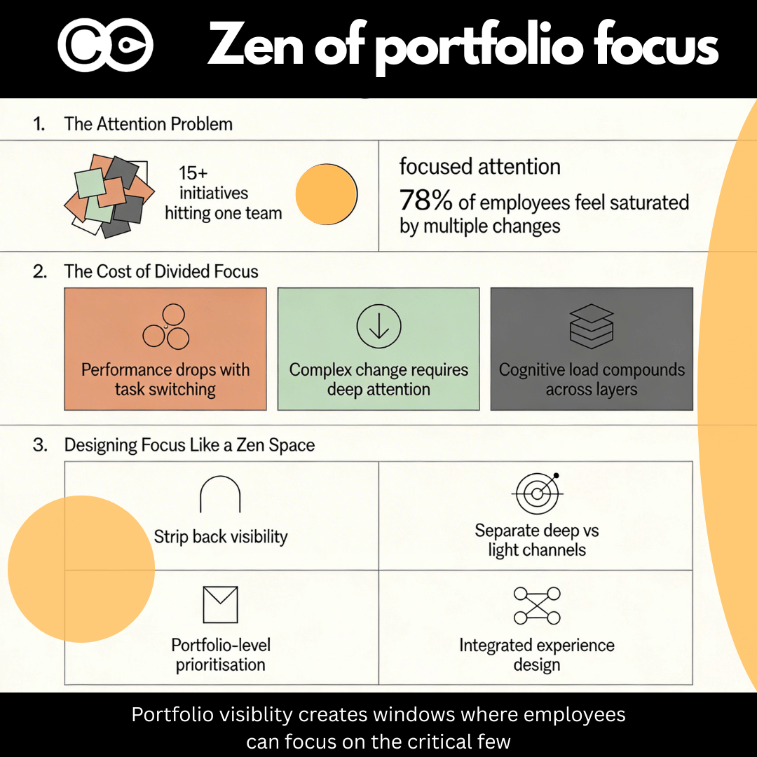
Most organisations now compete on how much change they can push through the system. Very few compete on how well they design focus.
Travelling through Japan, visiting zen temples and the art islands of Teshima and Naoshima, I was struck by how intentional design changes how you feel and what you notice. Many exhibitions are minimalist. They strip everything away until only one thing remains to focus on.
One installation in Naoshima called Minamidera crystallised this. You enter a wooden house completely devoid of sound and light. For several minutes you sit in total darkness. No phone, no notifications, no visual stimulus. This invoked a sense of fear. Fear of unfamiliarity, and loss of control through the senses. Then a faint horizontal bar of light appears and you are invited to stand and walk towards it.
Nothing “happens” in a conventional sense. Yet it is a powerful lesson in design and focus. Remove noise, introduce a single clear stimulus, and the mind locks on. That bar of light becomes everything.
It made me think about how we design the focus of employees’ working lives during change.
From zen rooms to inbox overload
In most organisations, employees already juggle multiple focus areas in their business-as-usual roles. Customer issues, team responsibilities, metrics, projects, performance expectations. That complexity is normal and, for many roles, manageable.
Then change arrives.
During change, we add new focus demands on top of existing BAU:
New systems to learn
New processes to follow
New KPIs and reporting
New behaviours and expectations
New governance or risk controls
Change is technically “part of work”, but the cognitive load it demands is different. Learning, unlearning, experimenting, troubleshooting and making sense of ambiguity all draw on high-order attention. Research shows that performance deteriorates significantly when complex tasks are combined with frequent switching and divided attention.
In other words, complex change competes directly with complex BAU for the same limited attention budget. When you stack multiple complex changes, you do not just add more work. You fragment focus and degrade performance.
Why divided attention is so expensive in complex change
Cognitive psychology has been clear for decades: multitasking and task switching carry measurable costs. Studies consistently show that:
Reaction times and error rates increase when people switch between demands compared to focusing on a single demand.
Divided attention and frequent switching degrade performance even when total workload does not increase dramatically.
Now map this to organisational life. A team lead might, in a single day:
Respond to customer escalations in a legacy process
Attend training for a new system
Review impact of an upcoming regulatory change
Complete a risk assessment for another initiative
Report on metrics impacted by yet another change
Each of these requires a different “mental mode”. In isolation, each is manageable. Combined, especially when complexity is high, the brain is constantly reconfiguring. Research on task switching highlights that each reconfiguration has a cost that accumulates over the day.
This is exactly what many change portfolios unintentionally create: high complexity plus constant switching across initiatives, without any design of where attention should be concentrated at any point in time.
The result is familiar:
Slower adoption of every initiative
More errors and rework
Lower engagement and higher fatigue
Change saturation, where employees feel unable to give anything their full attention.
Complex change demands concentrated focus
Not all change requires the same depth of focus. Updating a minor reporting template is not the same as shifting a core operating model. Rolling out a minor policy tweak does not demand the same cognitive effort as embedding a new risk framework.
Complex change, by definition, requires:
Deep understanding of new concepts and language
Behaviour shifts that must become habitual
New decision rules that are not yet automatic
Coordinated changes across multiple teams or systems
This is closer to the experience of sitting in that darkened room in Naoshima and then orienting towards a single bar of light. You are not processing ten stimuli in parallel. You are committing fully to one.
Now imagine the “zen room” equivalent of most corporate portfolios. Instead of darkness and one bar of light, the space is filled with:
Multiple screens showing different dashboards
Three competing audio tracks promoting different initiatives
A handful of managers each pointing at a different “must win” change
A constant stream of notifications from collaboration tools
Complex change needs the opposite: fewer focus points at any given moment, presented through channels designed to support depth, not just awareness.
This is where change portfolio management and tools like The Change Compass become crucial. They allow you to see not just how many initiatives exist, but how much complex attention each demands, and how they collide in the lived experience of teams.
The hidden layers of focus: corporate, departmental, team
Once you add organisational structure, the focus problem becomes multi-layered.
At the corporate level, there might be three to five strategic priorities. Leaders often assume this gives clarity. On paper it does.
At the departmental level, each function translates corporate priorities into its own portfolio:
Technology has its own roadmap
HR runs its own transformation program
Finance has regulatory and process changes
Operations has efficiency and service initiatives
At the team level, local leaders overlay their own focus areas:
Performance targets
Local improvement efforts
Staff development and engagement work
An employee sitting in a branch, a contact centre, a distribution centre, or a shared service hub does not experience “three to five priorities”. They experience all of these layers at once. Each initiative thinks it is in the top three. Collectively, they become the top fifteen.
Prosci and other research bodies have shown that organisations struggle because they underestimate how many changes are underway at the same time and how those accumulate on individuals. Portfolio-level studies confirm that unmanaged accumulation leads to change saturation, which then drives fatigue, lower productivity, and higher turnover.
The job of change leaders, therefore, is not just to manage each initiative well. It is to cut through this layered complexity and design focus across levels.
Designing focus like a zen space, not a crowded noticeboard
If we take the Naoshima experience as a metaphor, there are several principles we can apply to portfolio-level change.
1. Strip back what is visible at any one time
In the art installation, everything non-essential is removed so that one element can dominate experience.
In change terms, this means:
Not every initiative gets equal airtime in every channel.
At any point in time, each role should have a small number of clearly signposted focus changes.
Organisation-wide channels should highlight only the handful of complex, behaviour-changing initiatives that truly require deep attention.
The rest can move into lighter touch channels designed for awareness rather than behaviour shift.
Change portfolio tools can support this by showing, for each role or team, how many initiatives are active in a period and how heavy their impacts are. This allows you to actively design “focus windows” where only one or two complex initiatives hit that population at depth.
2. Separate “deep change” channels from “background noise”
We often treat all communication channels as equal, which means critical change messages compete with general updates and noise.
Instead, consider:
Deep-focus channels for complex change. These might include structured workshops, leadership-led sessions, immersive simulations, or well-designed learning journeys. These are the equivalent of the darkened room and single bar of light. When employees are in these channels, they know “this is where I need to concentrate fully”.
Light-touch channels for background or ongoing awareness. These can be newsletters, intranet updates, short videos, or social posts that keep other initiatives visible without demanding deep focus.
By consciously assigning initiatives to the right channel type, you avoid clouding focus. High-complexity changes are not diluted by being mixed in with dozens of minor updates.
Research on change saturation emphasises the importance of managing not just volume, but the perceived intensity and cognitive load of communication and demands.
3. Prioritise across the whole portfolio, not just within silos
Prioritisation is often done within portfolios: technology prioritises its roadmap, HR prioritises its programs, operations prioritises its improvement work. The result is multiple “top fives” that collide.
Portfolio-level prioritisation asks a different question: “For this specific group of people, across all sources of change, what truly matters most over the next quarter?”
This requires:
A single view of all initiatives and their impacts on each group
A way to compare intensity and complexity of impact
The courage to pause, cancel, or delay lower-value changes, even if they are important in isolation
Research on change saturation and portfolio management consistently recommends portfolio-level prioritisation and sequencing to avoid overloading stakeholders and to improve adoption outcomes.
McKinsey and other studies have shown that organisations that prioritise and sequence change at portfolio level can realise significantly more value from transformation, in some cases 40% more, precisely because people can focus on fewer things at a time.
4. Design the integrated employee experience across initiatives
Different initiatives naturally craft their own messaging, content, leader narratives, and release plans. Left alone, this produces a fragmented experience. Messages collide, tones differ, and employees receive multiple “number one priorities” in the same week.
A portfolio lens lets you weave an integrated experience across initiatives:
Messaging: Align language, avoid contradictory slogans, and show how different initiatives connect to a coherent story.
Content design: Sequence learning so that foundational knowledge for one initiative supports another, rather than overloads.
Leader messages: Equip leaders to speak to “the whole change story” for their teams, not just the initiative they sponsor.
Release packaging: Bundle related changes where it makes sense, so employees experience one combined release instead of a series of disjointed tweaks.
Adoption reinforcement: Use shared reinforcement mechanisms that support multiple initiatives, such as integrated coaching, common dashboards, or combined recognition programs.
This is the portfolio equivalent of designing a curated art experience instead of hanging every artwork the museum owns in one room. Research on enterprise change management shows that organisations with integrated, portfolio-level approaches achieve significantly higher change success than those managing initiatives in isolation.
Making this practical with change portfolio data
All of this is only possible if you have data on:
How many initiatives touch each role
The complexity and depth of impact for each initiative
Timing and sequencing across the year
The channels being used and their cognitive load
Readiness, saturation, and adoption measures across the portfolio
This is precisely the problem The Change Compass is designed to solve. By quantifying change impacts and visualising them across initiatives and time, it gives leaders the equivalent of that darkened room and single bar of light: a clear view of what truly needs to be in focus, for whom, and when.
With that view, you can:
Identify teams with too many complex initiatives landing simultaneously
Re-sequence releases to create focus windows
Simplify or postpone lower-value changes for overloaded groups
Design channel strategies that separate deep change from background updates
Align messaging and reinforcement across initiatives
In short, you can design focus, not just deliver activity.
Bringing zen discipline into modern change leadership
The lesson from Japanese minimalist art is not to do less for its own sake. It is to make deliberate choices about what fills the frame.
In change and transformation, that means:
Being ruthless about what you ask people to focus on now versus later
Reducing visual and cognitive clutter in your change communications
Using portfolio data to create clarity in environments that are inherently complex
Treating employee attention as a scarce and strategic resource, not an elastic one
Change leaders today are not just managing timelines and training plans. They are curating the attention of an organisation under pressure from continuous transformation, competing priorities, and constant noise.
Those who do this well will not simply “land more initiatives”. They will build organisations where people can focus deeply on the critical few changes that truly matter, embed them well, and be ready for what comes next.
And that, in a noisy world, is a genuine competitive advantage.
Frequently Asked Questions
What is change portfolio focus and why does it matter?
Change portfolio focus refers to intentionally designing employee attention across multiple initiatives, ensuring complex changes receive deep concentration rather than competing for divided attention. Without it, performance drops, adoption suffers, and employees experience saturation.
How does divided attention affect complex change adoption?
Cognitive research shows task switching between complex demands increases errors and reaction times. When multiple initiatives layer on top of BAU work, employees cannot embed new behaviours effectively, leading to fragmented adoption and fatigue.
How can zen principles apply to change management?
Zen minimalism teaches removing noise to highlight one clear focus point. In portfolios, this means stripping back competing messages, using dedicated channels for deep change, and creating “focus windows” where employees concentrate on 1-2 critical initiatives.
What are the main causes of change saturation across organisational layers?
Saturation occurs when corporate, departmental, and team-level priorities collide. Each layer adds its “top priorities,” overwhelming employees. Portfolio visibility reveals these overlaps, enabling prioritisation and sequencing.
How does The Change Compass help with portfolio focus design?
The Change Compass provides role-level impact heatmaps, saturation alerts, and sequencing analysis, helping leaders design integrated experiences, reduce cognitive load, and create focus windows across initiatives.
What are practical steps to implement portfolio-level focus?
Map all initiatives and their complexity by role
Prioritise across the portfolio, not just within silos
Sequence releases to avoid concurrent peaks
Separate deep-focus channels from awareness channels
Align messaging and reinforcement across initiatives.
Change management assessments are the foundation of successful transformation. Yet many change practitioners treat them like compliance boxes to tick rather than strategic tools that reveal the real story of whether change will stick. The difference between a thorough assessment and a surface-level one often determines whether a transformation delivers business impact or becomes another expensive learning experience.
The evolution of change management assessments reflects a shift in how mature organisations approach transformation. Beginners follow methodologies, use templates, and gather information in structured ways. That’s valuable starting ground. But experienced practitioners do something different. They look for patterns in the data, drill into unexpected findings, challenge surface-level conclusions, and adjust their approach continuously as new insights emerge. Most critically, they understand that assessments without data are just opinions, and opinions are rarely reliable guides for multi-million pound transformation decisions.
The future of change management assessments lies in combining digital and AI tools that can rapidly identify patterns and connections across massive datasets with human interpretation and contextual insight. Technology handles the heavy lifting of data collection and pattern recognition. Change practitioners apply experience, intuition, and business understanding to translate findings into meaningful strategy.
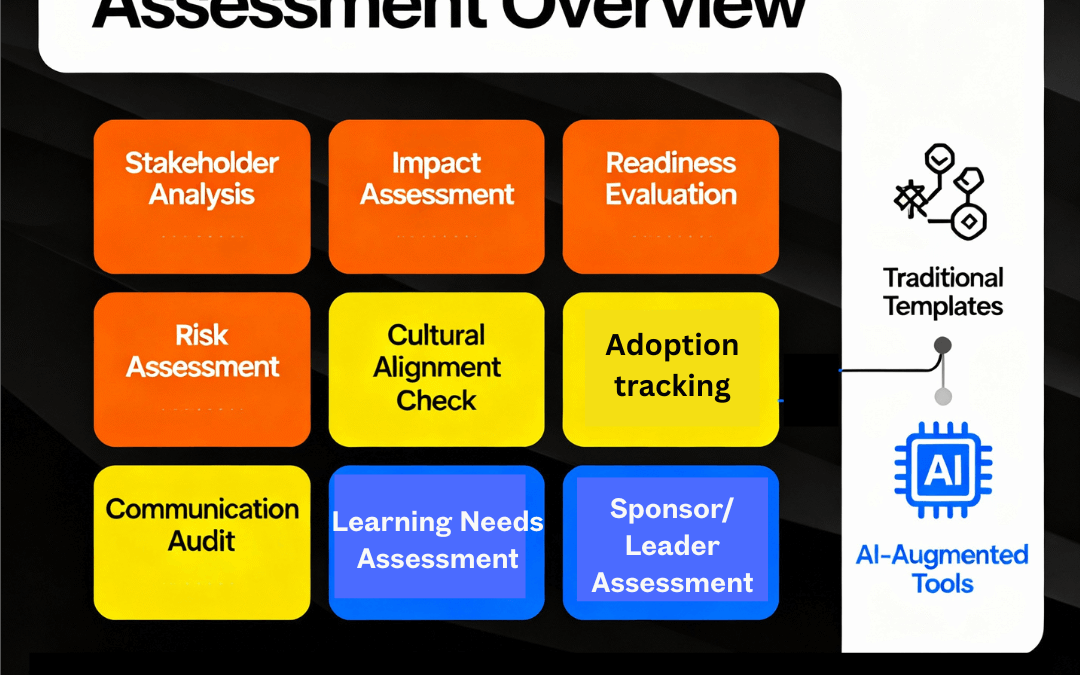
Understanding the Scope of Change Management Assessments
Change management assessments come in many forms, each serving a distinct purpose in the transformation lifecycle. Most practitioners use multiple assessment types across a single transformation initiative, layering insights to build a comprehensive picture of readiness, impact, risk, and opportunity.
The most common mistake organisations make is using a single assessment type and believing it tells the whole story. It doesn’t. A readiness assessment reveals whether people feel ready but doesn’t tell you what skills they actually need. A cultural assessment identifies organisational values but doesn’t map who will resist. A stakeholder analysis shows whom matters in the change but doesn’t reveal their specific concerns. A learning needs assessment identifies training gaps but doesn’t connect to adoption barriers. Only by using multiple assessment types, layering insights, and looking for connections between findings can you understand the true landscape of your transformation.
Impact assessment is the starting point for any transformation. It answers a fundamental question: what will actually change, and who does it affect?
An impact assessment goes beyond the surface-level project scope statement. It identifies every function, process, system, role, and team affected by the transformation. More importantly, it measures the magnitude of impact: is this a minor tweak to how people work, or a fundamental reshaping of processes and behaviours?
Impact assessment typically examines:
Process changes (what activities will be different)
System changes (what technology or tools will change)
Organisational changes (what reporting lines, structures, or roles will shift)
Role changes (what responsibilities each person will have)
Skill requirement changes (what new competencies are needed)
Culture changes (what new behaviours or mindsets are required)
Operational changes (what performance metrics will shift)
The data collected during impact assessment shapes everything downstream. Without clarity on impact, you can’t accurately scope training needs, can’t properly segment stakeholders, and can’t build a realistic change management budget. Many transformation programmes discover halfway through that they fundamentally misunderstood the scope of impact, forcing painful scope changes or inadequate mitigation strategies.
Experienced change practitioners know that impact assessment isn’t just about listing what’s changing. It’s about understanding the ripple effects. When you implement a new system, yes, people need training on the system. But what other impacts cascade? If the system changes workflow sequencing, other teams need to understand how their dependencies shift. If it changes approval permissions, people need clarity on who now has decision rights. If it changes performance metrics, people need to understand new success criteria. Impact assessment identifies these cascading effects before they become surprises during implementation.
Sample impact assessment
Function/Department
Number of Staff
Impact Level
Process Changes
System Changes
Skill Requirements
Behaviour Shifts
Loan Operations
95
HIGH
85% of workflow affected
Complete system replacement
12 new technical competencies
Shift from approval-based to data-driven decision-making
Credit Risk
32
MEDIUM
Risk approval steps remain but timing shifts
Integration with new system
5 new risk analysis capabilities
More rapid decision cycles required
Customer Service
120
LOW
Customer-facing interface improves but core responsibilities unchanged
New CRM interface
3 new system features
Proactive customer communication approach
Finance & Reporting
15
MEDIUM
New metrics and reporting required
New reporting module
4 new reporting skills
Real-time reporting vs monthly cycles
Compliance
8
MEDIUM
New compliance verification steps
Audit trail enhancements
2 new compliance processes
Continuous monitoring vs spot-checks
IT Support
12
HIGH
Support model fundamentally changes
New ticketing system
8 new technical support skills
Shift from reactive to proactive support
Cultural Assessment: Evaluating Organisational Readiness for Change
Culture is rarely measured but constantly influences transformation outcomes. Cultural assessment evaluates the values, beliefs, assumptions, and unwritten rules within an organisation that shape how people respond to change.
Cultural dimensions that affect change outcomes include:
Risk orientation: Is the culture risk-averse or entrepreneurial? This determines whether people embrace or resist change.
Trust in leadership: Do employees believe leadership has good intentions and sound judgement? This affects whether people follow leadership guidance.
Pace of decision-making: Is the culture deliberate and careful, or fast-moving and adaptable? This shapes whether transformation timelines feel realistic or rushed.
Accountability clarity: Are people comfortable with clear accountability, or do they prefer ambiguity? This affects whether new role clarity feels empowering or controlling.
Learning orientation: Does the culture embrace experimentation and learning from failure, or does it punish mistakes? This influences whether people adopt new approaches.
Collaboration norms: Do people naturally work across silos, or are functions protective? This shapes whether cross-functional change governance feels natural or forced.
Cultural assessment typically uses surveys, interviews, and focus groups to gather employee perspectives on these dimensions. The goal is to identify cultural strengths that will support change and cultural obstacles that will create resistance.
The insight here is often counterintuitive. A strong, unified culture can actually impede change if the culture is change-resistant. A culture that prides itself on “how we do things here” will push back against “doing things differently.” Conversely, organisations with more fluid, adaptive cultures often experience faster adoption. Experienced practitioners don’t judge culture as good or bad; they assess it realistically and build mitigation strategies that work with cultural reality rather than fighting it.
Stakeholder Analysis: Mapping Influence, Interest, and Engagement
Stakeholder analysis identifies everyone affected by transformation and categorises them by influence and interest. This determines engagement strategy: who needs constant sponsorship? Who needs information? Who will naturally resist? Who are likely advocates?
Stakeholder analysis typically uses a matrix that plots stakeholders by influence (high/low) and interest (high/low), creating four quadrants:
High influence, high interest: Manage closely. These are your key players.
High influence, low interest: Keep satisfied. They can block progress if dissatisfied.
Low influence, high interest: Keep informed. They’re advocates but not decision-makers.
Low influence, low interest: Monitor. They’re not critical to success but shouldn’t be ignored.
Beyond the matrix, sophisticated stakeholder analysis profiles individual stakeholder motivations: what does each person care about? What are their concerns? What will they gain or lose? What language and communication approach resonates with them?
The transformation benefit emerges when you layer stakeholder analysis with other insights. When you combine stakeholder influence mapping with cultural assessment, you can predict where resistance will come from and who has power to either amplify or neutralise that resistance. When you combine stakeholder analysis with learning needs assessment, you understand what support each stakeholder group requires. The patterns that emerge from multiple data sources are far richer than any single assessment.
Readiness Assessment: Evaluating Preparation for Change
Change readiness assessment comes in two flavours, and experienced practitioners use both.
Organisational readiness assessment happens before the project formally starts. It evaluates whether the organisation has the structural and cultural foundation to support transformation: Do we have a committed sponsor? Do we have change infrastructure and governance? Do we have resources allocated? Do we have clarity on what we’re trying to achieve? Is leadership aligned? This assessment answers the question: should we even attempt this transformation right now, or should we address foundational issues first?
Adoption readiness assessment happens just before go-live. It evaluates whether people are actually prepared to adopt the change: Have they completed training? Do they understand how their role will change? Is their manager prepared to support them? Are support structures in place? Do they feel confident in their ability to succeed? This assessment answers the question: are we ready to launch, or do we need final preparation?
Readiness assessment typically examines seven dimensions:
Awareness: Do people understand what’s changing and why?
Desire: Do people believe the change is necessary and beneficial?
Knowledge: Do people have the information and skills needed?
Ability: Do people have systems, processes, and infrastructure to execute?
Support: Is leadership visibly committed and actively removing barriers?
Culture and communication: Is there trust, openness, and honest dialogue?
Commitment: Will people sustain the change long-term?
The data reveals what readiness actually exists versus what’s assumed. Many organisations assume that if people attended training, they’re ready. Assessment data often shows something different: training completion and actual readiness are correlates, not equivalents. People can attend training and remain unconfident or unconvinced. Assessment finds these gaps before they become adoption failures.
Readiness assessment sample output
Assessment Type: Organisational Readiness (Pre-Transformation) Initiative: Customer Data Platform Implementation
Readiness Scorecard:
Dimension
Score
Status
Comment
Sponsorship Commitment
8/10
Strong
CEO personally championing; allocated budget
Leadership Alignment
6/10
Caution
Finance and Ops aligned; Technology concerns about timeline
Change Infrastructure
5/10
At Risk
No dedicated change function; relying on project team
Resource Availability
7/10
Good
Core team allocated; limited surge capacity
Clarity of Vision
8/10
Strong
Compelling business case; clear success metrics
Cultural Readiness
5/10
At Risk
Risk-averse organisation; past project failures causing hesitation
Stakeholder Buy-In
6/10
Caution
Early adopters engaged; middle management unconvinced
Learning needs assessment identifies what knowledge and skills people need to perform effectively in the new state and what gaps exist today.
A complete learning needs assessment examines:
Knowledge gaps: What do people need to know about new systems, processes, and ways of working?
Skill gaps: What new capabilities are required?
Behaviour gaps: What new ways of working must people adopt?
Confidence gaps: Where do people feel unprepared or uncertain?
Role-specific needs: What are differentiated needs by role, function, or seniority?
The insight emerges when you look for patterns. Which teams have the largest gaps? Which roles feel most uncertain? Are gaps concentrated in specific functions or spread across the organisation? Do gaps cluster around particular topics or specific systems? These patterns shape training strategy, timing, and emphasis.
Experienced practitioners know that learning needs assessment connects to adoption barriers. If specific groups have large capability gaps, they’ll likely struggle with adoption. If specific topics generate high uncertainty, they’ll need more support. If certain roles feel unprepared, they’ll become adoption blockers. By identifying these connections early, practitioners can build targeted interventions.
Adoption Assessment: Measuring Actual Behavioural Change
Adoption assessment is perhaps the most critical yet often most neglected assessment type. It measures whether people are actually using new systems, processes, and ways of working correctly and consistently.
Adoption assessment goes beyond tracking login frequency or training completion. It examines:
System usage: Are people using the system? Which features are used, and which are ignored?
Workflow adherence: Are people following new processes, or reverting to old ways?
Proficiency progression: Are people becoming more skilled over time, or plateauing?
Workarounds: Where are people working around new systems or processes?
Behavioural change: Are new, desired behaviours becoming embedded?
Compliance: Are people following required controls and governance?
The patterns that emerge reveal what’s actually working and what isn’t. High adoption in some areas but resistance in others suggests the change fits some business contexts but conflicts with others. Rapid adoption followed by plateau suggests initial enthusiasm but difficulty sustaining change. Widespread workarounds suggest the new system or process has design gaps or conflicts with real operational needs.
Adoption assessment is where data and human interpretation diverge most sharply. The data shows what’s happening. The interpretation determines why. Is low adoption a change management failure (people don’t understand or don’t want the change), an adoption support failure (they want to change but lack resources or capability), a design failure (the new system or process doesn’t actually work for their context), or a business case failure (the change doesn’t deliver the promised benefits)? Each root cause requires different mitigation. Data alone can’t tell you the answer; experience and contextual understanding can.
Behavioural Change Tracking:
Behaviour
Adoption Rate
Trend
Submitting expenses via system
72%
Increasing
Using digital receipts instead of paper
48%
Increasing but slow
Submitting on time (vs overdue)
61%
Slight decline
Approving expenses in system
85%
Strong
Compliance and Risk Assessment: Understanding Regulatory and Operational Risk
Compliance and risk assessment evaluates whether transformation activities maintain regulatory compliance, control adherence, and operational risk management.
This assessment typically examines:
Control effectiveness: Are required controls still operating correctly during and after transition?
Regulatory compliance: Are we maintaining compliance with relevant regulations during change?
Data security: Are we protecting sensitive data throughout transition?
Process integrity: Are critical processes maintained even as we change other elements?
Operational risk: What new risks are introduced by the transformation?
The insight here is often stark: many transformations discover during implementation that they’re creating compliance or control gaps. System transitions may leave periods where controls are weaker. New processes may have unintended compliance implications. Data migration may create security exposure. Early risk assessment identifies these issues before they become problems, allowing mitigation planning.
Compliance and risk assessment sample output
Assessment: Control Environment During System Transition Initiative: Manufacturing ERP Implementation
Critical Control Status During Transition:
Control
Pre-Migration Status
Migration Risk
Post-Migration Status
Mitigation
Segregation of Duties (Purchasing)
Operating
HIGH
Design verified
Dual sign-off during transition
Inventory Cycle Counts
Operating
MEDIUM
Design verified
Weekly counts during transition period
Financial Reconciliation
Operating
HIGH
Design verified
Parallel run for 30 days
Approval Authorities
Operating
MEDIUM
Reconfigured
Training on new authority matrix
Audit Trail
Not available
MEDIUM
Enhanced
Data retention policy reviewed
The Role of Analysis and Analytical Skills
Here’s where experienced change practitioners distinguish themselves from those following templates: the ability to analyse assessment data, find patterns, and translate findings into strategic insight.
Template-based approaches gather assessment data, check boxes, and move to predetermined next steps. Analytical approaches ask harder questions of the data:
What patterns emerge across multiple assessments? If readiness assessment shows low awareness but high desire, that’s different from low desire and high awareness. The first needs communication; the second needs benefits clarity.
Where do assessments conflict or create tension? If cultural assessment shows a risk-averse culture but impact assessment shows the change requires risk-embracing behaviours, that’s a critical tension requiring specific mitigation strategy.
Which findings are unexpected? Unexpected patterns often reveal important insights that predetermined templates miss.
What do the findings suggest about root causes versus symptoms? Surface-level resistance might stem from awareness gaps, capability gaps, cultural misalignment, or stakeholder concerns. Each has different solutions.
How do findings in one area cascade to other areas? Low adoption readiness in one function might cascade to adoption failures in dependent functions.
Analytical skills require comfort with ambiguity. Assessment data rarely tells a clear story. More commonly, it tells multiple stories that require interpretation. Experienced practitioners synthesise across data sources, form hypotheses about what’s really happening, and design targeted interventions to test and refine those hypotheses.
The Evolution: From Templates to Technology to Intelligence
Change management practice is evolving through distinct phases.
Phase 1: Template-based assessment dominated for years. Standard questionnaires, predetermined analysis, checkbox completion. Templates provided structure and consistency, which was valuable for bringing consistency to change management practice. The limitation: templates assume one size fits all and rarely surface unexpected insights.
Phase 2: Data-driven assessment emerged as practitioners recognised that larger data sets reveal patterns templates miss. Instead of a standard questionnaire, assessment included multiple data sources: surveys, interviews, focus groups, historical project data, performance metrics, employee sentiment analysis. The limitation: even with more data, human capacity to synthesise complex information across multiple sources is limited.
Phase 3: Digital/AI-augmented assessment is emerging now. Digital platforms collect assessment data at scale and speed impossible for humans. Machine learning identifies patterns across thousands of data points and surfaces anomalies and correlations humans might miss. But here’s the critical insight: AI may not always be reliable at interpretation across different types of data forms. It can tell you that adoption is lower in division X than division Y. It might not always be accurate in telling you whether that’s because division X has a change-resistant culture, because the change conflicts with their business model, because their local leadership isn’t visibly committed, or because their systems don’t integrate well with the new platform. The various layers of nuances plus data interpretation requires human judgment, critique, business context, and change experience.
The future of change management assessment lies in this combination: AI handling data collection, pattern recognition, and anomaly detection at scale, supplemented by human interpretation that understands context, causation, and strategy.
How to Build Assessment Rigour Into Your Approach
Regardless of the assessment types you use, several principles improve quality and insight:
Use multiple data sources. Single-source data is unreliable. Surveys show what people think; interviews show what they really believe; project history shows what actually happens. Layering sources reduces individual bias.
Segment your data. Aggregate data hides important variation. Breaking data by function, location, seniority level, or job role often reveals where challenges concentrate and where strengths lie.
Look for patterns and contradictions. Where multiple assessments show consistent findings, you’ve found solid ground. Where assessments contradict, you’ve found important tensions requiring investigation.
Question unexpected findings. When assessment data contradicts assumptions or conventional wisdom, dig deeper before dismissing the finding. Often these are the most important insights.
Connect findings to strategy. Assessment findings should shape change management strategy. If readiness assessment shows low awareness, communication strategy must shift. If cultural assessment shows misalignment with required behaviours, you need specific culture change work. If stakeholder analysis shows concentrated resistance, you need targeted engagement strategy.
Reassess throughout the transformation. Assessment isn’t a one-time event. Conditions change as you move through transformation phases. Early assessment findings may no longer apply by mid-programme. Reassessment at key milestones tracks whether your mitigation strategies are working.
Making Assessment Practical
The risk with comprehensive assessment guidance is it sounds overwhelming. Here’s how to make it practical:
Start with the assessments most critical to your specific transformation. You don’t need all assessment types for every change. Match assessment type to your biggest uncertainties or risks.
Use assessment to test specific hypotheses. Rather than generic “what’s your readiness?” ask “do you understand how your role will change?” This makes assessment data actionable.
Combine template efficiency with analytical depth. Use standard survey templates for consistency and comparable data. Then drill into unexpected patterns with targeted interviews and focus groups.
Invest in interpretation time. The assessment data collection is the easy part. The valuable work is stepping back and asking “what does this really mean for my transformation strategy?”
The Future of Assessment: Data Plus Insight
Change management assessments are at an inflection point. The frameworks and methods have matured. What’s evolving is the way we gather, analyse, and interpret assessment data.
Technology enables assessment at unprecedented scale and speed. Organisations can now assess thousands of employees, track sentiment evolution through transformation phases, and correlate adoption patterns with dozens of organisational variables. The pace of data collection and pattern recognition is transforming.
What hasn’t changed and won’t change is the need for human expertise to interpret and critique findings, understand context, and translate data into strategy. An AI might identify that adoption is declining in specific roles or locations. A change practitioner interprets whether that’s a training issue, a support issue, a design issue, or a business case issue, and designs appropriate response.
The organisations that will excel at transformation are those that combine both: technology that amplifies human capability by handling data collection and pattern recognition, and experienced practitioners who interpret findings and design strategy based on understanding of organisation, context, and change leadership.
Key Takeaways
Change management assessments are not compliance exercises. They’re strategic tools for understanding whether transformation will succeed or fail. Using multiple assessment types, looking for patterns across assessments, and combining analytical skill with technology creates the foundation for transformation success. The organisations that treat assessment as rigorous analysis rather than checkbox completion consistently achieve better transformation outcomes.
What is the difference between readiness assessment and adoption assessment?
Organisational readiness assessment happens before transformation begins and evaluates whether the organisation is structurally and culturally prepared to undertake change. It asks: do we have committed sponsorship, resources, aligned leadership, and infrastructure? Adoption readiness assessment happens just before go-live and evaluates whether employees are prepared to actually adopt the change. It asks: have people completed training, do they understand how their role changes, are support structures in place? Both are essential; they serve different purposes at different transformation phases. On the other hand, actual adoption tracking and monitoring happens after the project release.
Why do many transformations fail despite passing readiness assessments?
Readiness assessments measure perceived readiness and infrastructure readiness, not actual capability or genuine commitment. People can report feeling ready on a survey but lack actual skills, still hold reservations or just become busy with other work focus priorities. Leadership can appear committed in formal settings but subtly undermine change through conflicting priorities. Organisations can have assessment processes in place but lack follow-through on issues the assessment revealed. True success requires not just assessment but acting on assessment findings throughout transformation.
How do I connect assessment findings to actual change management strategy?
Assessment findings should directly shape strategy. If readiness assessment shows awareness gaps, communication intensity must increase. If cultural assessment shows risk-averse culture but change requires risk-embracing behaviours, you need explicit culture change work alongside training. If stakeholder analysis shows concentrated resistance among key influencers, targeted engagement strategy is essential. If adoption assessment shows workarounds, the system or process design may need refinement. Each finding type should trigger specific, tailored strategy responses.
What’s the most critical assessment type for transformation success?
Adoption assessment is perhaps most critical because it measures what actually matters: whether people are using new ways of working correctly. Results may be used to reinforce or support adoption. However, no single assessment type tells the complete story. For example, readiness assessment is critical because it is the predictor for adoption. On top of this, having an accurate impact assessment is key as it forms the overall change approach. Comprehensive transformation success requires multiple assessment types at different phases, layering insights to understand readiness, impact, capability, risk, and actual outcomes. The assessment types work together to build approach strategic clarity.
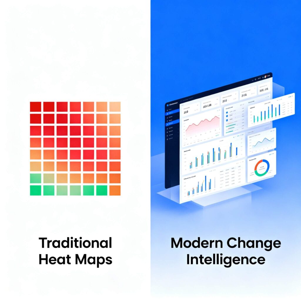
Change impact assessment has become a cornerstone of effective change management, providing practitioners with visual tools to understand and communicate how organisational transformations will affect different areas of the business. The change management heat map, with its familiar red, amber, and green colour coding, has emerged as one of the most widely used change management tools and techniques for visualising change impact across departments, teams, and business units.
For change managers beginning their impact assessment journey, heat maps offer an accessible entry point into systematic change analysis. They provide a visual framework that executives can quickly grasp and a structured change management approach for gathering stakeholder input about change effects across the organisation. Understanding how to manage change through these tools effectively remains an important foundational skill for change management professionals pursuing change management best practices.
We will explore a comprehensive approach to creating change management heat maps, from initial setup through stakeholder engagement and final presentation. However, we will also explore the significant limitations of traditional heat map approaches and examines why modern organisations require more sophisticated change assessment tools to successfully navigate complex change initiatives.
Understanding change management heat maps
What is a change management heat map
A change management heat map is a visual representation that displays the anticipated impact of change in organisations across different areas of the business using colour-coded matrices. Most commonly, these maps use traffic light colours – red for high impact, amber for medium impact, and green for low impact – to provide stakeholders with an immediate visual understanding of where change will be most significant within their change management framework.
Heat maps typically organise information along two key dimensions as part of a structured change management methodology. The vertical axis usually represents different organisational areas (departments, business units, locations, or roles), while the horizontal axis might show different types of change impact (process changes, technology changes, people changes, structural changes) or different phases of the change initiative (planning, implementation, adoption, sustainment). There are also other display methods including months of the year at the horizontal axis and business process changes along the vertical axis.
The appeal of heat maps lies in their simplicity and visual impact for implementing change management. Executives can quickly scan the map to understand which areas require the most attention and resources, while change managers can use the visual to guide conversation about support needs and intervention strategies as part of their change management activities.
When heat maps are most useful
Heat maps work particularly well in several specific contexts within the change management process:
• Initial change scoping: When you need to provide stakeholders with a high-level overview of change impact across the organisation during early change management planning
• Executive communication: When presenting to change leadership who require rapid visual understanding of impact distribution
• Resource planning: When making initial decisions about where to focus change management resources and effort
• Stakeholder engagement: When facilitating discussions with business unit leaders about their areas’ change requirements
Heat maps also serve as effective starting points for more detailed change analysis. They can help identify areas that warrant deeper investigation and provide a change management framework for structuring stakeholder conversations about specific impacts and needs.
Creating your change management heat map: a step-by-step guide
Step 1: Define your assessment scope and dimensions
Before creating your heat map, you need to establish clear parameters for your analysis as part of fundamentals of change management. This foundational step determines the effectiveness and usefulness of your final change assessment.
Identifying organisational areas for assessment: Start by determining which parts of the organisation your change initiative will affect. Common approaches to managing organizational change include:
• Business unit analysis (Product divisions, geographic regions, customer segments)
• Functional role groupings (Front-line staff, middle management, senior leadership)
• Location-based divisions (Head office, regional offices, field locations)
Selecting impact dimensions: Choose the types of change impact you want to assess using proven change management techniques. Typical dimensions include:
• Process changes (new workflows, revised procedures, updated standards)
• Technology changes (new systems, software upgrades, digital tools)
• People changes (role modifications, skill requirements, reporting relationships)
• Cultural changes (values, behaviours, communication patterns)
Establishing your rating scale: Define what constitutes different levels of change in your organisational context:
• High impact (Red): Significant changes requiring extensive support, training, or adjustment
• Medium impact (Amber): Moderate changes requiring some support and adjustment
• Low impact (Green): Minor changes requiring minimal support or adjustment
Document these definitions clearly as part of your change management plan, as they’ll guide all subsequent change management activities and ensure consistency across different evaluators.
Also note that change heatmaps can be focused for one specific project, or multiple projects within a portfolio, a department or across the whole organisation.
Step 2: Gather stakeholder input and data
Effective heat map creation requires systematic data collection from relevant stakeholders who understand the operational realities of different organisational areas, representing core change management principles of stakeholder engagement.
Identifying key informants: Select stakeholders who can provide accurate insights about change impacts for your change management process:
• Business unit leaders who understand operational requirements
• Subject matter experts familiar with current processes and systems
• Front-line managers who understand day-to-day work realities
• HR representatives who understand people and capability implications
• Technical specialists who understand system and process dependencies
Conducting impact assessment interviews: Structure your stakeholder conversations to gather consistent, comparable information and conduct subsequent analysis given the organisation environment:
• Present the change initiative overview and timeline
• Explain your impact assessment dimensions and rating scale
• Walk through each relevant organisational area
• For each area, discuss the nature and extent of changes across your chosen dimensions
• Document not just the ratings but the reasoning behind them
• Identify any dependencies or interconnections between areas
Using assessment surveys and workshops: Complement interviews with broader data collection methods as part of comprehensive change management techniques:
• Change management surveys for stakeholders who can’t participate in detailed interviews
• Group workshops to explore areas where multiple perspectives are valuable
• Focus groups to understand specific stakeholder concerns and requirements
• Document reviews to understand current state processes and procedures
Step 3: Build your heat map matrix
With your data collected, you can begin constructing your visual heat map representation using appropriate change management tools and techniques.
Setting up your matrix structure: Create a grid with your organisational areas on one axis and your impact dimensions on the other. Most practitioners use spreadsheet for this initial construction, though purpose-built change assessment tools offer additional functionality.
Populating impact ratings: For each intersection of organisational area and impact dimension within your change management framework:
• Review your stakeholder input and supporting data
• Apply your defined rating criteria consistently
• Assign the appropriate colour code (red, amber, green)
• Document the rationale for each rating in supporting notes
Adding supporting information: Enhance your heat map with additional context following change management best practices:
• Include brief descriptions of the specific changes driving each rating
• Note key dependencies or risks associated with high-impact areas
• Identify stakeholder groups requiring particular attention
• Document assumptions and data sources for transparency
Creating visual clarity: Ensure your heat map is visually effective for change management communication:
• Use consistent colour schemes and formatting
• Include clear legends explaining your rating system
• Add titles and labels that make the map self-explanatory
• Consider using different visual elements (patterns, symbols) to convey additional information
Step 4: Validate and refine your assessment
Before finalising your heat map, validate your analysis through stakeholder review and refinement as part of rigorous change management methodology.
Stakeholder validation sessions: Present your draft heat map to key stakeholders for feedback on your change assessment:
• Walk through your methodology and rating criteria
• Review specific ratings for areas where stakeholders have expertise
• Explore any unexpected patterns or outliers in your assessment
• Gather additional context or information that might affect your ratings
Cross-referencing and consistency checking: Review your heat map for internal consistency within your change management approach:
• Compare similar organisational areas to ensure rating consistency
• Check that interdependent areas have appropriate ratings
• Verify that your impact assessment aligns with known change requirements
• Ensure your ratings reflect the actual scope and timeline of planned changes
Incorporating feedback and adjustments: Refine your heat map based on stakeholder input following change management principles:
• Adjust ratings where new information suggests different impact levels
• Add missing organisational areas or impact dimensions
• Clarify definitions or criteria where confusion arose
• Document changes and the reasoning behind them
Step 5: Present and utilise your heat map
The final step involves presenting your heat map effectively and using it to guide change management planning for change success.
Executive presentation strategies: When presenting to change leadership:
• Start with an overview of your methodology and data sources
• Highlight the highest-impact areas requiring immediate attention
• Explain the implications for resource allocation and timeline
• Connect impact patterns to business priorities and strategic objectives
• Provide clear recommendations for next steps in your change management plan
Facilitating stakeholder discussions: Use your heat map as a conversation starter for managing change:
• Focus discussions on high-impact areas and required support
• Explore dependencies and interconnections between areas
• Identify opportunities for shared resources or coordinated approaches
• Develop action plans for addressing specific impact requirements
Translating insights into change strategy: Convert your heat map findings into practical change management plans:
• Prioritise high-impact areas for early engagement and support
• Design targeted interventions based on specific impact types
• Allocate change management resources according to impact intensity
• Develop communication messages tailored to different impact levels
• Create change monitoring approaches to track progress in critical areas
The growing limitations of traditional heat map approaches
While heat maps serve as useful introductory tools for change assessment, experienced change managers increasingly recognise their significant limitations in complex organisational environments. These limitations become particularly problematic when dealing with large-scale transformations, multi-dimensional changes, or sophisticated organisational structures that require advanced change management analytics.
Risks in using the heatmap
A lot of change managers have experienced situations where they walk into a leadership meeting expecting to have discussions about business areas most impacted by the change, and instead:
They are interrogated about how the colours are determined and are asked to justify how logical the ratings are
Stakeholders’ eyes glaze over the visuals since there is not much they could do with the information beyond a nice FYI
Stakeholders start asking questions about specific decisions required for business capacity risks, but decisions are hard to make with high level categorical ratings that does not allow any depth in drilling down to specific details
The psychological bias challenge
The most immediate problem with heat maps lies in their reliance on traffic light colours that carry inherent psychological associations. When stakeholders see red, they instinctively interpret this as “bad” or “problematic,” while green suggests “good” or “safe.” Yet in change impact assessment, these colours are supposed to represent intensity of change, not positive or negative outcomes.
This psychological bias creates several practical change management challenges that undermine the effectiveness of heat map communication. A department marked as “red” for high change impact might be perceived as where the attention should be. However, it may be that the department has great leadership strength and team capability and the changes for them are not more significant than for other departments that are less change-mature. Conversely, “green” areas might be overlooked entirely, even if they contain critical dependencies or risks that need change monitoring.
More problematically, this colour-coding system makes it remarkably easy for stakeholders to challenge your assessments. “Why is marketing red when they’re already using digital tools?” or “How can finance be amber when they’ve been through system changes before?” These questions expose the fundamental issue: heat maps don’t provide the underlying logic, criteria, or evidence base that supports the colour assignments, limiting their effectiveness as change management validity tools.
The decision-making limitation crisis
Perhaps the most damaging limitation of heat maps is their inability to support actual decision-making within enterprise change management. While they might look impressive in executive presentations, they provide no actionable intelligence about what needs to be done differently. A department coded as “high impact” tells you nothing about:
• What specific interventions are required
• When those interventions should be deployed
• What resources are needed for successful implementation
• How this area’s change journey interconnects with others
• What success looks like for this particular context
This lack of actionable insight means that heat maps often become wallpaper real estate – visually appealing but functionally useless for the practical work of managing change through complex initiatives.
The granularity gap that undermines effectiveness
Traditional heat maps operate at the department or business unit level, but modern change rarely respects these organisational boundaries. Consider a digital transformation affecting customer service operations. Within a single “customer service department,” you might have:
• Digital chat specialists (low process change, high technology change)
• Team leaders managing hybrid teams (high people change, moderate process change)
• Quality assurance analysts (moderate process change, high reporting change)
• Training coordinators (high content change, moderate delivery change)
A single colour coding for this department obscures these critical differences, making it impossible to design targeted interventions that address specific needs within your change management methodology.
The granularity problem extends beyond roles to encompass geographic, temporal, and contextual variations. Teams in Melbourne might experience different impacts than those in Brisbane due to local market conditions. Day shift workers might face different challenges than evening shift staff. Customer-facing roles require different support than back-office functions.
Why Excel-based approaches are obsolete in 2025
The credibility challenge of 1980s methodology
Using Excel spreadsheets for change impact assessment in 2025 is equivalent to bringing a slide rule to a data science conference. It signals to stakeholders – particularly senior executives and technology-savvy employees – that your change management approach is fundamentally outdated.
This isn’t about being fashionable with technology; it’s about organisational credibility in change management in business. When your finance team is using sophisticated analytics platforms to forecast revenue, your marketing team is leveraging AI-powered customer insights, and your operations team is using real-time dashboards to monitor performance, presenting change analysis in basic Excel spreadsheets undermines confidence in your entire change management approach.
The credibility problem extends to practical limitations as well. Excel-based approaches typically can’t handle complex stakeholder relationships and dependencies, provide real-time collaboration capabilities for distributed teams, generate automated insights from pattern recognition, integrate with other organisational data sources, support sophisticated filtering and drill-down analysis, or scale effectively across large organisations requiring enterprise change management capabilities.
The mathematical inconsistency problem
From a purely analytical perspective, heat maps violate fundamental principles of data representation. They attempt to multiply likelihood values by impact scores to determine “heat,” but this mathematical operation is meaningless when you’re combining different types of data.
Likelihood is typically represented as a bounded integer (1-5), but impact is represented as an ordinal value. Ordinal values tell you about sequence or ranking, but they don’t tell you about the mathematical distance between categories. An impact of “3” doesn’t communicate how much more severe it is than a “2” or how much less severe than a “5.” Yet the heat map calculation treats these as if they were proper numbers that can be multiplied together.
This mathematical inconsistency undermines any attempt to use heat map results for prioritisation or resource allocation decisions within your change management framework. You can’t meaningfully compare a “9” heat score from one area with a “6” from another when the underlying calculation is mathematically invalid.
The modern requirements for sophisticated change impact understanding
Multi-dimensional analysis capabilities
Contemporary change impact assessment must move beyond simple high-medium-low categorisations to support multi-dimensional analysis that enables measuring change management effectiveness. This means simultaneously examining impacts across temporal dimensions (when do impacts occur?), stakeholder dimensions (how do impacts vary by role, location, team?), impact type dimensions (process, technology, cultural, structural changes?), severity dimensions (magnitude of change required?), and readiness dimensions (change readiness levels of different groups?).
This multi-dimensional approach enables change managers to identify patterns and relationships that aren’t visible in simplified heat map representations. It supports strategic decision-making at multiple organisational levels through location-based analysis of regional variations, role-based analysis of specific competency requirements, team-based analysis of group dynamics, and activity type analysis of operational requirements for successful change management.
Real-time collaboration and predictive capabilities
Sophisticated change impact assessment requires platforms that support real-time collaboration, dynamic updating as change initiatives evolve, and predictive analytics to identify risks and opportunities that might not be obvious to human analysts. This represents a fundamental shift in change management tools and techniques.
This includes automated notifications, integration with project management tools, pattern recognition across similar historical initiatives, predictive modelling of adoption rates, and resource optimisation recommendations based on impact patterns. These capabilities enable change management tracking and monitoring change management effectiveness in real-time rather than through static reports.
Advanced metrics and dashboards
Modern change impact assessment platforms can provide sophisticated change management metrics dashboards that go beyond simple traffic light indicators. This includes change management performance metrics that track adoption rates, resistance levels, competency development, and behavioural change indicators across multiple dimensions.
These platforms should support change management success metrics such as time-to-proficiency, intervention effectiveness rates, stakeholder satisfaction levels, and business outcome achievement. The ability to measure change management success through granular data analysis represents a critical advancement over traditional heat map approaches.
To find out more about leveraging change management platforms check out The Change Compass.
Building organisational intelligence beyond artefacts
From assessment tools to strategic capability
The most significant limitation of traditional heat maps isn’t their visual representation – it’s their treatment of change impact assessment as an artefact rather than a capability. Heat maps encourage organisations to think of impact assessment as something you create, present, and file away, rather than as an ongoing intelligence system that informs decision-making throughout the change cycle.
Building sophisticated change assessment capability requires organisations to invest in systematic data collection processes, analytical expertise and tools, decision-making integration, and continuous improvement mechanisms. This represents a fundamental shift from traditional change management approaches to agile change management methodologies that adapt based on real-time intelligence, inline with how other business functions are digitising.
Developing competitive advantage through assessment sophistication
Organisations that develop sophisticated change impact assessment capabilities gain significant competitive advantages in their transformation initiatives. These advantages include faster implementation cycles, higher adoption rates, reduced resistance and conflict, better resource allocation, improved stakeholder confidence, and enhanced learning organisation capabilities.
The future of change management platforms that combine human insight with analytical power, providing change managers with intelligence for informed decisions about complex transformations. This includes artificial intelligence capabilities, predictive analytics, and collaborative capabilities that harness collective organisational knowledge for change management success. And luckily, a lot of these capabilities are already available.
Strategic implementation for modern organisations
For organisations ready to move beyond traditional heat maps, the transition should be strategic and systematic rather than sudden. This involves augmenting existing approaches while building more sophisticated analysis underneath, implementing collaborative platforms that support real-time change management tracking, and building predictive capabilities that model different change management scenarios.
The organisations that master this integrated approach to change impact assessment will find themselves better equipped to handle the accelerating pace of change while maintaining focus on the human experience that ultimately determines change management success or failure. Change impact assessment work isn’t just about assessment – it’s about building the intelligence and adaptability that enables sustainable transformation through effective managing change practices in modern digital organisations.
The choice facing change managers is straightforward: continue relying on tools that provide the illusion of insight while undermining transformation success, or invest in sophisticated assessment capabilities that provide genuine intelligence for complex change initiatives. The red, amber, and green squares have served their purpose, but the future belongs to organisations that can measure change management effectiveness through meaningful, real-time intelligence that drives superior change management outcomes.
Frequently Asked Questions
Q: When should I still use heat maps instead of more sophisticated assessment tools? A: Heat maps remain appropriate for simple changes, initial scoping exercises where you need quick visual communication to executives, organisations with limited change management maturity just beginning systematic impact assessment, and simple changes with clear, departmental boundaries. However, even in these situations, consider heat maps as a starting point rather than a complete assessment solution. For complex change environments, a heatmap may be an initial view, to be supplemented by other visuals.
Q: How do I measure the effectiveness of my new change impact assessment approach? A: Establish baseline change management success metrics before implementing new approaches, then track improvements in key areas including change initiative success rates, time-to-adoption for new processes, stakeholder satisfaction with change support, accuracy of impact predictions versus actual outcomes, adoption outcome, and early identification of risks and issues. Compare these metrics against historical heat map-based assessments.
Q: What are the main risks of moving beyond heat maps, and how do I mitigate them? A: Primary risks include increased complexity overwhelming stakeholders (mitigate through phased implementation and training), higher initial costs (justify through business case and ROI projections), resistance to new approaches, and over-analysis leading to paralysis (establish clear decision-making frameworks and timelines). Start with pilot implementations to demonstrate value before organisation-wide rollout.
Q: How do I maintain stakeholder engagement when moving to more comprehensive assessment processes? A: Maintain engagement by clearly communicating the benefits of better decision-making, providing simplified executive summaries alongside detailed analysis, using interactive dashboards and visualisations that make complex data accessible, involving stakeholders in defining assessment criteria and success measures, and demonstrating quick wins through improved change outcomes. Focus on how sophisticated assessment leads to more targeted, efficient interventions that reduce disruption for end users.
Most change practitioners fall into the trap of thinking that change impact work begins and ends with the change impact assessment – that single exercise conducted before the midway of a project to determine who’s affected and how. This narrow view fundamentally misunderstands the role of impact work in successful change management. Change impact assessment isn’t a one-off activity; it’s the backbone that runs through every phase of your change initiative, from initial scoping through to post-implementation adoption. Incorrect change impact assumptions means your change approach is incorrect and you may never reach adoption.
The reality is that understanding and managing change impact is an evolving change management process that should inform every decision you make throughout the lifecycle of change. It’s about building a comprehensive picture of how your initiative will affect people, processes, and the broader organisational ecosystem – and then using that understanding to craft interventions that actually work.
When we limit ourselves to a single impact assessment, we’re essentially taking a snapshot of a moving picture. Change impact assessment is dynamic, and our change management approach needs to be equally adaptive. This means starting impact work from the moment we begin understanding what the change entails, and continuing through to ensuring sustainable adoption long after go-live.
Understanding change impact as continuous discovery
Early discovery: mapping the unknown
The journey begins much earlier than most practitioners realise in any effective change management framework. As soon as you start gathering initial information about the proposed change, you’re already conducting preliminary change assessment work. This early phase is about understanding the fundamental nature of what’s changing and beginning to piece together who might be affected.
During these initial conversations with stakeholders, you’re not just collecting requirements – you’re starting to build a picture of potential impacts through systematic change analysis. When a sponsor describes needing to “improve our customer service response times,” you’re already thinking about which teams handle customer enquiries, what systems they use, and how their daily work might shift. This isn’t formal assessment yet; it’s intelligent reconnaissance that will inform everything that follows.
The key at this stage is to remain curious and avoid jumping to conclusions. This foundational change management activity helps you understand not just what’s changing, but why it’s changing and what success looks like. This understanding will shape how you approach every subsequent phase of impact work and serves as a critical component of managing change effectively.
Scoping the scale: from broad strokes to focused planning
As you gather more information through your change management process, you can begin to scope out the size and complexity of the change at a high level. This is where impact work transitions from discovery to strategic planning within your broader change management methodology. You’re now able to make informed decisions about the resources required for change management and how different stakeholder groups will need to be involved.
This phase is crucial because it directly influences your change management approach and resource allocation. A change initiative that affects five people in one department requires a fundamentally different methodology to one that touches every business unit across multiple locations. Understanding the levels of change helps you determine whether you need a small, focused change team or a comprehensive change network with champions across the organisation.
The impact scoping also informs critical decisions about timing and sequencing within your enterprise change management strategy. If your change affects multiple interconnected systems or processes, you need to understand these dependencies early enough to plan a logical rollout sequence that minimises disruption and maximises change success.
Developing your strategic impact lens
High-level impact assessment for approach design
With sufficient detail gathered, you can conduct a more structured high-level change assessment. This forms the foundation of your change management approach and helps you make strategic decisions about how to manage the transformation using proven change management techniques.
This assessment goes beyond simply identifying who’s affected. It examines the nature and depth of impacts across different dimensions: how people’s roles will change, what new skills they’ll need, how processes will be modified, what systems will be different, and how the organisational structure might shift. Each of these dimensions requires different types of change management activities and represents various levels of change management intervention.
The strategic value of this phase lies in its ability to inform your overall change management framework. If your assessment reveals that the change primarily affects processes rather than technology, your approach will emphasise process training and workflow redesign. If it shows significant cultural shifts are required through behavioural change management, you’ll need to plan for longer timelines and more intensive change management leadership engagement.
Detailed impact analysis: the precision phase
Eventually, you have sufficient detail to conduct a comprehensive change impact assessment. This is the phase most practitioners are familiar with, but it’s important to understand that this detailed analysis builds on all the previous impact work rather than starting from scratch as part of implementing change management effectively.
The detailed assessment examines specific impacts at the individual and team level. It identifies exactly how each role will change, what new competencies people will need, and what barriers they might face in adopting new ways of working. This granular understanding enables you to design targeted interventions that address specific needs rather than generic solutions, representing change management best practices in action.
This phase also involves creating detailed stakeholder maps that go beyond simple influence-interest matrices. You’re looking at change readiness levels, change capacity, potential sources of resistance, and opportunities for leveraging natural change champions within the organisation as part of your broader change management strategy.
Seeing the whole picture: landscape assessment
Understanding the broader change ecosystem
One of the most overlooked aspects of impact work is understanding the broader change landscape that your stakeholders are navigating. To truly take a human-centric view of managing change, you need to see the experience from the perspective of impacted individuals and teams within change in organisations.
This means mapping out all the other change initiatives and business-as-usual challenges that your stakeholders are dealing with simultaneously. Are they also implementing a new performance management system? Have they just been through a restructure? Are they facing increased compliance requirements? All of these factors influence their change readiness and capacity to absorb and adapt to your change.
The landscape assessment often reveals insights that fundamentally alter your change management approach. You might discover that your planned June rollout coincides with the busiest period for your target audience, or that they’re already experiencing change saturation with three other major initiatives. This intelligence enables you to make informed decisions about prioritisation, sequencing, and resource allocation.
Using the right change metrics to assess impacts within the change landscape or within your change initiative is critical to help you piece together a picture of what the impacts mean and if there are risks and opportunities due to impacts within your overall delivery.
Strategic decision-making from landscape insights
The landscape assessment doesn’t just inform timing decisions; it shapes your entire change management framework. If you discover that your stakeholders are experiencing change fatigue, you might decide to emphasise the benefits more strongly or invest more heavily in leadership support. If you find that they’re excited about innovation but wary of technology, you can frame your change accordingly using appropriate analogy or reference points.
This broader view also helps you identify risks and opportunities that aren’t visible when looking at your change initiative in isolation. Perhaps another initiative has already built change capability in your target audience that you can leverage, or maybe there’s a risk of conflicting messages that you need to coordinate through effective change monitoring.
The landscape assessment should inform decisions about whether to proceed as planned, adjust timing, or modify your approach. Sometimes it reveals that the organisation simply doesn’t have the capacity for your change right now, and the most strategic decision is to delay or rescope the initiative based on change readiness factors.
Testing and adapting: impact work in execution
Pilot testing your impact assumptions
When you move into execution, your change impact assessment work shifts from assessment to validation through systematic change management tracking. Your pilot implementation becomes a critical test of all the assumptions you’ve made about how the change will affect people and operations.
This is where the theoretical meets the practical in your change management process. You might have assessed that people will need two days of training to become proficient with a new system, but the pilot reveals they actually need four days plus ongoing coaching. Your impact assessment predicted resistance from middle managers, but it turns out they’re actually champions once they understand the benefits.
The pilot phase is your opportunity to gather real-world evidence about the accuracy of your impact predictions and the effectiveness of your interventions through measuring change management outcomes. This evidence should directly feed into refinements of your rollout strategy and overall change management methodology.
Adapting based on stakeholder feedback
Effective change impact assessment work during execution involves creating robust feedback loops that allow you to continuously refine your understanding and approach through change management monitoring. This means going beyond simple satisfaction surveys to gather meaningful insights about how people are experiencing the change.
Are your readiness activities actually preparing people for the level of change and nature of the impacts they’re experiencing? Are people confident about using new processes, or are they struggling with aspects you hadn’t anticipated in your change analysis? Is the support you’re providing sufficient, or do they need additional resources or different types of assistance?
This ongoing change assessment during execution often reveals gaps in your original analysis or changes in the organisational context that require adjustment. The key is to remain agile and responsive while maintaining the overall integrity of your change management approach.
Sustaining change through continued impact focus
Maximising adoption through ongoing assessment
Even after go-live, change impact assessment work continues to play a crucial role in ensuring successful adoption and measuring change management effectiveness. This phase focuses on validating whether your impact assumptions were correct and whether your interventions are achieving the desired behavioural changes.
This is where you assess whether people are actually doing what they need to do differently, not just whether they know how to do it. Are they using new systems as intended? Are they following revised processes? Are they demonstrating the mindset shifts that the change requires? This ongoing change management tracking helps ensure sustainable change success.
The adoption phase often reveals the difference between compliance and genuine adoption through measuring change outcomes. People might be going through the motions of change without truly embracing new ways of working. This insight helps you determine whether additional change management activities are needed to reinforce desired behaviours and fully embed the change.
Reinforcement and continuous improvement
The final phase of impact work involves ensuring that changes stick and continue to deliver value over time through systematic change management monitoring. This requires ongoing assessment of whether the organisation is sustaining new behaviours and achieving the intended change management objectives.
This phase might reveal that while initial adoption was successful, people are gradually reverting to old ways of working, or that new challenges have emerged that require additional support. Understanding these longer-term impacts enables you to design reinforcement mechanisms that ensure lasting change management success.
The sustainability phase also provides valuable insights for future change initiatives. What worked well in terms of impact management? What would you do differently next time? How can the organisation build on the change capability it has developed through this experience as part of enterprise change management maturity?
Making impact work practical
Building impact work into your change methodology
The shift from treating impact as an activity to embedding it as a continuous process requires some practical adjustments to how you structure change management activities. Rather than having a single “impact assessment” deliverable, consider how impact considerations can be woven throughout your change management framework.
This might mean adding impact review checkpoints to every phase of your project, ensuring that impact considerations inform key decision points, and creating mechanisms for continuously updating your understanding based on new information. This represents one of the key change management best practices for modern organisations.
Developing organisational impact capability
For organisations that undergo frequent change, developing systematic capability around impact work pays dividends as part of enterprise change management maturity. This involves training change managers in comprehensive impact methodologies, creating templates and tools that support continuous change assessment, and building organisational memory about what works.
The most mature organisations develop integrated approaches that combine impact work with broader change portfolio management, ensuring that individual change initiatives are planned and executed with full awareness of the broader organisational context and change in organisations dynamics.
The shift to treating change impact assessment as continuous, strategic work rather than a discrete assessment activity represents a fundamental maturation in change management practice. It recognises that change is complex, dynamic, and inherently human – and that our change management approaches need to reflect this reality.
By embedding impact work throughout the change management process, we create more responsive, effective change management frameworks that better serve both change management objectives and the people who make change happen. This holistic approach doesn’t just improve change success rates; it builds organisational capability for navigating an increasingly complex and change-intensive business environment.
The organisations that master this integrated approach to change impact assessment will find themselves better equipped to handle the accelerating pace of change while maintaining focus on the human experience that ultimately determines change management success or failure. Change impact assessment work isn’t just about assessment – it’s about building the intelligence, logic and adaptability that enables sustainable transformation through effective managing change practices.