Here is a number that rarely appears in transformation business cases: the productivity cost of the change itself.
Organisations routinely model the financial benefits of a new system or operating model. They calculate the headcount savings, the efficiency gains, the revenue uplift. What they rarely model is the six to twelve months during which the productivity of their workforce will fall , sometimes sharply , before those benefits are realised.
This is the productivity dip. Every major change initiative creates one. The question is not whether it will happen, but how severe it will be, how long it will last, and whether you have done enough to shorten it. This article examines what drives the productivity dip during change, what the evidence says about its scale, and what practitioners can do to manage it.
What the data says about productivity loss during change
The productivity impact of organisational change is well-documented, even if it remains chronically underestimated in programme planning.
Willis Towers Watson’s research on workplace transformation found that over a third of employers experienced a measurable decline in productivity as a result of significant organisational change. More than half reported high to moderate anxiety among employees during major transitions, and two-thirds reported work distraction , a leading indicator of productivity loss.
Gallup’s State of the Global Workplace research quantifies the broader disengagement effect: global employee disengagement costs the global economy an estimated $438 billion in lost productivity annually. When organisations run poorly managed change programmes, they accelerate this disengagement among their most affected employee groups.
A 2025 analysis by ActivTrak found that the share of employees at risk of disengagement increased by 23% between 2024 and 2025, with research suggesting that disengagement and attrition could cost a median-size S&P 500 company between $228 million and $355 million per year. Not all of this is attributable to change management failures, but programme-driven change saturation is consistently identified as a contributing factor.
The implication is clear: the productivity dip is not a minor footnote to a transformation programme. For large organisations, it is a multi-million-dollar risk that deserves the same analytical rigour as any other programme cost.
Why the productivity dip happens: the mechanics of transition
Understanding why productivity falls during change is the first step to managing it. The dip is not a single phenomenon , it has several distinct causes that often compound each other.
The learning curve effect
When people are asked to work in new ways , using new systems, following new processes, operating in new team structures , they inevitably take longer to do what they could previously do almost automatically. This is the classic learning curve. Productivity falls in the short term because competence takes time to build.
The steeper the change, the steeper the learning curve. A minor process update might create a negligible dip. An enterprise-wide ERP implementation that changes how every transaction is processed can create a performance trough that lasts months.
The uncertainty and anxiety effect
Change creates uncertainty, and uncertainty is cognitively expensive. Research on workplace anxiety during transformation consistently shows that when employees are uncertain about their role, their job security, or how they are expected to perform in the new environment, their capacity for focused work drops significantly.
People spend time processing the change , discussing it with colleagues, seeking information, managing anxiety , rather than delivering at their normal pace. This is not irrational behaviour. It is a predictable response to an uncertain environment.
The cumulative change load effect
The productivity dip is significantly amplified when employees are experiencing multiple significant changes simultaneously. A team navigating a restructure, a new performance management framework, and a technology platform migration at the same time is not facing three manageable changes , they are facing a compounding load that can exceed their capacity to absorb and adapt.
McKinsey’s 2024 research on transformation highlights this directly: organisations running multiple transformations concurrently face compounding risk that goes beyond what individual programme risk assessments typically capture. Managing cumulative change load is one of the most important, and most underinvested, aspects of enterprise change management.
The disengagement effect
Not all employees who struggle with change become disengaged, but a significant proportion do , particularly those who feel the change was poorly communicated, who did not feel involved in the process, or who do not understand the rationale for what is being asked of them.
Disengaged employees are not simply less productive in a quantifiable sense. They are also more likely to resist the change actively or passively, to share negative sentiment with peers, and to leave the organisation , taking institutional knowledge and capability with them.
Five evidence-based strategies to minimise the productivity dip
The productivity dip cannot be eliminated entirely. But it can be shortened, shallowed, and managed. Here are five strategies supported by research and practitioner experience.
1. Quantify the expected dip in the business case
The single most important thing you can do to prepare your organisation for the productivity dip is to make it visible before the programme begins.
Build a productivity impact model into the programme business case. Estimate the duration and depth of the dip for the most affected groups, and translate it into financial terms. This does two things: it sets realistic expectations with leadership, and it creates a budget case for investment in change management support.
A business case that shows a twelve-month payback period based solely on benefit realisation, without accounting for a six-month productivity trough, is presenting a misleadingly optimistic picture. Making the dip explicit is not pessimism , it is intellectual honesty, and it protects the programme when the inevitable short-term performance decline materialises.
2. Invest in change management earlier, not later
Prosci’s research on change management timing consistently shows that change management deployed early in a project lifecycle , during design, not just implementation , is significantly more effective than change support added after go-live.
By the time productivity is visibly declining, the window for the most impactful interventions has usually passed. Early change management focuses on leader alignment, employee awareness, and readiness building , all of which reduce the depth of the dip at go-live.
The organisations that minimise productivity loss are those where change practitioners have been involved in programme design, not just programme delivery.
3. Manage cumulative change load deliberately
If your employees are experiencing three, four, or five significant changes simultaneously, no amount of good communication will fully offset the cognitive and emotional load they are carrying.
Change portfolio management , the discipline of tracking and managing the total volume of change across an organisation , is a practical response to this problem. By mapping which groups are affected by which initiatives, and sequencing or pacing change to avoid overload in any single group, organisations can meaningfully reduce the cumulative impact on productivity.
This kind of portfolio visibility requires data , specifically, change impact data aggregated across programmes in a consistent format. Platforms like Change Compass are built precisely for this purpose, enabling enterprise change teams to identify which groups are most at risk of change saturation and to make evidence-based decisions about pacing and prioritisation.
4. Invest in targeted capability building, not just training
The standard response to the learning curve effect is training. But generic, volume-led training programmes are one of the least efficient ways to address a productivity dip. The most effective interventions are targeted to the specific capability gaps created by the change, delivered in a format that matches how each group actually learns, and timed to when people are ready to apply the new capability.
This requires a clear picture of what each affected group needs to know and be able to do differently. The change impact assessment drives this, as discussed earlier in this series. The key principle is that training design should follow impact analysis, not precede it.
Just-in-time training , delivered close to the point where new capability is needed , consistently outperforms early, front-loaded training for productivity recovery. People forget what they learned two months ago. They retain what they practise immediately.
5. Build a visible measurement and recovery framework
One of the reasons productivity dips persist longer than they need to is that organisations lack the mechanisms to detect them early and respond quickly. If you are waiting for quarterly performance data to identify that productivity has declined, you are months behind where you need to be.
Build a measurement framework that includes leading indicators of the dip , early adoption rates, support ticket volumes, manager-reported confidence levels, self-reported readiness surveys , alongside lagging indicators of business performance. Monitor these indicators weekly during and immediately after go-live, and have a response protocol for groups showing early warning signs.
Research by Gartner on change management success suggests that the organisations with the best change outcomes have systematised their response to performance signals, rather than treating each dip as a unique event requiring an ad hoc response.
The role of leadership in managing the productivity dip
No technical change management strategy will fully compensate for leaders who are not genuinely present during a transition. One of the strongest predictors of how quickly productivity recovers is whether employees’ direct managers are visible, informed, and actively supporting the change.
This matters for a specific reason: the primary source of information and reassurance for most employees during a change is their direct manager, not a central communications team. If managers are uncertain, avoidant, or visibly resistant, that signals to their teams that the change is more threatening than the official messaging suggests.
Equipping managers to lead through change , with clear information, talking points, and personal support , is one of the highest-return activities in a change programme. The productivity cost of a disengaged middle-management layer is far higher than the cost of a structured manager engagement programme.
Monitoring productivity recovery in real time
One of the practical challenges of managing the productivity dip is knowing when you are actually through it. Without consistent measurement, organisations often assume recovery has occurred before it has , and withdraw change support too early as a result.
Effective recovery monitoring combines quantitative data (system usage rates, process cycle times, quality metrics) with qualitative signals (employee confidence surveys, manager assessments, support volumes). Tracking both allows you to distinguish between apparent recovery (people have stopped complaining) and actual recovery (performance has returned to baseline or better).
Digital change management platforms like Change Compass can support this monitoring by consolidating adoption data across the programme portfolio, flagging groups where adoption is lagging behind plan, and providing a single view of change health across the organisation.
The productivity dip during change is predictable, quantifiable, and manageable. It is not an inevitable cost of doing business. Organisations that treat it as such , accepting performance decline as unavoidable , are leaving value on the table and creating unnecessary difficulty for their employees.
The key disciplines are: building the dip into your business case so it is expected and budgeted for, investing in change management early rather than reactively, managing cumulative change load at the portfolio level, targeting capability building to actual gaps, and measuring recovery with enough granularity to respond when groups fall behind.
None of these is technically complex. What they require is the conviction that the productivity dip matters enough to plan for , and a change function with the data and the mandate to act.
Frequently asked questions
What is the productivity dip during change?
The productivity dip is the temporary decline in workforce output that occurs when an organisation implements significant change. It is caused by the combined effects of learning new processes or systems, the cognitive cost of uncertainty, and the disruption of established working patterns. The depth and duration of the dip vary depending on the scale of change, the level of preparation, and the quality of change management support.
How long does the productivity dip typically last?
Duration varies considerably by change type and management quality. Minor process changes may create a dip of days to weeks. Major technology implementations or structural reorganisations can produce a productivity trough lasting three to nine months. With strong change management, including early preparation, targeted training, and leadership engagement, the dip can be shortened significantly compared to unmanaged transitions.
How do you measure the productivity dip during change?
Effective measurement combines leading and lagging indicators. Leading indicators include system adoption rates, self-reported confidence surveys, support ticket volumes, and manager-assessed readiness. Lagging indicators include output metrics, quality measures, and cycle times. Tracking both provides early warning of groups at risk and confirms when genuine recovery has been achieved.
Can the productivity dip be avoided entirely?
Not entirely , some degree of performance decline is inherent in the transition to new ways of working. However, the depth and duration of the dip can be reduced substantially through proactive change management. Organisations with excellent change management support are documented to achieve significantly better project timelines and outcomes than those with poor or absent change management.
What role does cumulative change load play in the productivity dip?
Cumulative change load , the total volume of change being asked of an employee or group at any one time , is one of the strongest amplifiers of the productivity dip. A group experiencing three significant changes simultaneously faces a compounding burden that can exceed their capacity to adapt. Managing cumulative load through change portfolio visibility and deliberate sequencing is one of the most effective structural interventions available.
How does leadership behaviour affect the productivity dip?
Leadership behaviour is a critical moderating factor. Visible, informed leaders who actively communicate the rationale for change and support their teams through transition consistently produce faster recovery curves than absent or resistant leaders. Equipping managers with the information and tools to lead through change is one of the highest-return investments in the change management toolkit.
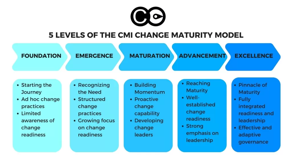
Change management maturity is the degree to which an organisation has made change management a consistent, measured and continuously improving capability, rather than something each project invents for itself. On that definition, most organisations are not mature: Prosci’s benchmark research places 54% of participants at Levels 1 or 2 (absent or confined to isolated projects) and only 11% at Levels 4 or 5 (organisation-wide standards or a true competency). The remaining third sit in the middle, applying change management on several projects without an organisation-wide system behind it.
That gap has a price. A sponsor is appointed, a communication plan is written, training is delivered, and the programme closes. Then the next initiative starts from a blank page, with the same debates about method and the same missing data about what the last one learned. The cost shows up in outcomes: Prosci found that 88% of projects with excellent change management met or exceeded their objectives, against 13% with poor change management, and WTW found that organisations with the strongest change effectiveness delivered markedly better revenue and margin results.
This guide is for change, HR and transformation leaders who need to answer three questions: where does our organisation actually sit, what should we target, and what do we do in the next 90 days? It sets out the two main maturity models, a five-level scale with evidence-based diagnostics, the commercial case, the traps that stall progress, and a level-by-level roadmap.
What change management maturity means, and how the main models measure it
Change management maturity describes how reliably an organisation delivers the people side of change without depending on individual heroics. A mature organisation can name who owns change capability, show the standards it applies, and produce data on whether change is landing, all without asking which project team is involved.
Two established models shape the field.
The Prosci model: Five levels and five capability areas
Prosci’s maturity model runs from Level 1 (ad hoc or absent change management) through Level 2 (change management on isolated projects), Level 3 (change management on multiple projects) and Level 4 (organisational standards) to Level 5 (organisational competency). It pairs that scale with five capability areas:
Leadership: Visible senior support, sponsorship, vision and resourcing for change capability.
Application: How widely the methodology and tools are used across projects and divisions.
Competencies: Training and development for practitioners, leaders, managers and employees.
Standardisation: Common approaches, tools and curricula built into organisational processes.
Socialisation: Shared understanding and commitment to change management at every level.
The CMI model: Three domains and five levels
The Change Management Institute’s Organisational Change Maturity Model also uses five levels, but it assesses three domains: strategic change leadership (how leaders set direction, sponsor and prioritise), business change readiness (how the business prepares to receive and sustain change) and project change management. Its framing is useful for senior audiences because it ties maturity to connecting change to strategy, sequencing it and understanding its cumulative impact.
Maturity, readiness and assessment: What is the difference?
These terms are often mixed up. Maturity describes the organisation’s standing capability. Readiness asks whether a specific group is prepared for one specific change. Impact assessment maps what a given change does to roles and teams. A maturity assessment is the one that evaluates the capability itself, and it should draw on readiness and impact data rather than replace them. For how the three fit together, see our guide to change management assessments.
The shared insight across the models: maturity does not mean doing change management on more projects. It means building the governance, leadership behaviours, standards and measurement that make good change management the default.
The five levels of change management maturity, and how to diagnose yours
The framework below synthesises the Prosci and CMI approaches into a five-level scale you can use for self-assessment. It broadly corresponds to Prosci’s levels, with more emphasis on governance and measurement at Levels 4 and 5.
Level
Name
What it looks like
Broadly equivalent Prosci level
Typical pain point
1
Ad hoc
No consistent approach. Success depends on individuals.
Ad hoc or absent
Repeated mistakes, no institutional learning, uneven stakeholder experience
2
Emerging
Some projects apply a method, but quality varies widely.
Isolated projects
Pockets of excellence beside projects with no change support; no shared tools
3
Standardised
Organisation-wide standards, tools and training exist.
Multiple projects, moving to standards
Standards on paper but unevenly enforced
4
Managed
Change is built into project governance. Metrics are reported. Portfolio-level visibility.
Organisational standards
Governance can feel bureaucratic and become a checkbox
Sustaining momentum; adapting to new kinds of change such as AI
Two rules make the scale more useful than a single score.
Score the capability areas separately. Maturity is rarely uniform. An organisation may have strong leadership support (Level 4) but weak standardisation (Level 2), or high maturity on technology change where project methods enforce it and low maturity on structural or cultural change. Present the result as a profile across the five areas, and use the lowest area to decide where to invest.
Ask for evidence, not opinion. For each level, the test is whether you can produce the artefact or behaviour on request, such as a standard that was actually applied, a gate review that stopped a project, or a report an executive used to change a decision.
Most organisations will find they are at Level 1 or 2, which matches the Prosci benchmark. Gartner’s 2025 research points the same way: only 32% of business leaders said the last change they led achieved healthy employee adoption.
Level 1 diagnostic: Ad hoc
Is change management applied inconsistently, with some projects having dedicated support and others none?
Do project teams create their own approach from scratch each time?
Is there no central function, community of practice or shared methodology?
Evidence test: Can you find two projects in the last year that used the same change approach?
If you answered yes to most, you are at Level 1. The priority is to establish a baseline method and show value on a small number of visible projects.
Level 2 diagnostic: Emerging
Do some project teams use a recognised methodology while others do not?
Are there pockets of expertise but no organisation-wide standard?
Is change management seen as a project activity rather than an organisational capability?
Evidence test: Can you show that the projects using the method performed better than those that did not?
Level 2 organisations need to standardise, building shared tools, templates and training that create consistency across the portfolio.
Level 3 diagnostic: Standardised
Is there a documented methodology, standard templates and training programmes?
Are practitioners trained in a common approach?
Is change management expected on all significant projects, even if enforcement is inconsistent?
Evidence test: When a project skips the standard, does anything happen?
Level 3 organisations have the foundations. The challenge is moving from standards that exist to standards that are enforced and integrated into governance, which is where a structured assessment capability starts to matter.
Level 4 diagnostic: Managed
Is change formally integrated into governance (gate reviews, investment decisions, steering committees)?
Are change metrics tracked, reported and used to inform decisions?
Does the organisation assess change at portfolio level, not initiative by initiative?
Is there executive accountability for change effectiveness?
Level 4 organisations perform well. The opportunity is to move from managed process to embedded culture.
Level 5 diagnostic: Optimised
Is change management treated as a strategic competency rather than a project support function?
Does the organisation improve its practices continuously, based on data and lessons learned?
Are leaders at every level competent in change leadership, not only practitioners?
Is change management part of strategic planning, not just project delivery?
Level 5 is rare. Organisations that reach it treat change capability as a competitive advantage and fund it accordingly.
Which level should you target?
Not every organisation needs Level 5. A realistic target for most large enterprises is a solidly evidenced Level 4 across leadership, application and standardisation, with Level 3 acceptable for socialisation. A nominal Level 5 built on thin evidence is worse than an honest Level 4, because leaders stop asking whether the system still works.
The business case for investing in change management maturity
The evidence linking capability to performance is consistent across independent sources, although each measures something slightly different.
Caution is warranted. These are correlations from survey data, and organisations that manage change well may also run better in other respects. What the pattern does show is that the differences are large, and they come from consistency across the portfolio rather than from excellence on one flagship project. That is the compounding effect maturity produces.
Common maturity traps to avoid
Progress from Level 1 to Level 5 is not linear. Several mistakes stall it or create the appearance of maturity without the substance.
Over-investing in training without governance
Sending 200 people through certification does not build maturity if no governance requires them to apply what they learned. Training builds individual competency; maturity needs organisational systems that activate and sustain it.
Confusing activity with capability
An organisation that produces impact assessments, communication plans and training schedules for every project can look mature. If those artefacts are produced by rote and never influence a decision, they are documentation, not capability. The test is whether the organisation makes different decisions because of change data. The stakes are higher than they look: Gartner found that 79% of 2,850 employees surveyed in April 2025 had low trust in organisational change, which paperwork alone will not repair.
Trying to jump levels
Organisations at Level 1 sometimes attempt to leap to Level 4 by imposing enterprise governance before building the methodology and skills beneath it. This usually produces a bureaucratic framework that practitioners resent and circumvent. Each level builds on the one below.
Treating maturity as a destination
Level 5 is not a finish line. High maturity has to be maintained as experienced practitioners move on and as new kinds of change arrive, including AI-driven transformation, continuous delivery models and distributed workforces. In the AI era the main risk is not a lack of method but a lack of capacity data: organisations that cannot see how much concurrent change each team is absorbing will keep approving one more initiative.
How to advance from your current level
Moving up a level takes sustained effort. As a planning heuristic (not a research finding), allow 12 to 24 months per level, and two to four years to get from Level 1 to Level 3. Compressing that by skipping levels usually backfires.
Moving from Level 1 to Level 2
Focus on demonstrating value. Select two or three high-visibility projects and apply a structured method rigorously. Document outcomes and build an internal evidence base. Establish a small community of practice to share approaches and lessons learned.
Moving from Level 2 to Level 3
Standardise the methodology. Create organisation-wide templates, tools and training. Set minimum change requirements for every project above a defined threshold. Build or hire a central capability that supports project teams.
Embed change management in culture. Build change leadership competency at every management level, not only among practitioners. Create continuous improvement loops that use data to refine practice, and integrate change management into strategic planning. Gartner’s recommendation that leaders routinise change rather than rely on inspiration fits this stage: the aim is to make adopting change second nature.
A 90-day starter sequence
Whatever your level, a first quarter can be organised like this.
Weeks 1 to 3: Score the five capability areas with evidence tests, and name the weakest area.
Weeks 4 to 6: List every initiative in flight and the teams each one affects, so the first portfolio view exists.
Weeks 7 to 10: Pick one governance hook (a gate review, an investment form or a steering agenda) and add a single change criterion to it.
Weeks 11 to 13: Report one change metric, such as adoption, to the executive team and record which decision it influenced.
Beyond Level 3, maturity depends on data that manual methods cannot provide. Portfolio-level visibility, adoption tracking, cumulative impact analysis and measurement dashboards all need tooling. Spreadsheets and slide decks can describe a single initiative, but they cannot keep a live view of dozens of concurrent changes and the teams they hit.
Digital change management platforms such as The Change Compass let organisations manage change at portfolio level, visualise cumulative impact across stakeholder groups and track adoption in near real time. This matters most at Level 3 and above, where the shift from project-level to portfolio-level capability requires data that spreadsheets and consultant-built decks cannot sustain.
Closing: Start with an honest score, then fix the weakest area
Change management maturity is not about earning a high score on a model. It is about building the capability to manage change consistently, measure its impact and improve over time. Start by scoring your five capability areas against evidence, and accept that the result will probably show an uneven profile. Pick the weakest area and the next level, not the top of the scale. Invest in the governance hooks, skills and leadership habits that close that specific gap, and report one change metric to the executive team within a quarter. The organisations that do this do not just deliver better individual projects. They build an advantage that makes each subsequent transformation more likely to succeed.
Frequently asked questions
What is change management maturity?
Change management maturity is the degree to which an organisation has embedded change management as a consistent, scalable and continuously improving capability rather than an activity done differently on each project. It is usually measured on a five-level scale, from ad hoc project support to a core organisational competency built into governance, leadership behaviour and strategic planning.
How long does it take to advance change management maturity?
As a planning heuristic, moving up one level takes 12 to 24 months of sustained effort, and moving from Level 1 to Level 3 often takes two to four years. The pace depends on executive sponsorship, funding for capability and whether change criteria are written into project governance. Attempting to skip levels usually produces process that practitioners work around.
How do you measure change management maturity?
Score your organisation against a five-level model across several capability areas, such as leadership, application, competencies, standardisation and socialisation in the Prosci model, and ask for evidence at each level rather than opinion. Repeat the assessment annually and compare against a published benchmark such as Prosci or the Change Management Institute model. Report the result as a profile across areas, not a single number.
Do you need a consultant to build change management maturity?
External advisers can speed up methodology design and benchmarking against peers. Lasting maturity has to be owned internally, because it depends on governance, leadership habits and data that the organisation runs every day. The most effective pattern is to use outside expertise to set foundations and transfer skills, then sustain the capability with internal teams and systems.
What is the relationship between change management maturity and culture?
They reinforce each other. A culture where leaders model adaptive behaviour makes it easier to adopt shared methods and governance, and those practices in turn normalise change as an expected way of working. Neither can be built alone, so a maturity roadmap should include leadership behaviours as well as tools and templates.
Measuring change adoption means checking, with observed data and against a pre-change baseline, whether the people affected are consistently working the new way, group by group, at fixed intervals after go-live.
Teams that measure whether the change is actually being followed meet or exceed their project objectives 76% of the time, against 24% for teams that do not, according to Prosci’s best practices research. Yet most change reporting still stops at go-live dates, training completions and a pulse survey, none of which show a single person working differently. This guide is for change, HR and transformation leaders who are asked to prove that a change has landed, and who suspect that the numbers they report are measuring effort rather than adoption. It argues that adoption is established by observed behaviour, in a defined group, over time. By the end you will have a five-step method you can apply to a system rollout, a process change or a behavioural shift: define what adoption means, choose behaviours and data you can observe, take a baseline, track at fixed intervals, and act on the gaps. If you want the list of metrics itself, read our guide to change adoption metrics; for the wider measurement picture, start with the ultimate guide to measuring change.
What adoption measurement covers, and why it earns its effort
Adoption measurement tracks whether the people affected by a change have shifted to the new ways of working that the change required, and it is separate from project delivery and from awareness. Delivery tells you the system went live on time. Awareness tells you people know about it. Adoption tells you whether the new process or tool is used consistently, whether day-to-day behaviour has visibly changed, whether the outcomes that depended on the change are appearing, and whether workarounds have disappeared. Because adoption can decay once launch support fades, it needs measurement after go-live, not only at it.
The gap between those layers is large in practice. A 2025 Gartner survey of business leaders found that only 32% said the last change they led achieved healthy adoption by employees. That is the population your measurement has to work for: most changes are not landing cleanly, and leaders need an early, honest read of where.
Adoption versus compliance
A group can comply without adopting. Compliance means doing the required thing because it is required or watched; adoption means doing it because it has become the normal way of working. Staff who only comply revert when oversight eases, which is why the measurement window must extend past the end of hypercare and not stop when the project team rolls off.
Why it is worth the effort
Measurement is the nearest thing a change practitioner has to proof that the interventions worked. It also shows progress to the project team and to stakeholder groups, and it points leaders at the specific places that need their attention. Done well, it lets you influence the direction of the initiative, build momentum with senior stakeholders and steer the organisation toward the change objectives. It takes time, though. You need deliberate measurement design, a reliable way of collecting data and a visual that stakeholders understand at a glance, so budget for it early rather than bolting it on in the final fortnight.
Step 1: Define adoption in terms of the benefit
The first step in measuring adoption is to state, in observable terms, what people must do differently for the benefit the change was funded to deliver to appear. Work with the project manager to understand which benefits are targeted and how they will be tracked, because adoption measures that do not connect to a benefit are vanity metrics. Prosci reports that when organisations define success well and measure performance against objectives, their odds of meeting or exceeding those objectives can increase by up to 5X.
Start from the benefit
Benefit targets usually fall into three groups:
Business success factors, such as revenue or cost targets.
Product integration measures, such as usage rates.
Market objectives, such as user base or revenue growth.
Some targets are harder to quantify but still matter: competitive positioning, employee relations, employee experience, employee capability and customer experience. The project manager may value benefits with payback time (the point at which cumulative cash flow turns positive), net present value or internal rate of return. Your job is not to run those models. It is to understand the targeted benefit, how it will be tracked, and which change management steps stand between the current state and the future state.
Map the benefit to steps and measures
A simple table keeps the logic visible. Here is a worked example for a new customer service system:
Project benefit
Change steps required
Adoption measure
Baseline
Target
Higher customer satisfaction and productivity
Users operate the new system; use new features in customer conversations; managers coach and give feedback
% of users passing the proficiency test; feature usage rate; user feedback on manager coaching
Set before go-live
Agreed with the project manager
Faster resolution
Users proactively apply new features to drive conversations
Monthly benefit tracking shared in team meetings; customer communication about the improved process
Customer satisfaction score; call volume handled
Current score
Agreed target
Fill in baseline and target for every row before go-live. A measure with no baseline cannot show movement, and a measure with no target cannot show success. Which indicators sit best in each row is a question for the adoption metrics guide; for concrete examples, see our change management adoption metric examples.
Step 2: Choose behaviours and data you can observe
The second step is to select the behaviours that evidence adoption and to pair each with an objective data source, because what people do is a firmer signal than what they say. Prosci’s ERP research draws the line sharply: activity metrics such as training completion and communications sent help manage delivery, while steering metrics, such as whether employees can complete critical transactions independently, show whether the change is working. In that research, organisations with strong metrics were 2.5 times more likely to exceed expectations for their ERP programmes, and those with poor metrics succeeded only 7% of the time, against 26% for organisations with no formal metrics.
Look past training completion and readiness
Most practitioners measure what is easy: stakeholder perceptions, readiness and training completion. These have value, but they are forward-looking indications that adoption is on its way, not adoption itself. Be wary of vanity metrics that look good and are simple to explain but do not connect to business outcomes; our piece on the problem with change management metrics covers the common traps. For readiness data, see this strategic view of readiness assessment. To measure adoption itself, look for system usage, behaviour change, correct use of the new process, or the achievement of cost or service targets, with particular attention to early adopters.
Pick observable behaviours
Most changes involve behaviour change, whether it is a different way of operating a system, new steps in a process or a new conversation with a customer. These tips keep the selection practical:
Make it observable. A behaviour is something another person can see or a system can record. Thoughts and attitudes are not behaviours.
Choose the right grain. Clicking a button is too fine to be worth tracking. “Proactively understands customer concerns” is too broad to rate. “Asks about the customer’s needs in the three agreed areas during each interaction” works.
Find the trigger. Behaviours usually follow a cue, such as a customer saying “not happy”, which should start the new complaints process. Name the trigger and you can measure the response.
Limit the count. Too many behaviours create extra work for the project team; too few cannot evidence the benefit.
Break broad behaviours into micro-behaviours
Behaviour change can feel elusive. Micro-behaviours make it practical: small, specific, observable steps rather than a cluster of behaviours. A broad aim such as “build customer rapport” becomes four measurable actions: use the customer’s name (“Is it OK if I call you Michelle?”), open with a short check-in (“How has your day been?”), reflect the customer’s feeling (“It sounds like that was frustrating”), and agree the next step (“Would it help if I escalate this for you?”). Each can be rated yes or no from call listening or case sampling. For the fuller picture of measuring and driving behaviour change, see our ultimate guide to behaviour change.
Rank your data sources
Prefer sources in this order: system logs and records, process audits and quality data, sampled observation by managers, then self-reported surveys. Surveys are useful to explain why a group is lagging, not to prove that it has adopted.
Steps 3 and 4: Take a baseline, then track at fixed intervals
Adoption is measured as movement from a known starting point, so record current performance on every chosen indicator before go-live, then re-measure at consistent intervals after it, commonly at 30, 60 and 90 days. Report each stakeholder group separately, not as one blended average, because an average of 80% can hide a team stuck at 30%. Gallup’s May 2026 tracking of AI use shows why the curve matters: 15% of US employees use AI daily, 30% use it a few times a week or more, and 52% use it a few times a year or more. Experimenting is widespread; regular use is not. A single reading would have called that a success or a failure depending on the line you drew.
Expect an S-curve, not a change curve
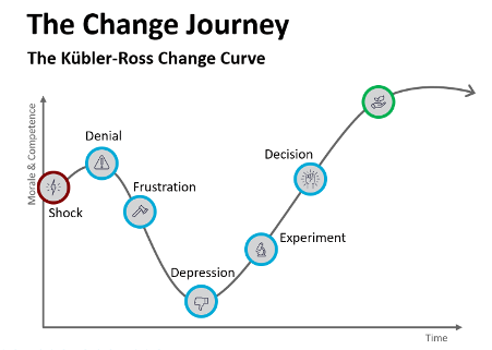
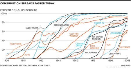
The most popular chart in change management, the Kubler-Ross change curve, was built to describe how terminally ill patients cope with dying. A 2025 review in the Journal of Organizational Change Management traces its path into workplaces and notes that empirical support for a universal sequence of stages in organisations is limited. Treat any model that is simple and intuitively right with care: it can steer you away from stakeholders’ real input, which is often where the best ideas sit. For measuring adoption, the more defensible shape is the S-curve, familiar from technology and new-product adoption. It starts slowly, climbs steeply as the majority joins, then flattens. Our World in Data’s chart of US household technology adoption shows the same shape across a century of technologies.
Minor process change. A small step from the current process gives a gentle curve, reached quickly.
Complex new technology. A long, shallow start and a late climb are normal.
Iterative or agile change. Each release that touches users is a small S-curve of its own, and the releases should add up to a larger one.
The familiar adoption categories (innovators, early adopters, early majority, late majority and laggards) are useful here for targeting. Support that suits innovators does not suit late majority groups, so tailor your communication and help by where each group sits, and watch the early adopters first, since they signal whether the main wave will follow.
Set the interval schedule
As a working guide, simple process changes often stabilise within 30 to 60 days, significant system or behavioural changes within 90 to 180 days, and cultural or leadership changes can take a year or more. These are planning ranges from practice, not benchmarks, so confirm them against a pilot group before you commit leaders to a date.
Plan the reporting process once the measures are set. These are the main considerations:
Make reporting easy. Automate collection wherever possible, using in-app data and tools, so the burden stays low and the cadence survives busy periods.
Set contribution expectations. Get stakeholder support so it is clear who supplies which data, and when.
Build reinforcement. If a measure relies on people’s input, such as a survey, design a reason for them to respond. Without one, response rates drop.
Choose recipients deliberately. Include the business leaders who own the benefit and the middle and first-line managers who shape daily behaviour.
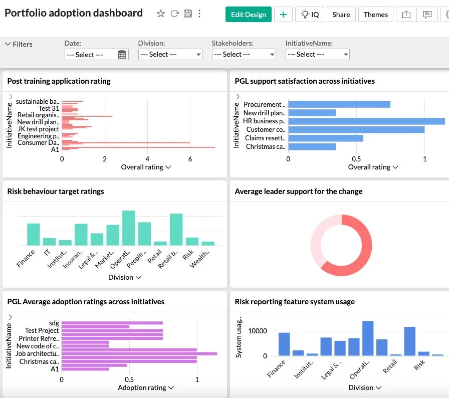
Example of change adoption dashboard from Change Automator
Diagnose before you intervene
When a group lags, work out which of three gaps explains it, because each has a different fix:
Awareness gap. People do not know what is changing or why. Communicate more clearly and more often.
Capability gap. People know, but cannot yet do it. Add training, practice or hands-on support in the specific tasks that fail.
Motivation gap. People can, but are not choosing to. Look to manager engagement, incentives and removal of the old way of working.
Then track whether the intervention moved the number at the next interval. That closes the loop that most change reporting leaves open.
Measuring adoption across several initiatives
Comparing adoption across initiatives needs a common scale, even though each initiative defines adoption differently. If you run a programme or portfolio, three common ways to report are the overall percentage of identified adoption elements achieved, the percentage of milestones reached, and the share of the target population showing the behaviour, supported by manager reports and system utilisation records. These give like-for-like comparison without forcing every initiative onto one definition.
Portfolio measurement also shows something single-initiative reporting cannot: which teams are absorbing several changes at once, and which interventions lead to higher adoption across the whole portfolio. For the strategic angle, see how to align multiple initiatives for maximum benefit realisation.
Where digital tools fit
Manual adoption tracking in spreadsheets works for one initiative and breaks down at portfolio scale. Digital platforms such as The Change Compass collect adoption data in the flow of work, report it by group and initiative, and show which change interventions are associated with higher adoption. Whatever tool you choose, apply the same five steps: the tool automates collection and reporting, but the definition, the behaviours and the baseline are still yours to set.
Start with one change and one baseline
Pick the change you are most worried about, and write down in one sentence what a person would be doing differently if it had worked. Choose three observable behaviours, find the data source for each, and take a baseline this week, before the next milestone gives you a reason to postpone it. Then book the 30, 60 and 90-day readings in the diary and agree who will see them. A rough baseline taken now is worth more than a polished one taken after go-live, and it gives you the one thing leaders rarely get from change reporting: evidence of movement they can trust. When you are ready to choose indicators for each behaviour, the adoption metrics guide is the next step, and the ultimate guide to measuring change puts it in context.
Frequently asked questions
How do you measure change adoption step by step?
Define what adoption looks like in observable terms, choose the behaviours and data sources that show it, record a baseline before the change, track each affected group at fixed intervals after go-live (commonly 30, 60 and 90 days), and use the gaps to trigger targeted action. Report by group rather than as one average, so lagging teams are visible.
What is the difference between change adoption and change compliance?
Compliance is doing the required thing because it is required or observed. Adoption is doing the new thing consistently because it has become the normal way of working. Employees who comply without adopting tend to revert when oversight eases, so measure behaviour again after support is withdrawn, not only at go-live.
How long does change adoption take?
As a working guide, simple process changes often stabilise within 30 to 60 days of go-live, significant system or behavioural changes within 90 to 180 days, and cultural or leadership changes can take 12 to 24 months or more. These are planning ranges drawn from practice, not research benchmarks, so set your own expected curve from a baseline and a pilot group.
How do you measure adoption when there is no system data?
Use observed behaviour instead of opinion: manager observation checklists, call or case sampling, process audits, and downstream quality or cycle-time data. Break the change into small observable micro-behaviours that can be rated yes or no, and sample a consistent number of cases per group at each interval. Use surveys to explain a gap, not to prove adoption.
How do you compare adoption across several change initiatives?
Define adoption separately for each initiative, then report on a common scale: the percentage of identified adoption elements achieved, the percentage of milestones reached, and the share of the target population showing the behaviour. This lets you compare like with like across a portfolio, and spot where several changes are landing on the same teams at once.
In the world of scaled agile, “Release on Demand” is a concept that has profound implications for agile teams and their project approaches. It guides teams on how to release and deliver value when stakeholders and customers are truly ready to receive it. However, a crucial, often-overlooked factor in this concept is the role of change management. While Release on Demand has primarily been framed as a technical approach within the Scaled Agile Framework (SAFe), the readiness of people—including end-users, stakeholders, customers, and partners—forms an equally vital part of determining the demand for release.
As change management practitioners, understanding and actively shaping “Release on Demand” can significantly impact project outcomes. In this article, we’ll explore how change management can enhance this core SAFe concept through strategic timing, prioritisation, and thoughtful execution of each release. We’ll also discuss how to structure governance cadences to ensure operational and people readiness, going beyond the technical lens.
Understanding Release on Demand in SAFe
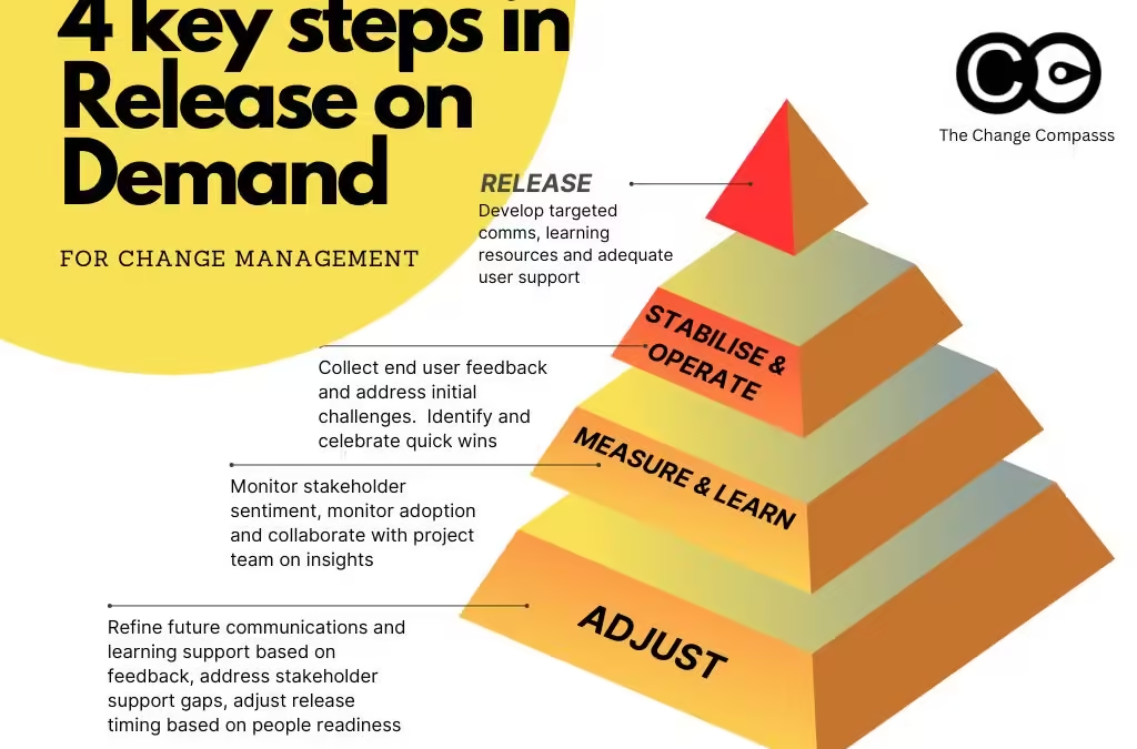
Within SAFe, Release on Demand means that project outputs or new functionality are delivered when the organisation, teams, and stakeholders are ready to adopt and benefit from it. It enables flexible delivery rather than a rigid release schedule. The four key activities for Release on Demand are:
Release – Delivering the product or change to users.
Stabilise and Operate – Ensuring the release is operationally sound and running smoothly.
Measure and Learn – Assessing the release’s impact and learning from the results.
Adjust – Making necessary improvements based on insights gained.
The goal of these activities is to minimise risk, gather user feedback, and optimise the release to maximise impact. While these steps seem straightforward, they demand thoughtful change management to ensure all stakeholders are prepared to support, use, and benefit from the release. Let’s delve deeper into how a change management approach can strengthen each of these activities.
People Readiness as the Core Demand Factor
The “demand” for a release is often misunderstood as being purely about project or market readiness. However, the reality is that it depends on multiple factors, including how ready people are to adopt the change. For any release to succeed, people readiness is crucial and requires focus on:
End-User Readiness: Ensuring that end-users are prepared for the new tools, processes, or functionalities. This could mean conducting user training, crafting support resources, and managing expectations.
Stakeholder Readiness: Stakeholders at all levels need to understand the change, its rationale, and its anticipated impact. This may involve regular briefings, updates, and even individual consultations.
Customer and Partner Readiness: For customer-facing or partner-facing releases, it’s essential to gauge external readiness as well. A clear communication plan and alignment of goals with partners or clients can smooth the path for a successful launch.
These readiness efforts form a significant part of the “demand” in Release on Demand and reflect the reality that people’s capacity to adapt often determines when a release will be genuinely effective.
The Broader Change Landscape
People readiness isn’t only determined by a single project or team but by the broader change landscape within an organisation. Multiple changes or ongoing initiatives can either enhance or inhibit readiness for a new release. For instance, if an organisation is already undergoing a significant digital transformation, adding another change may lead to overload and resistance.
Change practitioners should map the change landscape to identify concurrent changes and evaluate how these may impact readiness for Release on Demand. By assessing the timing and impact of other changes, change managers can:
Avoid change fatigue by spacing out initiatives.
Synchronize related changes to reduce redundancy.
Communicate the overall strategic direction to help stakeholders and users understand how individual changes fit into the bigger picture.
By accounting for these interdependencies, change management can improve people readiness and ensure the Release on Demand aligns with the organisation’s capacity to handle it.
Applying the Four Key Steps in Release on Demand
Let’s explore how change management activities can amplify each of the four Release on Demand steps:
1. Release: The release phase requires both technical and people preparation. Beyond deploying the technical elements, change management practitioners should:
Develop targeted communication plans to inform all affected stakeholders.
Offer targeted training sessions or resources that build users’ confidence and competence.
Ensure adequate support is in place for the transition, including help desks or peer mentoring.
2. Stabilise and Operate: After a release, it’s crucial to monitor adoption and support operational stability. The change team can:
Collect feedback from end-users and support staff on initial challenges and address these promptly.
Identify and celebrate quick wins that demonstrate the release’s value.
Work closely with operations teams to resolve any unforeseen issues that may inhibit adoption or cause frustration.
3. Measure and Learn: This step goes beyond tracking technical metrics and should also capture change-specific insights. Change management can contribute by:
Conducting surveys, interviews, or focus groups to gauge user and stakeholder sentiment.
Monitoring adoption rates and identifying any training gaps or knowledge shortfalls.
Collaborating with product or project teams to share insights that may refine or prioritisation subsequent releases.
4. Adjust: Based on insights gained from the Measure and Learn phase, change managers can advise on necessary adjustments. These might include:
Refining future communication and training plans based on user feedback.
Addressing any gaps in stakeholder support or sponsorship.
Adjusting the timing of subsequent releases to better align with people readiness.
The iterative nature of these four steps aligns well with agile methodologies, allowing change managers to continuously refine and enhance their approach.
The Critical Role of Sequencing, Prioritisation, and Timing
FFor change management practitioners, Release on Demand isn’t just about executing steps—it’s about doing so in the right sequence and at the right time. The impact of a release depends significantly on when it occurs, who is prepared for it, and how well each group’s readiness aligns with the release cadence and continuous integration.
Here are some tips to help change managers get the timing right:
Analyze stakeholder engagement levels: Regularly assess how engaged and ready stakeholders are, tailoring messaging and interventions based on their feedback and sentiment.
Prioritisation change activities based on impact: Not all releases will have the same impact, so change teams should focus resources on those that require the most user readiness efforts.
Create phased rollouts: If full-scale readiness across the board isn’t achievable, a phased rollout can provide users with time to adapt, while allowing the change team to address any emergent issues in stages.
By managing the release cadence thoughtfully, change managers can avoid the disruptions caused by hasty releases and ensure the deployment feels both manageable and meaningful for users.
Release governance in SAFe is often perceived as a predominantly technical or project-focused process. However, effective governance should encompass business operations and people readiness as well. Change management plays a pivotal role in designing governance cadences that account for these critical aspects.
To integrate change governance within release governance, change practitioners should:
Establish clear communication channels with project teams and product owners to ensure people readiness factors are consistently part of release discussions.
Implement a readiness checklist that includes technical, operational, and people readiness criteria. This checklist should be reviewed and signed off by relevant stakeholders before any release.
Maintain a cadence of review and feedback sessions where project teams, change managers, and stakeholders discuss readiness progress, key risks, and post-release outcomes.
This approach ensures that each release is evaluated from multiple perspectives, minimising disruption and maximising its potential for success.
The above is from Scaledagileframework.com
Developing a Change Cadence that Complements Agile Delivery
SAFe’s principle of “develop on cadence; release on demand” is central to effective agile delivery. For change management practitioners, developing a strong change cadence is equally important. This cadence, or rhythm of activities, aligns with the agile teams’ development cadence and helps build stakeholder momentum, maintain engagement, and reduce surprises.
Here’s how to develop a cadence that works in tandem with agile teams:
Planning Cadence: Hold regular planning sessions to align change activities with upcoming releases and identify readiness gaps. This could be quarterly for major releases or bi-weekly for smaller, iterative releases.
Execution Cadence: Establish a reliable cycle for change interventions, such as training, communication, and stakeholder meetings. This cadence helps stakeholders build expectations and fosters a predictable rhythm in change activities.
Feedback Cadence: Collect feedback at consistent intervals, aligning it with release intervals or sprint reviews. Consistent feedback keeps the change process agile and responsive to evolving needs.
A well-defined change cadence not only prepares users effectively but also reinforces trust and transparency in the change process.
Release on Demand may have originated as a technical concept within SAFe, but its success is deeply tied to how well people, stakeholders, and users are prepared for each release. For change management practitioners, Release on Demand is an opportunity to enhance the broader release process by prioritizing people readiness, orchestrating thoughtful sequencing, and establishing governance that prioritisations user success as much as project outcomes.
By proactively engaging in each of the four stages of Release on Demand—Release, Stabilise and Operate, Measure and Learn, and Adjust—change management can ensure releases are not just technically ready but fully integrated into the people and business context they serve. Embracing this role allows change managers to become essential partners in agile delivery, maximising the impact of each release for end-users, the organisation, and the overall success of the project.
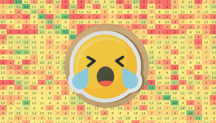
Every change leader has seen the heat map. It sits in the deck, a grid of red, amber and green cells showing which business units are being hit hardest over the next 12 months. The leadership team glances at the red cells, nods gravely, and the meeting moves on. Decisions are made. Resources are allocated.
But here is the problem: the heat map may be the most widely used change planning tool in organisations today, and one of the most misleading. It answers the wrong question. It flattens nuanced impact into a single colour. And it creates a false sense of certainty that can actively harm your change planning.
This article is a change management heat map explained for senior practitioners. We will cover what a heat map is, where it genuinely adds value, and why relying on it as your primary decision-making tool puts your programme at risk. We will also explore what better approaches look like in practice.
What is a change management heat map?
A change management heat map is a visual tool that maps the volume or intensity of change impacts across an organisation over time. Typically displayed as a grid, it plots business units or employee groups on one axis against a timeline on the other. Each cell is colour-coded, usually using a traffic light system, to indicate the relative level of change exposure.
The premise is straightforward: where the cells are red, change intensity is high. Where they are green, the change load is manageable. Leaders can scan the map quickly and form a view of where the organisation is under pressure.
According to a 2024 review of change management decision-making tools on ResearchGate, organisations that use structured, visual change data to support planning decisions are significantly more likely to align stakeholders and maintain project momentum than those relying on narrative reporting alone. That finding reflects why heat maps became popular, they translate complex programme data into something immediately scannable for executives. Their appeal is real.
How heat maps are constructed in practice
Most heat maps are built by change managers or PMO leads who collect data from individual project teams, typically asking each team to rate how much impact their initiative will have on each business unit in each quarter. Those ratings are then aggregated into a single heat level per cell.
There are two common formats:
Project-versus-stakeholder group: Each row is a project, each column is a business unit, and the cell shows that project’s impact on that group. This format works well when you need to communicate a specific initiative’s reach.
Business unit over time: Each row is a business unit, each column is a quarter, and the cell aggregates all project impacts on that group for that period. This is the more popular format for portfolio-level planning.
Both are useful. Both are also problematic when treated as the primary basis for change decisions.
Where the change management heat map adds genuine value
Before dismantling the heat map, it is worth acknowledging what it does well, because used appropriately, it remains a valuable part of the change practitioner’s toolkit.
It makes the case for change management resourcing. When a heat map shows a business unit sitting under sustained red for three consecutive quarters, it is a compelling argument for additional change capacity. The visual is immediate. Executives who struggle to grasp the volume of concurrent change often respond well to seeing it rendered spatially.
It supports initial triage. Early in a programme, when you are still gathering impact data, a heat map gives you a rough signal of where to direct attention first. It is not the final word, but it is a useful starting point for conversations.
It builds stakeholder alignment. Showing a leadership team a heat map of their organisation’s change exposure can generate productive dialogue. Leaders who assumed their business unit was not heavily affected may be surprised. That conversation, however imperfect the underlying data, can be valuable.
It communicates portfolio scale. For boards and executive committees who need a summary view, the heat map provides a visual shorthand for “this organisation has a lot happening simultaneously.” That message matters and the heat map delivers it efficiently.
The problem is not the heat map itself. The problem is what happens when it is used as the definitive basis for change planning decisions rather than one input among many.
Why the change management heat map creates risk when used alone
The aggregation problem distorts reality
The fundamental flaw in the standard heat map is that it aggregates impact ratings into a single score per cell. When a business unit is rated “red” in Q2, that cell may represent three projects each scoring moderate impact, or it may represent one catastrophic system implementation layered with a restructure and a compliance change. The cell colour is identical. The response required is entirely different.
This aggregation problem compounds when you consider that different types of change create different demands on employees. A technology rollout requires training time, system access, and behaviour change. A restructure creates psychological uncertainty and role ambiguity. A process change requires procedural relearning. Combining these into a single heat score does not reveal the nature of the burden, only the rough magnitude. And even the magnitude is suspect, because it depends entirely on how each project team calibrated their rating.
Prosci’s research on the correlation between change management and project success consistently finds that the quality of change management practice, not the quantity of change, is the primary driver of outcomes. Organisations that apply structured, high-quality change management are six times more likely to meet project objectives. The heat map, by focusing purely on volume, misses the quality dimension entirely.
Red cells do not tell you what to do
Suppose a business unit is sitting in red for Q3. What does that tell you? It tells you there is a lot happening. It does not tell you:
Which projects are driving the heat
Whether the impacted employees have capacity to absorb the change
Whether the business unit’s leadership is aligned and actively sponsoring the change
Whether there is any time within the quarter for training and adoption activities
Whether any of the projects could be de-scoped, delayed or phased
The heat map surfaces a symptom but provides no diagnostic information. It tells you the patient has a fever, not what is causing it or how to treat it. Senior leaders who see a red cell often ask the obvious question, “what should we do about this?” The heat map cannot answer that question.
Heat maps obscure the employee experience
The most significant limitation of the heat map is that it represents organisational units, not people. A business unit of 500 employees may have 50 people in roles that are heavily impacted by three concurrent changes, and 450 who are barely touched. The entire unit turns red because of the concentrated experience of a minority.
Conversely, a business unit showing amber or green may have pockets of employees who are completely overwhelmed because the changes affecting them happen to fall below the threshold that triggers a red rating at the aggregate level.
Research on change saturation in large organisations highlights that change overload is often a localised experience, felt acutely by specific groups, roles or teams, while the broader unit appears to be coping. A tool that averages across the business unit will consistently miss these hot spots. And it is the hot spots where change fails.
Better approaches to change impact decision making
The heat map should not be abandoned. It should be contextualised, supplemented, and in many cases, replaced as the primary planning tool with approaches that provide richer and more actionable insight.
Stakeholder-level impact analysis
Rather than mapping change at the business unit level, more sophisticated change teams map impact at the role or stakeholder group level. This means asking: which specific roles are affected by this change, and what does the change require of those people in terms of behaviour, process, systems and mindset?
This approach produces a much more granular picture of change exposure. It allows you to identify the roles carrying the highest load, where those roles cluster across the organisation, and whether those clusters correlate with your heat map’s red cells or deviate from it. Frequently, they deviate significantly.
Stakeholder-level analysis also supports much more targeted change activities. Rather than deploying a generic communications and training plan to an entire business unit, you can tailor your approach to the specific groups facing the highest impact and the lowest readiness.
Change volume over time, by impact type
A more informative version of the heat map separates change volume by impact type: process changes, technology changes, structural changes, and so on. This allows you to see not just how much change is happening to a group, but what kind. A quarter that contains significant technology change and structural change requires a very different response to one containing a series of smaller process updates, even if both produce the same aggregate heat score.
Adding a capacity dimension, actual available time for change activities within the quarter, makes this even more powerful. A business unit that is in a critical operational period, such as a financial year-end or a major product launch, has less capacity to absorb change regardless of the nominal heat level. Surfacing that constraint visually can prevent change teams from scheduling major activities during windows when employees simply cannot engage.
Integrated change analytics
The most effective change teams have moved beyond the heat map to integrated change analytics platforms that allow them to slice impact data by multiple dimensions simultaneously: project, business unit, role, impact type, timing, readiness, and adoption progress. This is not just a more complex heat map. It is a fundamentally different way of generating insight.
Prosci’s 2024 analysis of change management trends identifies data-driven change management as one of the most significant emerging practices in the field. Organisations that invest in change analytics capabilities are building a durable competitive advantage, not just for the current programme but for their long-term transformation capacity.
The shift from heat mapping to integrated analytics mirrors what has happened in project management, finance and HR over the past two decades. In each case, the move from summary dashboards to richer, multi-dimensional data produced better decisions. Change management is on the same trajectory.
Using digital tools to go beyond the heat map
Digital change management platforms are making it significantly easier for change teams to move from manual heat maps to integrated analytics without requiring data science expertise or custom IT development. Tools like The Change Compass allow change teams to input impact data at a granular level and then generate views that surface the insights a traditional heat map cannot: which roles are carrying the highest load, how change volume correlates with adoption outcomes, and where readiness gaps are most likely to translate into project risk.
Critically, these platforms allow the heat map to exist as one view among many, rather than the only view. Leaders who want the executive summary can see the heat map. Programme leads who need to understand the detail can interrogate the underlying data. Change managers who are designing interventions can filter by role, project, or time period to understand the specific context they are working in. This layered approach preserves the communicative value of the heat map while removing its limitations as a decision-making tool.
If your organisation is ready to explore what this looks like in practice, The Change Compass offers a weekly demo where you can see how leading organisations are using integrated change analytics to make better portfolio decisions.
Conclusion: use the heat map, but do not stop there
A change management heat map explained to its fullest is both a useful communication tool and a dangerous oversimplification. It makes complex portfolio data accessible to senior audiences. It supports initial triage. It creates a shared visual language for conversations about change volume and timing. These are genuine contributions.
But it was never designed to be the primary basis for change planning decisions, and treating it as such creates real risk. It flattens the nuance of different impact types, hides the employee-level experience of change saturation, and provides no diagnostic information about what to do when cells turn red.
The organisations managing change most effectively are those that use the heat map as an entry point, not a destination. They supplement it with stakeholder-level analysis, impact-type breakdowns, capacity data, and integrated analytics that allow them to understand not just where change is concentrated but why it is concentrated there and what the right response is. That is what good change portfolio management looks like in practice.
Frequently asked questions
What is a change management heat map?
A change management heat map is a visual tool, typically a grid, that displays the volume or intensity of change impacts across different parts of an organisation over time. Cells are colour-coded, most commonly using a traffic light system, to show where change load is highest. It is widely used in portfolio-level planning to give leaders a summary view of change exposure across the business.
Why do organisations use heat maps for change management?
Heat maps are popular because they translate complex programme data into a format that is immediately scannable for executives. They help build the case for change management resourcing, support initial triage of where to focus attention, and create a shared visual language for conversations about change volume and timing. Their simplicity is both their appeal and their limitation.
What are the main limitations of change management heat maps?
The main limitations are threefold. First, they aggregate impact into a single score per cell, losing the nuance of what types of change are happening and to whom. Second, a red cell tells you there is a problem but provides no information about what to do. Third, they operate at the business unit level, which can hide pockets of severe change saturation affecting specific roles or teams while the broader unit appears manageable.
How should a change management heat map be used effectively?
A heat map should be used as one input among several, not as the primary decision-making tool. It works best for executive communication and initial portfolio triage. For operational change planning decisions, it should be supplemented with stakeholder-level impact analysis, change volume breakdowns by impact type, capacity data, and, where possible, integrated change analytics that allow multi-dimensional interrogation of impact data.
What are the alternatives to change management heat maps?
Better alternatives include stakeholder group or role-level impact matrices, change volume timelines segmented by impact type, capacity-adjusted planning views, and integrated change analytics platforms that allow you to slice data by project, business unit, role, timing and readiness simultaneously. These approaches provide the diagnostic information that heat maps cannot, specifically what is driving the heat and what the right response is.
How do digital tools improve on traditional heat maps?
Digital change management platforms allow teams to input impact data at a granular level and generate multiple views from the same dataset. Leaders can access the summary heat map view for executive reporting while change managers can interrogate underlying data by role, project, or time period. This layered approach preserves the communicative value of the heat map while removing its limitations as a primary planning tool.
References
Prosci. The Correlation Between Change Management and Project Success. https://www.prosci.com/blog/the-correlation-between-change-management-and-project-success
Prosci. Change Management Trends Outlook: 2024 and Beyond. https://www.prosci.com/blog/change-management-trends-2024-and-beyond
ResearchGate. The Role of Change Management in Enhancing Data-Driven Decision Making: Insights from Business Intelligence Initiatives (2024). https://www.researchgate.net/publication/384017092_The_Role_of_Change_Management_in_Enhancing_Data-Driven_Decision_Making_Insights_from_Business_Intelligence_Initiatives
The Change Compass. Why Change Saturation Is a Pandemic for Most Large Organisations. https://thechangecompass.com/why-change-saturation-is-a-pandemic-for-most-large-organisations/
IMPLEMENTATION NOTES
Post ID: 13272
Suggested title: Change management heat map explained: what it tells you, what it hides, and what to do instead
Meta description: A change management heat map explained for senior practitioners , what it does well, its critical limitations, and how to make better change decisions.