Improving change adoption is the practice of taking concrete actions before, during and after a change is delivered so that the people affected actually shift to the new ways of working rather than reverting to the old. The improvement levers cluster into five areas: clarifying the change so the target behaviour is unambiguous, equipping leaders and managers to model and reinforce it, redesigning the environment so the new way is easier than the old, building feedback loops that catch slippage early, and measuring adoption continuously rather than at a single post-go-live point. Adoption is a system outcome, not a communications activity.
Change adoption is arguably the most important metric in change management, yet it remains one of the hardest to measure well. Most organisations can tell you how many people attended training or received communications. Far fewer can tell you whether those people actually changed their behaviour, and fewer still can prove that the behavioural change stuck.
This measurement gap has real consequences. Gartner’s 2025 research found that only 32% of business leaders globally report achieving healthy change adoption by employees. Yet the same research revealed that organisations with better-than-average healthy adoption report two times higher year-over-year revenue growth. The business case for measuring and managing adoption is not theoretical; it is a measurable driver of financial performance.
The challenge is that adoption is not a single event. It is a progression from initial awareness through to embedded behaviour. Measuring it requires different approaches at different stages, different data sources, and a clear framework for what “good” looks like at each point. This guide provides that framework.
What change adoption actually means
Before measuring adoption, it helps to define it precisely. Change adoption is the sustained demonstration of new behaviours, processes, or system usage by the target population, to the standard required for the change to deliver its intended business outcomes.
Three elements of this definition matter:
Sustained: Initial compliance is not adoption. If people revert to the old way after 30 days, the change has not been adopted.
To the standard required: Partial usage does not count. If a new system requires data entry in five fields and users consistently skip two, that is not full adoption.
Business outcomes: Adoption is not an end in itself. It only matters to the extent that it drives the performance improvements the initiative was designed to deliver.
This distinction is critical because many organisations declare adoption success at go-live, when all they have actually measured is initial compliance under close supervision.
The four stages of change adoption
Adoption follows a predictable progression. Measuring it effectively requires matching your metrics to the stage the change is in.
Stage 1: Awareness and understanding
Before anyone can adopt a change, they need to understand what is changing, why it matters, and what is expected of them. This stage occurs before and during the initial rollout.
What to measure:
Percentage of affected stakeholders who can accurately describe the change and its purpose
Comprehension scores from short knowledge assessments
Number and quality of questions being asked (engaged questions indicate understanding is building)
What good looks like: 80%+ of the target population can articulate the change, its rationale, and its impact on their role before go-live. Low awareness at this stage is a reliable predictor of adoption failure.
How to measure it: Pulse surveys (5-7 questions), manager check-in reports, town hall Q&A analysis.
Stage 2: Initial usage and compliance
This is the earliest observable adoption behaviour: people begin using the new system, following the new process, or attempting the new behaviour for the first time.
What to measure:
System login rates and basic feature usage within the first 30 days
Process compliance rates (percentage of transactions following the new process)
Training proficiency scores (not just attendance, but demonstrated competency)
Support ticket volumes and nature (high volume is expected; the nature of questions indicates where adoption is struggling)
What good looks like: 70%+ of the target population is demonstrating initial usage within 30 days of go-live. Support tickets shift from “how do I do this?” to “how do I do this more efficiently?” within the first month.
How to measure it: System analytics dashboards, process audit sampling, help desk categorisation reports.
Stage 3: Proficiency and integration
At this stage, users move beyond basic compliance to genuine proficiency. They are not just following the new process; they are integrating it into their daily work patterns with increasing efficiency.
What to measure:
Error and rework rates (declining rates indicate proficiency is building)
Processing time trends (users should be getting faster)
Self-service rates (decreasing reliance on help desk or support teams)
Voluntary usage of advanced features or capabilities beyond the minimum required
Productivity metrics compared to pre-change baselines
What good looks like: By 90 days post-implementation, error rates should be approaching pre-change levels (or better), processing times should show steady improvement, and support ticket volumes should have dropped significantly. See our guide to change management metrics for specific examples by initiative type.
How to measure it: System analytics, quality audit data, productivity dashboards, manager observation reports.
Stage 4: Ownership and advocacy
The highest level of adoption occurs when users no longer see the change as something imposed on them. They own it, improve it, and advocate for it to peers. This is where adoption becomes self-sustaining.
What to measure:
Sustained usage rates at 180+ days (with no active reinforcement)
User-initiated improvements or suggestions for the new process or system
Positive sentiment in employee feedback and surveys
Business outcome achievement against the original benefits case
What good looks like: Usage rates remain stable or increase without active change management intervention. Users identify improvements independently. The “old way” of doing things has been forgotten.
How to measure it: Long-term system analytics, employee engagement surveys, benefits realisation tracking, qualitative interviews.
Adoption metrics by initiative type
Different types of change require different adoption metrics. The table below maps the most relevant metrics to common initiative types.
Initiative type
Primary adoption metrics
Leading indicators
Measurement source
System implementation
Login rates, feature usage, transaction volumes
Training proficiency, awareness scores
System analytics, LMS
Process change
Compliance rates, error rates, processing time
Readiness assessment, manager confidence
Process audits, quality data
Restructure
Role clarity scores, decision speed, handover completion
One of the most common traps in measuring change adoption is over-reliance on self-reported data. Surveys asking employees whether they have adopted the change consistently overstate actual adoption, sometimes dramatically.
Self-reported data tells you what people believe or want you to hear. Behavioural data tells you what people actually do.
Where possible, prioritise behavioural indicators:
System usage data over survey responses about system satisfaction
Process compliance audit results over self-assessments of process adherence
Error rate trends over self-reported confidence levels
Observation data from managers over employee self-ratings
Self-reported data still has value for measuring awareness, sentiment, and perceived barriers, but it should never be the primary measure of adoption. Prosci’s research on metrics for measuring change management emphasises this: organisations that measured actual compliance and overall performance, rather than relying on subjective assessments, were three times more likely to meet project objectives.
Setting adoption targets and thresholds
Not every change needs 100% adoption. The appropriate target depends on the nature of the change and its relationship to business outcomes.
Mandatory compliance changes (regulatory, safety, legal): Target 95-100% adoption. Zero tolerance for non-compliance.
System and process changes: Target 85-90% sustained adoption at 90 days. Accept that a small percentage of edge cases may require workarounds.
Cultural and behavioural changes: Target 70-80% observable behaviour shift at 180 days. Cultural change is slower and more uneven; set realistic thresholds and measure trajectory rather than absolute numbers.
For each target, also define an intervention threshold: the adoption level below which corrective action is triggered. For example, if 30-day adoption falls below 50%, escalate to the sponsor and activate targeted support.
Portfolio-level adoption: measuring across concurrent changes
Organisations running multiple concurrent changes face an additional measurement challenge: understanding adoption at the portfolio level, not just initiative by initiative.
Portfolio-level adoption measurement examines:
Which stakeholder groups face the highest cumulative adoption burden
Whether adoption for one initiative is being achieved at the expense of another
Whether overall change capacity is being respected or overwhelmed
WTW’s 2023 research found that companies taking a proactive, data-driven approach to change management, one that considers the full portfolio rather than individual initiatives, drove nearly three times more revenue. For a deeper exploration of moving beyond single-initiative views, see our guide on graduating from change heatmaps.
How digital tools accelerate adoption measurement
Measuring adoption across a portfolio of concurrent changes, with stage-appropriate metrics, behavioural data, and real-time dashboards, is exceptionally difficult to manage manually.
Digital change management platforms such as The Change Compass enable organisations to track adoption metrics across multiple initiatives in real time, visualise where adoption is lagging and why, and aggregate portfolio-level data that manual methods cannot produce at scale. For organisations managing complex change portfolios, this kind of tooling transforms adoption measurement from periodic reporting into continuous, actionable intelligence. For a complete approach to measurement, see our ultimate guide to measuring change management outcomes.
Conclusion
Measuring change adoption effectively requires moving beyond go-live compliance counts to a staged framework that tracks progression from awareness through to ownership. Use behavioural data wherever possible, match your metrics to the adoption stage and initiative type, set realistic targets with clear intervention thresholds, and measure at the portfolio level, not just initiative by initiative. The organisations that measure change adoption with this rigour do not just deliver better projects; they build the evidence base that demonstrates change management’s direct contribution to business performance.
Frequently asked questions
What is change adoption?
Change adoption is the sustained demonstration of new behaviours, processes, or system usage by the target population, to the standard required for the change to deliver its intended business outcomes. It goes beyond initial compliance or training completion to encompass genuine behavioural change that persists over time.
How do you measure change adoption rates?
Measure adoption using a combination of behavioural data (system usage rates, process compliance audits, error rates) and survey data (awareness levels, sentiment scores). Track these metrics at 30, 90, and 180 days post-implementation to distinguish between initial compliance and sustained adoption. Prioritise observable behavioural indicators over self-reported data.
What is a good change adoption rate?
Target adoption rates depend on the type of change. Mandatory compliance changes should target 95-100%. System and process changes should aim for 85-90% sustained adoption at 90 days. Cultural and behavioural changes should target 70-80% observable behaviour shift at 180 days. The key is to measure trajectory, not just a single point in time.
How long does change adoption take?
Initial adoption typically begins within the first 30 days post-implementation. Proficiency usually develops over 60-90 days. Sustained, embedded adoption, where the new behaviour becomes habitual, typically requires 120-180 days for system and process changes, and 6-12 months for cultural changes. The timeline depends on complexity, support quality, and organisational readiness.
What is the difference between change adoption and change readiness?
Change readiness is the state of preparedness before a change is implemented: whether stakeholders are aware, trained, and supported. Change adoption is what happens after implementation: whether stakeholders actually demonstrate the required behaviours. Readiness is a leading indicator that predicts adoption; adoption is the outcome that readiness aims to enable.
How do you improve change adoption when it stalls?
First, diagnose where in the four-stage model adoption has stalled. If awareness is low, invest in targeted communication. If initial usage is low, investigate barriers (system issues, workflow conflicts, insufficient training). If proficiency is plateauing, provide coaching and peer support. If users are reverting to old behaviours, strengthen reinforcement mechanisms and sponsor engagement.
Change management practitioners are often tasked with ensuring that transitions are smooth and successful. However, to truly excel in this role, it’s crucial to embrace a systems thinking approach—an understanding that organisations are complex, interconnected systems where every change, including new core business processes and new processes, can create ripple effects throughout. One of the most potent tools for fostering systems thinking is the use of change data within change portfolio management. Here, we will focus on how change data can build interconnectedness across the organisation, enhance the management of change initiatives, and ultimately improve business results.
What is systems change management and why is it important?
Systems change management involves a strategic approach to transforming complex systems, addressing underlying issues rather than just symptoms, including important internal processes. It’s crucial for fostering sustainable development, enhancing organizational efficiency, and driving innovation. By understanding interconnections within systems, organizations can implement effective solutions that lead to long-term positive impacts.
The below are some of the core principles in Systems Thinking and how they may be applied to change portfolio management through data and analysis.
Principle 1: Interconnectedness
At the core of systems thinking is the principle of interconnectedness. Organisations are not merely a collection of individual parts; rather, they consist of various components that interact in complex ways. When change is initiated in one area, it can have unintended consequences in another. For instance, a change in the sales strategy might impact customer service processes, employee motivation, and even supply chain operations. By recognising these interconnected relationships, practitioners can make more informed decisions that take the broader organisational context into account.
In fact, change impact assessment is the process of identifying and ascertaining the linkages across the system. With each change, the various impacts across different processes, people working to support those processes and the systems involved in the processes.
Principle 2: Feedback Loops
Another fundamental aspect of systems thinking is the identification and understanding of feedback loops. These loops can be either reinforcing (positive) or balancing (negative). A reinforcing feedback loop occurs when a change in one part of the system leads to further changes in the same direction, creating a cycle of growth or enhancement. For example, an increase in employee training may lead to improved performance, which in turn boosts morale and reduces turnover, further enhancing overall productivity.
Conversely, balancing feedback loops act to stabilize the system. They can dampen the effects of change, preventing extremes from occurring. Recognising these feedback mechanisms allows practitioners to leverage positive feedback loops to enhance desired outcomes while being vigilant against the negative loops that may emerge, which could undermine the change initiatives.
Here is an example of a feedback loop –
Goal: Prevent stagnation or failure by adjusting strategies based on real-time feedback.
Use case: Ensuring that deviations or resistance are managed effectively to keep the change on track.
How it works:
Collect data from employee surveys, performance metrics, and feedback sessions to understand what’s working or not.
Identify points of resistance and take corrective actions (e.g., additional training or clarifying leadership vision).
Example: If employees express frustration with new tools, gather input and refine the rollout to address concerns.
Collect data from employee surveys, performance metrics, and feedback sessions to understand what’s working or not.
Identify points of resistance and take corrective actions (e.g., additional training or clarifying leadership vision).
Example: If employees express frustration with new tools, gather input and refine the rollout to address concerns.
What are key benefits of feedback loops?
Increased adaptability: Ensures the organisation can react to unforeseen challenges during implementation.
Engaged workforce: Employees feel more involved when they see their feedback incorporated into the process.
Sustainable change: Continuous feedback ensures that change efforts stay relevant, preventing them from losing momentum or being abandoned.
Principle 3: Causality
Systems thinking also emphasizes understanding causality—how different components of the organisation influence one another. This perspective is vital in change management, as it shifts the focus from merely addressing symptoms of problems to exploring their root causes. This can be applied throughout the change lifecycle ranging from understanding the impacts across the organisation, through to anticipating resistance and motivation levels to support the change.
Here is an example of applying the principle of causality in systems thinking
Change Initiative: Implementing a New KPI-Based Evaluation System
Initial Cause: Leaders decide to replace the existing subjective performance reviews with measurable KPIs to improve accountability.
Direct Effect: Employees shift their focus to achieving their KPIs.
This change seems positive—employees now have clear, measurable targets to meet.
Ripple Effects Across the System:
Short-term unintended outcome: Employees may begin to focus only on achieving their KPIs, ignoring tasks that are not directly rewarded, such as collaboration or innovation.
Behavioural impact: Some employees might feel micromanaged or disengaged if they view the new system as rigid or unfair.
Team dynamics: Competitive behaviour between employees could increase, reducing collaboration and creating silos.
Long-term Causal Feedback:
Lower collaboration can negatively affect innovation and employee morale, leading to attrition of high performers.
A balancing feedback loop emerges when HR notices a decline in collaboration scores and recommends revising KPIs to include teamwork-related metrics.
Principle 4: Holistic Perspective
Adopting a holistic perspective is crucial in systems thinking. Instead of viewing the organisation as a set of isolated parts, practitioners should consider the organisation as a dynamic whole. This approach enables better problem-solving and decision-making by considering all relevant factors and their interactions. A holistic view facilitates a deeper understanding of how changes in one area may impact others, ultimately leading to more sustainable and effective change initiatives.
For example, An organisation is running several parallel initiatives under a broader digital transformation effort, including:
CRM System Implementation
Agile Ways of Working Initiative
Cloud Migration for Core IT Systems
Employee Upskilling Program on Digital Tools
Application of Holistic Perspective
Identifying InterdependenciesThe CRM system needs to integrate with both legacy IT infrastructure and future cloud platforms, incorporating new features to enhance user experience.
The agile transformation affects how teams work, influencing the success of the CRM project and cloud migration by demanding faster collaboration cycles.
The upskilling program needs to ensure employees are trained not only in new digital tools but also on agile practices and cloud-based platforms.
Avoiding Initiative SilosWithout a holistic view, each project might focus only on its own goals, causing schedule conflicts (e.g., IT resources are overbooked for the cloud migration and CRM deployment).
Teams might experience change fatigue if initiatives are rolled out simultaneously without coordination. For example, employees may struggle to participate in the upskilling program while also meeting deadlines for the agile rollout.
Portfolio-Level Governance and PrioritizationUsing a holistic lens, the portfolio management team can sequence projects logically. For example:
First: Migrate critical systems to the cloud to ensure the CRM implementation has a stable foundation.
Second: Begin the agile transformation to align working methods before launching cross-functional CRM initiatives.
Third: Schedule employee upskilling to ensure readiness before key milestones in the CRM and cloud projects.
Optimizing Resources and Reducing RisksViewing the portfolio holistically allows management to optimize resource allocation (e.g., sharing skilled IT personnel across cloud and CRM projects efficiently).
By aligning initiatives, the company mitigates the risk of conflicting efforts and reduces change fatigue through coordinated communication and engagement plans.
The CRM system needs to integrate with both legacy IT infrastructure and future cloud platforms.
The agile transformation affects how teams work, influencing the success of the CRM project and cloud migration by demanding faster collaboration cycles.
The upskilling program needs to ensure employees are trained not only in new digital tools but also on agile practices and cloud-based platforms.
Without a holistic view, each project might focus only on its own goals, causing schedule conflicts (e.g., IT resources are overbooked for the cloud migration and CRM deployment).
Teams might experience change fatigue if initiatives are rolled out simultaneously without coordination. For example, employees may struggle to participate in the upskilling program while also meeting deadlines for the agile rollout.
Using a holistic lens, the portfolio management team can sequence projects logically. For example:
First: Migrate critical systems to the cloud to ensure the CRM implementation has a stable foundation.
Second: Begin the agile transformation to align working methods before launching cross-functional CRM initiatives.
Third: Schedule employee upskilling to ensure readiness before key milestones in the CRM and cloud projects.
First: Migrate critical systems to the cloud to ensure the CRM implementation has a stable foundation.
Second: Begin the agile transformation to align working methods before launching cross-functional CRM initiatives.
Third: Schedule employee upskilling to ensure readiness before key milestones in the CRM and cloud projects.
Viewing the portfolio holistically allows management to optimize resource allocation (e.g., sharing skilled IT personnel across cloud and CRM projects efficiently).
By aligning initiatives, the company mitigates the risk of conflicting efforts and reduces change fatigue through coordinated communication and engagement plans.
Principle 4: Emergence
Finally, the concept of emergence in systems thinking highlights how complex behaviours can arise from simple interactions among components. The principle of emergence in systems thinking refers to the idea that when individual elements interact, new patterns or behaviours emerge that were not predictable by examining the parts alone. In change portfolio management, this means that the outcomes of managing multiple change initiatives may be different—often more complex or unexpected—than the sum of each individual change project. Emergent behaviours can create both opportunities and risks.
Scenario: Managing a Sustainability Transformation Portfolio
A large organisation launches several interconnected initiatives to become a more sustainable enterprise:
Carbon Reduction Initiative – Shift to renewable energy and reduce emissions.
Sustainable Supply Chain Project – Engage suppliers on environmental standards.
Green Product Innovation Program – Develop eco-friendly products.
Employee Engagement Initiative – Promote green behaviours among employees.
Application of Emergence
Unexpected Synergies EmergeEmployees participating in the engagement initiative start identifying operational inefficiencies, such as excess waste, leading to additional cost savings.
The green product innovation program creates a culture of experimentation that spills over into other departments, resulting in improved collaboration and faster innovation cycles across the organisation, beyond sustainability-focused efforts.
Emergent Risks and Complex InteractionsSuppliers struggling to meet new sustainability requirements may delay the sustainable supply chain project, impacting both product launches and company operations.
Employees feel overwhelmed by the number of sustainability programs and resist further change, creating unexpected resistance that spreads to unrelated initiatives, such as digital transformation efforts.
New Opportunities Emerge from InteractionsAs cross-functional teams work together, new business models emerge. For example, sales and product teams discover that green products appeal to a new customer segment, leading to revenue growth opportunities not originally anticipated in the change portfolio plan.
Collaborations with suppliers in the supply chain project uncover the potential for joint ventures focused on sustainable technology.
Employees participating in the engagement initiative start identifying operational inefficiencies, such as excess waste, leading to additional cost savings.
The green product innovation program creates a culture of experimentation that spills over into other departments, resulting in improved collaboration and faster innovation cycles across the organisation, beyond sustainability-focused efforts.
Suppliers struggling to meet new sustainability requirements may delay the sustainable supply chain project, impacting both product launches and company operations.
Employees feel overwhelmed by the number of sustainability programs and resist further change, creating unexpected resistance that spreads to unrelated initiatives, such as digital transformation efforts.
As cross-functional teams work together, new business models emerge. For example, sales and product teams discover that green products appeal to a new customer segment, leading to revenue growth opportunities not originally anticipated in the change portfolio plan.
Collaborations with suppliers in the supply chain project uncover the potential for joint ventures focused on sustainable technology.
It may not be possible to forecast or anticipate all types of employee behaviours and reactions to new changes introduced. However, engaging your stakeholders and involving them in the change process may help you identify these in advance.
The Role of Change Data in Building Systems-Thinking Within Change Portfolio Management
Change portfolio management involves overseeing a collection of change initiatives and ensuring that they align with the organisation’s strategic objectives. The integration of change data into this process can significantly enhance systems thinking capabilities.
Creating a Data-Driven Culture
One of the first steps in leveraging change data is to establish a data-driven culture. Practitioners should promote the importance of data in decision-making processes across the organisation. By providing visibility of the changes that are upcoming, they can empower employees at all levels to utilize change data in their daily work. This cultural shift fosters an environment where data becomes a common language, allowing for clearer communication about changes and their potential impacts. However, do note that different type of employees may require different type of data.
Mapping Change Initiatives
Using change data, organisations can create visual maps of their change initiatives. These maps can illustrate how different initiatives are interconnected and highlight the dependencies between them. For example, a visual representation can show how key performance indicators link to a new software implementation, relying on training programs or how changes in one department may impact others. By visualizing these relationships, practitioners can better assess the potential ripple effects of changes and make more informed decisions.
Monitoring and Analysing Feedback Loops
By actively monitoring change data, organisations can identify and analyse feedback loops in real-time and enhance user adoption. This ongoing audit analysis allows practitioners to quickly respond to emerging trends or unintended consequences, including potential performance improvements. For instance, if data shows a decline in employee productivity following a process change, practitioners can investigate and implement corrective actions before the situation worsens. By understanding these feedback loops, organisations can not only react to changes but also proactively shape their outcomes.
Causal Analysis
Incorporating change data into causal analysis enables organisations to identify the root causes of issues. Practitioners can use data analytics to explore the relationships between different components of the organisation, leading to a clearer understanding of how changes impact various outcomes. This data-driven approach allows for more targeted interventions, ensuring that efforts are directed towards addressing the underlying issues rather than merely treating surface-level symptoms.
Holistic Change Portfolio Assessment
When practitioners evaluate their change portfolio, they should adopt a holistic approach that considers the interplay between various initiatives within the change management process. By analysing change data in aggregate, organisations can identify patterns and trends that may not be visible when examining initiatives in isolation. This holistic assessment allows practitioners to prioritise initiatives that align with broader organisational goals, ultimately leading to more effective change management.
Fostering Collaborative Environments
Change data can also be a catalyst for fostering collaborative environments. By sharing insights and findings from change initiatives, organisations can create a culture of collaboration where change agents help teams learn from one another’s experiences. This exchange of information can lead to emergent solutions that drive innovation and improve the process of change outcomes. Additionally, collaborative tools and platforms can be leveraged to facilitate communication and knowledge sharing across departments.
Building Connectedness Across the Organisation
The integration of change data across different types of changes into change portfolio management fosters interconnectedness within the organisation. By emphasising the importance of data and encouraging collaboration, practitioners can create a more cohesive organisational culture that embraces change.
Enhancing Communication
Clear communication is essential for effective change management. Change data provides a foundation for effective communication about initiatives and their impacts to key stakeholders. Practitioners can use data visualizations and reports to communicate progress, challenges, and successes, fostering a sense of shared understanding across the organisation.
Breaking Down Silos
Change data can also help break down silos within the organisation. By sharing data and insights across departments, practitioners can encourage collaboration and foster a sense of unity. This interconnectedness enhances problem-solving capabilities, as diverse teams bring different perspectives to the table, leading to more innovative solutions. Issues may be pre-empted if stakeholders can pick up on impacts that may be missed for example.
Aligning Goals and Objectives
When change initiatives are informed by change data, it becomes easier to align goals and objectives across the organisation. Practitioners can use data to ensure that all initiatives are working towards the same strategic objectives, reducing the likelihood of conflicting priorities. This alignment creates a more focused approach to change management, ultimately leading to improved business results.
Improving Business Results Through Systems Thinking
The application of systems thinking through change data in change portfolio management can lead to substantial improvements in business results. By fostering interconnectedness, enhancing communication, and breaking down silos, organisations can create a more agile and responsive environment.
Increased Agility
Organisations that embrace systems thinking and utilize change data are better equipped to respond to changes in the external environment. By understanding the interconnectedness of their initiatives, practitioners can pivot quickly in response to emerging trends or challenges. This agility is essential in today’s fast-paced business landscape.
Enhanced Employee Engagement
When employees see their work as part of a larger, interconnected system, they are more likely to feel engaged and motivated. By involving employees in the change process and using data to demonstrate the impact of their contributions, organisations can foster a sense of ownership and commitment to change initiatives.
Improved Decision-Making
Systems thinking promotes better decision-making by encouraging practitioners to consider the broader context of their actions. When decisions are informed by change data, organisations can identify potential consequences and make choices that align with their strategic goals. This improved decision-making ultimately leads to more successful change outcomes.
Sustainable Change Initiatives
Finally, the application of systems thinking and change data can lead to more sustainable change initiatives. By focusing on root causes, leveraging feedback loops, and fostering collaboration, organisations can implement changes that are not only effective in the short term but also sustainable over time. This sustainability is crucial for long-term business success.
Change data is a powerful lever that change management practitioners and business leaders can use to foster systems thinking within their organisations. By recognising the interconnectedness of change initiatives, understanding feedback loops, exploring causality, adopting a holistic perspective, and nurturing environments for emergence, organisations can improve their approach to change management solutions. Through these efforts, practitioners can build connectedness across the organisation, ultimately enhancing how change is managed and driving improved business results, as well as ensuring the success of that change. Embracing systems thinking in change portfolio management is not just a best practice; it’s a necessity for organisations seeking to thrive in an ever-evolving business landscape.
Frequently Asked Questions
What is systems thinking in change management?
Systems thinking in change management is the practice of looking at an organisation as an interconnected system rather than a collection of independent parts. It means recognising that a change in one part of the organisation will have ripple effects on other parts, that employee responses to change are influenced by the full portfolio of changes they are experiencing simultaneously, and that the outcomes of change initiatives emerge from the interaction of many factors rather than from any single cause.
How does change data support a systems thinking approach?
Change data makes the interconnections in an organisational system visible. When you can see which employee groups are affected by multiple simultaneous changes, how change load is distributed across the organisation, and where feedback loops between initiatives are creating conflicting messages, you can make much more informed decisions about sequencing, prioritisation, and support.
What are the four systems thinking principles most useful in change management?
The four principles most applicable are: feedback loops (monitoring how people are responding and adjusting based on what you learn); emergence (recognising that adoption outcomes emerge from the collective response of many people); interconnectedness (understanding how your change is linked to other changes happening simultaneously); and non-linearity (accepting that small interventions can sometimes have large impacts depending on the specific dynamics of the system).
Change managers are not just facilitators of change transition; they are strategic partners who must understand and navigate complex organisational landscapes. One key skill that is often under-emphasised in this role is analytical capability. By adopting a strategic consultant’s mindset and employing robust analytical skills, change managers can significantly enhance their effectiveness throughout the project lifecycle. Let’s explore how change managers can leverage analytical skills at each phase of the project lifecycle, emphasising frameworks like MECE and TOSCA to drive successful change initiatives.
The Importance of an Analytical Lens
Change management involves facilitating transitions while ensuring that stakeholders are engaged and informed. However, to do this effectively, change managers must analyse complex data sets, identify patterns, and make informed decisions based on evidence. This analytical lens can be applied through every stage of the project lifecycle: commencement, planning, execution, monitoring, and closure.
Gone are the days when change practitioners are making recommendations ‘from experience’ or based on stakeholder input or feedback. For complex transformation, stakeholders now (especially senior stakeholders) demand a more rigorous, data-driven approach to drive toward solid change outcomes.
1. Project Commencement Phase
At the project commencement phase, the groundwork is laid for the entire change initiative. Change managers need to scan the organizational environment through the lens of impacted stakeholders, gathering relevant information and data.
Example: Consider a company planning to implement a new customer relationship management (CRM) system. The change manager should begin by analysing the existing state of customer interactions, assessing how the change will impact various departments such as sales, marketing, and customer service. This involves conducting stakeholder interviews, reviewing existing performance metrics, and gathering feedback from employees.
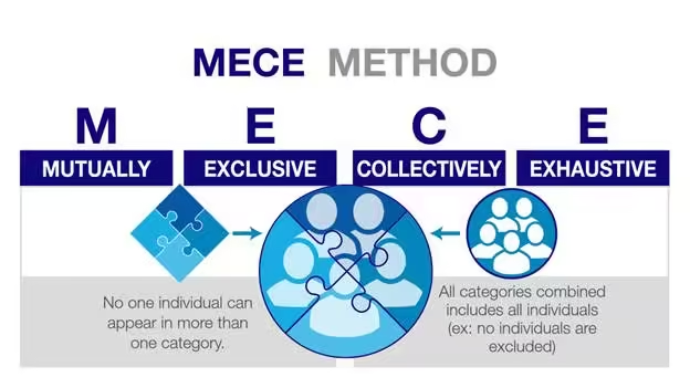
Using a MECE (Mutually Exclusive, Collectively Exhaustive) framework, the change manager can categorize stakeholder concerns into distinct groups—such as operational efficiency, user experience, and integration with existing systems—ensuring that all relevant factors are considered. By identifying these categories, the change manager can articulate a clear vision and define the desired end state that resonates with all stakeholders.
The above is from Caseinterview.com
Hypothesis: Sales Team Will Resist the New CRM System Due to Lack of Training and User-Friendliness
Step 1: Identify the Hypothesis
Hypothesis: The sales team will resist the new CRM system because they believe it is not user-friendly and they fear insufficient training.
Step 2: Break Down the Hypothesis into MECE Categories
To validate this hypothesis, we’ll break it down into specific categories that are mutually exclusive and collectively exhaustive. We’ll analyse the reasons behind the resistance in detail.
Categories:
User Experience Issues
Complexity of the Interface
Navigation Difficulties
Feature Overload
Training and Support Concerns
Insufficient Training Programs
Lack of Resources for Ongoing Support
Variability in Learning Styles
Change Management Resistance
Fear of Change in Workflow
Previous Negative Experiences with Technology
Concerns About Impact on Performance Metrics
Step 3: Gather Data for Each Category
Next, we need to collect data for each category to understand the underlying reasons and validate or refute our hypothesis.
Category 1: User Experience Issues
Data Collection:
Conduct usability testing sessions with sales team members.
Administer a survey focusing on user interface preferences and pain points.
Expected Findings:
High rates of confusion navigating the new interface.
Feedback indicating that certain features are not intuitive.
Category 2: Training and Support Concerns
Data Collection:
Survey the sales team about their current training needs and preferences.
Review existing training materials and resources provided.
Expected Findings:
Many team members express a need for more hands-on training sessions.
A lack of available resources for ongoing support after the initial rollout.
Category 3: Change Management Resistance
Data Collection:
Conduct focus groups to discuss fears and concerns regarding the new system.
Analyse historical data on previous technology implementations and employee feedback.
Expected Findings:
Employees voice concerns about how the CRM will change their current workflows.
Negative sentiments stemming from past technology rollouts that were poorly managed.
Step 4: Analyse Data Within Each Category
Now that we have gathered the data, let’s analyse the findings within each MECE category.
Analysis of Findings:
User Experience Issues:
Complexity of the Interface: Usability tests reveal that 70% of sales team members struggle to complete certain tasks in the CRM.
Navigation Difficulties: Survey responses show that 80% find one step of the navigation counterintuitive, leading to frustration.
Training and Support Concerns:
Insufficient Training Programs: Surveys indicate that only 40% of employees feel adequately trained to use this part of the new system.
Lack of Resources for Ongoing Support: Focus groups reveal that team members are unsure where to seek help after the initial training.
Change Management Resistance:
Fear of Change in Workflow: Focus group discussions highlight that 60% of participants fear their productivity will decrease with the new system, at least during the post Go Live period.
Previous Negative Experiences: Historical data shows that past technology rollouts had mediocre adoption rates due to insufficient support, reinforcing current fears.
Step 5: Develop Actionable Recommendations
Based on the analysis of each category, we can create targeted recommendations to address the concerns raised.
Recommendations:
User Experience Issues:
Conduct additional usability testing with iterative feedback loops to refine the CRM interface before full rollout.
Simplify the navigation structure based on user feedback, focusing on the most frequently used features.
Training and Support Concerns:
Develop a comprehensive training program that includes hands-on workshops, tutorials, and easy-to-access online resources.
Establish a dedicated support team to provide ongoing assistance, ensuring team members know whom to contact with questions.
Change Management Resistance:
Implement a change management strategy that includes regular communication about the benefits of the new system, addressing fears and expectations.
Share success stories from pilot programs or early adopters to demonstrate positive outcomes from using the CRM.
By following this detailed step-by-step analysis using the MECE framework, the change manager can thoroughly investigate the hypothesis regarding the sales team’s resistance to the new CRM system. This structured approach ensures that all relevant factors are considered, enabling the development of targeted strategies that address the specific concerns of stakeholders. Ultimately, this increases the likelihood of successful change adoption and enhances overall organizational effectiveness.
Data-Driven Decision Making:
At this stage, change managers should work closely with the project sponsor and project manager to determine effective positioning. A data-driven approach allows the change manager to form a hypothesis about how the change will impact stakeholders. For instance, if data suggests that the sales team is particularly resistant to change, the manager might hypothesize that this resistance stems from a lack of understanding about how the new CRM will enhance their workflow.
2. Planning Phase
Once the project is initiated, the planning phase requires detailed strategy development. Here, analytical skills are essential for conducting stakeholder analysis and impact assessments.
Example: In our CRM implementation scenario, the change manager must analyse the data collected during the commencement phase to identify the specific impacts on different departments. This involves grouping and sorting the data to prioritize which departments require more extensive support during the transition.
Using the TOSCA (Target, Objectives, Strategy, Constraints, Actions) framework provides a structured approach to guide the change management process for the CRM implementation. This framework helps clarify the overall vision and specific steps needed to achieve successful adoption. Below is a detailed exploration of each component:
1. Target
Definition: The target is the overarching goal of the change initiative, articulating the desired end state that the organization aims to achieve.
Application in CRM Implementation:
Target: Improve customer satisfaction and sales efficiency.
This target encapsulates the broader vision for the CRM system. By focusing on enhancing customer satisfaction, the organization aims to create better experiences for clients, which is crucial for retention and loyalty. Improving sales efficiency implies streamlining processes that enable sales teams to work more effectively, allowing them to close deals faster and serve customers better.
2. Objectives
Definition: Objectives are specific, measurable outcomes that the organization intends to achieve within a defined timeframe.
Application in CRM Implementation:
Objectives: Increase customer retention by 20% within a year.
This objective provides a clear metric for success, enabling the organization to track progress over time. By setting a 20% increase in customer retention as a target, the change manager can align training, support, engagement and system adoption with this goal. This objective also allows for measurable evaluation of the CRM’s impact on customer relationships and retention efforts.
3. Strategy
Definition: The strategy outlines the high-level approach the organization will take to achieve the objectives. It serves as a roadmap for implementation.
Application in CRM Implementation:
Strategy: Implement phased training sessions for each department, with tailored support based on the unique impacts identified.
This strategy emphasizes a thoughtful and structured approach to training, recognizing that different departments may face distinct challenges and needs when adapting to the new CRM. By rolling out training in phases, the organization can focus on one department at a time, ensuring that each team receives the specific support they require. Tailoring the training content based on the unique impacts identified earlier in the MECE analysis helps maximize engagement and effectiveness, addressing concerns about usability and fostering greater adoption of the CRM.
4. Constraints
Definition: Constraints are the limitations or challenges that may impact the successful implementation of the strategy. Recognizing these upfront allows for better planning and risk management.
Application in CRM Implementation:
Constraints: Limited budget and time restrictions.
Acknowledging these constraints is critical for the change manager. A limited budget may affect the types of training resources that can be utilized, such as hiring external trainers or investing in advanced learning technologies. Time restrictions might necessitate a more rapid rollout of the CRM system, which could impact the depth of training provided. By recognizing these constraints, the change manager can plan more effectively and prioritize key areas that will deliver the most value within the available resources.
5. Actions
Definition: Actions are the specific steps that will be taken to implement the strategy and achieve the objectives.
Application in CRM Implementation:
Actions: Develop a communication plan that includes regular updates and feedback mechanisms.
This action focuses on the importance of communication throughout the change process. A well-structured communication plan ensures that all stakeholders, particularly the sales team, are kept informed about the implementation timeline, training opportunities, and how their feedback will be incorporated into the process. Regular updates foster transparency and help build trust, while feedback mechanisms (such as surveys or suggestion boxes) allow team members to voice concerns and share their experiences. This two-way communication is essential for addressing issues promptly and reinforcing a culture of collaboration and continuous improvement.
By applying these frameworks, change managers can make informed recommendations that align with organizational objectives. This structured approach helps ensure that all relevant factors are accounted for and that stakeholders feel included in the planning process.
3. Execution Phase
As the project moves into the execution phase, the change manager must remain agile, continually collecting organizational data to confirm or reject the hypotheses formed during the planning stage.
Example: In an agile setting, where iterative processes are key, the change manager should implement mechanisms for ongoing feedback. For instance, after each sprint of CRM implementation, the manager can gather data from users to assess how well the system is being received. Surveys, usage analytics, and focus groups can provide rich insights into user experiences and pain points.
This ongoing data collection allows change managers to adjust their strategies in real-time. If feedback indicates that certain features of the CRM are causing confusion, the change manager can pivot to provide additional training or resources targeted specifically at those areas. This iterative feedback loop is akin to the work of strategic consultants, who continuously assess and refine their approaches based on empirical evidence.
Example in Practice: Imagine a situation where the sales team reports difficulties with the new CRM interface, leading to decreased productivity. The change manager can analyse usage data and user feedback to pinpoint specific issues. This data-driven insight can guide the development of targeted training sessions focusing on the problematic features, thus addressing concerns proactively and fostering user adoption.
4. Monitoring Phase
Monitoring the change initiative is crucial for ensuring long-term success. Change managers need to analyse performance metrics to evaluate the effectiveness of the implementation and its impact on the organization.
Example: For the CRM project, key performance indicators (KPIs) such as sales conversion rates, customer satisfaction scores, and employee engagement levels should be monitored. By employing data visualization tools, change managers can easily communicate these metrics to stakeholders, making it clear how the change initiative is progressing.
A fact-based approach to analysing these metrics helps in making informed decisions about any necessary adjustments. If, for instance, customer satisfaction scores are declining despite an increase in sales, the change manager may need to investigate further. This might involve conducting interviews with customers or analysing customer feedback to identify specific areas for improvement.
Suppose the organization observes a drop in customer satisfaction scores following the CRM implementation. The change manager could work with other stakeholders to conduct a root cause analysis using customer feedback and service interaction data to identify patterns, such as longer response times or unresolved issues. By addressing these specific problems, the change manager can refine the CRM processes and enhance overall service quality.
5. Closure Phase
The closure phase involves reflecting on the outcomes of the change initiative and drawing lessons for future projects. This is where the analytical skills of change managers can shine in assessing the overall impact of the change.
Example: After the CRM system has been fully implemented, the change manager should conduct a comprehensive review of the project along with the project team (retro). This involves analysing both qualitative and quantitative data to evaluate whether the initial objectives were met. Surveys can be distributed to employees to gather feedback on their experiences, while sales data can be analysed to determine the financial impact of the new system.
Using frameworks like MECE can help in categorizing the lessons learned. For instance, feedback could be sorted into categories such as user experience, operational efficiency, and overall satisfaction, allowing the change manager to develop clear recommendations for future initiatives.
Lessons Learned: If the analysis shows that certain departments adapted more successfully than others, the change manager could investigate the factors contributing to this variance. For example, departments that received more personalized support and training may have demonstrated higher adoption rates. This insight can inform strategies for future change initiatives, emphasizing the importance of tailored support based on departmental needs.
Building Relationships with Senior Leaders
In addition to the technical aspects of change management, the ability to communicate effectively with senior leaders is crucial. Seasoned change managers must clearly understand organizational objectives and be able to articulate how the change initiative contributes to these goals.
Example: During discussions with senior leadership, a change manager along with the rest of the project team can present data showing how the CRM system has improved customer retention rates and increased sales. By positioning this information in an easily understandable and rigorous manner, the change manager demonstrates the value of the initiative and its alignment with broader organizational objectives.
Effective communication ensures that leaders remain engaged and supportive throughout the change process, increasing the likelihood of success. By continuously linking the change initiative to organizational goals, change managers can build trust and credibility with stakeholders at all levels.
Leveraging Analytical Frameworks
Throughout the project lifecycle, incorporating structured analytical frameworks can enhance the decision-making process. Here are two key frameworks that change managers can leverage:
MECE Framework
MECE (Mutually Exclusive, Collectively Exhaustive) helps in breaking down complex information into manageable parts without overlap. By ensuring that all categories are covered without redundancy, change managers can identify all relevant factors affecting the change initiative.
TOSCA Framework
TOSCA (Target, Objectives, Strategy, Constraints, Actions) provides a comprehensive roadmap for change initiatives. By clearly defining each component, change managers can develop coherent strategies that align with organizational goals. This framework not only clarifies the change strategy but also ensures that all team members understand their roles in achieving the objectives.
Continuous Learning and Adaptation
Change management is not a static process; it requires continuous learning and adaptation. As organizations evolve, change managers must stay attuned to emerging trends and best practices in the field. This involves seeking feedback, conducting post-project evaluations, and staying updated on analytical tools and methodologies.
Change managers can attend workshops, participate in industry conferences, and engage with professional networks to enhance their analytical skills and learn from peers. By sharing experiences and insights, change managers can refine their approaches and incorporate new strategies that drive successful change.
The Transformative Power of Analytical Skills
The role of a change manager is multifaceted and requires a broad range of skills. However, one skill that stands out as particularly critical is the ability to think analytically. By adopting a strategic consultant’s mindset and applying analytical skills at each phase of the project lifecycle, change managers can significantly enhance their effectiveness.
From project commencement to closure, employing frameworks like MECE and TOSCA allows change managers to approach challenges in a structured way, making informed decisions that drive successful change. Continuous data collection, stakeholder engagement, and effective communication with senior leaders are essential components of this analytical approach.
In an era where organizations must adapt quickly to change, the ability to analyse complex data sets and derive actionable insights will distinguish successful change managers from the rest. Emphasizing this critical skill not only positions change managers as strategic partners within their organizations but also ensures that change initiatives lead to lasting, positive transformations.
As change practitioners, let us elevate our analytical capabilities and drive impactful change with confidence and clarity. By embracing this essential skill, we can navigate the complexities of organizational change and lead our teams toward a successful future.
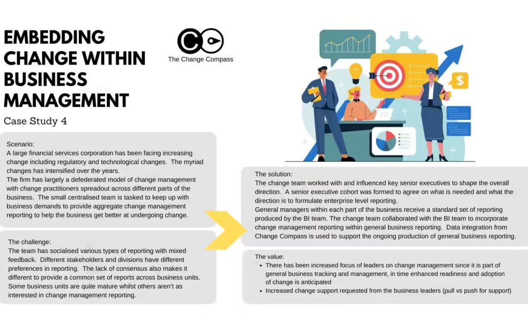
In the rapidly evolving landscape of financial services, organisations face significant challenges due to regulatory and technological changes. A large financial services corporation has recognised the need for an integrated approach to change management reporting, embedding it within general business reporting to enhance organisational agility and effectiveness. This case study outlines the firm’s journey, challenges faced, solutions implemented, and the resulting value derived from this strategic initiative.
Background
The corporation operates under a defederated model of change management, where change practitioners are distributed across various business units. This structure has led to inconsistent change management practices and reporting, complicating the ability to provide comprehensive insights into organisational change efforts. As regulatory demands and technological advancements have intensified, the need for cohesive change management reporting became paramount.
Challenges
The primary challenges encountered by the centralized change management team included:
Diverse Reporting Preferences: Different stakeholders and divisions within the organization exhibited varying preferences for reporting formats and metrics. This lack of consensus hindered the development of a standardized reporting framework.
Maturity Disparities: Business units displayed varying levels of maturity in their change management practices, with some units showing strong interest while others remained indifferent.
Feedback Variability: Initial attempts to socialize various reporting types received mixed feedback, complicating efforts to establish a unified approach.
Solution Implementation
To address these challenges, the change management team adopted a multi-faceted strategy:
Executive Engagement: The team actively engaged with senior executives to align on the direction for change management reporting. A senior executive cohort was formed to define essential reporting needs and establish a common vision.
Collaboration with Business Intelligence (BI) Team: The change management team partnered with the BI team to integrate change management metrics into existing general business reports. This collaboration ensured that change management insights were included in routine business tracking.
Data Integration: Utilising data from Change Compass facilitated the ongoing production of comprehensive reports that combined operational metrics with change management insights.
Value Realized
The integration of change management reporting into general business reporting yielded several significant benefits:
Increased Leadership Focus: By embedding change metrics within standard business reports, leaders began to prioritize change management as part of their strategic oversight. This shift is expected to enhance readiness and adoption of future changes across the organization.
Proactive Change Support: Business leaders increasingly requested support for change initiatives, indicating a transition from a push model (where support is offered) to a pull model (where support is actively sought).
Enhanced Reporting Consistency: The establishment of a standardized set of reports improved clarity and consistency in how change initiatives were tracked and communicated across business units.
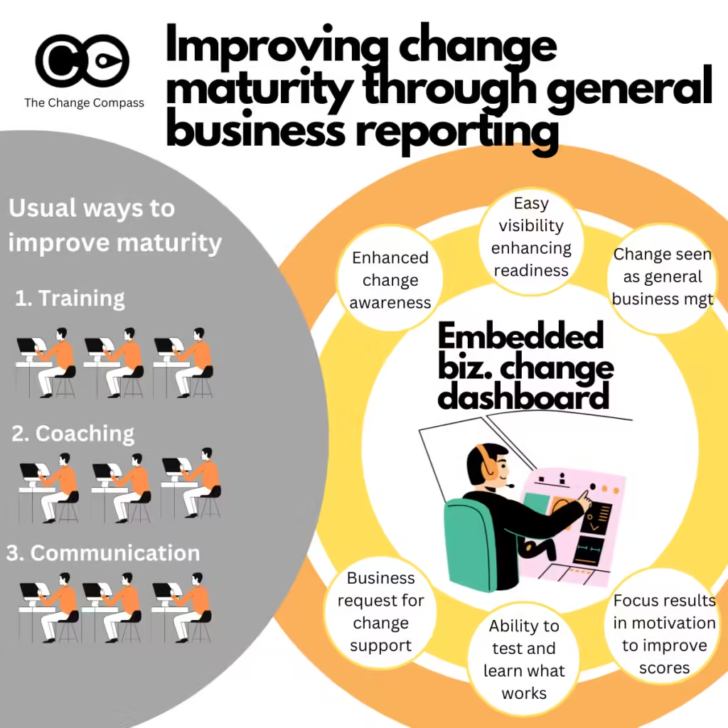
Change management Maturity: Enhancing change management maturity within the business is general done through capability development and coaching. However, this case showcases that embedding change management within general business management is a strategic way to raise awareness, visibility, and through this enhance the business’ efforts to improve the management of change.
This case study illustrates how a large financial services corporation successfully embedded change management reporting into its general business reporting framework. By engaging senior leadership, collaborating with data teams, and standardising metrics, the organisation not only improved its reporting capabilities but also fostered a culture that values proactive engagement with change initiatives. As a result, the firm is better positioned to navigate future changes while ensuring that it meets regulatory demands and capitalizes on technological advancements.
In the realm of organizational change management, the concept of a Single View of Change (SVOC) has become a focal point for experienced change practitioners. This approach aims to provide a comprehensive perspective on the myriad changes occurring within an organization, thereby facilitating informed decision-making among stakeholders. However, while the SVOC is often lauded for its potential to deliver a holistic picture of change impacts, its practical implementation raises several critical questions.
The Allure of a Single View of Change
The SVOC is designed to offer change practitioners a unified lens through which to view all organizational changes—be they strategic, operational, or cultural. By consolidating information about various changes, practitioners hope to present stakeholders with a clear and coherent narrative that captures the overall impact on the organization. This is particularly valuable in environments characterized by rapid change, where stakeholders may struggle to keep track of multiple initiatives.
Concept Illustration: The Change Landscape
Imagine an organization as a bustling city. Each building represents a different initiative or project, while the streets symbolize the pathways through which information flows. In this analogy, the SVOC acts as an aerial view of the city—providing insights into how each building interacts with others and how traffic (information) moves between them. This perspective allows stakeholders to see not just individual projects but also their collective impact on the organization.
Understanding Stakeholder Challenges
Change practitioners must develop an acute ability to read their stakeholders’ business challenges and tailor their communications accordingly. This involves:
Tailoring Data Presentations
Adjusting the types of data shared based on stakeholder roles and responsibilities is crucial. For example:
A project manager might need detailed timelines and resource allocations for specific initiatives.
A finance officer may require cost-benefit analyses and benefit realisation forecast linked to adoption rates related to ongoing changes.
Customising Visuals
Selecting visuals that resonate with specific stakeholder concerns while remaining aligned with overarching organizational goals is essential for effective communication. Using storytelling techniques in presentations can help convey complex information more effectively:
Contextualize Data: Start with a narrative that outlines why changes are necessary.
Visualize Impact: Use graphs or infographics to illustrate projected outcomes.
Call-to-Action: Conclude with specific actions required from stakeholders based on insights presented.
By framing data within a narrative context, practitioners can foster greater engagement and understanding among stakeholders.
Trial and error
A lot of your stakeholder may not know what they want. They are not change management experts so they may not be able to tell you exactly what the outputs look like. Often they may tell you at a high level the type of data they are after, but not the specifics.
You need to be able to carefully balance giving them something that will hit the mark, as a ‘test’ (since you may not hit the mark the first time). A bit of trial and error is required in this process as you continually test with your stakeholders what resonates and what gets their attention and drives action.
This can cause a lot of frustration and anxiety for change practitioners. After all, you are doing your very best to deliver something that is requested. But again, your audience does not know exactly what they want. There is an element of you guiding them, but also the other element of directly giving them what they are looking for.
Do note that if you don’t hit the mark too many times you may lose their interest, and therefore the opportunity to present change management data. This means that you may only have a small window of opportunity. Digital tools can help you with selecting the right visuals for the right stakeholders.
Facilitating Governance Forums
Creating spaces where stakeholders can discuss insights derived from change data allows for collaborative decision-making:
Regular Business Meetings: Schedule governance forums where stakeholders review progress on key initiatives.
Interactive Discussions: Encourage open dialogue about challenges faced during implementation.
Action-Oriented Outcomes: Ensure meetings conclude with clear action items based on insights shared.
Addressing Change Fatigue
One significant challenge in managing change is addressing change fatigue, which occurs when employees feel overwhelmed by constant organizational shifts. Symptoms include:
Apathy
Burnout
Increased resistance
To combat this phenomenon, organizations must implement strategies that foster resilience among employees:
Engagement Initiatives
Actively involving employees in the change process allows them to voice concerns and contribute solutions:
Feedback Mechanisms: Implement regular surveys or focus groups where employees can share their thoughts on ongoing changes.
Recognition Programs: Celebrate small wins related to change initiatives to maintain morale.
Transparent Communication
Maintaining open lines of communication regarding what changes are occurring and why they matter helps mitigate feelings of uncertainty among employees:
Regular Updates: Provide frequent updates through newsletters or town hall meetings.
Clear Messaging: Ensure messaging is consistent across all channels to avoid confusion.
Learning and Support
Providing resources that equip employees with the skills needed to navigate changes effectively is vital for reducing resistance:
Skill Development Workshops: Offer training sessions focused on new processes or technologies being implemented.
Mentorship Programs: Pair employees with mentors who have successfully navigated similar changes in the past.
The concept of a Single View of Change holds considerable promise for enhancing stakeholder understanding in dynamic organizational environments. However, its successful implementation hinges on recognizing the diverse needs of stakeholders and tailoring communications accordingly. By leveraging technology and fostering an environment conducive to engagement and support, change practitioners can create a more effective framework for managing organizational change. In summary, while striving for an SVOC may seem aspirational, it is essential for change practitioners to remain pragmatic about its execution—balancing ambition with realism to meet stakeholder needs effectively.
As organizations continue evolving in response to market demands and internal dynamics, understanding how best to communicate change becomes paramount. The Single View of Change offers a powerful toolset; however, it requires thoughtful consideration regarding stakeholder needs, technological integration, and ongoing adaptability in communication strategies. By embracing these principles, organizations not only enhance their capacity for effective change management but also cultivate resilience among their workforce—ultimately positioning themselves for sustained success in an ever-changing landscape.
We use cookies to improve your experience and understand site use. Marketing cookies stay off until you accept, and in the EU, UK and Switzerland analytics does too. Cookie Policy.
Strictly necessary
Required for the site to work: security, load balancing, and remembering your choices. These cannot be switched off.
Always active
Analytics
Google Analytics and similar, so we can see which pages are useful and where visitors get stuck. Aggregated, never sold.
Marketing
Used to measure campaigns and show relevant content on other platforms such as LinkedIn.