A large services organisation ran a change readiness assessment before a major operating-model shift. The survey came back at 78% favourable. Leadership read it as a green light and pressed go. Eight months later the initiative was quietly behind on every adoption metric that mattered, and the post-implementation review reached for the usual explanation: the change was harder than expected, the culture was more resistant than the survey suggested. Neither explanation was true. The survey had measured what people felt about the change in the abstract. It had not measured whether the structural conditions for adoption were actually present. They were not, and that was knowable before the launch.
This is the central weakness of how most organisations approach change readiness assessment. The instrument is almost always a survey, and the survey almost always measures individual sentiment at a single point in time. Sentiment matters, but it is one of three dimensions of readiness, and it is the one least predictive of whether adoption actually lands. The dimensions that predict adoption most strongly, leadership alignment and systemic capacity, are precisely the ones a sentiment survey cannot see.
Readiness is worth measuring well, because it is one of the few leading indicators a change function has. Almost everything else is lagging: adoption rates, engagement scores, benefit realisation all tell you what already happened. Readiness, measured properly, tells you what is about to happen while you can still change it. The problem is not that organisations measure readiness. It is that they measure one third of it and treat the result as the whole.
What change readiness assessment actually predicts
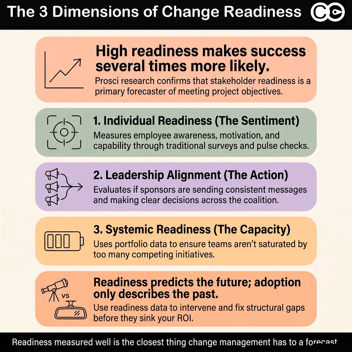
Change readiness assessment is the practice of evaluating, before and during a change, whether the conditions required for successful adoption are present. The reason it matters is that readiness is a genuine leading predictor of outcomes, not a feel-good exercise. Prosci’s research across more than 10,800 practitioners consistently finds that initiatives with strong change management and high stakeholder readiness are several times more likely to meet their objectives than those with poor readiness. The correlation is strong enough that readiness deserves to be treated as a forecasting instrument, not a box-ticking ritual.
But a predictor is only as good as the variables it captures. If your readiness assessment captures only individual sentiment, you have a model that predicts how people feel, which is weakly correlated with whether they will actually adopt the change when the structural conditions work against them. People can feel positive about a change and still fail to adopt it because their team is saturated, their manager has been given three contradictory priorities, or the supporting process and system changes have not landed. Conversely, people can feel anxious about a change and adopt it cleanly because leadership is aligned, capacity has been protected, and the path is clear.
Why readiness is a leading indicator, not a lagging one
Most change measurement happens too late to act on. Adoption curves, benefit realisation, and engagement dips all describe a state that already exists. Readiness is different. Measured before launch and tracked through delivery, it tells you whether you are heading for an adoption problem while there is still time to intervene. This is what makes readiness assessment strategically valuable: it converts change management from a reactive discipline into a predictive one. But that only works if the assessment measures the variables that actually move adoption.
This is also why readiness deserves a place in the business case, not just the change plan. McKinsey’s research on transformations found that even transformations rated successful capture only a fraction of their intended value, and a large share of that shortfall is set in motion early, before execution even begins, by conditions that a proper readiness assessment would have surfaced. The strategic point is that readiness is not a soft, people-side comfort metric. It is an early read on value at risk. When a senior leader treats a readiness assessment as optional, they are choosing to launch without a forecast of the one variable most within their control.
Where survey-only readiness breaks down
A sentiment survey asks people whether they understand the change, whether they support it, and whether they feel equipped for it. Those are reasonable questions. The problem is threefold. First, self-reported sentiment is a weak proxy for behaviour: people routinely report readiness and then fail to change, or report scepticism and then adopt smoothly. Second, a survey captures a moment, and readiness is dynamic, eroding as competing initiatives stack up. Third, and most importantly, a survey cannot see the systemic conditions that determine whether sentiment translates into adoption. A favourable survey in a saturated, misaligned environment is a false positive, and false positives in readiness assessment are expensive because they license launches that should have been delayed.
The three dimensions of change readiness
Readiness is not a single variable. It is a composite of three distinct dimensions, each requiring a different measurement approach. Treating readiness as one number, usually the survey score, collapses three different questions into one and loses the two that matter most.
Individual readiness
This is the dimension surveys capture well. Individual readiness covers awareness of the change, understanding of why it is happening, perceived capability to operate in the new way, and personal motivation to do so. It maps closely to the awareness and desire stages of established adoption models. Sentiment surveys, pulse checks, and focus groups are legitimate instruments here, and individual readiness is a real component of the picture. The error is not measuring it. The error is stopping there.
Leadership alignment
Leadership alignment is the degree to which the sponsors and managers connected to a change are saying and doing consistent things. It covers whether the sponsor coalition is visible and active, whether messages across leaders are coherent rather than contradictory, and whether decision authority is clear when trade-offs arise. Prosci’s data identifies active and visible executive sponsorship as the single largest contributor to change success, which means misalignment at the leadership level is one of the strongest predictors of failure. A sentiment survey of the affected workforce does not measure this at all. You measure leadership alignment by auditing what leaders actually say and decide, not by asking employees how they feel.
Leadership alignment is also the dimension most likely to be quietly assumed rather than checked. Change teams tend to take it on faith that the sponsors who approved the business case are aligned on execution, when in practice they are often aligned on the goal and divided on the path. The cost of that assumption is high, because misaligned sponsorship does not announce itself. It surfaces downstream as mixed manager messaging, stalled decisions, and a workforce that correctly reads the incoherence and waits to see which leader prevails before committing. Measuring alignment explicitly, early, is how you catch this while it is still cheap to fix.
Systemic and structural readiness
The third dimension is the one almost no readiness assessment captures, and it is frequently the most predictive. Systemic readiness asks whether the structural conditions for adoption exist: Is there spare capacity in the affected groups, or are they already saturated? Are competing initiatives drawing on the same people in the same window? Have the dependent process, system, and policy changes actually landed? Is the change being introduced into an environment that can absorb it? An individual can be entirely willing and still unable to adopt, because the system around them is not ready. This dimension is measured with portfolio and operational data, not with attitudinal questions.
Why surveys can only see one dimension
The reason surveys under-measure readiness is not that they are badly designed. It is that they are the wrong instrument for two of the three dimensions. A survey is an attitudinal instrument: it captures what people think and feel. That is exactly right for individual readiness and exactly wrong for leadership alignment and systemic readiness, which are structural conditions, not attitudes.
You cannot survey your way to an accurate picture of leadership alignment, because the people best placed to report misalignment, the affected employees, often cannot see the boardroom, and the leaders themselves are unlikely to self-report that they are contradicting each other. You measure alignment by reading the actual communications, decisions, and sponsor behaviours across initiatives.
You cannot survey your way to systemic readiness either, because employees experience their own load but rarely see the cumulative portfolio picture. An employee can tell you they feel busy. They cannot tell you that four initiatives are converging on their team in the same fortnight, because no single person in the organisation has that view unless the data has been deliberately aggregated. This is why systemic readiness has to be measured with structured impact and capacity data, the same data layer that supports stakeholder impact analysis across the portfolio.
How to build a multi-dimensional readiness picture
A credible change readiness assessment combines instruments rather than relying on one. The method is to measure each dimension with the tool suited to it, then integrate the three into a single readiness view. The following sequence works in practice.
Measure individual readiness with targeted surveys and pulse checks. Keep them short, behavioural where possible, and repeated over time rather than run once. Track the trend, not just the snapshot.
Assess leadership alignment through a structured sponsor and message audit. Review the communications, talking points, and stated priorities of every leader connected to the change. Flag contradictions in framing, pace, or priority. This is a qualitative review, scored against a consistent rubric.
Quantify systemic readiness with portfolio and capacity data. Map the cumulative change load on each affected stakeholder group across a rolling window, identify competing initiatives, and check the readiness of dependent process and system changes. This draws directly on a defined change capacity model.
Integrate the three into a single readiness profile per stakeholder group. Do not average them into one number that hides the weakest dimension. Show all three, because a group can be individually willing, well-sponsored, and structurally overloaded all at once, and the overload is what will sink adoption.
Re-measure through delivery, not just before launch. Readiness erodes as conditions change. A group that was ready at planning can be saturated by go-live if the portfolio shifts underneath them.
The output is a readiness profile that shows, for each stakeholder group, where the gap is. That specificity is what makes the assessment actionable. “This group scored 65% on the readiness survey” tells you almost nothing you can act on. “This group is individually willing and well-sponsored but carrying 1.4 times its absorption ceiling across three concurrent initiatives” tells you exactly what to fix.
Consider how this plays out in practice. A retail bank assessing readiness for a new lending-origination platform surveyed its branch network and returned a healthy 74% favourable score. On a survey-only model, that is a launch. But when the same readiness question was answered across all three dimensions, a different picture emerged. Individual readiness was genuinely high: branch staff understood the change and wanted the new system. Leadership alignment, however, was weak, because the retail and risk functions were sending subtly different messages about what “good” looked like under the new process. And systemic readiness was poor, because the platform go-live fell in the same six-week window as a separate restructure and a compliance retraining push aimed at the same staff. The survey saw none of that. The multi-dimensional assessment saw all of it, and the launch was resequenced by five weeks. Adoption landed cleanly. The survey alone would have sent them into the worst possible window with full confidence.
The readiness and saturation link
There is a structural relationship between readiness and change saturation that survey-based assessment systematically misses. Organisations operating at or beyond saturation have structurally lower readiness regardless of what their sentiment surveys say, because the capacity required to absorb a new change has already been consumed by existing ones. A favourable readiness survey in a saturated environment is one of the most dangerous false positives in change management, because it gives leadership permission to launch into a workforce that has no room to absorb the change.
This is also where readiness and change fatigue intersect. Fatigue is the human residue of repeated change; saturation is the structural ceiling on how much more can be absorbed. Both depress readiness, and neither shows up reliably in a one-off survey, because people normalise their own overload and under-report it. The only way to see the saturation component of readiness is to measure cumulative load directly, at the stakeholder-group level, with portfolio data. When you do, you often find that the binding constraint on adoption is not attitude at all. It is that the system is full.
Five common mistakes in change readiness assessment
Readiness assessment fails in recognisable ways. The most common are:
Equating readiness with the survey score. The survey measures one of three dimensions. Treating its result as the whole readiness picture systematically over-states readiness in saturated and misaligned environments.
Measuring once, before launch. Readiness is dynamic. A single pre-launch assessment misses the erosion that happens as competing initiatives stack up between planning and go-live.
Ignoring leadership alignment entirely. The dimension with the strongest link to success is the one most readiness assessments never measure, because it cannot be surveyed out of the affected workforce.
Averaging the dimensions into one number. A blended score hides the weakest dimension. A group that is willing and sponsored but structurally overloaded will show as moderately ready, when in fact it is not ready at all.
Treating low readiness as a communications problem. When readiness is low because of saturation or misalignment, more communication does not fix it. The fix is structural: resequencing, capacity protection, or sponsor realignment.
How Change Compass measures readiness across all three dimensions
This is where a dedicated platform changes what is possible. Most organisations can run a sentiment survey, but few can connect that survey to the systemic data that determines whether the sentiment will translate into adoption. Change Compass integrates survey data with portfolio impact data, so individual readiness can be read alongside the cumulative load, conflict, and capacity picture for the same stakeholder group. The platform’s Surveys capability captures the individual dimension, while its portfolio views supply the systemic dimension: saturation scores, stakeholder impact aggregation, and capacity modelling. The result is a readiness picture that reflects both how people feel and whether the structural conditions for adoption are actually present. No survey tool working alone can produce this, because the systemic dimension lives in portfolio data that a survey instrument never touches.
Where to start
If you do one thing differently, stop treating the readiness survey as the readiness assessment. Pick your next significant change and measure all three dimensions deliberately: run the sentiment survey for individual readiness, audit the sponsor coalition and message consistency for leadership alignment, and map the cumulative load on the affected groups for systemic readiness. Put the three side by side rather than blending them. The first time you do this, you will almost certainly find a group that looks ready on the survey and is structurally not ready at all. That gap is the single most valuable output of a real change readiness assessment, because it is the adoption failure you can still prevent. Readiness measured well is the closest thing change management has to a forecast. It is worth measuring all of it.
Frequently asked questions
What is a change readiness assessment? A change readiness assessment evaluates whether the conditions required for successful adoption of a change are present, before and during delivery. Done well, it measures three dimensions: individual readiness (sentiment and capability), leadership alignment (sponsor and message consistency), and systemic readiness (capacity, saturation, and competing load). It is a leading indicator of adoption, which is what makes it strategically valuable.
How do you measure change readiness with data rather than surveys? Surveys measure individual sentiment, which is only one dimension. Leadership alignment is measured by auditing sponsor behaviour and message consistency against a rubric. Systemic readiness is measured with portfolio and capacity data: cumulative change load per stakeholder group, competing initiatives, and the readiness of dependent process and system changes. The full picture combines all three instruments rather than relying on the survey alone.
Why is change readiness a predictor of adoption? Readiness captures the conditions that determine whether a change will be absorbed: whether people understand and support it, whether leaders are aligned behind it, and whether the system has capacity to take it on. Because it is measured before adoption happens, it functions as a leading indicator, giving change teams the chance to intervene before an adoption problem becomes visible in lagging metrics.
What is the difference between change readiness and change saturation? Change readiness is whether the conditions for adopting a specific change are present. Change saturation is whether the workforce has any remaining capacity to absorb additional change at all. They are linked: organisations at or beyond saturation have structurally lower readiness regardless of survey scores, because the capacity needed to absorb the new change has already been consumed.
How often should you assess change readiness? Readiness should be assessed before launch and tracked through delivery, not measured once. It is dynamic and erodes as competing initiatives stack up, so a group that was ready at planning can be saturated by go-live. Continuous or repeated measurement, especially of the systemic dimension, catches that erosion while there is still time to act.
There is an uncomfortable irony at the heart of most change management practices. Change managers are trained to help organisations plan for the human side of transition, measure adoption, track readiness, and manage stakeholder resistance. They can tell you precisely which business units are most exposed to a given change, which employee groups are furthest from readiness, and which initiatives are competing for the same people’s attention at the same time.
What most of them cannot tell you is what their function is worth in dollars.
Change management ROI (the measurable financial return that structured change management delivers relative to its cost) is the business case gap that change leaders have struggled to close for decades. Not because the value is not there, but because the data is rarely collected in a way that makes it legible to finance or the executive team. The business case gets written once, at the start of a programme, and then quietly shelved while the real work begins. By the time a senior leader asks “what did we actually get from the change team?”, the answer has to be reconstructed from memory, output logs, and adoption survey scores that nobody can connect to a dollar figure.
This article makes the case that the problem is not a lack of value. It is a lack of measurement infrastructure. And it provides a practical framework for closing that gap, one that practitioners can apply to their current programmes without waiting for a new mandate or a new budget.
Why change management is one of the few business functions that struggles to quantify its own value
Finance teams measure return on every capital investment. Marketing tracks cost per acquisition and customer lifetime value. IT reports on system uptime, incident rates, and cost per transaction. HR has moved decisively toward workforce analytics in the last decade, with turnover costs, time-to-productivity, and engagement scores now standard inputs into boardroom conversations.
Change management, by contrast, has relied primarily on activity metrics: training completion rates, communications sent, stakeholder engagement sessions held, survey scores at go-live. These are outputs, not outcomes. They measure what the change team did, not what the organisation gained as a result.
The business case problem
The typical change management business case is written before the work begins. It makes the case for investment by projecting the cost of failure: failed adoption, delayed benefit realisation, productivity loss during transition, attrition. These projections are often compelling. They are also speculative, because they are written in advance of the data.
The problem is structural. Most change managers do not control the financial data that would allow them to validate those projections later. Benefit realisation sits with the project sponsor. Productivity data sits with HR or operations. Adoption rates get reported to the project board but rarely get connected back to the financial case. By the time the programme closes, the change team has produced a substantial body of work, and has no mechanism to tie it to the outcomes the executive team cares about.
Why the data disappears
There are three reasons the ROI data gets lost:
Benefit tracking is assigned to the wrong team. Projects own the financial case. Change teams own the people case. When these are managed separately, the connection between adoption and benefit realisation is never made explicit.
The measurement points are front-loaded. Organisations invest in readiness assessment and go-live surveys, but rarely in systematic 60, 90, or 180-day post-implementation tracking. The data that would demonstrate sustained adoption, and connect it to financial outcomes, simply is not collected.
The business case is treated as a document, not a process. Once the investment is approved, the business case is filed. Nobody updates it as the programme delivers. The opportunity to demonstrate value in real time is missed.
What change management ROI actually means
Change management ROI, properly defined, is the net financial benefit delivered by structured change management investment across a programme or portfolio of change initiatives, expressed as a percentage of the cost of that investment.
The formula is conceptually straightforward:
Change management ROI = (Financial benefit delivered by change management / Cost of change management investment) x 100
The challenge is populating the numerator. Unlike a marketing campaign where you can track revenue from a specific channel, the financial benefit of change management is distributed across three layers, each of which requires a different measurement approach.
The three layers of change management ROI
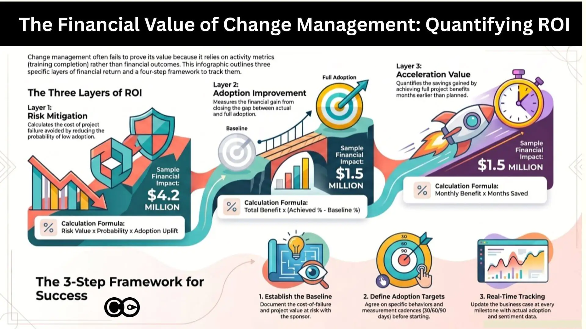
Layer 1: risk mitigation and the cost of failure avoided
The first and most immediately legible ROI layer is risk mitigation: the financial cost that structured change management prevents, relative to what would have happened without it.
The research here is clear. According to Prosci’s 12th Edition Best Practices in Change Management, organisations with excellent change management are six times more likely to meet project objectives than those with poor change management. Willis Towers Watson’s Business Case for Change Management research found that organisations managing change well are 2.5 times more likely to outperform their peers financially and achieve 3.5 times more revenue growth than those that do not.
The risk mitigation value is calculated as:
Risk mitigation value = Project value at risk x Probability of failure without change management x Adoption uplift attributable to change management
For a $20 million ERP implementation with a historically observed 30% risk of low adoption without structured change management, and where change management is estimated to reduce that risk by 70%, the risk mitigation value is: $20M x 0.30 x 0.70 = $4.2 million.
This is a conservative approach. It does not require you to prove that change management delivered the outcome. It only requires you to quantify what was at risk and apply a defensible estimate of the change management contribution. Most project sponsors will accept this framing, because it mirrors how they think about insurance: you buy it to reduce the cost of failure, and you measure its value by what did not happen.
Layer 2: adoption rate improvement and benefit realisation
The second ROI layer is adoption rate improvement. Every change programme has a gap between theoretical benefit (what the change would deliver at 100% adoption) and realised benefit (what it actually delivers at actual adoption rates). Change management’s direct contribution is to close that gap.
This connection between adoption and financial outcomes is often treated as obvious in principle and ignored in practice. McKinsey’s analysis of large transformation programmes found that 42% of projected value is typically lost in the implementation and adoption phases, not because the technology failed, but because people did not use it consistently or at all.
The adoption value calculation is:
Adoption value = Programme benefit at full adoption x (Achieved adoption rate – Baseline adoption rate without structured change management)
If a new sales system is projected to deliver $5 million in productivity gains at 100% adoption, and your change management programme moves adoption from an estimated 55% baseline to 85% achieved, the adoption value is: $5M x (0.85 – 0.55) = $1.5 million.
The baseline adoption rate is the hardest variable to establish. The best approach is to use historical data from comparable programmes in your organisation where change management was minimal or absent. If that data does not exist, Prosci’s research provides sector benchmarks. Alternatively, model it as a sensitivity range (optimistic, base, conservative) and present the range to executives rather than a single point estimate.
Layer 3: benefit realisation acceleration and time-to-value
The third ROI layer is benefit realisation acceleration. Programmes with effective change management do not just achieve higher adoption. They achieve it faster. Every month that a programme runs at partial adoption is a month of benefit that is not being realised.
The acceleration value calculation is:
Acceleration value = Monthly programme benefit x Number of months of acceleration
If a programme is expected to deliver $500,000 per month in operational savings at full adoption, and effective change management accelerates time-to-full-adoption by three months, the acceleration value is: $500K x 3 = $1.5 million.
This calculation is particularly compelling for executives who think in terms of payback periods and net present value. A programme expected to break even at month 18 that breaks even at month 15 has materially better financial performance. Change management’s contribution to that acceleration is both quantifiable and credible, because it is directly connected to the adoption data collected throughout delivery.
The change management ROI calculation framework
The three layers above give you the components. The four-step framework below gives you the structure for assembling them into a business case that executives can interrogate and validate.
Step 1: Establish the cost-of-failure baseline
Before you can claim ROI, you need a denominator: what is this programme worth if things go wrong? Work with the project sponsor to document the total programme investment, the projected benefit at full adoption, the historical failure rate for comparable programmes in your organisation, and the known risk factors such as saturation, leadership misalignment, and competing initiatives.
This baseline is what makes your risk mitigation calculation credible. It also forces an honest conversation at the start of the programme about what is actually at stake.
Step 2: Define the adoption target and measurement approach
Agree in writing with the project sponsor and executive sponsor on what “full adoption” means for this programme (behaviours, not just system logins), how adoption will be measured, what the measurement cadence will be (go-live, 30 days, 90 days, 6 months), and who owns the adoption tracking.
This step is where most business cases fail. The measurement approach is left vague, and when adoption data is not collected systematically, there is nothing to put into the ROI calculation later.
Step 3: Track and update the business case in real time
As the programme delivers, update the business case with actual data: adoption rates at each measurement point, any acceleration or delay relative to the benefit realisation schedule, incidents or productivity dips that the risk mitigation value was designed to prevent, and stakeholder sentiment data that indicates future adoption trajectory.
The business case is a living document, not a filing artefact. If your change team cannot update the financial projections with real adoption data at each governance meeting, the business case has no credibility at programme close.
Step 4: Calculate and report total change management ROI at milestones
At programme close, or at significant milestones for longer programmes, aggregate the three layers:
Total change management value = Risk mitigation value + Adoption value + Acceleration value
Net ROI % = (Total value – Cost of change management) / Cost of change management x 100
Using the worked examples above: $4.2M + $1.5M + $1.5M = $7.2 million in change management value against $800,000 in change management investment. That is an ROI of 800%.
These numbers will vary significantly by programme. The point of the framework is not to produce an impressive-looking figure. It is to produce a number that is defensible, documented, and connected to data collected throughout the programme rather than reconstructed after the fact.
Five common mistakes when building the change management business case
Even practitioners who understand the three-layer model make predictable errors that undermine the credibility of their business case. These are the most common:
Writing the business case for investment approval, then never updating it. This is the single biggest failure mode. The business case becomes a sales document rather than a measurement tool. Any ROI calculation at programme close is regarded as self-serving, because there is no audit trail of data to support it.
Using adoption metrics that do not connect to outcomes. Training completion rates and email open rates are easy to collect but hard to connect to financial value. Define adoption in terms of the behaviour change that leads to outcomes, not proxy metrics that measure activity.
Failing to establish a counterfactual. A claim that “the programme delivered $5 million in value” is not the same as “change management delivered $5 million in value.” You need a credible baseline for what would have happened without structured change management. Without it, executives will rightly attribute the value to the technology or the project team.
Treating benefit realisation as someone else’s job. Change managers often hand off to the business at go-live and stop tracking. The adoption data that would close the ROI loop gets abandoned precisely when it becomes most valuable: in the 90 to 180 days post-implementation when sustained adoption either consolidates or erodes.
Building the business case in isolation. The strongest change management ROI cases are co-developed with finance, the project sponsor, and the executive sponsor. A number endorsed by the CFO carries substantially more weight than a number produced by the change team alone, even if the underlying methodology is identical.
How Change Compass measures and reports change management ROI
One reason change management ROI has historically been so difficult to demonstrate is the fragmentation of the data. Adoption surveys live in one system. Benefit realisation tracking lives in another. Stakeholder sentiment data, if it exists at all, lives in a spreadsheet that gets emailed around and then lost.
Change Compass addresses this by collecting the data throughout the programme rather than requiring you to reconstruct it at the end. The platform aggregates adoption tracking, stakeholder impact analysis, saturation measurement, and readiness scores across the entire portfolio, and surfaces them in reporting that connects the human side of change to programme outcomes in a format executives can act on.
For one enterprise client, this approach identified over $10 million in operational risk being carried silently across five concurrent initiatives, none of which had visibility into what the others were demanding from the same employee groups. Surfacing that risk early, and enabling the portfolio team to sequence and resource more intelligently, is precisely the kind of risk mitigation value that Layer 1 of the ROI framework is designed to capture.
Rather than assembling the change management ROI calculation retrospectively, Change Compass provides the data architecture to make it a running report throughout the programme. Adoption rates, readiness indicators, and saturation scores update in real time. When the executive team asks what the change function has delivered, the answer is already in the system.
For practitioners who want to understand how to structure that data for executive consumption, the Northwestern Mutual case study on elevating change data to executive level illustrates how a large financial services organisation made this shift from retrospective reporting to real-time portfolio intelligence. And for the mechanics of presenting that output in a format executives will actually read, the guide on creating executive-ready change management reports covers the practical steps in detail.
Making the business case a continuous practice
The change management business case is not a document you write at the start of a programme to secure investment. It is a measurement practice you maintain throughout the programme to demonstrate value, course-correct when adoption is lagging, and hold the organisation accountable for the commitments it made when it approved the investment.
This is a different operating model for many change practitioners. It requires agreement with the project sponsor on what will be measured and how. It requires access to the benefit realisation data that typically sits with finance or the business owner. And it requires a discipline of updating the business case at each governance milestone, not just at the end.
The organisations that do this consistently are the ones where change management has genuine executive sponsorship, not because the change team advocated for their own function, but because the data made the case. An adoption rate that moves from 55% to 85% over 90 days, tracked in a dashboard that the executive sponsor reviews every fortnight, is its own argument.
Start with one programme. Agree the measurement approach with the project sponsor before the work begins. Collect the adoption data at every defined milestone. Build an executive change management dashboard that shows the benefit case updating in real time. At programme close, calculate the return on investment using the three-layer framework and present it with the data that supports every number.
Done once, this gives you a template. Done consistently across a portfolio, it gives you the argument that change management is not a cost centre but a return-generating investment, with the evidence to prove it.
Frequently asked questions
What is change management ROI? Change management ROI is the measurable financial return delivered by structured change management investment, expressed as a percentage of the cost of that investment. It is calculated across three value layers: risk mitigation (the financial cost of failed adoption avoided), adoption rate improvement (higher adoption rates connected to greater benefit realisation), and benefit realisation acceleration (faster time-to-value). Each layer requires a different measurement approach and its own calculation.
How do you calculate change management ROI? Use a four-step framework: first, establish the cost-of-failure baseline by quantifying what is financially at risk if adoption is low; second, define the adoption target and agree the measurement approach with the project sponsor before delivery begins; third, track and update the business case in real time with actual adoption data at each governance milestone; fourth, aggregate the three ROI layers at programme close to produce a total value figure and a net ROI percentage.
How do you build a change management business case? An effective change management business case starts with a clear articulation of what is financially at risk if the change delivers low adoption. It then quantifies the likely impact of structured change management on three dimensions: risk reduction, adoption rate improvement, and benefit realisation acceleration. Critically, the business case must be co-developed with the project sponsor and updated throughout the programme with real adoption data, not written once and filed.
What is the typical return on investment for change management? Research by Prosci and Willis Towers Watson consistently finds that organisations with effective change management are two to six times more likely to meet project objectives than those without it. The financial ROI varies significantly by programme size and sector, but a disciplined three-layer calculation framework typically demonstrates returns well above 100% for structured change management investment on large transformation programmes where the value at risk is high.
How do you justify change management investment to executives? The most effective justification frames change management as risk reduction rather than a people process. Executives respond to financial risk arguments: if this programme delivers at 55% adoption instead of 90%, what is the cost of that gap? What has happened on comparable programmes in this organisation? A co-developed business case, endorsed by the project sponsor and finance, that quantifies risk mitigation, adoption improvement, and benefit acceleration in dollar terms is substantially more persuasive than activity metrics or anecdotal claims about the value of people-side support.
A Transformation Director recently described her tool selection process to me with a sentence that has stuck. “Most vendors we evaluated showed us a Gantt chart, a heatmap and a resourcing chart, and called it portfolio management. None of them could easily tell me which of our 30+ initiatives were competing for the same audience bandwidth, and none of them could explain why our adoption scores were sliding even though delivery was on track.”
This is the gap most buyers walk into. The change management software market has grown crowded over the last three years, and almost every vendor now promises a “single view of change”. For a PMO Director with a board paper due in two weeks, the demos look reassuringly similar. They are not. The difference between a visualisation tool and a real change portfolio management platform is the difference between a basic, generic dashboard and an intelligence layer that informs the decisions your executive team makes about sequencing, capacity and risk.
This guide is written for PMO/Transformation Directors and enterprise change leads who are evaluating a change portfolio management tool in 2026. It covers what the category actually requires, why your change data is your system of record, what AI features matter (and which to walk away from), and a seven-criteria framework to use in your shortlist conversations.
What change portfolio management actually is (and what most tools are selling instead)
Let’s start with a definition. Change portfolio management is the structured, systematic discipline of managing change across the enterprise portfolio. It includes initiative-level analysis, cross-portfolio risk and opportunity identification, capacity assessment, conflict detection and visual data storytelling that informs business decision making at executive level. It is not a chart. It is a practice supported by a system, built on a defined set of change portfolio management best practices.
Most tools you will see in vendor demos are selling a slice of this. They will show you three views and stop:
A Gantt or timeline chart of initiatives plotted across the next 12 to 18 months
A heatmap of impacts by business unit or stakeholder group, usually colour-coded by month
A resourcing chart showing change practitioner allocation across the portfolio
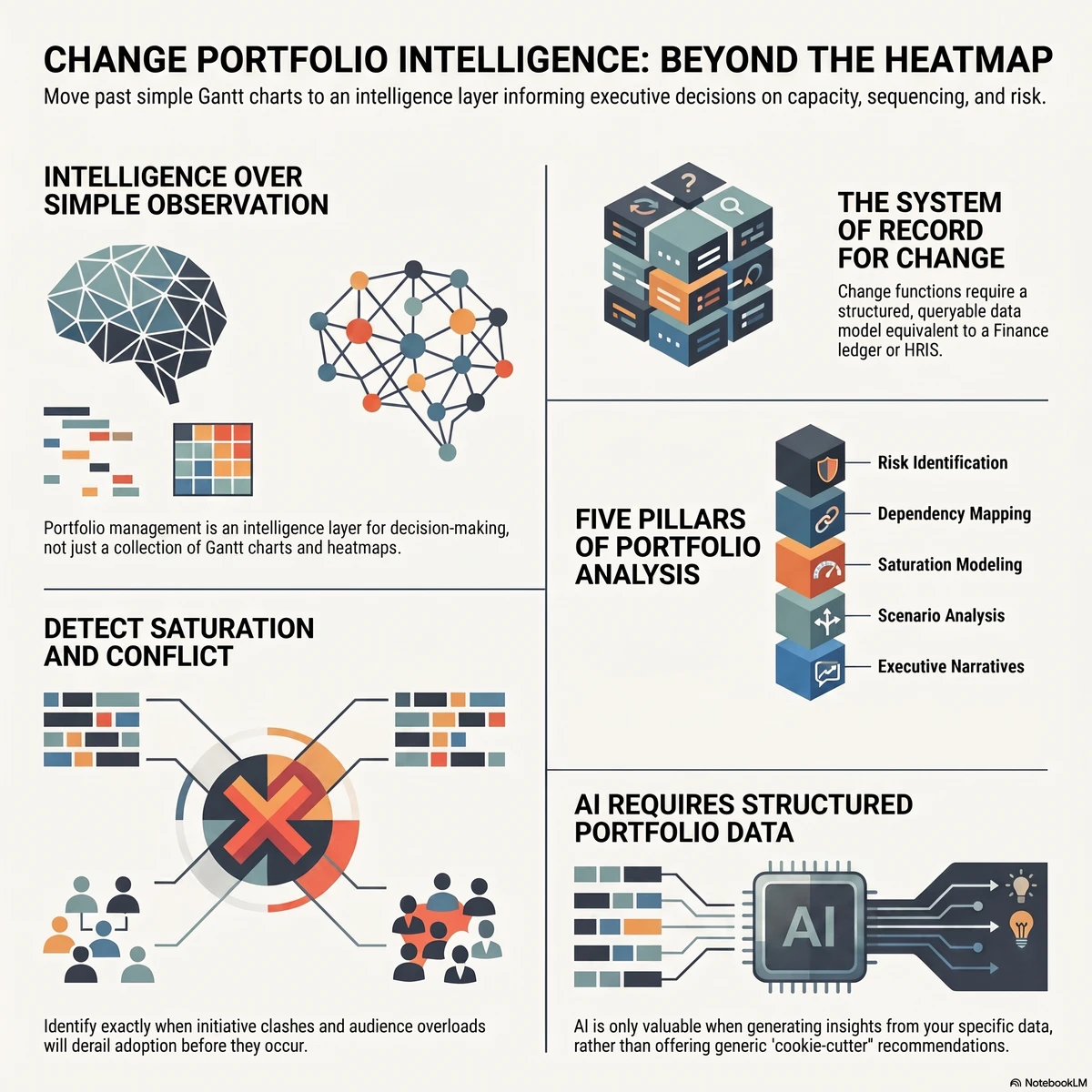
Those three views are useful as visual artefacts. They are not portfolio management. Portfolio management is what you do with them. The vendor that shows you a heatmap but cannot help you interrogate it, model alternative scenarios, or detect the structural risks hiding inside it has given you a clipboard, not a platform. A useful test in a demo: ask “Show me where two initiatives are competing for the same stakeholder group in the same fortnight, and what the projected adoption impact is if we don’t re-sequence.”
The work a PMO is being asked to do has changed. McKinsey’s research on transformation has consistently shown that the bulk of value erosion happens in implementation, not strategy, with 42 per cent of value lost in the implementation and scaling phases. The PMO is the function closest to that loss. To prevent it, you need to do analysis, not just observation.
The portfolio analysis layer most tools skip
The work that turns visualisation into intelligence sits in five activities:
Risk and opportunity identification across the portfolio (where are we exposed, where are we under-using capacity)
Cross-initiative dependency mapping (which initiatives share the same audience, the same systems, or the same critical resources)
Saturation and capacity modelling (what is the true change load on each business unit at each point in time, and where does that breach safe thresholds)
Scenario analysis (if we delay initiative X, what does the load profile look like, and which audiences benefit)
Executive narrative development (how do we tell this story in one slide that drives the right decision)
A change portfolio management tool earns the name when it can support all five. Anything that stops at heatmaps and Gantt charts has stopped at observation.
Why your change data is your system of record
Here is the part most PMO conversations skip. Every other corporate function has a system of record. HR has its HRIS. Finance has its general ledger. Operations has its ERP. Risk has its GRC platform. Change is the only enterprise function still routinely run out of spreadsheets, slide decks and project management tools repurposed for portfolio reporting.
This matters more than it sounds. The system of record is not the tool. It is the authoritative source of data on which decisions are made. When the CFO needs to know the cash position, they don’t ask three teams to email their numbers and reconcile them in Excel. They look at the ledger. When the CHRO needs to know headcount, they look at the HRIS. The PMO is the function that should be the system of record for change data, and most PMOs aren’t, because they don’t have a tool that can hold the data in a structured, queryable, executive-ready form.
Why is this the foundation? Because the data informs everything that comes after it. The approach you recommend to the business, the sequencing decisions you make, the capacity warnings you raise, the readiness conclusions you draw. All of these are only as credible as the data underneath them. If your data lives in fragmented spreadsheets owned by individual change managers, your recommendations are anecdotal. If your data lives in a structured portfolio platform with consistent impact frameworks, audience taxonomies and historical patterns, your recommendations are evidence-based. The platform is upstream of the conversation.
This is also why a change portfolio tool is fundamentally different from a project management tool. Monday, Smartsheet and similar platforms are excellent at task tracking and team coordination. They are not designed to hold change data as a system of record. The fields they track (task, owner, status, due date) are not the fields a change leader needs to make portfolio decisions (impacted audience, change type, adoption risk, saturation contribution, dependency map). Trying to bolt change portfolio management onto a project management tool is like trying to run payroll out of Trello. It will technically work for a while, and it will fail at scale.
For a fuller treatment of why the change function deserves its own intelligence layer rather than a project tool with extra columns, the change intelligence platform pillar article goes deeper into the architecture.
Why standard charts cannot tell your story
The second area where tools quietly fail is data visualisation. The PMO’s job is not to display data. It is to influence executive decisions using data. Those are different jobs, and they need different visualisations.
Most vendors offer a fixed set of charts: a Gantt timeline, an impact heatmap, a resourcing bar chart, possibly a stoplight summary. These are fine for an analyst staring at a screen for ten minutes. They are not what a CEO needs to see in a 5-minute portfolio update.
The complexity of an enterprise change portfolio is genuinely high. You are simultaneously tracking initiatives with different start dates, different audiences (sometimes overlapping, sometimes nested), different change types, different risk profiles, different dependencies and different stages of maturity. A standard chart library can show you any one of those dimensions. None of them can show you the story you need to tell, which is usually two or three of them intersected.
What this means in practice: the data visualisation in a real portfolio tool needs to be flexible. You need to be able to filter, slice, overlay, drill down and reshape the view to match the question being asked. The CFO has a different question to the COO. The board wants a different cut to the divisional MD. The sequencing committee needs to see something different to the audit committee. If your tool gives you the same three charts for all of them, you are doing manual translation work every week that a properly designed platform would do in real time.
A practical test: in your shortlist demos, ask the vendor to build a chart that shows you the top five stakeholder groups by impact load over the next quarter, then layer in the projected change saturation score for each, then highlight which initiatives are driving the highest contribution. If the answer is “we’d need to build a custom report”, you’ve found the ceiling. If they can do it live in the platform, you’ve found a real visualisation engine.
The principle is straightforward: complex change demands flexible visualisation. The story changes, the audience changes, the question changes. The chart must change with it, and one glance must do the work.
AI features: what to look for, what to avoid
If you are evaluating change portfolio tools in 2026 and AI is not on your criteria list, your evaluation is out of date. The PMO use cases for AI fall into two buckets, and both matter:
Reducing manual effort. A change portfolio generates an enormous volume of administrative work: drafting impact statements, summarising initiative updates, normalising data from different change managers, generating stakeholder communications, building first-cut readiness assessments. A capable AI layer should automate large parts of this without removing the change manager from the loop.
Generating insight. This is the higher-value bucket and the one most providers are weaker on. The AI should be able to look across your portfolio and tell you things you wouldn’t have spotted by hand: emerging saturation hotspots, audience groups whose risk profile has shifted, initiatives whose adoption trajectory is diverging from the plan, dependencies that have moved into the critical path.
Both buckets require one thing the vendor demos often skip past: your data. This is the point many PMOs miss when they’re comparing tools against ChatGPT or Copilot. General AI tools cannot do portfolio-level work for you because they have no portfolio data. They can draft a generic impact statement. They cannot tell you that your Q3 SAP rollout is the third initiative landing on Operations in eight weeks and that adoption is at risk because Operations is already at 87 per cent of safe load. The data is what makes the AI useful.
There is a sharper version of this point worth making to your executive team. General-purpose AI tools used without your organisation’s change data will give you cookie-cutter recommendations. The bigger risk is not that the recommendations are generic. It is that they are confidently wrong, in a way that sounds plausible enough to act on. A general model with no context about your portfolio will recommend an approach that’s wrong for your sector, your maturity, your stakeholder base or your sequencing reality. The cost is not the bad recommendation. The cost is the time spent going down a wrong path because the recommendation sounded sensible. We treat this risk in more depth in the companion piece on AI change management automation, which explains the architecture difference between general AI and a change-data-informed AI layer.
What this means for your buyer’s evaluation:
The AI features must be trained on or fed by your portfolio’s structured change data, not bolted on as a generic LLM wrapper
The vendor should be able to demonstrate insight generation, not just text generation (drafting a paragraph is table stakes; spotting a saturation risk is differentiation)
There must be a clear and consistent path for human-in-the-loop review on any AI-generated recommendation that flows to executives
The AI must explain its reasoning (what data did it use, what assumptions did it make), so the change leader using it can defend the recommendation in the room
The vendor that says “yes, we have AI” without being able to demonstrate the data plumbing is, with respect, behind. AI without your data is generic by definition.
The seven criteria for evaluating a change portfolio management tool
If you take one artefact from this article into a shortlist conversation, take this. These are the seven evaluation criteria we recommend PMO Directors use, in priority order. Each is followed by a question to ask in the demo.
#
Criterion
Question to ask in the demo
1
Portfolio analysis depth
“Show me how you identify cross-initiative risk and opportunity, not just where you display it.”
2
Data as system of record
“What is the data model? Can it hold consistent impact, audience and saturation data across all initiatives, regardless of who entered it?”
3
Flexible data visualisation
“Build me a chart now, live, showing X dimension intersected with Y dimension for the top Z audiences.”
4
AI features informed by portfolio data
“Demonstrate one insight the AI surfaced that a human wouldn’t have spotted.”
5
Executive-ready outputs
“Show me the slide or dashboard you would put in front of my CEO. Can it be filtered by their question in real time?”
6
Saturation and capacity modelling
“How do you measure saturation? Is it a real model with thresholds, or a colour applied to a heatmap?”
7
Conflict and dependency detection
“Show me where two initiatives are competing for the same audience in the same window. Did the platform flag it, or did I have to find it?”
The order matters. A platform can have beautiful visualisations and weak data. A platform with weak data will mislead you. Start at criterion two if you’re tight on time. If the data model doesn’t hold up, nothing built on top will.
A few of these are worth a closer look.
Saturation and capacity
Change saturation is the single biggest cause of preventable adoption failure. Prosci’s research and our own client data consistently show that organisations that exceed their safe change load see a measurable drop in adoption rates, often well before any single initiative shows red on its individual report. The portfolio view is the only place this risk becomes visible.
A real saturation model has thresholds (per audience, per role, sometimes per geography), tracks contribution by initiative, and forecasts forward. A fake saturation feature is a heatmap with three colours. Make sure you can tell the difference. For more on the model, see our practical methodology for measuring change saturation.
Conflict and dependency detection
The structural problem with most enterprise change portfolios is not that the initiatives are individually badly run. It is that they are individually well run, on parallel tracks, by teams that never see each other’s stakeholder lists. Conflict detection is the platform capability that makes the hidden visible. Two initiatives competing for the same business unit in the same fortnight is a problem you cannot solve if you cannot see it. The right tool surfaces this automatically, not on request.
Executive reporting
The most overlooked criterion. Your tool is doing one of two things at executive level: making you look credible, or making you look like the spreadsheet team. There is no middle. The platforms that win at this layer let you generate executive views in real time, filter them live in the meeting, and answer questions on the spot. The ones that lose make you go away, build a slide and come back next week.
For a worked example of what executive-grade reporting looks like at a Fortune 500 financial services firm, see our case studies on elevating change data to the executive table.
The vendor landscape: what’s actually out there
The change portfolio management category includes four kinds of tools that PMOs commonly evaluate. None are equivalent.
1. Project and work management platforms (Monday, Smartsheet, Asana, Jira, Microsoft Project). Strong at task tracking, team coordination and basic Gantt visualisation. Weak at change-specific data structures (impacted audience, change type, saturation contribution) and almost universally weak at portfolio-level analytics. Useful as your delivery tool. Not a change portfolio platform. The common failure mode is the PMO that tries to retrofit Monday with custom columns and reports, ends up with a high-maintenance spreadsheet, and concludes “tools don’t work for change”. The tool wasn’t built for change.
2. HR analytics and employee experience platforms (Workday Adaptive, Visier, Glint, Culture Amp). Strong at employee sentiment, engagement data and HR analytics. Weak at initiative tracking and portfolio composition. Useful as a complementary data source feeding readiness insights. Not a portfolio platform on their own.
3. General-purpose AI tools (ChatGPT Enterprise, Copilot, Claude, Gemini). Strong at text generation, drafting and conversational analysis. Weak at portfolio data management because they don’t have your data. Useful as a productivity layer for individual change managers. Not a portfolio platform.
4. Purpose-built change portfolio platforms (The Change Compass and a small number of others). Designed from the data model upwards for change portfolio work: change-native fields, structured audience taxonomies, saturation modelling, cross-initiative analytics, AI insight layer informed by portfolio data, executive-grade visualisation. This is the category to evaluate against your seven criteria.
This taxonomy matters because the wrong category will look adequate in the first 90 days. The cracks show at scale, when the portfolio grows past 20 to 30 active initiatives, when the executive team starts asking forward-looking questions, and when adoption issues start surfacing that the tool cannot diagnose.
A short list of things that should slow your evaluation down, not speed it up:
The demo shows the same three charts (Gantt, heatmap, resourcing) and the vendor calls it portfolio management
The vendor cannot answer how their AI uses your data (the answer “we use OpenAI’s API” is not an architecture)
The data model is not visible or not explained, or every customer apparently configures it from scratch
Saturation is described but not measured (no thresholds, no model, just colour)
Executive reporting is “we’ll build you a custom dashboard” rather than a real-time configurable view
Conflict and dependency detection requires a custom report or human analysis to surface
The vendor’s reference customers are all individual change managers, not PMO Directors or transformation leaders
Pricing is not anchored to data volume or portfolio size, which usually means it will become anchored to them later
None of these is fatal on its own. A pattern of three or more should make you go back to the brief.
What the right tool actually does for you
The point of all of this is not the tool. It is the outcomes the right tool unlocks. A real change portfolio management platform should move the needle on three things:
Systemic change capability. Not the capability of individual change managers, who are usually competent. The capability of the function as a whole to do portfolio-level work consistently. A platform with a real data model lifts the floor of the function. Less time spent reconciling spreadsheets, more time spent on analysis, advisory and influence.
Adoption and readiness. The downstream measure. Better data leads to better sequencing decisions, better load management, better stakeholder conversations and better readiness preparation. Better readiness preparation leads to better adoption. The mechanism is upstream. The result is adoption rates that move because the underlying conditions move.
Executive influence. The metric most PMO Directors quietly care about. Your change data, when held in a system of record and visualised flexibly, becomes a data set the executive team treats as authoritative. The conversation moves from “the change team is asking us to slow down” to “the portfolio data shows we are at 92 per cent capacity in Operations next quarter, here is the sequencing recommendation”. This is the shift Northwestern Mutual described in their work with us: change data elevated to the same level of visibility and priority as financial and operational data.
The Change Compass is the platform we’ve built for this category. We exist because PMO Directors at firms like Northwestern Mutual, IAG and NiSource told us the tooling they had wasn’t enough. We aren’t the only option you should evaluate. We are the option you should benchmark the rest against. If you’d like to see what a purpose-built change portfolio platform looks like applied to your portfolio, our team runs PMO-focused demos that walk through the seven criteria above using real data structures. Book one, or pressure-test your shortlist against the criteria with your own internal team. Either way, the framework is what matters.
Where to start
If you take one action from this article, make it this: before you sit through another vendor demo, write down the three portfolio questions your executive team is asking that your current tooling cannot answer cleanly. Maybe it’s “are we going to overload Operations next quarter”. Maybe it’s “where are two initiatives quietly competing for the same audience”. Maybe it’s “what’s our forward 12-month saturation curve and where does it breach”. Bring those three questions to every demo. Ask each vendor to answer them live, with their tool, using a portfolio data set, not a slide deck. The right tool will answer at least two of them in the demo and show flexibility in catering for audience needs.
The category is changing fast and the gap between the visualisation tools and the real portfolio platforms is widening, not narrowing. Choose the platform that treats your change data as a system of record, makes it flexible to visualise, applies AI on top of it rather than instead of it, and gives you outputs your executive team actually uses. That’s the buy that pays back. Anything less is a clipboard. If your executive team still needs convincing that portfolio data belongs on their agenda, our guide to building change portfolio literacy in senior leaders covers how to bring them along.
What is a change portfolio management tool? A change portfolio management tool is a software platform built specifically to hold, analyse and visualise change data across an enterprise portfolio of initiatives. It is distinct from a project management tool (which tracks tasks and timelines) and from a general BI or analytics tool (which lacks change-specific data structures). It supports portfolio-level activities such as risk identification, capacity and saturation modelling, conflict and dependency detection, and executive reporting.
How is change portfolio management different from project portfolio management? Project portfolio management focuses on delivery: what initiatives are running, who owns them, what milestones are due, what budget is committed. Change portfolio management focuses on the people-side outcomes: which audiences are impacted, by what change types, at what load, with what adoption risk. The two are complementary, but the data structures and the analytical questions are different. A PPM tool tells you whether projects are on track. A change portfolio tool tells you whether your organisation is on track to absorb them.
Do general AI tools like ChatGPT or Copilot replace the need for a change portfolio platform? No. General AI tools are useful for individual productivity tasks (drafting communications, summarising notes, generating first-cut content). They are not portfolio platforms because they don’t hold your change data as a system of record. Recommendations from general AI tools without your portfolio data tend to be generic at best and confidently wrong at worst, because they have no context for your sector, your maturity, your stakeholder base or your sequencing. The two tool categories are complementary, not substitutes.
What is the most important criterion for choosing a change portfolio tool? The data model. A platform with a strong data model can be improved everywhere else; a platform with a weak data model can never be saved by features bolted on top. Ask the vendor to explain how the platform holds impact data, audience taxonomies, saturation contribution and dependencies in a consistent, queryable structure. If they cannot explain it clearly, that’s your answer.
How long should a tool evaluation take? For an enterprise PMO, expect six to twelve weeks from shortlist to decision. The two highest-leverage activities in that window are: (a) running a pilot against your real portfolio data, not a demo data set, and (b) interviewing two or three reference customers at PMO Director level, not change manager level. Skipping either of those will cost you more later than they cost you now.
A change management centre of excellence is usually busy, well-liked, and quietly vulnerable. It runs the methodology, maintains the templates, trains the practitioners, and deploys change managers onto whichever projects shout loudest. Everyone who works with it says good things. And then a new CFO arrives, asks what measurable difference the function makes to the outcomes the board cares about, and the honest answer turns out to be a list of activities rather than a line of evidence. Within two budget cycles the centre is reframed as a cost, its people are redistributed into the business, and the organisation goes back to doing change one project at a time.
This is a common occurance of a change management centre of excellence built on the wrong premise. Most are built as one of two things: a methodology/learning team to improve ‘capability’, or a body shop of change managers. The library version owns standards, templates, and training, and measures itself by adoption of the method. The body-shop version is a pool of change practitioners deployed to projects, measured by utilisation. Both are operationally useful. Neither is strategic, and neither survives serious scrutiny, because both answer the question “are we doing change management well?” when the question executives are actually asking is “will the things we are betting the company on actually land, and can we see the risk in time to act?”
The centres that endure are designed backwards from that second question. They are aligned to executive outcomes, they allocate their scarce resources by strategic importance rather than by who asked first, and they offer differentiated levels of service rather than spreading a thin layer of support evenly across every initiative. Most importantly, they sit on an intelligence layer that lets them see the whole portfolio, which is what separates a strategic capability from a craft shop. This article lays out what that actually requires.
What a change management centre of excellence is actually for
The purpose of a change management centre of excellence is not to do change management well in the ‘theory’. It is to increase the probability that the organisation’s portfolio of change lands, and to give leadership visibility of the risk to that portfolio while there is still time to act. Everything else, the standards, the tooling, the coaching, is in service of that outcome, not an end in itself. When a centre forgets this, it optimises its craft and loses its mandate.
The two default models and why they plateau
The methodology-capability model treats the centre as the custodian of “how we do change here”. It standardises the approach, builds templates, accredits practitioners, and runs a community of practice. This is genuinely valuable, and it is where most centres should start. But it plateaus, because a library is a fixed asset that depreciates. Once the method is published and people are trained, the marginal value of the library falls, while its visible cost stays the same. A library or a distributed change capability improvement at some level cannot tell an executive anything about whether the portfolio is at risk.
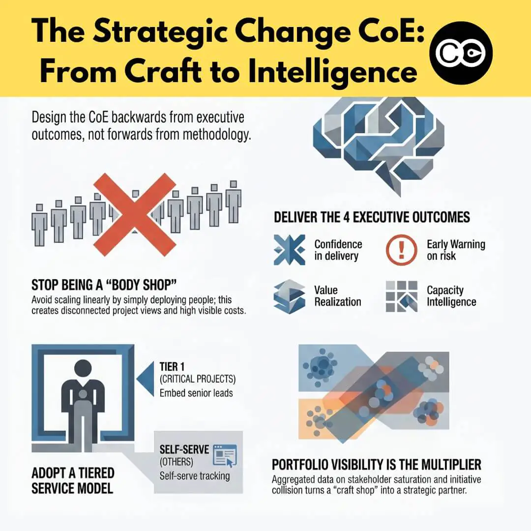
The body-shop model treats the centre as a resourcing pool. It hires change managers centrally and deploys them to projects on demand, billing time and measuring utilisation. This feels strategic because it is operationally indispensable, but it is the more dangerous trap of the two. A body shop scales linearly: more change requires more people, costs rise in lockstep with demand, and the function is permanently one efficiency drive away from being outsourced. Worse, because each practitioner is embedded in a single project, no one in the body shop sees across the portfolio. The function that should hold the enterprise view instead holds dozens of disconnected project views.
The strategic reframe: design backwards from outcomes
The reframe that escapes both traps is to design the centre from executive outcomes backwards. Instead of asking “what does good change management look like and how do we deliver it everywhere”, ask “what do our executives need to be confident about to run successful change and transformation, and what would the centre have to see, know, and do to give them that confidence”. The answer reorganises the whole function. It makes portfolio visibility a core capability rather than an afterthought. It makes prioritisation a deliberate act rather than a queue. And it makes the centre a source of intelligence about enterprise risk, not just a supplier of change-management labour.
Start with the outcomes executives actually want
Executives do not want better change management … necessarily. They want a small number of outcomes, and a change management centre of excellence earns its mandate by being demonstrably the function that improves them. In practice, senior leaders are looking for four things from the change portfolio:
Confidence that the critical initiatives will land. Not activity reports, but a credible read on whether the changes the strategy depends on will actually be adopted.
Early warning on risk. The ability to see an adoption problem, a capacity breach, or a conflict between initiatives early enough to do something about it, rather than in a post-implementation review.
Value realisation. Evidence that the benefits in the business case are being captured, and a clear account of where they are leaking. This is the territory of the return on investment of change management, and it is the language that wins executive sponsorship.
Capacity/adoption intelligence for decisions. A defensible answer to “can the organisation absorb this on top of everything else and how are we on track to fully adopt the changes”, so that portfolio and investment decisions are made against real capacity/adoption rather than optimism.
Notice what is not on that list: methodology adoption, template usage, practitioner accreditation, utilisation. Those are means, and a centre that reports them to executives is answering a question no one asked. Design the centre so that its core reporting speaks directly to the four outcomes above, and the conversation about its value changes entirely.
The capabilities a strategic change CoE needs
A strategic centre needs five core capabilities. The first three are what most centres already have or aspire to. The last two are what separate a strategic capability from a methodology library, and they are the ones most often missing.
Capability
What it delivers
Executive outcome it serves
Maturity signal
Standards and method
A consistent, fit-for-purpose change approach
Confidence in delivery quality
The method is used because it helps, not mandated
Tools and templates
Reusable artefacts that lower the cost of good practice
Efficiency and consistency
Practitioners reach for them by default
Coaching and capability building
Skilled change practitioners and change-capable leaders
Confidence the critical initiatives will land
Business leaders run change competently with light support
Portfolio visibility and intelligence
A live, aggregated view of change load, risk, and conflict across the enterprise
Early warning on risk; capacity intelligence
Leadership consults the centre before approving new initiatives
Governance and prioritisation
Disciplined allocation of scarce change resource to what matters most
Value realisation; capacity intelligence
The centre can say no, or not yet, with evidence
The capability that does the most to make a centre strategic is portfolio visibility. A centre that can see across every active initiative, where the load is concentrated, where initiatives collide, which stakeholder groups are saturated, is a centre that can answer the executive’s real questions. Without it, even a well-run centre is, in effect, a methodology library with a coaching service attached. This is also the capability that benefits most from AI-supported change automation, because aggregating and interpreting portfolio data at scale is precisely the kind of work that is impractical to do manually across dozens of initiatives.
Prioritise by strategic importance, not by who asks first (or is more influential)
The defining constraint of every change centre is that change resource is scarce and demand is effectively unlimited. Every initiative wants a change manager. The body-shop response is to ration by availability and seniority, which means resource flows to the loudest sponsors rather than the most important initiatives. The strategic response is to allocate deliberately, by strategic importance.
This requires the centre to hold an explicit view of which initiatives matter most to the enterprise, and to be willing to differentiate. Not every initiative deserves a dedicated change lead, and pretending otherwise is how centres spread themselves so thin that they add little anywhere. The uncomfortable truth is that a centre trying to support everything equally is implicitly deprioritising the initiatives that matter most, by denying them the depth of support their importance warrants. Prioritisation is not bureaucracy. It is the mechanism by which a scarce resource is pointed at the highest-value work, and it is impossible to do credibly without the portfolio visibility described above.
The shift is easier to see with a concrete picture. Consider a centre with six change practitioners facing a portfolio of thirty initiatives. The body-shop instinct is to spread those six across as many initiatives as possible, giving each a fraction of a change manager and none of them enough. Every initiative gets a name against it, and almost none get real support. The strategic alternative is to look at the thirty through the lens of strategic importance, identify the three that the corporate strategy genuinely depends on, and place a dedicated senior lead on each. The remaining three practitioners then run a coaching model across the next tier of important initiatives, while the rest are served by self-serve enablement and portfolio tracking. The same six people now create disproportionate value on the initiatives that matter, instead of uniform mediocrity across all thirty. The only thing that changed was the willingness to differentiate, backed by a clear view of which initiatives sit where.
A tiered service model for limited change resources
The practical expression of prioritisation is a tiered service model. Rather than offering one undifferentiated service (a change manager on your project) to whoever secures one, a strategic centre offers different levels of service matched to the strategic importance and complexity of each initiative. This is the single most effective move a centre can make to escape the body-shop trap, because it breaks the assumption that the centre’s only product is one-to-one practitioner deployment.
A workable four-tier model looks like this:
Tier
Who it is for
What the centre provides
Resource intensity
Tier 1: Embedded
The handful of enterprise-critical, high-complexity initiatives
A dedicated, senior change lead working full-time on the initiative
High
Tier 2: Guided
Important initiatives with a business-side change owner
A centre consultant who coaches the embedded owner, reviews artefacts, and assures quality on a regular cadence
Medium
Tier 3: Enabled
Standard initiatives run by capable business teams
Self-serve toolkit, templates, training, and scheduled office hours; the business runs its own change
Low
Tier 4: Tracked
Everything else with a change footprint
No direct support, but the initiative is captured in the portfolio view for load, conflict, and saturation monitoring
Minimal
Three things make this model work. First, the tier is assigned by strategic importance and complexity, not by who asks, which is what enforces the prioritisation discipline. Second, every initiative gets something, even if it is only Tier 4 portfolio tracking, which means the centre retains enterprise-wide visibility rather than only seeing the projects it staffs. That visibility is what lets the centre answer portfolio-level questions no body shop can. Third, the model scales without scaling headcount linearly, because most initiatives sit in the lighter tiers, and the centre’s scarce senior practitioners are concentrated where they create the most value.
The tiered model also reframes the centre’s identity. It is no longer “the place you get a change manager”. It is the function that decides, on evidence, how much and what kind of change support each initiative warrants, and that holds the only complete view of change across the enterprise. That is a strategic position. A body shop can never occupy it.
The intelligence layer that makes a centre strategic
Every capability above depends on one thing the traditional centre lacks: a live, aggregated view of change across the whole portfolio. Without it, prioritisation is guesswork, the tiered model cannot see what sits in Tier 4, and the executive outcomes about risk and capacity cannot be answered at all. This is why a change management centre of excellence without portfolio data is, in the end, a methodology library with good intentions.
This is the role a change intelligence platform plays for the centre. Change Compass aggregates impact, load, and risk data across every initiative in the portfolio, giving the centre the enterprise-wide view that turns it from a craft function into a strategic one. It is what lets the centre tell an executive, with evidence, that a stakeholder group is saturated, that two initiatives are about to collide, or that the portfolio is carrying more change than it can absorb. The platform does not replace the centre’s people or method. It gives them the intelligence layer that makes their judgement visible and credible at the enterprise level. For centres evaluating how to build this, the criteria are the same ones covered in any serious assessment of change portfolio management tools.
The maturity journey from informal to embedded
No centre arrives fully formed, and trying to stand up all five capabilities at once is a common way to fail. The journey runs through three broad stages.
Informal
Change is done project by project, with no shared method and no central function. Some practitioners are good, some are not, and there is no enterprise view. The first move is to establish standards and a small core team: the methodology-library foundation, which is a legitimate and necessary starting point.
Functional
The centre exists, owns the method, builds capability, and deploys or coaches practitioners. This is where most centres stall, because it is comfortable and visibly useful. The risk is mistaking this stage for the destination. A functional centre is still answering “are we doing change well”, not “will the portfolio land”.
Strategic and embedded
The centre operates the tiered service model, allocates by strategic importance, holds the portfolio intelligence, and reports to executives in the language of risk, capacity, and value. At this stage the centre is consulted before initiatives are approved, not just after they are funded. It has moved from supporting change to shaping the change agenda, and its mandate is secure because its value is visible in the outcomes leaders care about.
Where to start
If your centre today is a library, a body shop, or both, the highest-value first move is not to add people. It is to build the portfolio view and reframe what the centre reports. Start tracking every initiative with a change footprint, even the ones you do not staff, so you can see the enterprise picture. Then introduce the tiered service model, so your scarce senior practitioners are concentrated on the initiatives that matter most rather than spread evenly across all of them. Finally, change what you report to executives, from activity and utilisation to portfolio risk, capacity, and value realisation. A change management centre of excellence becomes strategic the moment it can answer the question executives actually ask, which is not whether change is being managed, but whether the things the organisation is betting on will land, and whether anyone can see the risk in time. Build the centre that answers that, and it will not be the function that gets cut in the next review. It will be the one the board asks for more of.
Frequently asked questions
What is a change management centre of excellence? A change management centre of excellence is a central function that raises the probability the organisation’s change portfolio succeeds, by owning the change method, building capability, allocating scarce change resource, and holding an enterprise-wide view of change risk and capacity. The strongest centres are defined by their portfolio intelligence and executive alignment, not just by the methodology and templates they maintain.
What does a change COE actually do? At maturity, a change COE does five things: it sets standards and method, provides tools and templates, builds change capability through coaching, maintains portfolio visibility across all initiatives, and runs the governance and prioritisation that directs limited change resource to the most important work. The first three are common; the last two are what make a COE genuinely strategic rather than a methodology library.
How do you structure a change COE with limited resources? Use a tiered service model that matches the level of support to each initiative’s strategic importance and complexity. A typical model has four tiers: a dedicated change lead for enterprise-critical initiatives, a coaching and assurance model for important ones, a self-serve toolkit for standard ones, and portfolio tracking only for the rest. This concentrates scarce senior practitioners where they add the most value and keeps every initiative visible.
How is a change COE different from a project management office? A PMO is generally concerned with delivery of projects: scope, schedule, budget, and dependencies. A change COE is concerned with adoption of the changes those projects create, and with the cumulative impact of change on the workforce. The two are complementary, but a change COE answers questions a PMO cannot, particularly about stakeholder load, change saturation, and whether the organisation can absorb what it is delivering.
How do you measure the value of a change COE? Measure it in the language executives use: confidence that critical initiatives will land, early warning on portfolio risk, value realisation against business cases, and capacity intelligence for investment decisions. Avoid reporting only activity metrics such as methodology adoption or practitioner utilisation, because they describe effort rather than the outcomes leadership actually cares about.
Measuring change is no longer a nice to have. It’s a must-have for a lot of organisations. A lot of stakeholders are now demanding to see and understand what is happening in the world of change. With the enhanced volume of change and therefore the increased investment made by the organisations, it’s no wonder.
Why are stakeholders demanding to see change data?
When we look across the room amongst the various disciplines, data forms an integral part of any function. Finance – tick. HR – tick, yes pretty much all aspects of people are tracked and reported. Operations – tick, as we have all types of performance KPIs and efficiency indicators. Technology – tick, since every part of technology can easily be measured and reported. Marketing – tick, as marketing outcomes are tied to revenue and customer sentiments.
With Covid it is even more the case that data is integral. We can no longer ‘walk the factory’ to sense what is happening. To see what is happening and what is going to happen stakeholders revert to data. In our virtual working environment, stakeholders require a constant dashboard of data to track how things are progressing.
Why is measuring change not an activity?
In the past it used to be that measuring change is only something you do in a project when you want to see if stakeholders are ready for the change. No more. Most organisations have a multitude of changes running concurrently. There is no choice to select 1 or 2 changes to roll out. With significant business challenges, most organisations are finding that running with multiple changes is the norm.
With multiple changes, increased stakeholder demands and appetite, measuring change is no longer just an activity. Measuring change takes a set of structured routines. It requires effective governance design. It takes experience and analytical expertise. Most of all, it is not a once-off event, it is a continual building of organisational muscle and capability. We are heading into the world of change analytics capability.
What is change analytics capability and how do I attain this?
Here are 7 core components of building and maturing change analytics capability:
1. Establishing change data management procedures and practices
This is about setting up the right steps in place so that change data can be identified, collected, and documented. This includes identifying the types of change data you would like to collect and how to go about collecting them. It will be easier to start with the core set of data required and then build from these as needed. This will reduce the risk of overwhelming your stakeholders.
After the right metrics and collection channels have been identified then it’s about building the regular routines to collect and document the metrics.
2. Sponsorship and leadership of change analytics
To really reap the value of change analytics you will need to gain the blessing and sponsorship of your leaders. Well, at least in time. In the beginning, you may need some time to come up with compelling data that tell the story that you want them to before you show your leaders. Eventually, without strong leadership buy-in, change data will not be effectively leveraged to make business decisions.
Getting your leaders’ blessing isn’t just a verbal exercise. It means that they are signing-up to regularly review, discuss and utilise change data to realise business value.
3. Build talent and organisation to support change analytics
Think about the various stakeholders and what you need them to understand in terms of change data. The way you educate stakeholders will be different to how you educate operations managers or the PMO. Plot out how you plan to help them get familiar with change data. Do you need particular roles to support data analysis? Is it a Change Analyst who is focused on the regular upkeep and consolidation of change data? What roles do you need other team members to play?
4. Insight generation
With a full set of change data infront of you, it’s now time to dive into them to generate insights. What is the data telling you? How do they support other data sources to form a clear picture of what is happening in the workforce? Is the data accurate and updated? Generating insights from the data takes skills and experience. It takes the ability to integrate different sources of data outside of change data themselves.
5. Insight application
This is about setting up the right routines and processes so that any insights generated may be discussed and applied. It could be through various governance forums, leadership or planning meetings that insights are shared and socialised. An integral part of this step is applying the insight by making business decisions. For example, do we delay the initiative roll out or invest more to support leaders? Are there reasons for us to speed up roll out to support the workforce?
6. Change analytics capability development
Change analytics is a capability.
With good change data emerging, you also need to have the right people with the right skills to collect, process and interpret the data. You may also want to think about which teams need what analytical skills. Do you have people in the team who are sufficiently analytical and data-oriented? Do they know how to interpret the data to form trends and predictions?
You may want to think about organising capability sessions or training to strengthen data analysis skills. Are there members in the different governance bodies that need support to be more confident in using change data?
7. Realising business value through change analytics
The last part of the equation is realising business value through change analytics. This is about tracking and documenting the value realised through using change analytics. It could include incidents where the business decision made has lead to significant risk reduction or operations protection. It could be enhanced leadership confidence mitigating risks in negative customer experience. Tracking value generated is critical to make clear to stakeholders the value of the overall investment.
If you found this article useful please share.
Do you have questions on measuring change for your organisation? Ping us on our chat.