Peter Drucker’s principle, that you can only manage what you measure, has been cited in management contexts for decades. Applied to change management, it exposes one of the field’s most persistent problems. Most organisations are measuring the wrong things. They are measuring activity: communications sent, training sessions delivered, stakeholder engagement meetings held. These metrics demonstrate that change management work is being done. They do not demonstrate that change is happening.
The consequence of measuring the wrong things is that you end up managing the wrong things. Change functions that track activity metrics optimise for activity. They ensure training completion rates are high. They send communications on schedule. They hold engagement sessions. And they are routinely surprised when adoption at go-live is lower than expected, because the thing they were actually trying to achieve, a genuine shift in how people work, was never the thing they were measuring.
Getting measuring change management right requires a deliberate shift: from activity metrics to adoption metrics, from go-live snapshots to trend data over time, and from programme-level reporting to portfolio-level visibility. Each shift is technically straightforward. Collectively, they transform the information a change function has available and the decisions it enables.
Why activity metrics dominate and why they mislead
Activity metrics are appealing for two reasons. They are easy to collect, and they show progress in real time. The number of stakeholders briefed grows with each workshop held. Training completion percentage climbs as learning modules are finished. Communication send dates tick off against the plan.
The problem is that these metrics tell you about inputs, not outcomes. A training completion rate of 95% tells you that 95% of employees sat through a training module. It tells you nothing about whether they are working differently. A stakeholder briefing tells you that a conversation happened. It does not tell you whether the stakeholder is now an active advocate for the change, actively resistant to it, or somewhere in between.
AIHR’s guide to change management metrics draws a clear distinction between process metrics, which track activities completed, and outcome metrics, which track whether the change is actually taking hold. Process metrics are necessary but not sufficient. Without outcome metrics, a change function is flying blind on the question that matters: is the change happening?
The deeper problem with activity-focused measurement is what it rewards. A change team assessed primarily on whether communications are on schedule and training is completed will optimise for those things. It will not necessarily prioritise the harder, less quantifiable work of identifying and removing the structural barriers to adoption, coaching managers through their own uncertainty, or advocating for performance framework changes that align incentives with the new ways of working. Those interventions require time and attention. Without metrics that value them, they get crowded out.
The three levels of change measurement
A robust measuring change management framework operates at three levels, each of which answers a different question.
Level 1: Adoption measurement
The foundational level tracks whether people are actually changing how they work. Adoption metrics vary by change type but typically include:
Active usage rates for new systems and tools, measured at the role-group level, not just organisation-wide
Behavioural indicators specific to the change: are decisions being made using the new process? Are outputs conforming to the new standard?
Error rates and workaround patterns, which indicate where the new way of working is breaking down in practice
Self-reported proficiency, gathered through structured check-ins rather than end-of-training surveys
Adoption measurement requires a baseline. You need to know what behaviour looked like before the change to assess whether it has shifted. This sounds obvious but is often skipped, leaving change functions unable to demonstrate movement even when significant movement has occurred.
Level 2: Readiness and leading indicators
The second level focuses on the conditions for adoption rather than adoption itself. These are leading indicators that predict future adoption outcomes:
Manager confidence and capability in supporting the change at team level
Stakeholder sentiment and the degree to which key influencers are actively supporting versus passively or actively resisting
Awareness and understanding scores, which indicate whether employees know what is changing, why, and what is expected of them
Access to support, whether employees know where to go when they encounter difficulty with the new way of working
Leading indicators are valuable because they can identify problems while there is still time to intervene. An adoption measurement taken at go-live tells you what happened. Leading indicators taken four weeks before go-live give you the opportunity to change what happens.
Level 3: Business outcome linkage
The third level connects change management work to business results. This is the most difficult level to measure and the most persuasive for executive audiences.
Business outcome metrics vary by change programme. For a technology implementation, they might include productivity measures or error rates in the affected process. For an organisational restructure, they might include time-to-effectiveness for teams in new configurations. For a culture change programme, they might include customer satisfaction or employee engagement trends.
The practical challenge at this level is attribution. Business outcomes are affected by many things beyond change management quality. The most effective approach is not to claim sole attribution, but to demonstrate contribution through correlation and comparison: how do adoption levels compare between groups that received intensive change support and those that received standard support? How does benefits realisation timing track against adoption curve progress?
Common mistakes in change measurement frameworks
Several patterns recur in how change measurement frameworks go wrong, beyond the activity-versus-outcome problem.
Measuring at go-live rather than over time. Change adoption is not a moment; it is a curve. Most organisations take a readiness snapshot at go-live and a benefits measurement six months later. The period in between, when adoption is building, stalling, or reversing, is often invisible. Organisations that measure adoption at monthly intervals across the first six months after go-live consistently identify problems that go-live-only measurement misses.
Using the same metrics for all change types. A technology adoption and a cultural change require different measurement approaches. A process change and an organisational restructure have different adoption timelines. Generic measurement frameworks applied uniformly across a change portfolio produce data that is too coarse to act on.
Reporting averages across heterogeneous groups. An organisation-wide adoption rate of 68% might mask a rate of 90% in one business unit and 35% in another. The action required in those two units is entirely different. Effective change measurement reports adoption by employee group, role level, and geography rather than flattening everything to a single number.
Treating employee survey responses as objective data. Pulse surveys and change readiness assessments reflect what employees are willing to say, which is shaped by psychological safety, survey fatigue, and the perceived consequences of honest feedback. They are useful inputs but should be triangulated with behavioural data where possible.
Portfolio-level measurement: the view that matters most
Individual programme measurement, even done well, produces a fragmented picture. A change function that can tell you adoption rates for each of its ten active programmes cannot necessarily tell you the cumulative change burden on specific employee groups, whether the portfolio as a whole is delivering adoption at the rate the organisation’s transformation strategy requires, or where the systemic patterns in adoption performance suggest structural capability issues.
Portfolio-level measurement addresses these gaps. It requires:
A consistent measurement taxonomy across programmes, so that adoption data from different initiatives can be aggregated meaningfully
A portfolio adoption dashboard that shows trend lines by employee group across all active programmes, not just point-in-time scores for individual initiatives
Comparative analysis across programmes to identify patterns: are certain types of change consistently underperforming? Are certain employee groups consistently showing lower adoption rates regardless of which programme is being measured?
The comparison question is particularly valuable. If a specific business unit shows below-target adoption across five consecutive change programmes, that is a portfolio signal, not a programme signal. The root cause is more likely to be leadership capability, change saturation, or structural friction in that unit than a problem with any specific initiative. Programme-level measurement cannot surface this insight. Portfolio-level measurement can.
Tools such as The Change Compass are purpose-built for this portfolio measurement challenge: aggregating adoption data across programmes, tracking cumulative impact by employee group, and generating the portfolio-level view that enables the conversations with business leadership that individual programme reporting cannot support.
Making the case for better measurement
For change leaders who need to build the internal case for investing in measurement capability, the most compelling argument is opportunity cost. What decisions is the organisation currently unable to make, or making badly, because of gaps in change measurement data?
Specific examples that resonate with executive audiences include: the inability to predict which programmes are at risk of underperforming on adoption before go-live; the absence of data to support a sequencing decision when two major programmes are planned to land simultaneously on the same employee group; and the difficulty of demonstrating the contribution of change management investment to business outcomes when outcomes are tracked but change quality is not.
These are not abstract arguments. They describe real decisions that organisations make with inadequate information every quarter. A measurement framework that closes these gaps has demonstrable decision value, not just methodological value.
A practical starting point
Building a full three-level measurement framework from scratch is a multi-year effort. For most change functions, the most valuable immediate step is to add a single adoption metric to at least one current programme that is not currently being measured.
The most useful first adoption metric is typically active usage rate by role group, tracked monthly for the first six months post go-live, compared against a baseline taken in the last month before go-live. This single data series will generate more actionable insight about whether the change is landing than any number of communications-sent or training-completed metrics.
From there, the measurement framework can be built progressively: adding leading indicators, extending to business outcome linkage for strategic programmes, and eventually aggregating to portfolio level as the methodology matures. The principle at each stage is the same. Measure what you are trying to achieve, not what is easiest to count.
Frequently asked questions
What should change management metrics actually measure?
Effective change metrics measure whether behaviour has changed, not whether change activities were completed. The primary outcomes to measure are adoption rate by role group, which tracks whether people are working in the new way; readiness and capability scores, which are leading indicators of adoption; and business outcome contribution, which connects change quality to the results the change programme was designed to achieve.
What is the difference between change management activity metrics and adoption metrics?
Activity metrics track inputs: communications sent, training completed, stakeholder briefings held. Adoption metrics track outputs: whether employees in specific roles are consistently working in the new way. Activity metrics are easy to collect and show progress in real time, which is why they dominate most change measurement frameworks. The problem is that high activity metrics and low adoption outcomes frequently coexist, because completing training and changing behaviour are different things.
How often should you measure change adoption?
More frequently than most organisations do. A readiness baseline before go-live, monthly adoption tracking for the first six months post go-live, and a benefits realisation review at months six and twelve gives a meaningful picture of how adoption is progressing. Organisations that measure adoption only at go-live miss the adoption curve in its entirety and have no early warning of problems that could be addressed with timely intervention.
How do you measure the ROI of change management?
The most practical approach for most organisations is to track adoption levels and benefits realisation timing across programmes where change management was applied, and compare them to a realistic alternative scenario or historical baseline. Prosci’s research consistently finds that programmes with effective change management achieve significantly better adoption and benefits realisation than those without. Building an internal evidence base over multiple programmes creates a credible case for change management ROI that external benchmarks alone cannot provide.
What is portfolio-level change measurement?
Portfolio-level change measurement aggregates adoption data, impact data, and readiness indicators across all active change programmes to give a view of how change is landing across the organisation as a whole. It enables comparisons across programmes, identification of systemic adoption patterns, and cumulative load analysis by employee group. It is the level of measurement that enables the strategic conversations with business leadership that programme-level reporting cannot support.
References
AIHR. 15 Important Change Management Metrics To Track in 2026. https://www.aihr.com/blog/change-management-metrics/
Prosci. Metrics for Measuring Change Management. https://www.prosci.com/blog/metrics-for-measuring-change-management
Prosci. The Correlation Between Change Management and Project Success. https://www.prosci.com/blog/the-correlation-between-change-management-and-project-success
Freshworks. 12 Change Management Metrics and KPIs to Track in 2025. https://www.freshworks.com/change-management/metrics/
In every organisational change, there are two fundamentally different experiences unfolding simultaneously. Some people are change drivers – those who initiate, design, or lead the change. Others are change receivers – those who are asked to adopt it, adapt to it, and absorb its consequences in their daily work. These two experiences are so different that they might as well belong to different transformations. And yet, in most organisations, the people in the driver seat rarely stop to consider what the passenger seat actually feels like.
The challenge runs deeper than a lack of empathy, though empathy certainly matters. The structural reality of most large organisations is that the distinction between driver and receiver is far less clean than it appears on an organisational chart. A general manager leading a major technology transformation for their division is simultaneously a change driver – setting direction, allocating resources, communicating the vision – and a change receiver, absorbing a new enterprise strategy handed down from the executive team. Middle managers occupy this dual role even more acutely. They are expected to champion changes they had no hand in designing while simultaneously managing their own uncertainty about what those changes mean for their role, their team, and their future.
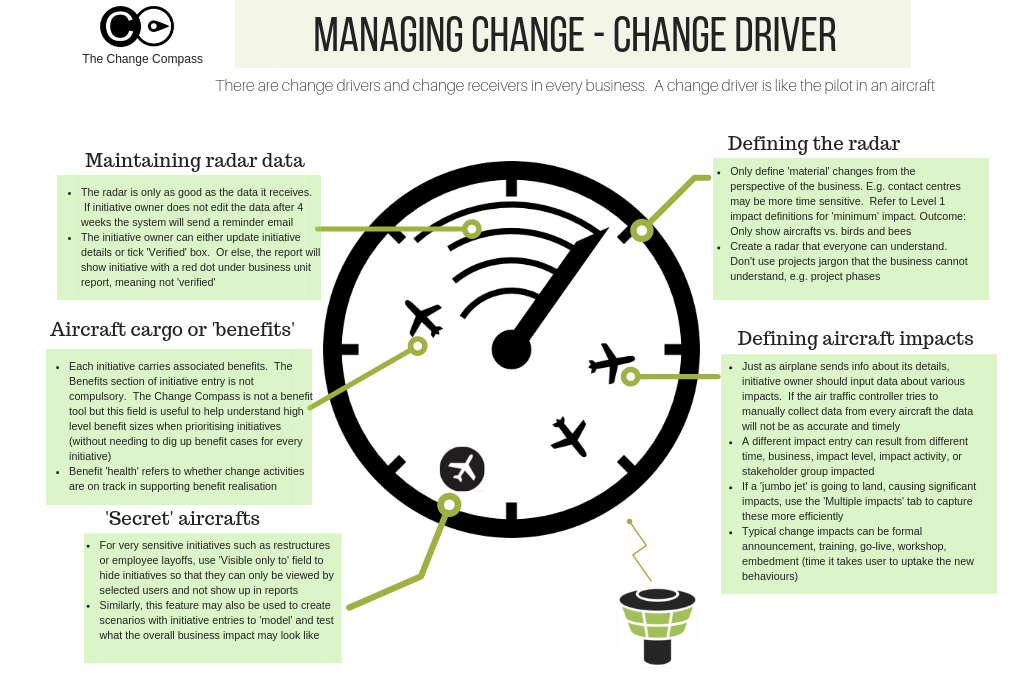
Understanding this driver-receiver dynamic is not merely an academic exercise. It is one of the most practical lenses available for diagnosing why change programmes generate resistance, why implementation falters at the middle management layer, and why even well-designed changes land differently than their architects intended. Download the Managing Change as a Change Driver infographic for a visual summary of the key concepts explored in this article.
What it means to be a change driver
Being a change driver means having some degree of ownership over the design, direction, or delivery of a change. This ownership comes in different forms. Senior leaders who commission a transformation are change drivers at the strategic level – they have defined the why and the what, allocated the resources, and set the success criteria. Programme managers and change practitioners who design the implementation approach are change drivers at the execution level – they translate the strategic intent into a delivery plan, a stakeholder engagement approach, and a benefits realisation framework. Business unit leaders who sponsor a change within their division are change drivers at the operational level – they are accountable for whether the change lands in their part of the organisation.
What these different forms of change driver role have in common is a sense of agency – the feeling, accurate or not, that one has some control over what is happening and why. This sense of agency is psychologically significant. Research on the psychology of control published in Harvard Business Review consistently finds that perceived agency – the belief that one’s actions matter and that outcomes are at least partially within one’s influence – is one of the strongest predictors of how well people tolerate uncertainty and change. Change drivers, by virtue of their role, typically have more of this than change receivers.
This agency advantage creates a blind spot. The change driver’s experience of a transformation – one of purposeful action, problem-solving, and progress – is so different from the change receiver’s experience of the same transformation that it is genuinely difficult for drivers to accurately model what receivers are experiencing. They know the rationale, have rehearsed the answers to likely questions, and understand the endgame. Receivers, particularly in the early stages of a change, have none of these advantages.
The change receiver experience: what drivers consistently underestimate
The experience of being a change receiver is defined primarily by uncertainty and limited agency. Unlike the change driver who has been working on the programme for months and has internalised its logic, the change receiver typically encounters the change through a communication – a town hall, an email, a team meeting – that gives them a fraction of the context the driver has accumulated over weeks or months of planning.
The questions that immediately arise for most change receivers are intensely personal and practical: What does this mean for my role? Will my team still exist? Am I being asked to learn something I am not sure I can learn? Do I have a say in any of this? These questions are not unreasonable. They are the natural cognitive response to being told that the way one has been working – perhaps for years – is being replaced. Yet they are often precisely the questions that change communications fail to answer, because the change driver’s instinct is to communicate at the level of organisational rationale rather than individual impact.
Prosci’s research on employee experience during change consistently finds that the most common reason employees resist change is not disagreement with the change’s strategic rationale but rather uncertainty about what it means for them personally. The receiver’s primary concern is not “is this change good for the organisation?” It is “is this change good for me, and do I have the support I need to navigate it?” Change drivers who communicate only to the first question and neglect the second consistently generate more resistance than those who address both.
The dual-role challenge: when drivers are also receivers
The most complex and under-examined position in any change programme is the one occupied by people who are simultaneously change drivers and change receivers. This is the standard condition for middle managers and business unit leaders in large organisations. They are asked to lead their teams through a change they did not design, often in a context where they themselves are uncertain about the direction and may have significant reservations about the approach. They are expected to be visible champions of a change while processing their own reactions to it – often without adequate support or acknowledgment that their situation is genuinely more difficult than either pure driver or pure receiver.
The consequences of this dual-role tension play out in predictable ways. Leaders in this position often communicate the change with less conviction than the programme requires, because they are transmitting a message they have not fully internalised. They are more likely to signal their own ambivalence – through body language, through qualifications in how they present the change, through the questions they choose not to answer – than leaders who genuinely believe in what they are championing. Employees are highly attuned to this authenticity gap, and an ambivalent manager is frequently more damaging to change adoption than no communication at all.
McKinsey research on the drivers of transformation success identifies leader commitment as one of the most powerful predictors of change outcomes. But commitment cannot simply be mandated. Leaders who are themselves experiencing significant uncertainty about a change – who have not been adequately informed, engaged, or supported in processing their own receiver experience – cannot credibly project commitment. Addressing the receiver experience of leaders is not a luxury. It is a precondition for effective change sponsorship at the level where change actually lives or dies: the middle of the organisation.
Practical strategies for managing well from the driver seat
For those in the change driver role – whether as senior sponsors, programme leaders, or business unit champions – there are specific practices that consistently improve the receiver experience and increase the likelihood of sustainable adoption.
The first is deliberate perspective-taking. Before launching any major change communication or engagement activity, effective change drivers systematically ask: what does this look like from the receiver’s perspective? What is the most important question someone in this role or this team will ask when they hear this news, and does our communication answer it? This sounds straightforward, but it requires actively suppressing the driver’s instinct to lead with the strategic rationale and instead leading with the personal impact. The business case matters, but it is not what moves people. What moves them is a clear, honest answer to “what does this mean for me?”
The second practice is creating genuine two-way engagement – not the performative consultation that many change programmes offer, where feedback is solicited but rarely influences the design, but the kind of engagement where receiver input actually shapes decisions. When employees see that the concerns they raised in a listening session have been visibly reflected in how the change has been adjusted, their relationship to the change shifts from passive recipient to active participant. This shift in psychological ownership is one of the most powerful accelerators of adoption available to any change driver.
The third practice is explicit support for leaders in the dual-role. This means giving business unit leaders and middle managers sufficient advance notice and context to process their own receiver experience before they are asked to communicate to their teams. It means creating forums where they can ask the difficult questions, express genuine concerns, and receive honest answers – rather than being handed a communication pack and asked to cascade key messages they may not believe. It means recognising that asking someone to lead others through change while they are still navigating their own is an extraordinary ask, and structuring the programme to provide the support that makes it possible.
How change load shapes the driver-receiver experience
The driver-receiver dynamic does not exist in a vacuum. It is powerfully shaped by the total volume of change that an organisation’s people are absorbing at any given time. In organisations with multiple concurrent change programmes, the same team that is being asked to receive and adopt several simultaneous changes is also likely to have leaders who are driving some of those changes while receiving others. The cognitive and emotional load of managing both roles across multiple changes is substantial – and it compounds in ways that organisations with only programme-level visibility consistently fail to detect.
Gartner’s research on change fatigue found that employees experiencing high levels of concurrent change show dramatically reduced willingness to engage with any individual change, even those they might otherwise have supported. The mechanism is the depletion of adaptive capacity – the cognitive and emotional resources required to absorb, process, and act on change-related demands. When those resources are exhausted by simultaneous changes, even a well-designed change with clear rationale and strong sponsorship will land poorly.
For change drivers, this has a critical practical implication: the effectiveness of any individual change is not solely a function of how well that change is designed and communicated. It is also a function of how much other change the receivers are simultaneously absorbing. A change that would land smoothly if it were the only thing happening to a team may generate significant resistance if it is the fourth major change hitting that team in six months. Managing the driver-receiver dynamic therefore requires portfolio-level visibility into the cumulative change load on specific employee groups – something that no single programme team can produce for itself.
Using data to bridge the driver-receiver gap
One of the most consequential improvements a change driver can make is developing access to objective data about the receiver experience. This goes beyond the anecdotal feedback that naturally reaches programme leaders – which is systematically biased towards either extreme positive or extreme negative responses – and towards structured measurement of where in the organisation receivers are struggling with the change and why.
Platforms like The Change Compass provide change drivers with exactly this kind of portfolio-level visibility. By tracking change impact data across all concurrent programmes, and aggregating it by team or role group, change drivers can see which parts of the organisation are experiencing the highest cumulative change load – and can use that data to make informed decisions about sequencing, pacing, and where to concentrate additional support. Rather than relying on intuition about what the receiver experience looks like, they can navigate the programme with evidence about where the pressure is greatest and where additional intervention is likely to make the most difference.
This data-informed approach does not replace the human skills of empathy, communication, and leadership that the driver-receiver dynamic demands. But it provides the factual foundation that makes those skills more targeted and more effective. A change driver who knows that a specific team is at or near its absorption capacity can make a different engagement decision than one who is guessing. A sponsor who can see adoption indicators disaggregated by business unit can target their visible commitment where it will have the greatest impact on momentum and morale.
Building organisational capability across both roles
The most resilient change capability in an organisation is one where the distinction between driver and receiver is not treated as fixed. People who have had deep experience as change receivers – who have navigated significant uncertainty, absorbed major changes to their role and their way of working, and come through the experience intact – bring insight to the driver role that cannot be acquired any other way. And change drivers who deliberately create conditions that allow receivers to understand, question, and contribute to change design are building the kind of organisational trust that makes future changes land more smoothly.
Prosci’s change management maturity model identifies the highest levels of organisational change maturity as those where change capability is not concentrated in a specialist team but embedded broadly – where managers at all levels understand the receiver experience and actively manage it as part of their leadership responsibility. Reaching this level of maturity requires deliberate investment in building empathy across the driver-receiver boundary: structured listening, honest communication about what is known and unknown, visible responsiveness to receiver feedback, and genuine recognition that the people being asked to change are doing something genuinely difficult.
Organisations that treat their change receivers as passive subjects of transformation – rather than as active participants whose experience and engagement is the primary determinant of whether the transformation succeeds – consistently underperform. Those that invest in closing the driver-receiver gap, through better data, better communication, better leader preparation, and more honest engagement, build something more durable than any individual change programme: an organisational culture where change is managed as a shared endeavour rather than imposed from above.
Frequently asked questions
What is the difference between a change driver and a change receiver?
A change driver is someone who initiates, designs, or leads a change – they have some degree of agency over what is happening and why. A change receiver is someone who is asked to adopt and adapt to a change they did not design. The key insight is that these roles frequently overlap: most leaders and managers are simultaneously driving change downward through their teams while receiving change from above, creating a dual-role challenge that requires specific support and preparation.
Why do change drivers and change receivers experience transformation so differently?
Change drivers typically have accumulated context, understand the rationale, and have a sense of agency over the process. Change receivers encounter the change with less information, experience more uncertainty, and have limited influence over what is happening. This asymmetry of information and control creates fundamentally different psychological experiences of the same change, and it is the primary reason that change drivers frequently underestimate the difficulty of the receiver experience.
How should change drivers manage the dual-role challenge?
Leaders in the dual-role – simultaneously driving and receiving change – need specific support to perform effectively in both dimensions. This includes advance notice and context to process their own receiver experience before they are asked to communicate to their teams, forums to raise genuine questions and concerns, and honest acknowledgment of the complexity of their position. Without this support, dual-role leaders frequently communicate change with insufficient conviction, which damages adoption outcomes at exactly the level where change succeeds or fails.
How does portfolio-level change load affect the driver-receiver dynamic?
When employees are absorbing multiple concurrent changes, their adaptive capacity – the cognitive and emotional resources available for change – becomes depleted. This makes even well-designed changes land more poorly than they would in isolation. Change drivers need portfolio-level visibility into the cumulative change load on their receivers to make informed decisions about timing, pacing, and where to concentrate support. Programme-level measurement alone cannot provide this view.
A critical part of agile is being able to iterate and continuously improve in order to deliver an optimal solution. Rather than one large change release, an agile project would break this down into smaller releases. Each release will go through an iterative process to test, collect data, evaluate and use any learning to improve the next release.
If an agile approach is appropriate we should also adopt this same approach in how we deliver change management activities. This means that we should be running a series of experiments to test, learn, document and improve on how we deliver change to the organization.
This contrasts to how most change managers would approach developing and delivering the change approach. The standard approach is collecting various information about the change, talk to key stakeholders about the change, and then form a view based on previous experiences in terms of what change approach would work for this initiative. Then, this approach would be present to stakeholders to get their blessing before executing on the change approach.
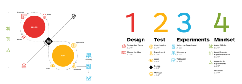
Below is an example of planning to run experiments in an agile environment from Alex Osterwalder, the founder of Strategyzer. First is designing the experiment, shaping its hypothesis, and testing it, which involves looking at the outcome data, learning from the experiment and making any relevant decisions based on the outcome.
Referenced from Alexander Osterwalder.
In this first part of a series on practical agile applications for change managers we focus on communications.
Communicating for change is a critical part of managing change and is also one that can easily be tested using a series of experiments.
The Campaign Monitor has outlined a series of aspects in which emails can easily be tested. These include:
Subject headlines
Pre-header
Date and time
Call to action
Content
Digital businesses also often conduct A/B Testing whereby 2 different sets of content are designed and delivered at the same time for the duration of the test. At the conclusion of the experiment we can then look at the results to see which one did better based on audience responses.
How do we measure communications experiments?
There are several ways to do this:
Readership – For intranet pages, your corporate affairs rep can usually access readership statistics
Surveys – Send surveys to the audience to ask for feedback
Focus groups – Run small focus groups for feedback
There is one area in which corporate can better learn from digital businesses – using digital tools to measure and track communications. For example, you can send out emails promoting a new intranet page, and then check back to see how many users actually visited the site. The results may be helpful as an initial experiment before launching the email to a wider audience group to achieve maximum results.
There are plenty of external tools such as ActiveCampaign or Mailchimp where you are able to use features such as:
A/B testing results
Send emails are certain times or dates
Automatic email responses
Target particular segments
View and click rates
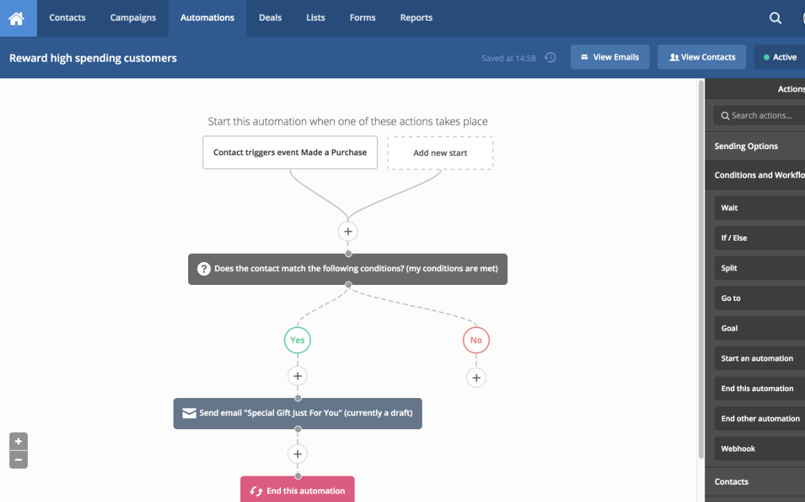
In the following diagram you can see an example that it’s not difficult to build a drip-email series of interactions with your stakeholders based on their responses (or lack of).
It’s feasible to use these tools for a project where you can run a series of experiments and measure outcomes to support your change iterations.
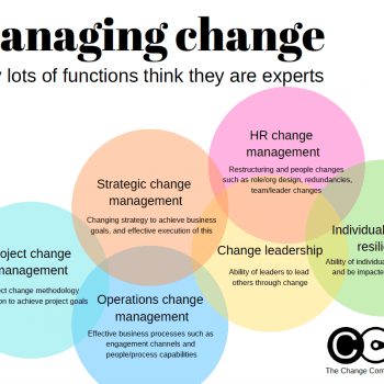
Walk into any large organisation and ask which team owns change management. The answers you receive will be illuminating. HR will tell you it is fundamentally a people and culture discipline. The project management office will point out that every project methodology includes a change stream. Communications will argue that behaviour change is impossible without the right messages. IT will note that system adoption is the primary delivery risk on their programmes. And depending on the organisation, finance, legal, or operations may each have their own claim.
This is not a trivial naming dispute. When multiple functions each believe they hold the primary expertise in managing change, the practical result is fragmented accountability, duplicated effort, conflicting methodologies, and employees who receive inconsistent and often contradictory guidance about the same transformation. Understanding why this happens — and what it means for how organisations should develop genuine change capability — is one of the more important questions in organisational design.
Why every function has a partial claim
The reason so many functions feel entitled to claim change management expertise is that they are all, in a genuine sense, partially right. Change management as a discipline draws on theories and practices that have been developed across psychology, organisational behaviour, communications, project management, and HR. Each of these fields has made real contributions to our understanding of how individuals and organisations adapt. The problem arises when a partial contribution is mistaken for the whole discipline.
HR’s claim is grounded in the fact that people are at the centre of every change. Resistance, capability development, role redesign, and cultural alignment are all genuinely HR concerns, and the best HR practitioners bring sophisticated people skills to change work. What HR frameworks often underweight is the structural and portfolio-level complexity of managing multiple concurrent changes — the governance, sequencing, and organisational capacity questions that are distinct from any individual people initiative.
Project management’s claim is grounded in the reality that most organisational change is delivered through projects. Disciplined planning, risk management, milestone tracking, and resource allocation are essential to any successful transformation. But project management frameworks are designed to deliver defined outputs within a scope boundary. Change management is concerned with what happens to the organisation after the outputs are delivered — whether behaviours actually shift, whether capabilities are actually built, whether the change is actually absorbed into how work gets done.
Communications’ claim is well-founded because uncertainty is the primary psychological driver of change-related stress, and communication is the primary tool for replacing uncertainty with clarity. But communication without genuine understanding of the change’s impact on specific roles and workflows becomes messaging without meaning — polished announcements that tell employees what is changing without helping them understand what it means for how they do their job on Monday morning.
IT’s claim stems from the fact that many of the most significant organisational changes in recent decades have been system implementations — ERP rollouts, CRM migrations, digital transformation programmes — where adoption of a new technology platform is the primary measure of success. Technology change is real change management work, but it is a subset. Organisations that define change management as system adoption have implicitly limited their change capability to one category of change, leaving them less equipped for structural reorganisations, process redesigns, or strategic pivots that do not have a technology component.
The consequences of fragmented ownership
When change management ownership is fragmented across functions, several predictable problems emerge. The first is methodology inconsistency. Employees who have been through five transformations in three years may have experienced five different approaches to stakeholder engagement, five different formats for impact assessment, five different ideas about what “being consulted” means. This inconsistency erodes trust. When people cannot predict how change will be handled, they become cynical about the process before it has even begun.
The second problem is invisible cumulative load. No single function has a view across the entire change portfolio. HR sees the people initiatives. The PMO sees the project list. Communications sees the announcement schedule. But no one is looking at what all of these add up to for a specific team or role group at a specific point in time. The result is change saturation — teams absorbing more concurrent change than their adaptive capacity can handle — that is entirely visible in retrospect but was invisible to every function at the time.
The third problem is accountability diffusion. When everyone owns change management, no one is truly accountable for whether a change lands well. The PMO can point to on-time delivery. HR can point to the training programme that was run. Communications can point to the number of messages sent. But if adoption is low, productivity has not recovered, and employees are still doing things the old way six months after go-live, the responsibility can be passed indefinitely between functions. No one is accountable for the outcome, only for their slice of the input.
What genuine organisational change capability actually looks like
Genuine change management capability is not located in any single function, but it does require a recognised discipline with its own body of knowledge, its own accountability structures, and its own seat at the table when strategic decisions are made. The most capable organisations treat change management the way they treat other enterprise capabilities — as something that requires deliberate investment, clear ownership, and measurable standards.
The characteristics of organisations with mature change capability are well documented in the research literature. Prosci’s longitudinal research on change management best practices consistently finds that the highest-performing organisations share several features: dedicated change management practitioners who are not also wearing project management or HR hats; executive sponsorship that is active rather than nominal; structured methodology applied consistently across programmes; and formal mechanisms for capturing and applying lessons from past changes.
Critically, mature change capability is not about the size of the change team. Small change teams that have organisational authority, cross-portfolio visibility, and rigorous methodology consistently outperform larger teams that are embedded in individual functions without coordination. The key variable is not resource quantity but structural position.
The role of data in adjudicating functional claims
One of the reasons functional disputes about change management ownership persist is that they are typically conducted without data. Each function makes its claim on the basis of its professional identity and its past experience, not on the basis of evidence about what actually drives change outcomes in the specific organisation. This is a solvable problem.
Organisations that measure change outcomes — adoption rates, productivity recovery, attrition during transitions, error rates in new processes — quickly develop an evidence base for understanding which factors actually determine whether changes land well. In most organisations that collect this data systematically, the findings consistently point to the same variables: the quality of people leadership through the transition, the degree to which employees understood what the change meant for their specific role, the pace of change relative to the organisation’s absorption capacity, and the degree to which concerns raised during implementation were visibly acted upon.
Notably, these factors cut across all the functional claims. Quality people leadership is relevant to HR’s concerns. Understanding what change means for specific roles is a communications challenge. Absorption capacity is a portfolio management question. Acting on concerns is a governance issue. The data, in other words, vindicates the view that change management is genuinely cross-functional — while also making clear that it cannot be owned by any single function in isolation.
This is precisely the insight that drives the design of platforms like The Change Compass, which provides organisations with portfolio-level visibility into change load, impact, and capacity across the enterprise. Rather than giving any one function a proprietary view of the change landscape, this kind of platform creates a shared data layer that all functions can draw on — and that makes the aggregate picture visible to decision-makers who would otherwise be managing blind.
A framework for resolving functional tension
Rather than attempting to definitively answer which function should own change management — a question that will be answered differently in every organisation depending on history, structure, and culture — it is more useful to describe the conditions under which cross-functional change capability works well.
The first condition is a single point of accountability. Even when change management work is distributed across functions, there needs to be one person or team that is ultimately accountable for whether the organisation’s change portfolio is being managed well. This does not mean centralising all change activity — it means ensuring there is someone whose job it is to hold the cross-portfolio view and escalate when capacity constraints, methodology inconsistencies, or accountability gaps are creating risk.
The second condition is agreed methodology. Functions can and should contribute their specialist expertise to change work. But the overarching framework — how impact is assessed, how stakeholders are engaged, how readiness is measured, how adoption is tracked — needs to be consistent across programmes. Agreed methodology does not suppress functional contribution; it channels it.
The third condition is shared data. When all functions can see the same picture of the organisation’s change landscape — the same impact data, the same capacity measures, the same adoption indicators — functional disputes about ownership become less important, because the shared data makes the organisational need clear regardless of which team is doing the work. Harvard Business Review research on organisational judgment consistently finds that shared information reduces the inter-functional conflicts that arise from asymmetric awareness.
The fourth condition is executive sponsorship that cuts across functions. When the senior leader who sponsors the change management capability is positioned above the functional disputes — at the executive team level rather than embedded within any single function — it becomes possible to make governance decisions about methodology, accountability, and resource allocation that no individual function can make unilaterally.
Building maturity rather than winning territory
The framing of change management ownership as a territorial dispute — which function wins? — is ultimately counterproductive. The more useful question is: how does the organisation build mature change capability, and what role does each function play in that maturity journey?
Prosci’s change management maturity model describes five levels of organisational capability, from ad hoc and project-specific at the lower end to organisational competency and standardised methodology at the higher end. What distinguishes higher-maturity organisations is not that they have resolved the question of which function owns change management. It is that they have transcended the functional dispute entirely — change management has become an enterprise capability with its own governance, its own standards, and its own accountability, drawing on but not subordinated to any single function.
Reaching that level of maturity requires each function to make a genuine contribution: HR bringing its understanding of people and culture, the PMO bringing its project governance rigour, Communications bringing its ability to create meaning and clarity, IT bringing its implementation discipline. But it also requires each function to recognise the limits of its contribution — the things that its professional lens does not equip it to see.
The organisations that manage change most effectively are not those where one function has won the territorial dispute. They are those where the discipline has grown beyond the territory entirely.
Frequently asked questions
Why do so many functions claim change management expertise?
Change management draws on knowledge from HR, communications, project management, psychology, and organisational design. Each of these fields makes a genuine partial contribution to the discipline, which means that practitioners from each field can legitimately claim relevant expertise. The problem arises when a partial contribution is mistaken for the whole discipline, leading to fragmented ownership and inconsistent practice.
What are the consequences of fragmented change management ownership?
Fragmented ownership produces methodology inconsistency across programmes, invisible cumulative change load on employee groups, and diffused accountability for outcomes. When every function claims ownership and none is truly responsible for whether changes land well, the organisation loses the ability to learn systematically from change experience and to govern the change portfolio as a coherent whole.
Does change management belong in HR or the PMO?
Neither location is inherently correct. What matters more than location is structural position, accountability clarity, and methodology consistency. Change management capability that sits within HR tends to be strong on people and culture dimensions but may lack portfolio governance. Capability that sits within the PMO tends to be strong on project discipline but may underweight the sustained adoption and cultural dimensions of change. Many mature organisations establish change management as a distinct capability that draws on both functions without being subordinated to either.
What does genuine organisational change maturity look like?
Mature change capability is characterised by consistent methodology applied across programmes, cross-portfolio visibility into change load and capacity, clear accountability for change outcomes rather than just change activities, and systematic capture and application of lessons from past programmes. It is an enterprise capability with its own governance and standards, rather than an activity embedded within any single functional team.
Heat maps have become the default visual language of organisational change management. Almost every change team produces one. They are familiar, easy to build, and satisfying to present, colourful grids that give the impression of analytical rigour. But here is the uncomfortable truth: for most organisations, heat maps are where change analytics begins and ends.
Prosci’s benchmarking research consistently shows that organisations with excellent change management are seven times more likely to meet project objectives than those with poor change management (88% vs 13%). And a key differentiator between excellent and poor is measurement capability. When your change reporting has not evolved beyond the heat map, you are almost certainly making slower and less informed decisions than you could be.
This article does not argue that heat maps are useless. They serve a purpose as an initial orientation tool. But they become dangerous when they are treated as the final word on change impact. Here are the specific limitations, and a practical path forward.
The three problems with relying on change heat maps
Before discussing alternatives, it is worth understanding precisely why heat maps fall short. The issues are not cosmetic, they are structural.
Heat maps flatten complexity into a single dimension
A standard change heat map typically shows volume of change by business unit or stakeholder group, using colour intensity to indicate “high,” “medium,” or “low” impact. But change is not one-dimensional. A business unit might face a low volume of changes that are each individually massive in scope, or a high volume of changes that are individually minor but cumulatively overwhelming.
The core problem is that heat maps flatten multidimensional data into a single visual layer. A 2023 Harvard Business Review article on employee change fatigue revealed that the average employee now experiences 10 planned enterprise changes per year, up from just 2 in 2016. When you reduce that complex, overlapping change landscape to red, amber, and green cells, you inevitably lose the nuance that matters most, particularly the interdependencies between initiatives and their cumulative impact on people.
Heat maps are snapshots, not trajectories
A heat map shows you where things stand at a single point in time. It does not show you whether things are getting better or worse, whether the pace of change is accelerating or decelerating, or whether a business unit that looks “green” today is about to turn “red” next quarter when three major initiatives converge.
Decision-makers do not just need to know the current state. They need to understand the trajectory: where are we heading, and do we need to change course?
Heat maps rarely drive specific action
The most common reaction to a change heat map presentation is nodding. Senior leaders see the colours, acknowledge that some areas have more change than others, and move to the next agenda item. This is because heat maps present information without context or recommendation.
A heat map that shows Finance is “red” tells you nothing about why it is red, which specific changes are causing the overload, or what you should do about it. Without that analytical depth, the heat map becomes wallpaper rather than a decision-making tool.
Five ways to move beyond the heat map
If heat maps are your starting point, the question is: what comes next? Here are five practical pathways that progressively build your change analytics capability.
1. Understand the transformation narrative, not just the volume
Heat maps count changes. But the number of changes is rarely the most important question. What matters is the nature of those changes and how they interact.
Start asking deeper questions about your change portfolio:
Are these changes fundamentally reshaping the operating model, or are they incremental process improvements?
Do multiple initiatives affect the same teams, systems, or processes simultaneously?
Is there a logical sequencing, or are changes landing randomly based on project timelines?
When you understand the transformation narrative, you can explain to senior leaders not just how much change is happening, but what kind of change it is and what it means for the organisation’s capacity to absorb it. For a deeper exploration of why change saturation is a pandemic for most large organisations, this shift from quantity to quality is the single most impactful upgrade you can make.
2. Move from static spreadsheets to data-driven storytelling
WTW’s 2023 global study of 600 organisations found that companies taking a data-driven, proactive approach to change management drive nearly three times more revenue than those with below-average change effectiveness. Change accelerators achieved 6% one-year revenue growth compared to negative 30% for transitional companies. The implication is clear: the quality of your change data directly shapes the quality of your outcomes. Yet many change teams still build their heat maps manually in Excel, updating them quarterly at best.
Data-driven storytelling means:
Replacing opinion-based impact ratings with quantifiable metrics (system usage data, training completion rates, process compliance scores)
Using visualisation tools that update in real time as underlying data changes
Structuring your narrative around what the data shows, not what you think the audience wants to hear
The shift from “I believe this area is heavily impacted” to “the data shows this area has 14 concurrent changes affecting 2,300 employees over the next quarter” is transformational for credibility.
3. Analyse stakeholder impact across multiple dimensions
Heat maps typically look at change through an organisational lens: which business units are affected. But changes also affect customers, partners, subject matter experts, and communities of practice that cross organisational boundaries.
Build a multi-dimensional view of impact that includes:
Volume: How many changes are landing?
Complexity: How difficult is each change to adopt?
Duration: How long will the disruption last?
Concurrency: How many changes overlap in timing?
Cumulative load: What is the total cognitive and operational burden on each stakeholder group?
Tools like The Change Compass’s Total Impact visualisation allow you to layer these dimensions rather than reducing them to a single colour code. When a senior leader can see that the Customer Service team faces four concurrent changes of moderate complexity over the same eight-week window, the conversation shifts from “they’re amber” to “we need to reschedule one of these.”
4. Assess the pace and trajectory of change
A heat map is a photograph. What you need is a time-lapse.
Build visualisations that show how the change landscape evolves over time:
Is the volume of change increasing or decreasing quarter over quarter?
Are go-live dates clustering in ways that create bottlenecks?
Do timelines realistically account for embedding periods, or do they assume instant adoption?
Are benefits realisation milestones aligned with actual change completion, or are they aspirational?
When you can show a trajectory, you create the opportunity for proactive decision-making. A leader who sees that Q3 is trending toward saturation can act in Q2 to reschedule or resource up. A leader who sees a static red cell in Q3 has no time to respond.
5. Connect change to strategic alignment
The most mature change analytics capability does not just track what is changing and how much. It tracks whether the right things are changing.
Map your change portfolio against the organisation’s strategic priorities:
What percentage of change effort is aligned to the top three strategic goals?
Are the highest-priority strategic initiatives receiving adequate implementation runway and stakeholder communication?
Is there meaningful change effort being spent on initiatives that no longer align with current strategy?
This analysis often reveals uncomfortable truths: that 40% of the change portfolio is legacy work with no clear strategic connection, or that the CEO’s top priority has the least change management support. For practical approaches to this challenge, see our guide on how to be more strategic in managing change. These are insights that heat maps simply cannot provide.
The evolution from heat maps to dynamic change analytics
The gap between what heat maps offer and what organisations need has driven the emergence of a new category of tools: dynamic change analytics platforms.
A Capgemini change management study (2023) found that an organisation’s level of data maturity directly increases the success of its transformation efforts. The reason is straightforward: when you can see the change landscape updating in real time rather than waiting for a quarterly spreadsheet refresh, you make better decisions faster.
Modern change analytics platforms go beyond the heat map in several critical ways:
Real-time data integration. Instead of manually updating a spreadsheet, the platform pulls data from project management tools, HR systems, and survey platforms continuously.
Predictive analytics. AI models forecast where saturation is likely to occur based on historical patterns and planned change volumes, allowing proactive resequencing.
Multi-dimensional impact views. Replace the single red/amber/green cell with layered visualisations showing volume, complexity, timing, and cumulative load simultaneously.
Automated reporting. Generate stakeholder-specific views, from executive summaries to team-level detail, without manually rebuilding reports for each audience.
Scenario modelling. Test “what if” scenarios before committing to change schedules: what happens if we delay Initiative X by four weeks? How does that affect the saturation forecast for the Technology team?
Digital change management platforms like The Change Compass were built specifically to address the limitations of heat map-based reporting. If your organisation has outgrown the heat map, and most have, book a live demo to see what dynamic change analytics looks like in practice.
When heat maps still make sense
To be fair, heat maps are not always wrong. They can be useful in specific contexts:
As an initial orientation tool when a new change leader joins and needs a quick visual overview
For very early-stage change portfolio management where the organisation has no analytics infrastructure
As a simplified communication device for audiences who are not yet ready for more complex visualisations
The key is treating the heat map as a stepping stone, not a destination. If your change analytics capability has not evolved beyond heat maps in the past 12 months, that should be a red flag.
The heat map is a stepping stone, not a destination
Change management heat maps served the profession well as a first generation of change analytics. They gave practitioners a visual language for describing change impact and a tool for getting the attention of senior leaders. But the profession has moved on, and the tools need to move with it.
The five pathways described in this guide, from understanding the transformation narrative to connecting change to strategic alignment, represent a practical progression. You do not need to implement all five at once. Start with the one that addresses your organisation’s most acute blind spot, build credibility through better insights, and expand from there.
The organisations that are leading in change management today are not the ones with the prettiest heat maps. They are the ones that have graduated beyond them entirely.
Frequently asked questions
What is a change management heat map?
A change management heat map is a visual tool that displays the volume or intensity of change across an organisation, typically using colour-coded cells to indicate high, medium, or low impact by business unit or time period. While useful as a starting point, heat maps have significant limitations because they flatten complex, multi-dimensional change data into a single visual dimension.
Why are change heat maps not enough for enterprise change management?
Heat maps reduce complex change data to simple colour codes, losing critical nuance about change complexity, duration, concurrency, and cumulative stakeholder load. With the average employee now experiencing 10 planned changes per year (up from 2 in 2016, according to Harvard Business Review), the interdependencies between initiatives are too complex for a single visual layer. Enterprises need multi-dimensional analytics to make informed sequencing and resourcing decisions.
What should I use instead of a change management heat map?
Progress from heat maps to dynamic change analytics platforms that offer real-time data integration, multi-dimensional impact views, predictive saturation modelling, and automated reporting. These tools provide the analytical depth needed for informed decision-making. In the interim, you can improve your existing approach by layering dimensions such as complexity, concurrency, and trajectory into your reporting.
How do you measure change saturation?
Change saturation is measured by tracking the cumulative change load on specific stakeholder groups, including the volume of concurrent changes, the complexity of each change, the duration of disruption, and the recovery time between major changes. Modern analytics tools use predictive models to forecast saturation before it occurs, enabling proactive resequencing.
What is change portfolio management?
Change portfolio management is the practice of viewing and managing all active and planned change initiatives across an organisation as a coordinated portfolio, rather than as isolated projects. It involves analysing the combined impact on stakeholder groups, sequencing changes to manage saturation, and aligning the portfolio with strategic priorities.
How does AI improve change management analytics?
AI-powered change analytics provides real-time adoption tracking, predictive saturation modelling, automated sentiment analysis, and impact attribution. According to Prosci’s research, practitioners using AI report significantly increased efficiency and faster response times. Gartner’s 2026 study found that teams redesigning workflows with AI are twice as likely to exceed revenue goals, enabling a shift from reactive problem-solving to proactive risk mitigation.
References
Prosci (2014, updated 2025). The Correlation Between Change Management and Project Success. https://www.prosci.com/blog/the-correlation-between-change-management-and-project-success
Harvard Business Review (2023). Employees Are Losing Patience with Change Initiatives. https://hbr.org/2023/05/employees-are-losing-patience-with-change-initiatives
Capgemini (2023). Change Management Study 2023. https://www.capgemini.com/insights/research-library/change-management-study-2023/
Prosci (2024, updated 2026). AI in Change Management: Early Findings. https://www.prosci.com/blog/ai-in-change-management-early-findings
Gartner (2026). Top Change Management Trends for CHROs in the Age of AI. https://www.gartner.com/en/newsroom/press-releases/2026-3-16-gartner-identifies-top-change-management-trends-for-chros-in-age-of-ai
We use cookies to improve your experience and understand site use. Marketing cookies stay off until you accept, and in the EU, UK and Switzerland analytics does too. Cookie Policy.
Strictly necessary
Required for the site to work: security, load balancing, and remembering your choices. These cannot be switched off.
Always active
Analytics
Google Analytics and similar, so we can see which pages are useful and where visitors get stuck. Aggregated, never sold.
Marketing
Used to measure campaigns and show relevant content on other platforms such as LinkedIn.