Ask most senior leaders how they decide to proceed with a major transformation programme, and you will hear words like “gut feel”, “experience”, and “strategic judgement”. Rarely will you hear “the data told us”. A Prosci benchmarking study found that fewer than one in five organisations consistently use quantitative change data to inform portfolio decisions. The remaining four-fifths are making consequential choices about people, timelines, and resources based on professional instinct and political negotiation.
This is not because the data does not exist. Most organisations have the raw ingredients: employee engagement surveys, project status reports, HR attrition numbers, training completion rates. The problem is that these data points are rarely synthesised into something a leader can actually use at a decision point. They live in separate systems, owned by separate teams, and are pulled together — if at all — after the fact.
There are four categories of decisions in change management where switching from instinct to evidence makes a consistent, measurable difference. None of them require a data science team. They require the right framing and, increasingly, the right tools. This article covers each one in practical terms.
Why most change decisions are still made without data
Before getting to the four decisions, it is worth understanding why data-driven change management is still the exception rather than the norm. A McKinsey analysis of people analytics maturity found that most organisations collect people data but rarely act on it. The gap is not measurement — it is interpretation and application at the moment decisions are actually made.
In change management specifically, the decision-making environment makes data harder to use. Timelines are political. Sponsors have competing agendas. Business cases are written to justify decisions that have already been made. In this environment, data that contradicts the preferred narrative tends to be acknowledged and then politely ignored.
The organisations that break this pattern share a common characteristic: they have defined, in advance, which data points will trigger which decisions. They have established thresholds — not as guidelines to consider, but as commitments to act on. Data without a decision framework is just a report. Data embedded in a governance framework is a tool.
Decision 1: The pace of change
The most common question in any transformation governance forum is some version of: “Are we moving too fast?” Without data, this question is answered by whoever speaks most confidently or has the most senior title. With data, it becomes an empirical question with a defensible answer.
Pace-of-change decisions are fundamentally about the rate at which new demands are being placed on employees relative to their capacity to absorb them. This requires two inputs: a measure of current change load (how many initiatives are landing, and how intensely) and a measure of current adoption quality (are previous changes actually sticking before the next wave arrives).
What the data tells you about timing
When you track change impact by role and time period across your portfolio, patterns emerge that are invisible at the individual initiative level. A team that looks manageable when you assess each project separately may be absorbing change impacts equivalent to three or four additional weeks of disruption per quarter when you aggregate across all concurrent initiatives. Gartner research on change fatigue found that only 43% of employees with high change fatigue plan to stay with their employer, compared to 74% of those with low fatigue — a 31-percentage-point gap that represents a direct financial exposure in any high-change environment.
The actionable version of this insight is a threshold: a defined point at which the data triggers a mandatory review of sequencing rather than a discretionary conversation. Organisations that set these thresholds in advance find it significantly easier to have difficult conversations with programme sponsors, because the trigger is the data, not a change manager’s judgement call.
Decision 2: Where to focus resources based on total impact
One of the most persistent problems in multi-initiative portfolios is that change resources — consultants, business partners, communications capacity — are allocated to initiatives based on political weight rather than actual impact. The biggest project gets the most support. The loudest sponsor gets the most attention. The teams that are quietly drowning in a combination of mid-sized changes get almost none.
Total impact analysis flips this logic. Instead of starting with initiatives and asking “which ones need support?”, you start with stakeholder groups and ask “which groups are absorbing the most change?” The answer frequently surprises leadership teams.
How to build a total impact picture
Effective total impact analysis requires three things working together:
A common impact taxonomy across all initiatives — so that “medium impact” means the same thing whether it comes from an IT system change or a restructure
A consistent view of which roles and teams are affected by each initiative — tracked at a granular enough level to identify hotspots
An aggregation mechanism — a way to sum the impacts across initiatives for each group, by time period, so you can see cumulative load rather than individual project burden
When this data exists, resource allocation decisions become much more defensible. A Deloitte human capital trends study found that organisations with strong workforce data capabilities were 2.3 times more likely to consistently make good people decisions compared to those without. The same principle applies to change: better impact data produces better resourcing decisions, which produces better adoption outcomes.
In practice, total impact analysis often reveals that the teams carrying the highest cumulative change load are mid-level operational groups — the people who run the business day-to-day. They absorb system upgrades, process changes, organisational restructures, and regulatory compliance updates simultaneously, while also being the groups with the least dedicated change management support. Data makes this visible. Without it, it stays invisible until it manifests as attrition, errors, or adoption failure.
Decision 3: Protecting the customer experience during transformation
Most transformation programmes are designed to improve customer outcomes eventually. Many of them degrade customer outcomes in the short to medium term, because the employees who serve customers are too absorbed in change to deliver reliably. This is one of the most under-examined costs of poorly managed portfolios, and it is almost entirely preventable with the right data.
The connection between internal change load and external service quality follows a predictable pattern. When frontline employees are absorbing significant change impacts — learning new systems, changing processes, adapting to restructures — their cognitive bandwidth for complex customer interactions decreases. Response times slow. Error rates increase. Escalations rise. For organisations in competitive markets, this quality dip can have revenue and retention consequences that dwarf the cost of the transformation itself.
Using change data to protect service quality
The data-driven approach to this decision links change impact data (which customer-facing roles are absorbing the most change, and when) to operational performance data (service quality metrics, customer satisfaction scores, complaints). Organisations that do this proactively can make two types of protective decisions:
Sequencing decisions: Delaying or staggering the rollout of initiatives affecting customer-facing teams during peak service periods or periods of already-high change load
Resourcing decisions: Temporarily increasing support capacity for customer-facing teams during high-impact change periods — additional coaching, reduced targets, extended hypercare — to buffer the performance dip
Research published in Harvard Business Review on employee experience and customer outcomes found consistent evidence that employee capacity directly predicts customer satisfaction. Organisations that managed employee workload actively during transformation periods saw significantly smaller dips in customer metrics than those that did not. The data does not eliminate the trade-off, but it makes the trade-off visible and manageable rather than invisible until the damage is done.
Decision 4: Choosing between change scenarios before committing
The most strategically valuable use of change data is one that most organisations never attempt: scenario planning before a major programme is approved or a portfolio decision is made. Instead of asking “how do we manage this change?”, the question becomes “which version of this change is most achievable given our current portfolio and capacity?”
Scenario planning with change data allows you to model the impact of different implementation choices before anyone has committed resources or announced timelines. Should we roll this out nationally in Q1, or stagger by region across Q1 and Q2? Should we sequence this after the ERP go-live, or run them in parallel? Should we descope the training component this quarter and invest more in operational support instead?
Without data, these questions are answered by whoever has the strongest view. With a portfolio impact model, each scenario can be assessed against existing capacity, allowing the governance forum to choose the option that delivers the best outcome given real constraints rather than theoretical ones.
The business case for scenario planning
A Prosci study on the value of change management found that initiatives with excellent change management were six times more likely to meet objectives than those with poor change management. The single biggest differentiator in “excellent” change management was proactive planning — making decisions earlier in the initiative lifecycle when options are still open. Scenario planning with portfolio data is the mechanism that makes this possible. It moves change management from a delivery function to a planning function, which is where the real value sits.
Organisations that regularly use scenario data in portfolio governance report a shift in how the change function is perceived at executive level. When change managers can quantify the capacity implications of different initiative timing options, they become contributors to strategic decisions rather than recipients of them. That shift in positioning is not a soft outcome — it directly affects which decisions get made and how well they land.
How digital change management platforms enable these decisions
The four decisions described above share a common requirement: portfolio-level data that is current, comparable, and accessible at the moment decisions are being made. Maintaining this manually, in spreadsheets owned by different project teams, is possible at small scale but unsustainable across a complex portfolio. Purpose-built platforms like The Change Compass are designed specifically to aggregate change impact data across initiatives, visualise cumulative load by team and time period, and enable scenario modelling in real time. They shift the data infrastructure from a reporting exercise to a decision support system, which is the context in which these four decisions actually change.
Making the shift from instinct to evidence
The organisations that consistently make better change decisions are not those with the most sophisticated analytics functions. They are those that have agreed, in advance, on which data points matter for which decisions, and have built those commitments into their governance processes. The four decisions covered in this article — pace, total impact, customer experience, and scenario choice — represent the highest-value opportunities for most organisations. Start with one. Build the measurement capability for pace-of-change decisions, establish a threshold, and commit to acting on it at your next portfolio governance review. That single shift will demonstrate more value than any number of change management frameworks that stay in a document and never reach a governance forum.
Frequently asked questions
What is data-driven change management?
Data-driven change management means using quantitative evidence — such as change impact assessments, adoption rates, capacity utilisation, and stakeholder sentiment scores — to inform decisions about how change is planned, sequenced, resourced, and monitored. It contrasts with the more common practice of relying on professional judgement and political negotiation to make the same decisions.
How do you measure the pace of change in an organisation?
Pace of change can be measured by tracking the number and intensity of change initiatives affecting each stakeholder group across a defined time period. Expressing impact in terms of hours of disruption per week per role group provides a quantifiable measure that can be compared against a capacity threshold. When the aggregated impact crosses that threshold, it signals that the pace of change exceeds the organisation’s absorption capacity.
What is total impact analysis in change management?
Total impact analysis aggregates the change impacts from all concurrent initiatives to show the cumulative burden on specific stakeholder groups. Unlike assessing each initiative in isolation, total impact analysis reveals which teams are absorbing the most change overall — which is often different from which teams are involved in the largest individual projects. This enables more rational resourcing decisions across the portfolio.
How does change scenario planning work?
Change scenario planning involves modelling the portfolio impact of different implementation choices before committing to a specific approach. For example, you might model the cumulative change load on affected teams under a Q1 full rollout versus a Q1-Q2 phased rollout, and choose the scenario that is most achievable given current capacity. This moves change management from a delivery function to a strategic planning input.
Why do most organisations still make change decisions without data?
The primary barriers are not technical but cultural and structural. Change data often sits in separate systems owned by separate teams and is never synthesised into a form that is useful at a decision point. Additionally, in politically charged transformation environments, data that contradicts preferred narratives tends to be acknowledged and then disregarded. Organisations that overcome this typically do so by embedding data thresholds into governance commitments rather than leaving data as an optional input.
Change heatmaps have become the default visualisation tool for organisations trying to understand the scale of transformation activity hitting their workforce. They are useful – they make the volume of concurrent change visible in a way that project lists and programme registers do not. But they represent only one dimension of a more complex picture. Organisations that manage change using heatmaps alone are navigating with an incomplete instrument panel, and the dimensions they are missing are among the most consequential for predicting change outcomes and managing employee wellbeing through periods of intense transformation.
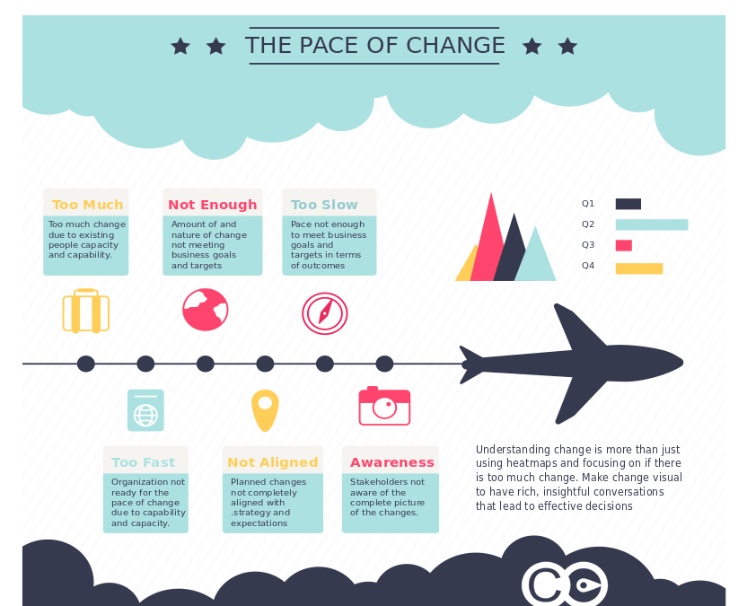
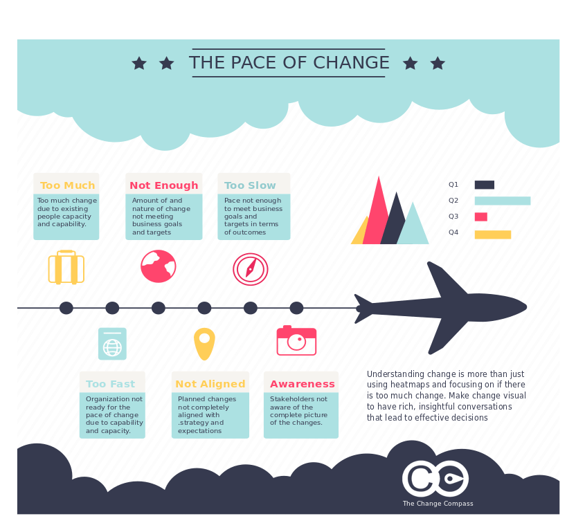
The pace of change is a distinct concept from the volume of change, and conflating them leads to systematic miscalculations in how change portfolios are managed. A single major change sustained over two years imposes a very different kind of demand on employees than twelve months of rapid, sequential changes even if the cumulative disruption is equivalent. Similarly, a surge of changes concentrated in a single quarter creates a different organisational stress pattern than the same number of changes spread across eighteen months. Understanding pace – not just volume – is what separates organisations that manage change as a strategic capability from those that merely count it.
Pace of change refers to the rate at which change demands are introduced to a given group of employees over a defined period of time. It encompasses both the frequency of new changes being initiated and the velocity at which those changes require employees to shift from their current way of working. High pace does not necessarily mean high volume in aggregate – it means that the interval between significant change demands is short, leaving employees insufficient time to stabilise in a new state before the next wave of change arrives.
This distinction matters because the human psychology of adaptation is fundamentally a sequential process. When a person adopts a new way of working – learns a new system, internalises a new process, builds capability in a new skill – they go through a predictable arc from initial disruption through experimentation, competence building, and eventual proficiency. This arc takes time, and it cannot be substantially compressed regardless of how well the change is designed or communicated. Introducing a new significant change before this arc is complete does not simply add to the load – it interrupts the adaptation process itself, resetting the person’s progress and compounding the psychological cost of the transition.
Prosci’s ADKAR model describes the individual change journey across five dimensions: awareness, desire, knowledge, ability, and reinforcement. The reinforcement phase – embedding the new behaviour until it becomes the default – is the one most frequently truncated by high pace of change. When a new change is introduced before reinforcement of the previous one is complete, the organisation is effectively asking employees to build on an unstable foundation. The result is not just slow adoption of the new change. It is regression in the previous one.
Why heatmaps alone are insufficient
Change heatmaps typically visualise which teams or roles are affected by which programmes at which points in time. They answer the question of coverage: who is touched by change, and when. What they typically do not answer is the question of pace: how rapidly are change demands arriving for specific employee groups, and how much stabilisation time is available between them?
The limitation becomes acute when a heatmap shows that a team is affected by multiple programmes across a twelve-month period. The heatmap may show this as a continuous band of change impact – useful for identifying overall load – but it does not distinguish between a pattern where changes are sequenced with meaningful recovery time between them and a pattern where changes are simultaneous or closely stacked. These two patterns impose very different demands on employees, and they require very different management responses. The first is manageable with strong communication and targeted support. The second creates the conditions for change fatigue regardless of how well any individual change is managed.
A related limitation of heatmaps is their tendency to treat all change impacts as equivalent in terms of the adaptation effort they require. A process change that affects how an employee fills in a form is captured the same way as an organisational restructure that changes their reporting line, their team composition, and the fundamental nature of their role. Effective pace measurement needs to account for the depth of change – the degree of behavioural shift required – not just its presence or absence.
The organisational consequences of unsustainable pace
When the pace of change consistently exceeds employees’ adaptive capacity, the consequences are well documented and significant. The most visible is change fatigue – a state of exhaustion, cynicism, and disengagement that develops when employees are asked to sustain high levels of change-related effort over extended periods without adequate recovery time. Change fatigue is not simply tiredness. It is a fundamental reduction in an individual’s willingness and ability to engage with further change, even changes they might otherwise have supported.
Gartner research on change fatigue found that employees experiencing high fatigue are significantly more likely to consider leaving the organisation and substantially less likely to adopt changes successfully. The performance implications extend beyond individual wellbeing: teams in a state of change fatigue show reduced productivity, increased error rates, higher absenteeism, and degraded customer outcomes during peak change periods. These costs are almost never attributed to the pace of change in standard business reporting, because organisations lack the measurement frameworks to make the causal connection.
The consequence at the portfolio level is equally significant. When change programmes are sequenced without regard to pace, the organisation effectively subsidises its most ambitious change initiatives with the adaptive capacity of its employees – a resource that is finite and that does not regenerate quickly once depleted. Senior leaders who approve programme portfolios without visibility into the pace implications for specific employee groups are making resource allocation decisions with an incomplete picture of what those decisions cost.
Measuring pace: what good looks like
Effective pace measurement requires data that goes beyond the change calendar. It needs to capture the intensity of impact by employee group across time, not just the presence or absence of change. This means collecting structured information about each change programme’s impacts on specific roles and teams – the nature of the change, its depth, the degree of behavioural shift required, and the timeline over which those shifts are expected to occur. This data, aggregated across the portfolio, allows organisations to construct a picture of change pace that heatmaps alone cannot provide.
Several dimensions are useful in assessing pace. The first is interval analysis: how much time exists between significant change demands on a given employee group, and is that interval sufficient for stabilisation? Research from organisational psychology suggests that meaningful stabilisation – the point at which employees have returned to baseline productivity in the previous change – typically requires between three and six months following a major change, depending on its depth and the support provided. Portfolios that do not build these stabilisation windows into their sequencing are likely to generate compounding adaptation costs.
The second dimension is depth weighting: treating impacts that require significant behavioural shift as more demanding than those requiring minor adjustment. A system upgrade that changes how employees log information is a different order of adaptation challenge from a role redesign that changes what they do, who they report to, and what skills they need. Effective pace measurement accounts for this difference rather than treating all change impacts as equivalent.
The third dimension is cumulative load tracking: monitoring the aggregate pace of change on specific employee groups across all concurrent programmes, not just within individual programme boundaries. This is the dimension that is most frequently absent from change measurement frameworks because it requires cross-portfolio data infrastructure that no single programme team can produce. It is also the dimension most likely to reveal the patterns that drive change fatigue before they become crises.
Managing pace as a strategic decision
Once pace is visible, it becomes manageable. The governance decisions that follow from pace data are among the highest-value decisions available to senior change leaders: whether to defer a programme because a specific team is approaching or exceeding its sustainable pace threshold, whether to sequence changes so that stabilisation time is protected, whether to invest additional change support resources in teams carrying the heaviest pace burden, and whether to restructure a programme’s delivery timeline to create recovery space.
These decisions are qualitatively different from the programme-level decisions that most change governance structures are designed to make. Programme governance focuses on whether an individual change is on track. Portfolio governance focuses on whether the aggregate change load is manageable and whether the sequencing of programmes is optimised for sustainable adoption. McKinsey research on transformation outcomes consistently finds that portfolio-level change governance – including explicit management of change pace and sequencing – is a significant predictor of transformation success at the enterprise level.
Platforms like The Change Compass are designed specifically to make pace visible and actionable at the portfolio level. By collecting structured impact data from each programme and aggregating it across employee groups, the platform allows change leaders and executives to see cumulative pace of change in real time – and to model the pace implications of proposed portfolio adjustments before making governance decisions. This turns pace management from an intuitive judgement call into a data-informed discipline.
Building pace awareness into change planning
The most effective point at which to address pace is before a change programme enters execution – in the planning phase, when sequencing decisions are still malleable and when the portfolio governance structure has the most flexibility to respond. Organisations that wait until pace becomes a visible problem – until change fatigue is measurable in engagement surveys and attrition data – have already paid a significant cost that better planning could have avoided.
Building pace awareness into change planning means incorporating pace impact assessment as a standard component of programme initiation. Before a programme is approved and resourced, the change team should be able to answer: which employee groups are most affected by this programme, what is the current pace of change on those groups from existing programmes, and what is the projected pace implication of adding this programme to the portfolio? If the honest answer is that certain groups are already at or near their sustainable pace threshold, that finding should inform the programme’s sequencing and delivery design – not be noted and set aside.
Research on organisational decision quality consistently finds that access to comprehensive, timely data is the primary differentiator between organisations that make sound portfolio decisions and those that default to optimism. Pace data is not complex to collect, but it requires a consistent approach across programmes and a shared infrastructure for aggregation. Organisations that invest in this infrastructure gain a systematic advantage in managing one of the most significant and underappreciated determinants of change programme success.
Frequently asked questions
What is the pace of change and why does it matter?
The pace of change refers to the rate at which change demands are introduced to employees over time – how frequently new changes arrive and how little stabilisation time exists between them. It matters because human adaptation to change is a sequential process that requires time to complete. When changes arrive faster than employees can stabilise in each new state, adaptive capacity depletes, change fatigue develops, and adoption outcomes deteriorate even for well-designed changes. Managing pace is therefore as important as managing volume when structuring a change portfolio.
Why aren’t change heatmaps enough?
Change heatmaps show which teams are affected by which programmes at which points in time, but they do not distinguish between changes that are well-sequenced with recovery time between them and changes that are stacked so closely together that stabilisation is impossible. They also typically treat all change impacts as equivalent regardless of depth, and they operate within individual programme boundaries rather than aggregating across the portfolio. Effective pace management requires data that addresses all three of these limitations.
What are the signs that the pace of change is unsustainable?
The most common indicators of unsustainable change pace include declining engagement scores during change-heavy periods, rising attrition among the employee groups most heavily affected by concurrent changes, low adoption rates for new changes even where the design and communication have been strong, regression to old ways of working in recently completed changes, and anecdotal reports of change fatigue and cynicism from managers and employees. By the time these indicators are visible in standard business reporting, the adaptive capacity depletion has usually been developing for months.
How can organisations better manage the pace of change?
Effective pace management requires portfolio-level visibility into the cumulative rate of change on specific employee groups – data that no single programme team can produce alone. It requires incorporating pace impact assessment into programme planning and approval processes, so that sequencing decisions are informed by evidence about current pace rather than made optimistically. It requires governance structures with the authority to defer or descope programmes when pace data shows that specific groups are at or near their absorption limit. And it benefits significantly from purpose-built platforms that aggregate change impact data across the portfolio and make pace trends visible to decision-makers in real time.
Peter Drucker’s principle, that you can only manage what you measure, has been cited in management contexts for decades. Applied to change management, it exposes one of the field’s most persistent problems. Most organisations are measuring the wrong things. They are measuring activity: communications sent, training sessions delivered, stakeholder engagement meetings held. These metrics demonstrate that change management work is being done. They do not demonstrate that change is happening.
The consequence of measuring the wrong things is that you end up managing the wrong things. Change functions that track activity metrics optimise for activity. They ensure training completion rates are high. They send communications on schedule. They hold engagement sessions. And they are routinely surprised when adoption at go-live is lower than expected, because the thing they were actually trying to achieve, a genuine shift in how people work, was never the thing they were measuring.
Getting measuring change management right requires a deliberate shift: from activity metrics to adoption metrics, from go-live snapshots to trend data over time, and from programme-level reporting to portfolio-level visibility. Each shift is technically straightforward. Collectively, they transform the information a change function has available and the decisions it enables.
Why activity metrics dominate and why they mislead
Activity metrics are appealing for two reasons. They are easy to collect, and they show progress in real time. The number of stakeholders briefed grows with each workshop held. Training completion percentage climbs as learning modules are finished. Communication send dates tick off against the plan.
The problem is that these metrics tell you about inputs, not outcomes. A training completion rate of 95% tells you that 95% of employees sat through a training module. It tells you nothing about whether they are working differently. A stakeholder briefing tells you that a conversation happened. It does not tell you whether the stakeholder is now an active advocate for the change, actively resistant to it, or somewhere in between.
AIHR’s guide to change management metrics draws a clear distinction between process metrics, which track activities completed, and outcome metrics, which track whether the change is actually taking hold. Process metrics are necessary but not sufficient. Without outcome metrics, a change function is flying blind on the question that matters: is the change happening?
The deeper problem with activity-focused measurement is what it rewards. A change team assessed primarily on whether communications are on schedule and training is completed will optimise for those things. It will not necessarily prioritise the harder, less quantifiable work of identifying and removing the structural barriers to adoption, coaching managers through their own uncertainty, or advocating for performance framework changes that align incentives with the new ways of working. Those interventions require time and attention. Without metrics that value them, they get crowded out.
The three levels of change measurement
A robust measuring change management framework operates at three levels, each of which answers a different question.
Level 1: Adoption measurement
The foundational level tracks whether people are actually changing how they work. Adoption metrics vary by change type but typically include:
Active usage rates for new systems and tools, measured at the role-group level, not just organisation-wide
Behavioural indicators specific to the change: are decisions being made using the new process? Are outputs conforming to the new standard?
Error rates and workaround patterns, which indicate where the new way of working is breaking down in practice
Self-reported proficiency, gathered through structured check-ins rather than end-of-training surveys
Adoption measurement requires a baseline. You need to know what behaviour looked like before the change to assess whether it has shifted. This sounds obvious but is often skipped, leaving change functions unable to demonstrate movement even when significant movement has occurred.
Level 2: Readiness and leading indicators
The second level focuses on the conditions for adoption rather than adoption itself. These are leading indicators that predict future adoption outcomes:
Manager confidence and capability in supporting the change at team level
Stakeholder sentiment and the degree to which key influencers are actively supporting versus passively or actively resisting
Awareness and understanding scores, which indicate whether employees know what is changing, why, and what is expected of them
Access to support, whether employees know where to go when they encounter difficulty with the new way of working
Leading indicators are valuable because they can identify problems while there is still time to intervene. An adoption measurement taken at go-live tells you what happened. Leading indicators taken four weeks before go-live give you the opportunity to change what happens.
Level 3: Business outcome linkage
The third level connects change management work to business results. This is the most difficult level to measure and the most persuasive for executive audiences.
Business outcome metrics vary by change programme. For a technology implementation, they might include productivity measures or error rates in the affected process. For an organisational restructure, they might include time-to-effectiveness for teams in new configurations. For a culture change programme, they might include customer satisfaction or employee engagement trends.
The practical challenge at this level is attribution. Business outcomes are affected by many things beyond change management quality. The most effective approach is not to claim sole attribution, but to demonstrate contribution through correlation and comparison: how do adoption levels compare between groups that received intensive change support and those that received standard support? How does benefits realisation timing track against adoption curve progress?
Common mistakes in change measurement frameworks
Several patterns recur in how change measurement frameworks go wrong, beyond the activity-versus-outcome problem.
Measuring at go-live rather than over time. Change adoption is not a moment; it is a curve. Most organisations take a readiness snapshot at go-live and a benefits measurement six months later. The period in between, when adoption is building, stalling, or reversing, is often invisible. Organisations that measure adoption at monthly intervals across the first six months after go-live consistently identify problems that go-live-only measurement misses.
Using the same metrics for all change types. A technology adoption and a cultural change require different measurement approaches. A process change and an organisational restructure have different adoption timelines. Generic measurement frameworks applied uniformly across a change portfolio produce data that is too coarse to act on.
Reporting averages across heterogeneous groups. An organisation-wide adoption rate of 68% might mask a rate of 90% in one business unit and 35% in another. The action required in those two units is entirely different. Effective change measurement reports adoption by employee group, role level, and geography rather than flattening everything to a single number.
Treating employee survey responses as objective data. Pulse surveys and change readiness assessments reflect what employees are willing to say, which is shaped by psychological safety, survey fatigue, and the perceived consequences of honest feedback. They are useful inputs but should be triangulated with behavioural data where possible.
Portfolio-level measurement: the view that matters most
Individual programme measurement, even done well, produces a fragmented picture. A change function that can tell you adoption rates for each of its ten active programmes cannot necessarily tell you the cumulative change burden on specific employee groups, whether the portfolio as a whole is delivering adoption at the rate the organisation’s transformation strategy requires, or where the systemic patterns in adoption performance suggest structural capability issues.
Portfolio-level measurement addresses these gaps. It requires:
A consistent measurement taxonomy across programmes, so that adoption data from different initiatives can be aggregated meaningfully
A portfolio adoption dashboard that shows trend lines by employee group across all active programmes, not just point-in-time scores for individual initiatives
Comparative analysis across programmes to identify patterns: are certain types of change consistently underperforming? Are certain employee groups consistently showing lower adoption rates regardless of which programme is being measured?
The comparison question is particularly valuable. If a specific business unit shows below-target adoption across five consecutive change programmes, that is a portfolio signal, not a programme signal. The root cause is more likely to be leadership capability, change saturation, or structural friction in that unit than a problem with any specific initiative. Programme-level measurement cannot surface this insight. Portfolio-level measurement can.
Tools such as The Change Compass are purpose-built for this portfolio measurement challenge: aggregating adoption data across programmes, tracking cumulative impact by employee group, and generating the portfolio-level view that enables the conversations with business leadership that individual programme reporting cannot support.
Making the case for better measurement
For change leaders who need to build the internal case for investing in measurement capability, the most compelling argument is opportunity cost. What decisions is the organisation currently unable to make, or making badly, because of gaps in change measurement data?
Specific examples that resonate with executive audiences include: the inability to predict which programmes are at risk of underperforming on adoption before go-live; the absence of data to support a sequencing decision when two major programmes are planned to land simultaneously on the same employee group; and the difficulty of demonstrating the contribution of change management investment to business outcomes when outcomes are tracked but change quality is not.
These are not abstract arguments. They describe real decisions that organisations make with inadequate information every quarter. A measurement framework that closes these gaps has demonstrable decision value, not just methodological value.
A practical starting point
Building a full three-level measurement framework from scratch is a multi-year effort. For most change functions, the most valuable immediate step is to add a single adoption metric to at least one current programme that is not currently being measured.
The most useful first adoption metric is typically active usage rate by role group, tracked monthly for the first six months post go-live, compared against a baseline taken in the last month before go-live. This single data series will generate more actionable insight about whether the change is landing than any number of communications-sent or training-completed metrics.
From there, the measurement framework can be built progressively: adding leading indicators, extending to business outcome linkage for strategic programmes, and eventually aggregating to portfolio level as the methodology matures. The principle at each stage is the same. Measure what you are trying to achieve, not what is easiest to count.
Frequently asked questions
What should change management metrics actually measure?
Effective change metrics measure whether behaviour has changed, not whether change activities were completed. The primary outcomes to measure are adoption rate by role group, which tracks whether people are working in the new way; readiness and capability scores, which are leading indicators of adoption; and business outcome contribution, which connects change quality to the results the change programme was designed to achieve.
What is the difference between change management activity metrics and adoption metrics?
Activity metrics track inputs: communications sent, training completed, stakeholder briefings held. Adoption metrics track outputs: whether employees in specific roles are consistently working in the new way. Activity metrics are easy to collect and show progress in real time, which is why they dominate most change measurement frameworks. The problem is that high activity metrics and low adoption outcomes frequently coexist, because completing training and changing behaviour are different things.
How often should you measure change adoption?
More frequently than most organisations do. A readiness baseline before go-live, monthly adoption tracking for the first six months post go-live, and a benefits realisation review at months six and twelve gives a meaningful picture of how adoption is progressing. Organisations that measure adoption only at go-live miss the adoption curve in its entirety and have no early warning of problems that could be addressed with timely intervention.
How do you measure the ROI of change management?
The most practical approach for most organisations is to track adoption levels and benefits realisation timing across programmes where change management was applied, and compare them to a realistic alternative scenario or historical baseline. Prosci’s research consistently finds that programmes with effective change management achieve significantly better adoption and benefits realisation than those without. Building an internal evidence base over multiple programmes creates a credible case for change management ROI that external benchmarks alone cannot provide.
What is portfolio-level change measurement?
Portfolio-level change measurement aggregates adoption data, impact data, and readiness indicators across all active change programmes to give a view of how change is landing across the organisation as a whole. It enables comparisons across programmes, identification of systemic adoption patterns, and cumulative load analysis by employee group. It is the level of measurement that enables the strategic conversations with business leadership that programme-level reporting cannot support.
References
AIHR. 15 Important Change Management Metrics To Track in 2026. https://www.aihr.com/blog/change-management-metrics/
Prosci. Metrics for Measuring Change Management. https://www.prosci.com/blog/metrics-for-measuring-change-management
Prosci. The Correlation Between Change Management and Project Success. https://www.prosci.com/blog/the-correlation-between-change-management-and-project-success
Freshworks. 12 Change Management Metrics and KPIs to Track in 2025. https://www.freshworks.com/change-management/metrics/
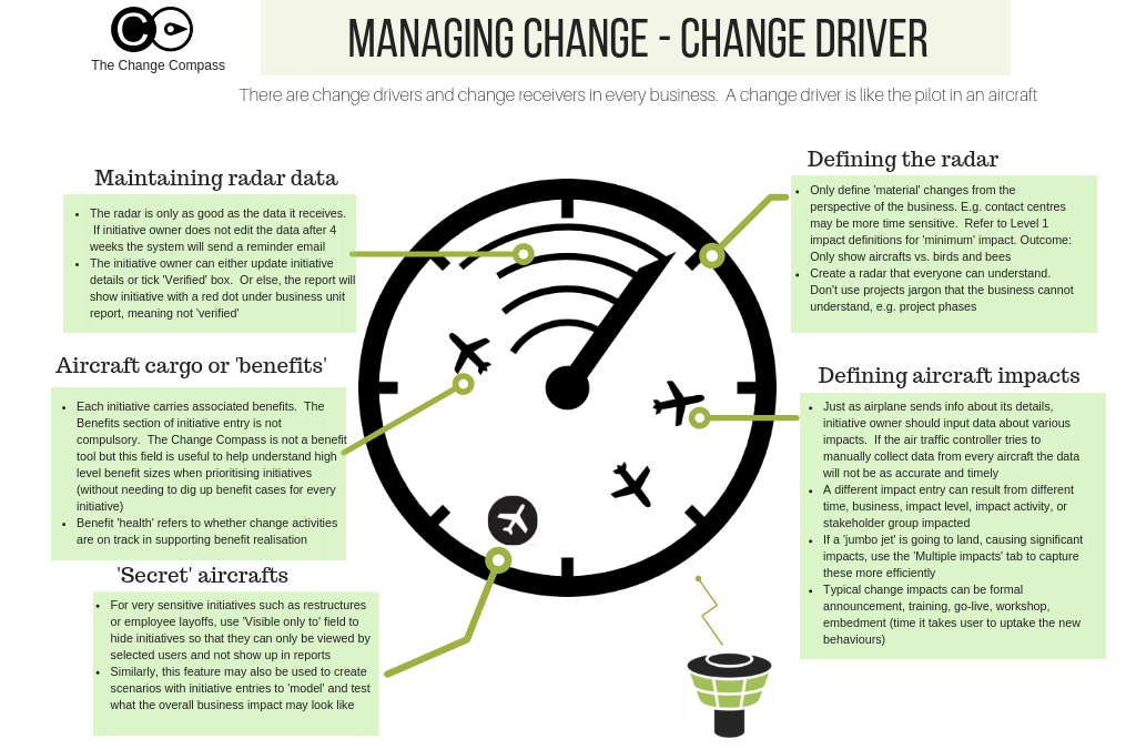
In every organisational change, there are two fundamentally different experiences unfolding simultaneously. Some people are change drivers – those who initiate, design, or lead the change. Others are change receivers – those who are asked to adopt it, adapt to it, and absorb its consequences in their daily work. These two experiences are so different that they might as well belong to different transformations. And yet, in most organisations, the people in the driver seat rarely stop to consider what the passenger seat actually feels like.
The challenge runs deeper than a lack of empathy, though empathy certainly matters. The structural reality of most large organisations is that the distinction between driver and receiver is far less clean than it appears on an organisational chart. A general manager leading a major technology transformation for their division is simultaneously a change driver – setting direction, allocating resources, communicating the vision – and a change receiver, absorbing a new enterprise strategy handed down from the executive team. Middle managers occupy this dual role even more acutely. They are expected to champion changes they had no hand in designing while simultaneously managing their own uncertainty about what those changes mean for their role, their team, and their future.
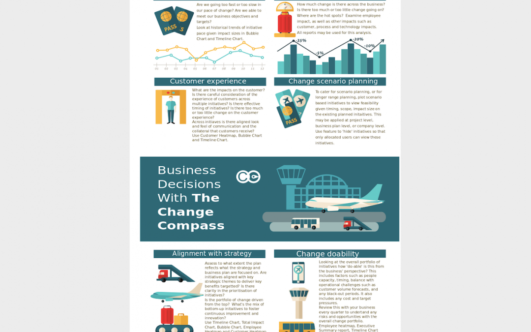
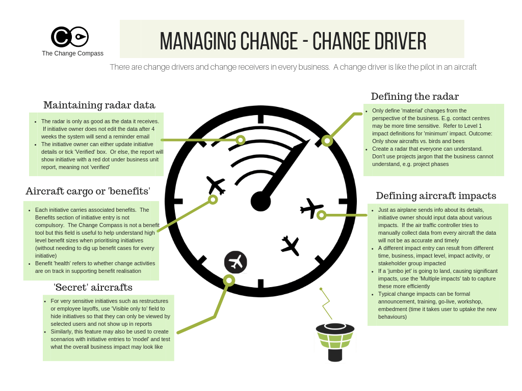
Understanding this driver-receiver dynamic is not merely an academic exercise. It is one of the most practical lenses available for diagnosing why change programmes generate resistance, why implementation falters at the middle management layer, and why even well-designed changes land differently than their architects intended. Download the Managing Change as a Change Driver infographic for a visual summary of the key concepts explored in this article.
What it means to be a change driver
Being a change driver means having some degree of ownership over the design, direction, or delivery of a change. This ownership comes in different forms. Senior leaders who commission a transformation are change drivers at the strategic level – they have defined the why and the what, allocated the resources, and set the success criteria. Programme managers and change practitioners who design the implementation approach are change drivers at the execution level – they translate the strategic intent into a delivery plan, a stakeholder engagement approach, and a benefits realisation framework. Business unit leaders who sponsor a change within their division are change drivers at the operational level – they are accountable for whether the change lands in their part of the organisation.
What these different forms of change driver role have in common is a sense of agency – the feeling, accurate or not, that one has some control over what is happening and why. This sense of agency is psychologically significant. Research on the psychology of control published in Harvard Business Review consistently finds that perceived agency – the belief that one’s actions matter and that outcomes are at least partially within one’s influence – is one of the strongest predictors of how well people tolerate uncertainty and change. Change drivers, by virtue of their role, typically have more of this than change receivers.
This agency advantage creates a blind spot. The change driver’s experience of a transformation – one of purposeful action, problem-solving, and progress – is so different from the change receiver’s experience of the same transformation that it is genuinely difficult for drivers to accurately model what receivers are experiencing. They know the rationale, have rehearsed the answers to likely questions, and understand the endgame. Receivers, particularly in the early stages of a change, have none of these advantages.
The change receiver experience: what drivers consistently underestimate
The experience of being a change receiver is defined primarily by uncertainty and limited agency. Unlike the change driver who has been working on the programme for months and has internalised its logic, the change receiver typically encounters the change through a communication – a town hall, an email, a team meeting – that gives them a fraction of the context the driver has accumulated over weeks or months of planning.
The questions that immediately arise for most change receivers are intensely personal and practical: What does this mean for my role? Will my team still exist? Am I being asked to learn something I am not sure I can learn? Do I have a say in any of this? These questions are not unreasonable. They are the natural cognitive response to being told that the way one has been working – perhaps for years – is being replaced. Yet they are often precisely the questions that change communications fail to answer, because the change driver’s instinct is to communicate at the level of organisational rationale rather than individual impact.
Prosci’s research on employee experience during change consistently finds that the most common reason employees resist change is not disagreement with the change’s strategic rationale but rather uncertainty about what it means for them personally. The receiver’s primary concern is not “is this change good for the organisation?” It is “is this change good for me, and do I have the support I need to navigate it?” Change drivers who communicate only to the first question and neglect the second consistently generate more resistance than those who address both.
The dual-role challenge: when drivers are also receivers
The most complex and under-examined position in any change programme is the one occupied by people who are simultaneously change drivers and change receivers. This is the standard condition for middle managers and business unit leaders in large organisations. They are asked to lead their teams through a change they did not design, often in a context where they themselves are uncertain about the direction and may have significant reservations about the approach. They are expected to be visible champions of a change while processing their own reactions to it – often without adequate support or acknowledgment that their situation is genuinely more difficult than either pure driver or pure receiver.
The consequences of this dual-role tension play out in predictable ways. Leaders in this position often communicate the change with less conviction than the programme requires, because they are transmitting a message they have not fully internalised. They are more likely to signal their own ambivalence – through body language, through qualifications in how they present the change, through the questions they choose not to answer – than leaders who genuinely believe in what they are championing. Employees are highly attuned to this authenticity gap, and an ambivalent manager is frequently more damaging to change adoption than no communication at all.
McKinsey research on the drivers of transformation success identifies leader commitment as one of the most powerful predictors of change outcomes. But commitment cannot simply be mandated. Leaders who are themselves experiencing significant uncertainty about a change – who have not been adequately informed, engaged, or supported in processing their own receiver experience – cannot credibly project commitment. Addressing the receiver experience of leaders is not a luxury. It is a precondition for effective change sponsorship at the level where change actually lives or dies: the middle of the organisation.
Practical strategies for managing well from the driver seat
For those in the change driver role – whether as senior sponsors, programme leaders, or business unit champions – there are specific practices that consistently improve the receiver experience and increase the likelihood of sustainable adoption.
The first is deliberate perspective-taking. Before launching any major change communication or engagement activity, effective change drivers systematically ask: what does this look like from the receiver’s perspective? What is the most important question someone in this role or this team will ask when they hear this news, and does our communication answer it? This sounds straightforward, but it requires actively suppressing the driver’s instinct to lead with the strategic rationale and instead leading with the personal impact. The business case matters, but it is not what moves people. What moves them is a clear, honest answer to “what does this mean for me?”
The second practice is creating genuine two-way engagement – not the performative consultation that many change programmes offer, where feedback is solicited but rarely influences the design, but the kind of engagement where receiver input actually shapes decisions. When employees see that the concerns they raised in a listening session have been visibly reflected in how the change has been adjusted, their relationship to the change shifts from passive recipient to active participant. This shift in psychological ownership is one of the most powerful accelerators of adoption available to any change driver.
The third practice is explicit support for leaders in the dual-role. This means giving business unit leaders and middle managers sufficient advance notice and context to process their own receiver experience before they are asked to communicate to their teams. It means creating forums where they can ask the difficult questions, express genuine concerns, and receive honest answers – rather than being handed a communication pack and asked to cascade key messages they may not believe. It means recognising that asking someone to lead others through change while they are still navigating their own is an extraordinary ask, and structuring the programme to provide the support that makes it possible.
How change load shapes the driver-receiver experience
The driver-receiver dynamic does not exist in a vacuum. It is powerfully shaped by the total volume of change that an organisation’s people are absorbing at any given time. In organisations with multiple concurrent change programmes, the same team that is being asked to receive and adopt several simultaneous changes is also likely to have leaders who are driving some of those changes while receiving others. The cognitive and emotional load of managing both roles across multiple changes is substantial – and it compounds in ways that organisations with only programme-level visibility consistently fail to detect.
Gartner’s research on change fatigue found that employees experiencing high levels of concurrent change show dramatically reduced willingness to engage with any individual change, even those they might otherwise have supported. The mechanism is the depletion of adaptive capacity – the cognitive and emotional resources required to absorb, process, and act on change-related demands. When those resources are exhausted by simultaneous changes, even a well-designed change with clear rationale and strong sponsorship will land poorly.
For change drivers, this has a critical practical implication: the effectiveness of any individual change is not solely a function of how well that change is designed and communicated. It is also a function of how much other change the receivers are simultaneously absorbing. A change that would land smoothly if it were the only thing happening to a team may generate significant resistance if it is the fourth major change hitting that team in six months. Managing the driver-receiver dynamic therefore requires portfolio-level visibility into the cumulative change load on specific employee groups – something that no single programme team can produce for itself.
Using data to bridge the driver-receiver gap
One of the most consequential improvements a change driver can make is developing access to objective data about the receiver experience. This goes beyond the anecdotal feedback that naturally reaches programme leaders – which is systematically biased towards either extreme positive or extreme negative responses – and towards structured measurement of where in the organisation receivers are struggling with the change and why.
Platforms like The Change Compass provide change drivers with exactly this kind of portfolio-level visibility. By tracking change impact data across all concurrent programmes, and aggregating it by team or role group, change drivers can see which parts of the organisation are experiencing the highest cumulative change load – and can use that data to make informed decisions about sequencing, pacing, and where to concentrate additional support. Rather than relying on intuition about what the receiver experience looks like, they can navigate the programme with evidence about where the pressure is greatest and where additional intervention is likely to make the most difference.
This data-informed approach does not replace the human skills of empathy, communication, and leadership that the driver-receiver dynamic demands. But it provides the factual foundation that makes those skills more targeted and more effective. A change driver who knows that a specific team is at or near its absorption capacity can make a different engagement decision than one who is guessing. A sponsor who can see adoption indicators disaggregated by business unit can target their visible commitment where it will have the greatest impact on momentum and morale.
Building organisational capability across both roles
The most resilient change capability in an organisation is one where the distinction between driver and receiver is not treated as fixed. People who have had deep experience as change receivers – who have navigated significant uncertainty, absorbed major changes to their role and their way of working, and come through the experience intact – bring insight to the driver role that cannot be acquired any other way. And change drivers who deliberately create conditions that allow receivers to understand, question, and contribute to change design are building the kind of organisational trust that makes future changes land more smoothly.
Prosci’s change management maturity model identifies the highest levels of organisational change maturity as those where change capability is not concentrated in a specialist team but embedded broadly – where managers at all levels understand the receiver experience and actively manage it as part of their leadership responsibility. Reaching this level of maturity requires deliberate investment in building empathy across the driver-receiver boundary: structured listening, honest communication about what is known and unknown, visible responsiveness to receiver feedback, and genuine recognition that the people being asked to change are doing something genuinely difficult.
Organisations that treat their change receivers as passive subjects of transformation – rather than as active participants whose experience and engagement is the primary determinant of whether the transformation succeeds – consistently underperform. Those that invest in closing the driver-receiver gap, through better data, better communication, better leader preparation, and more honest engagement, build something more durable than any individual change programme: an organisational culture where change is managed as a shared endeavour rather than imposed from above.
Frequently asked questions
What is the difference between a change driver and a change receiver?
A change driver is someone who initiates, designs, or leads a change – they have some degree of agency over what is happening and why. A change receiver is someone who is asked to adopt and adapt to a change they did not design. The key insight is that these roles frequently overlap: most leaders and managers are simultaneously driving change downward through their teams while receiving change from above, creating a dual-role challenge that requires specific support and preparation.
Why do change drivers and change receivers experience transformation so differently?
Change drivers typically have accumulated context, understand the rationale, and have a sense of agency over the process. Change receivers encounter the change with less information, experience more uncertainty, and have limited influence over what is happening. This asymmetry of information and control creates fundamentally different psychological experiences of the same change, and it is the primary reason that change drivers frequently underestimate the difficulty of the receiver experience.
How should change drivers manage the dual-role challenge?
Leaders in the dual-role – simultaneously driving and receiving change – need specific support to perform effectively in both dimensions. This includes advance notice and context to process their own receiver experience before they are asked to communicate to their teams, forums to raise genuine questions and concerns, and honest acknowledgment of the complexity of their position. Without this support, dual-role leaders frequently communicate change with insufficient conviction, which damages adoption outcomes at exactly the level where change succeeds or fails.
How does portfolio-level change load affect the driver-receiver dynamic?
When employees are absorbing multiple concurrent changes, their adaptive capacity – the cognitive and emotional resources available for change – becomes depleted. This makes even well-designed changes land more poorly than they would in isolation. Change drivers need portfolio-level visibility into the cumulative change load on their receivers to make informed decisions about timing, pacing, and where to concentrate support. Programme-level measurement alone cannot provide this view.
A critical part of agile is being able to iterate and continuously improve in order to deliver an optimal solution. Rather than one large change release, an agile project would break this down into smaller releases. Each release will go through an iterative process to test, collect data, evaluate and use any learning to improve the next release.
If an agile approach is appropriate we should also adopt this same approach in how we deliver change management activities. This means that we should be running a series of experiments to test, learn, document and improve on how we deliver change to the organization.
This contrasts to how most change managers would approach developing and delivering the change approach. The standard approach is collecting various information about the change, talk to key stakeholders about the change, and then form a view based on previous experiences in terms of what change approach would work for this initiative. Then, this approach would be present to stakeholders to get their blessing before executing on the change approach.
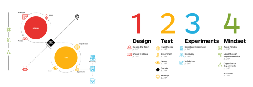
Below is an example of planning to run experiments in an agile environment from Alex Osterwalder, the founder of Strategyzer. First is designing the experiment, shaping its hypothesis, and testing it, which involves looking at the outcome data, learning from the experiment and making any relevant decisions based on the outcome.
Referenced from Alexander Osterwalder.
In this first part of a series on practical agile applications for change managers we focus on communications.
Communicating for change is a critical part of managing change and is also one that can easily be tested using a series of experiments.
The Campaign Monitor has outlined a series of aspects in which emails can easily be tested. These include:
Subject headlines
Pre-header
Date and time
Call to action
Content
Digital businesses also often conduct A/B Testing whereby 2 different sets of content are designed and delivered at the same time for the duration of the test. At the conclusion of the experiment we can then look at the results to see which one did better based on audience responses.
How do we measure communications experiments?
There are several ways to do this:
Readership – For intranet pages, your corporate affairs rep can usually access readership statistics
Surveys – Send surveys to the audience to ask for feedback
Focus groups – Run small focus groups for feedback
There is one area in which corporate can better learn from digital businesses – using digital tools to measure and track communications. For example, you can send out emails promoting a new intranet page, and then check back to see how many users actually visited the site. The results may be helpful as an initial experiment before launching the email to a wider audience group to achieve maximum results.
There are plenty of external tools such as ActiveCampaign or Mailchimp where you are able to use features such as:
A/B testing results
Send emails are certain times or dates
Automatic email responses
Target particular segments
View and click rates
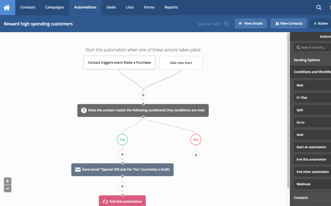
In the following diagram you can see an example that it’s not difficult to build a drip-email series of interactions with your stakeholders based on their responses (or lack of).
It’s feasible to use these tools for a project where you can run a series of experiments and measure outcomes to support your change iterations.