As the new year begins, it’s a natural time to reflect, refocus, and set the stage for success. For senior change and transformation professionals, this is an opportune moment to assess the upcoming portfolio of initiatives. Taking inspiration from Marie Kondo’s principles of decluttering and creating joy, we can apply these ideas to optimise our change portfolios and ensure they are designed for impact, sustainability, and value.
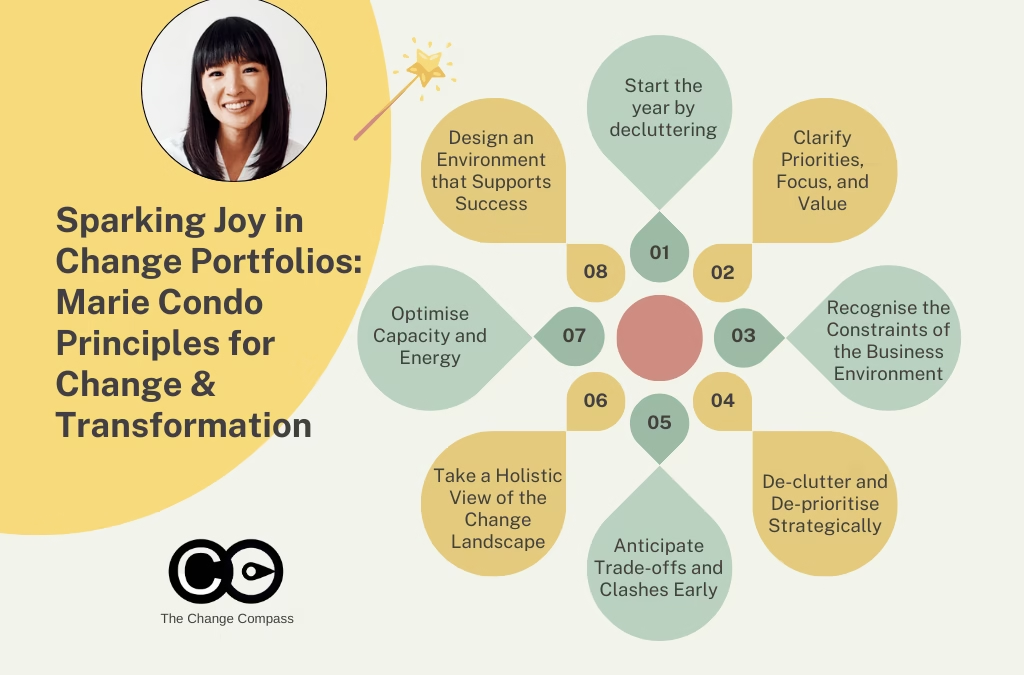
1. Start the Year by Decluttering
Just as Marie Kondo advises starting with a clean slate by letting go of unnecessary items, the new year offers the perfect chance to reassess the change portfolio. Decluttering is not just about removing excess; it’s about making deliberate, strategic decisions to create space for what truly matters. Many organisations find themselves burdened by legacy projects, overlapping initiatives, and unnecessary complexity. These elements consume valuable resources and dilute focus, ultimately jeopardising the success of the portfolio as a whole.
To start the decluttering process, take time to systematically review all initiatives. Begin by cataloging everything currently in progress or planned for the upcoming year. This exercise will reveal the true scope of commitments and help identify initiatives that may no longer align with the organisation’s strategic priorities. From there, engage with key stakeholders to challenge assumptions and uncover opportunities to streamline. By proactively identifying what can be paused, combined, or retired, you free up capacity for the initiatives that deliver the greatest value.
Your next PI (Program Increment) Planning will be a great opportunity to do this. As you work with other teams to assess scheduling and alignment, use this opportunity to align with stakeholder to cull and re-prioritise as required. It may be a good idea to do this prior to the PI Planning session to ensure the session is tight and focused.
Decluttering is not just about removing initiatives; it’s about creating space for the initiatives that truly matter. This exercise can involve:
Conducting a Portfolio Audit: List all current and planned initiatives. Categorize them by strategic importance, urgency, and expected impact.
Engaging Stakeholders: Facilitate discussions with leaders and project owners to challenge the status quo. Ask critical questions: Does this initiative serve a pressing need? Can its objectives be achieved through another project?
Identifying Redundancies: Often, multiple initiatives address overlapping goals. Combining efforts can streamline resources and improve focus.
2. Clarify Priorities, Focus, and Value
One of the key principles of joyful organisation is clarity. In the context of change management, clarity means ensuring that every initiative in the portfolio has a clearly defined purpose, aligns with organizational priorities, and delivers measurable value. Without this clarity, portfolios risk becoming overcrowded and unfocused, leading to wasted resources and frustrated teams.
Take a step back to evaluate each initiative against the organisation’s strategic goals. This process should involve critical questions such as: Does this initiative support our long-term vision? What specific problems does it solve? How does it fit into the broader transformation journey? Answering these questions will help identify initiatives that lack focus or fail to deliver meaningful value.
Clarity also requires a shared understanding across the organisation. Leaders, teams, and stakeholders must be aligned on what matters most. Misaligned priorities can lead to confusion, duplication of efforts, and competing demands on resources. By fostering open communication and establishing clear criteria for decision-making, you can ensure that everyone is working toward the same goals.
Creating clarity requires tools and structured processes:
Use Priority Matrices: Tools like the Eisenhower Matrix or impact-effort grids can help categorise initiatives based on their urgency and value. To read more about the Eisenhower Matrix visit this Forbes article
Define Metrics of Success: For each initiative, identify clear KPIs that demonstrate its contribution to the organisation’s goals. This helps maintain focus and provides a benchmark for future evaluations.
Communicate Priorities Clearly: Ensure that leadership and teams are aligned on what matters most. A shared understanding of priorities reduces the risk of misaligned efforts.
3. Recognise the Constraints of the Business Environment
Unlike a personal decluttering exercise, most organisations cannot afford to focus on just a few initiatives due to the fast-paced and ever-changing nature of the business world. New market demands, technological advancements, and regulatory changes often force organisations to pivot or expand their priorities mid-year. This makes it critical to design a change landscape that can accommodate both planned and emergent needs.
A well-structured portfolio balances transformational initiatives with business-as-usual (BAU) activities, ensuring that both long-term and short-term goals are addressed. However, achieving this balance requires careful planning and the ability to adapt. Organisations must be prepared to reassess priorities and make adjustments without derailing progress.
Designing the change landscape involves creating a comprehensive view of all initiatives, their interdependencies, and their impact on resources. This view should be regularly updated to reflect changes in the business environment. Scenario planning can also be invaluable, allowing organisations to explore potential outcomes and identify strategies for adapting to new challenges.
The optimal change landscape for your impacted stakeholders is one that is not cluttered, but one that is tight, focused and considered. It is not just about avoiding change saturation. It is about designing the right energy, focus, momentum and capacity.
Designing the change landscape involves:
Mapping the Portfolio: Visualise all initiatives, their timelines, and dependencies. Tools like Gantt charts or Kanban boards can help create a comprehensive view
Scenario Planning: Consider different scenarios based on potential changes in the business environment. How will the portfolio adapt if priorities shift mid-year?
Building Flexibility: Design the portfolio to accommodate adjustments without derailing progress. This might mean reserving resources for unforeseen priorities or having contingency plans for high-risk initiatives.
To do all these can be taxing. Check out The Change Compass for a view of your initiative impacts on people in terms of capacity and involvement. It also allows you to design and visualise different scenarios of different initiative sequences. You can easily see the forecasted capacity of various teams and be able to leverage AI insights on key risks.
4. De-clutter and De-prioritise Strategically
It’s common for certain initiatives to linger in the portfolio simply because they are pet projects of influential leaders. While these may have merit, it’s essential to make deliberate choices about what stays and what goes. Without these hard decisions, portfolios can become bloated, stretching resources too thin and compromising the success of high-priority initiatives.
Facilitating open conversations with stakeholders is key to successful de-prioritisation. This requires a combination of diplomacy and data-driven insights. By presenting clear evidence of an initiative’s impact (or lack thereof), you can shift the conversation from emotion to evidence. It’s also important to address the organisational culture around failure and closure. Retiring an initiative should be seen as a strategic decision rather than a failure.
Strategies for effective de-prioritization include:
Data-Driven Decision Making: Use data to demonstrate the potential ROI of each initiative. This helps shift conversations from emotion to evidence.
Transparent Communication: Be honest about why certain initiatives are being deprioritised. Transparency builds trust and reduces resistance.
Celebrate Closure: For initiatives that are retired, acknowledge the effort invested and celebrate the learnings. This reinforces a culture of continuous improvement.
5. Anticipate Trade-offs and Clashes Early
One of the most common pitfalls in change management is waiting until conflicts arise before addressing them. Portfolio clashes, resource shortages, and stakeholder fatigue can often be predicted well in advance. However, many organisations fail to have the necessary conversations early enough, leading to last-minute crises that disrupt progress. Having conversations too late means your initiative stakeholders are already invested given the significant effort and resources put in. This means it makes it even harder to change committed timelines, even when there are significant risks.
Proactively anticipating trade-offs requires a combination of foresight, tools, and collaborative discussions. Change impact assessments, capacity planning, and regular portfolio reviews are invaluable in identifying potential bottlenecks and saturation points. Additionally, creating forums for open dialogue allows stakeholders to surface concerns and explore solutions before issues escalate.
By anticipating challenges ahead of time, you create a smoother path for change initiatives to succeed. Key practices include:
Regular Portfolio Reviews: Establish a cadence for reviewing the portfolio. These reviews should assess progress, identify emerging risks, and recalibrate priorities as needed.
Engaging Cross-Functional Teams: Include representatives from impacted teams in decision-making. Their insights can help identify potential clashes that might be overlooked.
Scenario Analysis: Model different scenarios to understand how changes in one initiative might ripple across the portfolio. This foresight enables proactive adjustments.
6. Take a Holistic View of the Change Landscape
Change portfolios often focus on big-ticket initiatives, but employees experience all changes—big or small—as part of the same landscape. Every new tool, process, or initiative adds to the cognitive and emotional load of employees. Failing to account for this cumulative impact can lead to burnout, disengagement, and resistance to change.
Taking a holistic view means looking beyond the high-profile initiatives to include BAU initiatives, operational changes, and even cultural events like town halls or roadshows. All these elements compete for employees’ time and energy. By considering the full scope of activities, you can create a more realistic and empathetic plan that supports employee well-being.
Everything that takes time, focus, or mental energy should be part of the portfolio view. This holistic approach ensures realistic planning and reduces the risk of burnout. Practical steps include:
Creating a Change Calendar: Map all change-related activities, including BAU tasks and cultural events, to understand their cumulative impact on employees.
Conducting Employee Impact Assessments: Gather feedback from employees to understand how various initiatives affect their workload and well-being.
Prioritizing Communication: Ensure employees have a clear understanding of what’s coming and how it fits into the broader organisational goals.
7. Optimise Capacity and Energy
While most portfolios focus on deliverables, the real enabler of success is the energy and capacity of those who drive and experience change. Key considerations include:
Assessing the available capacity in impacted teams.
Designing sequences of change that maximize energy levels (e.g., scheduling major initiatives after quieter periods).
Factoring in recovery time after high-stress periods or significant releases.
By aligning the portfolio to the energy rhythms of the organisation, you increase the likelihood of successful adoption and sustained change. Specific strategies include:
Workload Balancing: Ensure no team or individual is overburdened. Distribute responsibilities equitably and provide support where needed.
Energy Mapping: Identify periods of high energy and focus within the organisation. Schedule demanding initiatives during these times to maximise success.
Encouraging Breaks: Build in time for reflection and recovery. Whether it’s a pause after a major release or regular team check-ins, these moments are crucial for maintaining momentum.
8. Design an Environment that Supports Success
Finally, creating the right environment for change is essential. Just as Marie Kondo encourages designing spaces that spark joy, change professionals should design portfolios that:
Foster collaboration and open communication.
Provide the necessary tools, resources, and support for employees.
Build a culture of adaptability and resilience.
‘Joy’ for the organisation is one that is balanced with achieving business objects and optimal people experience during change and transformation
A well-designed change environment creates the conditions for initiatives to thrive and for employees to embrace new ways of working. Consider:
Investing in Change Capability: Provide training and resources to build change management skills across the organisation.
Creating Feedback Loops: Establish mechanisms for continuous feedback and improvement. This ensures the portfolio remains aligned with evolving needs.
Celebrating Successes: Recognise and reward achievements, both big and small. Celebrating progress reinforces a positive change culture.
Applying Marie Kondo’s principles to change portfolio management allows organisations to focus on what truly matters, let go of what doesn’t, and create a change landscape that sparks energy and engagement. By decluttering, prioritising, and designing for capacity, senior change professionals can position their organisations for success in the year ahead. Take this opportunity to curate a portfolio that not only drives transformation but also brings clarity, purpose, and joy to the journey.
Remember, a well-organised change portfolio is not just about achieving organisational goals—it’s about creating an environment where people thrive, adapt, and contribute their best. Let this be the year your change portfolio truly sparks joy.
With complex, high-stakes change environments, change leaders know that success hinges on more than just strategies and frameworks. It rests on the ability to transform behaviours into habits—turning deliberate, effortful actions into automatic routines. After all, the core of change is largely the result of a series of behaviour changes. Here we delve into the psychology and practice of habit formation in organisational change, offering actionable insights for senior change leaders.
The Foundation: Belief Fuels Change
Change begins with belief. Stakeholders must believe that change is not only necessary but achievable—and that they themselves are capable of adapting. This foundational belief can be especially elusive in organisations with a history of failed initiatives. Skepticism and fatigue are common barriers.
Leaders play a pivotal role in cultivating belief. They must demonstrate that change is possible through a series of small, achievable wins. For instance, consider a team resistant to adopting a new project management tool. Instead of mandating full adoption from day one, leaders might first encourage the team to use the tool for a single task or project. As the team sees the benefits—improved collaboration, streamlined processes—their belief in the tool and their ability to adapt grows.
Creating belief also involves transparent communication. Leaders need to articulate why the change is necessary and how it aligns with the organisation’s goals. When stakeholders understand the “why,” they are more likely to commit to the “how.”
Additionally, addressing past failures openly can help rebuild trust. Leaders can acknowledge previous shortcomings while emphasising what will be different this time—whether it’s stronger leadership commitment, improved resources, or a more phased approach. By creating an environment where past lessons inform current actions, belief becomes more attainable.
Social Reinforcement: The Power of Community
Humans are inherently social creatures, and the behaviours of others significantly influence our own. This is why social reinforcement is a cornerstone of successful change initiatives. Change champions and team leaders serve as visible examples of the desired behaviours, demonstrating both commitment and success.
Stories are particularly powerful in this context. When change champions share their experiences—challenges faced, strategies employed, and victories achieved—it reinforces the idea that change is possible for everyone. For example, in a digital transformation initiative, a frontline employee who shares how a new system simplified their workflow can inspire others to give it a chance.
Social reinforcement also fosters accountability. When team members see their peers embracing new behaviours, it creates a sense of collective momentum that is hard to resist. Positive peer pressure can become a motivating force, pushing individuals to align with group norms and expectations.
Furthermore, leveraging social proof through team recognition can amplify the impact. Publicly celebrating individuals or teams who exemplify desired behaviours not only rewards them but also encourages others to follow suit. Recognition initiatives, such as “Change Hero of the Month,” can spotlight efforts that align with organisational goals, building a culture of reinforcement and inspiration.
From Behaviour to Habit: The Mechanics of Routine
Turning behaviours into habits involves repetition and reinforcement. According to a 2006 study from Duke University, as much as 40% of our daily actions are based on habit. This underscores the importance of embedding new behaviours deeply enough that they become second nature.
The habit loop, as popularised by Charles Duhigg in The Power of Habit, consists of three components:
Cue: A trigger that initiates the behaviour.
Routine: The behaviour itself.
Reward: The benefit or satisfaction derived from the behaviour.
Let’s apply this framework to a customer complaints initiative. Suppose the goal is to enhance customer satisfaction by encouraging consultants to proactively address complaints. The cue might be specific language from a dissatisfied customer. The routine could involve logging the complaint, initiating a structured conversation, and offering next steps. The reward? The consultant feels confident they’ve resolved the issue and improved the customer’s experience. Over time, this routine becomes habitual, reducing the cognitive load required to execute it. This is also why sufficiently forecasting and estimating the effort and load required as a part of change adoption is critical in initiative planning.
To support habit formation, organisations can utilise tools and reminders. For instance, automated notifications or visual aids like posters can reinforce cues and encourage consistent practice. Technology can also play a vital role by integrating habit-supporting systems, such as digital dashboards that track key behaviours and provide immediate feedback.
Habits are further strengthened when they are tied to personal values and aspirations. For example, a team member who values customer care will find it easier to embrace new routines that align with their intrinsic motivation. Aligning organisational habits with individual and collective values creates a powerful foundation for sustained change.
Scaling Change: Small Wins, Big Impact
Complex, large-scale changes can feel overwhelming. The key to success is to break these initiatives into smaller, manageable changes. Achieving these small wins builds momentum and confidence, laying the groundwork for tackling more significant challenges.
For instance, in an organisation shifting to remote work, a small initial change might involve standardising virtual meeting protocols. Once teams are comfortable with this, leaders can introduce more complex changes, such as remote performance management systems or asynchronous collaboration tools.
Small wins also provide measurable milestones. These visible markers of progress are crucial for maintaining stakeholder engagement and belief in the larger vision. Each success, no matter how minor, contributes to a sense of achievement that propels the team forward.
Moreover, small wins create opportunities for feedback and refinement. As each milestone is achieved, leaders can gather input to identify what’s working and what isn’t, ensuring continuous improvement. Feedback loops keep the change process agile and adaptive, responding to emerging challenges and opportunities.
Keeping the End in Sight: Navigating Obstacles
The journey of change is rarely linear. Delays, setbacks, and unforeseen obstacles are inevitable. To navigate these challenges, leaders must keep the end goal firmly in mind while celebrating progress along the way.
Regularly communicating achievements—both big and small—helps maintain focus and motivation. For example, if the ultimate goal is a 30% increase in operational efficiency, celebrating a 5% improvement early in the process can reinforce commitment and belief.
Visualisation tools such as roadmaps, dashboards, and progress trackers can also help teams see how their efforts contribute to the overall objective. This clarity reduces ambiguity and keeps everyone aligned. Leaders can further use storytelling to paint a vivid picture of the future state, inspiring teams to stay the course. This also helps to put human nuances and experiences into the data shown.
Equally important is maintaining flexibility. Leaders should be prepared to adjust timelines or approaches in response to new challenges without losing sight of the ultimate goal. This adaptability demonstrates resilience and fosters trust among stakeholders. Encouraging a mindset of learning and iteration can transform obstacles into opportunities for growth.
The Role of Measurement: Tracking Success
Measurement is integral to behaviour and habit formation. It provides objective data to assess whether changes are taking root and if progress aligns with strategic goals.
Metrics should be both quantitative and qualitative. For instance, in a customer satisfaction initiative, quantitative measures might include Net Promoter Scores (NPS) or resolution times. Qualitative data could involve customer feedback or employee reflections on their new routines.
Regularly reviewing these metrics allows leaders to adjust strategies as needed, ensuring that small changes cumulatively drive the desired outcomes. Dashboards and reporting tools can provide real-time insights, enabling data-driven decision-making.
In addition to tracking progress, measurement fosters accountability. When individuals and teams know their efforts are being monitored, they are more likely to remain committed to the change process. Transparent reporting also builds trust, showing stakeholders that their efforts are valued and impactful.
Alignment with Strategy: The Bigger Picture
In the midst of multiple concurrent changes, it’s easy for teams to lose sight of how their individual efforts support the broader strategy. Leaders must articulate this alignment clearly and consistently.
Consider an organisation undergoing a digital transformation while also pursuing sustainability goals. Leaders might connect the two by emphasising how digital tools reduce paper usage or improve energy efficiency. This alignment helps employees see the “bigger picture” and understand how their routines contribute to overarching organisational priorities.
Clarity is particularly important when behaviours differ across teams. For example, proactive listening might be a critical behaviour for customer-facing teams, while cross-functional collaboration could be the focus for back-office teams. Leaders need to explain how these distinct behaviours interconnect and drive the overall strategy.
Furthermore, aligning behaviours with the organisation’s values can deepen commitment. When employees see how their actions reflect core values, they are more likely to internalise and sustain the desired changes. Leaders can leverage organisational storytelling to create a compelling narrative that unifies diverse initiatives under a shared vision.
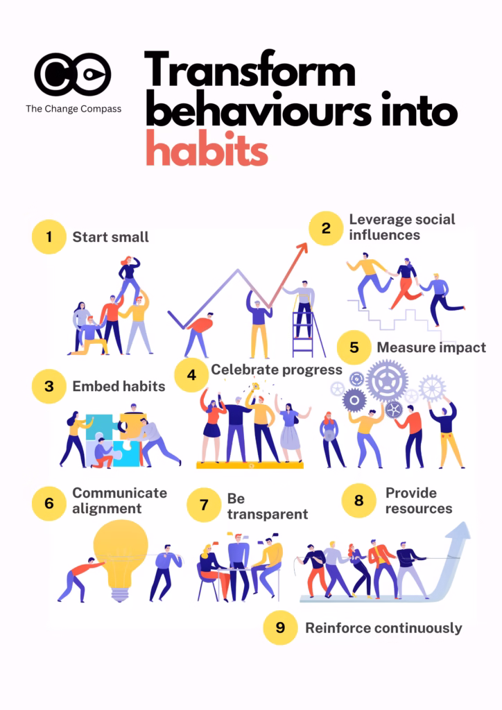
Practical Steps for Change Leaders
Start Small: Identify a single behaviour to change and build on early successes.
Leverage Social Influence: Empower change champions to share stories and model behaviours.
Embed Habits: Use the habit loop (Cue, Routine, Reward) to make new behaviours automatic.
Celebrate Progress: Recognise achievements, no matter how small, to maintain momentum.
Measure Impact: Regularly track progress against clear, relevant metrics.
Communicate Alignment: Ensure teams understand how their efforts contribute to the overall strategy.
Be Transparent: Share challenges and adjustments to build trust and credibility.
Provide Resources: Equip teams with the tools and training needed to succeed.
Reinforce Continuously: Ensure that reinforcement mechanisms
Transforming behaviours into habits is the cornerstone of sustained organizational change. By fostering belief, leveraging social reinforcement, and breaking complex changes into manageable steps, change leaders can build a culture where new behaviours become second nature. With clear goals, consistent measurement, and strategic alignment, these habits will not only endure but also drive lasting success.
Sustaining change requires patience, persistence, and a deep understanding of human behaviour. By focusing on the incremental steps that lead to lasting habits, senior practitioners can guide their organizations through even the most challenging transformations—one habit at a time.
Clinical psychology principles integrated with change management strategies can increase organizational transformation success rates. This evidence-based guide explores cognitive-behavioural therapy (CBT) techniques, evidence-based change management strategies, and proven approaches to overcome employee resistance to change – transforming organizational initiatives into sustainable, human-centered transformations.
What Is Clinical Psychology in Change Management?
Clinical psychology in change management is the application of evidence-based psychological principles, therapeutic techniques, and behavioural science to organizational transformation initiatives. Unlike traditional change management that focuses primarily on processes and systems, this integrated approach prioritizes the human element – addressing emotional resistance, cognitive barriers, and behavioural patterns that influence change adoption.
Research from the American Psychological Association highlights that organizations emphasizing psychological safety and integrating clinical psychology principles into change management strategies experience significantly improved outcomes compared to relying solely on conventional methods. This synergistic approach combines structured change management frameworks with clinical psychology techniques, addressing both organizational processes and the psychological factors that drive sustainable behavioral change in the workplace (see APA Work in America Survey).
Why Does Clinical Psychology Matter for Organizational Change?
Traditional change management often fails because it underestimates the psychological complexity of human behaviour.
Clinical psychology addresses these challenges by:
Enabling sustainable transformation: Creating lasting behavioural change rather than temporary compliance
Understanding resistance mechanisms: Identifying cognitive distortions, defense mechanisms, and emotional barriers that prevent change acceptance
Providing therapeutic frameworks: Applying proven techniques like Cognitive Behavioural Therapy (CBT) to reshape thought patterns and behaviours
Supporting mental well-being: Reducing change-related stress, anxiety, and burnout through evidence-based interventions
Enabling sustainable transformation: Creating lasting behavioural change rather than temporary compliance
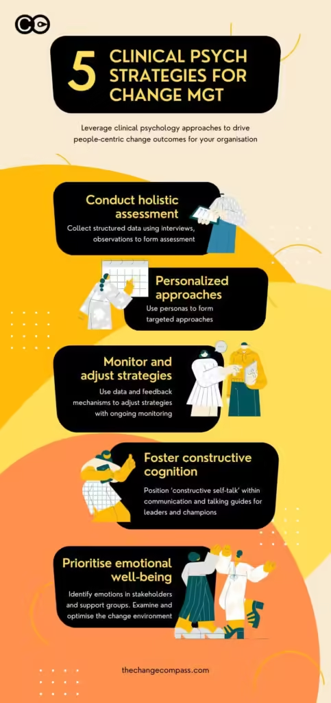
What Is the 5-Step Clinical Psychology Framework for Change Management?
Successful integration of clinical psychology into change management follows a structured, evidence-based framework with five essential steps:
Step 1: Conduct a Holistic Assessment
Begin with comprehensive psychological readiness evaluation using validated assessment tools. Examine organizational culture, individual stress levels, team dynamics, and historical change experiences. This holistic view identifies psychological barriers, strengths, and readiness factors before initiating transformation.
Step 2: Develop Personalized Approaches
Recognize that one-size-fits-all change management fails. Tailor interventions based on psychological profiles, learning styles, stress responses, and individual needs. Customize communication strategies, training methods, and support systems to match diverse employee populations and organizational contexts.
Step 3: Monitor and Adjust Strategies
Implement continuous psychological monitoring throughout the change process. Track well-being indicators, stress levels, adoption rates, and resistance patterns. Use data-driven insights to adapt interventions in real-time, ensuring strategies remain effective and responsive to emerging challenges.
Step 4: Foster Constructive Cognition
Apply cognitive restructuring techniques to address negative thought patterns about change. Challenge cognitive distortions, reframe limiting beliefs, and build growth mindsets. Use evidence-based cognitive behavioural therapy (CBT) methods to transform “This won’t work” into “How can we make this work?”
Step 5: Prioritize Emotional Well-Being
Place employee mental health at the center of change initiatives. Provide psychological support resources, stress management tools, and safe spaces for processing emotions. Organizations prioritizing well-being see 40% lower turnover and significantly higher change success rates.
How Do You Apply CBT Techniques to Workplace Change?
Cognitive Behavioural Therapy (CBT) offers powerful tools for addressing change resistance at its psychological roots. Building on the 5-step framework above, here’s how organizations can apply specific CBT principles:
1. Identify Cognitive Distortions
Employees often develop negative thought patterns about change: “This will never work,” “I’ll lose my job,” or “Management doesn’t care about us.” CBT helps identify these distortions – catastrophizing, black-and-white thinking, personalization – and reframe them with evidence-based reasoning.
2. Implement Behavioural Experiments
Rather than forcing immediate adoption, CBT-inspired change management encourages small-scale testing. Pilot programs allow employees to “experiment” with new processes, gathering real evidence about outcomes and reducing anxiety through controlled exposure.
3. Develop Coping Strategies
CBT teaches employees practical coping mechanisms for change-related stress: mindfulness techniques, problem-solving frameworks, and emotional regulation strategies. Organizations that provide these tools report 40% lower change-related turnover and significantly improved employee well-being during organizational transformation periods.
What Are Evidence-Based Change Management Strategies?
Integrating clinical psychology into change management requires systematic, evidence-based approaches:
Psychological Assessment and Readiness Evaluation
Before initiating change, conduct psychological readiness assessments using validated tools like the Organizational Change Questionnaire (OCQ) or Change Readiness Survey. These instruments measure emotional preparedness, trust levels, and potential resistance factors.
Tailored Communication Based on Psychological Profiles
Different personality types and psychological profiles respond differently to change messaging. Organizational psychology techniques help segment audiences and craft targeted communications using change management strategies: analytical types need data-driven evidence and logical frameworks, while relationship-oriented individuals prioritize team impact, collaborative processes, and personal connections throughout the transformation journey.
Trauma-Informed Change Leadership
Many employees have experienced previous failed change initiatives – creating organizational trauma. Trauma-informed approaches acknowledge this history, rebuild trust gradually, and create psychologically safe environments where concerns can be voiced without fear.
How Do You Overcome Employee Resistance to Change?
Employee resistance to change isn’t defiance – it’s a natural psychological response to perceived threat and uncertainty. Clinical psychology reframes resistance as valuable diagnostic information about unmet psychological needs, legitimate concerns, and opportunities to refine change management strategies for better organizational outcomes.
The Psychology of Resistance:
Loss aversion: People fear losing current status, skills, or relationships more than they value potential gains
Identity threat: Change can challenge professional identity and self-concept
Cognitive load: Learning new systems increases mental burden, triggering avoidance behaviours
Autonomy needs: Imposed change violates fundamental psychological needs for control and choice
Clinical Psychology Solutions for Behavioural Change:
Use motivational interviewing techniques to explore ambivalence and build intrinsic motivation for organizational change
Implement gradual exposure therapy principles – small, incremental behavioural changes rather than overwhelming transformation
Create psychological safety through transparent communication, genuine listening, and evidence-based change management practices
Provide autonomy within structure – offering choices about implementation while maintaining strategic direction and organizational goals
Apply cognitive behavioural therapy (CBT) workplace techniques to address negative thought patterns and resistance mechanisms
How Do You Measure Change Management Success?
Successful integration of clinical psychology into change management should be measured across both psychological and business dimensions:
Psychological Metrics:
Employee well-being scores (measured via validated instruments like PHQ-9 or GAD-7)
Change readiness and acceptance rates
Psychological safety perception
Stress and burnout indicators
Business Outcomes:
Change adoption rates and speed
Productivity during transition periods
Retention and turnover during change
Long-term sustainability of new behaviours
What Role Does Clinical Psychology Play in Digital Transformation?
As organizations navigate digital transformation and remote work environments, clinical psychology techniques become even more critical for effective change management. Virtual environments amplify isolation, reduce social support networks, and complicate emotional communication – all psychological factors that clinical psychology principles are uniquely equipped to address through evidence-based interventions.
Forward-thinking organizations integrate digital mental health tools, virtual peer support systems, technology-enabled psychological assessments, and remote-adapted CBT techniques to maintain the human-centered element in increasingly digital organizational change initiatives while ensuring sustainable behavioural change across distributed teams.
A Synergistic Approach to Organizational Transformation
Leveraging clinical psychology in change management isn’t just evidence-based best practice – it’s essential for modern organizational success and sustainable transformation. By understanding the psychological dimensions of change, addressing employee resistance to change with cognitive behavioural therapy techniques, implementing evidence-based change management strategies, and prioritizing human well-being alongside business outcomes, organizations create transformations that employees embrace rather than endure.
The synergy between clinical psychology techniques and organizational change management represents the future of organizational development – one that recognizes successful change is fundamentally about changing minds, hearts, and behaviours through evidence-based approaches, not just processes and systems. Organizations that master this integration achieve 67% higher success rates, reduced turnover, and lasting behavioural change that drives competitive advantage.
Frequently Asked Questions
What is clinical psychology in change management?
Clinical psychology in change management is the application of evidence-based psychological principles, therapeutic techniques like CBT, and behavioural science to organizational transformation. It addresses the human and emotional aspects of change, including resistance, stress, and behavioural adaptation.
How does CBT help with organizational change?
Cognitive Behavioural Therapy (CBT) helps identify and reframe negative thought patterns about organizational change, implement behavioural experiments through pilot programs, and develop practical coping strategies for workplace transitions. Organizations using evidence-based CBT techniques in their change management strategies report 40% lower change-related turnover, higher adoption rates, and more sustainable behavioural change outcomes.
Why do employees resist change?
Employee resistance stems from psychological factors including loss aversion (fear of losing current status), identity threat (challenge to professional self-concept), cognitive load (mental burden of learning), and autonomy needs (desire for control). Resistance is a natural protective response, not defiance.
What are evidence-based change management strategies?
Evidence-based strategies include psychological readiness assessments using validated tools, tailored communication based on personality profiles, trauma-informed leadership approaches, motivational interviewing, and gradual exposure techniques. These methods are proven through research to increase change success rates by up to 67%.
How do you measure change management success?
Measure both psychological metrics (employee well-being scores, change readiness, psychological safety, stress indicators) and business outcomes (adoption rates, productivity, retention, sustainability). Use validated instruments like the Organizational Change Questionnaire (OCQ) for comprehensive assessment.
What is the success rate of psychology-informed change management?
Organizations integrating clinical psychology principles achieve 67% higher success rates compared to traditional methods. They also experience 40% lower change-related turnover, faster adoption, and more sustainable behavioural change over time.
Change adoption is the heart of every change practitioner’s work. It’s the primary measure of whether a change initiative truly succeeds, yet, surprisingly, many organizations still fail to adequately track, measure, and manage change adoption. Without a clear understanding of how well end-users are adopting the change, it’s nearly impossible to gauge the initiative’s real impact on the business. Change adoption must be both intentional and managed, not just assumed.
If you search for change adoption on Google the top articles seem to refer to the same things. These include transition preparation, communication, training and support. The top 2 articles are by Whatif and Walkme and seem to emphasise the importance of in-app training products they offer. The Prosci article emphasise the ADKAR model on the other hand.
While common strategies for change adoption—such as communication, training, and support—are essential, these are foundational steps and not the complete formula for sustained adoption. There’s a nuanced spectrum of factors that contribute to adoption, including the type of change, the stakeholders, the organization’s capacity for change, measurement metrics, and performance management. The following insights explore these core factors and share practical strategies, bolstered by real-world examples, to help change practitioners improve adoption rates across their organizations.
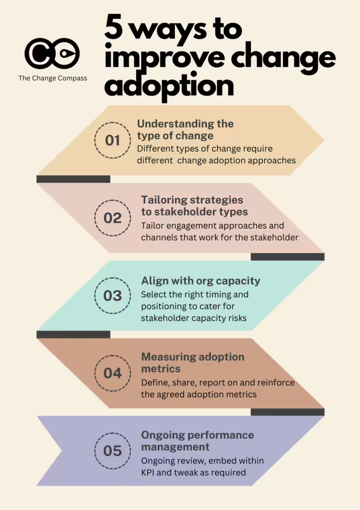
1. Understanding the Type of Change
The nature of the change plays a significant role in determining how to drive adoption. A change can range from a simple update in process to a fundamental shift in behaviour, and this range requires different approaches:
– Simple Changes : Minor changes, like a new software feature or a small process tweak, may only need a basic communication update. For instance, consider an HR team implementing a new self-service portal for employees to access their pay stubs. In this case, a simple email announcement explaining how to access the feature, along with a short tutorial video, might be all that’s required to ensure adoption.
– Complex, Behavioural Changes : For more complex changes that impact behaviours or workflows, adoption strategies need to be more involved. Imagine an organization implementing a new performance review system that shifts from annual reviews to ongoing, quarterly feedback sessions. This type of change isn’t just procedural—it demands a shift in how employees and managers think about performance. Here, communication alone won’t be sufficient. It requires ongoing training, leadership modeling, reinforcement through feedback loops, and alignment with performance metrics. Regular team meetings can serve as a platform for leaders to showcase the change, while role-playing sessions can help embed the new behaviours.
Analogy : Think of the change type as similar to cooking different dishes. For a quick salad, all you need is the right ingredients and a bowl to toss them in. For a complex dish like a soufflé, you’ll need precise measurements, specific tools, and careful monitoring to ensure it doesn’t collapse. The type of change similarly determines the level of preparation and intervention required.
2. Tailoring Strategies to Stakeholder Types
Understanding your end-users or stakeholders—those directly impacted by the change—is crucial. Each group will have different engagement channels and needs, which means you can’t rely on a one-size-fits-all communication plan. To drive adoption, you need to deliver information in ways that resonate with each audience.
– Identify Effective Channels : For example, one team may prefer to discuss updates in weekly meetings, while another may respond better to monthly town hall sessions. When a global retail company rolled out a new inventory management system, the change team customized its communication and training by region. Regional managers were empowered to communicate the changes in a way that suited their teams’ preferences, whether that meant team huddles, newsletters, or one-on-one conversations. As a result, the change was embraced much more readily because each team felt that the approach was tailored to their needs.
– Build Change into Routine Communication : To make the change part of the team’s daily workflow, leverage existing channels, like monthly business reviews or quarterly updates. For instance, if sales teams have weekly performance meetings, consider incorporating brief updates about how the change (such as a new CRM feature) can benefit their sales process, along with success stories from team members.
Analogy : Think of stakeholder engagement as similar to hosting a dinner party. You wouldn’t serve the same meal to every guest without considering their preferences. Similarly, change practitioners need to “serve” the change in ways that appeal to each stakeholder group’s tastes and communication preferences.
3. Aligning with Organisational Change Capacity
Change capacity—the organization’s ability to absorb and adopt change—is a critical but often overlooked factor. The timing of introducing new changes matters, especially when the change is complex. If an organization is already handling multiple projects or transformations, adding another initiative can result in resistance or “change fatigue.”
– Manage Competing Priorities : Suppose a financial services company is simultaneously upgrading its internal software, launching a new customer-facing app, and implementing a data security compliance initiative. Launching yet another change, like a new employee recognition program, may overwhelm employees, who may deprioritize it in favour of what they perceive as more urgent projects. Change practitioners should work closely with program managers to prioritize initiatives and strategically phase them to avoid saturation.
– Change Portfolio Management : Treat change initiatives as part of a portfolio. By actively managing this portfolio, you can ensure changes are introduced in waves that the organization can absorb. Regularly review the status of active changes with stakeholders to reassess the capacity and timing. This way, your adoption efforts won’t be diluted by other competing projects.
Analogy : Imagine trying to load groceries into an already-full refrigerator. Some items will fit, but others might have to wait. The same concept applies to organizational change capacity—only so much can fit into the organization’s “refrigerator” at once before things start falling out.
4. Defining and Measuring Adoption Metrics
Effective change adoption strategies hinge on clear metrics. Without defined adoption goals and measurement tools, it’s difficult to determine if users are actually embracing the change or merely checking boxes. Metrics will vary depending on the change and should be relevant to the behaviours or outcomes desired.
– Set Clear Adoption Metrics : For example, a company introducing a new collaborative software might measure adoption through the frequency of use, the number of shared documents, or the volume of cross-departmental activity within the platform. Each of these metrics helps track actual usage and determine if employees are using the tool to its full potential.
– Gauge Awareness, Willingness, and Competency : Assess and understand stakeholder readiness for the change at hand. Do they have the awareness, motivation and know-how for the new expected behaviours? Conduct regular surveys or feedback sessions to assess where teams are on the adoption curve. This approach can highlight areas where additional support is needed, such as more coaching or stronger reinforcement from leadership.
Analogy : Think of adoption metrics like the gauges in a car’s dashboard. Each gauge (speed, fuel, engine temperature) provides specific insights into the car’s overall performance, just as adoption metrics give insights into how well a change is taking hold within the organization.
5. Ongoing Performance Management for Sustained Adoption
Adoption isn’t a “one and done” effort. It requires continuous management, monitoring, and, ideally, integration into performance management. By tracking and reinforcing adoption metrics over time, organizations can keep the change front and centre and drive deeper, lasting adoption.
– Incorporate Adoption into KPIs : Align adoption goals with KPIs to maintain visibility. For example, if the goal is to increase the use of a project management tool, set a KPI that tracks project updates within the tool. Managers can be held accountable for meeting this KPI, incentivizing their teams to incorporate the tool into their workflow.
– Regular Check-Ins and Feedback: Use data-driven insights to adjust your strategy as needed. For instance, if certain teams lag in adoption rates, consider arranging tailored training sessions or conducting one-on-one interviews to understand the barriers they’re experiencing. Continuous feedback loops allow change practitioners to refine their approach based on real-time adoption data. Performance needs to be constantly nurtured, reinforced and managed. No ‘set and forget’ approach will work.
Analogy: Sustaining adoption is like maintaining a healthy habit. Just as regular exercise requires motivation, tracking, and routine check-ins to stay consistent, ongoing performance management helps ensure that change remains a part of the organizational fabric.
Data as the Catalyst for Improved Change Adoption
Data-driven insights are game-changers for change adoption. They enable change practitioners to move beyond guesswork and implement strategies with measurable, predictable results. By leveraging analytics, organizations can identify successful tactics based on stakeholder type, change type, and historical adoption patterns.
For example, by analyzing adoption data from previous projects, a technology company could discover that smaller, incremental training sessions worked better for developers than day-long sessions. This insight could inform future adoption strategies and improve the likelihood of success for similar changes.
Utilizing data to understand what drives adoption allows change practitioners to apply these learnings across the organization, achieving more consistent and reliable outcomes. Through correlation and prediction, organizations can anticipate which approaches will work best for each type of change and tailor their strategies accordingly.
This is exactly what we’ve been doing at The Change Compass. We’ve incorporated automation and AI to provide data insights that tell you what tactics and approaches work to maximise change adoption based on data. You can also drill into what works for particular stakeholders, business units and types of changes. Data insights can also inform what volume of change may stifle change adoption.
Designing change approach and interventions should not be guess work. So far, companies try to enhance their rates of change adoption success by hiring change management specialists, together with stakeholder feedback. However, the most senior stakeholder or those with the loudest voice in the room don’t always get the outcome. These are still based on opinions, versus what has proven to work based on data. Imagine the power of implementing this across the enterprise and the ability to avoid costly mistakes and mishaps in the tens (or hundreds) of millions of investments in change initiatives per annum.
Building a Culture of Adoption
Improving change adoption is not a one-time effort but an ongoing, intentional process that combines targeted communication, stakeholder engagement, capacity planning, performance tracking, and data-driven insights. By focusing on the unique aspects of each change, tailoring strategies to specific stakeholder groups, and continuously managing performance, change practitioners can significantly increase adoption rates. Ultimately, success lies in building a culture where change is not just accepted but actively integrated into the organization’s DNA.
When change adoption becomes a measurable, manageable, and data-driven process, practitioners can guide their organizations through change with confidence and clarity, transforming resistance into resilience and integration into innovation.
Change management practitioners are often tasked with ensuring that transitions are smooth and successful. However, to truly excel in this role, it’s crucial to embrace a systems thinking approach—an understanding that organisations are complex, interconnected systems where every change, including new core business processes and new processes, can create ripple effects throughout. One of the most potent tools for fostering systems thinking is the use of change data within change portfolio management. Here, we will focus on how change data can build interconnectedness across the organisation, enhance the management of change initiatives, and ultimately improve business results.
What is systems change management and why is it important?
Systems change management involves a strategic approach to transforming complex systems, addressing underlying issues rather than just symptoms, including important internal processes. It’s crucial for fostering sustainable development, enhancing organizational efficiency, and driving innovation. By understanding interconnections within systems, organizations can implement effective solutions that lead to long-term positive impacts.
The below are some of the core principles in Systems Thinking and how they may be applied to change portfolio management through data and analysis.
Principle 1: Interconnectedness
At the core of systems thinking is the principle of interconnectedness. Organisations are not merely a collection of individual parts; rather, they consist of various components that interact in complex ways. When change is initiated in one area, it can have unintended consequences in another. For instance, a change in the sales strategy might impact customer service processes, employee motivation, and even supply chain operations. By recognising these interconnected relationships, practitioners can make more informed decisions that take the broader organisational context into account.
In fact, change impact assessment is the process of identifying and ascertaining the linkages across the system. With each change, the various impacts across different processes, people working to support those processes and the systems involved in the processes.
Principle 2: Feedback Loops
Another fundamental aspect of systems thinking is the identification and understanding of feedback loops. These loops can be either reinforcing (positive) or balancing (negative). A reinforcing feedback loop occurs when a change in one part of the system leads to further changes in the same direction, creating a cycle of growth or enhancement. For example, an increase in employee training may lead to improved performance, which in turn boosts morale and reduces turnover, further enhancing overall productivity.
Conversely, balancing feedback loops act to stabilize the system. They can dampen the effects of change, preventing extremes from occurring. Recognising these feedback mechanisms allows practitioners to leverage positive feedback loops to enhance desired outcomes while being vigilant against the negative loops that may emerge, which could undermine the change initiatives.
Here is an example of a feedback loop –
Goal: Prevent stagnation or failure by adjusting strategies based on real-time feedback.
Use case: Ensuring that deviations or resistance are managed effectively to keep the change on track.
How it works:
Collect data from employee surveys, performance metrics, and feedback sessions to understand what’s working or not.
Identify points of resistance and take corrective actions (e.g., additional training or clarifying leadership vision).
Example: If employees express frustration with new tools, gather input and refine the rollout to address concerns.
What are key benefits of feedback loops?
Increased adaptability: Ensures the organisation can react to unforeseen challenges during implementation.
Engaged workforce: Employees feel more involved when they see their feedback incorporated into the process.
Sustainable change: Continuous feedback ensures that change efforts stay relevant, preventing them from losing momentum or being abandoned.
Principle 3: Causality
Systems thinking also emphasizes understanding causality—how different components of the organisation influence one another. This perspective is vital in change management, as it shifts the focus from merely addressing symptoms of problems to exploring their root causes. This can be applied throughout the change lifecycle ranging from understanding the impacts across the organisation, through to anticipating resistance and motivation levels to support the change.
Here is an example of applying the principle of causality in systems thinking
Change Initiative: Implementing a New KPI-Based Evaluation System
Initial Cause: Leaders decide to replace the existing subjective performance reviews with measurable KPIs to improve accountability.
Direct Effect: Employees shift their focus to achieving their KPIs.
This change seems positive—employees now have clear, measurable targets to meet.
Ripple Effects Across the System:
Short-term unintended outcome: Employees may begin to focus only on achieving their KPIs, ignoring tasks that are not directly rewarded, such as collaboration or innovation.
Behavioural impact: Some employees might feel micromanaged or disengaged if they view the new system as rigid or unfair.
Team dynamics: Competitive behaviour between employees could increase, reducing collaboration and creating silos.
Long-term Causal Feedback:
Lower collaboration can negatively affect innovation and employee morale, leading to attrition of high performers.
A balancing feedback loop emerges when HR notices a decline in collaboration scores and recommends revising KPIs to include teamwork-related metrics.
Principle 4: Holistic Perspective
Adopting a holistic perspective is crucial in systems thinking. Instead of viewing the organisation as a set of isolated parts, practitioners should consider the organisation as a dynamic whole. This approach enables better problem-solving and decision-making by considering all relevant factors and their interactions. A holistic view facilitates a deeper understanding of how changes in one area may impact others, ultimately leading to more sustainable and effective change initiatives.
For example, An organisation is running several parallel initiatives under a broader digital transformation effort, including:
CRM System Implementation
Agile Ways of Working Initiative
Cloud Migration for Core IT Systems
Employee Upskilling Program on Digital Tools
Application of Holistic Perspective
Identifying InterdependenciesThe CRM system needs to integrate with both legacy IT infrastructure and future cloud platforms, incorporating new features to enhance user experience.
The agile transformation affects how teams work, influencing the success of the CRM project and cloud migration by demanding faster collaboration cycles.
The upskilling program needs to ensure employees are trained not only in new digital tools but also on agile practices and cloud-based platforms.
Avoiding Initiative SilosWithout a holistic view, each project might focus only on its own goals, causing schedule conflicts (e.g., IT resources are overbooked for the cloud migration and CRM deployment).
Teams might experience change fatigue if initiatives are rolled out simultaneously without coordination. For example, employees may struggle to participate in the upskilling program while also meeting deadlines for the agile rollout.
Portfolio-Level Governance and PrioritizationUsing a holistic lens, the portfolio management team can sequence projects logically. For example:
First: Migrate critical systems to the cloud to ensure the CRM implementation has a stable foundation.
Second: Begin the agile transformation to align working methods before launching cross-functional CRM initiatives.
Third: Schedule employee upskilling to ensure readiness before key milestones in the CRM and cloud projects.
Optimizing Resources and Reducing RisksViewing the portfolio holistically allows management to optimize resource allocation (e.g., sharing skilled IT personnel across cloud and CRM projects efficiently).
By aligning initiatives, the company mitigates the risk of conflicting efforts and reduces change fatigue through coordinated communication and engagement plans.
The CRM system needs to integrate with both legacy IT infrastructure and future cloud platforms.
The agile transformation affects how teams work, influencing the success of the CRM project and cloud migration by demanding faster collaboration cycles.
The upskilling program needs to ensure employees are trained not only in new digital tools but also on agile practices and cloud-based platforms.
Without a holistic view, each project might focus only on its own goals, causing schedule conflicts (e.g., IT resources are overbooked for the cloud migration and CRM deployment).
Teams might experience change fatigue if initiatives are rolled out simultaneously without coordination. For example, employees may struggle to participate in the upskilling program while also meeting deadlines for the agile rollout.
Using a holistic lens, the portfolio management team can sequence projects logically. For example:
First: Migrate critical systems to the cloud to ensure the CRM implementation has a stable foundation.
Second: Begin the agile transformation to align working methods before launching cross-functional CRM initiatives.
Third: Schedule employee upskilling to ensure readiness before key milestones in the CRM and cloud projects.
Viewing the portfolio holistically allows management to optimize resource allocation (e.g., sharing skilled IT personnel across cloud and CRM projects efficiently).
By aligning initiatives, the company mitigates the risk of conflicting efforts and reduces change fatigue through coordinated communication and engagement plans.
Principle 4: Emergence
Finally, the concept of emergence in systems thinking highlights how complex behaviours can arise from simple interactions among components. The principle of emergence in systems thinking refers to the idea that when individual elements interact, new patterns or behaviours emerge that were not predictable by examining the parts alone. In change portfolio management, this means that the outcomes of managing multiple change initiatives may be different—often more complex or unexpected—than the sum of each individual change project. Emergent behaviours can create both opportunities and risks.
Scenario: Managing a Sustainability Transformation Portfolio
A large organisation launches several interconnected initiatives to become a more sustainable enterprise:
Carbon Reduction Initiative – Shift to renewable energy and reduce emissions.
Sustainable Supply Chain Project – Engage suppliers on environmental standards.
Green Product Innovation Program – Develop eco-friendly products.
Employee Engagement Initiative – Promote green behaviours among employees.
Application of Emergence
Unexpected Synergies EmergeEmployees participating in the engagement initiative start identifying operational inefficiencies, such as excess waste, leading to additional cost savings.
The green product innovation program creates a culture of experimentation that spills over into other departments, resulting in improved collaboration and faster innovation cycles across the organisation, beyond sustainability-focused efforts.
Emergent Risks and Complex InteractionsSuppliers struggling to meet new sustainability requirements may delay the sustainable supply chain project, impacting both product launches and company operations.
Employees feel overwhelmed by the number of sustainability programs and resist further change, creating unexpected resistance that spreads to unrelated initiatives, such as digital transformation efforts.
New Opportunities Emerge from InteractionsAs cross-functional teams work together, new business models emerge. For example, sales and product teams discover that green products appeal to a new customer segment, leading to revenue growth opportunities not originally anticipated in the change portfolio plan.
Collaborations with suppliers in the supply chain project uncover the potential for joint ventures focused on sustainable technology.
Employees participating in the engagement initiative start identifying operational inefficiencies, such as excess waste, leading to additional cost savings.
The green product innovation program creates a culture of experimentation that spills over into other departments, resulting in improved collaboration and faster innovation cycles across the organisation, beyond sustainability-focused efforts.
Suppliers struggling to meet new sustainability requirements may delay the sustainable supply chain project, impacting both product launches and company operations.
Employees feel overwhelmed by the number of sustainability programs and resist further change, creating unexpected resistance that spreads to unrelated initiatives, such as digital transformation efforts.
As cross-functional teams work together, new business models emerge. For example, sales and product teams discover that green products appeal to a new customer segment, leading to revenue growth opportunities not originally anticipated in the change portfolio plan.
Collaborations with suppliers in the supply chain project uncover the potential for joint ventures focused on sustainable technology.
It may not be possible to forecast or anticipate all types of employee behaviours and reactions to new changes introduced. However, engaging your stakeholders and involving them in the change process may help you identify these in advance.
The Role of Change Data in Building Systems-Thinking Within Change Portfolio Management
Change portfolio management involves overseeing a collection of change initiatives and ensuring that they align with the organisation’s strategic objectives. The integration of change data into this process can significantly enhance systems thinking capabilities.
Creating a Data-Driven Culture
One of the first steps in leveraging change data is to establish a data-driven culture. Practitioners should promote the importance of data in decision-making processes across the organisation. By providing visibility of the changes that are upcoming, they can empower employees at all levels to utilize change data in their daily work. This cultural shift fosters an environment where data becomes a common language, allowing for clearer communication about changes and their potential impacts. However, do note that different type of employees may require different type of data.
Mapping Change Initiatives
Using change data, organisations can create visual maps of their change initiatives. These maps can illustrate how different initiatives are interconnected and highlight the dependencies between them. For example, a visual representation can show how key performance indicators link to a new software implementation, relying on training programs or how changes in one department may impact others. By visualizing these relationships, practitioners can better assess the potential ripple effects of changes and make more informed decisions.
Monitoring and Analysing Feedback Loops
By actively monitoring change data, organisations can identify and analyse feedback loops in real-time and enhance user adoption. This ongoing audit analysis allows practitioners to quickly respond to emerging trends or unintended consequences, including potential performance improvements. For instance, if data shows a decline in employee productivity following a process change, practitioners can investigate and implement corrective actions before the situation worsens. By understanding these feedback loops, organisations can not only react to changes but also proactively shape their outcomes.
Causal Analysis
Incorporating change data into causal analysis enables organisations to identify the root causes of issues. Practitioners can use data analytics to explore the relationships between different components of the organisation, leading to a clearer understanding of how changes impact various outcomes. This data-driven approach allows for more targeted interventions, ensuring that efforts are directed towards addressing the underlying issues rather than merely treating surface-level symptoms.
Holistic Change Portfolio Assessment
When practitioners evaluate their change portfolio, they should adopt a holistic approach that considers the interplay between various initiatives within the change management process. By analysing change data in aggregate, organisations can identify patterns and trends that may not be visible when examining initiatives in isolation. This holistic assessment allows practitioners to prioritise initiatives that align with broader organisational goals, ultimately leading to more effective change management.
Fostering Collaborative Environments
Change data can also be a catalyst for fostering collaborative environments. By sharing insights and findings from change initiatives, organisations can create a culture of collaboration where change agents help teams learn from one another’s experiences. This exchange of information can lead to emergent solutions that drive innovation and improve the process of change outcomes. Additionally, collaborative tools and platforms can be leveraged to facilitate communication and knowledge sharing across departments.
Building Connectedness Across the Organisation
The integration of change data across different types of changes into change portfolio management fosters interconnectedness within the organisation. By emphasising the importance of data and encouraging collaboration, practitioners can create a more cohesive organisational culture that embraces change.
Enhancing Communication
Clear communication is essential for effective change management. Change data provides a foundation for effective communication about initiatives and their impacts to key stakeholders. Practitioners can use data visualizations and reports to communicate progress, challenges, and successes, fostering a sense of shared understanding across the organisation.
Breaking Down Silos
Change data can also help break down silos within the organisation. By sharing data and insights across departments, practitioners can encourage collaboration and foster a sense of unity. This interconnectedness enhances problem-solving capabilities, as diverse teams bring different perspectives to the table, leading to more innovative solutions. Issues may be pre-empted if stakeholders can pick up on impacts that may be missed for example.
Aligning Goals and Objectives
When change initiatives are informed by change data, it becomes easier to align goals and objectives across the organisation. Practitioners can use data to ensure that all initiatives are working towards the same strategic objectives, reducing the likelihood of conflicting priorities. This alignment creates a more focused approach to change management, ultimately leading to improved business results.
Improving Business Results Through Systems Thinking
The application of systems thinking through change data in change portfolio management can lead to substantial improvements in business results. By fostering interconnectedness, enhancing communication, and breaking down silos, organisations can create a more agile and responsive environment.
Increased Agility
Organisations that embrace systems thinking and utilize change data are better equipped to respond to changes in the external environment. By understanding the interconnectedness of their initiatives, practitioners can pivot quickly in response to emerging trends or challenges. This agility is essential in today’s fast-paced business landscape.
Enhanced Employee Engagement
When employees see their work as part of a larger, interconnected system, they are more likely to feel engaged and motivated. By involving employees in the change process and using data to demonstrate the impact of their contributions, organisations can foster a sense of ownership and commitment to change initiatives.
Improved Decision-Making
Systems thinking promotes better decision-making by encouraging practitioners to consider the broader context of their actions. When decisions are informed by change data, organisations can identify potential consequences and make choices that align with their strategic goals. This improved decision-making ultimately leads to more successful change outcomes.
Sustainable Change Initiatives
Finally, the application of systems thinking and change data can lead to more sustainable change initiatives. By focusing on root causes, leveraging feedback loops, and fostering collaboration, organisations can implement changes that are not only effective in the short term but also sustainable over time. This sustainability is crucial for long-term business success.
Change data is a powerful lever that change management practitioners and business leaders can use to foster systems thinking within their organisations. By recognising the interconnectedness of change initiatives, understanding feedback loops, exploring causality, adopting a holistic perspective, and nurturing environments for emergence, organisations can improve their approach to change management solutions. Through these efforts, practitioners can build connectedness across the organisation, ultimately enhancing how change is managed and driving improved business results, as well as ensuring the success of that change. Embracing systems thinking in change portfolio management is not just a best practice; it’s a necessity for organisations seeking to thrive in an ever-evolving business landscape.
Change managers are not just facilitators of change transition; they are strategic partners who must understand and navigate complex organisational landscapes. One key skill that is often under-emphasised in this role is analytical capability. By adopting a strategic consultant’s mindset and employing robust analytical skills, change managers can significantly enhance their effectiveness throughout the project lifecycle. Let’s explore how change managers can leverage analytical skills at each phase of the project lifecycle, emphasising frameworks like MECE and TOSCA to drive successful change initiatives.
The Importance of an Analytical Lens
Change management involves facilitating transitions while ensuring that stakeholders are engaged and informed. However, to do this effectively, change managers must analyse complex data sets, identify patterns, and make informed decisions based on evidence. This analytical lens can be applied through every stage of the project lifecycle: commencement, planning, execution, monitoring, and closure.
Gone are the days when change practitioners are making recommendations ‘from experience’ or based on stakeholder input or feedback. For complex transformation, stakeholders now (especially senior stakeholders) demand a more rigorous, data-driven approach to drive toward solid change outcomes.
1. Project Commencement Phase
At the project commencement phase, the groundwork is laid for the entire change initiative. Change managers need to scan the organizational environment through the lens of impacted stakeholders, gathering relevant information and data.
Example: Consider a company planning to implement a new customer relationship management (CRM) system. The change manager should begin by analysing the existing state of customer interactions, assessing how the change will impact various departments such as sales, marketing, and customer service. This involves conducting stakeholder interviews, reviewing existing performance metrics, and gathering feedback from employees.
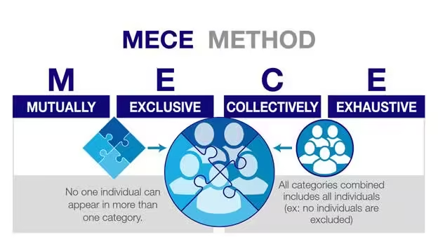
Using a MECE (Mutually Exclusive, Collectively Exhaustive) framework, the change manager can categorize stakeholder concerns into distinct groups—such as operational efficiency, user experience, and integration with existing systems—ensuring that all relevant factors are considered. By identifying these categories, the change manager can articulate a clear vision and define the desired end state that resonates with all stakeholders.
The above is from Caseinterview.com
Hypothesis: Sales Team Will Resist the New CRM System Due to Lack of Training and User-Friendliness
Step 1: Identify the Hypothesis
Hypothesis: The sales team will resist the new CRM system because they believe it is not user-friendly and they fear insufficient training.
Step 2: Break Down the Hypothesis into MECE Categories
To validate this hypothesis, we’ll break it down into specific categories that are mutually exclusive and collectively exhaustive. We’ll analyse the reasons behind the resistance in detail.
Categories:
User Experience Issues
Complexity of the Interface
Navigation Difficulties
Feature Overload
Training and Support Concerns
Insufficient Training Programs
Lack of Resources for Ongoing Support
Variability in Learning Styles
Change Management Resistance
Fear of Change in Workflow
Previous Negative Experiences with Technology
Concerns About Impact on Performance Metrics
Step 3: Gather Data for Each Category
Next, we need to collect data for each category to understand the underlying reasons and validate or refute our hypothesis.
Category 1: User Experience Issues
Data Collection:
Conduct usability testing sessions with sales team members.
Administer a survey focusing on user interface preferences and pain points.
Expected Findings:
High rates of confusion navigating the new interface.
Feedback indicating that certain features are not intuitive.
Category 2: Training and Support Concerns
Data Collection:
Survey the sales team about their current training needs and preferences.
Review existing training materials and resources provided.
Expected Findings:
Many team members express a need for more hands-on training sessions.
A lack of available resources for ongoing support after the initial rollout.
Category 3: Change Management Resistance
Data Collection:
Conduct focus groups to discuss fears and concerns regarding the new system.
Analyse historical data on previous technology implementations and employee feedback.
Expected Findings:
Employees voice concerns about how the CRM will change their current workflows.
Negative sentiments stemming from past technology rollouts that were poorly managed.
Step 4: Analyse Data Within Each Category
Now that we have gathered the data, let’s analyse the findings within each MECE category.
Analysis of Findings:
User Experience Issues:
Complexity of the Interface: Usability tests reveal that 70% of sales team members struggle to complete certain tasks in the CRM.
Navigation Difficulties: Survey responses show that 80% find one step of the navigation counterintuitive, leading to frustration.
Training and Support Concerns:
Insufficient Training Programs: Surveys indicate that only 40% of employees feel adequately trained to use this part of the new system.
Lack of Resources for Ongoing Support: Focus groups reveal that team members are unsure where to seek help after the initial training.
Change Management Resistance:
Fear of Change in Workflow: Focus group discussions highlight that 60% of participants fear their productivity will decrease with the new system, at least during the post Go Live period.
Previous Negative Experiences: Historical data shows that past technology rollouts had mediocre adoption rates due to insufficient support, reinforcing current fears.
Step 5: Develop Actionable Recommendations
Based on the analysis of each category, we can create targeted recommendations to address the concerns raised.
Recommendations:
User Experience Issues:
Conduct additional usability testing with iterative feedback loops to refine the CRM interface before full rollout.
Simplify the navigation structure based on user feedback, focusing on the most frequently used features.
Training and Support Concerns:
Develop a comprehensive training program that includes hands-on workshops, tutorials, and easy-to-access online resources.
Establish a dedicated support team to provide ongoing assistance, ensuring team members know whom to contact with questions.
Change Management Resistance:
Implement a change management strategy that includes regular communication about the benefits of the new system, addressing fears and expectations.
Share success stories from pilot programs or early adopters to demonstrate positive outcomes from using the CRM.
By following this detailed step-by-step analysis using the MECE framework, the change manager can thoroughly investigate the hypothesis regarding the sales team’s resistance to the new CRM system. This structured approach ensures that all relevant factors are considered, enabling the development of targeted strategies that address the specific concerns of stakeholders. Ultimately, this increases the likelihood of successful change adoption and enhances overall organizational effectiveness.
Data-Driven Decision Making:
At this stage, change managers should work closely with the project sponsor and project manager to determine effective positioning. A data-driven approach allows the change manager to form a hypothesis about how the change will impact stakeholders. For instance, if data suggests that the sales team is particularly resistant to change, the manager might hypothesize that this resistance stems from a lack of understanding about how the new CRM will enhance their workflow.
2. Planning Phase
Once the project is initiated, the planning phase requires detailed strategy development. Here, analytical skills are essential for conducting stakeholder analysis and impact assessments.
Example: In our CRM implementation scenario, the change manager must analyse the data collected during the commencement phase to identify the specific impacts on different departments. This involves grouping and sorting the data to prioritize which departments require more extensive support during the transition.
Using the TOSCA (Target, Objectives, Strategy, Constraints, Actions) framework provides a structured approach to guide the change management process for the CRM implementation. This framework helps clarify the overall vision and specific steps needed to achieve successful adoption. Below is a detailed exploration of each component:
1. Target
Definition: The target is the overarching goal of the change initiative, articulating the desired end state that the organization aims to achieve.
Application in CRM Implementation:
Target: Improve customer satisfaction and sales efficiency.
This target encapsulates the broader vision for the CRM system. By focusing on enhancing customer satisfaction, the organization aims to create better experiences for clients, which is crucial for retention and loyalty. Improving sales efficiency implies streamlining processes that enable sales teams to work more effectively, allowing them to close deals faster and serve customers better.
2. Objectives
Definition: Objectives are specific, measurable outcomes that the organization intends to achieve within a defined timeframe.
Application in CRM Implementation:
Objectives: Increase customer retention by 20% within a year.
This objective provides a clear metric for success, enabling the organization to track progress over time. By setting a 20% increase in customer retention as a target, the change manager can align training, support, engagement and system adoption with this goal. This objective also allows for measurable evaluation of the CRM’s impact on customer relationships and retention efforts.
3. Strategy
Definition: The strategy outlines the high-level approach the organization will take to achieve the objectives. It serves as a roadmap for implementation.
Application in CRM Implementation:
Strategy: Implement phased training sessions for each department, with tailored support based on the unique impacts identified.
This strategy emphasizes a thoughtful and structured approach to training, recognizing that different departments may face distinct challenges and needs when adapting to the new CRM. By rolling out training in phases, the organization can focus on one department at a time, ensuring that each team receives the specific support they require. Tailoring the training content based on the unique impacts identified earlier in the MECE analysis helps maximize engagement and effectiveness, addressing concerns about usability and fostering greater adoption of the CRM.
4. Constraints
Definition: Constraints are the limitations or challenges that may impact the successful implementation of the strategy. Recognizing these upfront allows for better planning and risk management.
Application in CRM Implementation:
Constraints: Limited budget and time restrictions.
Acknowledging these constraints is critical for the change manager. A limited budget may affect the types of training resources that can be utilized, such as hiring external trainers or investing in advanced learning technologies. Time restrictions might necessitate a more rapid rollout of the CRM system, which could impact the depth of training provided. By recognizing these constraints, the change manager can plan more effectively and prioritize key areas that will deliver the most value within the available resources.
5. Actions
Definition: Actions are the specific steps that will be taken to implement the strategy and achieve the objectives.
Application in CRM Implementation:
Actions: Develop a communication plan that includes regular updates and feedback mechanisms.
This action focuses on the importance of communication throughout the change process. A well-structured communication plan ensures that all stakeholders, particularly the sales team, are kept informed about the implementation timeline, training opportunities, and how their feedback will be incorporated into the process. Regular updates foster transparency and help build trust, while feedback mechanisms (such as surveys or suggestion boxes) allow team members to voice concerns and share their experiences. This two-way communication is essential for addressing issues promptly and reinforcing a culture of collaboration and continuous improvement.
By applying these frameworks, change managers can make informed recommendations that align with organizational objectives. This structured approach helps ensure that all relevant factors are accounted for and that stakeholders feel included in the planning process.
3. Execution Phase
As the project moves into the execution phase, the change manager must remain agile, continually collecting organizational data to confirm or reject the hypotheses formed during the planning stage.
Example: In an agile setting, where iterative processes are key, the change manager should implement mechanisms for ongoing feedback. For instance, after each sprint of CRM implementation, the manager can gather data from users to assess how well the system is being received. Surveys, usage analytics, and focus groups can provide rich insights into user experiences and pain points.
This ongoing data collection allows change managers to adjust their strategies in real-time. If feedback indicates that certain features of the CRM are causing confusion, the change manager can pivot to provide additional training or resources targeted specifically at those areas. This iterative feedback loop is akin to the work of strategic consultants, who continuously assess and refine their approaches based on empirical evidence.
Example in Practice: Imagine a situation where the sales team reports difficulties with the new CRM interface, leading to decreased productivity. The change manager can analyse usage data and user feedback to pinpoint specific issues. This data-driven insight can guide the development of targeted training sessions focusing on the problematic features, thus addressing concerns proactively and fostering user adoption.
4. Monitoring Phase
Monitoring the change initiative is crucial for ensuring long-term success. Change managers need to analyse performance metrics to evaluate the effectiveness of the implementation and its impact on the organization.
Example: For the CRM project, key performance indicators (KPIs) such as sales conversion rates, customer satisfaction scores, and employee engagement levels should be monitored. By employing data visualization tools, change managers can easily communicate these metrics to stakeholders, making it clear how the change initiative is progressing.
A fact-based approach to analysing these metrics helps in making informed decisions about any necessary adjustments. If, for instance, customer satisfaction scores are declining despite an increase in sales, the change manager may need to investigate further. This might involve conducting interviews with customers or analysing customer feedback to identify specific areas for improvement.
Suppose the organization observes a drop in customer satisfaction scores following the CRM implementation. The change manager could work with other stakeholders to conduct a root cause analysis using customer feedback and service interaction data to identify patterns, such as longer response times or unresolved issues. By addressing these specific problems, the change manager can refine the CRM processes and enhance overall service quality.
5. Closure Phase
The closure phase involves reflecting on the outcomes of the change initiative and drawing lessons for future projects. This is where the analytical skills of change managers can shine in assessing the overall impact of the change.
Example: After the CRM system has been fully implemented, the change manager should conduct a comprehensive review of the project along with the project team (retro). This involves analysing both qualitative and quantitative data to evaluate whether the initial objectives were met. Surveys can be distributed to employees to gather feedback on their experiences, while sales data can be analysed to determine the financial impact of the new system.
Using frameworks like MECE can help in categorizing the lessons learned. For instance, feedback could be sorted into categories such as user experience, operational efficiency, and overall satisfaction, allowing the change manager to develop clear recommendations for future initiatives.
Lessons Learned: If the analysis shows that certain departments adapted more successfully than others, the change manager could investigate the factors contributing to this variance. For example, departments that received more personalized support and training may have demonstrated higher adoption rates. This insight can inform strategies for future change initiatives, emphasizing the importance of tailored support based on departmental needs.
Building Relationships with Senior Leaders
In addition to the technical aspects of change management, the ability to communicate effectively with senior leaders is crucial. Seasoned change managers must clearly understand organizational objectives and be able to articulate how the change initiative contributes to these goals.
Example: During discussions with senior leadership, a change manager along with the rest of the project team can present data showing how the CRM system has improved customer retention rates and increased sales. By positioning this information in an easily understandable and rigorous manner, the change manager demonstrates the value of the initiative and its alignment with broader organizational objectives.
Effective communication ensures that leaders remain engaged and supportive throughout the change process, increasing the likelihood of success. By continuously linking the change initiative to organizational goals, change managers can build trust and credibility with stakeholders at all levels.
Leveraging Analytical Frameworks
Throughout the project lifecycle, incorporating structured analytical frameworks can enhance the decision-making process. Here are two key frameworks that change managers can leverage:
MECE Framework
MECE (Mutually Exclusive, Collectively Exhaustive) helps in breaking down complex information into manageable parts without overlap. By ensuring that all categories are covered without redundancy, change managers can identify all relevant factors affecting the change initiative.
TOSCA Framework
TOSCA (Target, Objectives, Strategy, Constraints, Actions) provides a comprehensive roadmap for change initiatives. By clearly defining each component, change managers can develop coherent strategies that align with organizational goals. This framework not only clarifies the change strategy but also ensures that all team members understand their roles in achieving the objectives.
Continuous Learning and Adaptation
Change management is not a static process; it requires continuous learning and adaptation. As organizations evolve, change managers must stay attuned to emerging trends and best practices in the field. This involves seeking feedback, conducting post-project evaluations, and staying updated on analytical tools and methodologies.
Change managers can attend workshops, participate in industry conferences, and engage with professional networks to enhance their analytical skills and learn from peers. By sharing experiences and insights, change managers can refine their approaches and incorporate new strategies that drive successful change.
The Transformative Power of Analytical Skills
The role of a change manager is multifaceted and requires a broad range of skills. However, one skill that stands out as particularly critical is the ability to think analytically. By adopting a strategic consultant’s mindset and applying analytical skills at each phase of the project lifecycle, change managers can significantly enhance their effectiveness.
From project commencement to closure, employing frameworks like MECE and TOSCA allows change managers to approach challenges in a structured way, making informed decisions that drive successful change. Continuous data collection, stakeholder engagement, and effective communication with senior leaders are essential components of this analytical approach.
In an era where organizations must adapt quickly to change, the ability to analyse complex data sets and derive actionable insights will distinguish successful change managers from the rest. Emphasizing this critical skill not only positions change managers as strategic partners within their organizations but also ensures that change initiatives lead to lasting, positive transformations.
As change practitioners, let us elevate our analytical capabilities and drive impactful change with confidence and clarity. By embracing this essential skill, we can navigate the complexities of organizational change and lead our teams toward a successful future.
In the rapidly evolving landscape of financial services, organisations face significant challenges due to regulatory and technological changes. A large financial services corporation has recognised the need for an integrated approach to change management reporting, embedding it within general business reporting to enhance organisational agility and effectiveness. This case study outlines the firm’s journey, challenges faced, solutions implemented, and the resulting value derived from this strategic initiative.
Background
The corporation operates under a defederated model of change management, where change practitioners are distributed across various business units. This structure has led to inconsistent change management practices and reporting, complicating the ability to provide comprehensive insights into organisational change efforts. As regulatory demands and technological advancements have intensified, the need for cohesive change management reporting became paramount.
Challenges
The primary challenges encountered by the centralized change management team included:
Diverse Reporting Preferences: Different stakeholders and divisions within the organization exhibited varying preferences for reporting formats and metrics. This lack of consensus hindered the development of a standardized reporting framework.
Maturity Disparities: Business units displayed varying levels of maturity in their change management practices, with some units showing strong interest while others remained indifferent.
Feedback Variability: Initial attempts to socialize various reporting types received mixed feedback, complicating efforts to establish a unified approach.
Solution Implementation
To address these challenges, the change management team adopted a multi-faceted strategy:
Executive Engagement: The team actively engaged with senior executives to align on the direction for change management reporting. A senior executive cohort was formed to define essential reporting needs and establish a common vision.
Collaboration with Business Intelligence (BI) Team: The change management team partnered with the BI team to integrate change management metrics into existing general business reports. This collaboration ensured that change management insights were included in routine business tracking.
Data Integration: Utilising data from Change Compass facilitated the ongoing production of comprehensive reports that combined operational metrics with change management insights.
Value Realized
The integration of change management reporting into general business reporting yielded several significant benefits:
Increased Leadership Focus: By embedding change metrics within standard business reports, leaders began to prioritize change management as part of their strategic oversight. This shift is expected to enhance readiness and adoption of future changes across the organization.
Proactive Change Support: Business leaders increasingly requested support for change initiatives, indicating a transition from a push model (where support is offered) to a pull model (where support is actively sought).
Enhanced Reporting Consistency: The establishment of a standardized set of reports improved clarity and consistency in how change initiatives were tracked and communicated across business units.
Change management Maturity: Enhancing change management maturity within the business is general done through capability development and coaching. However, this case showcases that embedding change management within general business management is a strategic way to raise awareness, visibility, and through this enhance the business’ efforts to improve the management of change.
This case study illustrates how a large financial services corporation successfully embedded change management reporting into its general business reporting framework. By engaging senior leadership, collaborating with data teams, and standardising metrics, the organisation not only improved its reporting capabilities but also fostered a culture that values proactive engagement with change initiatives. As a result, the firm is better positioned to navigate future changes while ensuring that it meets regulatory demands and capitalizes on technological advancements.
In the realm of organizational change management, the concept of a Single View of Change (SVOC) has become a focal point for experienced change practitioners. This approach aims to provide a comprehensive perspective on the myriad changes occurring within an organization, thereby facilitating informed decision-making among stakeholders. However, while the SVOC is often lauded for its potential to deliver a holistic picture of change impacts, its practical implementation raises several critical questions.
The Allure of a Single View of Change
The SVOC is designed to offer change practitioners a unified lens through which to view all organizational changes—be they strategic, operational, or cultural. By consolidating information about various changes, practitioners hope to present stakeholders with a clear and coherent narrative that captures the overall impact on the organization. This is particularly valuable in environments characterized by rapid change, where stakeholders may struggle to keep track of multiple initiatives.
Concept Illustration: The Change Landscape
Imagine an organization as a bustling city. Each building represents a different initiative or project, while the streets symbolize the pathways through which information flows. In this analogy, the SVOC acts as an aerial view of the city—providing insights into how each building interacts with others and how traffic (information) moves between them. This perspective allows stakeholders to see not just individual projects but also their collective impact on the organization.
The Realities of Implementation
Despite its theoretical appeal, achieving a Single View of All Changes may be unrealistic for many organizations. In practice, organizations often grapple with hundreds of concurrent changes, some of which may be deemed too minor or insignificant to warrant inclusion in a comprehensive overview. The administrative burden associated with capturing and maintaining this data can be substantial, leading some practitioners to question whether the effort is justified. One of the few ways to achieve this is through digital means.
Example: Too Many Changes
Consider a technology firm undergoing multiple changes simultaneously: launching a new product line, implementing an agile methodology, and restructuring its sales team. Each initiative generates its own set of data points—feedback from customers, team performance metrics, and employee satisfaction surveys. If the firm attempts to capture every detail from each initiative for its SVOC, it may end up drowning in data without gaining actionable insights.
So, what information to capture, and the methodology of capturing the information is critical. Again, digital solutions can help to automate the process, which means it can be faster and easier to capture and utilise the information.
The Cost-Benefit Analysis
Organizations must weigh the benefits of creating an SVOC against the costs involved. Practitioners should ask themselves:
What is the purpose of the SVOC?
Who are the primary stakeholders?
What decisions will be informed by this view?
If the answers indicate minimal value for certain changes or stakeholders, it may be more pragmatic to focus on high-impact initiatives rather than attempting to capture every nuance. However, if the organisation’s changes are mainly business-as-usual changes, then leaving this out will mean that the picture is no longer accurate.
To read more about calculating the financial benefits of managing a change portfolio check out this article.
Diverse Stakeholder Needs
Different stakeholders have varying requirements when it comes to understanding change:
Senior Executives: Typically prefer high-level summaries that align with strategic objectives. They seek key insights into risks and mitigations without being bogged down by granular details.
Operational Leaders: Often desire a more detailed view that includes specific impacts on daily operations and resource allocation. They may require insights down to the minute level to effectively manage their teams.
Example: Tailored Reporting
A financial services company might have different reporting needs based on stakeholder roles:
Department Heads receive weekly reports detailing project timelines, resource allocations, and immediate operational impacts.
By tailoring reports in this manner, organizations can ensure that each stakeholder receives relevant information without overwhelming them with unnecessary details.
Visual Communication Strategies
The selection of visuals plays a crucial role in conveying the right message to stakeholders. Effective visual communication should:
Allow for Flexible Drill-Downs
Stakeholders should be able to explore data at varying levels of granularity—aggregating macro-level views or drilling down into specifics as required. For example:
A senior executive might want an overview of change impacts across departments.
An operations manager may wish to drill down into specific team metrics related to a new process implementation.
Facilitate Easy Switching
Different stakeholders may prefer different types of visuals. Providing options for visual switching can enhance engagement and ensure that each stakeholder receives information in their preferred format.
Example: Interactive Dashboards
Using interactive dashboards can allow stakeholders to switch between different visual representations effortlessly. They enable stakeholders to engage with data meaningfully while catering to their individual preferences:
Heat Maps can show areas of high change impact at a glance.
Gantt Charts can provide timelines for specific initiatives.
Pie Charts can illustrate resource allocation across departments (if there are significant quantitative differences across each piece of the pie, or else the pie chart can be incredibly difficult to read for the audience. Check out this article to read more about this).
The Role of Technology
In today’s complex change environments, leveraging technology becomes increasingly critical. The sheer volume of data generated by ongoing changes can overwhelm traditional analysis methods. Here, artificial intelligence (AI) and live forecasting can serve as invaluable tools:
Automation
Utilizing AI can streamline data collection and analysis processes, reducing the need for extensive manual oversight. For instance:
Natural Language Processing (NLP) algorithms can analyze employee feedback from surveys or social media platforms to gauge sentiment regarding ongoing changes.
Automated reporting tools can generate real-time updates on project statuses without requiring manual input from team members.
Forecasting Capabilities
Live forecasting tools can provide real-time insights into potential impacts and outcomes, enabling practitioners to make proactive adjustments. For example:
A manufacturing company might use predictive analytics to forecast how changes in supply chain management will affect production schedules.
A healthcare organization could employ simulation models to assess how new policies will impact patient care delivery.
Example: AI Implementation in Change Management
Consider a global retail chain implementing AI-driven analytics during its digital transformation efforts:
Data Collection: AI tools generates various change data including change impacts, communication plan, stakeholder assessment, etc.
Analysis: Machine learning analyses the data and calls out key data observations, trends, outliers, and patterns.
Reporting: Stakeholders receive tailored reports and dashboards showing an integrated view of what upcoming changes there are, and highlighting key risks and actions required.
This approach not only saves time but also enhances decision-making by providing actionable insights based on real-time data. However, note that currently AI will not be able to do everything. The change practitioner still needs to be able to analyse generated data and amend as needed, prioritise and select key data observations for reporting, and provider editorial oversight on what key messages should go out to the various types of stakeholders.
Understanding Stakeholder Challenges
Change practitioners must develop an acute ability to read their stakeholders’ business challenges and tailor their communications accordingly. This involves:
Tailoring Data Presentations
Adjusting the types of data shared based on stakeholder roles and responsibilities is crucial. For example:
A project manager might need detailed timelines and resource allocations for specific initiatives.
A finance officer may require cost-benefit analyses and benefit realisation forecast linked to adoption rates related to ongoing changes.
Customising Visuals
Selecting visuals that resonate with specific stakeholder concerns while remaining aligned with overarching organizational goals is essential for effective communication. Using storytelling techniques in presentations can help convey complex information more effectively:
Contextualize Data: Start with a narrative that outlines why changes are necessary.
Visualize Impact: Use graphs or infographics to illustrate projected outcomes.
Call-to-Action: Conclude with specific actions required from stakeholders based on insights presented.
By framing data within a narrative context, practitioners can foster greater engagement and understanding among stakeholders.
Trial and error
A lot of your stakeholder may not know what they want. They are not change management experts so they may not be able to tell you exactly what the outputs look like. Often they may tell you at a high level the type of data they are after, but not the specifics.
You need to be able to carefully balance giving them something that will hit the mark, as a ‘test’ (since you may not hit the mark the first time). A bit of trial and error is required in this process as you continually test with your stakeholders what resonates and what gets their attention and drives action.
This can cause a lot of frustration and anxiety for change practitioners. After all, you are doing your very best to deliver something that is requested. But again, your audience does not know exactly what they want. There is an element of you guiding them, but also the other element of directly giving them what they are looking for.
Do note that if you don’t hit the mark too many times you may lose their interest, and therefore the opportunity to present change management data. This means that you may only have a small window of opportunity. Digital tools can help you with selecting the right visuals for the right stakeholders.
Facilitating Governance Forums
Creating spaces where stakeholders can discuss insights derived from change data allows for collaborative decision-making:
Regular Business Meetings: Schedule governance forums where stakeholders review progress on key initiatives.
Interactive Discussions: Encourage open dialogue about challenges faced during implementation.
Action-Oriented Outcomes: Ensure meetings conclude with clear action items based on insights shared.
Addressing Change Fatigue
One significant challenge in managing change is addressing change fatigue, which occurs when employees feel overwhelmed by constant organizational shifts. Symptoms include:
Apathy
Burnout
Increased resistance
To combat this phenomenon, organizations must implement strategies that foster resilience among employees:
Engagement Initiatives
Actively involving employees in the change process allows them to voice concerns and contribute solutions:
Feedback Mechanisms: Implement regular surveys or focus groups where employees can share their thoughts on ongoing changes.
Recognition Programs: Celebrate small wins related to change initiatives to maintain morale.
Transparent Communication
Maintaining open lines of communication regarding what changes are occurring and why they matter helps mitigate feelings of uncertainty among employees:
Regular Updates: Provide frequent updates through newsletters or town hall meetings.
Clear Messaging: Ensure messaging is consistent across all channels to avoid confusion.
Learning and Support
Providing resources that equip employees with the skills needed to navigate changes effectively is vital for reducing resistance:
Skill Development Workshops: Offer training sessions focused on new processes or technologies being implemented.
Mentorship Programs: Pair employees with mentors who have successfully navigated similar changes in the past.
The concept of a Single View of Change holds considerable promise for enhancing stakeholder understanding in dynamic organizational environments. However, its successful implementation hinges on recognizing the diverse needs of stakeholders and tailoring communications accordingly. By leveraging technology and fostering an environment conducive to engagement and support, change practitioners can create a more effective framework for managing organizational change. In summary, while striving for an SVOC may seem aspirational, it is essential for change practitioners to remain pragmatic about its execution—balancing ambition with realism to meet stakeholder needs effectively.
As organizations continue evolving in response to market demands and internal dynamics, understanding how best to communicate change becomes paramount. The Single View of Change offers a powerful toolset; however, it requires thoughtful consideration regarding stakeholder needs, technological integration, and ongoing adaptability in communication strategies. By embracing these principles, organizations not only enhance their capacity for effective change management but also cultivate resilience among their workforce—ultimately positioning themselves for sustained success in an ever-changing landscape.
As a change management practitioner, your mission is to guide organisations through change, building their ability to manage transitions effectively and sustainably. A major part of this work often involves helping organisations develop their “change maturity” — the capacity to continuously and successfully deliver change. Many experienced change practitioners focus on moving organisations along this maturity curve, seeing it as a vital part of creating a culture that embraces and sustains transformation.
However, in this pursuit, there’s a potential risk: becoming too fixated on achieving “change maturity” can cloud your judgment about what the organisation really needs. You may find yourself caught up in the desire to build structured change processes, educate stakeholders on every change theory, or create complex frameworks to assess and elevate change capability. While these elements are important, an over-reliance on them can impede progress. In some cases, your organisation might be more capable of managing change than you think, but your approach could be holding them back.
There are several common areas where change practitioners may become too focused on change maturity — and how this focus can actually hinder their ability to support successful, meaningful change. We’ll delve into how overemphasising change terminology, processes, structures, and risk-averse approaches can become obstacles to progress. By understanding and addressing these potential pitfalls, you can better align your support with the unique needs and readiness of your organisation, enabling a smoother, more effective path to support successful change.
Are You Too Quick to Label Your Organisation as Change Immature?
One of the first traps experienced change practitioners might fall into is quickly labeling their organisation as “change immature.” It’s tempting to assess an organisation’s change capability through the lens of formal change frameworks and models, but by doing so, you may be discounting their informal ability to adapt to change.
In other words, is your ‘label’ placed on the organisation a potential self-fulfilling prophecy? For example, if you see the organisation as mildly change mature, your approach and lens may all be geared around this label and expectation.
Organisations that have not formally defined their change management processes or have not made concerted efforts to assess their change maturity might seem “immature” on the surface. But that doesn’t mean they lack the inherent capacity to change. In many cases, businesses have evolved and navigated transitions without formal change models in place, relying on their leadership, adaptability, and problem-solving capabilities.
Example: Mislabeling the Organisation’s Maturity
Consider a large, successful organisation with a history of navigating mergers, market shifts, and product innovation. While this company may have never formalised a change management function or assessed its change maturity, its survival and success prove that it has navigated complex changes in the past. You, as the change practitioner, might arrive and see that the business lacks a formal change methodology like Prosci or Kotter, so you label them as immature. As a result, you might start recommending a highly cautious, structured approach to “bring them up to speed.”
However, this label can lead to unnecessary delays. Rather than imposing new structures or over-engineering the process, it could be more effective to build on the organisation’s existing ways of working. The business may already have the right instincts, and simply needs to refine its approach to handle more formalised, larger-scale change efforts.
This cautious approach of assuming immaturity often leads to missed opportunities for progress. It slows down the pace of change and leaves businesses feeling that they are incapable of handling large-scale change without significant external help.
Change Terminology and Concepts: Over-Education vs. Practical Implementation
Another common pitfall is becoming too focused on educating stakeholders about change management concepts and frameworks, rather than focusing on practical implementation. It’s easy for experienced change practitioners to get caught up in explaining the intricacies of change theories, but the reality is that many stakeholders may not need or want this level of detail.
Stakeholders, especially those in senior leadership positions, are often more interested in results than in the underlying change management theories. Spending too much time educating them on ADKAR, Kotter’s 8-step process, or Lewin’s model can divert attention from the critical issue: how to implement the change in their specific organisational context.
Using and coaching your stakeholders on implementing change without change methodology is a skill, but one that can be critical.
Example: Change Concepts vs. Actionable Strategies
Imagine working on a digital transformation project where the leadership team is eager to see results. Instead of diving straight into how the change will be implemented, you spend the first few weeks educating the leaders on the theory behind change management, explaining why each stage of the ADKAR model is important and why a structured approach is necessary. While these concepts are valuable, the leadership team is left feeling overwhelmed by jargon and disconnected from the practicalities of the change they need to deliver.
A more effective approach in this situation might be to focus on practical, actionable strategies that are action-based learning. Instead of over-explaining change concepts, walk stakeholders through the steps they need to take, provide them with tools to manage resistance, and give them clear, real-time metrics on progress. In many cases, stakeholders don’t need an in-depth lesson on change theory—they need guidance on how to lead change within their teams, how to prepare and engage effectively, and how to overcome resistance.
Even if you don’t focus on education, and instead label them as change immature. This in itself can be dangerous and unhelpful. As a result you don’t implement the right approaches to support the change required to achieve their business goals.
While it’s essential to help stakeholders understand the principles behind change, overemphasis on theoretical knowledge can take the focus away from delivering the change itself.
Processes and Structures: Building New or Leveraging Existing?
One of the hallmarks of a maturing change organisation is the establishment of formal structures and processes to support change. Communities of practice, change champion networks, formalised governance bodies, and change management offices all play vital roles in building long-term change capability. However, there’s a risk of becoming too focused on building these structures rather than finding ways to work within the current framework of the organisation.
When faced with the task of improving change capability, many practitioners instinctively begin to build new structures from scratch. However, this can add complexity and create parallel processes that the business may not be equipped to handle. Sometimes, rather than introducing new structures, the better approach is to refine and optimise existing business processes and forums to embed change more naturally.
Example: Building New Structures vs. Leveraging Existing Ones
Consider an organisation that already has strong cross-functional governance in place for operational projects. Instead of introducing a new change champion network, you could work with the existing project governance structures to ensure change management principles are integrated into these meetings. By adapting existing forums to include change discussions, you avoid creating extra layers of complexity and leverage routines that are already familiar to the business.
The challenge is to balance the need for formal change structures with the desire to minimise disruption to current workflows. Often, the most effective approach is to enhance existing structures rather than building entirely new ones. This also helps to prevent the perception that change management is an “additional burden” rather than an integrated part of business operations.
‘Babying’ Your Stakeholders: Are You Doing the Change for Them?
As a change practitioner, it’s natural to want to help stakeholders navigate the complexities of change. But there’s a fine line between supporting your stakeholders and doing the change for them. When you step in to handle every aspect of the change process, you risk undermining your stakeholders’ ability to build their own change capability.
The goal of change management is to empower the business to manage change independently. If you are too involved in managing the change, you can inadvertently create dependency, where stakeholders rely on you to handle resistance, communications, or decision-making. This not only stifles their growth but also prevents the organisation from building a sustainable, internal capacity for change.
Example: Over-Involvement vs. Coaching for Capability Building
Suppose you’re leading a change initiative in a large organisation, and you find yourself handling most of the communications, solving problems that arise, and managing resistance from teams. While you may feel that you’re helping, the reality is that your stakeholders are becoming overly dependent on you to manage the change.
A more effective approach is to take a coaching stance. Rather than doing the change for them, help your stakeholders learn how to anticipate resistance, communicate effectively, and manage change within their teams. Offer guidance and support, but resist the temptation to take over. When you empower stakeholders to lead the change themselves, you help them build the confidence and skills they need to manage future changes more independently.
The key is to recognise when your involvement is crossing the line from support into doing the change for them. The more you can coach and mentor your stakeholders, the more resilient and capable the organisation will become.
Setting the Bar Too Low for Your Organisation
The COVID-19 pandemic demonstrated something profound about people and organisations: they are capable of changing far more quickly than we might have thought. Practically overnight, organisations adapted to remote working, adopted new technologies, and restructured their operations. This rapid adaptation showed that many organisations have far more resilience and capacity for change than we often give them credit for.
But in the post-pandemic world, are you still setting the bar too low for your organisation? Are you approaching change cautiously because you assume the business is not capable of rapid adaptation? If so, you may be underestimating their ability to handle larger-scale change or more ambitious transformation initiatives.
Example: Underestimating Organisational Capacity
Imagine working with an organisation that wants to implement a large-scale digital transformation. You might assume that because the business has not undertaken such a significant change before, they will need to move cautiously, taking small steps toward change maturity. However, given the right leadership support, clear communication, and resources, the organisation might be able to implement the transformation far more quickly and effectively than anticipated.
The key is to challenge your assumptions about the organisation’s capacity for change. Instead of setting the bar too low and taking overly cautious steps, consider where you can stretch the organisation’s potential. Businesses often have far more adaptability and resilience than we might assume, and by aiming higher, you can help them achieve more ambitious outcomes. Again, COVID was a clear demonstration of what can be possible.
Caution vs. Progress: Finding the Right Balance
One of the biggest challenges for change practitioners is finding the right balance between caution and progress. In many cases, particularly with organisations that are newer to structured change management, a cautious approach may feel like the safest route. But taking overly cautious steps can prevent the organisation from achieving the level of change it needs to succeed.
The other side of the equation is pushing too hard, too fast. While organisations may have a greater capacity for change than we give them credit for, they also need time to adapt and build their change capability. The trick is to strike the right balance between ambitious progress and thoughtful pacing, especially iterative paced learning.
Example: Caution vs. Ambition in Portfolio-Level Change
Consider an organisation that is managing a portfolio of change initiatives. One approach is to take small, incremental steps to build change capability, slowly rolling out new processes and frameworks. While this approach may feel safe, it can prevent the business from keeping up with the volume and pace of change it needs to manage.
A more ambitious approach might involve embedding change management principles directly into business planning, governance, and decision-making. By integrating change management into existing processes, the organisation can manage a high volume of change more effectively without creating new silos or delays. This approach pushes the organisation to operate at a higher level, while still allowing time for adaptation and learning.
Adjusting Your Lens on Change Maturity
While change maturity is an important goal for any organisation, becoming too fixated on achieving it can inadvertently cloud your judgment and therefore negatively impact outcomes. Overemphasising change models, frameworks, and cautious steps can slow down the pace of change and underestimate the organisation’s capacity to evolve. As a change management practitioner, your role is not just to assess change maturity but to empower the organisation to grow and adapt.
By adjusting your lens and focusing on the organisation’s immediate needs and strengths, you can support more effective, sustainable change. This means balancing formal change processes with practical implementation, empowering stakeholders to lead the change themselves, and setting higher expectations for what the organisation can achieve.
The goal is not just to build change maturity, but to help the organisation experience navigating change in a way gives them confidence and meets their business goals.
In the world of change management, Go Lives are often seen as significant milestones. For many project teams, these events represent the culmination of months or even years of hard work, signaling that a new system, process, or initiative is officially being launched. It’s common for stakeholders to view Go Lives as a key indicator of the success of a change initiative. However, while Go Lives are undeniably important, relying on them as the primary measure of change impact can be misleading and potentially harmful to the overall change effort.
Go Lives are just one piece of the puzzle. Focusing too heavily on these milestones can lead to an incomplete understanding of the change process, neglecting crucial activities that occur both before and after Go Live. Let’s outline the risks associated with using Go Lives to report on change management impacts and offers best practices for a more holistic approach.
Go Lives: A Double-Edged Sword
Go Lives are naturally a focal point for project teams. They represent a clear, tangible goal, and the success of a Go Live can boost morale, validate the efforts of the team, and provide a sense of accomplishment. From a project delivery perspective, Go Lives are critical. They signal that the project has reached a level of maturity where it is ready to be released to the broader organization. In terms of resourcing and business readiness, Go Lives ensure that everything is in place for the new system or process to function as intended.
However, the very attributes that make Go Lives attractive can also make them problematic as indicators of change impact. The simplicity and clarity of a Go Live event can lead stakeholders to overestimate its significance, from a impacted business perspective. The focus on Go Lives can overshadow the complex and often subtle changes that occur before and after the event. While a successful Go Live is necessary for change, it is not sufficient to guarantee that the change will be successful in the long term.
The Pre-Go Live Journey: Laying the Foundation for Change
A significant portion of the change management journey occurs long before the Go Live date. During this pre-Go Live phase, various engagement and readiness activities take place that are critical to shaping the overall impact of the change. These activities include town hall meetings, where leaders communicate the vision and rationale behind the change, and briefing sessions that provide detailed information about what the change will entail.
Training and learning sessions are also a crucial component of the pre-Go Live phase. These sessions help employees acquire the necessary skills and knowledge to adapt to the new system or process. Discussions, feedback loops, and iterative improvements based on stakeholder input further refine the change initiative, ensuring it is better aligned with the needs of the organization.
These pre-Go Live activities are where much of the groundwork for successful change is laid. They build awareness, generate buy-in, and prepare employees for what is to come. Without these efforts, the Go Live event would likely be met with confusion, resistance, or outright failure. Therefore, it is essential to recognize that the impact of change is already being felt during this phase, even if it is not yet fully visible.
Post-Go Live Reality: The Real Work Begins
While the Go Live event marks a significant milestone, it is by no means the end of the change journey. In fact, for many employees, Go Live is just the beginning. It is in the post-Go Live phase that the true impact of the change becomes apparent. This is when employees start using the new system or process in their daily work, and the real test of the change’s effectiveness begins.
During this phase, the focus shifts from preparation to adoption. Employees must not only apply what they have learned but also adapt to any unforeseen challenges that arise. This period can be fraught with difficulties, as initial enthusiasm can give way to frustration if the change does not meet expectations or if adequate support is not provided.
Moreover, the post-Go Live phase is when the long-term sustainability of the change is determined. Continuous reinforcement, feedback, and support are needed to ensure that the change sticks and becomes embedded in the organization’s culture. Without these ongoing efforts, the change initiative may falter, even if the Go Live event was deemed a success.
The Risk of Misleading Stakeholders
One of the most significant dangers of focusing too heavily on Go Lives is the risk of misleading stakeholders. When stakeholders are led to believe that the Go Live event is the primary indicator of change impact, they may not fully appreciate the importance of the activities that occur before and after this milestone. This narrow focus can lead to a number of issues.
Firstly, stakeholders may prioritize the Go Live date to the exclusion of other critical activities. This can result in insufficient attention being paid to pre-Go Live engagement and readiness efforts or to post-Go Live adoption and support. As a consequence, the overall change initiative may suffer, as the necessary foundations for successful change have not been properly established.
Secondly, stakeholders may develop unrealistic expectations about the impact of the change. If they believe that the Go Live event will immediately deliver all the promised benefits, they may be disappointed when these benefits take longer to materialize. This can erode confidence in the change initiative and reduce support for future changes.
Finally, a narrow focus on Go Lives can create a false sense of security. If the Go Live event is successful, stakeholders may assume that the change is fully implemented and no further action is required. This can lead to complacency and a lack of ongoing support, which are essential for ensuring the long-term success of the change.
Best Practices for Reporting Change Management Impact
To avoid the pitfalls associated with relying on Go Lives as indicators of change impact, change management practitioners should adopt a more holistic approach to reporting. This involves considering the full scope of the change journey, from the earliest engagement activities to the ongoing support provided after Go Live. Here are some best practices for reporting on change management impact:
Integrate Pre-Go Live Metrics:
Track and report on engagement activities, such as attendance at town hall meetings, participation in training sessions, and feedback from employees.
Monitor changes in employee sentiment and readiness levels throughout the pre-Go Live phase.
Report on aggregate pan-initiative change initiative impost on business units, pre-Go Live
Emphasize Post-Go Live Support:
Develop metrics to measure the effectiveness of post-Go Live support, such as the number of help desk inquiries, employee satisfaction with the new system, and the rate of adoption.
Highlight the importance of continuous feedback loops to identify and address any issues that arise after Go Live.
Communicate the need for ongoing reinforcement and support to stakeholders, emphasizing that change is an ongoing process
Report on post-Go Live adoption time impost expected across initiatives
Provide a Balanced View of Change Impact:
Ensure that stakeholders understand that Go Live is just one part of the change journey and that significant impacts occur both before and after this event.
Use a combination of quantitative and qualitative data to provide a comprehensive view of change impact.
Regularly update stakeholders on progress throughout the entire change journey, not just at the time of Go Live.
Manage Expectations:
Clearly communicate to stakeholders that the full impact of the change may not be immediately visible at the time of Go Live.
Set realistic expectations about the timeline for realizing the benefits of the change.
Prepare stakeholders for potential challenges in the post-Go Live phase and emphasize the importance of ongoing support.
While Go Lives are important milestones in the change management process, they should not be used as the sole indicator of change impact. The journey to successful change is complex, involving critical activities before, during, and after the Go Live event. By adopting a more holistic approach to reporting on change management impact, practitioners can provide stakeholders with a more accurate understanding of the change journey, manage expectations more effectively, and ensure the long-term success of the change initiative.
The key takeaway is that change management is not just about delivering a project; it’s about guiding an organization through a journey of transformation. Go Lives are just one step in this journey, and it is the responsibility of leaders to ensure that every step is given the attention it deserves.