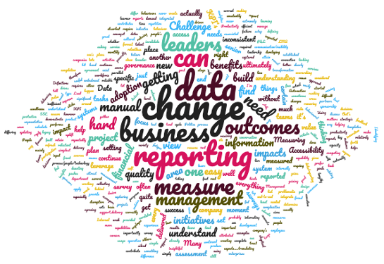
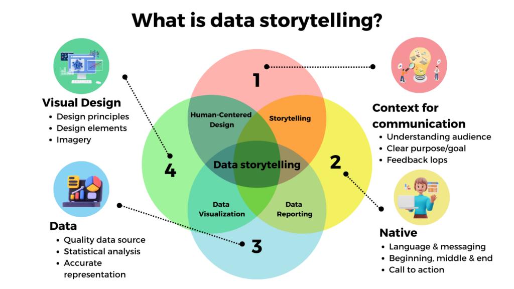
We surveyed senior change practitioners on their key challenges in using change data to generate insights, and here is what we found …
Change practitioners seem to face quite a lot of challenges across the board in measuring change and demonstrating the value of managing change. For many, there appears to be a level of angst and frustration in not being able to break through and demonstrate insight through change data in a clear and simple way.
Why did we survey this topic? In the new economy, our world is increasingly dominated by technology and data. More than ever data is all around us and our ability to access a range of data is becoming more prevalent. At our fingertips, we can access our phone to see how many steps we have taken today, work email and even workplace chat platforms.
In the business world, the same applies even more so. All facets of how business is being will increasingly be dominated by data. The availability of data. The insight that can be generated by data to make decisions. Data is king and a competitive advantage.
However, in change management, our ability to use data has mainly been restricted to ‘soft’ qualitative data. Of course, all types of data are useful both hard and soft data. However, most of our stakeholders who make decisions on project execution, funding, and prioritisation are focused on hard metrics. We really cannot blame them because hard metrics tell a direct compelling picture, whereas soft, qualitative data requires a level of interpretation and maybe less direct in the implication.
We surveyed a sample of senior change practitioners and received 30+ responses. After sorting through the feedback and responses we grouped them into the following 7 themes. We also directly address each of the challenges posed.
1. Getting buy-in from stakeholders on data input
Some mention the importance of stakeholder support and buy-in in collecting change data. This can be quite challenging if your stakeholder does not see the value of the change data that you are collecting. Since the bulk of change data is derived from each of the impacted businesses and those involved in the initiative, it is critical that the impacted stakeholders are supportive to ensure that data may be collected and response is sufficient.
A key element in ensuring that your stakeholder buy-in to your change data plans is to come up with a ‘sales pitch’ for them personally. Each stakeholder is concerned about their own priorities and challenges. If the change data can be positioned to address one of their pain points, then it will be hard to imagine any stakeholder who will not be interested.
2. How to measure cultural & behavioural change
This is probably the biggest challenge called out across respondents. Most change practitioners work on embedding some form of behaviour change. As a result, being able to measure the behaviour change is critical to demonstrate the value of having a change manager onboard and the value of change tactics.
And since most initiatives are not end-to-end transformations of everything within the organization, there is usually a limited set of behaviours that the initiative aims to change. Working on measuring a small set of behaviours can be challenging because it is not that we are measuring the whole culture of the organisation, which can be measured by culture inventories such as Organization Culture Inventory (OCI).
One way to do this is to start by defining the actual behaviours you are trying to measure in very specific detail, in a way that is behavioural and observable. For example, customer service representatives will be able to resolve customer complaints in the first contact without escalating to their team leader. This can easily be measured using the data from the CRM system that the representative uses.
Then we can break this down into more discrete ‘micro-behaviours’ that will contribute to the overall behavioural outcome. For example, in this example, it could be 1) Establish rapport within the first 3-5 minutes of the conversation and 2) ability to identify a customer complaint 3) Apply structured complaint resolution strategies as per training content 4) Regular supervisor coaching and guidance on complaint resolution performance. These behaviours can be recorded using call listening audits, self-ratings, and/or supervisor ratings.
3. Data requires time, resources and effort to collect.
Change practitioners told us that the amount of work involved in collecting, sorting through, and analysing data is very resource-intensive. Because of this many try and avoid this as they do not have sufficient time or resources to collect data.
A lot of the work required is also very manual. Many mentioned automation as something they are looking forward to. Change data that can be automated to save time and energy to follow up, collect, followed by data analysis is one that everyone looks forward to.
The solution is to leverage various digital tools to better automate the capturing, analysis and visualization of data. For example, Change Tracking is a tool now owned by Accenture that measures change readiness and generated reports. For various task management and collaboration features, most use such as Trello or Jira/Confluence. To measure change impact and change capacity, try The Change Compass.
4. Change capacity
The capacity for the impacted business stakeholder to undergo and embed the change is often the first that comes to mind when it comes to change data and reporting. Most respondents mention manually developing a change heatmap to try and depict the potential change capacity.
However, what the change heatmap actually depicts is the amount of change impact the various initiatives have added up together. This shows how much change impact there is and not the actual capacity that the impacted stakeholder groups have. It could be that certain parts of the organization are agile, mature and have great leaders. Therefore, they are able to have a much greater capacity to undergo larger volumes of change than another part of the organization. To read more about change heatmaps go to The death of the change heat map.
To resolve this it is important to map out the level of change capacity. How does one do this? By using historical data and comparing the level of change against business feedback such as performance indicators, and employee and leader feedback. To automate this process whereby you’re able to visualize the impacts of change against the plotted change capacity levels of each part of the business leverage The Change Compass.
5. Change prioritisation
Respondents call out the fact that often prioritisation of initiatives is made based on typical project manager data points such as cost, timeline, funding and business results. The gap is that change data should also be taken into account. Data such as the velocity of the change, the volume of the change, change capacity, risk of impact on business performance, business readiness, all should be valid data points to consider in making prioritisation decisions.
With the ability to access a range of data points, the organisation is better able to make balanced decisions to maximise benefits and minimise risk. The fact is that with the various challenges listed here in not being able to access a range of change data, decision-makers simply make decisions based on whatever they can get their hands on.
6. Data recency and validity
The usefulness of data is only as good as its recency and validity. Outdated data cannot be used to make decisions. What respondents call out is that it is difficult to ensure that data is constantly updated and valid. Once again, keeping data recent takes significant time and effort. However, various digital tools can again be leveraged to support data recency. At The Change Compass we build in a feature to remind users to update information and data recency is also depicted in reports to reinforce the update of data.
Change governance is critical to be able to support and govern the change data collected and reported. Change governance does not need to be a separate body created just for the purpose of governance change data. It could be a business unit planning meeting or a part of a PMO agenda for example. The purpose of the governance body here is to reinforce the importance of data, review any generated insights, and make decisions on how to apply insights to business decisions.
As a change community, our challenge ahead remains how we adopt and embrace the new world of data and insights. The more we are able to leverage data and not shy away from it. The more we are able to move the discipline forward to that which is seen as directly driving business value and has a critical seat at the table in decision making.
Change Management is full of concepts and frameworks that are outdated and not based on empirical research. It seems that in the business world, we are very comfortable with concepts that sound like they make sense intuitively. If the concept is simple and interesting then we’re in. We don’t require them to have any scientific proof and research is often not required.
Let’s take one example. The Kubler-Ross model is one of the most popular models that outlines the 5 stages of grief a psychiatrist in the book ‘On Death and Dying’. The 5 stages are denial, anger, bargaining, depression, and acceptance. However, there is a lack of empirical research supporting these 5 stages, and in fact, research suggests other expressions of grief.
Moreover, we’ve somehow applied this model to change management assuming that it is relevant. Whilst dying is a change process, this context cannot be generalised across all other changes such as implementing a new system, a new product, or a new policy. Moreover, there is no research supporting this. We all know that there are lots of people who do not go through these phases during lots of change processes. And certainly, it would be hard to imagine someone going through these phases after buying a new desirable iPhone from a previous older model.
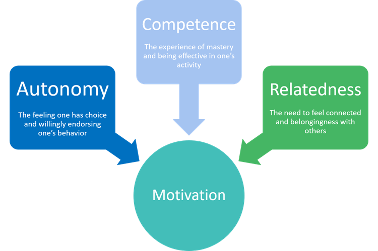
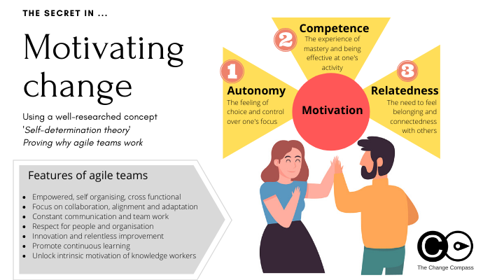
Now, if there are so many popular concepts that are not backed up by research what should we use that is based on proven evidence? Self-determination theory (SDT) by Edward Deci and Richard Bryan should be one that the change management community adopts. It is a broad-based theory about human motivation that focuses on people’s inherent growth tendencies and innate psychological needs. There has been significant research supporting this theory since the 1970s and more research is underway.
What is the self-determination theory about motivation?
The theory states that there are 3 innate human needs that if met will provide motivation, motivation to undertake tasks, to develop, and to undergo change. These 3 elements are:
1) Competence
The experience of mastery and being effective at one’s activity. When people feel that they have the skills required to be successful they are much more likely to take on tasks that will help them achieve their goals
2) Relatedness
The need to feel belonging and connectedness to others.
3) Autonomy
The feeling of choice and control over one’s focus.
Each of the three elements contributes to motivation, by having the right level of skills and confidence, by wanting to be connected to others, and by feeling in control over one’s focus or task.
Some implications of these 3 elements on how we manage change include:
1) Simply conducting training may not address someone’s level of competence. The outcome is that they need to feel confident. This means that there should be a holistic focus on a range of learning interventions to promote and support confidence, such as managerial acknowledgment, catering to individual learning styles, supportive learning environment/community after training sessions, etc.
2) Change activities should not be implemented for individuals in isolation from others. For example, if learning is utilized, the change approach should be designed to provide visibility on how others are undergoing the change process, and where they are sharing their experiences. This is why change champions are so important since effective champions promote and build a supportive community
3) Especially for more significant changes, it is important to design into the change process a sense of autonomy for those impacted. This may seem contradictory to how most companies implement change, i.e. one that is characterized by one common set of activities for all employees. What this important to emphasise according to SDT is to build in employee involvement so that they feel that they are shaping and developing the change versus being negatively impacted by it with no choice whatsoever.
There are 2 types of motivations:
1) Controlled Motivation
• “The carrot and the stick” approach to motivating someone • Seduced into the behaviour • Coerced into the behavior, often with the threat of punishment • Experience of tension and anxiety
Employees who work in a controlled motivation environment usually have negative emotions and their confidence and well-being also suffer. Also, in this environment, employees usually take the shortest path to reach the desired outcome. This may or may not have the best consequences for the company. If the company is trying to stipulate a set of behaviors, these may be avoided or blind-sighted to get to the ultimate ‘measure’.
2) Autonomous motivation:
• Experience of volition and choice about the work that one is doing • If the person enjoys the work and finds it interesting, then the autonomous motivation level increases • If the values of the work are consistent with the values of the individual this also increases motivation • If the person endorses the work, then he or she will also be more motivated to undertake the work
Organisations want more autonomous individuals that are aligned their work. Why?
Because research has found that autonomous workers are:
• More creative • Better problem solvers and be able to think outside of the box • Better performance • More positive emotions • Better psychological and physical wellbeing
So how do we promote a change environment that develops autonomous workers?
• Take the perspectives of the workers and their mindset, and be clear about what moves them, what bugs them, what they get excited or bored about, their core values and interests, etc.
• Providing them with choice and the ability to participate in the change and the decision-making process where possible. This will encourage their buy-in and engagement.
• Support them with exploring different ideas and trying new ways of approaching the work differently. This approach is also very consistent with agile ways of working, encouraging innovation, and a ‘safe to fail’ environment.
• Encouraging them to be self-starters and self-initiated.
• Provide them with a strong and meaningful rationale of the ‘why’ of the purpose of the change so that they understand the reasons behind the change.
Edward Deci goes on further to state “Don’t ask how you can motivate others, ask how you can create the conditions for them to motivate themselves”.
From activity-driven to design-driven
One of the biggest implications of SDT is that next time you design your change intervention you should focus away from key standard change management activities such as communications and training. Instead, focus on creating and designing an environment from which people can motivate themselves.
This is a fundamental shift for a lot of change practitioners and requires a depth of understanding about how the organisation functions and what will move its dial. It is not about implementing 1 or 2 core activities, it is about implementing a range of interventions to shape the environment to support change.
Some practical ways in which you can design an environment to promote change motivation:
1) Workshops for participants to brainstorm and discuss ways in which they can undergo the change journey;
2) Share stories of how other employees have experienced change personally; Use different mediums in which to communicate the change, to appeal to different people preferences (e.g. video, online, face-to-face, posters, etc.);
3) Leverage key influencers to influence the community. Provide a sandbox or other platforms (such as an online platform, showcase room, etc.) from which employees may experience and play with the new environment;
4) Break up the change journey into small steps and milestones and acknowledge each progression;
5) Encourage community discussions about the change;
The challenge in building change environments
When we start to design a holistic environment for change, more often than not we are designing this for a set of changes and not just one initiative. In this complex, continuously changing environment, we need to be able to keep tabs on what the changing environment looks like and how it is evolving amongst the various change initiatives.
As different change environment interventions ramp up, we need to be able to visualise how these interventions and activities are impacting the employees and their environment. This includes being able to visualise the pace, scale, nature, and multiplicity of the changes across various parts of the organisation. Using data visualisation tools such as The Change Compass is valuable for organisations within agile environments.
Using the insights and core concepts from the self-determination theory will serve significant value for the change management community. Not only are its concepts well-researched and proven by research but there is a range of directly applicable implications for the change practitioner. No longer do we have to work with frameworks that are fashionable but lack the rigor of empirical research. The challenge now is how we adopt this within our change approach and ‘change the way we approach to change’.
Elevate Your Change Management with The Change Compass: Weekly Demo
Embark on a transformative journey towards unparalleled change management insights and performance enhancement with The Change Compass. Join our weekly demo and discover how a single view of change can revolutionize your approach to business performance.
Move over older concepts and motivation theories such as Lewin’s, Bridges and Kubler-Ross models that are dated and not based on years of rigorous research….. It’s time we started to focus on well-researched and evidence-backed models that explain people’s behaviours in change. Of course there is no single approach that may provide the best results in the motivation of a group of employees. However, this framework provides valuable insights of the types of motivation for individual employees that lead to employee commitment to organizational change.
Change management practitioners often grapple with the challenge of employee motivation to embrace change. A powerful framework that can guide this process is Self-Determination Theory (SDT), which emphasizes the importance of intrinsic motivation (versus eternal factors) and the fulfilment of basic hierarchy of needs of people within the work environment. This theory of human motivation takes into account critical tiers of human needs of employee development or professional development that leads to the outcome of employee engagement. By understanding and applying SDT, practitioners can create environments that foster genuine motivation for change.
Understanding Self-Determination Theory
SDT identifies three core psychological needs essential for motivation:
Autonomy: The need to feel in control of one’s actions and decisions as one of the basic needs that leads to employee satisfaction and a positive work environment. When individuals perceive they have a choice, they are more likely to engage willingly in change initiatives.
Competence: This refers to the desire to feel effective and capable at the individual level that leads to employee performance. Providing opportunities for skill development, career development, performance reviews and positive feedback can enhance individuals’ sense of competence, making them more motivated to pursue change.
Relatedness: The need to feel connected and understood by others also leads to job satisfaction. Building supportive relationships and social connections foster a sense of belonging, which can significantly enhance motivation. This is a basic condition of human nature that focuses on intrinsic factors rather than external factors of needs theory that lead to job enrichment.
By addressing these needs, change management practitioners can cultivate an environment where individuals are intrinsically motivated to engage in and sustain change.
Applications in Change Management
Foster Autonomy: Encourage team members to take ownership of their roles in the change process with targeted performance goals. Allow them to set personal goals related to the change initiative and choose how they want to achieve those goals forms a solid foundation. This autonomy can lead to greater commitment and enthusiasm.
Build Competence: Offer training sessions and resources that help individuals develop the skills necessary for the change. Celebrate small wins to reinforce their capabilities, which boosts confidence and motivation.
Enhance Relatedness: Create opportunities for collaboration and open communication among team members. Establishing peer support systems or mentorship programs can help individuals feel connected, fostering a supportive environment conducive to change.
Linking SDT with Agile Teams
In Agile environments, where adaptability and collaboration are crucial, SDT aligns perfectly with team dynamics:
Empowered Teams: Agile practices emphasize self-organizing teams, which inherently supports autonomy. Team members are encouraged to make decisions collectively, enhancing their sense of ownership over the process.
Continuous Feedback: Agile methodologies promote regular feedback loops, which not only help build competence but also reinforce a culture of learning and growth.
Collaboration: Agile teams thrive on collaboration, fulfilling the need for relatedness. Daily stand-ups, retrospectives, and pair programming foster connections among team members, enhancing their commitment to shared goals.
Motivating change is not just about implementing new processes; it’s about understanding what drives people. By leveraging Self-Determination Theory, change management practitioners can create an environment that nurtures autonomy, competence, and relatedness. This approach not only facilitates smoother transitions but also cultivates a culture of intrinsic motivation—essential for sustaining long-term change. Embracing these principles within Agile frameworks further enhances team dynamics, making the journey toward change both effective and empowering.
Click here to download the infographic on ‘Self-Determination Theory’ of motivation. Stay tuned for our up-coming article on this.
There are many facets of driving agile changes. Agile changes are featured by such as developing minimum viable product and not investing too much initially, developing a series of iterations to gradually improve the product, engaging stakeholders early and frequently to ensure the outcomes meet business needs, developing working product/solutions from which feedback may be sought to feed iterative improvements prior to final release.
With so many facets of implementing agile changes, what is
the most important part of driving agile changes? What is the core concept that must be done right
without which the change would not be considered ‘agile’?
One of the most critical parts of agile change is the
concept of developing a hypothesis that can be tested. The outcome must be clear in terms of whether
the solution developed meets the business needs or not.
Why hypothesis?
In waterfall methods of delivering projects, the focus is on
spending significant focus understanding and detailing features and ‘requirements’
from the business. From these, the
solution is then designed and developed.
The problem with this approach is:
Significant resources and investment may be
required to sufficiently develop the solution depending on the complexity
involved
It may also take a long period of time to
involve various stakeholders and investigate solution design options before a final
product can be developed. A series of
design decisions also need to be made, each step taking time to undergo
The business may not know what they want and
they would need to provide ‘requirement’s that may or may not meet their
needs. For example, prior to the launch
of iphones, touch screen phones were not popular and were not seen as the
design of future phones
The risk can be significant if the solution developed
does not meet business needs. Millions
of dollars of project investment could have been wasted if this is the case.
On the other hand, what is the advantage of a hypothesis based approach?
Does not spend a lot of time creating a
sophisticated solution or product.
Instead, a simplified version is developed which captures the core of
business need. This is then tested, and then
the results can then feed into further improvements required. In this way, the process allows organisations
to fail early and cheaply in order to eventually come up with the winning
solution
Instead of focusing on detailed planning which
is based on a series of assumptions which may not have been tested to be valid,
the focus is on deriving a solution that CAN be tested and validated or
invalidated. This is especially important
when the solution is new and has not been implemented previously in the
organisation
The hypothesis approach is a scientific approach
where the focus is on proven results based on data. In the same way a laboratory technician would
conduct a series of experiments to test the properties of a chemical solution to
further understand it, in the same way the project team would conduct a series
of ‘experiments’ (or iterations) to gradually test and from testing results,
improve the solution
Tests are always based on ‘real’ data and real
scenarios therefore there is a much greater chance that the final solution will
meet business needs
The importance of a hypothesis-approach for organisational agility
The survival and growth of a company are dependent on its ability to go into different products, different territories or different customer groups to expand its offering. In order to do this, the company needs to ultimately launch various products or services that do not exist currently or that have not been launched in certain new areas/segments.
Therefore, the ability of the organisation to continuously develop, launch and learn from new products and services is critical for its success. Each product launch is a new hypothesis that is to be tested. And with each testing, a set of learning is achieved which will improve its next product launch. In this way, this is how companies become agile and develop the ability to flex and change based on its ability to generate hypotheses.
For digital businesses developing hypothesis is a core way of operating. A hypothesis can be as small as testing the wording of the website using A/B Testing to see which wording is more engaging for website visitors. A/B Testing is where a certain number of visitor traffic is channeled into one version of the website versus another version. And the results of visitor interactions can be used to validate which version is more engaging.
Change management hypothesis testing
To truly adopt a hypothesis-based approach to change management one needs to adopt change hypothesis testing. What is change hypothesis testing I hear you ask? It is basically developing a series of small change experiments to test assumptions. Change experiments are important because they help to inform what change tactics or approaches work or do not work.
Some examples of change experiments include:
Wording of campaign phrases or positioning
Email click-through rate based on details such
as who email is from, time of delivery, etc.
Effectiveness of training exercises
Employee awareness after town hall messages
Website effectiveness
Impact assessment approach effectiveness
Campaign medium effectiveness such as freebies,
posters, etc.
However, it is critical to ensure that hypothesis to be tested is not time nor resource intensive. The experiment must also be tested using feedback data. The hypothesis cannot be proven or disproved unless it is backed by hard data and not just opinions.
Change management is a broad and diverse discipline with many facets. Just like other essential business domains such as Finance, Marketing, Human Resources, or Management, it encompasses a variety of sub-components. In Finance, for instance, there are sub-disciplines like accounting, tax, budgeting, and investment. Similarly, Human Resources boasts sub-disciplines like employee relations, remuneration, organizational development, business partnering, and learning and development.
Within the vast landscape of change management, various sub-disciplines unfold, each playing a crucial role in orchestrating successful transformations. These include change leadership, learning and development, change impact assessment, organizational design, communications, and change portfolio management. Furthermore, multiple functions across the organizational spectrum claim proficiency in change management, including Human Resources, Project Management, Strategy, and Operations Management.
Navigating this complexity requires a keen understanding of the interconnected nature of these sub-disciplines and the functions that contribute to change management. It’s akin to the intricate workings of Finance, Marketing, and Human Resources, where each component plays a vital role in the overall success of the discipline.
So, where do we begin in this expansive landscape? Let’s unveil the secrets to understanding the core of change management, starting with the often-overlooked, yet crucial, aspect of change impact. To delve deeper into this topic, access our infographic ‘Why lots of functions think they are all experts in managing change’.
Change impact
With so many components to grasp, where does one start in the expansive landscape of change management? And which component holds greater significance? While it’s tempting to label all components as important depending on the nature and context of the change, effective change management begins with a crystal-clear understanding of what is changing. To achieve this understanding, one must unravel the intricate web of change impact on various stakeholder groups, both internal and external to the organization. It is only after a deep understanding of the impact that planning for effective change management can take place.
In many instances, generic change approaches such as training and communications are employed without a detailed understanding of the nature of the change’s impact on stakeholders. The result? Change interventions that miss the mark, leading to resistance and a lack of support.
But how do we gauge this elusive concept of change ‘impact’? How do we understand change ‘impact’? There are many ways to do this.
1. Perception of the change
How does the impacted stakeholder group perceive the change’s impact on them? For example, if implementing a new system in an environment where users are comfortable with the existing one, the perception may be one of skepticism and negativity. Imagine introducing a new project management tool to a team accustomed to their existing system. If the current tool meets their needs seamlessly, the perception of the new system may be met with skepticism, especially if the ‘why’ behind the change isn’t effectively communicated.
The perception of the change is about the mindsets, attitudes, and expectations of people. These are not easily quantifiable and will require a deep understanding of that particular stakeholder group and the history of how they have transitioned through different changes.
The perception of the change can also be positive or negative. Positive perceptions of change could be the result of a perception or expectation of benefit, for example, the system may be easier to use, saves time, or accomplish significant tasks that are not possible with the existing system. Negative perception could result if the benefit case is not clear or, worse, perceived to be adding more time, more complexity, and providing less value.
Typical ways to understand the perception of stakeholders may involve surveys, interviews, and focus groups.
2. Severity of impact
Another dimension crucial in understanding change is the severity of its impact. Does the change demand significant investment and resources, akin to a major restructuring exercise? Or is the impact more modest, involving minor process tweaks and requiring only email notifications for those affected?
Measuring the severity of impact is often done using a Likert scale, with 1 denoting a small impact, 3 indicating a medium impact, and 5 signifying a very high impact.
It’s important to note that when employing a scale to assess change impact, a 5-point scale is recommended over a 10-point or 3-point scale. A 10-point scale might be too intricate for individuals to navigate, leading to challenges in distinguishing between, for instance, 6/10 and 7/10, where the material difference may be minimal. Conversely, a 3-point scale tends to oversimplify the analysis, as organizations typically contend with multiple changes, and categorizing all impacts into three broad categories may lack the necessary granularity to differentiate impact levels meaningfully.
3. Capacity of impact
Another crucial aspect of understanding change is assessing how it impacts the capacity of stakeholders to digest and transition through the change. Consider, for instance, the effort and activities required for managers of a business unit to be sufficiently briefed about a new system, enabling them to guide their teams through the process. What are the learning requirements, and what support is necessary?
For changes that are more complex, and demanding significant effort and involvement in the change process, it’s essential to identify these activities and evaluate their impact on the stakeholder group. Common change and transition activities influencing stakeholder capacity include:
Town halls or briefing sessions
Workshops and focus groups
Involvement of subject-matter-experts
Watching videos or reading emails about the initiative
Team meetings to discuss the change
Learning and development sessions
Practice and gradual familiarity required
Providing feedback about the change
Attending any celebration or other events related to the initiative
Additionally, assessing the capacity of impacted stakeholders involves considering what else is happening during the change implementation period. Are there other changes or notable work tasks occurring concurrently? For example, is the change happening during a peak customer period or a major annual work cycle, such as the end of the financial year or audit? Understanding these contextual factors is crucial, as they can significantly impact the capacity of stakeholders.
In large organizations, where multiple changes are often underway simultaneously, navigating these capacity and bandwidth challenges is a skill in itself. Anticipating these challenges ahead of time and planning strategically is key. Explore our suite of articles on change portfolio management to gain insights into effectively managing multiple changes.
4. Time Impact
Considering the impact of change on stakeholder capacity extends to the element of time. Every aspect of change, from shifts in mindset to learning a new system, digesting emails and information packs, attending sessions and meetings, to practicing how to operate the new system, contributes to the temporal dimension of change impact.
Quantifying the time impact of various change aspects on different stakeholder groups allows for estimating the time ranges of impact. This quantification is especially valuable for teams that are highly time-sensitive, such as call centre teams or Finance teams during month-end or year-end periods, when they are deeply engaged in consolidating finances. Similarly, teams like Customer Complaints and Resolutions may experience heightened activity during end-of-year periods with increased customer volumes.
How do we put these into use?
How do we translate these insights into action? Change impact assessment is the critical process of evaluating the nature of change impacts on various stakeholder groups. By utilizing the methods outlined above to assess the impact of change, the change impact assessment generates a detailed set of information from which we can formulate the change approach. It is only after understanding the ‘what’ of the change that we can design the ‘how’ to transition stakeholders through the change.
The completed change impact assessment should be socialized and verified with those impacted. Without this verification process, there’s a risk that those affected may not agree with the captured change impacts, or there could be other impacts missed in the assessment.
At The Change Compass, we offer a cloud-based tool where organizations can input and visualize change impact information. By visualizing the data, we can assess risks and opportunities, including:
Identifying groups that may need additional support due to the complexity or volume of the change
Comparing different stakeholder groups to determine the most critical to the initiative’s success and the extent of their capacity impact, especially in terms of time
Plotting change saturation points for different parts of the business, assessing the extent to which changes exceed these points. Based on this assessment, we determine risk mitigation strategies such as re-prioritization, providing additional resources, or adjusting the change implementation timeline
Evaluating the extent to which impacts (across initiatives) on different parts of the business align with strategic goals. Are the largest impacts on parts of the business as expected according to the strategy? Is the organization’s implementation more focused on operational efficiency or growth, and does this align with the strategic intent?
In conclusion, understanding the core of change management requires a nuanced exploration of change impact, encompassing perception, severity, capacity, and time. By delving into these facets, organizations can chart a path to successful change, avoiding generic approaches that lead to resistance. The Change Compass provides the tools to unlock the full potential of change, ensuring that initiatives align with strategic goals and receive the support they need.
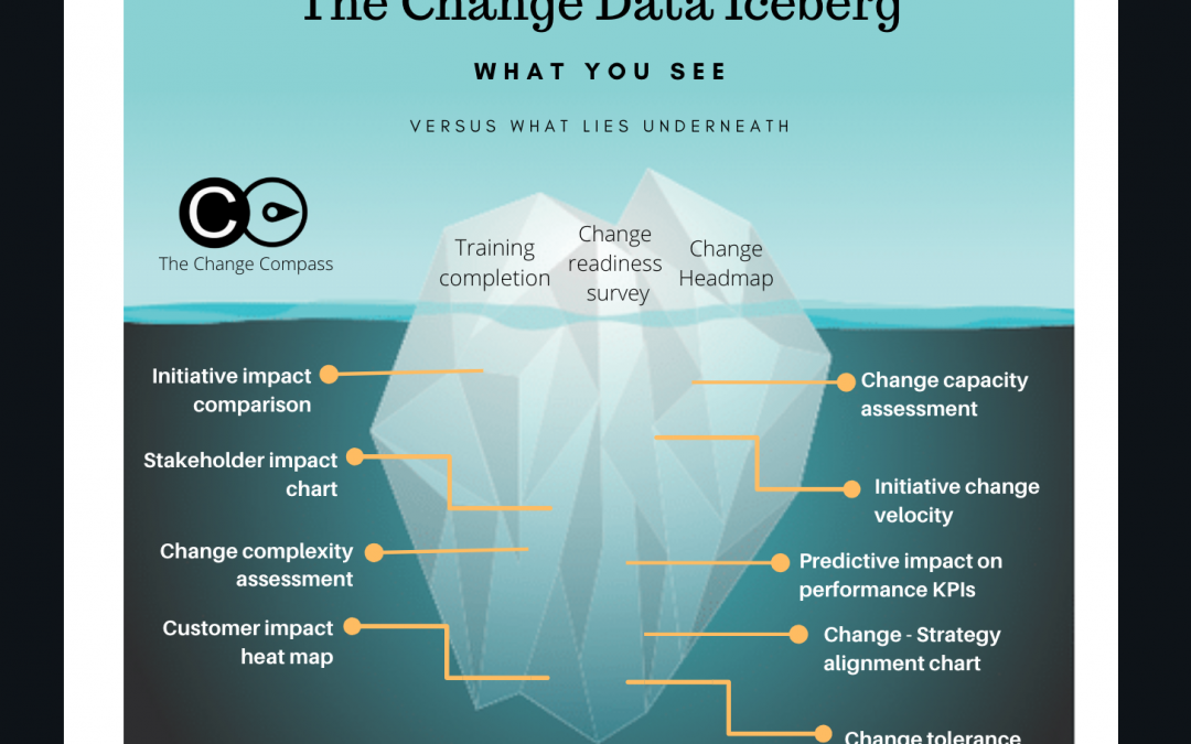
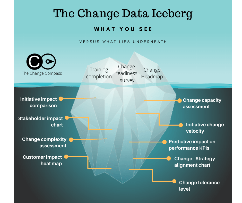
The various types of change data available is like an iceberg. Most people only see the small part of the surface of data types such as training completion rate or change heatmap. There is a lot more beneath the surface. Download our Change Data Iceberg diagram to find out more …
Australia and New Zealand are like 2 brothers. One big brother, Australia,
and the smaller brother New Zealand. We are culturally similar and speak
with almost the same accent (almost but not quite the same). Both
countries have experienced recent tragedies and challenges. However,
there are 2 very different prime ministers. Let’s explore what we can learn from
these two leaders within significant change events.
New Zealand
On 15 March in Christchurch New Zealand, there was a mass shooting at 2
mosques resulting in 51 killed and 49 injured. This has cut through the
psyche of New Zealand quite deeply as it was the first time the country had
experienced mass shooting at this scale. Being a small country with a
relatively liberal and tolerant culture this came a shock for most.
Jacinda Arden, the Prime Minister of New Zealand, reacted swiftly. Within
a few hours of the event she addressed the terrorist directly
demonstrating strength and determination. She quickly flew into
Christchurch to visit survivors and their relatives. Dressed in black head
scarf, she visited mosques and asked how she could support the mosques
and the victims. Within a few days of the event she also called out
blatantly the responsibility of social media platforms in hosting hate
messages which was the case for this incident as the attacker posted
Facebook messages prior to the attack.
She then made sweeping changes to gun laws in New Zealand banning all
assault rifles and military-style semi-automatics. This happened within a
few days of the event and though some may argue that this is much easier
to achieve in New Zealand than the US but the point is that she acted
swiftly and had even convinced the conservative opposition party to enact
on this law.
4 key lessons we can learn from her example as a change leader include:
1. Displaying agile leadership. She proactively faced into a catastrophic
situation and worked with others to address the situation head-on.
She made fast and clear decisions to resolve and contain the
situation.
2. Authenticity. She spent time with those affected by the tragedy and
showed empathy and care. This wasn’t about the photo
opportunity as it was more about spending time to listen and show
care for those impacted by change. She didn’t try to be someone
she is not. Instead of the antagonistic and hostile speeches that one
might expect from leaders like Trump, her words were empathic,
strong and unwavering.
3. Displaying emotional connection . She also placed herself in the
shoes of those affected by the tragedy with her cultural sensitivity
and emotional connection to those impacted. The grieving was not
only felt by those involved in the tragedy, the whole nation was
grieving. Her visibility was critical to speak for the nation but also to
acknowledge everyone’s emotional state and concerns. The critical
word here is ‘visibility’. Felt emotional connection wont garner
groups of people if they are not displayed.
4. Collaborating with others to drive change. A series of changes
ensued not just gun law changes, but also driving security, and
social media regulation changes. In an interview she used the words
“duty of care as a leader” to safeguard her people and address their
concerns. She is not just speaking for herself, but also for other
leaders, including business leaders, to step up and take action. She
also influenced various world leaders on the same agenda to rally
support.
Australia
Right now in Australia, at the time of writing, we are still in the middle of a
catastrophic set of fires raging across most states of Australia. More than
1300 homes have been burnt down and 18 people have died so far. In
Sydney, we have had more than 2 months of smoke haze in our air
resulting from bushfires, and sometimes the air quality can be 11 times
more than ‘hazardous’ level. This is absolutely the worst I have ever
experienced in Australia. This morning, I received the message that at the
southern highlands where I spend Christmas, the area is surrounded by
bushfires and residents have all been evacuated.
Let’s have a look at how our Prime Minister has lead the country during
this period of environmental change. Unlike the leadership we’ve seen
from Jacinda Ardern, Scott Morrison our Prime Minister flew out with his
family to Hawaii to spend holidays by the water. Whilst the country is
burning and people are suffering, even under intense criticism, our prime
minister was absent and away. When prompted to address serious
climate change issues, he responded by saying that it was not the time to
talk about climate change.
Eventually after continued public pressures, after Scott Morrison came
back from holidays he proceeded to visit some of the towns completely
destroyed by bushfires. Many of the victims refused to shake his hand. In
the business world we have also seen this type of reaction from those
who felt they have been deserted and have not received any leadership
support. There have even been incidents where the victims have asked
Scott questions and he had ignored them and moved away, then later on
quoting how he had promised help for them.
Whilst fires continue to burn through our states, the Prime Minister’s
party released a party propaganda social media tweet proclaiming the
party’s prowess in helping Australians through supporting firefighters,
listing the financial assistance offered as a part of the package. An
Australian TV panellist said this was like “being ‘sold to’ at a funeral”. It
was completely inappropriate and badly timed.
In terms of the same change leadership lessons we had captured from
Jacinda Ardern, what can we also learn from Scott Morrison’s change
leadership example?
1. Displaying agile leadership. Lack of action and decision at the
commencement of the change is almost unforgivable. It is very hard
to salvage from the lack of leadership support when at this pivotal
moment when there is no leadership action or response.
2. Authenticity. Unfortunately, authenticity by definition cannot be
faked nor acted. People see through the actions and inactions of a
leader. There is no amount of corporate communications packaging
nor word-smithing that can change how others experience through
change leadership, or the lack of. Being open and transparent
remains the best approach for any change leader.
3. Displaying emotional connection. It is difficult to fake emotional
reaction. Through overall body language as well as tonal cues
people can easily pick up on a leader’s ability to connect
emotionally. When people are in distress and in suffering, the best
approach is to simply listen and show that you have heard them.
Ideally, you are also able to address at least some of their core
concerns. But the critical must-have remains how a leaders
displayed active listening and showing that he or she cares.
4. Collaborating with others to drive change. What Australia needs is
global leadership to drive climate change and to work with various
agencies and leaders, the same way that Jacinda Ardern has been
doing with New Zealand‘s agenda. Several countries have proactive
offered support in fighting bushfires even without Scott Morrison
reaching out to tap on others.
Change is all around us, not just in the organizations that we work in.
In the same way, change leaders are also all around us.
Leading change is an absolutely critical skill to master and will well into the future.
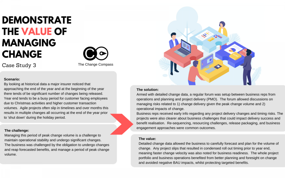
Turning change chaos into competitive advantage: How a leading insurer mastered peak change with The Change Compass
In today’s fast-paced business environment, change is the only constant – especially in highly regulated, customer-facing sectors like insurance. But what if, instead of being a source of risk, organisational change could become your greatest lever for business performance? That’s the journey one major insurer embarked on, and the results are a blueprint for transformation-driven success.
The perfect storm: Why peak change periods are so challenging
Every year, as the calendar ticks towards the December-January holiday season, this insurer encountered a familiar scenario:
Customer-facing employees were under pressure, fielding increased transactions and supporting customers through holidays.
Multiple agile projects, each designed to drive innovation and process improvement, were slipping in timelines – as often happens in complex transformation portfolios.
The result? A flood of change “went live” simultaneously just before the company-wide shutdown.
For business leaders, this created a daunting balancing act: realising the benefits of innovation, while not overwhelming frontline teams or sacrificing operational stability. Missed deadlines or last-minute rollouts could lead to service disruptions, employee burnout, lost revenue, and eroded customer trust.
The breakthrough: Data-powered collaboration
So how did this insurer escape the costly cycle of end-of-year chaos? With The Change Compass, they turned data into their superpower.
The organisation established a regular, cross-functional forum that brought together operations, planning, and project delivery (PMO). But this wasn’t just another meeting – this was a command centre built around live, detailed change data.
Key transformations in approach:
Shared Early Warning System:
Project delays, resource bottlenecks, and clustered change activity were visible weeks or months in advance, not discovered at the last minute.
Intelligent Risk Management:
The team could scenario-plan, not just react, to delivery risks and operational pinch points.
Business-Driven Dialogue:
Operations leaders voiced customer realities and BAU needs, shaping project timelines for true business readiness.
Real-world results: From fire-fighting to future-proofing
Thanks to this new level of insight and collaboration, the insurer fundamentally changed how it managed periods of peak change. Here’s what set them apart:
1. Proactive Forecasting and Portfolio Planning
The company moved from “gut feel” to data-backed change forecasts, mapping exactly when and where change would impact operations.
No more scrambling: resource plans, communications, and business readiness activities were optimised for actual risks and opportunities.
2. Collaborative Course Correction
Instead of viewing project slippage as a crisis, the PMO could re-sequence initiatives, redesign release packages, or reallocate teams before risks materialised.
The forum fostered joint problem-solving – turning silos into a unified change-fighting force.
3. Protecting Business Value
With fewer surprises and less disruption, business units delivered on promised benefits even during high-change windows.
Change velocity was matched by business readiness, preserving customer experience and employee morale – even during intense periods.
Key value metrics achieved
Savings from BAU cost spike of $1+Mil per annum from change peak periods
Protection from productivity dips of 30-45% from change disruptions
Prevention of customer churn of $1+Mil per annum from frontline operations disruptions
Additional 30-50% gain in change benefits realised through well-coordinated portfolio deployment
Why this matters: Making change your strategic weapon
The lesson is clear: Change doesn’t have to feel risky, unpredictable, or exhausting. With The Change Compass:
You gain clarity – see the full picture of what’s changing, when, and how it affects your people and customers.
You empower teams – from PMO to frontline operations, everyone acts with foresight and confidence, not crisis mode.
You realise more value – initiatives deliver lasting outcomes, not headaches or half-finished results.
This is more than a software platform – it’s a new operating model for change-centric businesses.
Going Beyond “Surviving Change” to Leading Your Market
Imagine if your organisation could:
Anticipate and neutralise risks long before they disrupt business
Execute more strategic projects, faster – without burning out staff or diluting customer experience
Align every level of the business around a shared, data-driven roadmap for change
That’s what The Change Compass unlocks. It’s already helping leading insurers and other organisations turn the “messiness” of change into disciplined, high-impact action – and giving them a real edge on competitors still stuck in fire-fighting mode.
Ready to step into change leadership using data?
If you’re tired of peak periods bringing more anxiety than opportunity, it’s time to see what’s possible when you combine collaboration, smart forums, and powerful change analytics.
Try The Change Compass and:
Put yourself in the driver’s seat for every change, no matter how complex.
Rally your teams around a data-powered playbook for business performance.
Experience smoother, smarter transformation—365 days a year.
Don’t just survive the next wave of change – lead it with data-backed confidence, outperform your industry, and empower your teams. The Change Compass is ready to help you turn every challenge into achievement.
In our fast-moving, data-centric world, the ability to capture the focus of senior leaders during data presentations is not just a valuable skill but a vital one. With attention spans growing shorter and the constant deluge of information, this challenge has become even more significant. To put it in perspective, think about this surprising fact: the average person’s attention span has shrunk from 12 seconds in 2000 to a mere 8 seconds today, which is even less than that of a goldfish.
Now, here’s the thing: when we present data to senior managers, we should understand that they are subject to the same challenges. Their workdays are a whirlwind of meetings, overflowing email inboxes, and a steady stream of digital interruptions. Just getting a meeting with a senior leader can be a tough feat in itself, and once you do, making an instant and lasting impression becomes essential.
The Significance of Data in a Time-Strapped World
In this age of information overload, where data constantly competes for our limited attention, the stakes couldn’t be higher. To put it plainly, research has uncovered an astonishing fact: senior leaders spend, on average, only 15 seconds reviewing a document before making a decision. In this remarkably brief moment, your data presentation must do more than simply seize their attention; it must inform and persuade, creating an indelible impact.
Now, let’s embark on a journey into five crucial strategies, thoughtfully designed to ensure that your data presentations to senior leaders not only capture their attention but also make a lasting mark on their decision-making process.
1. Use data visualization
Data visualization is a remarkable tool for making your information truly unforgettable. It’s not just about presenting data; it’s about creating a visual narrative that resonates. Visual content is something our brains process with remarkable efficiency compared to raw data. To bring your data to life, consider crafting infographics, diagrams, or charts that distill intricate data into simple, digestible forms.
However, here’s the key: clarity and simplicity. The aim isn’t to drown senior leaders in excessive detail. Rather, it’s about enabling them to grasp the essence of your message at a single glance.
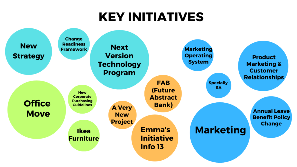
But remember, data visualization is more than adding charts; it’s about weaving a story. It’s about choosing the right type of visualization that complements your message. For instance, if you’re seeking to convey the impact of change initiatives, think about employing a bubble diagram. This elegant choice can illustrate the full extent of each initiative’s influence, transforming complex data into a captivating narrative.
Here’s an example of a bubble diagram that shows the extent of the impact of each initiative.
2. Navigating Psychological Bias in Data Presentation
Psychological bias is a formidable factor that can distort the way data is perceived, ultimately leading to decisions that may not be aligned with the true insights. To tackle this challenge effectively, it’s imperative to be meticulous in your choice of color schemes and data representations, with the ultimate aim of reducing cognitive biases.
Understanding the Impact of Color:
The use of color is a potent tool that can significantly affect the way we perceive information. Research has demonstrated that individuals can subconsciously interpret the same color differently, leading to potential misinterpretation of data. For example, red, traditionally associated with caution or danger, can be misconstrued as a negative signal even when it signifies high levels of change or activity.
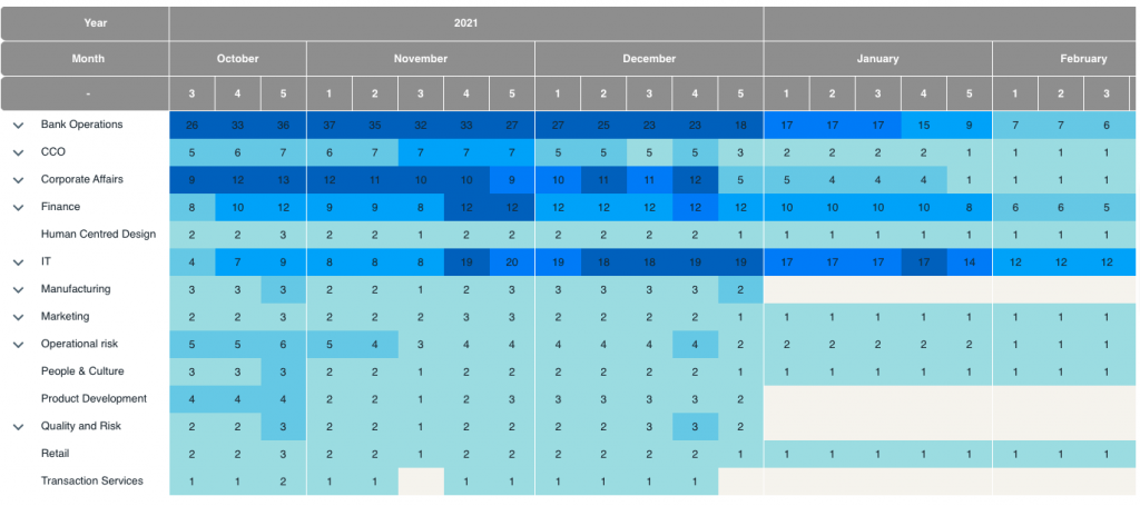
To counteract these biases, it’s critical to recognize that the way you present data can influence how senior leaders perceive it. A seemingly subtle yet profoundly influential alteration involves replacing traditional traffic light colors with different shades in change heatmaps, offering a more objective representation of data. This meticulous shift minimizes unintentional misinterpretations, ensuring that the data is approached with clarity and impartiality.
By incorporating this awareness into your data visualization strategy, you not only elevate the quality of your presentations but also cultivate a more unbiased and objective environment for senior leaders to engage with the data. This approach enables them to make decisions grounded in the true insights the data provides, ultimately leading to more informed and effective outcomes.
Here is an example of a change heat map from The Change Compass, using different shades of blue instead of traffic light colors.
3. Tailoring Data Detail for Maximum Impact
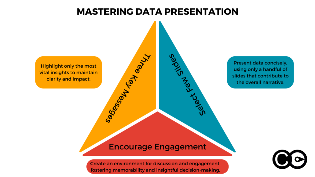
When it comes to presenting data to senior leaders, the age-old adage “less is more” couldn’t be truer. The art of capturing their attention and making a lasting impression often lies in the fine balance between depth and brevity. To master this art, it’s essential to focus on conveying no more than three key messages per meeting. The data you present should be honed to a razor’s edge, laser-focused on supporting the messages you aim to convey.
The Strategic Choice of Content
When it comes to presenting data to senior leaders, the age-old adage “less is more” couldn’t be truer. The art of capturing their attention and making a lasting impression often lies in the fine balance between depth and brevity. To master this art, it’s essential to focus on conveying no more than three key messages per meeting. The data you present should be honed to a razor’s edge, laser-focused on supporting the messages you aim to convey.
The selection of what to present is as critical as how you present it. In this context, less isn’t just more; it’s clearer and more impactful. Restrict the number of slides to just a few, ensuring that each slide serves a precise purpose while contributing to the overall narrative you’re crafting.
This strategic approach encourages discussion, engagement, and, most importantly, memorability. By avoiding information overload and guiding senior leaders through a concise, purpose-driven data journey, you create an environment ripe for insightful dialogue and informed decision-making.
4. Storytelling Using Data: Crafting a Narrative with Change Data
When it comes to engaging senior leaders with change initiatives, data becomes your most potent storytelling tool. Your change story should transcend mere speculation or gut feelings. It should be a narrative firmly grounded in the facts and figures, painting a vivid picture of the transformations taking place within your organization.
In essence, you are the storyteller, and the data is your plot, characters, and climax. Your narrative is the reflection of the changes happening, the challenges being faced, and the opportunities on the horizon. However, it’s not just about presenting data; it’s about using data to construct compelling stories that resonate with senior leaders.
To effectively engage senior leaders, consider the following key stories that your change data can help formulate and emphasize:
The Acceleration of Change: One of the critical narratives your data should convey is the ever-increasing pace of change. Show how the rate of change is evolving over time, highlighting that the organization’s ability to adapt is being tested like never before. This story emphasizes the urgency of the situation and the need for strategic responses.
Changing Volumes: Your data should illustrate fluctuations in the volume of change initiatives. Are they increasing, decreasing, or maintaining a consistent flow? This story aids in understanding whether the organization is overburdened with constant changes or if there’s a need for more transformative initiatives.
Capacity Risks and Emerging Challenges: Data should pinpoint potential capacity risks in various parts of the business. If certain departments or teams are near their limits in handling changes, senior leaders need to be aware of the looming challenges. Use your data to predict and prevent capacity-related bottlenecks.
Alignment with Strategy: Are the scheduled changes in your plan aligned with the overall strategic vision of the organization? Your data story should reveal any disparities between the two. A misalignment between change initiatives and the broader strategy can have detrimental consequences, and senior leaders should be made aware of this.
Impact on Customer Segments: If the same customer segment is affected by multiple change initiatives within a short timeframe, it can result in confusion and dissatisfaction. Your data story should bring this to light, highlighting the need for coordination and a more customer-centric approach to change management.
Change Saturation and Business Performance: One of the key narratives to create revolves around the concept of change saturation. Your data should indicate when a particular part of the business has reached a point where it can no longer absorb or adapt to more changes effectively. Show how this affects business performance and why it’s crucial to address it promptly.
In the realm of engaging senior leaders with change data, the data isn’t just raw information; it’s the foundation of a powerful story. As a change leader, your role is to weave a compelling narrative using data as your threads. Your stories should resonate with senior leaders, guiding them toward informed decisions and strategic actions in the ever-evolving landscape of change.
5. Use eye-catching visuals to increase memorability
Using eye-catching visuals is a powerful way to make your message memorable when presenting change data to senior leaders. In most corporate settings, the usual types of data visualization, such as pie charts, bar charts, and scatter plots, are commonly used. To set your data apart and capture your audience’s attention, consider these creative approaches:
1. Unique Color Schemes: Choose vibrant and unconventional color schemes for your charts and graphs. Bold colors can make data pop and draw attention to key insights. Ensure that the colors align with your brand or the theme of your presentation.
2. Innovative Chart Types: Experiment with different types of charts and graphs that best represent your data. Consider using radar charts, waterfall charts, Sankey diagrams, or treemaps, depending on the complexity of your data and the story you want to tell.
3. Engaging Layouts: Play with the layout of your visuals to create a unique and memorable design. You can use unconventional arrangements, like circular layouts or zigzag patterns, to present your data in a visually appealing way.
4. Data Storytelling: Integrate your visuals into a broader narrative. Instead of displaying raw data, tell a story using the visuals. Explain how the data points connect and impact each other. This approach helps senior leaders better understand the implications of the data.
5. Data Overlays: Combine different types of visuals to provide a comprehensive view of the data. You can overlay line charts on top of heatmaps or combine bar charts with area charts to highlight relationships and patterns.
6. 3D Effects: Use three-dimensional effects sparingly to add depth and dimension to your visuals. This can make specific data points stand out and create a visually interesting presentation.
7. Customized Illustrations: Incorporate custom illustrations and icons that are relevant to the data and the message you want to convey. This adds a personalized touch to your visuals.
8. Visual Metaphors: Use metaphors or analogies to represent data. For example, you can use a puzzle piece visual to show how different components fit together to form a complete picture.
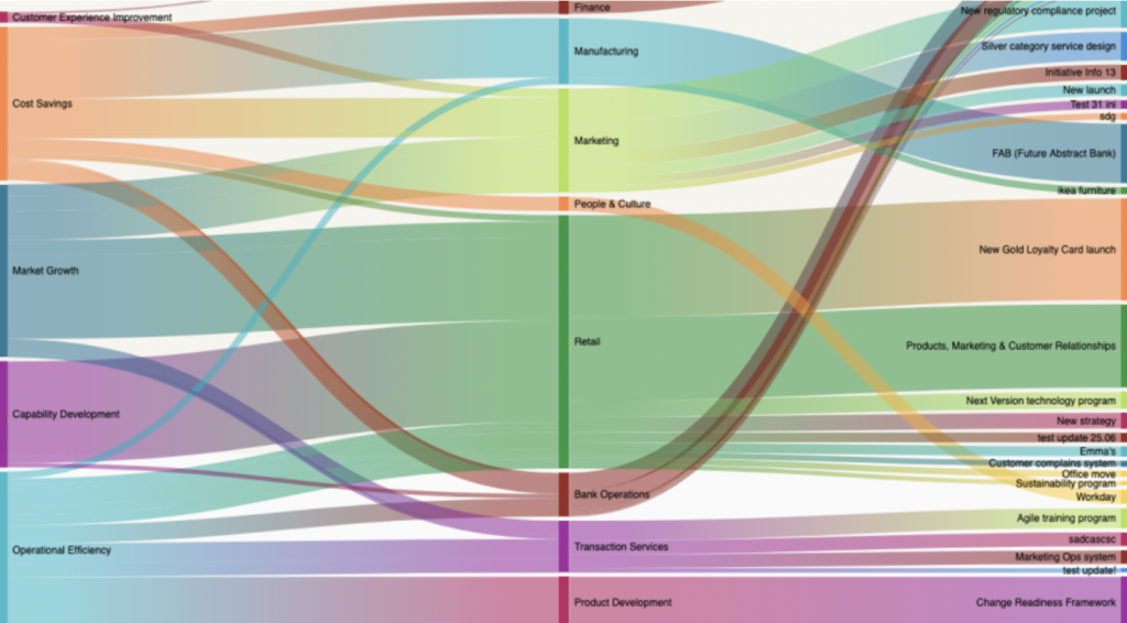
Here is an example of a chart that shows the extent to which each company strategy impacts different divisions and the various initiatives in concern. Instead of a standard bar chart, consider using a visually engaging diagram that resembles interconnected gears, symbolizing how different strategies drive various initiatives and divisions forward.
By embracing innovative design and visualization techniques, you can create visuals that not only convey your data effectively but also leave a lasting impression on senior leaders. When your data is presented in a memorable and visually captivating way, it is more likely to influence decision-making and drive meaningful change within the organization.
Mastering the art of engaging senior leaders with change data is the key to influencing decisions effectively in our fast-paced business environment. For a practical demonstration of these strategies, book a weekly demo with The Change Compass.


