Diagnosing change resistance is the practice of working past the most visible symptoms to identify the actual structural, behavioural or environmental cause that is blocking adoption. Surface-level blockers, such as low attendance at training or complaints in town halls, are usually downstream effects of deeper causes: unclear sponsorship, competing operational pressures, undisclosed scepticism about the business case, or a previous change that left scar tissue. A layer-by-layer diagnostic method asks “what is causing this” repeatedly until the answer points to something the change team can actually act on. Without this discipline, change interventions end up addressing symptoms while the root cause continues to derail adoption.
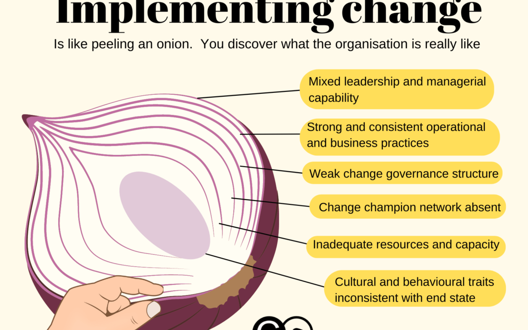
Change management, much like peeling an onion, involves uncovering multiple layers before reaching the core. Each layer peeled back in the journey of planning and implementing change reveals new insights about the organization and the stakeholders impacted by the change. This process is essential to understanding the full scope of the change, adapting strategies accordingly, and ensuring successful implementation. By examining the various facets of an organization, such as leadership capability, operational practices, and cultural traits, we can better navigate the complexities of change management. Let’s explore the analogy of peeling an onion in change management and some practical insights for transforming change outcomes.
What is the peeling the onion protocol and how does it work?
The Peeling the Onion Protocol is a change management strategy that involves gradually uncovering layers of resistance within an organization. By systematically addressing concerns and facilitating open dialogue, this protocol fosters understanding and acceptance of change, ultimately leading to smoother transitions and enhanced collaboration among team members.
Peeling the layers – each layer reveals a different facet of the organisation and how they may or may not be conducive to supporting the change. Here are some ‘layers’ you may want to examine.
Leadership and Managerial Capability in Managing Change
Effective change management begins with strong leadership. Leaders and managers play a crucial role in guiding the organization through the transition. Peeling back this layer reveals whether leaders are equipped with the necessary skills, knowledge, and attitudes to drive change. It also highlights their ability to inspire and mobilize their teams, communicate the vision effectively, and manage resistance. Assessing leadership capability is fundamental, as inadequate leadership can hinder the entire change process.
Operational and Business Practices
The next layer involves examining the organization’s operational and business practices. This includes evaluating current workflows, processes, and systems to identify areas that may need adjustment or improvement. Understanding how daily operations align with the proposed changes helps in anticipating potential disruptions and devising strategies to minimize them. Are existing practices consistent with the end state of the change? Are existing practices consistent? (or NA?) Why or why not? This layer also involves identifying key performance indicators (KPIs) that can measure the success of the change initiatives (https://thechangecompass.com/how-to-manage-a-multitude-of-change-initiatives-including-enterprise-wide/).
Change Governance Practices and Structure
Change governance refers to the frameworks and structures in place to manage and oversee change initiatives. Having the right governance structure ensures that the right oversight and decision making is setup to steer the change to success. Peeling back this layer involves assessing the effectiveness of existing governance mechanisms, such as steering committees, decision-making protocols, and accountability structures. Strong change governance ensures that change initiatives are well-coordinated, resources are allocated appropriately, and progress is monitored consistently. Weak governance, on the other hand, can lead to confusion, misalignment, and failure to achieve desired outcomes.
Key questions to ask here include such as:
Is there sufficient governance bodies in place at different levels of the organisation to support change?
Are there too many governance bodies?
Are decision-making processes clear and effective?
Are the right stakeholders involved in the relevant decision-making areas?
Engagement Channels
Effective engagement is critical in change management. This is more than just communication. This layer focuses on the channels and methods used to engage with stakeholders throughout the change process. Evaluating engagement channels helps in understanding how information is disseminated, feedback is collected, and concerns are addressed. It also highlights the effectiveness of internal communications and the role of external communications in managing stakeholder expectations and perceptions. What channels are most effective for what audience groups? Are there any gaps for engaging with all groups of stakeholders? (beyond just blasting emails or messages).
Change Champion Network
Change champions are resignated individuals within the organization who advocate for and support the change initiatives. Peeling back this layer involves identifying and empowering these champions. It also includes assessing their influence, credibility, and ability to motivate others. A strong network of change champions can facilitate smoother transitions by promoting buy-in, addressing resistance, and reinforcing positive behaviors. With the right nurturing and experience, an organisation-wide changechampion network can act to support a myriad of change initiatives.
System and Process Maturity
The maturity of systems and processes within an organization significantly impacts the success of change initiatives. This layer involves evaluating the current state of technological systems, process automation, and data management practices. Mature systems and processes provide a solid foundation for implementing changes efficiently and effectively. Conversely, immature systems may require significant upgrades or overhauls to support the desired changes.
Change Management Maturity
Change management maturity refers to the organization’s overall capability to manage change. Peeling back this layer involves assessing the maturity of change management practices, methodologies, and tools. Organizations with mature change management capabilities have established frameworks, experienced practitioners, and a culture that embraces change. In contrast, organizations with low maturity may struggle with inconsistencies, resistance, and a lack of structured approaches.
This layer examines the availability of resources and capacity to support change initiatives. It includes assessing the organization’s financial resources, human capital, and physical infrastructure. Adequate resources and capacity are essential for executing change plans, overcoming obstacles, and sustaining momentum. Insufficient resources can lead to delays, reduced quality, and increased stress on employees. This does not just include the resources required within the project itself, it points more to the impacted stakeholders and if they have the resources and capacity required to undergo the change.
Culture and Behavioral Traits
Organizational culture and behavioral traits play a significant role in how change is perceived and adopted. Peeling back this layer involves understanding the underlying values, beliefs, and behaviors that influence how employees respond to change. It also includes identifying cultural strengths that can be leveraged and cultural barriers that need to be addressed. A supportive culture fosters resilience, adaptability, and a positive attitude towards change.
Specifically:
Do existing behaviours and practices support the change end state?
Are there potentially inconsistent behaviours comparing the end state and the current state?
Beyond the specific behaviours required in the change initiative itself, how are these in alignment with broader cultural practices?
Key Takeaways from the Onion Analogy in Change Management
1. Each Layer Needs to Be Peeled Before Another Layer Can Be Peeled
The process of discovering and understanding the complexities of change cannot be rushed. Each layer provides valuable insights and learning opportunities that prepare the organization for the next layer of discovery. Skipping layers or rushing through the process can lead to incomplete assessments, overlooked challenges, and ineffective solutions. Patience and persistence are crucial for a thorough and successful change management journey.
Assessing and understanding each layer can take time. Data, both quantitative and qualitative, may be required to truly understand what each layer means and how it implicates the change.
2. How the Onion Appears May Not Be What It Is at Its Core
Initial perceptions of the organization may not reflect its true state. It takes time and effort to uncover the deeper issues, strengths, and opportunities. This requires a willingness to look beyond surface-level indicators and delve into the core aspects of the organization. Attention to detail and a commitment to uncovering the truth are essential for developing accurate and effective change strategies.
For example:
Are publically communicated and reinforced messages acted on?
Do leaders practice what they preach?
Do stakeholders commit to decisions already made? Or do they ignore it?
Is there clear alignment between different layers of the organisation? How is this done?
3. You May Discover Rotten Parts That Need to Be Replaced
During the process of peeling back layers, you may encounter parts of the organization that are severely inadequate or dysfunctional. These “rotten” parts may need to be replaced or significantly improved before the change can proceed. This could involve overhauling critical capabilities, restructuring teams, or implementing new systems. Recognizing and addressing these issues promptly is essential for ensuring the overall health and success of the organization.
You may find, for example:
Stakeholders that are adamant to block the change for various reasons
Teams that simply do not have the right skills or attitude to transition to the required state
Processes that are simply outdated or convoluted, so much that end state targets cannot be achieved
Systems that are outdated and do not provide the right insights to support the end state
4. Different Types of Onions and Organizations
Just as there are different types of onions, organizations vary in size, complexity, and nature. Assessing the complexity of the change at the outset helps in determining the time, effort, and resources required to peel back the layers. A comprehensive understanding of the organization’s unique characteristics allows for tailored change management strategies that address specific needs and challenges.
Practical Steps for Applying the Onion Analogy in Change Management
Step 1: Initial Assessment and Planning
Begin by conducting a thorough initial assessment of the organization. This involves gathering data, engaging with key stakeholders, and understanding the current state of affairs. Develop a comprehensive change management plan that outlines the objectives, scope, and timelines for each layer of the onion. This plan should also identify key metrics for measuring success and mechanisms for tracking progress.
Step 2: Assess Leadership and Managerial Capability
Evaluate the capability of leaders and managers to drive change. This includes assessing their skills, experience, and attitudes towards change. Provide training and support where needed to enhance their ability to lead effectively. Strong leadership is foundational to the success of any change initiative.
Step 3: Examine Operational and Business Practices
Analyze current workflows, processes, and systems to identify areas that may require adjustment. Engage with employees at all levels to gather insights and understand potential bottlenecks. Develop strategies to streamline operations and ensure alignment with the change objectives.
Step 4: Review Change Governance Practices
Assess the existing governance structures and practices in place to manage change initiatives. Ensure that there are clear decision-making protocols, accountability mechanisms, and regular progress reviews. Strengthen governance frameworks as needed to support effective change management.
Step 5: Evaluate Engagement Channels
Review the channels and methods used to communicate with stakeholders. Ensure that there are effective mechanisms for disseminating information, collecting feedback, and addressing concerns. Enhance engagement strategies to foster transparency, trust, and collaboration.
Step 6: Identify and Empower Change Champions
Identify individuals within the organization who can serve as change champions. Empower them with the necessary tools, resources, and support to advocate for the change initiatives. Leverage their influence and credibility to promote buy-in and address resistance.
Step 7: Assess System and Process Maturity
Evaluate the maturity of technological systems and processes. Identify areas that require upgrades or improvements to support the change. Invest in the necessary infrastructure and tools to ensure seamless implementation.
Step 8: Assess Change Management Maturity
Conduct a maturity assessment of the organization’s change management capabilities. Identify gaps and areas for improvement. Develop and implement strategies to enhance change management practices, methodologies, and tools.
Step 9: Review Resources and Capacity
Evaluate the availability of resources and capacity to support the change initiatives. Ensure that there are adequate financial, human, and physical resources to execute the change plans. Address any resource constraints proactively to prevent delays and disruptions.
Step 10: Understand Culture and Behavioral Traits
Conduct a cultural assessment to understand the underlying values, beliefs, and behaviors that influence how employees respond to change. Identify cultural strengths that can be leveraged and barriers that need to be addressed. Develop strategies to foster a supportive culture that embraces change.
The analogy of peeling an onion provides a powerful framework for understanding and managing change within an organization. Each layer peeled back reveals new insights and learning opportunities that are essential for successful change management. By carefully examining the various facets of the organization, such as leadership capability, operational practices, and cultural traits, organizations can navigate the complexities of change more effectively.
Patience, persistence, and attention to detail are key to uncovering the true state of the organization and developing tailored strategies that address specific needs and challenges. Ultimately, the journey of peeling the onion in change management leads to a deeper understanding, better preparation, and more successful change outcomes.
Successful change management relies on having the right metrics to measure progress, gauge impact, and communicate with stakeholders. Moreover, the right metrics can drive continuous improvement and help directly achieve change outcomes. However, not all metrics are beneficial, and some can mislead or fail to meet stakeholder needs, especially when managing change projects. Let’s check out the top change management metrics to avoid and go through examples to take note.
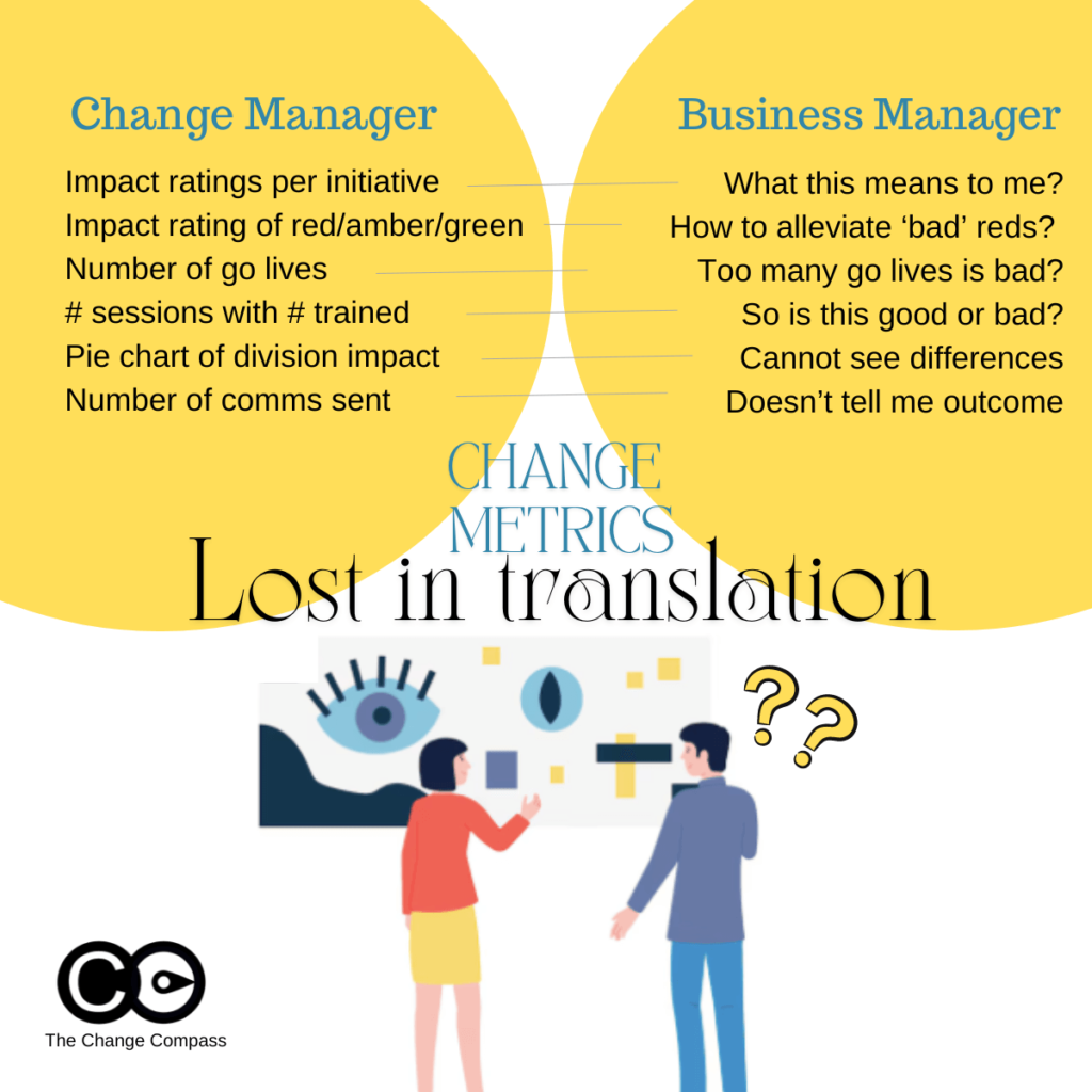
Understanding the Disconnect: Change Managers vs. Business Stakeholders
A significant reason certain change management metrics fall short is the differing perspectives between change managers and business stakeholders. Change managers and change practitioners are trained to view metrics through the lens of change management frameworks and methodologies, focusing on detailed assessments and structured approaches as a part of the change management strategy. These include applying ratings and judgments on aspects such as impact levels indicating levels and areas of impact.
In contrast, business stakeholders prioritize business operations, strategic outcomes, and practical implications. The busy business stakeholder is often looking for practical implications from metrics that can be used to directly drive decision making, meaning “what do I do with this data to improve the ultimate business outcome”.
Of course, different stakeholders have different data needs, and you need to show the right metric to the right type of stakeholder. For example, operations-focused stakeholders expect fairly detailed metrics and internal historical data to understand what that means in terms of organisation, coordination, capacity, and performance perspectives. Senior managers may prefer higher-level data with a focus on strategic impacts, overall progress, and adoption indicators of change success rate.
This disconnect can lead to the use of metrics that do not resonate with or are misunderstood by stakeholders that disrupt change success.
Change managers may leverage metrics that are derived from the various change management documents such impact assessments, training plan or communications plan. Metrics are also often chosen for ease of use and ideally are not overly complicated to execute.
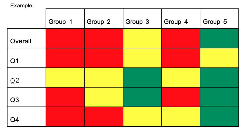
For example, impact assessments typically involve rating stakeholder groups and initiatives on a traffic light system (red, amber, green) based on their impact. While this approach is systematic, it can be problematic for several reasons:
Lack of Sufficient Stakeholder Context: Business stakeholders might not understand the practical implications of these ratings. For instance, an “impact rating per initiative” may not clearly convey what the rating means for day-to-day operations or strategic goals. For example, if an initiative has a red impact rating, stakeholders might not grasp the specific operational changes or strategic adjustments needed, in essence, “what do I do with this?”. So, incorrect usage of data could result in lack of stakeholder engagement.
Misinterpretation of Traffic Light Ratings: The red, amber, green system can be misleading. Stakeholders might interpret red as an indicator of alarm or imminent risk, while green may be seen as a sign that no action is needed. This is because stakeholders are trained to interpret traffic light ratings this way (from the various project/business updates they’ve attended). In reality, red might simply mean high impact, requiring focused attention, and green might indicate a low impact but still require monitoring. For instance, a red rating might indicate significant process changes that need careful management, not necessarily a negative outcome.
Hard to defend ratings if prompted: Business stakeholders may also want to drill into how the ratings are determined, and based on what basis. They may expect a logical data-backed reasoning of how each colour scheme is determined. If a rating is based on an overall ‘personal judgment’ this may be hard to defend infront of a group of stakeholders.
Examples of Potentially Misleading Metrics
Certain metrics, although straightforward, can be easily misinterpreted and fail to provide a realistic picture of change impacts as a part of effective change management. Often these are selected because they are easy to report on. However, easy, make not give you the outcome you are looking for.
Number of Go-Lives: Tracking the number of Go-Lives over time might seem like an effective way to represent change volume. However, the most significant impacts on people given time often occur before or after the Go-Live date. For example, the preparation and training phase before Go-Live and the adoption phase afterward are critical periods that this metric overlooks. A Go-Live date might indicate a milestone but not the challenges, progress or impacts faced during the implementation phase.
Number of Activities Implemented: Similar to Go-Lives, this metric focuses on quantity rather than quality. Simply counting the number of activities does not account for their effectiveness or the actual change they drive within the organisation. For example, reporting that 50 training sessions were conducted does not reveal whether employees found them helpful or if they led to improved performance.
Number of impacts or stakeholders impacted: Again, using a numerical way to indicate progress can be very misleading, or unmeaningful. This is because it may be ‘interesting’ but with no real action for your stakeholder to take in order to somehow lead to a better overall change outcome. If metrics do not result in some kind of action, then over time it will not shape your change(s) toward the targeted outcomes. Or worse, your stakeholders may lose interest and lose confidence in the strategic impact of these metrics.
Another common way to report change metrics is to use the number of impacts or number of stakeholders impacted by the organizational change. This can be in terms of the following:
Number of divisions impacted
Number of stakeholder groups impacted
Number of employees impacted
Number of initiatives per division/stakeholder
Metrics That May Be Too Operational
Metrics that are overly operational can fail to capture meaningful progress or adoption. Perhaps if the metric are for reporting within the Change Management team that may be OK. However, when you are showing metrics to stakeholders, a different set of expectations should be cast.
If you are presenting metrics to senior managers, you need to ensure that they hit the mark for that audience group. If the group is more interested in strategic impact, and higher level progress outcomes, you need to tailor accordingly.
Examples of metrics that may be too operational include:
Number of Communications Sent: This metric measures activity but not effectiveness. Sending numerous emails or messages does not guarantee that the message is received, understood, or acted upon by stakeholders. For instance, stakeholders might receive 100 emails, but if the content is unclear, the communication effort is wasted. Or worse, the emails may not even have been read.
Number of Training Sessions Attended: This one is a classic. While training is crucial, the number of sessions attended does not necessarily reflect the attendees’ understanding, engagement, or the practical application of the training. For example, employees might attend training but not apply the new skills if the training is not relevant to their roles for various reasons.
Number of workshops/meetings: Another way of articulating the change management progress in terms of activities is the number of workshops or meetings conducted with stakeholders including focus groups to indicate employee engagement. Again, this may be good to track within the change management team. However, presenting this metric to stakeholders may not be appropriate as it may not meet their needs nor indicate change management success.
Number of changes: This may be a common way to report on changes planned, but it doesn’t really inform the extent of the change. One change can be significantly impactful whilst another does not have major stakeholder impacts and are more system impacts. Listing number of changes may be deceiving or misleading. This kind of data may not get you the level of acceptance targeted.
The way metrics are presented is just as important as the metrics themselves. Poor visualization can lead to misinterpretation, confusion, and misguided decisions. Here are some common pitfalls to avoid:
Ineffective Use of Pie Charts
Pie charts can be misleading when used to show data points that are not significantly different. For example, using a pie chart to represent the percentage of divisions impacted by a change might not effectively communicate the nuances of the impact if the differences between the divisions are minimal. A pie chart showing 45%, 30%, and 25% might not convey the critical differences in impact levels among divisions.
Misleading Traffic Light Ratings
Using red, amber, and green to indicate high, medium, and low impacts can send the wrong message. Stakeholders might associate these colours with good and bad outcomes rather than understanding the actual levels of impact. Stakeholder may be used to interpreting these in the context of their usual project or business updates where red indicated alarm and ‘bad’. This can lead to unnecessary alarm or complacency. For instance, a green rating might suggest no need for action, while in reality, it might require ongoing monitoring.
Overuse of Colours
Using too many colours in charts and graphs can overwhelm stakeholders, making it difficult to discern the key message. Using colours in data visualisation can be two-edged sword. Colour can effectively point your stakeholders are the area where you want them to focus on. But, too many colours can lose your audience. A cluttered visual can obscure the critical data points and lead to misinterpretation. For example, a graph with ten different colours can confuse stakeholders about which data points are most important.
Data visualisation tools are also important. A lot of people use Power BI which works for a foundational level of charts. For tailored charts, specifically designed to to influence stakeholders to clearly see certain angles of risks and opportunities leverage tools such as Change Compass.
Practical Takeaways for Senior Change Managers
To ensure that change management metrics are effective and take into account best practices practices, consider the following practical takeaways:
Align Metrics with Key Stakeholder Perspectives
Understand Stakeholder Priorities: Engage with stakeholders to understand their business goals, priorities and concerns. Tailor your metrics to address these aspects directly. For example, if stakeholders are concerned about operational efficiency, focus on metrics that reflect improvements in this area.
Use Business Language: Frame your metrics in a way that resonates with business stakeholders. Avoid change management jargon and reference, and ensure that the implications of the metrics are clear and actionable. For example, instead of using technical terms, explain how the metrics impact business outcomes. Think in terms of business activities, milestones, busy periods, and capacity challenges.
Focus on Meaningful Metrics
Measure Outcomes, Not Just Activities: Change leaders should prioritize metrics that reflect the outcomes and impacts of change indicate level of knowledge, rather than just the activities performed as a part of change management KPIs. For example, instead of counting the total number of employees attending change management training sessions, measure the improvement in employee performance or knowledge retention post-training.
Example: Instead of reporting that 100 employees attended training sessions, report that 85% of attendees showed improved performance in their roles after training, or that certain level of competencies were gained. Note that quantifiable metrics have more impact on the audience.
Track Engagement and Adoption: Monitor metrics that indicate the level of engagement and adoption among stakeholders or their perception of the change. This could include surveys, feedback forms, or direct measures of behaviour change and the overall success rate of the change.
Example: Use post-training surveys to measure employee confidence in applying new skills or managerial rating of application of learnt skills rather than employee satisfaction of the training sessions using satisfaction scores. Track the percentage of employees who actively use new tools or processes introduced during the change.
Example: Instead of reporting that 100 employees attended training sessions, report that 85% of attendees showed improved performance in their roles after training, or that certain level of competencies were gained.
Example: Use post-training surveys to measure employee confidence in applying new skills or managerial rating of application of learnt skills. Track the percentage of employees who actively use new tools or processes introduced during the change.
Improve Metric Visualization
Simplify Visuals: Use clear, simple visuals that highlight the key messages. Avoid clutter and ensure that the most important data points stand out.
Example: Use bar charts or line graphs to show trends over time rather than pie charts that can be harder to interpret.
Contextualize Data: Provide context for the data to help stakeholders understand the significance. For example, instead of just showing the number of Go-Lives, explain what each Go-Live entails and its expected impact on operations. Or better, focus on showing the varying levels of impact on different stakeholders across time within the initiative.
Example: Accompany a Go-Live count with a visual showing the varying impact level of various implementation activities of the changes.
Example: Use bar charts or line graphs to show trends over time rather than pie charts that can be harder to interpret.
Example: Accompany a Go-Live count with a visual showing the varying impact level of various implementation activities of the changes.
Narrative Approach: Combine metrics with a narrative that explains the story behind the numbers as a part of the change management process. This can help stakeholders understand the broader context and implications.
Example: Instead of presenting raw data, provide a summary that explains key trends, successes, and areas needing attention.
Educate your stakeholders: Depending on stakeholder needs you may need to take them on a phased approach to gradually educate them on change management metrics and how you ultimately want them to drive the outcomes.
Example: You may start the education process to focus on more simplistic and easy-to-understand measures, and as your stakeholders are more change-mature, move to drill into more detailed metrics that explain the ‘why’ and ‘how’ to drive outcome success.
Continuously improvement: Provide regular updates on key metrics and adjust them based on feedback from stakeholders. Continuous communication ensures that everyone remains aligned and informed.
Example: Hold monthly review meetings with stakeholders to discuss the latest metrics, address concerns, and adjust strategies as needed.
Example: Instead of presenting raw data, provide a summary that explains key trends, successes, and areas needing attention.
Example: You may start the education process to focus on more simplistic and easy-to-understand measures, and as your stakeholders are more change-mature, move to drill into more detailed metrics that explain the ‘why’ and ‘how’ to drive outcome success.
Example: Hold monthly review meetings with stakeholders to discuss the latest metrics, address concerns, and adjust strategies as needed.
Examples of Effective Metrics
Employee Adoption and Engagement
Percentage of Employees Adopting New Process/System: This metric measures the rate at which employees are using new processes or systems introduced during the change. High adoption rates indicate successful integration.
Implementation: Use software usage analytics or surveys to track tool adoption rates.
Visualization: A graph showing adoption rates over time.
Employee Feedback Scores: Collect feedback on change initiatives through surveys or stakeholder ratings to measure sentiment/feedback and identify areas for improvement.
Implementation: Conduct regular surveys asking employees about their experience with the change process. Do note that depending on the change you may expect negative feedback due to the nature of the change itself (vs the way it was implemented).
Visualization: Bar/Line charts comparing feedback scores across different departments or time periods. Bar/Line charts are the standard go-to for data visualisation. They are easy to understand and interpret.
Implementation: Use software usage analytics or surveys to track tool adoption rates.
Visualization: A graph showing adoption rates over time.
Implementation: Conduct regular surveys asking employees about their experience with the change implementation process. Do note that depending on the change you may expect negative feedback due to the nature of the change itself (vs the way it was implemented).
Visualization: Bar/Line charts comparing feedback scores across different departments or time periods. Bar/Line charts are the standard go-to for data visualisation. They are easy to understand and interpret.
Impact on Business Outcomes
Improvement in Key Performance Indicators (KPIs): Track changes in KPIs that are directly impacted by the change initiatives, such as productivity, customer satisfaction, customer experience, improvement in process inconsistencies or financial performance.
Implementation: Identify relevant KPIs and measure their performance before and after change initiatives.
Visualization: Use line/bar graphs to show trends in KPI performance over time.
Operational Efficiency Metrics: Measure improvements in operational processes, such as reduced cycle times, error rates, or cost savings.
Implementation: Track specific operational metrics relevant to the change initiatives.
Visualization: Bar charts or heatmaps showing improvements in efficiency metrics across different operational areas.
Implementation: Identify relevant KPIs and measure their performance before and after change initiatives.
Visualization: Use line/bar graphs to show trends in KPI performance over time.
Implementation: Track specific operational metrics relevant to the change initiatives.
Visualization: Bar charts or heatmaps showing improvements in efficiency metrics across different operational areas.
Change management effectiveness requires metrics that not only measure progress but also resonate with business stakeholders and accurately reflect the impact of change initiatives. They should provide valuable insights. Avoiding common pitfalls such as relying on easily misinterpreted or overly operational metrics is crucial. By aligning metrics with stakeholder perspectives, focusing on meaningful outcomes, improving visualization, and communicating effectively, senior change and transformation professionals can ensure that their metrics truly support the success of their change initiatives.
The top change management metrics to avoid are those that fail to provide clear, actionable insights to business stakeholders. By understanding and addressing the disconnect between change managers and business stakeholders, and by prioritizing metrics that truly reflect the impact and progress of change, you can drive more effective and successful change management efforts by influencing your stakeholders in your organisation.
As a next step, Chat with us if you would like to discuss more about leveraging AI and technology to generate high-impact change management metrics and data for your stakeholders, both at project and portfolio levels, using data visualisation tools.
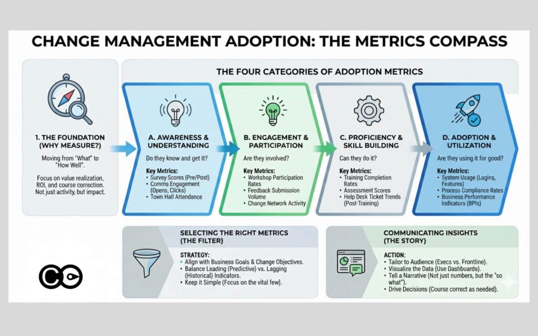
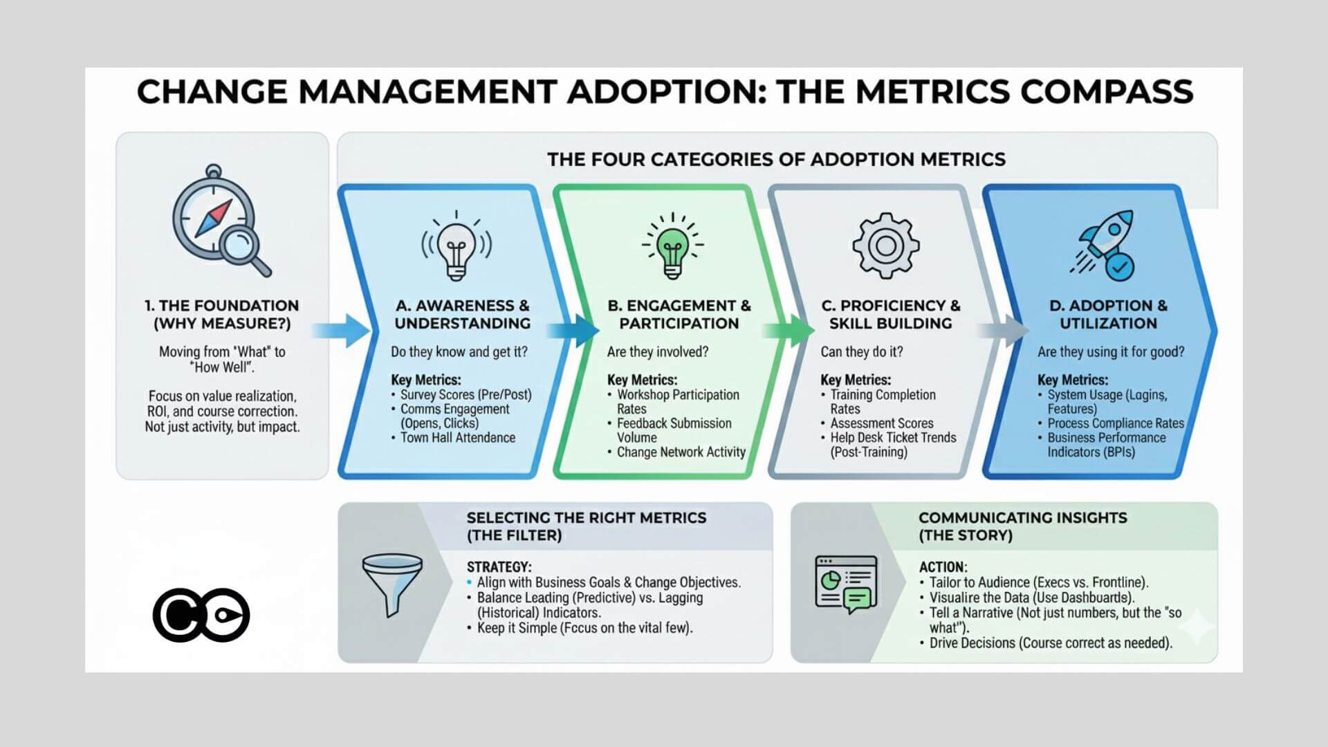
Change adoption metrics are the usage, proficiency, sustainment and outcome indicators that show whether people are working differently after a change, not merely that the change was delivered to them.
The average organisation uses only 54% of the software licences it pays for, according to Zylo’s 2026 SaaS Management Index, which is the adoption problem in one number: Access is not use. The same gap runs through change programmes. A project can report full training attendance, every account provisioned and a green status, while the new process is used for the easy cases and bypassed for the hard ones.
This article is for change, HR and transformation leaders who already know they should measure adoption and need to decide what, exactly, to put on the page. It argues that credible adoption evidence rests on four families of metric (usage, proficiency, sustainment and outcome), that each family fails in a predictable way when read alone, and that the skill is in reading them together. By the end you will be able to choose a short, defensible metric set for a given initiative and interpret it without overclaiming. If you need the method for collecting this data, see our guide to how to measure change adoption; for the wider framework, start with the ultimate guide to measuring change.
An adoption metric is any measure of what people do after the change that can be tied to a specific behaviour the change requires, and the strongest sets combine usage, proficiency, sustainment and outcome measures.
Prosci’s research gives practitioners a useful starting taxonomy. It describes speed of adoption, ultimate utilisation and proficiency as the core measures once people have reached the ability stage: How quickly people begin to use the change, how many are using it, and how well they apply it. We add two more families, because a programme that stops at those three cannot answer the questions executives actually ask later.
Usage: Are the intended people using the change, how often, and how fully? (Speed of adoption and ultimate utilisation.)
Proficiency and behaviour: Are they doing it correctly, in the way the benefit depends on?
Sustainment: Does use hold after launch support is withdrawn, or does work drift back?
Outcome: Is the business result the change was funded for visibly moving?
Each family answers a different question, and each has a blind spot. Usage can be high while proficiency is poor. Proficiency can be strong in the pilot team and absent elsewhere. Sustainment is invisible if you stop measuring at go-live. Outcomes move for many reasons other than adoption. The rest of this article takes each family in turn and then shows how to read them together.
Usage metrics: Reach, frequency and depth
Usage metrics tell you whether the intended population is using the change, how often and how deeply, and the most common error is treating login counts as evidence of any of these.
Gallup’s May 2026 indicator shows how misleading access data can be. Nearly half of US employees (47%) say their organisation has integrated AI tools, yet only 30% use them a few times a week or more and 15% use them daily. Implementation, in Gallup’s words, does not guarantee use. Any programme that reported adoption from provisioning or first-login data would have overstated it by roughly half.
Split usage into three measures, because each exposes a different failure:
Reach: The share of the intended population who have used the new process or tool at all, by role and by team. This is your speed-of-adoption view when plotted weekly from go-live.
Frequency: How often the people who use it do so, compared with how often the work requires it. A tool needed daily and used monthly is not adopted.
Depth: The share of use that happens in the core workflow, measured on the two or three features or steps the benefit depends on, not on every feature.
The depth measure matters most. For a system implementation it might be the percentage of orders created in the new system rather than raised by spreadsheet, or the share of customer records completed to the required standard at first save. For a process change it is the proportion of cases that follow the new sequence end to end. Choose the critical few and ignore the long tail of features.
Read usage by segment, not by average
An enterprise average hides the teams that matter. Report usage by role, location and manager, then look for the lowest quartile. A 78% overall rate that conceals one division at 35% describes a rollout that has succeeded in some places and not started in others, and the response to each is different.
Proficiency and behaviour metrics: Are people doing it right?
Proficiency metrics show whether people perform the new way correctly and consistently, and they are the family most often missing from adoption reports because they require more than system data.
Proficiency is measured through observable behaviours (sometimes called micro-behaviours): The small, specific actions that show the change is embedded. Useful examples:
Error and rework rate: The share of transactions returned, corrected or escalated because the new process was not followed.
Time to complete a key task against a pre-change baseline, once the learning curve has passed.
Workaround rate: The proportion of work still routed through the legacy spreadsheet, email or manual step.
Assessed competency: A short practical check or manager sign-off, rather than a quiz on course content.
Manager coaching frequency: How often team leaders observe and reinforce the new behaviour. Gallup finds that employees whose managers actively support their team’s AI use are 1.7 times as likely to use it a few times a week or more, and only 36% of employees in AI-integrating organisations strongly agree their manager does.
Behaviour data is cheaper to collect than it sounds if you decide in advance which three or four behaviours the benefit depends on. For a deeper treatment of how behaviours form and hold, see our guide to behaviour change in the workplace.
Sustainment and outcome metrics: Does it last, and does it pay?
Sustainment metrics test whether adoption survives after launch support ends, and outcome metrics test whether the benefit the change was funded for has actually arrived; reporting neither leaves the programme unable to prove its value.
Most of the value in a change is realised, or lost, after the programme team has moved on. BCG’s 2025 analysis of transformation concluded that only about a quarter of transformations successfully create value, which is a reminder that delivery and realisation are different events. Go-live is the start of the measurement window, not the end.
Sustainment indicators
Re-measure the same usage and proficiency indicators at fixed intervals after support ends (30, 90 and 180 days is a workable pattern) and add one specific measure:
Reversion rate: The share of work, by team, that has returned to the old process or an unapproved workaround.
Stability of use: Whether each team’s usage is flat or rising without fresh intervention. A decline that begins when champions or project staff withdraw points to a reinforcement gap, not a design flaw.
Support demand: The trend in help requests per user. A fall followed by a rise often signals a second wave of problems as edge cases appear.
Outcome indicators
Outcome metrics connect adoption to the business case: Cycle time, cost to serve, error cost, compliance incidents, customer satisfaction, or revenue per seller, depending on the change. Their discipline is attribution. Where possible compare adopting teams with lagging ones, or a team before and after it reached a stable usage level, rather than reading a portfolio-wide trend that moves for many reasons. Where you cannot isolate the effect, say so in the report. Our guide on the problem with change management metrics covers the most common ways outcome claims overreach.
Choosing metrics by change type
The right adoption metrics depend on what the change asks people to do, so start from the target behaviour and pick the two or three metrics in each family that evidence it.
A system implementation turns on depth of use in the core workflow. A compliance change turns on observed behaviour and incident trends, because logins say nothing about whether the rule is followed. A restructure has few clean usage measures, so engagement, role clarity and collaboration patterns carry more weight, though these are better described as readiness and outcome indicators than adoption in the strict sense.
Metric
System implementation
Compliance change
Restructure
Reach and active-use rate
High priority
Moderate
Low
Feature or workflow depth
High priority
Low
Low
Process compliance rate
Moderate
High priority
Moderate
Incident or error rate
Moderate
High priority
Low
Manager observation or coaching
Moderate
High priority
High priority
Assessed proficiency
Moderate
High priority
Moderate
Engagement or clarity pulse
Low
Moderate
High priority
Reversion rate
High priority
Moderate
Moderate
Productivity vs pre-change baseline
High priority
Moderate
High priority
How many metrics is enough?
Aim for a core set of 8 to 15 metrics per initiative, grouped under the four families, with only the handful that answer the sponsor’s question reported upward. Include a metric only if you can name the decision it would change and you can collect it reliably at the cadence you need. Mix system data with at least some observation or survey data, because system logs cannot tell you why a team is lagging.
How to read the numbers together
Adoption is established when usage, proficiency and sustainment point the same way, and every divergence between them is a diagnosis waiting to be made.
Read the families as a set and look for the patterns below.
What you see
Likely meaning
Where to look
High reach, low depth
People log in but bypass the core workflow
Process design, training on the critical steps
High usage, low proficiency
Use without the intended behaviour
Coaching, job aids, manager reinforcement
Strong pilot, weak elsewhere
Local conditions, not a general result
Team-level segmentation, champion coverage
Good at go-live, decline at 90 days
Reinforcement withdrawn too early
Sustainment plan, manager accountability
Good adoption, no outcome movement
Wrong behaviour targeted, or benefit case flawed
Revisit the benefit logic
Leading and lagging indicators
Treat reach, frequency and early proficiency as leading indicators: They move first and can still be acted on. Treat reversion, incident rates and outcome measures as lagging: They confirm or contradict the story weeks later. Report both, and set thresholds in advance (for example, 70% reach in the target population by week six) so that a number triggers a decision rather than a discussion about whether it is good.
Make the data visible where decisions happen
A metric set earns its keep when managers and sponsors see it regularly. Spreadsheets and BI tools work for a single programme, but they struggle once an organisation runs many changes at once and needs a consistent view by team. Digital change platforms such as Change Compass bring adoption and impact data for multiple initiatives into one view, so leaders can see where adoption is lagging by team without rebuilding the report each month. For the layout of such a view, see our guide to designing a change adoption dashboard.
Where to start next week
Pick one live initiative and write down the two or three behaviours its benefit depends on. For each, name one usage metric, one proficiency metric and a sustainment check at 90 days, then agree with the sponsor what level would count as adopted. That small set will tell you more than a dashboard of twenty indicators, because every number on it is tied to a behaviour and a decision. Retire any existing metric that nobody acts on, and add the outcome measure only once you can say how you will separate the effect of adoption from everything else that moved. Revisit the set after the first reporting cycle: If two metrics always move together, keep the cheaper one. The aim is not a complete picture of the organisation but a trustworthy answer to one question, whether people are working differently and whether it is lasting.
Frequently asked questions
What are the most important change adoption metrics?
The most useful set covers four things: Usage (reach, frequency and depth of use), proficiency (whether people perform the new way correctly), sustainment (whether use holds after launch support ends) and outcome (whether the intended benefit is showing up). Prosci frames the first three as speed of adoption, ultimate utilisation and proficiency. No single metric is enough, because each can look healthy while another is failing.
What is the difference between adoption, utilisation and proficiency?
Adoption is the point at which people start using the change, utilisation is how many of the intended people keep using it and how fully, and proficiency is how well they perform with it. A team can show 95% utilisation and low proficiency if people use the new system but work around its intended process. Measure all three separately.
How many adoption metrics should we track for one initiative?
Most initiatives are well served by a core set of 8 to 15 metrics, grouped under usage, proficiency, sustainment and outcome, with only a handful reported to executives. More than that dilutes attention and turns data collection into a burden. Choose metrics tied to the specific behaviour the change needs, and drop any you cannot act on.
Are system logins a good measure of adoption?
Logins show access, not adoption. Gallup’s May 2026 data shows 47% of US employees say their organisation has integrated AI tools, yet only 30% use them weekly or more. Track feature use in the core workflow, the share of work processed the new way, and proficiency, and treat logins only as a first signal.
How do you know whether adoption has been sustained?
Check the same usage and proficiency measures at 30, 90 and 180 days after launch support ends, and watch the reversion rate: The share of work that returns to the old process or a workaround. Sustained adoption shows as stable or rising use in each team without extra intervention. A drop after support ends usually points to a manager reinforcement or process design gap.
This guide focuses on tracking adoption, what people are actually doing with the change. Three closely related guides on this site each cover a distinct angle, pick the one that matches what you need now:
Measuring change adoption means checking, with observed data and against a pre-change baseline, whether the people affected are consistently working the new way, group by group, at fixed intervals after go-live.
Teams that measure whether the change is actually being followed meet or exceed their project objectives 76% of the time, against 24% for teams that do not, according to Prosci’s best practices research. Yet most change reporting still stops at go-live dates, training completions and a pulse survey, none of which show a single person working differently. This guide is for change, HR and transformation leaders who are asked to prove that a change has landed, and who suspect that the numbers they report are measuring effort rather than adoption. It argues that adoption is established by observed behaviour, in a defined group, over time. By the end you will have a five-step method you can apply to a system rollout, a process change or a behavioural shift: define what adoption means, choose behaviours and data you can observe, take a baseline, track at fixed intervals, and act on the gaps. If you want the list of metrics itself, read our guide to change adoption metrics; for the wider measurement picture, start with the ultimate guide to measuring change.
What adoption measurement covers, and why it earns its effort
Adoption measurement tracks whether the people affected by a change have shifted to the new ways of working that the change required, and it is separate from project delivery and from awareness. Delivery tells you the system went live on time. Awareness tells you people know about it. Adoption tells you whether the new process or tool is used consistently, whether day-to-day behaviour has visibly changed, whether the outcomes that depended on the change are appearing, and whether workarounds have disappeared. Because adoption can decay once launch support fades, it needs measurement after go-live, not only at it.
The gap between those layers is large in practice. A 2025 Gartner survey of business leaders found that only 32% said the last change they led achieved healthy adoption by employees. That is the population your measurement has to work for: most changes are not landing cleanly, and leaders need an early, honest read of where.
Adoption versus compliance
A group can comply without adopting. Compliance means doing the required thing because it is required or watched; adoption means doing it because it has become the normal way of working. Staff who only comply revert when oversight eases, which is why the measurement window must extend past the end of hypercare and not stop when the project team rolls off.
Why it is worth the effort
Measurement is the nearest thing a change practitioner has to proof that the interventions worked. It also shows progress to the project team and to stakeholder groups, and it points leaders at the specific places that need their attention. Done well, it lets you influence the direction of the initiative, build momentum with senior stakeholders and steer the organisation toward the change objectives. It takes time, though. You need deliberate measurement design, a reliable way of collecting data and a visual that stakeholders understand at a glance, so budget for it early rather than bolting it on in the final fortnight.
Step 1: Define adoption in terms of the benefit
The first step in measuring adoption is to state, in observable terms, what people must do differently for the benefit the change was funded to deliver to appear. Work with the project manager to understand which benefits are targeted and how they will be tracked, because adoption measures that do not connect to a benefit are vanity metrics. Prosci reports that when organisations define success well and measure performance against objectives, their odds of meeting or exceeding those objectives can increase by up to 5X.
Start from the benefit
Benefit targets usually fall into three groups:
Business success factors, such as revenue or cost targets.
Product integration measures, such as usage rates.
Market objectives, such as user base or revenue growth.
Some targets are harder to quantify but still matter: competitive positioning, employee relations, employee experience, employee capability and customer experience. The project manager may value benefits with payback time (the point at which cumulative cash flow turns positive), net present value or internal rate of return. Your job is not to run those models. It is to understand the targeted benefit, how it will be tracked, and which change management steps stand between the current state and the future state.
Map the benefit to steps and measures
A simple table keeps the logic visible. Here is a worked example for a new customer service system:
Project benefit
Change steps required
Adoption measure
Baseline
Target
Higher customer satisfaction and productivity
Users operate the new system; use new features in customer conversations; managers coach and give feedback
% of users passing the proficiency test; feature usage rate; user feedback on manager coaching
Set before go-live
Agreed with the project manager
Faster resolution
Users proactively apply new features to drive conversations
Monthly benefit tracking shared in team meetings; customer communication about the improved process
Customer satisfaction score; call volume handled
Current score
Agreed target
Fill in baseline and target for every row before go-live. A measure with no baseline cannot show movement, and a measure with no target cannot show success. Which indicators sit best in each row is a question for the adoption metrics guide; for concrete examples, see our change management adoption metric examples.
Step 2: Choose behaviours and data you can observe
The second step is to select the behaviours that evidence adoption and to pair each with an objective data source, because what people do is a firmer signal than what they say. Prosci’s ERP research draws the line sharply: activity metrics such as training completion and communications sent help manage delivery, while steering metrics, such as whether employees can complete critical transactions independently, show whether the change is working. In that research, organisations with strong metrics were 2.5 times more likely to exceed expectations for their ERP programmes, and those with poor metrics succeeded only 7% of the time, against 26% for organisations with no formal metrics.
Look past training completion and readiness
Most practitioners measure what is easy: stakeholder perceptions, readiness and training completion. These have value, but they are forward-looking indications that adoption is on its way, not adoption itself. Be wary of vanity metrics that look good and are simple to explain but do not connect to business outcomes; our piece on the problem with change management metrics covers the common traps. For readiness data, see this strategic view of readiness assessment. To measure adoption itself, look for system usage, behaviour change, correct use of the new process, or the achievement of cost or service targets, with particular attention to early adopters.
Pick observable behaviours
Most changes involve behaviour change, whether it is a different way of operating a system, new steps in a process or a new conversation with a customer. These tips keep the selection practical:
Make it observable. A behaviour is something another person can see or a system can record. Thoughts and attitudes are not behaviours.
Choose the right grain. Clicking a button is too fine to be worth tracking. “Proactively understands customer concerns” is too broad to rate. “Asks about the customer’s needs in the three agreed areas during each interaction” works.
Find the trigger. Behaviours usually follow a cue, such as a customer saying “not happy”, which should start the new complaints process. Name the trigger and you can measure the response.
Limit the count. Too many behaviours create extra work for the project team; too few cannot evidence the benefit.
Break broad behaviours into micro-behaviours
Behaviour change can feel elusive. Micro-behaviours make it practical: small, specific, observable steps rather than a cluster of behaviours. A broad aim such as “build customer rapport” becomes four measurable actions: use the customer’s name (“Is it OK if I call you Michelle?”), open with a short check-in (“How has your day been?”), reflect the customer’s feeling (“It sounds like that was frustrating”), and agree the next step (“Would it help if I escalate this for you?”). Each can be rated yes or no from call listening or case sampling. For the fuller picture of measuring and driving behaviour change, see our ultimate guide to behaviour change.
Rank your data sources
Prefer sources in this order: system logs and records, process audits and quality data, sampled observation by managers, then self-reported surveys. Surveys are useful to explain why a group is lagging, not to prove that it has adopted.
Steps 3 and 4: Take a baseline, then track at fixed intervals
Adoption is measured as movement from a known starting point, so record current performance on every chosen indicator before go-live, then re-measure at consistent intervals after it, commonly at 30, 60 and 90 days. Report each stakeholder group separately, not as one blended average, because an average of 80% can hide a team stuck at 30%. Gallup’s May 2026 tracking of AI use shows why the curve matters: 15% of US employees use AI daily, 30% use it a few times a week or more, and 52% use it a few times a year or more. Experimenting is widespread; regular use is not. A single reading would have called that a success or a failure depending on the line you drew.
Expect an S-curve, not a change curve
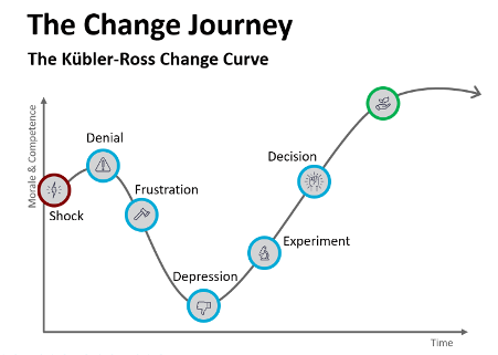
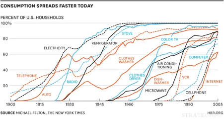
The most popular chart in change management, the Kubler-Ross change curve, was built to describe how terminally ill patients cope with dying. A 2025 review in the Journal of Organizational Change Management traces its path into workplaces and notes that empirical support for a universal sequence of stages in organisations is limited. Treat any model that is simple and intuitively right with care: it can steer you away from stakeholders’ real input, which is often where the best ideas sit. For measuring adoption, the more defensible shape is the S-curve, familiar from technology and new-product adoption. It starts slowly, climbs steeply as the majority joins, then flattens. Our World in Data’s chart of US household technology adoption shows the same shape across a century of technologies.
Minor process change. A small step from the current process gives a gentle curve, reached quickly.
Complex new technology. A long, shallow start and a late climb are normal.
Iterative or agile change. Each release that touches users is a small S-curve of its own, and the releases should add up to a larger one.
The familiar adoption categories (innovators, early adopters, early majority, late majority and laggards) are useful here for targeting. Support that suits innovators does not suit late majority groups, so tailor your communication and help by where each group sits, and watch the early adopters first, since they signal whether the main wave will follow.
Set the interval schedule
As a working guide, simple process changes often stabilise within 30 to 60 days, significant system or behavioural changes within 90 to 180 days, and cultural or leadership changes can take a year or more. These are planning ranges from practice, not benchmarks, so confirm them against a pilot group before you commit leaders to a date.
Plan the reporting process once the measures are set. These are the main considerations:
Make reporting easy. Automate collection wherever possible, using in-app data and tools, so the burden stays low and the cadence survives busy periods.
Set contribution expectations. Get stakeholder support so it is clear who supplies which data, and when.
Build reinforcement. If a measure relies on people’s input, such as a survey, design a reason for them to respond. Without one, response rates drop.
Choose recipients deliberately. Include the business leaders who own the benefit and the middle and first-line managers who shape daily behaviour.
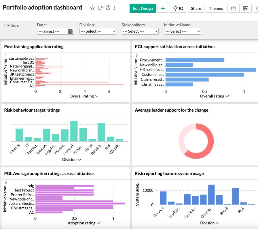
Example of change adoption dashboard from Change Automator
Diagnose before you intervene
When a group lags, work out which of three gaps explains it, because each has a different fix:
Awareness gap. People do not know what is changing or why. Communicate more clearly and more often.
Capability gap. People know, but cannot yet do it. Add training, practice or hands-on support in the specific tasks that fail.
Motivation gap. People can, but are not choosing to. Look to manager engagement, incentives and removal of the old way of working.
Then track whether the intervention moved the number at the next interval. That closes the loop that most change reporting leaves open.
Measuring adoption across several initiatives
Comparing adoption across initiatives needs a common scale, even though each initiative defines adoption differently. If you run a programme or portfolio, three common ways to report are the overall percentage of identified adoption elements achieved, the percentage of milestones reached, and the share of the target population showing the behaviour, supported by manager reports and system utilisation records. These give like-for-like comparison without forcing every initiative onto one definition.
Portfolio measurement also shows something single-initiative reporting cannot: which teams are absorbing several changes at once, and which interventions lead to higher adoption across the whole portfolio. For the strategic angle, see how to align multiple initiatives for maximum benefit realisation.
Where digital tools fit
Manual adoption tracking in spreadsheets works for one initiative and breaks down at portfolio scale. Digital platforms such as The Change Compass collect adoption data in the flow of work, report it by group and initiative, and show which change interventions are associated with higher adoption. Whatever tool you choose, apply the same five steps: the tool automates collection and reporting, but the definition, the behaviours and the baseline are still yours to set.
Start with one change and one baseline
Pick the change you are most worried about, and write down in one sentence what a person would be doing differently if it had worked. Choose three observable behaviours, find the data source for each, and take a baseline this week, before the next milestone gives you a reason to postpone it. Then book the 30, 60 and 90-day readings in the diary and agree who will see them. A rough baseline taken now is worth more than a polished one taken after go-live, and it gives you the one thing leaders rarely get from change reporting: evidence of movement they can trust. When you are ready to choose indicators for each behaviour, the adoption metrics guide is the next step, and the ultimate guide to measuring change puts it in context.
Frequently asked questions
How do you measure change adoption step by step?
Define what adoption looks like in observable terms, choose the behaviours and data sources that show it, record a baseline before the change, track each affected group at fixed intervals after go-live (commonly 30, 60 and 90 days), and use the gaps to trigger targeted action. Report by group rather than as one average, so lagging teams are visible.
What is the difference between change adoption and change compliance?
Compliance is doing the required thing because it is required or observed. Adoption is doing the new thing consistently because it has become the normal way of working. Employees who comply without adopting tend to revert when oversight eases, so measure behaviour again after support is withdrawn, not only at go-live.
How long does change adoption take?
As a working guide, simple process changes often stabilise within 30 to 60 days of go-live, significant system or behavioural changes within 90 to 180 days, and cultural or leadership changes can take 12 to 24 months or more. These are planning ranges drawn from practice, not research benchmarks, so set your own expected curve from a baseline and a pilot group.
How do you measure adoption when there is no system data?
Use observed behaviour instead of opinion: manager observation checklists, call or case sampling, process audits, and downstream quality or cycle-time data. Break the change into small observable micro-behaviours that can be rated yes or no, and sample a consistent number of cases per group at each interval. Use surveys to explain a gap, not to prove adoption.
How do you compare adoption across several change initiatives?
Define adoption separately for each initiative, then report on a common scale: the percentage of identified adoption elements achieved, the percentage of milestones reached, and the share of the target population showing the behaviour. This lets you compare like with like across a portfolio, and spot where several changes are landing on the same teams at once.
Measuring behaviours as a part of change adoption is a key part of effective change management, ensuring the full achievement of initiative benefits and helping practitioners understand whether impacted stakeholders are truly moving toward the future state. Behaviour change, particularly in domains like physical activity and health behavior, has been the subject of significant empirical research, with findings published in major outlets like Google Scholar. To design behaviour change interventions and select the right behaviours to measure, change practitioners should take a structured approach, informed by research findings and practical experience. There are different approaches to effective measurement and we explore some of these.
Selecting the Right Behaviours to Measure
Start with a clear understanding of the initiative’s objectives, the current state, the complexity of the change, different impacts, the change approach, target behaviours, and the quantum of the change being introduced. Not every behaviour is equally important; focus on the key elements most closely tied to initiative success and the full adoption of behaviours required for the future state.
Consider the impacted person’s perspective toward the desired future state: What will they have to do differently? From adopting new physical behaviours (such as physical effort required in physical activity interventions) to changes in decision-making or collaboration, choose behaviours that best reflect actual change, not just awareness or intent.
Prioritize observable and measurable actions. Research suggests that reminders of events or structured prompts can support behaviour change, but measuring the visible results of these reminders—such as compliance rates, social norm adherence, or reduction in social deviance—is essential for meaningful metrics.
Design and Measurement Considerations
Resist the heavy design of change interventions that lead to measurement overload. Simplicity and ease of understanding are crucial, both for those being measured and those collecting the data.
Draw from behavioral change frameworks supported by significant empirical research. For example, a Stanford professor’s work on social norm dynamics highlights how aligning behaviours with group expectations—rather than just individual compliance—can create more durable change.
Integrate measurement as part of a series of change interventions. Behaviour rarely shifts overnight; structured reinforcement, monitoring, and feedback, as supported by research findings, are necessary for full adoption.
Best Practice Tips
Use multiple sources of data: direct observation, self-reports, digital analytics, and reminders of events all have roles in robust measurement systems.
Anchor behaviour change efforts to broader elements like organizational culture (social norms) and systems for monitoring and feedback, to sustain behavioural change and minimize social deviance.
Apply the old adage, “what gets measured, gets managed,” but with the right focus—select measures tightly linked to initiative success.
Ultimately, successful behaviour change – and its measurement – depends on aligning the structured approach of change management with an empathy for the impacted person’s journey. Choosing the right behaviours to measure, grounded in significant empirical research and designed for ease of understanding, supports not only the full achievement of initiative benefits but also continuous improvement for future state readiness
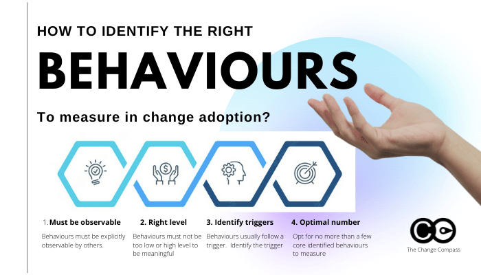
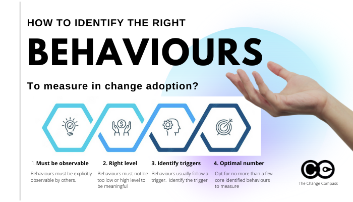
Whilst there could be a wide range of different behaviours depending on the initiative in concern, what are some of the tips in selecting the right behaviours to measure?
Check out our infographic on the top 4 elements to pay attention to when measuring behaviours as a part of change adoption metrics. Also check out Dr BJ Fogg’s model (Stanford University) on effective behaviour change.