How to measure change saturation: a practical methodology for enterprise change functions
Most organisations can feel change saturation before they can prove it. Leaders sense that employees are struggling, change managers notice adoption slipping, and business partners start raising concerns about “too much at once.” But when it comes to quantifying the problem, securing executive attention, or making a credible case for adjusting programme sequencing, feeling is not enough.
Measurement changes that dynamic entirely. An organisation that can measure change saturation can demonstrate it, act on it, and prevent it from quietly undermining transformation outcomes. An organisation that cannot measure it is stuck responding to symptoms rather than causes.
This article sets out a practical methodology for measuring change saturation in enterprise environments: what to measure, how to score it, what the data tells you, and how to turn the output into decisions that protect adoption and reduce change fatigue.
Why change saturation is so difficult to measure
The challenge with measuring change saturation is that it is not a single variable. It is an emergent condition that arises from the interaction between several variables: the volume of concurrent changes landing on a group, the intensity of each change, and the capacity of the group to absorb them. None of these is directly observable in isolation.
Volume is relatively straightforward to count: how many programmes are actively affecting this group right now? But volume without intensity gives you an incomplete picture. A group managing two major system replacements simultaneously is more saturated than a group managing ten minor policy updates. And both assessments are useless unless they are calibrated against capacity: a high-performing change champion network in a well-managed business unit with experienced managers can absorb more than a stretched team in the middle of a restructure.
Prosci’s Best Practices in Change Management research found that 73% of organisations surveyed were near, at, or beyond the saturation point. The reason that number is so high is not that organisations are careless. It is that most organisations have no systematic way to see saturation building before it becomes critical.
The three dimensions of a change saturation measurement model
A rigorous methodology for measuring change saturation needs to address all three dimensions: load, intensity, and capacity.
Dimension 1: Change load
Change load is the quantitative foundation of saturation measurement. It answers the question: how much change is being asked of this group, across all programmes, right now?
Calculating change load requires a portfolio-level view. For each group of employees, you need to know:
How many programmes are currently in active delivery (preparation, go-live, or post-go-live embedding)
The size of the group and the proportion affected by each programme
The timeline of each programme’s peak demand periods
A simple change load index can be constructed by assigning each programme a weight (based on the size and duration of its demand on the group) and summing those weights for each group across the current period. The output is a comparative score: Group A has a load index of 4.2, Group B has a load index of 1.8. High-load groups are immediate candidates for deeper investigation.
Dimension 2: Change intensity
Not all changes demand the same cognitive and behavioural adjustment. Change intensity measures how disruptive each individual programme is to the employees it affects. A robust intensity assessment covers the following dimensions:
Process change: Are employees being asked to follow materially different processes or procedures?
System change: Are new technologies being introduced that require new skills and habits?
Role change: Are roles being restructured, responsibilities shifting, or reporting lines changing?
Behavioural change: Are fundamental ways of working or cultural norms being challenged?
Location and environment: Are physical working arrangements changing?
Each dimension is typically scored on a scale of one to five: one meaning minimal adjustment required, five meaning radical shift. The total intensity score for a programme across all dimensions provides a standardised basis for comparison that goes well beyond “major” and “minor” labels.
When intensity scores are multiplied by the number of people affected, you get a weighted impact figure that can be aggregated across all programmes to give a cumulative impact score for any stakeholder group.
Dimension 3: Absorption capacity
Absorption capacity is the most subjective of the three dimensions, but it is also the most important for calibrating risk. Two groups facing identical change load and intensity may have very different actual saturation risk depending on their current capacity to absorb change.
Factors that increase absorption capacity include: a recent track record of successful change adoption, strong and engaged line managers who actively support transitions, low current business workload, a stable team structure, and access to dedicated change support resources.
Factors that reduce absorption capacity include: recent history of poorly managed change, a restructure or leadership transition in the past twelve months, high current business workload or seasonal pressure, high attrition in the period, and limited manager availability.
Capacity can be assessed using a structured scoring approach: assign each factor a weight and a score, sum the results, and produce a capacity index. When capacity is low and load is high, the saturation risk calculation shifts dramatically.
Combining the three dimensions: the saturation risk score
Once you have load, intensity, and capacity scores for each stakeholder group, you can combine them into a single saturation risk score. The formula is straightforward in principle:
Saturation Risk = (Change Load x Average Intensity) / Absorption Capacity
Groups with a high numerator (high load and high intensity) and a low denominator (low capacity) are at the greatest risk of saturation. Groups with moderate load, moderate intensity, and high capacity may be managing comfortably.
The specific weighting and calibration of this formula will vary by organisation. The important thing is that the formula is applied consistently across all groups and time periods so that comparisons are meaningful. An organisation that calculates saturation risk scores every quarter develops a trend view: is this group’s score rising, stable, or declining? That trend view is often more actionable than any single data point.
Gartner’s research on change fatigue identifies the cascading effects of high saturation: employee intent to stay declines by up to 42% and individual performance can fall by up to 27%. Having a risk score that flags these conditions before they materialise is what gives organisations time to intervene.
Leading indicators: what to watch before saturation becomes critical
Quantitative load, intensity, and capacity scores are the analytical foundation. But they are only as useful as the data that feeds them. Leading indicators provide an early warning layer that flags emerging saturation risk in real time.
The most reliable leading indicators for change saturation include:
Readiness assessment scores: If stakeholder readiness surveys are showing declining confidence in the same groups across multiple programmes, that is a strong signal of emerging saturation even before adoption data confirms it.
Support ticket volume and type: A spike in “how do I” tickets, process queries, or errors in a group that has recently gone through multiple changes indicates that new ways of working are not yet embedded.
Manager-reported concerns: Direct reports from line managers about team overload, confusion about priorities, or declining morale are a ground-level signal that formal data often misses.
Participation rates in change activities: Declining attendance at training sessions, communications open rates falling, or drop-off in workshop participation are early indicators that employees are starting to disengage from change processes.
Pulse survey sentiment: Structured short-cycle surveys asking employees specifically about their change experience, not just general engagement, can surface saturation signals weeks before adoption metrics deteriorate.
The value of these indicators is in their combination. Any single signal can have alternative explanations. When multiple leading indicators are moving in the same direction for the same group, the probability of saturation risk is high.
Lagging indicators: confirming what the leading indicators predicted
If saturation goes undetected or unmanaged, it will eventually show up in lagging indicators. These are retrospective: they confirm that saturation has already occurred, rather than giving you time to prevent it.
Key lagging indicators include:
Adoption rates below threshold: If post-go-live adoption data shows that target behaviours are not being sustained at expected levels, saturation is one of the most common root causes.
Benefits realisation shortfalls: When programmes that expected to deliver financial or operational outcomes within a defined period consistently fall short, compounded change load is often a contributing factor.
Attrition spikes in high-change groups: Research from Prosci identifies that 54% of employees experiencing change fatigue actively look for a new role. Voluntary attrition data disaggregated by group and correlated with change load data can confirm saturation impact after the fact.
Quality or error rate increases: In operational groups going through system or process changes, a measurable increase in errors or rework can indicate that employees are not yet proficient in the new ways of working.
Tracking lagging indicators matters for two reasons. First, they close the loop on the saturation risk methodology: if your risk scores correctly predicted the groups that experienced adoption failure, your model is calibrated well. Second, they provide the evidence base for executive conversations about saturation impact, which is often necessary before organisations will invest in prevention.
Building a change saturation dashboard
Measurement only creates value when it is visible to the people who can act on it. A change saturation dashboard serves as the primary communication tool for the enterprise change function, translating complex multi-variable analysis into a format that programme sponsors, business unit leaders, and transformation executives can consume quickly.
An effective saturation dashboard includes:
Portfolio heat map by group: A matrix showing which stakeholder groups are carrying the highest change load in the current quarter, with colour coding indicating saturation risk levels.
Trend lines for high-risk groups: For groups flagged as high-risk, a rolling view of their saturation score over the past two to four quarters.
Programme convergence view: A calendar-based visualisation showing where multiple programmes are landing on the same groups in the same window.
Leading indicator summary: A consolidated view of the current readings on key leading indicators, with flagging for any that are trending in a concerning direction.
Intervention log: A record of what saturation management interventions have been initiated, by whom, and for which groups.
This kind of visibility transforms saturation management from a reactive exercise into a governance function. When the dashboard is presented regularly to the portfolio governance committee, saturation risk becomes a standing agenda item alongside cost, schedule, and scope.
Practical tools for saturation measurement at scale
For enterprise change functions managing ten or more concurrent programmes, the practical challenge of measuring saturation is significant. The data collection, aggregation, and analysis required to maintain a current, accurate view of saturation risk across a complex portfolio cannot be managed sustainably in spreadsheets.
Change Compass is built specifically for this challenge. The platform provides enterprise change functions with a centralised data infrastructure for capturing change impact and load across the portfolio, automated aggregation of cumulative change demand by stakeholder group, and real-time visualisation of saturation risk. Rather than manually compiling data from twelve different programme SharePoint sites, change managers can work from a single source of truth that surfaces portfolio-level risk automatically.
For change teams in the early stages of building measurement capability, starting with the Change Compass weekly demo is a practical way to see what portfolio-level saturation measurement looks like in practice before committing to a platform investment.
Making measurement actionable: from scores to decisions
The ultimate purpose of measuring change saturation is not to produce scores. It is to produce better decisions about how the change portfolio is managed. A saturation risk score that sits in a report and is never acted on has no value.
The decisions that saturation measurement should be driving include:
Sequencing decisions: When high-risk groups are identified, programme governance should have a mechanism to delay or phase go-live dates for lower-priority programmes to reduce peak load.
Resourcing decisions: Groups identified as high-risk may require additional change support capacity, including dedicated practitioners, enhanced manager coaching, or intensified communication.
Scope decisions: When sequencing is not possible, MVP thinking applied to change scope can reduce the intensity of individual programmes landing on high-risk groups.
Reporting decisions: High-risk groups should be on the executive sponsor radar, with regular updates on saturation indicators and intervention progress.
Prosci’s research on change management metrics consistently identifies that organisations that actively measure and act on change data are significantly more likely to meet or exceed their project objectives. The measurement methodology matters, but the governance mechanism that turns measurement into action matters just as much.
Where to start: a phased approach to building saturation measurement capability
Most enterprise change functions cannot build a full saturation measurement system overnight. The most practical approach is phased.
Phase 1: Establish the data foundation. Standardise the change impact assessment template across all programmes so that group-level impact data is collected in a consistent, comparable format. Without this, aggregation is impossible.
Phase 2: Build the portfolio view. Map all active and upcoming programmes against the employee population in a shared register. Identify which groups are affected by more than two significant changes in the next quarter.
Phase 3: Add the intensity layer. For the highest-load groups identified in Phase 2, conduct structured intensity assessments for each programme affecting them. Calculate cumulative intensity scores.
Phase 4: Introduce capacity assessment. Develop a structured capacity scoring instrument for the highest-risk groups. Combine load, intensity, and capacity scores into a risk index.
Phase 5: Automate and sustain. Move from manual calculation to platform-supported aggregation and visualisation, so that saturation risk is maintained as a live view rather than a quarterly exercise.
The organisations that manage change saturation most effectively are those that started this journey early enough to have meaningful data before the next major convergence point. The methodology above is scalable from small beginnings, but the longer measurement is deferred, the less lead time there is to act.
Frequently asked questions
What is the best way to measure change saturation?
The most robust approach combines three dimensions: change load (the volume of concurrent programmes affecting a group), change intensity (how disruptive each programme is across process, system, role, and behavioural dimensions), and absorption capacity (the group’s current ability to take on change). Combining these into a saturation risk score, tracked over time, provides a meaningful basis for governance and intervention decisions.
How do you know when an organisation has reached change saturation?
Saturation is typically confirmed by a combination of leading and lagging indicators. Leading indicators include declining readiness scores across multiple programmes for the same groups, rising support ticket volumes, and falling participation in change activities. Lagging indicators include below-target adoption rates, benefits realisation shortfalls, and voluntary attrition spikes in high-change groups. When multiple signals align, saturation is almost certainly a factor.
What data do you need to measure change saturation?
The minimum data set includes: the change portfolio (all active programmes and their timelines), impact assessment data (which groups are affected, how significantly), readiness and adoption metrics from each programme, and capacity indicators for the highest-risk groups. Ideally this data is maintained in a centralised platform rather than distributed across programme-level documents.
Can change saturation be measured at the team level?
Yes, and team-level measurement is often the most actionable. While portfolio-level heat maps identify which business units or functions are carrying the highest load, team-level analysis identifies where the risk is most acute and allows targeted support to be directed precisely. Line manager input is essential for accurate capacity assessment at the team level.
How often should change saturation be measured?
At a minimum, quarterly. For organisations running fast-moving transformation portfolios, monthly or rolling measurement is more appropriate. The goal is to have enough lead time to act on risk signals before they translate into adoption failure. A retrospective saturation assessment after go-live confirms what happened but does not allow intervention.
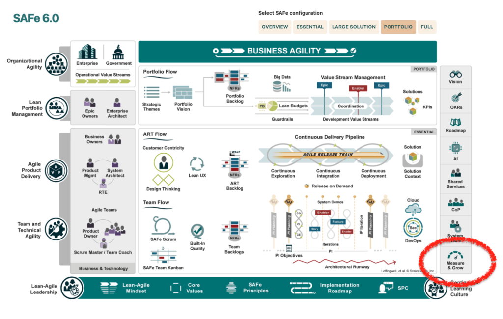
Scaled Agile Framework (SAFe) has emerged as a leading methodology to address the organisational change demands of fostering flexibility, collaboration, and continuous improvement. A cornerstone of SAFe is the principle of ‘Measure and Grow,’ which emphasizes using data and fact-based decisions to enhance change outcomes over time, including predictability. Despite its centrality, SAFe does not explicitly detail the change management components essential for its success, including its deep understanding of SAFe’s measurement model that enables the design of a tailored metrics strategy for ensuring strategic alignment. Here we outline how change management practitioners can effectively apply the ‘Measure and Grow’ principle within an Agile Release Train (ART) to lead change and improve outcomes to support the Scaled Agile environment.
What does it mean to “measure and grow” in a business context?
In a business context, “measure and grow” refers to the process of evaluating performance metrics to identify how our work drives business value and areas for improvement, aligning with strategic business goals. By analyzing data, companies can implement strategies that foster growth, enhance productivity, and improve overall outcomes. This approach ensures continuous development aligned with organizational goals.
The “Measure and Grow” Principle in Scaled Agile
What does it mean to “measure and grow” in a business context?
“Measure and grow” in a business context refers to the process of assessing performance metrics and outcomes to identify areas for improvement. By analyzing data, businesses can implement strategies that foster growth, enhance customer satisfaction, and optimize resource allocation, ultimately driving sustainable success and competitive advantage.
“Measure and Grow” is integral to SAFe, focusing on systematic measurement and continuous improvement for overall business agility within the value stream. By leveraging data and analytics, organizations can quickly respond to market changes, make informed decisions that meet the needs of our customers, identify areas needing attention, uncover improvement opportunities, and iteratively enhance meaningful change in performance. For change management professionals, this principle translates into a structured approach to evaluate the effectiveness of change initiatives, pinpoint areas for improvement, and implement necessary adjustments.
In a Scaled Agile environment, “Measure and Grow” is a core tenant or principle that applies in all types of agile environments. By continuously assessing and refining change efforts, organizations can align their initiatives with strategic objectives, mitigate risks, and ensure sustained success.
In practice, a lot of organisations have not pinpointed exactly how change management measures can make or break the outcome of the change, and in a SAFe environment, across the program, portfolio as well as enterprise.
The ‘Measure and Grow’ principle as a core part of SAFe (From Scaled Agile Framework)
To operationalize the “Measure and Grow” principle in change management, it is crucial to establish a set of metrics and assessment frameworks. Here are some broad categories of different types of change measurements that are relevant. Note that since we are talking about SAFe, it is not just at the initiative level that we are talking about metrics. More importantly, it is about establishing a system to promote change improvement across the organisation.
Change Management KPIs and OKRs
Key Performance Indicators (KPIs) and Objectives and Key Results (OKRs) are essential tools for tracking the success of change management initiatives. KPIs provide quantitative measures of performance, while OKRs align change efforts with broader organizational goals. A change management stream or function should focus on establishing KPIs or OKRs to achieve laser focus on achieving change outcomes.
Examples of Initiative-Level Change Management KPIs that may roll out to form portfolio views
Employee Engagement Levels: This KPI assesses how change impacts employee morale and engagement, providing insight into the overall acceptance and support of the change initiative.
Learning Achievement Rates: This can include tracking the percentage of employees who have completed necessary training programs, as well as achieving the target level of competence to ensure that the workforce is adequately prepared for the change.
Feedback Scores: Collecting feedback from stakeholders through surveys or feedback forms helps gauge perception and identify areas needing improvement. It is important to note that depending on the change context, stakeholders may not be happy with the content of the change. However, understanding and tracking this perception is still important.
Change Adoption Rate: This KPI measures the percentage of stakeholders who have adopted the change. High adoption rates are the ultimate goal for initiatives.
Issue Resolution Time: Measuring the time taken to resolve user-related issues related to the change highlights the efficiency of support mechanisms and the responsiveness of the change management team. This is especially important during an agile environment where there may be constant changes.
Change Readiness and Stakeholder Engagement Metrics
Evaluating change readiness and stakeholder engagement is crucial to the success of any change initiative. These metrics help assess the organization’s preparedness for change and the level of involvement and support from key stakeholders. Readiness and engagement rates can also roll up at a portfolio level to provide oversight.
Change Readiness Metrics
Readiness Assessments: Conduct surveys or interviews to gauge the organization’s preparedness for the impending change. This can include evaluating awareness, understanding, and acceptance of the change.
Resource Availability: Measure the availability of necessary resources, such as budget, personnel, and tools, to support the change initiative.
Communication Effectiveness: Assess the clarity, frequency, and effectiveness of communication regarding the change to ensure stakeholders are well-informed and engaged.
Stakeholder Engagement Metrics
Engagement Scores: Use surveys or feedback forms to measure the engagement levels of stakeholders, indicating their commitment and support for the change.
Participation Rates: Track stakeholder participation in change-related activities, such as workshops, meetings, and training sessions, to gauge their involvement.
Influence and Support: Assess the influence and support of key stakeholders in driving the change, ensuring that influential figures are actively endorsing the initiative.
By monitoring these metrics, change management professionals can identify potential barriers to change and take proactive steps to enhance readiness and engagement.
Stakeholder Competency Assessment
Successful change initiatives rely on the competence and readiness of key stakeholders. Assessing stakeholder competency involves evaluating the capability of sponsors and change champions to support and drive the change.
Sponsor Readiness/Capability Assessment
Sponsor Engagement: Measure the level of engagement and commitment from sponsors, ensuring they are actively involved and supportive of the change.
Decision-Making Effectiveness: Assess the ability of sponsors to make timely and effective decisions that facilitate the change process.
Resource Allocation: Evaluate the sponsor’s ability to allocate necessary resources, such as budget and personnel, to support the change initiative.
Change Champion Capability Assessment
Training and Knowledge: Measure the knowledge and training levels of change champions to ensure they are well-equipped to support the change.
Communication Skills: Assess the ability of change champions to effectively communicate the change message and address stakeholder concerns.
Influence and Leadership: Evaluate the influence and leadership capabilities of change champions, ensuring they can effectively drive and sustain the change.
By conducting these assessments, change management professionals can ensure that key stakeholders are prepared and capable of supporting the change initiative.
Change Adoption Metrics
Change adoption metrics provide insight into how well the change has been accepted and integrated into the organization. These metrics help assess the effectiveness of the change initiative and identify areas for improvement. At a portfolio level, there may be different levels of change adoption set for different initiatives depending on priority and complexity.
Key Change Adoption Metrics
Adoption Rate: Measure the percentage of stakeholders who have adopted the change, indicating the overall acceptance and integration of the new processes or systems.
Usage Metrics: Track the usage of new tools, processes, or systems introduced by the change to ensure they are being utilized as intended.
Performance Metrics: Assess the impact of the change on key performance indicators, such as productivity, efficiency, and quality, to determine the overall success of the change initiative.
By monitoring these metrics, change management professionals can gauge the success of the change initiative and identify opportunities for further improvement. To read more about change adoption metrics check out The Comprehensive Guide to Change Management Metrics for Adoption.
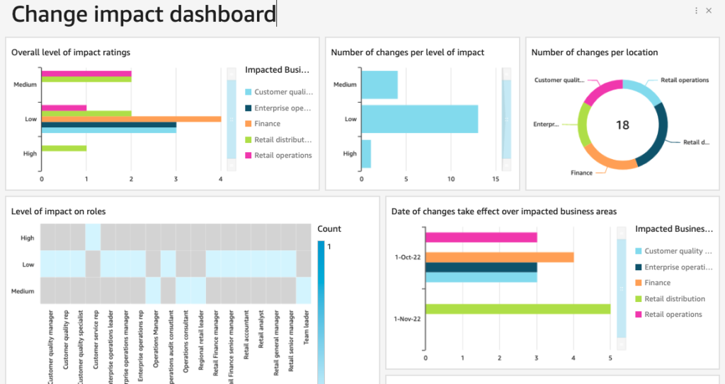
Change Impact and Capacity Metrics
Understanding the impact of change and the organization’s capacity to manage it is crucial for successful change management. Change impact metrics assess the effects of the change on the organization, while capacity metrics evaluate the organization’s ability to manage and sustain the change.
Change Impact Metrics
Aggregate impacts: Aggregate impacts across initiatives to form a view of how various teams and roles are impacted by various changes.
Risk Assessments: Identify potential risks associated with the change and evaluate their impact, ensuring that mitigation strategies are in place. A particular focus should be placed on business performance during change, across initiatives.
Capacity Metrics
Resource Capacity: Assess the availability of resources, such as personnel, budget, and tools, to support the change initiative and optimize flow time, enhance flow velocity, and improve flow efficiency while monitoring Flow Load.
Change Fatigue: Measure the risk for potential fatigue within the organization and its impact on stakeholders, ensuring that change initiatives are paced and driven appropriately.
Support Structures: Evaluate the effectiveness of support structures, such as training programs, information hubs, and help desks, in facilitating the change. Support structures may also include change champion networks.
By assessing change impact and capacity, change management practitioners can ensure that the organization is well-equipped to manage and sustain the change initiative.
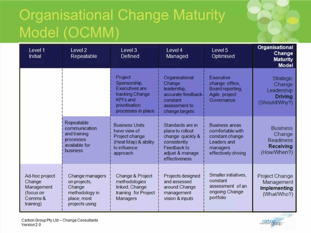
Change Maturity Assessment
Change maturity assessments provide a comprehensive evaluation of the organization’s capability to manage change effectively. These assessments help identify strengths and weaknesses in the organization’s change management practices and provide a roadmap for improvement.
The Change Management Institute (CMI) Change Maturity Model is a comprehensive framework that takes a holistic approach to enhancing an organization’s change management maturity. It’s divided into three core functional domains, each playing a vital role in the overall journey toward maturity:
Project Change Management
Business Change Readiness
Strategic Change Leadership.
These domains serve as the foundation for achieving higher levels of maturity within the organization.
Within each of these domains, the CMI model outlines a structured path, consisting of five distinct maturity levels. These levels represent a continuum, starting at Level 1, which serves as the foundational stage, and progressing all the way to Level 5, the zenith of maturity and effectiveness. This multi-tiered approach offers organizations a clear roadmap for growth and development, ensuring that they have the tools and insights necessary to navigate the complexities of change management.
By conducting regular change maturity assessments, change management professionals can identify areas for improvement and develop targeted strategies to enhance the organization’s change management capability.
The “Measure and Grow” principle is a powerful tool for improving change outcomes in a Scaled Agile environment. By leveraging data and fact-based decision-making, change management professionals can ensure that change initiatives are effective, aligned with strategic objectives, and continuously improving. Establishing robust metrics and assessment frameworks, such as KPIs, OKRs, change readiness and stakeholder engagement metrics, stakeholder competency assessments, change adoption metrics, change impact and capacity metrics, and change maturity assessments, is essential to applying the “Measure and Grow” principle effectively.
Incorporating these metrics and assessments into change management practices enables organizations to identify areas for improvement, make informed decisions, and drive continuous improvement. By doing so, change management professionals can enhance the effectiveness of change initiatives, ensure successful adoption, and ultimately achieve better business outcomes.
Successful change management relies on having the right metrics to measure progress, gauge impact, and communicate with stakeholders. Moreover, the right metrics can drive continuous improvement and help directly achieve change outcomes. However, not all metrics are beneficial, and some can mislead or fail to meet stakeholder needs, especially when managing change projects. Let’s check out the top change management metrics to avoid and go through examples to take note.
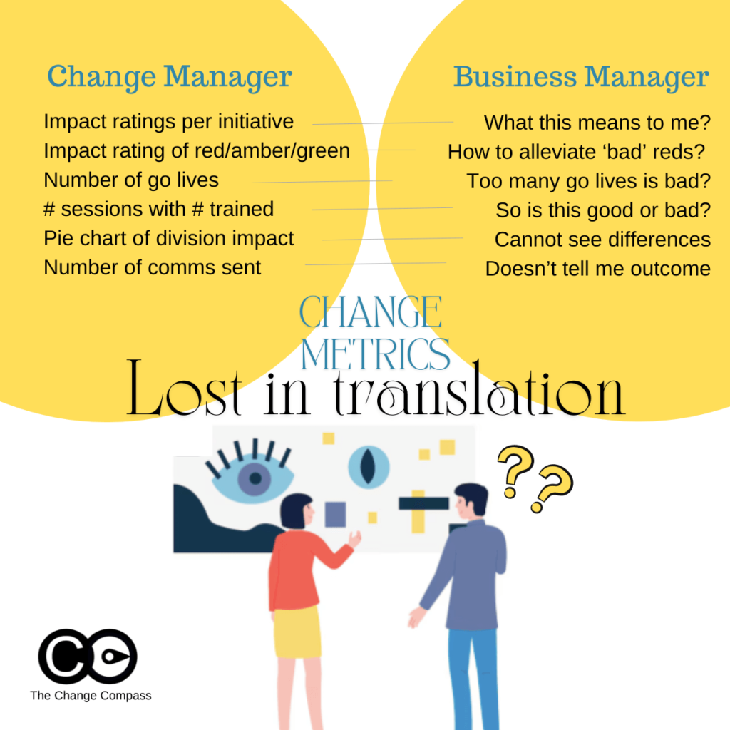
Understanding the Disconnect: Change Managers vs. Business Stakeholders
A significant reason certain change management metrics fall short is the differing perspectives between change managers and business stakeholders. Change managers and change practitioners are trained to view metrics through the lens of change management frameworks and methodologies, focusing on detailed assessments and structured approaches as a part of the change management strategy. These include applying ratings and judgments on aspects such as impact levels indicating levels and areas of impact.
In contrast, business stakeholders prioritize business operations, strategic outcomes, and practical implications. The busy business stakeholder is often looking for practical implications from metrics that can be used to directly drive decision making, meaning “what do I do with this data to improve the ultimate business outcome”.
Of course, different stakeholders have different data needs, and you need to show the right metric to the right type of stakeholder. For example, operations-focused stakeholders expect fairly detailed metrics and internal historical data to understand what that means in terms of organisation, coordination, capacity, and performance perspectives. Senior managers may prefer higher-level data with a focus on strategic impacts, overall progress, and adoption indicators of change success rate.
This disconnect can lead to the use of metrics that do not resonate with or are misunderstood by stakeholders that disrupt change success.
Change managers may leverage metrics that are derived from the various change management documents such impact assessments, training plan or communications plan. Metrics are also often chosen for ease of use and ideally are not overly complicated to execute.
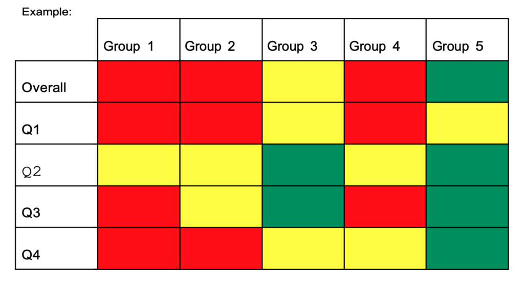
For example, impact assessments typically involve rating stakeholder groups and initiatives on a traffic light system (red, amber, green) based on their impact. While this approach is systematic, it can be problematic for several reasons:
Lack of Sufficient Stakeholder Context: Business stakeholders might not understand the practical implications of these ratings. For instance, an “impact rating per initiative” may not clearly convey what the rating means for day-to-day operations or strategic goals. For example, if an initiative has a red impact rating, stakeholders might not grasp the specific operational changes or strategic adjustments needed, in essence, “what do I do with this?”. So, incorrect usage of data could result in lack of stakeholder engagement.
Misinterpretation of Traffic Light Ratings: The red, amber, green system can be misleading. Stakeholders might interpret red as an indicator of alarm or imminent risk, while green may be seen as a sign that no action is needed. This is because stakeholders are trained to interpret traffic light ratings this way (from the various project/business updates they’ve attended). In reality, red might simply mean high impact, requiring focused attention, and green might indicate a low impact but still require monitoring. For instance, a red rating might indicate significant process changes that need careful management, not necessarily a negative outcome.
Hard to defend ratings if prompted: Business stakeholders may also want to drill into how the ratings are determined, and based on what basis. They may expect a logical data-backed reasoning of how each colour scheme is determined. If a rating is based on an overall ‘personal judgment’ this may be hard to defend infront of a group of stakeholders.
Examples of Potentially Misleading Metrics
Certain metrics, although straightforward, can be easily misinterpreted and fail to provide a realistic picture of change impacts as a part of effective change management. Often these are selected because they are easy to report on. However, easy, make not give you the outcome you are looking for.
Number of Go-Lives: Tracking the number of Go-Lives over time might seem like an effective way to represent change volume. However, the most significant impacts on people given time often occur before or after the Go-Live date. For example, the preparation and training phase before Go-Live and the adoption phase afterward are critical periods that this metric overlooks. A Go-Live date might indicate a milestone but not the challenges, progress or impacts faced during the implementation phase.
Number of Activities Implemented: Similar to Go-Lives, this metric focuses on quantity rather than quality. Simply counting the number of activities does not account for their effectiveness or the actual change they drive within the organisation. For example, reporting that 50 training sessions were conducted does not reveal whether employees found them helpful or if they led to improved performance.
Number of impacts or stakeholders impacted: Again, using a numerical way to indicate progress can be very misleading, or unmeaningful. This is because it may be ‘interesting’ but with no real action for your stakeholder to take in order to somehow lead to a better overall change outcome. If metrics do not result in some kind of action, then over time it will not shape your change(s) toward the targeted outcomes. Or worse, your stakeholders may lose interest and lose confidence in the strategic impact of these metrics.
Another common way to report change metrics is to use the number of impacts or number of stakeholders impacted by the organizational change. This can be in terms of the following:
Number of divisions impacted
Number of stakeholder groups impacted
Number of employees impacted
Number of initiatives per division/stakeholder
Metrics That May Be Too Operational
Metrics that are overly operational can fail to capture meaningful progress or adoption. Perhaps if the metric are for reporting within the Change Management team that may be OK. However, when you are showing metrics to stakeholders, a different set of expectations should be cast.
If you are presenting metrics to senior managers, you need to ensure that they hit the mark for that audience group. If the group is more interested in strategic impact, and higher level progress outcomes, you need to tailor accordingly.
Examples of metrics that may be too operational include:
Number of Communications Sent: This metric measures activity but not effectiveness. Sending numerous emails or messages does not guarantee that the message is received, understood, or acted upon by stakeholders. For instance, stakeholders might receive 100 emails, but if the content is unclear, the communication effort is wasted. Or worse, the emails may not even have been read.
Number of Training Sessions Attended: This one is a classic. While training is crucial, the number of sessions attended does not necessarily reflect the attendees’ understanding, engagement, or the practical application of the training. For example, employees might attend training but not apply the new skills if the training is not relevant to their roles for various reasons.
Number of workshops/meetings: Another way of articulating the change management progress in terms of activities is the number of workshops or meetings conducted with stakeholders including focus groups to indicate employee engagement. Again, this may be good to track within the change management team. However, presenting this metric to stakeholders may not be appropriate as it may not meet their needs nor indicate change management success.
Number of changes: This may be a common way to report on changes planned, but it doesn’t really inform the extent of the change. One change can be significantly impactful whilst another does not have major stakeholder impacts and are more system impacts. Listing number of changes may be deceiving or misleading. This kind of data may not get you the level of acceptance targeted.
The way metrics are presented is just as important as the metrics themselves. Poor visualization can lead to misinterpretation, confusion, and misguided decisions. Here are some common pitfalls to avoid:
Ineffective Use of Pie Charts
Pie charts can be misleading when used to show data points that are not significantly different. For example, using a pie chart to represent the percentage of divisions impacted by a change might not effectively communicate the nuances of the impact if the differences between the divisions are minimal. A pie chart showing 45%, 30%, and 25% might not convey the critical differences in impact levels among divisions.
Misleading Traffic Light Ratings
Using red, amber, and green to indicate high, medium, and low impacts can send the wrong message. Stakeholders might associate these colours with good and bad outcomes rather than understanding the actual levels of impact. Stakeholder may be used to interpreting these in the context of their usual project or business updates where red indicated alarm and ‘bad’. This can lead to unnecessary alarm or complacency. For instance, a green rating might suggest no need for action, while in reality, it might require ongoing monitoring.
Overuse of Colours
Using too many colours in charts and graphs can overwhelm stakeholders, making it difficult to discern the key message. Using colours in data visualisation can be two-edged sword. Colour can effectively point your stakeholders are the area where you want them to focus on. But, too many colours can lose your audience. A cluttered visual can obscure the critical data points and lead to misinterpretation. For example, a graph with ten different colours can confuse stakeholders about which data points are most important.
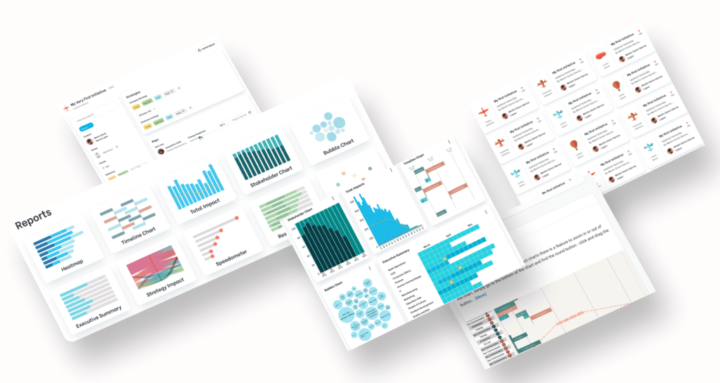
Data visualisation tools are also important. A lot of people use Power BI which works for a foundational level of charts. For tailored charts, specifically designed to to influence stakeholders to clearly see certain angles of risks and opportunities leverage tools such as Change Compass.
Practical Takeaways for Senior Change Managers
To ensure that change management metrics are effective and take into account best practices practices, consider the following practical takeaways:
Align Metrics with Key Stakeholder Perspectives
Understand Stakeholder Priorities: Engage with stakeholders to understand their business goals, priorities and concerns. Tailor your metrics to address these aspects directly. For example, if stakeholders are concerned about operational efficiency, focus on metrics that reflect improvements in this area.
Use Business Language: Frame your metrics in a way that resonates with business stakeholders. Avoid change management jargon and reference, and ensure that the implications of the metrics are clear and actionable. For example, instead of using technical terms, explain how the metrics impact business outcomes. Think in terms of business activities, milestones, busy periods, and capacity challenges.
Focus on Meaningful Metrics
Measure Outcomes, Not Just Activities: Change leaders should prioritize metrics that reflect the outcomes and impacts of change indicate level of knowledge, rather than just the activities performed as a part of change management KPIs. For example, instead of counting the total number of employees attending change management training sessions, measure the improvement in employee performance or knowledge retention post-training.
Example: Instead of reporting that 100 employees attended training sessions, report that 85% of attendees showed improved performance in their roles after training, or that certain level of competencies were gained. Note that quantifiable metrics have more impact on the audience.
Track Engagement and Adoption: Monitor metrics that indicate the level of engagement and adoption among stakeholders or their perception of the change. This could include surveys, feedback forms, or direct measures of behaviour change and the overall success rate of the change.
Example: Use post-training surveys to measure employee confidence in applying new skills or managerial rating of application of learnt skills rather than employee satisfaction of the training sessions using satisfaction scores. Track the percentage of employees who actively use new tools or processes introduced during the change.
Example: Instead of reporting that 100 employees attended training sessions, report that 85% of attendees showed improved performance in their roles after training, or that certain level of competencies were gained.
Example: Use post-training surveys to measure employee confidence in applying new skills or managerial rating of application of learnt skills. Track the percentage of employees who actively use new tools or processes introduced during the change.
Improve Metric Visualization
Simplify Visuals: Use clear, simple visuals that highlight the key messages. Avoid clutter and ensure that the most important data points stand out.
Example: Use bar charts or line graphs to show trends over time rather than pie charts that can be harder to interpret.
Contextualize Data: Provide context for the data to help stakeholders understand the significance. For example, instead of just showing the number of Go-Lives, explain what each Go-Live entails and its expected impact on operations. Or better, focus on showing the varying levels of impact on different stakeholders across time within the initiative.
Example: Accompany a Go-Live count with a visual showing the varying impact level of various implementation activities of the changes.
Example: Use bar charts or line graphs to show trends over time rather than pie charts that can be harder to interpret.
Example: Accompany a Go-Live count with a visual showing the varying impact level of various implementation activities of the changes.
Narrative Approach: Combine metrics with a narrative that explains the story behind the numbers as a part of the change management process. This can help stakeholders understand the broader context and implications.
Example: Instead of presenting raw data, provide a summary that explains key trends, successes, and areas needing attention.
Educate your stakeholders: Depending on stakeholder needs you may need to take them on a phased approach to gradually educate them on change management metrics and how you ultimately want them to drive the outcomes.
Example: You may start the education process to focus on more simplistic and easy-to-understand measures, and as your stakeholders are more change-mature, move to drill into more detailed metrics that explain the ‘why’ and ‘how’ to drive outcome success.
Continuously improvement: Provide regular updates on key metrics and adjust them based on feedback from stakeholders. Continuous communication ensures that everyone remains aligned and informed.
Example: Hold monthly review meetings with stakeholders to discuss the latest metrics, address concerns, and adjust strategies as needed.
Example: Instead of presenting raw data, provide a summary that explains key trends, successes, and areas needing attention.
Example: You may start the education process to focus on more simplistic and easy-to-understand measures, and as your stakeholders are more change-mature, move to drill into more detailed metrics that explain the ‘why’ and ‘how’ to drive outcome success.
Example: Hold monthly review meetings with stakeholders to discuss the latest metrics, address concerns, and adjust strategies as needed.
Examples of Effective Metrics
Employee Adoption and Engagement
Percentage of Employees Adopting New Process/System: This metric measures the rate at which employees are using new processes or systems introduced during the change. High adoption rates indicate successful integration.
Implementation: Use software usage analytics or surveys to track tool adoption rates.
Visualization: A graph showing adoption rates over time.
Employee Feedback Scores: Collect feedback on change initiatives through surveys or stakeholder ratings to measure sentiment/feedback and identify areas for improvement.
Implementation: Conduct regular surveys asking employees about their experience with the change process. Do note that depending on the change you may expect negative feedback due to the nature of the change itself (vs the way it was implemented).
Visualization: Bar/Line charts comparing feedback scores across different departments or time periods. Bar/Line charts are the standard go-to for data visualisation. They are easy to understand and interpret.
Implementation: Use software usage analytics or surveys to track tool adoption rates.
Visualization: A graph showing adoption rates over time.
Implementation: Conduct regular surveys asking employees about their experience with the change implementation process. Do note that depending on the change you may expect negative feedback due to the nature of the change itself (vs the way it was implemented).
Visualization: Bar/Line charts comparing feedback scores across different departments or time periods. Bar/Line charts are the standard go-to for data visualisation. They are easy to understand and interpret.
Impact on Business Outcomes
Improvement in Key Performance Indicators (KPIs): Track changes in KPIs that are directly impacted by the change initiatives, such as productivity, customer satisfaction, customer experience, improvement in process inconsistencies or financial performance.
Implementation: Identify relevant KPIs and measure their performance before and after change initiatives.
Visualization: Use line/bar graphs to show trends in KPI performance over time.
Operational Efficiency Metrics: Measure improvements in operational processes, such as reduced cycle times, error rates, or cost savings.
Implementation: Track specific operational metrics relevant to the change initiatives.
Visualization: Bar charts or heatmaps showing improvements in efficiency metrics across different operational areas.
Implementation: Identify relevant KPIs and measure their performance before and after change initiatives.
Visualization: Use line/bar graphs to show trends in KPI performance over time.
Implementation: Track specific operational metrics relevant to the change initiatives.
Visualization: Bar charts or heatmaps showing improvements in efficiency metrics across different operational areas.
Change management effectiveness requires metrics that not only measure progress but also resonate with business stakeholders and accurately reflect the impact of change initiatives. They should provide valuable insights. Avoiding common pitfalls such as relying on easily misinterpreted or overly operational metrics is crucial. By aligning metrics with stakeholder perspectives, focusing on meaningful outcomes, improving visualization, and communicating effectively, senior change and transformation professionals can ensure that their metrics truly support the success of their change initiatives.
The top change management metrics to avoid are those that fail to provide clear, actionable insights to business stakeholders. By understanding and addressing the disconnect between change managers and business stakeholders, and by prioritizing metrics that truly reflect the impact and progress of change, you can drive more effective and successful change management efforts by influencing your stakeholders in your organisation.
As a next step, Chat with us if you would like to discuss more about leveraging AI and technology to generate high-impact change management metrics and data for your stakeholders, both at project and portfolio levels, using data visualisation tools.
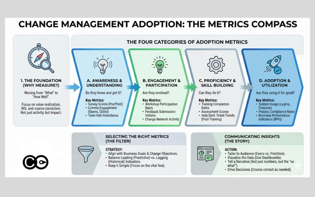
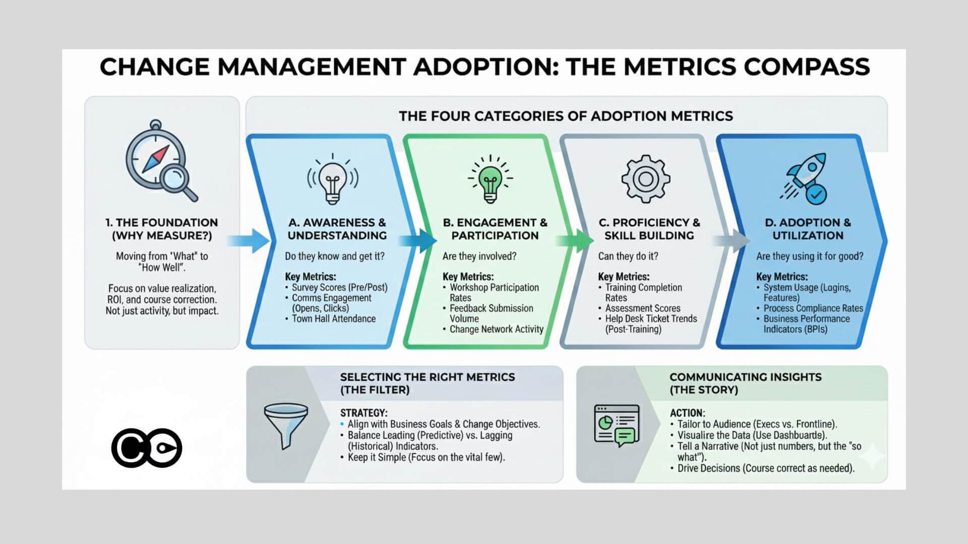
Change adoption metrics are quantifiable indicators that show how much of a workforce has actually shifted to new ways of working after a change initiative is delivered. They go beyond completion data such as training attendance or system logins. Strong adoption metrics measure consistent use of new processes, observed behaviour change at the team level, and stakeholder confidence in the outcome. Reporting these metrics to leadership requires both a portfolio view of where adoption is strong and where it is stalling, and a clear connection to the business outcome each initiative was meant to deliver.
Prosci’s 12th Edition Best Practices in Change Management research found that 76% of change practitioners who measure adoption met or exceeded their project objectives. Among those who did not measure, only 24% achieved the same result, a three-to-one difference in outcomes driven not by strategy or budget, but by whether a team tracked what was happening with adoption.
Yet only 63% of change practitioners measure adoption consistently. Roughly one in three change teams is managing a transformation without knowing whether people are actually changing.
Adoption metrics close this gap. They track how well individuals are embracing change, how behaviours are evolving, and whether change initiatives are delivering the outcomes that justified them. This guide covers the essential metrics, measurement principles, and dashboard structures that high-performing change functions use across system implementations, compliance rollouts, and restructuring programmes.
What Are Change Management Adoption Metrics?
Change management adoption metrics are quantifiable indicators that help organisations track the extent to which employees, teams, and other stakeholders successfully embrace and sustain changes introduced by transformation initiatives.
These metrics go beyond superficial indicators like training attendance or initial rollout success. Instead, they focus on meaningful outcomes that show real adoption, including:
User engagement rates: How actively users interact with new systems or processes.
Feature usage: Frequency and depth at which specific tools or functions are utilized.
Retention rates: Sustained use over time, indicating lasting adoption.
Behavioural compliance: Adherence to new workflows, policies, or regulatory behaviours.
Customer feedback: External perceptions of service or product improvements due to change.
Tracking these metrics allows organisations to understand adoption success, spotlight issues early, and continuously refine change strategies to drive greater impact.
Fundamental Principles of Measuring Adoption
Context Matters
Every change initiative is unique. Different organisational cultures, leadership styles, industries, and change scopes mean no two adoption measurement approaches are identical. Tailoring metrics to align with your initiative’s objectives, stakeholder dynamics, and organisational readiness ensures relevance and maximizes insights.
Focus on Outcomes
Effective adoption metrics focus on measuring outcomes and impact rather than just tracking inputs or activities. For example, instead of simply counting training session attendance, measure whether the training led to proficiency improvements, behaviour changes, or feature activations.
Continuous Monitoring
Adoption isn’t a one-time milestone but an ongoing process. Continuously monitoring adoption metrics over the lifecycle of the change initiative helps detect drops or resistance early, allowing course corrections before issues become entrenched.
Use Multiple Data Sources
Triangulate data across system logs, surveys, interviews, observations, and feedback channels. Combining quantitative system metrics with qualitative insights from stakeholders gives a holistic view of adoption progress.
Measure at Multiple Levels
Track adoption metrics at individual, team, process, and organisational levels to understand how change permeates through various layers and identify bottlenecks or champions.
Key Adoption Metrics for System Implementations
System implementation projects, such as rolling out a new CRM, ERP, or productivity tool, often represent significant organisational investments. Measuring adoption effectively is vital to ensure these investments deliver value.
Below are the most impactful metrics to track:
System Feature Usage Frequency
This metric measures how often different features of the new system are used by employees. High usage of core functionalities indicates engagement and proficiency, while low usage signals training or usability gaps.
Example: Track daily active users (DAU) leveraging key features and compare to expected adoption benchmarks.
Process Efficiency Gains
Measure improvements in process cycle times, throughput rates, and resource utilization resulting from system adoption. Efficiency gains indicate that new workflows powered by the system are being embedded effectively.
Example: Average time to complete a sales order before and after system launch.
Customer Conversation Audit
For systems impacting customer interactions (e.g., customer service platforms), auditing conversations for quality and completeness helps track whether adoption translates to better client experiences.
Example: Percentage of calls with complete data logged, sentiment improvement metrics.
Sales Volume Changes
Tracking changes in sales or revenue post-implementation demonstrates the monetary impact of system adoption. Correlate with feature usage and process compliance data for deeper insights.
Example: Monthly sales growth percentage compared to prior periods.
Information Completeness
Quantify how well the system captures comprehensive and accurate data. High data quality supports better decisions and downstream workflows.
Example: Percent of customer records with complete contact and interaction histories.
Customer Satisfaction Scores
Survey customers on their experience after the system adoption to assess satisfaction gains linked to the change.
Example: Net Promoter Score (NPS) or customer satisfaction index before and after rollout.
Pro Tips for System Implementation Metrics
Segment metrics by user roles and departments to identify adoption disparities.
Focus on the critical few features driving business outcomes rather than every system capability.
Use adoption trend charts over time rather than static snapshots for better story-telling with data.
Key Adoption Metrics for Compliance Initiatives
Compliance initiatives are critical for organisations to meet regulatory standards, industry certifications, or internal policies. Measuring adoption here ensures risks are minimized and consistent behaviours are embraced.
Process Compliance
This metric tracks adherence to defined regulatory processes and standards. High compliance levels reflect successful adoption of mandatory behaviours.
Example: Percent of audit checklist items fully completed within prescribed timelines.
Rated Compliance of Targeted Behaviours
Evaluate employee compliance with specific prescribed behaviours affected by regulatory changes. This can be measured through self-assessments, manager evaluations, or external audits.
Example: Percentage of staff consistently applying new data privacy protocols.
Frequency of Team Leader Coaching
Track how often supervisors provide coaching and reinforcement of compliance behaviours. Regular coaching boosts awareness and accountability.
Example: Number of coaching sessions conducted per month per team.
Customer Feedback on Compliance
Collect feedback from customers or clients regarding their experiences with the organisation’s compliance posture post-change.
Example: Customer ratings on service adherence to privacy and security standards.
Number of Incidents
Monitoring incidents related to non-compliance serves as an early warning system to detect gaps before they escalate.
Example: Incident count reduction trend over quarters after policy rollout.
Key Adoption Metrics for Restructuring Initiatives
Restructuring initiatives, such as mergers, realignments, or downsizing, profoundly impact employee morale and organisational performance. Analytics here help assess adoption and foster alignment with new structures.
Employee Engagement and Morale
Measure changes in engagement and morale through surveys, interviews, and focus groups pre- and post-restructuring.
Example: Employee Net Promoter Score (eNPS) variations over the restructuring timeline.
Organisational Alignment
Evaluate how well the restructuring aligns with strategic objectives by tracking KPIs like revenue growth, market share, and customer satisfaction.
Example: Changes in strategic goal attainment percentages post-merger integration.
Communication Effectiveness
Assess clarity, frequency, and impact of communication during restructuring via employee feedback.
Example: Percent of employees rating communication as clear and timely.
Employee Productivity and Performance
Monitor turnover rates, absenteeism, and performance evaluations over time to understand restructuring impact on workforce productivity.
Example: Decrease in voluntary turnover six months post-restructuring.
Leadership Effectiveness
Gather employee ratings of leadership communication, decisiveness, and supportiveness during change.
Example: Improvement in leadership trust scores in post-restructuring surveys.
Team Dynamics and Collaboration
Evaluate collaboration metrics and cross-functional cooperation to identify strengths and weaknesses impacting adoption.
Example: Frequency of cross-team projects and collaboration tool usage statistics.
Implementing and Measuring Adoption Metrics
Successfully measuring adoption requires a disciplined approach:
Define Clear and Measurable Objectives: Identify behaviour changes and outcomes critical for the initiative’s success. Set quantifiable goals aligned with these objectives.
Select Relevant Metrics: Choose metrics that are actionable, observable, and tied directly to desired behaviours or outcomes.
Utilize Multiple Data Sources: Collect data from system logs, surveys, interviews, observations, and feedback to get a comprehensive picture.
Monitor Progress Continuously: Establish real-time dashboards or regular reporting cadences to track trends and detect issues.
Provide Timely Feedback and Support: Deliver actionable insights to managers and change agents to reinforce positive behaviours or address gaps.
Iterate and Adapt: Use ongoing insights to refine measurement approaches and adoption strategies dynamically.
Measuring Micro-Behaviours in System Implementations
Micro-behaviours are the small, observable actions employees take that directly influence successful adoption at the operational level. Measuring these gives deeper insight than high-level outcomes alone.
User Interface Navigation
Track how proficiently employees navigate new software, including time taken to complete tasks and error rates. Frequent help requests indicate areas of friction.
Example Metric: Average clicks to complete a key transaction; number of help desk tickets per task.
Data Entry Accuracy
Measure precision and completeness of data input, reflecting adherence to new standards and training effectiveness.
Example Metric: Percent of customer records flagged for errors or omissions.
Workflow Integration
Assess usage of new tools in daily work routines compared to legacy processes.
Example Metric: Ratio of transactions processed via new system vs. manual methods.
Collaboration and Knowledge Sharing
Monitor participation in collaborative platforms, document sharing, and informal knowledge networks.
Example Metric: Number of active contributors to shared knowledge bases.
Adoption of Best Practices
Track compliance with recommended workflows and procedures designed to optimize new systems.
Example Metric: Rate of adherence to standardized templates or checklists.
Change Agent Engagement
Measure the involvement of designated change champions in driving adoption through training, communications, and peer support.
Example Metric: Frequency of training sessions led; engagement survey ratings for champions’ effectiveness.
Pro Tips for Micro-Behaviour Metrics
Combine quantitative data with qualitative input (e.g., feedback from change champions) to contextualize numbers.
Use micro-behaviour metrics to diagnose root causes of adoption issues quickly.
Highlight micro-behaviours as actionable areas rather than abstract outcomes for clearer communication with teams.
Adoption metrics by change type
The specific metrics that matter most vary by the type of change you are managing. The table below maps the highest-priority indicators to the three most common change categories, helping you build the right measurement mix for each initiative.
Metric
System implementations
Compliance changes
Restructuring
Active user rate / login frequency
High priority
Moderate
Low
Feature utilisation depth
High priority
Low
Low
Process compliance rate
Moderate
High priority
Moderate
Incident or error rate
Moderate
High priority
Low
Manager observation or coaching score
Moderate
High priority
High priority
Employee engagement score
Low
Moderate
High priority
Reversion rate
High priority
Moderate
Moderate
Proficiency or competency assessment
Moderate
High priority
Moderate
Productivity vs pre-change baseline
High priority
Moderate
High priority
How Many Adoption Metrics Should You Track?
When it comes to measuring behaviour change in change initiatives, the old adage “less is more” is especially true. While it’s tempting to track a multitude of metrics to capture every nuance, focusing on the critical few behaviours that drive the greatest impact is essential for clarity and actionable insights.
Focus on Key Objectives
Start by identifying the core outcomes your change initiative aims to achieve, whether increased system usage, improved compliance, enhanced morale, or customer satisfaction. Align your metric selection tightly to these objectives.
Prioritize High-Impact Behaviours
Narrow down to a manageable set of metrics that capture the behaviours most likely to influence success. Typically, 8 to 15 core metrics, carefully grouped by outcome area, strike a good balance.
Consider Manageability and Data Availability
Avoid overwhelming your teams or diluting focus by tracking too many metrics. Ensure selected metrics are feasible to collect accurately and regularly.
Use Both Quantitative and Qualitative Metrics
Combine objective data (completion rates, error counts, usage stats) with qualitative insights (surveys, interviews) for a rich, holistic measurement approach.
Account for Interdependencies
Recognize that behaviours are interconnected; changes in one area may affect others. Select metrics that capture key interactions or cascading effects when possible.
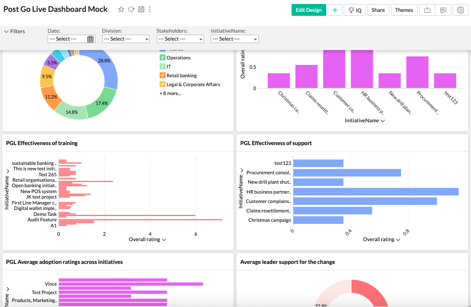
Change adoption dashboard
Now that you have determined exactly what you want to measure to drive adoption, you may want to create a dashboard. Check out our article on ‘Designing a Change Adoption Dashboard’.
What Is a Change Adoption Dashboard?
It’s a visual tool combining key adoption metrics, trends, and warnings into a single pane of glass, allowing leaders and change agents to monitor progress in real time.
Change adoption is the ultimate goal of any change initiative, and effective measurement of adoption metrics is key to integrating change into daily lives and achieving a product’s success. By understanding the dynamics of change adoption and the user journey, selecting the right metrics, and implementing them effectively, change practitioners and product managers can navigate the complexities of change and drive meaningful outcomes for their organisations. Remember, adoption is not a destination but a journey, and with the right metrics and strategies in place, sustainable change is within reach.
To find out more about leveraging a digital platform to create a change adoption dashboard click the below to chat to us.
Change management is an intricate dance between vision, strategy, execution, and perhaps most importantly, adoption. The ultimate goal of any change initiative is not merely to implement new systems, processes, or regulations, but rather to embed these changes into the very fabric of the organisation, ensuring widespread adoption and long-term sustainability.
However, achieving full adoption is no small feat. Many change initiatives falter along the way, failing to garner the buy-in and commitment necessary for success. Even when adoption is initially achieved, sustaining it over time presents its own set of challenges.
Frequently Asked Questions (FAQ)
1. What are the most important adoption metrics in change management? The most important metrics vary by initiative but generally include user engagement, behavioural compliance, feature usage, retention rates, and customer satisfaction.
2. How do you measure user adoption of a new system? Measure system feature usage frequency, process efficiency improvements, support ticket trends, and user satisfaction surveys.
3. How do you track behaviour change in employees? Use a combination of observational data, manager assessments, compliance audits, and micro-behaviour tracking such as task completion accuracy.
4. How many change adoption metrics should organisations track? Focus on 8 to 15 core metrics aligned with your primary objectives to avoid overwhelm and maximize impact.
5. What tools can I use to build a change adoption dashboard? Platforms like The Change Compass provide integrated solutions for automated data collection, visualization, and alerting tailored to adoption measurement.
6. How does continuous monitoring improve change adoption? It allows early detection of issues and timely interventions, preventing small problems from undermining overall adoption success.
This guide focuses on tracking adoption, what people are actually doing with the change. Three closely related guides on this site each cover a distinct angle, pick the one that matches what you need now:
The numbers tell a story that most change leaders already sense. IBM’s 2025 CEO study, surveying 2,000 executives globally, found that only around 25% of AI initiatives deliver expected ROI, and just 16% have scaled enterprise-wide. Investment in AI is accelerating at double-digit rates. The returns are not keeping pace. The gap is not technical. It is human. And it will not be closed by change management practices designed for a different era.
Change management in the digital age faces a challenge that goes beyond scale or speed. The tools, assumptions, and governance models that served change functions well through the ERP rollouts and restructures of the 2000s and 2010s were designed for discrete, definable transformations with identifiable endpoints. Digital transformation, AI adoption, and the automation of work do not have endpoints. They are ongoing conditions. Managing them as projects produces predictable results: partial adoption, underrealised value, and change fatigue that compounds with each successive initiative.
The organisations navigating digital transformation most effectively are not those with the biggest change budgets. They are those that have genuinely updated their change management model for the digital context, treating change capability itself as a strategic asset rather than a delivery function.
The digital transformation gap that change management must close
The scale of underperformance in digital transformation is well documented. Deloitte’s research on digital transformation value identifies three failure patterns that recur across industries: technology deployed without corresponding work redesign, adoption treated as a training problem rather than a behaviour change problem, and benefits realisation measured at go-live rather than at the point where new ways of working are actually embedded.
All three failure patterns are change management failures, not technology failures.
The IBM CEO data reinforces this. In 2026, twice as many workers across age groups say they would embrace greater AI use by their employers rather than resist it. Employee sentiment toward AI is broadly positive. The adoption gap is not about resistance. It is about the absence of the structural, managerial, and environmental conditions that convert positive sentiment into actual behaviour change. This is precisely the domain of change management. And precisely the area where traditional change management approaches are most underpowered.
What makes change management in the digital age different
Three structural characteristics distinguish digital transformation from the changes that traditional change management frameworks were built for.
There is no go-live
Classic change management models, whether ADKAR, Kotter’s 8 steps, or the Prosci methodology, are structured around a transition: a defined current state, a defined future state, and a change journey between them. Digital transformation does not conform to this structure. AI capabilities in use today are materially different from those available 18 months ago, and will be different again 18 months from now. The “future state” keeps moving.
This means that what organisations actually need to build is not a capacity to manage a specific digital change, but an adaptive organisational capability to absorb continuous digital evolution. That is a fundamentally different capability to develop and a fundamentally different change management challenge to address.
The impact is highly fragmented by role
A major ERP implementation affects large groups of employees in broadly similar ways: new system, new processes, new reporting lines. Digital transformation and AI adoption affect different roles in radically different ways. A finance analyst’s experience of AI adoption has almost nothing in common with a customer service representative’s. A supply chain planner and a legal counsel may both be in the same AI transformation programme but need entirely different support.
Generic change communications and enterprise-wide training programmes do not work well in this environment. Effective change management in the digital age requires function-level and role-level customisation at a depth that most change functions have not previously needed to operate at.
Middle management is both the opportunity and the obstacle
Gartner’s 2025 CHRO research found that 78% of CHROs agree workflows and roles will need to change to realise the value of AI investments. The people who must actually make those workflow and role changes happen are middle managers. They translate digital strategy into day-to-day practice. They also face the most immediate personal disruption from the changes they are asked to enable.
Change management approaches that treat managers primarily as a communication channel, rather than as a group with their own adoption challenge and their own need for specific support, consistently underperform. The manager layer is where digital transformation succeeds or stalls.
Data and measurement in the digital age
One of the defining features of digital transformation is the availability of adoption data. Most digital platforms generate detailed usage data. Organisations now have, or can have, precise information about which employees are using new systems and tools, how frequently, in what ways, and with what outcomes.
Traditional change management largely operated without this data. Communications were sent, training was attended, and surveys were occasionally administered. Whether behaviour had actually changed in meaningful ways was often a matter of judgement rather than evidence.
The digital age removes this ambiguity for organisations willing to use the data available. Key metrics that effective change functions track in digital transformation include:
Active usage rates by role group and function (not just platform access)
Time savings realised in specific processes, compared against baseline
Quality or output measures for AI-assisted work versus previous work
Support ticket and workaround patterns, which indicate where adoption is failing
Manager-reported team behaviour change, gathered through structured check-ins
The risk with digital adoption data is conflating access with adoption. A person who logs into a platform once a week is not the same as a person who has genuinely changed how they work. Effective measurement tracks the second thing, not the first.
Automation and what it means for the change management function itself
The digital age is also changing how change management work is done, not just what it is managing. Change functions are beginning to automate significant portions of the administrative and analytical work that previously consumed change practitioner time: impact assessment compilation, status reporting, communication scheduling, data aggregation across programmes.
This shift has two implications worth examining.
The first is a productivity gain. Change practitioners who are no longer spending days compiling portfolio heat maps in spreadsheets have time to do the work that requires human judgment: stakeholder conversations, resistance diagnosis, sponsor coaching, and the nuanced facilitation that data analysis cannot replace.
The second is a capability shift. The change practitioner of the digital age needs to be comfortable working with data and platforms in ways that were optional for practitioners in earlier generations. Interpreting adoption dashboards, working with automated workflow tools, and communicating findings in data-fluent ways are becoming baseline expectations rather than specialist skills.
Building a digital-age change management capability
For change leaders building or rebuilding their function’s capability for the digital context, the practical work happens in four areas.
Updating the impact methodology. Traditional impact assessment categories, such as process, role, technology, and structure, need to be extended to capture AI-specific dimensions: the degree to which a role’s core tasks are being automated or augmented, the learning curve associated with AI-enabled ways of working, and the interaction effects when multiple digital changes land simultaneously on the same employee group.
Investing in role-level differentiation. The days of enterprise-wide change communications being the primary engagement mechanism are over for major digital transformations. Effective change functions in the digital age develop function-specific change plans, with tailored messaging, use-case-specific training, and peer champion networks built around specific communities of practice rather than the whole organisation.
Building adaptive governance. Digital transformation moves faster than traditional programme governance. Change plans written at programme initiation will be outdated within months as capabilities evolve and adoption data comes in. The governance model needs to support continuous plan adaptation: regular portfolio reviews, rolling 90-day action planning, and the authority to reallocate resources based on adoption evidence rather than original project plans.
Using digital platforms for portfolio visibility. Managing the cumulative digital change burden on employee groups requires portfolio-level visibility that manual approaches cannot reliably provide. Platforms such as The Change Compass aggregate impact data across programmes, track adoption by function and role group, and enable the continuous monitoring that adaptive change governance requires. This is not a luxury for large change functions. It is the infrastructure that makes portfolio-level decision-making possible.
Where to start
For change leaders whose organisations are in the middle of active digital transformation programmes with traditional change management in place, the most useful first step is a diagnostic of the current approach against the digital age requirements.
The diagnostic questions are practical:
Are you measuring actual behaviour change or platform access?
Do you have function-specific change plans, or enterprise-wide plans applied uniformly?
How are you managing the cumulative digital change load on specific employee groups?
What is your process for adapting the change approach as adoption data comes in?
Are your managers being supported as a group with their own adoption challenge, or managed primarily as a change communication channel?
Most change functions running traditional approaches through digital programmes will find significant gaps in these areas. The gap that typically generates the fastest improvement when closed is measurement: moving from activity metrics to adoption metrics creates the feedback loop that enables everything else to improve.
Frequently asked questions
What is change management in the digital age?
Change management in the digital age refers to applying change management principles and practices to the specific challenges of digital transformation, AI adoption, and the automation of work. It extends traditional change management to address the absence of a fixed endpoint, the highly fragmented role-level impact of digital change, and the availability of adoption data that enables evidence-based course correction throughout the change journey.
Why do digital transformation programmes fail to deliver expected value?
The primary causes are change-related, not technical. Workflows are not redesigned to take advantage of new digital capabilities, middle managers are not supported as a group with their own adoption challenge, measurement focuses on system access rather than behaviour change, and change plans are not adapted as adoption evidence accumulates. IBM research found that only around 25% of AI initiatives deliver expected ROI, largely for these reasons.
How is digital transformation different from managing a standard technology change?
Digital transformation differs in three important ways: there is no defined future state because digital capabilities evolve continuously; the impact on different roles is highly fragmented, requiring function-level rather than enterprise-wide approaches; and the adoption data available through digital platforms enables a measurement-led approach that traditional change management rarely applied.
What metrics should you track in digital transformation change management?
The most informative metrics go beyond platform access to measure actual behaviour change: active usage rates by role group, time savings realised in specific processes, quality of AI-assisted output versus previous output, support ticket patterns indicating where adoption is failing, and manager-reported team behaviour change. These give a more honest picture of adoption progress than usage statistics alone.
How do you manage the cumulative digital change load on employees?
Managing cumulative load requires portfolio visibility: knowing what digital changes are landing on which employee groups at what time, and aggregating impact to identify when load is approaching the point where adoption quality begins to deteriorate. Portfolio change management platforms enable this aggregation and provide the early warning signals that allow sequencing adjustments before saturation becomes visible in adoption data.
References
IBM. CEO Study: CEOs Double Down on AI While Navigating Enterprise Hurdles (2025). https://newsroom.ibm.com/2025-05-06-ibm-study-ceos-double-down-on-ai-while-navigating-enterprise-hurdles
IBM Institute for Business Value. 5 Trends for 2026. https://www.ibm.com/downloads/documents/us-en/1443d5df79cf4c92
Deloitte Insights. Unleashing Value from Digital Transformation: Paths and Pitfalls. https://www.deloitte.com/us/en/insights/topics/digital-transformation/digital-transformation-value-roi.html
Gartner. Gartner Says CHROs’ Top Priorities for 2026 Center Around Realising AI Value and Driving Performance (October 2025). https://www.gartner.com/en/newsroom/press-releases/2025-10-02-gartner-says-chros-top-priorities-for-2026-center-around-realizing-ai-value-and-driving-performance-amid-uncertainty
AIHR. 15 Important Change Management Metrics To Track in 2026. https://www.aihr.com/blog/change-management-metrics/